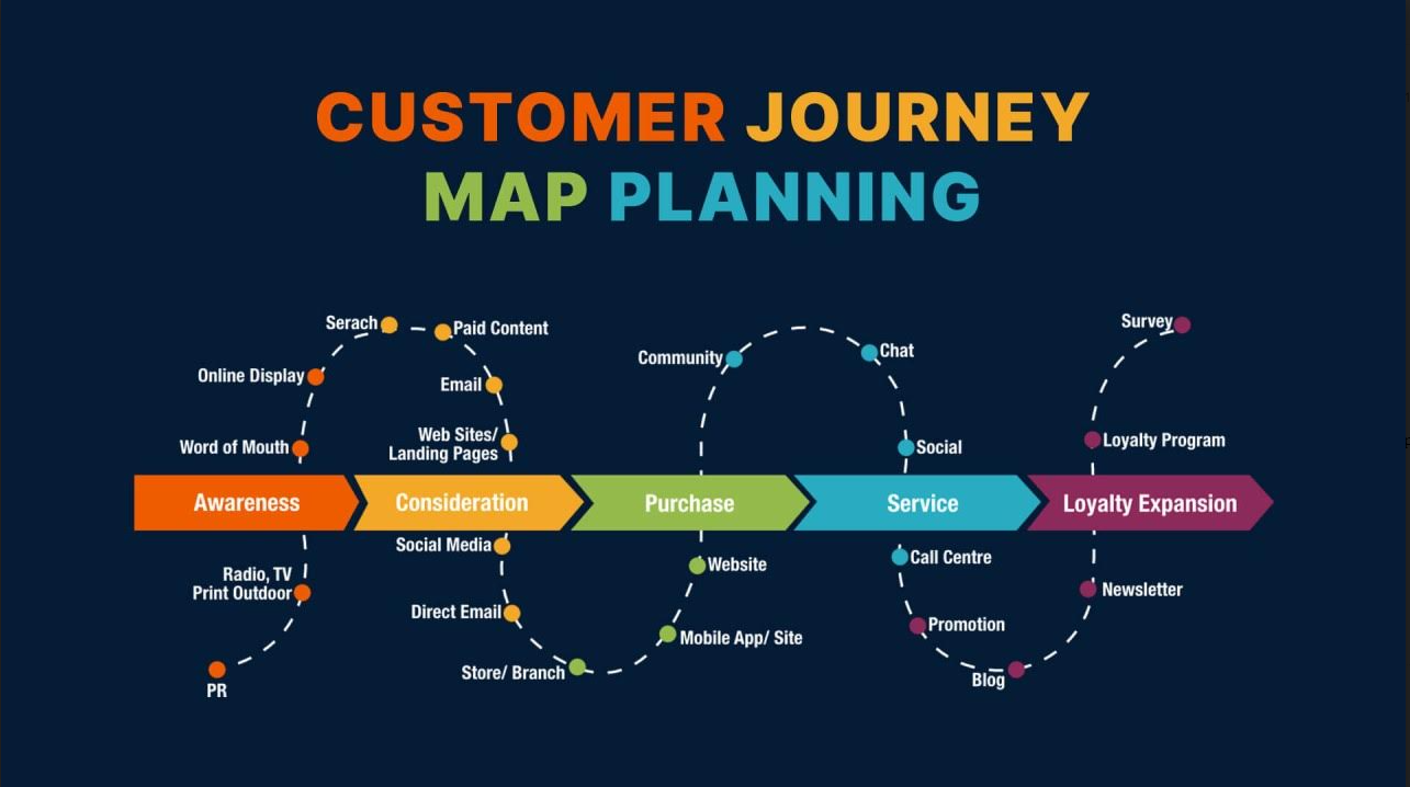
Website optimization tools help you improve rankings, speed, user experience, and conversions, but the best choice depends on what is actually holding your site back. If your issue is low traffic, you need SEO tools. If users are dropping off, you need UX and CRO tools. If pages feel slow, you need speed diagnostics. This guide breaks down the best website optimization tools by use case so you can choose the right stack faster.
The best website optimization tools depend on your goal. Use Ahrefs or Semrush for SEO, FullSession or Hotjar for user behavior and conversion friction, Google PageSpeed Insights or GTmetrix for speed, VWO for experimentation, and WAVE or BrowserStack for accessibility. Most teams get the best results from a small stack, not a single tool.
| Tool | Best for | Category | Best when you need | Main limitation |
|---|---|---|---|---|
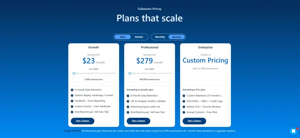
| FullSession | Behavioral insight + funnel friction | UX / CRO | Replay, heatmaps, feedback, funnel analysis together | Best value comes with active optimization work |
| Hotjar | Lightweight UX research | UX | Quick heatmaps, recordings, surveys | Less depth than larger platforms |
| Ahrefs | SEO research | SEO | Keywords, backlinks, competitor gaps | Requires regular use to justify spend |
| Semrush | Broad marketing workflows | SEO | SEO plus content and campaign support | Can feel broad for narrow use cases |
| Google PageSpeed Insights | Fast diagnostics | Speed | Quick performance review and Core Web Vitals checks | Limited for deeper debugging alone |
| GTmetrix | Technical performance analysis | Speed | Waterfalls and monitoring | More technical than beginner tools |
| VWO | Structured experimentation | CRO | A/B testing and optimization programs | Needs traffic and test discipline |
| WAVE | Accessibility checks | Accessibility | Quick issue detection | Best used with broader testing |
How to choose the right website optimization tools
Choose tools based on the problem you need to solve first.
- If traffic is low: prioritize SEO tools like Ahrefs or Semrush.
- If visitors are not converting: prioritize behavior analytics and CRO tools like FullSession, Hotjar, or VWO.
- If your pages are slow: start with Google PageSpeed Insights, GTmetrix, or WebPageTest.
- If usability or compliance is a concern: use accessibility tools like WAVE or BrowserStack.
Before buying anything, ask:
- What is the biggest performance bottleneck on our site right now?
- Which team will actually use this tool every week?
- Does this tool help us find issues, validate fixes, or both?
- Can we act on the insights without heavy technical overhead?
Key Takeaways
- Website optimization tools usually fall into five categories: SEO, UX analytics, page speed, CRO, and accessibility.
- The right tool depends on your bottleneck: traffic, friction, speed, or conversions.
- Most businesses do better with a focused stack of 2–4 tools than one overloaded platform.
- If you want better rankings, start with SEO tools.
- If you want higher conversions, start with behavior analytics and CRO tools.
- If your site is slow, start with page speed diagnostics
Visualize, Analyze, and Optimize with FullSession
See how to transform user data into actionable insights for peak website performance.
How Website Optimization Tools Fit Into Your Workflow

Image source: Freepik
Website optimization tools help you measure, diagnose, and improve specific parts of your website, but they are not the same as optimization strategy. Your strategy tells you what to improve first; tools help you analyze issues, validate changes, and monitor results.
This guide focuses on choosing the right software for UX, SEO, page speed, CRO, and accessibility.
The 5 main types of website optimization tools
- UX and behavior analytics tools – show where users get stuck
- SEO tools – improve rankings, visibility, and topical coverage
- Page speed tools – diagnose performance issues and Core Web Vitals problems
- CRO tools – test changes and improve conversion rates
- Accessibility tools – find usability and compliance issues
Many of these tools have free and paid versions. Free tools often provide basic features, while paid versions offer more advanced features.
User Experience (UX) Tools: Create Intuitive User Journeys
UX tools help you understand where visitors hesitate, get confused, or abandon key journeys. If your traffic is healthy but conversions are weak, this is often the first category to prioritize.
Which UX tool should you choose?
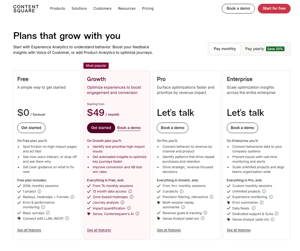
- Choose FullSession if you want behavior analytics plus funnel visibility in one workflow.
- Choose Hotjar if you want lightweight heatmaps, recordings, and surveys.
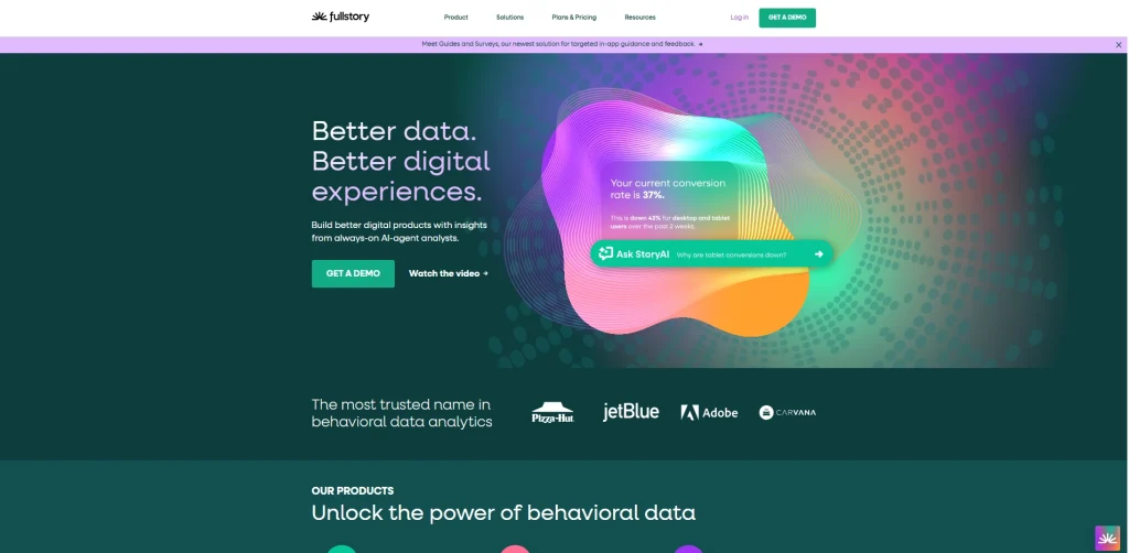
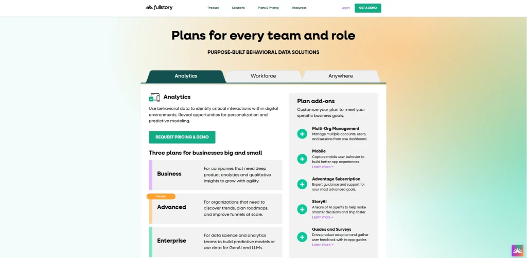
- Choose FullStory if you need enterprise-grade experience analytics.
- Choose Crazy Egg if your main goal is visual page analysis and simple testing.
- Choose UserTesting if you want direct qualitative feedback from real users.
Top UX tools for website owners
Once you know what kind of insight you need, the next step is choosing the right platform. Below are the top UX tools for website owners, along with what each one does best.
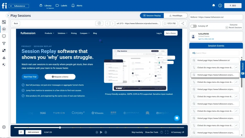
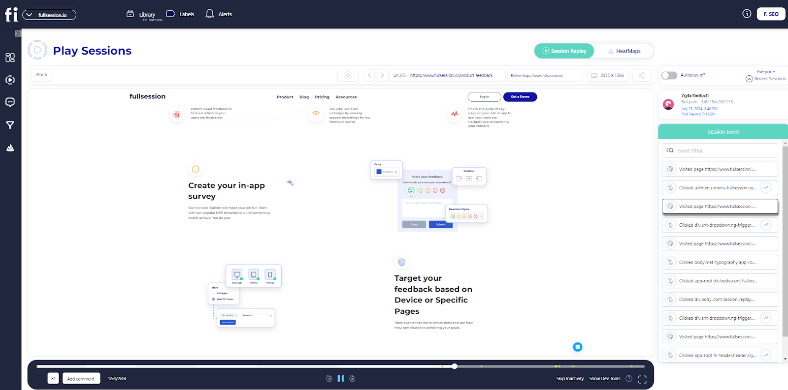
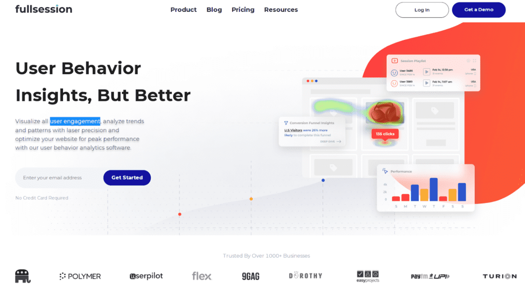
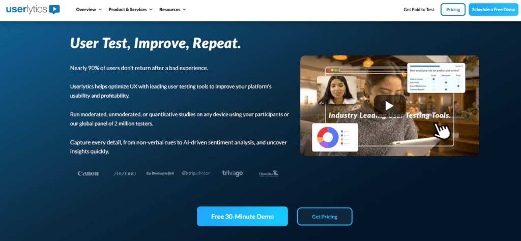
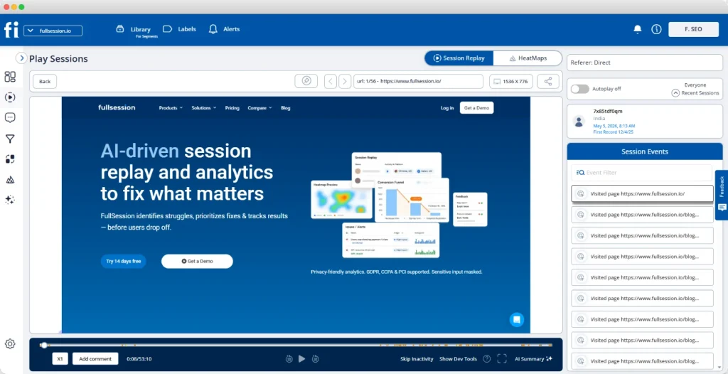
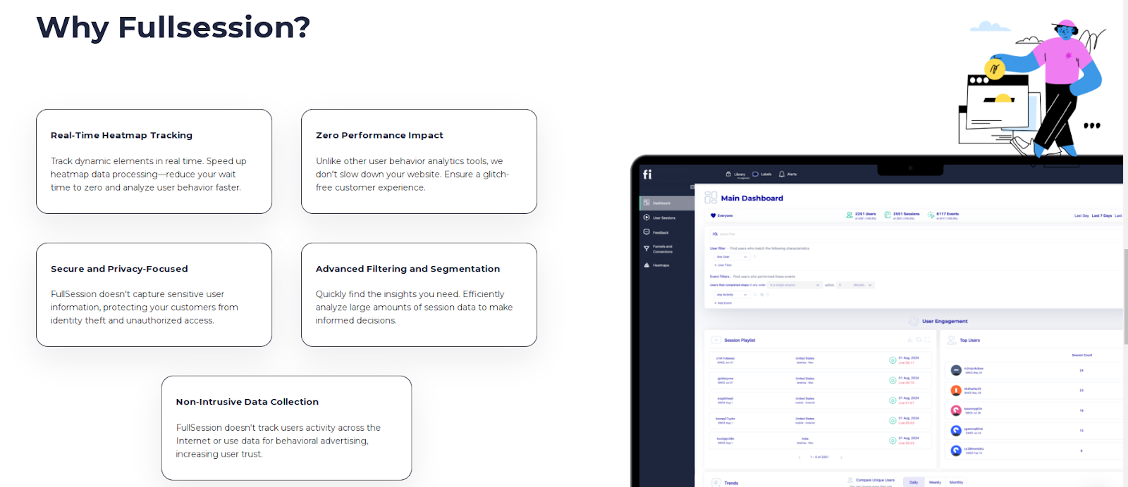
FullSession
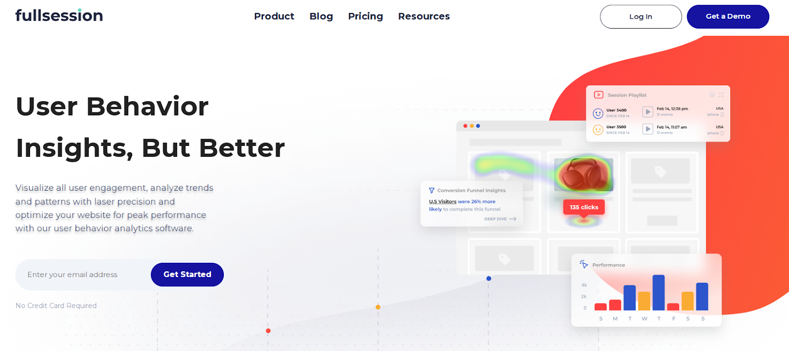
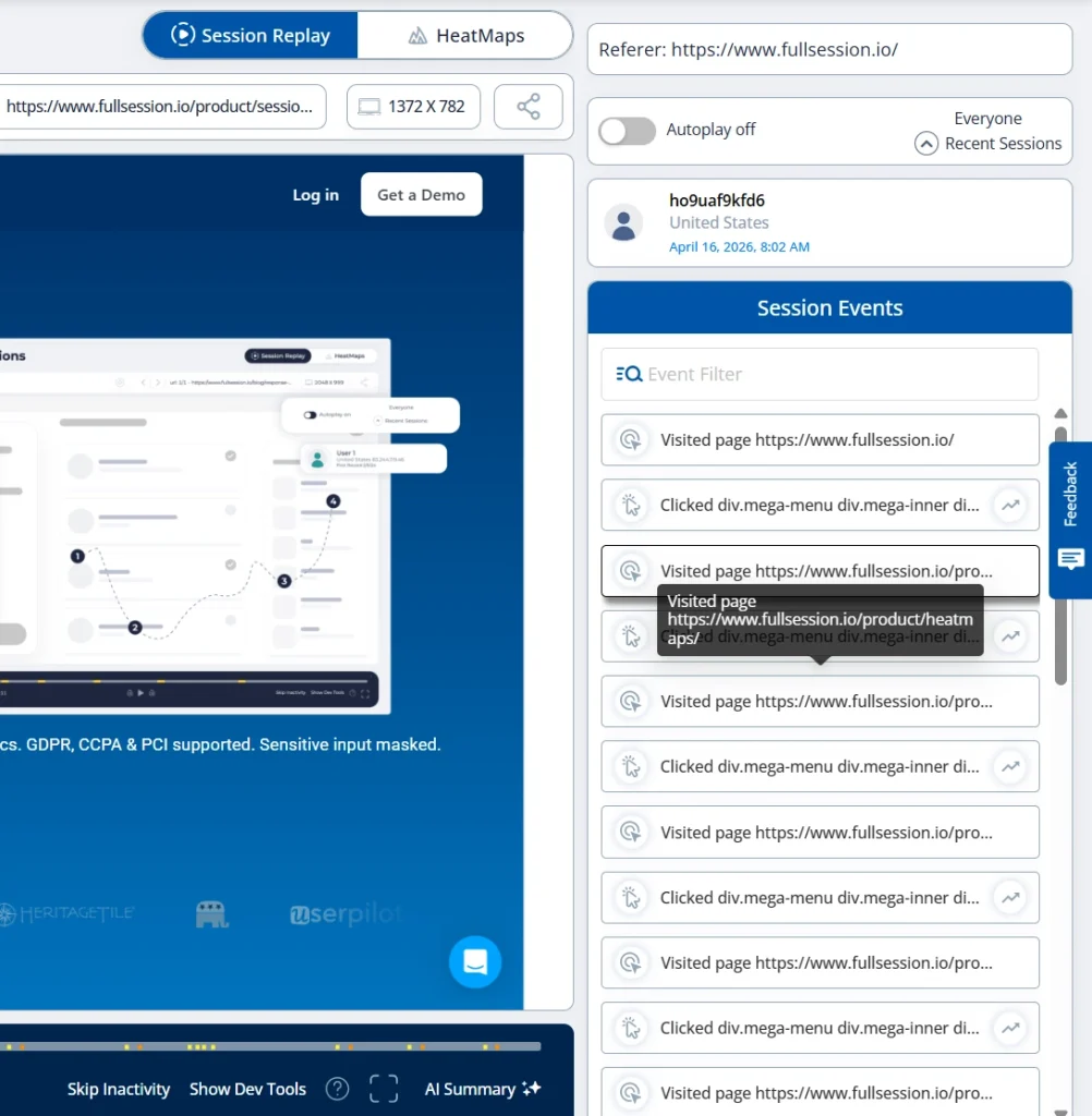
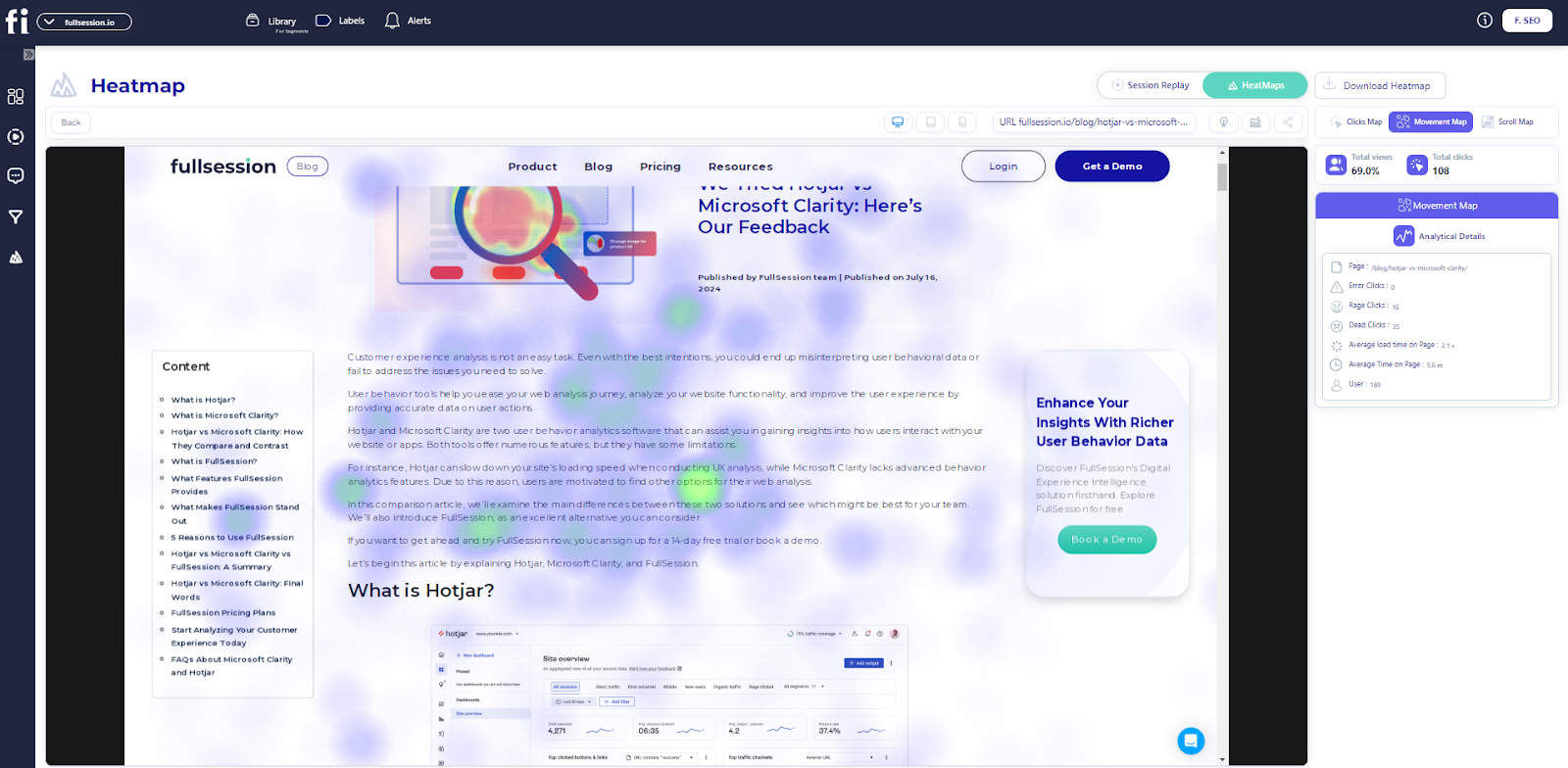
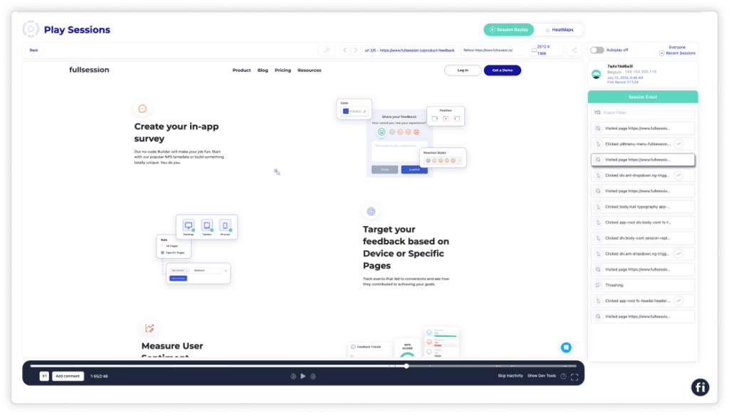
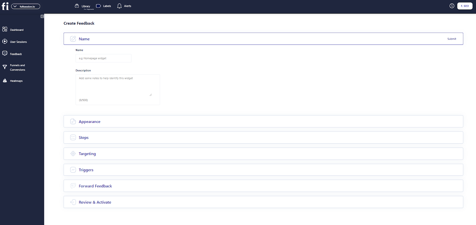
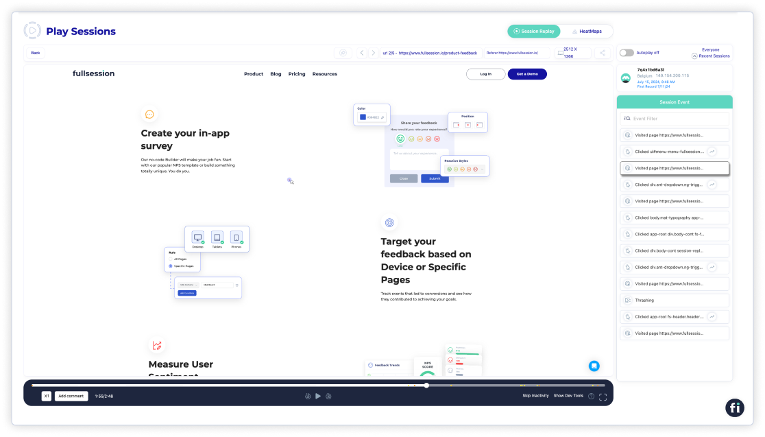
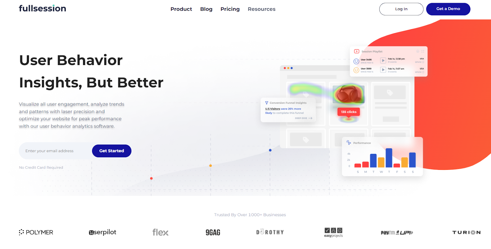
FullSession is a comprehensive user behavior analytics platform that captures all user interactions, helping you visualize and analyze trends and patterns to optimize your website’s usability, interface, and performance for increased conversions.
FullSession provides a complete overview of user behavior data in a single interface.

Forget about spending hours analyzing numbers. Instead, view real-time session recordings and replays to identify what drives or hinders your user experience, affecting the conversion rate. FullSession highlights the crucial stages of each user’s journey, delivering actionable insights instantly.

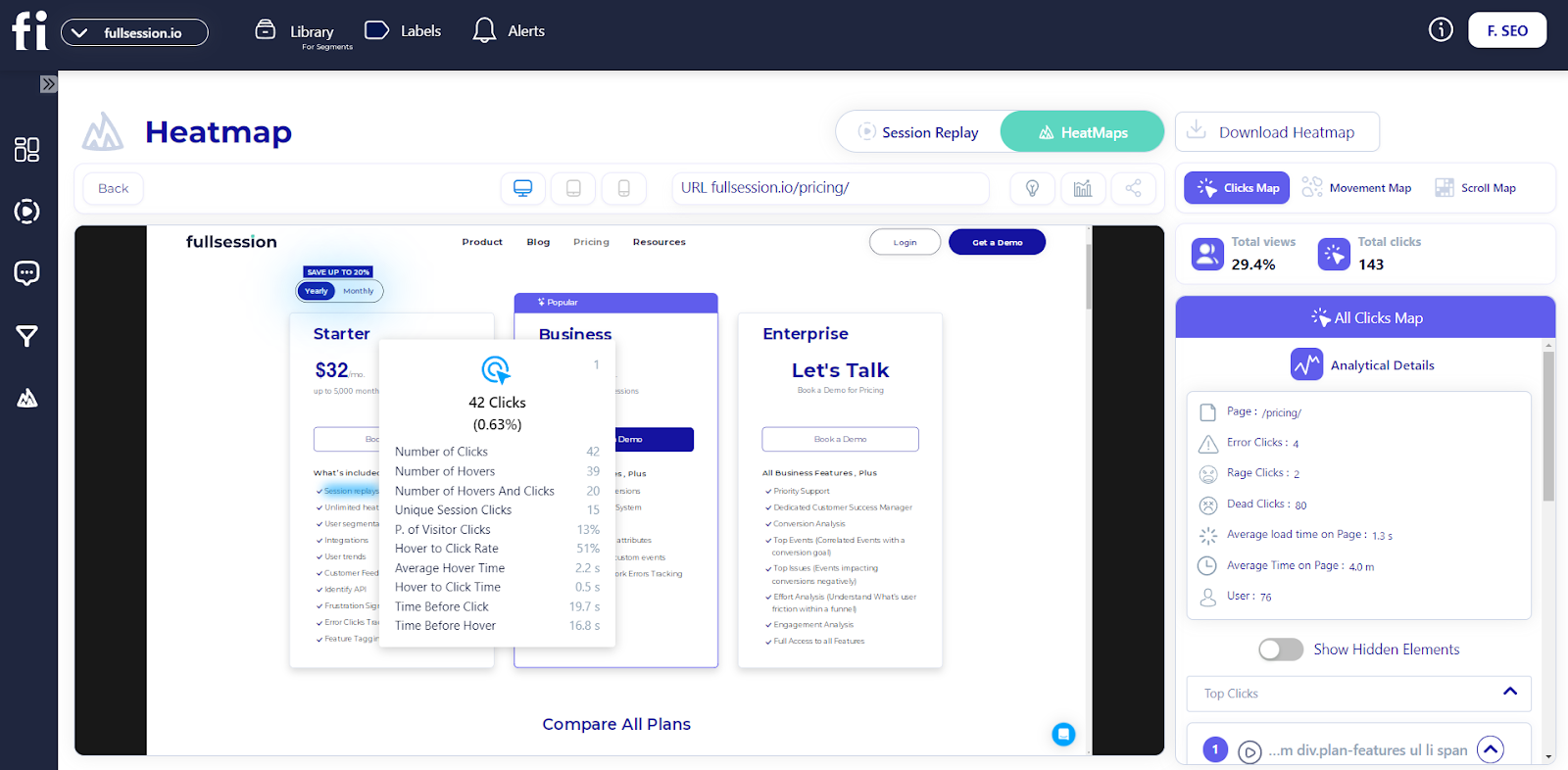
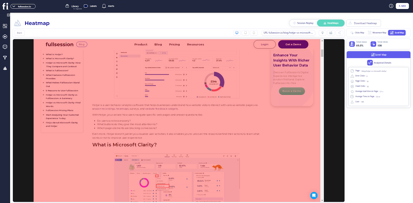
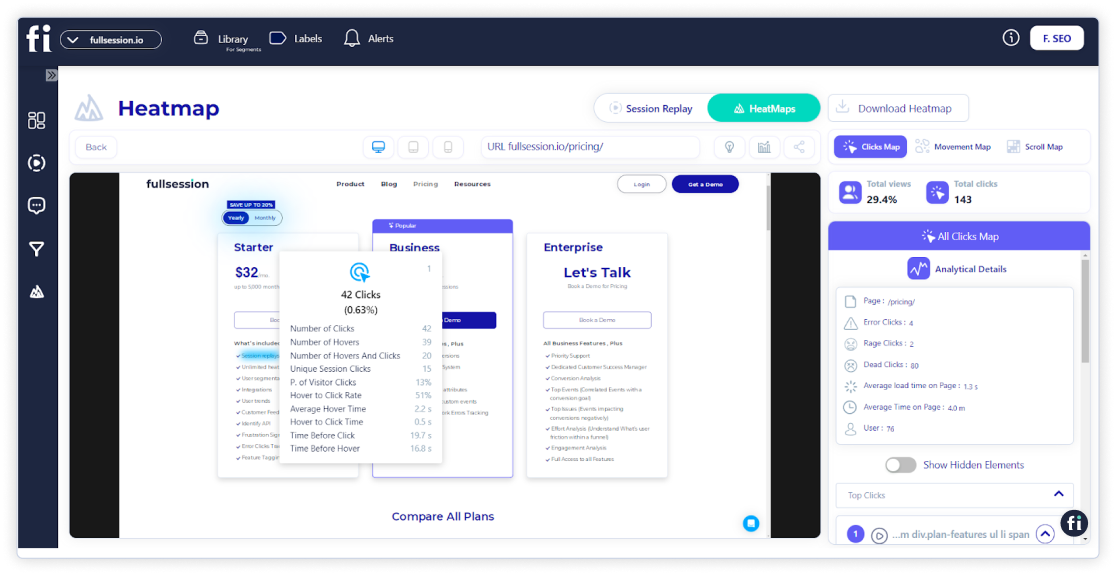
Employ website heatmap tools to identify effective and ineffective web page elements. Discover which areas of your website users overlook, evaluate page components, and verify if your changes cause better outcomes.
Identify and remove obstacles preventing visitors from becoming customers. Use conversion rate optimization tools to improve critical stages in your user’s journey and create a streamlined path to conversion through your sales funnel.

Gather user feedback in real-time using website feedback forms. Get a clear understanding of their frustrations and swiftly address their pain points. Rather than guessing, you’ll have precise knowledge of what’s causing issues and why.

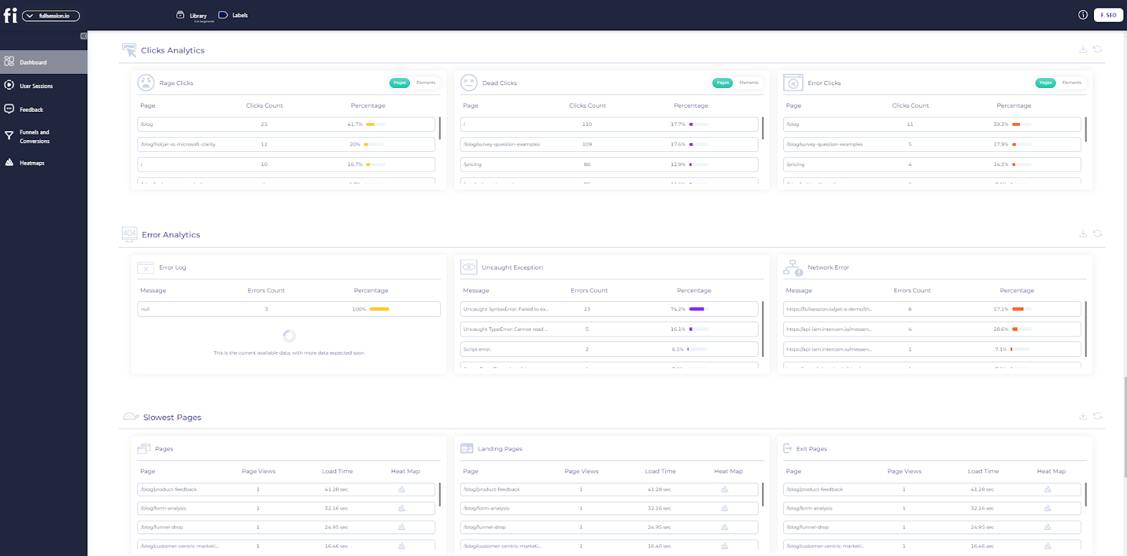
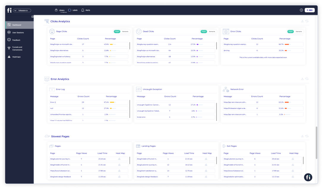
Identify, analyze, and fix errors that affect user experience with advanced error analysis. Get visual data on error clicks, network issues, console errors, error logs, and uncaught exceptions. Improve the site reliability and user satisfaction of your digital products.
Rely on FullSession to safeguard your data and protect your users’ privacy. We prioritize security, allowing you to concentrate on improving your site without worrying about data risks.
Our behavioral analysis software adheres to the most stringent privacy regulations, including GDPR, CCPA, and PCI standards. It means we’re not just tracking website visitor behavior; we’re doing it responsibly.
Turn User Behavior into Growth Opportunities
Learn how to visualize, analyze, and optimize your site with FullSession.
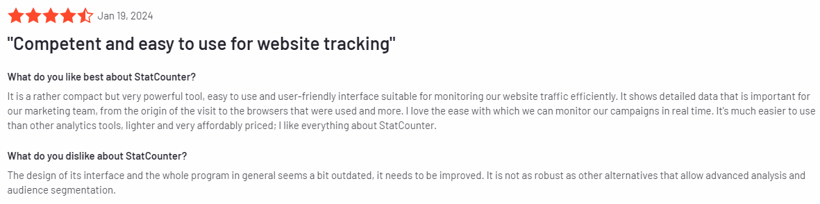
Hotjar
Hotjar is a full user behavior analytics tool showing how visitors use your website. It helps you understand user behavior to improve their experience.
Key features include heatmaps showing where users click and scroll and session recordings, which playback individual user interactions. Hotjar also has feedback polls and surveys to collect user input directly.
Combining insights from surveys and recordings provides a complete understanding of user experience. It helps you make data-driven decisions to optimize your site and potentially increase engagement and conversions.
Learn more:
- Hotjar alternatives
- Hotjar vs Google Analytics
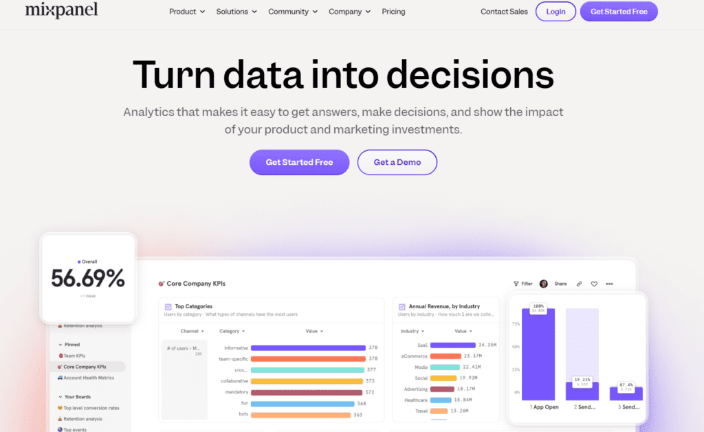
- Hotjar vs Mixpanel vs Clicktale
- Hotjar vs FullStory
- Smartlook vs Hotjar
- Hotjar vs Microsoft Clarity
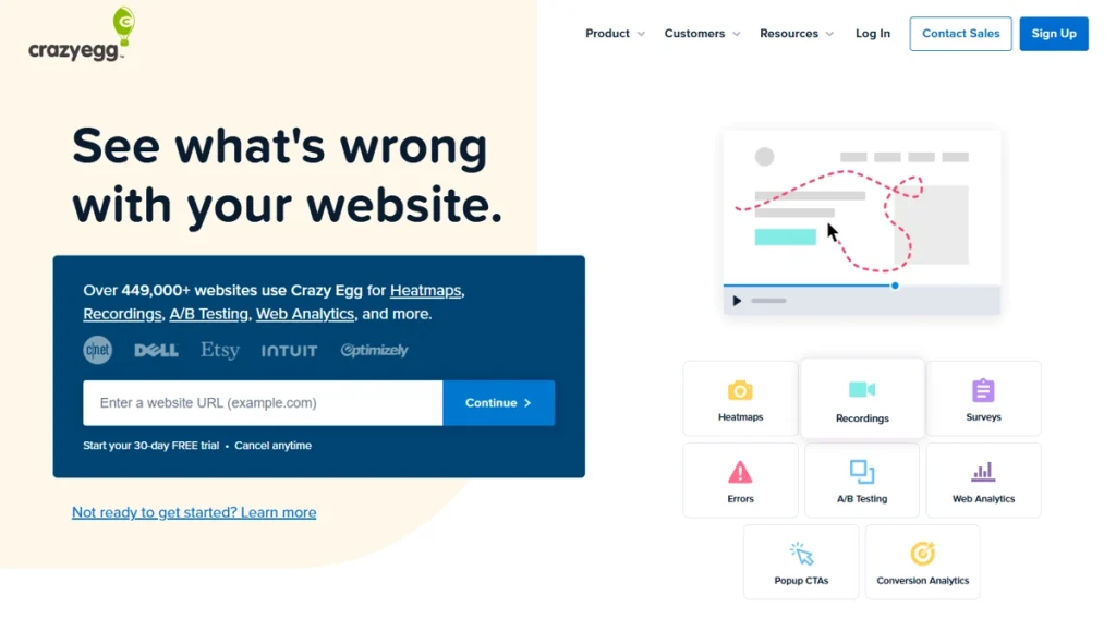
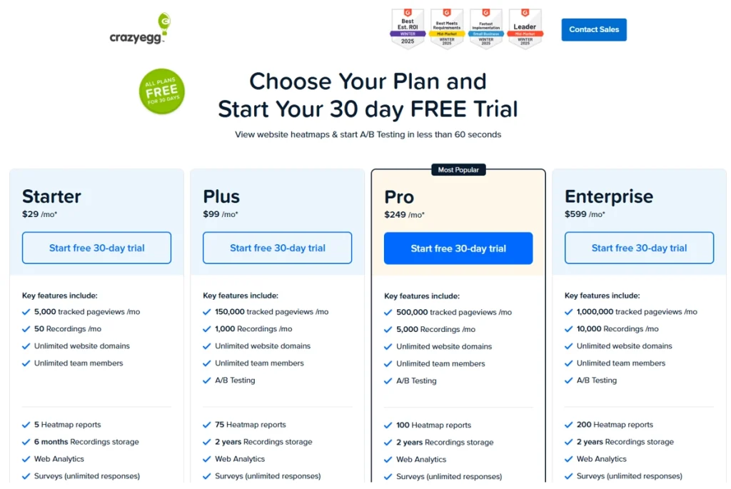
Crazy Egg
Crazy Egg is all about visualizing user behavior with a big focus on heatmaps and A/B testing.
Features include click heatmaps, scroll maps and user recordings. The platform also has strong A/B testing features so you can compare different versions of your pages.
It helps you optimize page layout and content placement based on real user behavior and potentially increase user experience and conversion rates.
Learn more:
FullStory
FullStory is a digital intelligence platform that shows detailed session replays and makes customer journey analysis.
Features include high-fidelity session recordings, conversion funnel analysis and error tracking. The platform uses machine learning to identify and categorize user frustrations automatically.
You can quickly spot and fix usability issues, understand drop-off points and optimize the overall user experience. It can lead to higher customer satisfaction and potentially higher retention rates.
Learn more:
UserTesting
UserTesting allows for live usability testing with real users for direct feedback. It gathers qualitative insights into user experience and preferences.
Features include video feedback of users completing tasks on your website or app and written answers to specific questions. You can define your target audience and set up custom test scenarios.
You can get in-depth qualitative feedback on your site’s usability, design and overall user experience to inform more user-centric design decisions and improvements.
Learn more: UserZoom vs UserTesting.
Best practices for improving user experience
To improve your website’s UX, consider these best practices:
- Simplify navigation: Make it easy for users to find what they need.
- Optimize page load times: Fast-loading pages improve user satisfaction.
- Use clear calls-to-action: Guide users towards desired actions.
- Ensure mobile responsiveness: Your site should work well on all devices.
- Implement user feedback: Regularly collect and act on user suggestions.
- Conduct A/B testing: Compare different design elements to see what works best.
With UX tools, you can create a more effective website for your visitors leading to increased user engagement, higher conversion rates, and improved overall performance.
SEO Tools: Boost Rankings and Drive Organic Traffic
SEO tools help you improve visibility, discover content opportunities, find technical issues, and benchmark competitors. If your problem is low organic traffic or weak keyword coverage, this should be one of the first categories you invest in.
Which SEO tool should you choose?
- Choose WooRank for quick audits and technical issue discovery.
- Choose GrowthBar if your team wants AI-assisted content workflows.
- Choose Ahrefs for backlink analysis, keyword gaps, and competitor research.
- Choose Semrush for a broader SEO and digital marketing suite.
- Choose Moz Pro if you want more guided recommendations.
Once you know what kind of SEO support you need, the next step is choosing the platform that best fits your workflow, budget, and level of technical depth.
WooRank
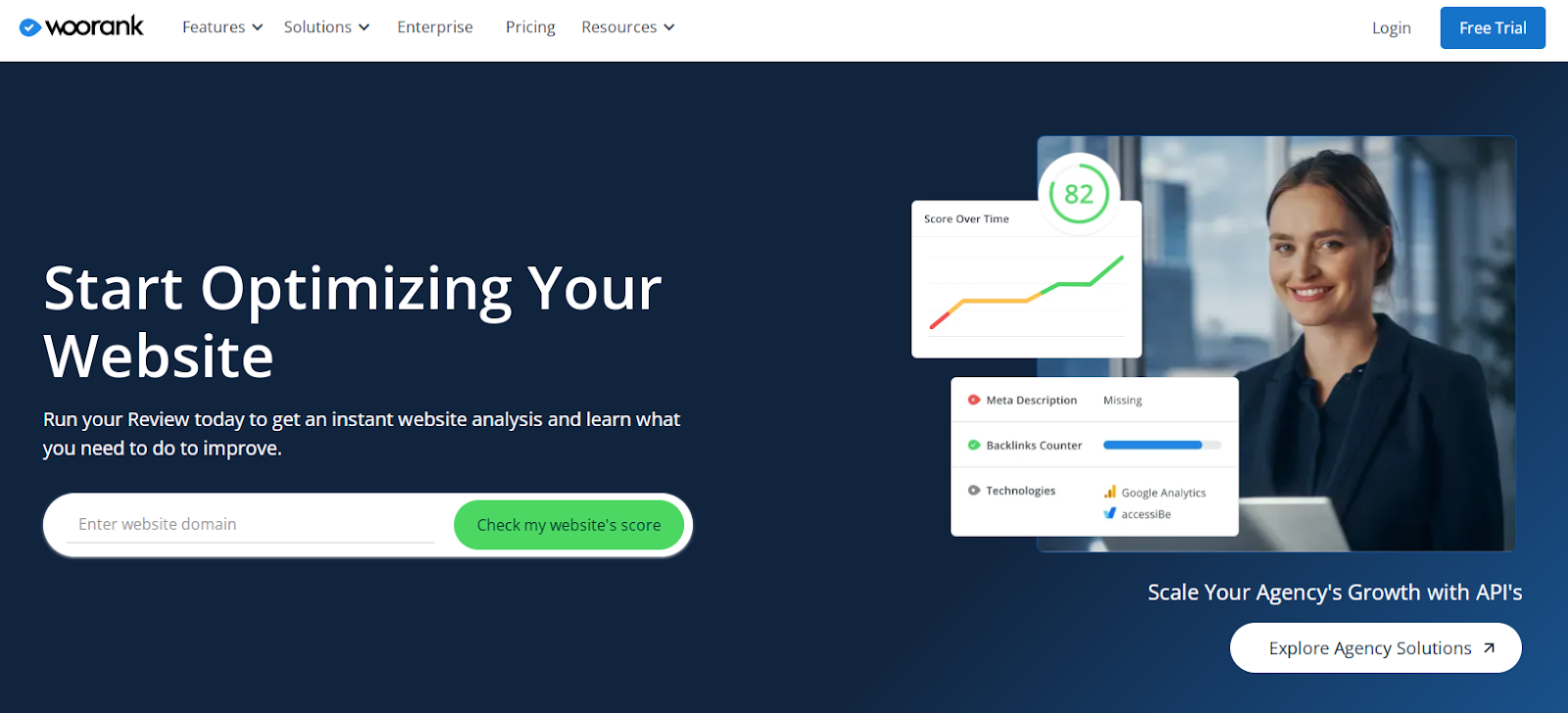
WooRank is an SEO audit and website review tool that helps you boost your search rankings. It gives you actionable insights to optimize your website.
On-page SEO analysis, keyword tracking and competitor analysis are the main features. WooRank also has a site crawl feature that finds technical SEO issues.
You can quickly identify and fix SEO weaknesses and get more search visibility and traffic.
GrowthBar
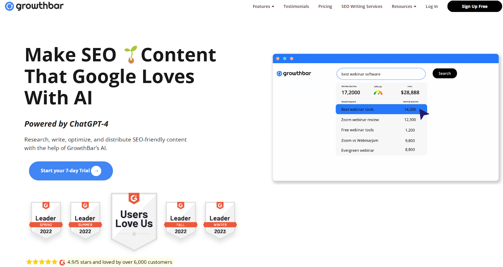
GrowthBar is an SEO tool for content creators and marketers. It simplifies keyword research and content optimization. AI content outlines, keyword suggestions and backlink analysis are the main features.
GrowthBar also integrates with Google Search Console for real-time data. You can streamline your content creation process, ensure you follow the best SEO practices, and get higher-ranking content and more traffic.
Ahrefs
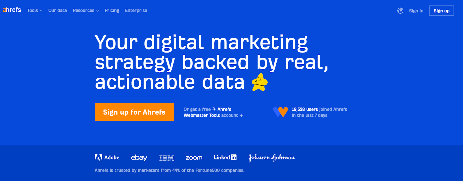
Ahrefs is a full SEO toolset known for its massive backlink database and competitor analysis. It gives you SEO insights and competitor intelligence.
The main features are site audits, keyword research, content explorer and rank tracking. Ahrefs also has a unique “Content Gap” feature that shows you the keywords your competitors rank for but you don’t.
You can develop data-driven SEO strategies based on competitor insights and complete link analysis.
SEMrush
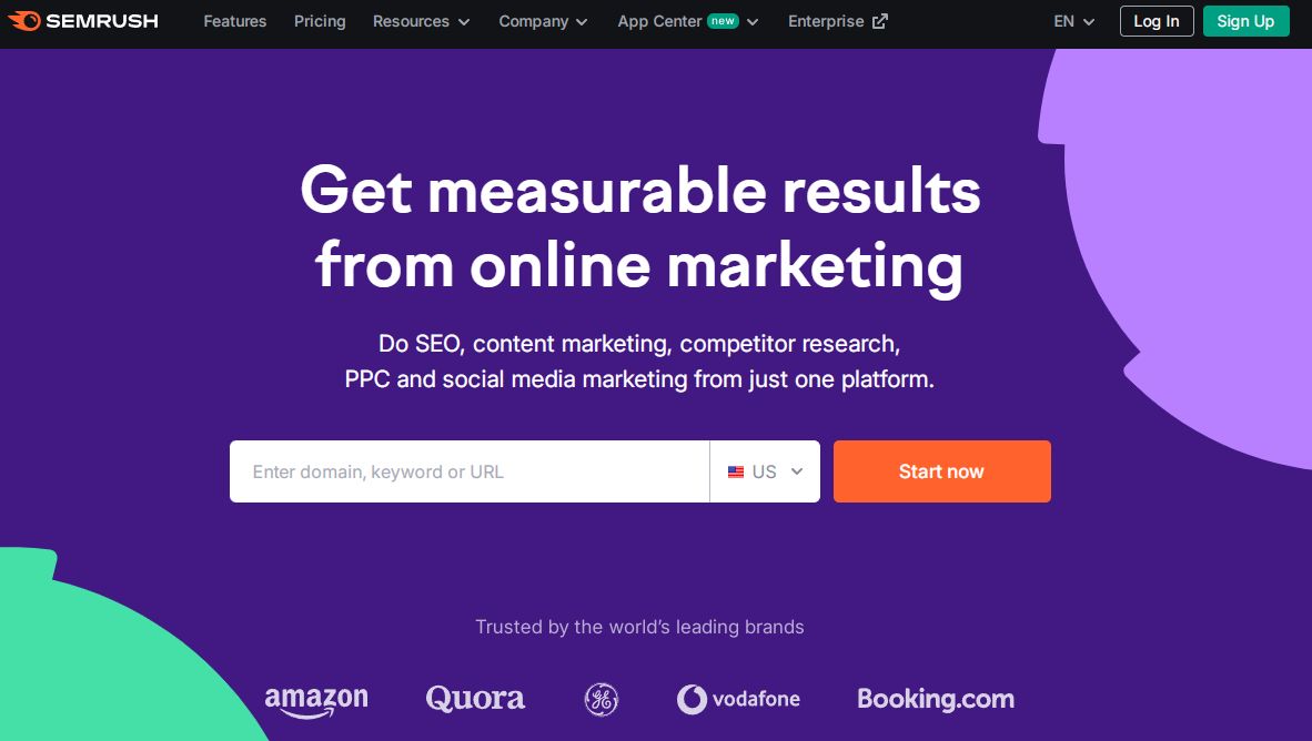
SEMrush is an all-in-one marketing toolkit with a strong SEO and content marketing focus.
It includes a full digital marketing suite. Keyword research, site audit, backlink analysis and position tracking are the main features.
SEMrush also has tools for PPC, social media and content marketing. You can manage multiple aspects of your digital marketing from one place.
Moz Pro
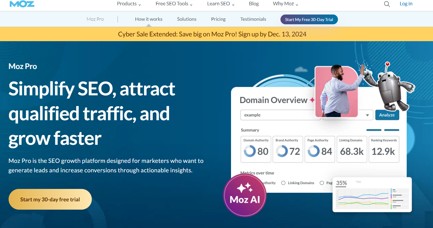
Moz Pro is a complete SEO software suite that boosts search rankings and traffic. It gives you actionable SEO insights and recommendations.
The main features are site crawl, keyword research, link research, and rank tracking. Moz Pro has a unique “Page Optimization” feature that gives you specific on-page SEO recommendations.
It includes trusted SEO metrics like Domain Authority and gives detailed insights to guide your SEO efforts and increase search visibility and traffic.
How to use SEO tools effectively
To get the most out of SEO tools, follow these tips:
- Set clear goals for your SEO efforts.
- Use multiple tools to get a complete picture.
- Focus on actionable data and insights.
- Regularly monitor your progress.
- Keep learning about SEO best practices.
Start by auditing your site to find quick wins. Use keyword research to guide your content strategy. Track your rankings and adjust your approach as needed.
Prioritize fixing technical issues that may hurt your rankings. Pay attention to your competitors’ strategies and learn from their successes.
Remember, SEO is an ongoing process. Use these tools consistently to stay on top of changes and opportunities in your niche.
Page Speed Optimization Tools: Accelerate Your Website
Page speed affects how people use your website. Slow sites make visitors leave quickly. Fast sites keep people around longer. Google looks at page speed when ranking sites. Faster sites often rank higher in search results.
Slow load times can decrease your conversion rates. People don’t like waiting. They might go to a faster site instead of yours. It means you could lose customers and sales.
Mobile users expect quick loading. With more people using phones to browse, speed matters even more. A fast mobile site can give you an edge over slower competitors.
Key metrics for measuring page speed
To improve speed, you need to measure it. Here are important metrics to track:
- Time to First Byte (TTFB): How fast your server responds
- First Contentful Paint (FCP): When the first content appears
- Largest Contentful Paint (LCP): When the main content loads
- First Input Delay (FID): How fast your site reacts to user input
- Cumulative Layout Shift (CLS): How stable your page elements are
These metrics help you understand different aspects of your site’s performance. They show where you need to focus your optimization efforts.
Top page speed optimization tools
Several tools can help you check and improve your website speed. Here are some of the best:
- Google PageSpeed Insights
- GTmetrix
- Pingdom
- WebPageTest
- Dareboost
Each tool offers unique features to analyze your site’s performance.
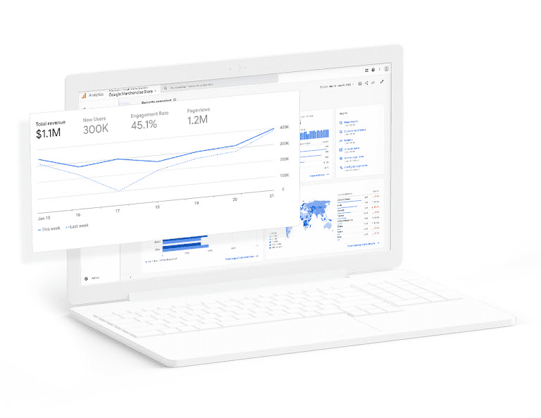
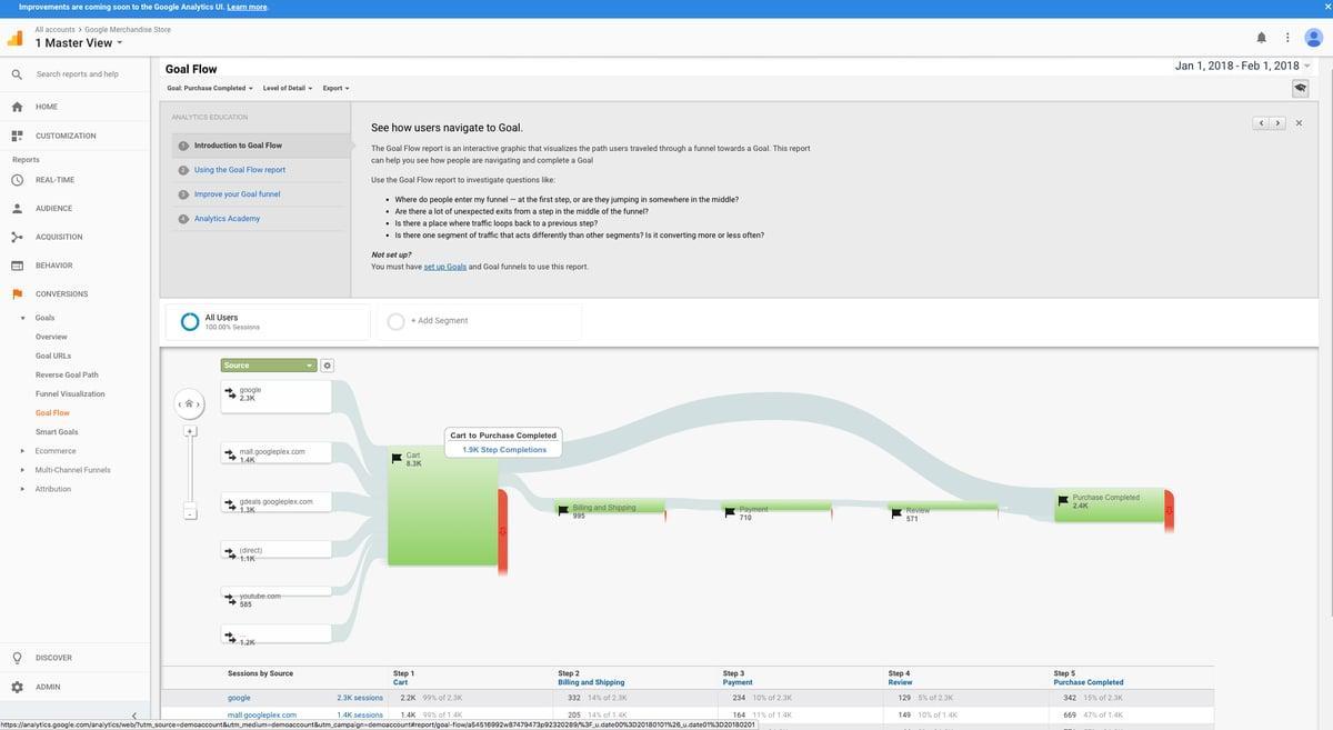
Google PageSpeed Insights
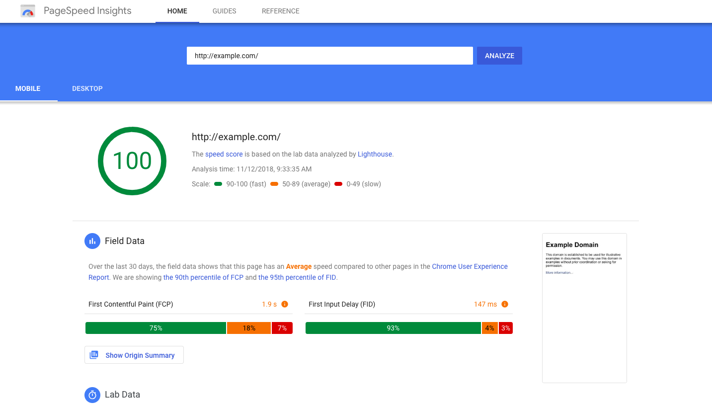
Image source: Google for Developers
Google PageSpeed Insights is a free tool from Google. It checks both mobile and desktop versions of your site. It gives you a score out of 100 for your page speed.
It offers detailed suggestions to fix issues. These tips cover things like image optimization and code minification. Google PageSpeed Insights uses real-world data from Chrome users to show how your site performs.
It is great for beginners and experts alike. It’s easy to use and gives actionable advice.
GTmetrix
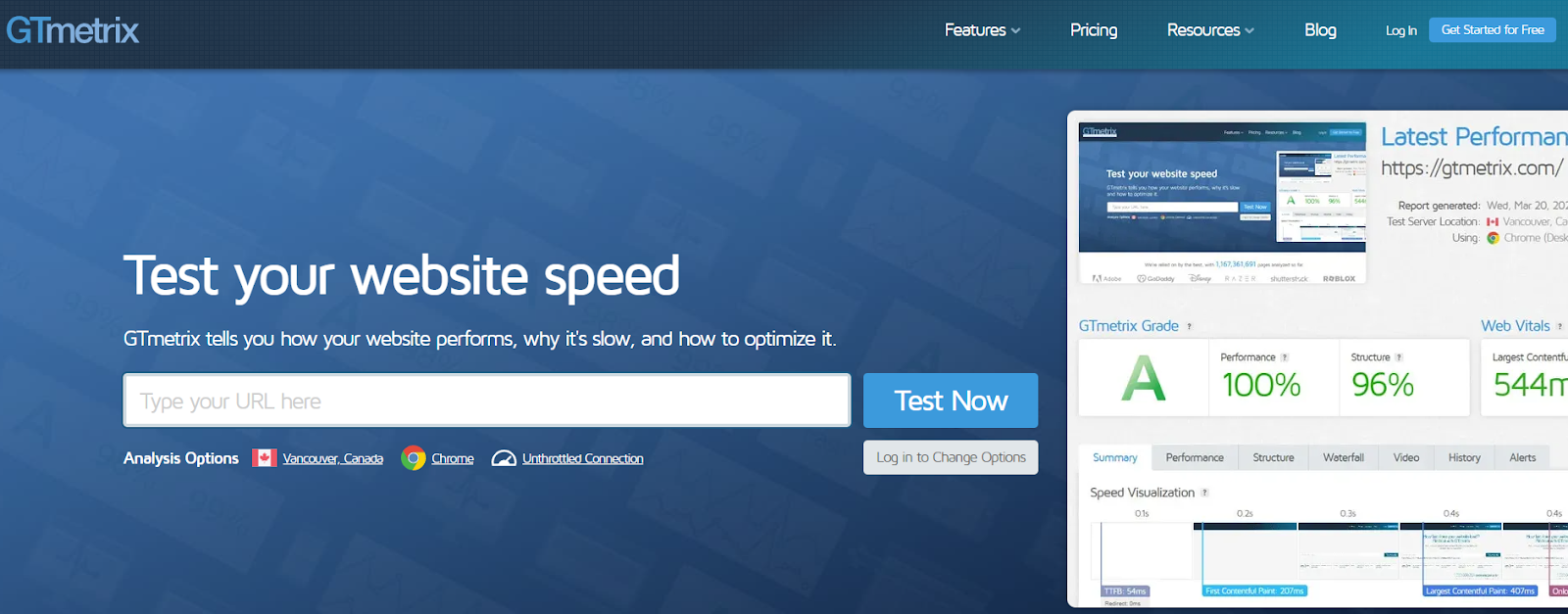
GTmetrix is a popular tool for checking website performance. It gives you grades for your site’s speed and structure. The tool shows you how long it takes for your page to load fully.
You get a breakdown of what’s slowing your site down. GTmetrix suggests ways to fix these issues. It can also compare your site to others in your industry.
The free version is useful, but paid plans offer more features. These include monitoring and alerts for your site’s performance.
Pingdom
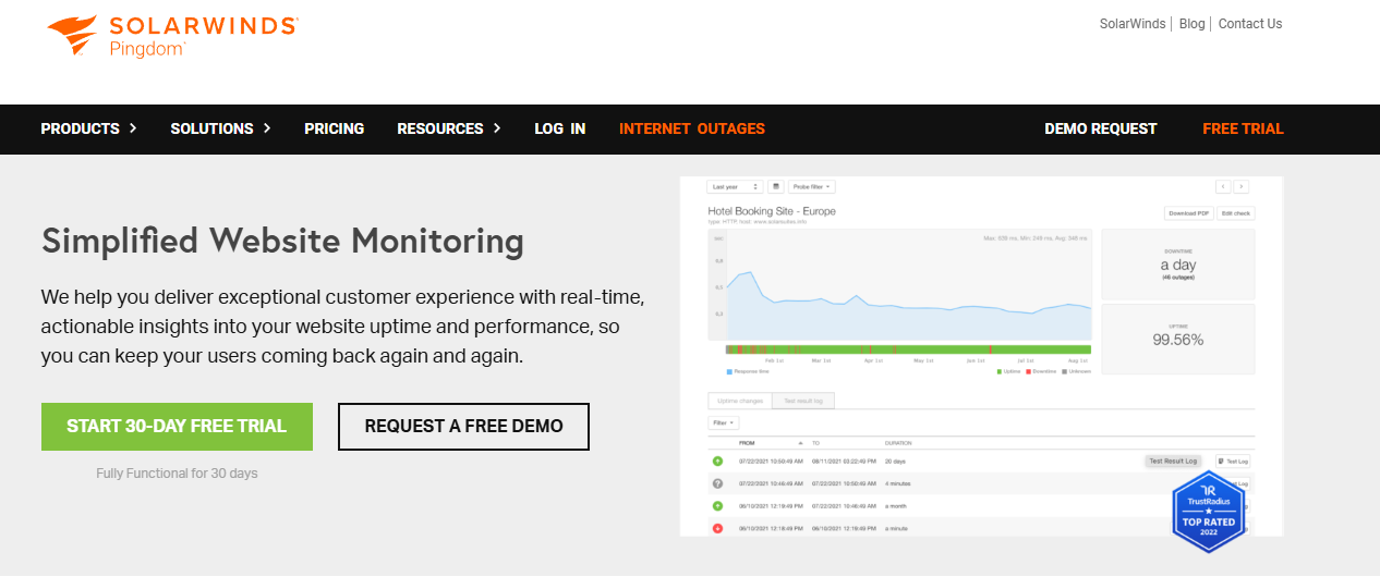
Pingdom offers a simple interface for checking your site’s speed. It shows you how fast your site loads from different locations around the world. It helps you see how your site performs for users in various countries.
The tool breaks down each element of your page. You can see which parts take the longest to load. Pingdom gives you a performance grade and suggests improvements.
It’s good for getting a quick overview of your site’s speed. The paid version offers more detailed monitoring and reporting.
WebPageTest
WebPageTest is a free tool for advanced users. It lets you test your site from many locations and browsers. You can also set up custom test scenarios.
The tool provides detailed waterfall charts. These show you exactly how your page loads over time. WebPageTest also offers video capture of your page loading.
It gives you in-depth data about your site’s performance. This includes information on server response times and content delivery.
Dareboost
Dareboost combines speed testing with monitoring features. It checks your site’s speed and gives you a detailed report. The tool suggests ways to improve your performance.
One unique feature is its ability to compare two versions of your site. It helps you see if the changes you make actually improve speed. Dareboost also offers privacy and security checks.
The tool is good for both technical and non-technical users. It explains issues in plain language and offers clear fixes.
Tips for improving website speed using these tools
Use these tools to find and fix speed issues on your site:
- Optimize images: Compress and resize large images.
- Minify code: Remove unnecessary characters from your HTML, CSS, and JavaScript.
- Use browser caching: Let browsers store static files to load pages faster.
- Reduce server response time: Upgrade your hosting or optimize your database.
- Enable compression: Use Gzip to reduce the size of your files.
- Minimize redirects: Too many redirects slow down your page load time.
- Remove render-blocking JavaScript: Load critical JS first and defer the rest.
- Use a content delivery network (CDN): Serve your content from servers closer to your users.
Test your site regularly with these tools. Make small changes and measure the impact. Keep working on your site’s speed to stay competitive and keep visitors happy.
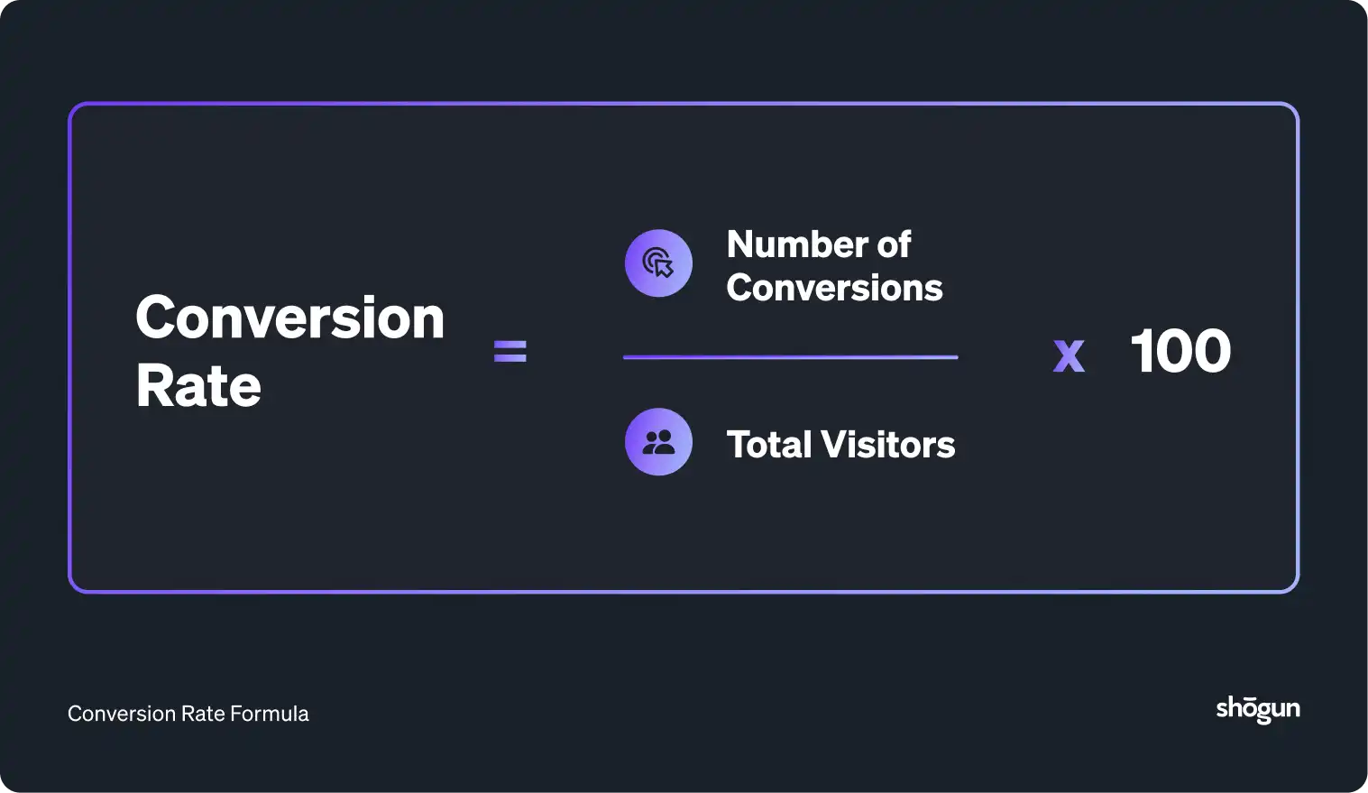
CRO Tools: Turn Visitors into Customers
CRO tools offer valuable insights and testing capabilities to optimize websites effectively. It helps you improve user experience and boost conversions.
With CRO tools, you can:
- Identify areas of improvement on your website
- Test different design elements and content
- Understand user preferences and pain points
- Increase sales and revenue without more traffic
CRO tools let you analyze user behavior and make data-driven decisions. It leads to higher conversion rates and better ROI.
Top CRO tools for website owners
CRO tools come in various types, each serving different purposes. Here are some top picks:
- FullSession
- Kissmetrics
- VWO (Visual Website Optimizer)
- Unbounce
- Heap
Let’s review each one.
FullSession
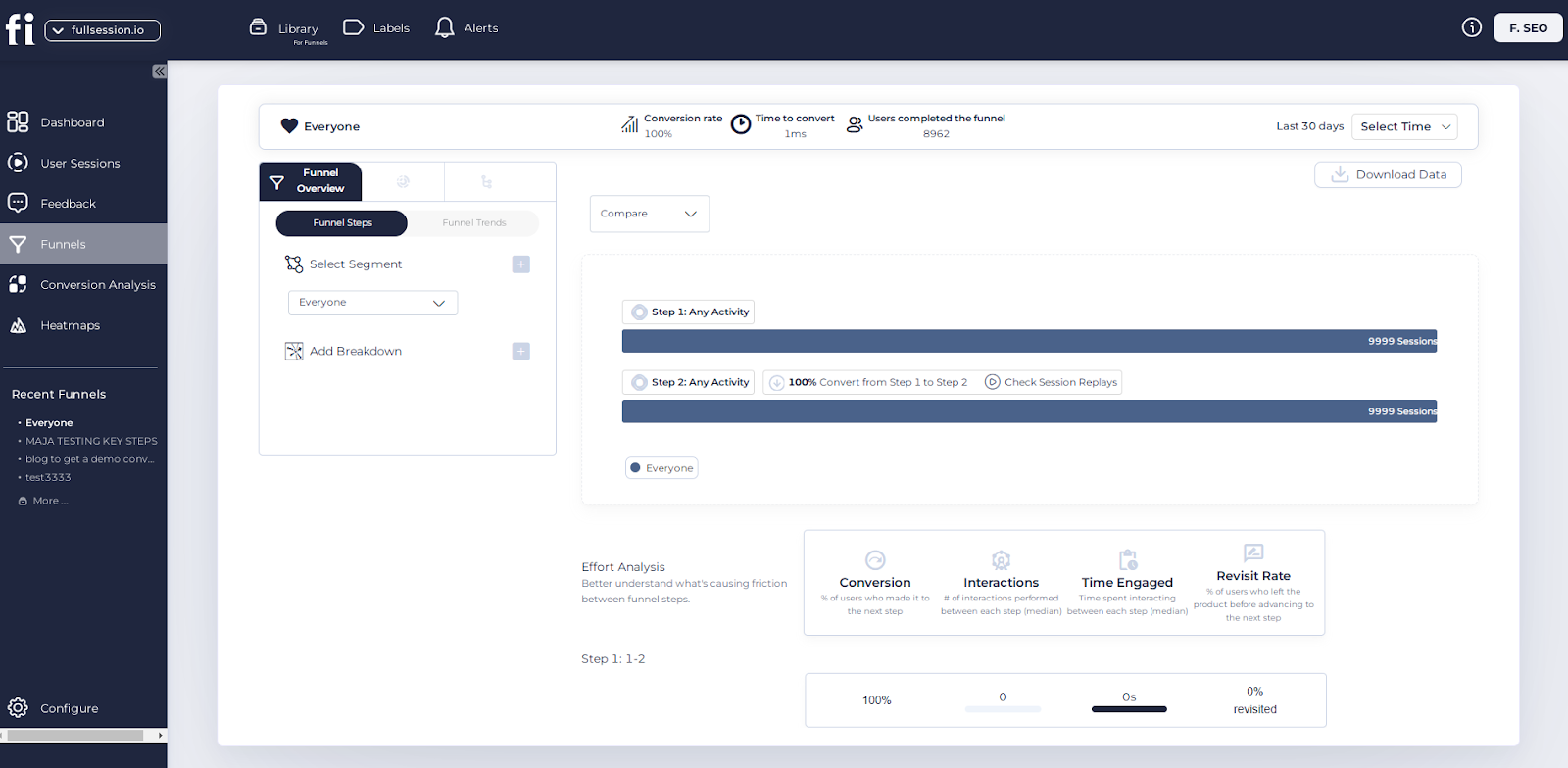
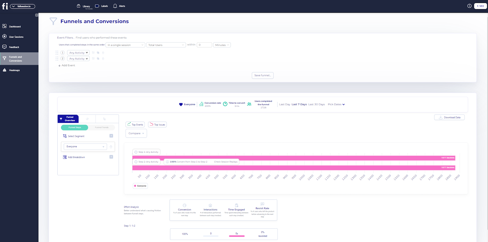
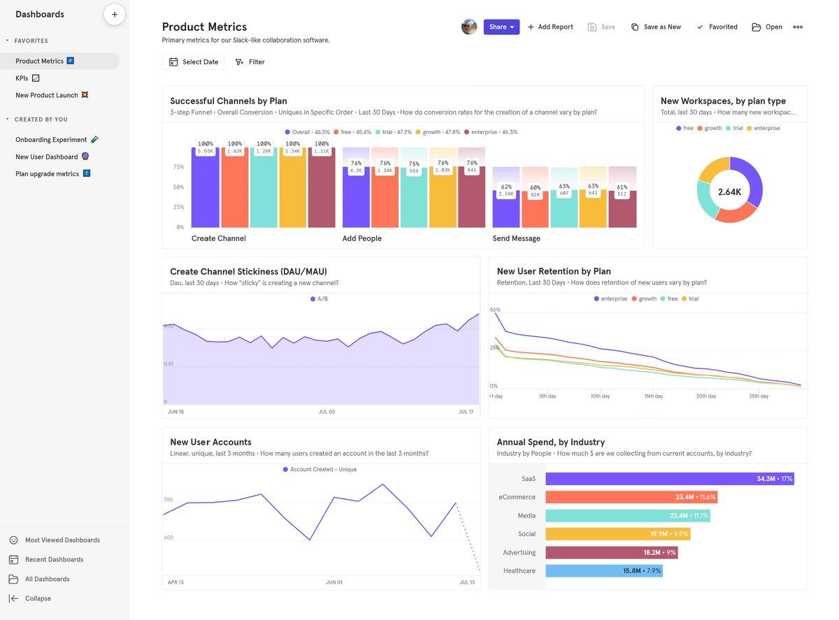
Besides all the user behavior tools we mentioned previously, FullSession also provides conversion funnel analysis. It lets you track, understand and optimize every step of the user journey so you can make data-driven decisions to improve user experience and conversion rates.
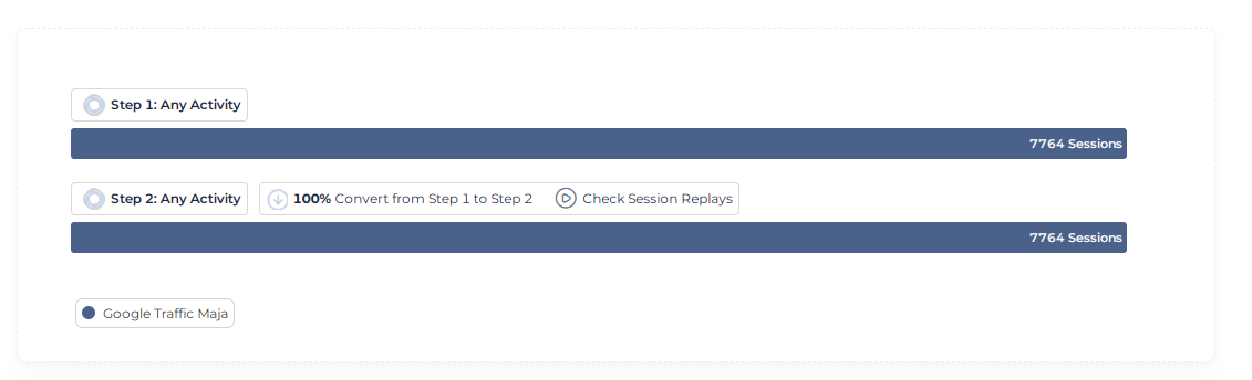
The Funnel Steps Visualization is a key part of this feature. You can see users’ flow through each step of your funnel. It helps you identify drop-off points and conversion rates between steps to pinpoint where to improve.
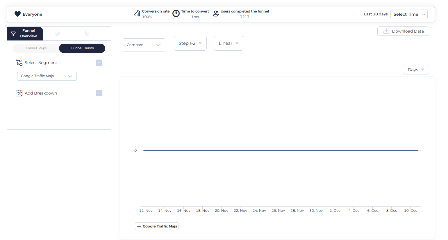
The Funnel Trends feature monitors how user flow and conversion rates change over time. This time series analysis helps you identify trends and seasonality in user behavior so you can plan and optimize better.
The Events Correlations feature shows you the top events that are driving conversions and the top events that are causing drop-offs. It allows you to replicate the good and fix the bad so you can streamline the user journey and improve conversion rates.
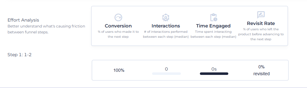
The Effort Analysis part gives you a deeper understanding of user engagement in the funnel. It includes metrics like Time Engaged, Top Engaged steps and Revisit Rate. It helps you identify friction points in the funnel, where users struggle, and which steps are most engaging. You can make informed decisions to optimize the user experience and reduce exits from the funnel.
Finally, FullSession’s Segmentation and Comparison feature lets you dive deeper into funnel performance. You can compare performance across different user segments, device type, geographic location or referral source. You can create tailored strategies for specific user groups and compare funnel performance across periods to identify long-term trends and seasonality.
This full-funnel analysis can lead to higher conversion rates and, ultimately, more revenue, so FullSession is a must-have tool for any business looking to optimize its online presence.
Maximize Your Conversion Rate With FullSession
See how our CRO tools help you improve website performance to drive conversions.
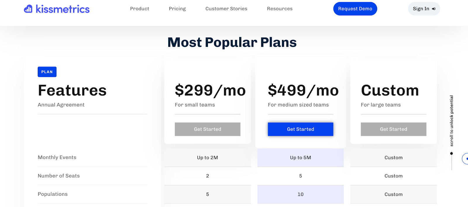
Kissmetrics
Kissmetrics is a customer analytics and engagement platform that tracks and analyzes user behavior across the customer lifecycle. Key features include customer journey mapping, cohort analysis, and A/B testing.
It helps you understand user interactions, optimize conversion funnels, and personalize marketing efforts. The main benefit is its ability to provide actionable insights for improving customer retention and lifetime value.
VWO (Visual Website Optimizer)
VWO is a conversion rate optimization platform. It provides tools to test, analyze and improve website conversions. Features include A/B testing, multivariate testing, heatmaps and advanced targeting options for personalization.
You can create and run complex optimization experiments and see big conversion rate improvements across user segments.
Teams comparing experimentation platforms can also evaluate VWO competitors and alternatives to see which tools better fit their testing volume, analytics needs, and CRO workflow.
Learn more: Mouseflow vs VWO.
Unbounce
Unbounce is a landing page builder and a platform for conversion optimization. It helps you create and test high-converting landing pages without needing developer resources.
Features include a drag-and-drop landing page builder, A/B testing and dynamic text replacement for PPC campaigns. Unbounce also has AI powered optimization suggestions.
You can create and optimize landing pages for specific campaigns and potentially see higher conversion rates and better ROI on marketing spend.
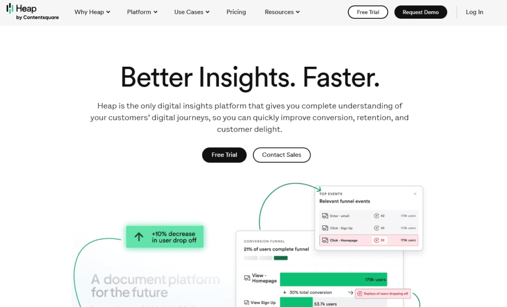
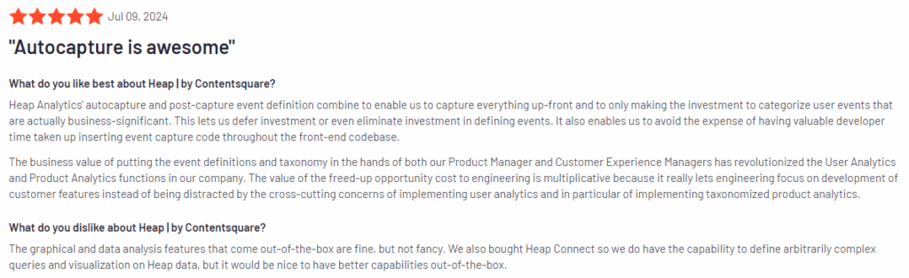
Heap
Heap is an automated digital insights platform for user behavior analysis and conversion optimization. It captures all user interactions automatically without manual tagging. Features include retroactive analysis, funnel analysis and user segmentation.
Heap also integrates with other business tools. You can analyze any user behavior or conversion path and find unexpected insights that can lead to a better user experience and conversion rate improvements.
Learn more: Heap alternatives.
Strategies for effective A/B testing and conversion optimization
To get the most out of CRO tools, follow these strategies:
- Set clear goals for each test
- Test one element at a time for best results
- Run tests for at least two weeks or until statistical significance
- Use both qualitative and quantitative data
Gather direct user feedback through surveys and interviews. This helps you understand the “why” behind user actions.
Use session recordings to spot usability issues and user frustrations. This visual data complements your analytics.
Always base your tests on data and user insights. Avoid making changes based on assumptions or personal preferences.
Remember to test your entire funnel, not just landing pages. Look for optimization opportunities at every stage of the user journey.
Regularly review and update your CRO strategy. User preferences and market trends change, so your website should evolve too.
Website Accessibility Tools: Ensure Inclusivity and Compliance
Web accessibility makes your site usable for everyone, including those with disabilities. It’s not just good practice – it’s often a legal requirement.
By making your site accessible, you reach a wider audience and improve user experience for all visitors. Accessible websites are easier to use on mobile devices and often rank better in search results.
Key accessibility standards (WCAG 2.1)
WCAG 2.1 (Web Content Accessibility Guidelines) sets the standard for web accessibility.
These guidelines focus on four main principles:
- Perceivable: Users must be able to see the information presented.
- Operable: Users must be able to use the interface.
- Understandable: Users need to understand the information and interface.
- Robust: Content must be robust enough to work with various technologies.
Following these guidelines helps you create a site that works for everyone.
Top accessibility tools for website owners
Several tools can help you check and improve your site’s accessibility. Here are some top picks:
- BrowserStack
- WAVE
- Tanaguru
- Rocket Validator
- accessScan
These tools scan your site for issues and offer suggestions for fixes.
BrowserStack
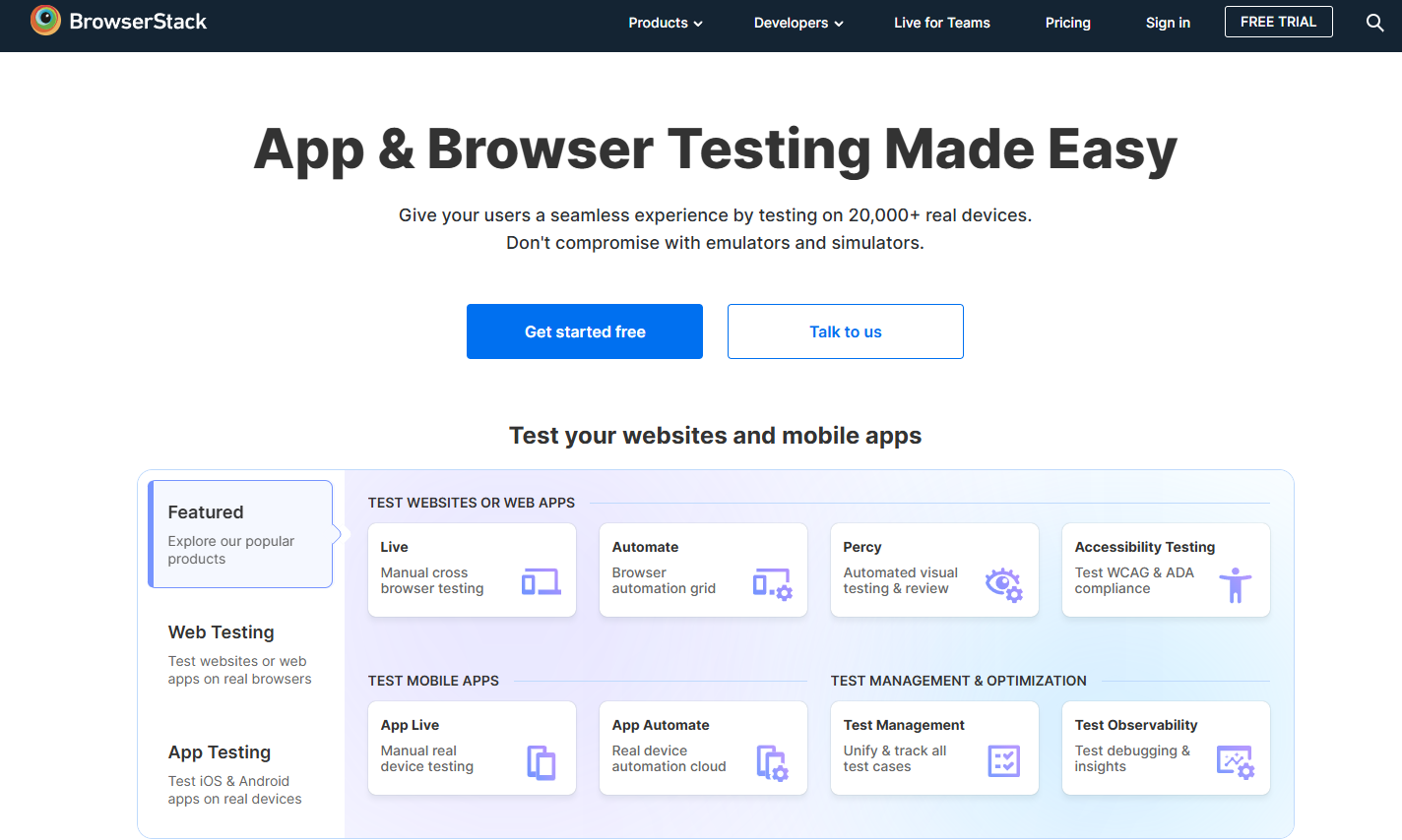
BrowserStack’s Accessibility Testing Tool helps developers and website owners ensure their websites are accessible to everyone. It automates the process of checking web pages against WCAG guidelines.
Features include real-time testing across multiple browsers and devices, detailed reports of accessibility issues and integration with popular development workflows. Y
You can identify and fix accessibility barriers quickly and potentially improve user experience and accessibility compliance.
WAVE
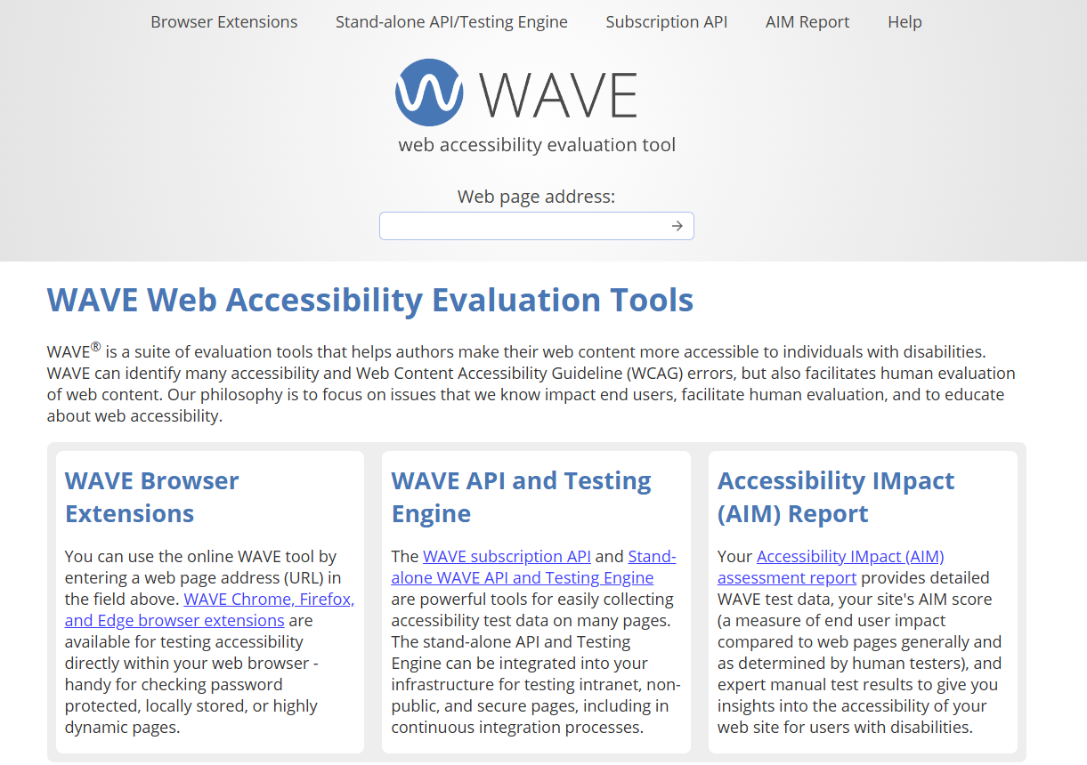
WAVE (Web Accessibility Evaluation Tool) is a suite of tools that help authors make their web content more accessible to people with disabilities. Its main purpose is to provide visual feedback about the accessibility of web content by injecting icons and indicators into the page.
Features include detailed error and alert reporting, contrast checking and structure/order view. The benefit for website owners is its simplicity and the ability to see accessibility errors and good practice.
Tanaguru
Tanaguru is an open source automated accessibility testing tool for web developers and quality assurance teams. Its main purpose is to automate accessibility checks against WCAG guidelines and other standards.
Features include full website scanning, detailed reporting with prioritized issues and ability to run tests via API or command line. You can integrate accessibility testing into your development process and catch issues early to reduce the cost of fixes.
Rocket Validator
Rocket Validator is an accessibility and HTML validation tool. Its main purpose is to scan entire websites for accessibility issues and HTML errors.
Features include bulk URL checking, detailed reports referencing WCAG success criteria and the ability to schedule regular scans. You can maintain accessibility compliance across large websites with minimal manual effort.
accessScan
accessScan is an AI-powered web accessibility testing tool. Its main purpose is to provide fast and accurate accessibility audits using machine learning algorithms.
Features include WCAG 2.1 compliance checking, prioritized issue reporting and recommendations for fixes. You can identify and fix accessibility issues quickly, improve user experience, and reduce legal risk of noncompliance.
How to use these tools to improve website accessibility
To improve your site’s accessibility:
- Run a scan using one or more of the tools mentioned.
- Review the results and prioritize issues.
- Fix high-priority issues first, such as broken links or missing alt text.
- Test your site on different browsers and devices.
- Use Google’s Mobile-Friendly Test to ensure your site works well on mobile.
- Regularly re-scan your site to catch new issues.
Remember, accessibility is an ongoing process. Keep checking and improving your site over time.
Benefits of making your website more accessible
Making your website accessible offers many benefits:
- Wider audience reach: You’ll be able to serve users with disabilities.
- Improved user experience: Accessible sites are often easier for everyone to use.
- Better SEO: Many accessibility features also improve search engine rankings.
- Legal compliance: You’ll meet legal requirements for web accessibility.
- Enhanced brand image: Shows you care about all users.
By using these tools and focusing on accessibility, you create a better website for all users.
How to build the right website optimization stack
Start with one primary goal for the next 90 days.
If your goal is more organic traffic
Use:
- Ahrefs or Semrush
- Google Search Console
- Google PageSpeed Insights
If your goal is higher conversion rates
Use:
- FullSession or Hotjar
- VWO or another experimentation tool
- Funnel analysis and user feedback
If your goal is better UX on high-value pages
Use:
- Session replay
- Heatmaps
- Form analysis
- User testing or surveys
If your goal is enterprise-level visibility
Use:
- a strong SEO suite
- a behavior analytics platform
- accessibility scanning
- a formal testing workflow
Why Choose FullSession for Website Optimization
FullSession is the top choice for website optimization, offering a range of strong features that can truly transform your approach. Here’s why FullSession should be your go-to tool:
- Real-time insights on dynamic elements: We track how users interact with your site’s dynamic content as it happens, giving you the most up-to-date and accurate view of user behavior.
- Lightning-fast heatmaps without slowing you down: Our heatmaps process quickly without putting any drag on your site speed. This means you get valuable data without sacrificing performance.
- We take privacy seriously: We automatically exclude sensitive information from our recordings, keeping your users’ data safe and your business compliant with privacy regulations.
- Make sense of big data, fast: Even with tons of data, FullSession helps you zero in on what matters. Our tools sift through the noise to reveal key insights quickly, so you can make informed decisions without delay.
- Keep data where it belongs: We only track user behavior on your site, preventing any misuse of data and ensuring the insights you get are 100% relevant to your business.
- Get everyone on the same page: FullSession brings all your teams together on one platform. Whether it’s marketing, design, or development, everyone can access and analyze the same data, making collaboration a breeze.
By choosing FullSession, you’re not just getting a tool – you’re getting a partner in optimization.
We combine comprehensive features with a focus on privacy, performance, and teamwork, giving you everything you need to boost your site’s user experience and conversion rates.
Visualize, Analyze, and Optimize with FullSession
See how to transform user data into actionable insights for peak website performance.
Conclusion About Website Optimization Tools
Website optimization tools help you analyze and improve various aspects of your website.
These tools can boost your site’s speed, user experience, and search engine visibility. By using them, you can identify areas that need improvement and make data-driven decisions.
Each tool offers unique features to help you optimize your website. You can track metrics, perform A/B tests, or generate heatmaps to understand user behavior.
Remember, website optimization is an ongoing process. Regularly using these tools will help you stay competitive and provide a better experience for your visitors.
By investing time in website optimization, you can:
- Increase conversion rates
- Improve search engine rankings
- Enhance user satisfaction
- Reduce bounce rates
Choose the tools that best fit your needs and budget. With the right combination, you’ll be well-equipped to boost your web performance and achieve your online goals.
FAQs About Website Optimization Tools
Let’s answer the most common questions about website optimization tools.
What are website optimization tools?
Website optimization tools are software platforms that help improve a site’s performance, visibility, usability, and conversion rate. They usually fall into five groups: SEO, UX analytics, page speed, CRO, and accessibility tools.
What is the best website optimization tool?
There is no single best tool for every site. The best option depends on the problem you are solving. For SEO, many teams prefer Ahrefs or Semrush. For UX and behavior analysis, teams often choose tools like FullSession or Hotjar. For page speed, Google PageSpeed Insights is a common starting point.
Which website optimization tools should I use first?
Start with the category closest to your bottleneck. If traffic is low, begin with SEO tools. If traffic is healthy but conversions are weak, start with UX and CRO tools. If your site is slow, begin with performance testing tools.
Do small businesses need multiple optimization tools?
Not always. Small teams can often start with a lean stack: one SEO tool, one speed tool, one accessibility checker, and one behavior analytics tool.
Are free website optimization tools enough?
Free tools can cover a lot of ground early on, especially for site audits, performance checks, and basic SEO data. Paid tools become more useful when you need competitive analysis, advanced segmentation, or formal experimentation.
What is the difference between website analytics and website optimization tools?
Analytics tools show what happened. Optimization tools help you understand why it happened and what to improve next.
Remember, the best solution depends on your specific needs and goals.

Mohamed oversees operations and finance at FullSession and has contributed to the company’s UX analytics knowledge base.