
Users do not rage click because they are impatient. They rage click because your interface promised an action and failed to deliver it.
A button looked clickable but did nothing. A page stalled with no feedback. A form appeared to submit but never confirmed success. In each case, repeated clicking is not random behavior. It is a visible sign of friction.
Rage clicks matter because they often happen at the exact moments users are trying to complete something important submit a form, open a menu, move to checkout, or continue to the next step.
In this guide, you’ll learn:
- what rage clicks are
- what causes them
- how to detect them
- how to diagnose the real issue behind them
- how to fix them before they hurt conversions
A rage click happens when a user clicks or taps the same element several times in quick succession because the page does not respond as expected. It usually signals frustration caused by broken functionality, slow feedback, misleading design, or confusing navigation.
What are Rage Clicks?
A rage click happens when a user clicks or taps the same area several times in a short span because the interface does not respond the way they expect.
In UX and behavior analytics, rage clicks are treated as a frustration signal. They often point to:
- broken or non-responsive elements
- slow page feedback
- misleading design
- confusing navigation
- blocked interactions on mobile
Rage clicks matter because they reveal moments where user intent is high but the interface creates friction instead of progress.
Why rage clicks matter
Rage clicks are not just a UX annoyance. They often appear on high-intent actions such as:
- clicking a CTA
- submitting a form
- opening a menu
- applying a filter
- progressing through checkout
- moving through onboarding
When rage clicks happen at these moments, they can lead to abandonment, lost trust, and lower conversion rates.
What causes rage clicks?
A single rage click can be random. A pattern of rage clicks usually is not.
When repeated rapid clicks show up across multiple sessions, they often point to a specific UX, performance, or interface problem. The most common causes are below.
Dead Links
Dead or broken links are a common trigger for rage clicks because users expect a clickable element to take them somewhere. When nothing happens, they click again to confirm whether the problem is the page or their own action.
This kind of failure interrupts the user journey and can quickly push visitors to leave the page altogether.
Common examples:
- product links that fail to load
- CTA buttons that do nothing
- menu items that lead nowhere
- links blocked by overlays or script errors
Slow Loading Times
Sometimes the click works, but the page gives no clear signal that it worked. Users click again because the interface feels frozen.
This often happens when:
- pages take too long to load
- forms validate too slowly
- CTA buttons show no loading state
- filters or menus update with a delay
- server or script lag interrupts feedback
The real issue is not just speed. It is the lack of visible response after the first click.
Misleading Buttons or Elements
Rage clicks often happen when an element looks interactive but does not behave the way users expect.
Examples include:
- images styled like buttons
- cards that look clickable but are static
- dropdowns that are only visual, not functional
- icons that suggest one action but trigger another
- buttons whose labels do not match the destination
When design creates false expectations, repeated clicks are a predictable response.
Confusing Navigation
Users rage click when they cannot tell where to go next or when navigation behaves inconsistently across the site.
This usually happens when:
- menus are poorly labeled
- navigation patterns change from page to page
- important links are buried too deeply
- dropdowns are difficult to use
- labels rely on internal jargon instead of plain language
When users cannot find the right next step, repeated clicking becomes a sign of confusion rather than intent.
Rage clicks vs dead clicks: what is the difference?
| Signal | What it means | Common behavior | Typical cause |
|---|---|---|---|
| Rage click | Repeated rapid clicks on the same area | User clicks several times in frustration | Delayed response, misleading UI, broken flow |
| Dead click | A click with no visible result | User may click once or several times | Non-responsive element, broken interaction, missing feedback |
How Can You Track Rage Clicks?
The first step to analyzing user behavior is to detect rage clicks, and the best way to do this is to use user behavior tools like FullSession. With this platform, you have access to features that can help you identify rage clicks and their causes, such as:
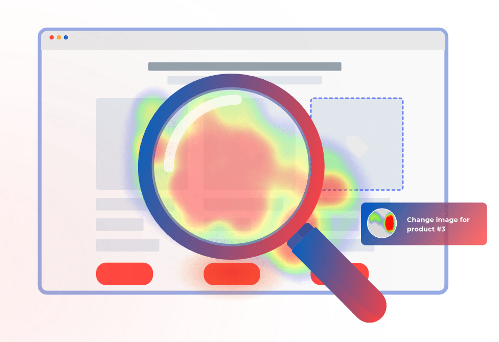
Heatmaps
Heatmaps offer a visual representation of where users click on a webpage, which can be extremely revealing. They aggregate user clicks to show patterns, including areas of high activity that might indicate frustration or confusion. With heatmaps, you can:
- Identify High-Activity Zones: Look for areas with an unusually high density of clicks. These “hotspots” often indicate where users expect functionality that isn’t there, such as non-responsive buttons or decorative elements mistaken for interactive ones.
- Analyze Click Patterns: Patterns can tell you a lot. Are many users clicking repeatedly in one spot? Are there rapid clicks spread over an entire area? This kind of activity can signify that users are trying different spots hoping for a response, suggesting that the interface may be misleading.
- Compare Different Pages: By comparing heatmaps of different pages, you can identify whether certain design elements consistently lead to rage clicks across your site. This can be important for recognizing design flaws that need a broader strategy adjustment.
Session Recordings and Replays
A session replay or recording gives you a detailed view of their interactions with your website. They can be particularly useful for understanding the context behind rage clicks:
- Watch User Behavior: Observing how users move through your site can let you see what leads up to a rage click. What was the user trying to do? What might have triggered their frustration? This context is key to understanding why the rage clicks are happening.
- Identify Usability Issues: Session recordings can help you spot usability problems that might not be obvious from other analytics. For example, if users frequently rage click after navigating through a certain process, there might be something about that process that is confusing.
How Can You Minimize Rage Clicks?
Analytics can give you actionable insights into how to address customer frustration and eliminate the things that cause rage clicks.
Here are some great strategies to improve the customer experience and keep users happy:
Optimize Load Times
Speed is a must-have factor in user satisfaction, and slow loading times are a common trigger for rage clicks.
To improve your site’s performance, consider compressing images to reduce file sizes without sacrificing quality, minimizing HTTP requests by reducing the number of page elements, using a Content Delivery Network (CDN) to speed up content delivery globally, and optimizing JavaScript and CSS by minifying files and removing unnecessary code.
Get Rid of Confusing Elements
Interactive elements should be clearly distinguishable and perform exactly as expected. Design elements should be such that buttons distinctly look like buttons and links are obviously clickable.
Avoid designs that could be mistaken for interactive elements to prevent confusion.
Make Navigation Easy
Make sure that your website’s navigation is intuitive and straightforward. This involves maintaining a consistent layout across all pages so that users don’t have to relearn their way around each time they visit a different section.
Use clear, direct language for menu items and links to make sure they are understandable and organize content in a clear hierarchy with breadcrumbs to help users track their navigation path.
Conduct User Testing
Regular testing with real users can provide insights into how people interact with your site and highlight customers’ pain points. Gather user feedback through usability testing sessions to get direct responses on what works and what doesn’t.
You can also use A/B testing to experiment with different versions of your site to determine which elements perform best and which may lead to confusion and rage clicks.
FullSession Pricing Plans
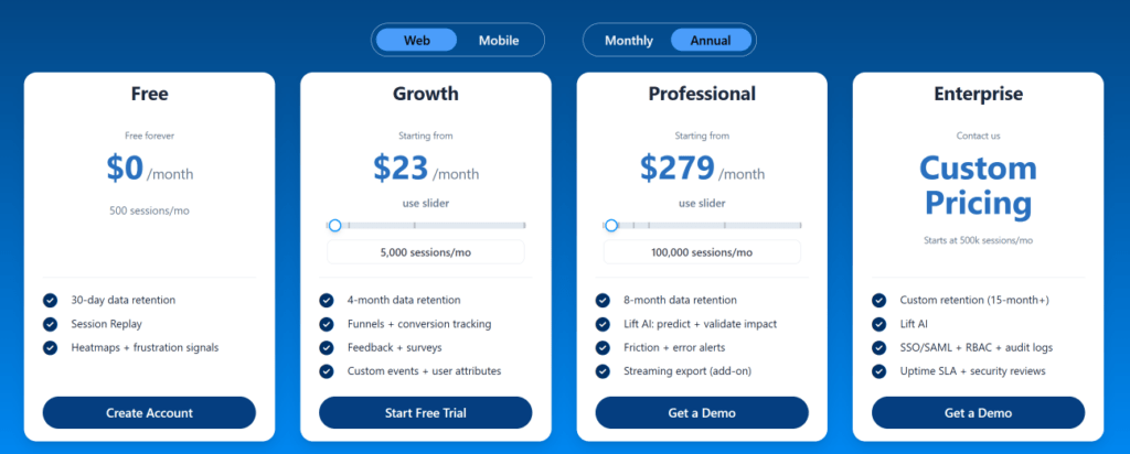
The FullSession platform offers a 14-day free trial. It provides two paid plans—Basic and Business. Here are more details on each plan.
- The Starter plan costs $39/month or $32/year and allows you to monitor up to 5,000 monthly sessions with up to 6 months of data storage.
- The Business plan costs $75/month or $60/year and helps you to track and analyze up to 100,000 monthly sessions with up to 12 months of data storage.
- The Enterprise plan has custom pricing and offers customizable sessions plus full access to all features.
Get Your First Heatmap Right Now
It takes less than 5 minutes to set up your first website heatmap with FullSession, and it’s completely free!
FAQs About Rage Clicks
What is a rage click?
A rage click happens when a user clicks or taps the same area several times in quick succession because the interface does not respond as expected.
Why do users rage click?
Users rage click when they expect something to happen and the page fails to respond clearly, quickly, or correctly.
What causes rage clicks most often?
The most common causes are broken links, slow feedback, misleading interface design, confusing navigation, and mobile usability problems.
What is the difference between rage clicks and dead clicks?
A dead click is a click with no visible result. A rage click is repeated rapid clicking caused by frustration. A dead click can become a rage click if the user keeps trying.
Are rage clicks bad for SEO?
Not directly as a standalone ranking factor, but they can point to UX and performance problems that reduce satisfaction, engagement, and conversions.
Are rage clicks only a desktop issue?
No. Rage clicks also happen on mobile, often because of small tap targets, blocked controls, and inconsistent touch behavior.
How do you detect rage clicks?
Use a combination of heatmaps, rage click maps, session replay, funnel analysis, form analytics, and performance monitoring.
How often should you review rage click data?
Monthly is a solid baseline. For high-traffic or high-conversion pages, weekly review is often better.
Mohamed oversees operations and finance at FullSession and has contributed to the company’s UX analytics knowledge base.