Session replay has become one of the most important tools in modern conversion optimisation and product analytics. While traditional analytics tells you what users clicked, scrolled, bounced, dropped off session replay reveals why those behaviours happened.
Rather than relying purely on charts and funnels, session replay reconstructs real user sessions from your website or application, showing every interaction in a video-like experience. This gives teams a layer of qualitative context that numbers alone can never provide.
With session replay, you can watch how users interact with forms, navigate complex journeys, hesitate before converting, or stumble into friction points. Whether a user clicked an element they assumed was interactive, struggled with a form field, or encountered a silent error, replay makes that friction visible.
In many cases, CRO and product teams uncover conversion leaks within minutes that would never surface through dashboards alone.
In this guide, we’ll explore:
What session replay is and how it works
Why it plays a critical role in CRO, UX, and product optimisation
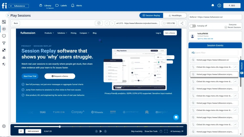
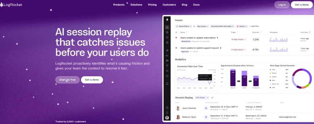
Session replay (also called session recording software) is a type of behavioral analytics tool that recreates individual user sessions on a website or application. It allows teams to observe how users interact with real interfaces in real time or after the session ends.
Unlike traditional product analytics, which focuses on aggregated metrics and reports, session replay provides:
Individual user journeys
Visual playback of interactions
Full behavioral context behind every conversion or drop-off
This makes it one of the most powerful tools for:
Conversion rate optimization (CRO)
UX research
Product optimization
Support diagnostics
Technical debugging
How Session Replay Actually Works
Although session replay looks like a screen recording, the underlying technology is very different and far more secure.
Session replay tools capture changes to the Document Object Model (DOM), which is the structured representation of your web page. Every interaction a user performs clicking a button, opening a dropdown, typing into a field, scrolling a page, or navigating between views generates events and DOM mutations.
Instead of storing raw video footage, the tool logs these changes as structured data.
During playback, the platform reconstructs the page using these DOM updates and event streams, recreating the session with high visual accuracy. This method allows replay to feel like a video while remaining:
Lightweight
Highly performant
Privacy-safe
Sensitive inputs such as passwords, payment data, and personal identifiers can be masked or excluded before capture. Most modern tools also support:
When something broke, developers had to rely on vague user explanations. When conversions dropped, marketers speculated. When friction occurred, teams debated root causes without visual proof.
Session replay removes this uncertainty.
It allows teams to observe real users in real environments, not staged usability tests, not theoretical journeys, but actual behaviour. When friction appears, you can see exactly what happened. When errors occur, you can trace the precise steps that triggered them. When users convert smoothly, replay shows why the flow worked.
Replay shifts optimisation from:
Opinions → visual evidence
Assumptions → behavioural proof
Lagging signals → real-time clarity
Examples of high-impact issues replay routinely uncovers:
A form drop-off caused by a validation error hidden below the fold
A mobile CTA obstructed by a sticky element
A checkout bug appearing only on a specific browser version
A rage-click loop caused by a disabled button that still appears clickable
In practice, the most damaging conversion leaks are rarely strategic failures. They are small, invisible friction points that session replay exposes instantly.
Benefits of Session Replay
1. Faster Debugging & Error Resolution
Developers can jump directly into the moment an error occurred, observe the exact steps leading up to it, and identify the root cause without relying on second-hand user reports. This dramatically reduces mean-time-to-repair (MTTR).
2. Rich Behavioural Insights for CRO
CRO specialists gain full visibility into:
Hesitation patterns
Form abandonment behaviour
Rage clicks
Scroll depth mismatches
Unexpected navigation paths
These insights make experimentation more strategic and dramatically reduce wasted A/B testing cycles. For ecommerce brands, this becomes especially valuable when teams need to understand checkout friction, product page hesitation, cart abandonment, and the tools that support those workflows. A comparison of the best session replay tools for ecommerce can help teams evaluate which platforms support conversion-focused online store analysis.
3. Better Customer Support Experiences
Support teams no longer need long diagnostic conversations. They can replay exactly what the user experienced, identify the issue instantly, and resolve tickets faster improving both CSAT and retention.
4. Real UX Research Without Bias
Replay data comes from real-world sessions, not lab environments. This eliminates artificial behaviour, reduces survey bias, and gives UX teams authentic behavioural evidence at scale.
Challenges to Be Aware Of
Privacy & Data Protection
Strict masking, RBAC, encryption, and consent controls are required to prevent exposure of sensitive personal or financial data.
Tool Sprawl & Integration Complexity
Replay works best when connected with analytics, funnel tracking, A/B testing, and error monitoring tools. Without integration, insights remain siloed.
Data Volume & Cost Management
High-traffic platforms generate large replay datasets, making intelligent filtering and session sampling essential for cost control.
Design Version Mismatches
If the UI changes frequently, older replays can lose visual accuracy unless historical snapshot support exists.
Global Compliance
Modern session replay platforms are built to meet international data protection standards, including:
🇪🇺 GDPR (European Union)
🇺🇸 CCPA & CPRA (United States)
🇬🇧 UK Data Protection Act
HIPAA (Healthcare Apps)
SOC 2 & ISO 27001 (Enterprise Security)
This allows session replay to be safely deployed across: North America, Europe, the UK, the Middle East, and Asia-Pacific.
Who Uses Session Replay
Developers
Developers rely on replay to reproduce bugs in seconds and trace failures directly to the responsible code or component.
Customer Support
Support teams can instantly identify UI confusion, product misuse, or technical errors — accelerating resolution and improving trust.
Product Managers & Growth Marketers
Replay reveals where users lose momentum, skip steps, or abandon high-intent flows. Combined with funnel data, it highlights what truly drives conversion.
UX Designers & Researchers
UX teams analyse thousands of authentic user sessions to validate usability improvements using real behavioural patterns.
Session Replay vs Heatmaps vs Traditional Analytics
Advanced filters, segmentation, and replay controls
Final Thoughts
Session replay bridges the gap between behavioural data and real human experience. It allows teams to see the product exactly as users experience it, not as dashboards interpret it.
Whether your goal is to:
Improve conversions
Reduce support workload
Debug product issues
Validate UX decisions
Increase activation and retention
Session replay delivers a level of clarity that no other analytics category can match.
If you’d like to see how these insights work in practice, FullSession provides privacy-safe session replay combined with behavioral analytics, funnels, and performance monitoring giving growth, product, and engineering teams a complete view of the user journey in one platform.
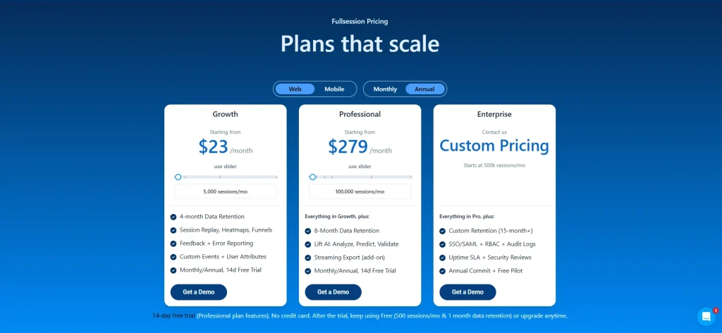
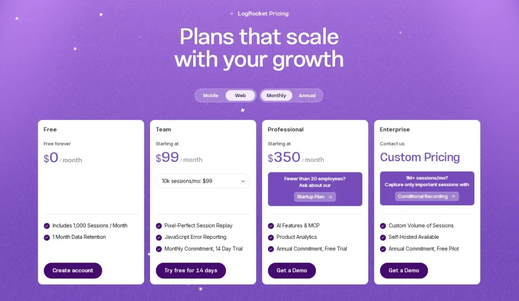
FullSession Pricing Plans
The FullSession platform offers multiple pricing plans to suit different business needs, including a Free plan and three paid plans Growth, Pro, and Enterprise. Below are the details for each plan of FullSession Pricing.
The Free plan is available at $0/month and lets you track up to 500 sessions per month with 30 days of data retention, making it ideal for testing core features like session replay, website heatmap, and frustration signals.
The Growth Plan starts from $23/month (billed annually, $276/year) for 5,000 sessions/month – with flexible tiers up to 50,000 sessions/month. Includes 4 months of data retention plus advanced features like funnels & conversion analysis, feedback widgets, and AI-assisted segment creation.
The Pro Plan starts from $279/month (billed annually, $3,350/year) for 100,000 sessions/month – with flexible tiers up to 750,000 sessions/month. It includes everything in the Growth plan, plus unlimited seats and 8-month data retention for larger teams that need deeper historical insights.
The Enterprise plan starts from $1,274/month when billed annually ($15,288/year) and is designed for large-scale needs with 500,000+ sessions per month, 15 months of data retention, priority support, uptime SLA, security reviews, and fully customized pricing and terms.
What is session replay in simple terms? Session replay lets you visually watch how users interact with your website or app, showing where they click, scroll, hesitate, or abandon.
How does session replay work? It records DOM changes and user events, then reconstructs the session visually without storing raw video.
Is session replay safe and legal? Yes. When configured with masking, consent, encryption, and access controls, it complies with GDPR, CCPA, and enterprise security standards.
What is session replay used for? It’s used for CRO optimization, UX research, debugging errors, reducing support tickets, and improving product adoption.
Does session replay slow down a website? No. Modern tools run asynchronously and have near-zero performance impact.
What’s the difference between session replay and heatmaps? Heatmaps show aggregated behavior. Session replay shows individual user journeys in full detail.
Roman Mohren is CEO of FullSession, a privacy-first UX analytics platform offering session replay, interactive heatmaps, conversion funnels, error insights, and in-app feedback. He directly leads Product, Sales, and Customer Success, owning the full customer journey from first touch to long-term outcomes. With 25+ years in B2B SaaS, spanning venture- and PE-backed startups, public software companies, and his own ventures, Roman has built and scaled revenue teams, designed go-to-market systems, and led organizations through every growth stage from first dollar to eight-figure ARR. He writes from hands-on operator experience about UX diagnosis, conversion optimization, user onboarding, and turning behavioral data into measurable business impact.
25 Website Optimization Tools to Boost Traffic and Conversions in 2025
By Daniela Diaz • Updated 2025
TL;DR: In the competitive digital landscape of 2025, a “good” website isn’t enough. If your site is slow, confusing, or invisible to search engines, you are leaving money on the table. Website optimization is the holistic practice of improving every aspect of your site—from speed and SEO to UX and conversions.With thousands of tools available, this guide curates the top 25 across SEO, UX, CRO, speed, and content to build a high-performance stack that actually drives growth.
Roman Mohren is CEO of FullSession, a privacy-first UX analytics platform offering session replay, interactive heatmaps, conversion funnels, error insights, and in-app feedback. He directly leads Product, Sales, and Customer Success, owning the full customer journey from first touch to long-term outcomes. With 25+ years in B2B SaaS, spanning venture- and PE-backed startups, public software companies, and his own ventures, Roman has built and scaled revenue teams, designed go-to-market systems, and led organizations through every growth stage from first dollar to eight-figure ARR. He writes from hands-on operator experience about UX diagnosis, conversion optimization, user onboarding, and turning behavioral data into measurable business impact.
TL;DR: Teams that pair interactive heatmaps with funnel jump-to-replay identify friction faster and protect conversion on priority flows. Updated: Nov 2025.
Privacy: Sensitive inputs are masked by default; allow-list only when truly necessary.
Choose FullSession if you want interactive heatmaps with real-time readouts, quick funnel drop-off context, and a privacy-first capture model designed to keep payloads light—ideal for PLG teams who need fast diagnosis and fewer tools to juggle.
Choose Hotjar if you mainly want a surveys‑first UX stack and prefer its broader template library.
Note: FullSession also includes in‑app feedback, so teams can keep feedback + heatmaps + funnels in one workflow.
Risk #1: Different heatmap sampling windows create apparent discrepancies. Mitigation: Align windows (e.g., 7 days) and device filters before comparing.
Risk #2: SDK overhead on Core Web Vitals. Mitigation: Use streamed, batched capture; keep masking defaults to reduce payload.
Risk #3: Team change-management. Mitigation: Save presets (A/B Rescue, Mobile Fold, Rage-Tap) and run a 15-minute workflow enablement.
Does FullSession support the same heatmap types as Hotjar?
Yes—click/tap and scroll coverage, plus frustration signals. FullSession emphasizes interactive/near real-time readouts and quick funnel context.
How does pricing compare?
Both have public pricing pages; Hotjar highlights a free plan with session caps and paid tiers. Confirm current details on each vendor’s site.
What about privacy?
FullSession masks sensitive inputs by default with allow-lists for exceptions; Hotjar documents privacy practices across its suite. Evaluate per your data policy.
Can I migrate saved views?
Recreate your top filters (pages, devices, variants) as saved presets in FullSession; parity typically takes ~30 minutes.
Will this slow my site?
FullSession capture is engineered for low overhead via streaming/batching; keep masking defaults to minimize payload.
Can I still use surveys/polls?
If you rely heavily on Hotjar’s surveys, you can keep them and run FullSession for heatmaps/funnel triage—or consolidate as your team prefers.
Do I need replays?
Heatmaps show where; replays reveal why. Many teams use both for faster fixes, especially on mobile friction.
Roman Mohren is CEO of FullSession, a privacy-first UX analytics platform offering session replay, interactive heatmaps, conversion funnels, error insights, and in-app feedback. He directly leads Product, Sales, and Customer Success, owning the full customer journey from first touch to long-term outcomes. With 25+ years in B2B SaaS, spanning venture- and PE-backed startups, public software companies, and his own ventures, Roman has built and scaled revenue teams, designed go-to-market systems, and led organizations through every growth stage from first dollar to eight-figure ARR. He writes from hands-on operator experience about UX diagnosis, conversion optimization, user onboarding, and turning behavioral data into measurable business impact.
TL;DR: Comparing mobile vs desktop heatmaps at key steps surfaces gesture-driven friction earlier and reduces time-to-fix on responsive UX issues. Updated: Nov 2025.
Privacy: Sensitive inputs are masked by default; enable allow-lists sparingly for non-sensitive fields only.
Problem signals: how device context hides (or reveals) friction
Mobile users tap; desktop users click and hover. That difference changes what heatmaps reveal and which fixes move the needle. For online stores, ecommerce heatmap analysis can show whether product filters, coupon fields, CTAs, and checkout steps behave differently across mobile and desktop journeys.
Mobile sign-up stalls while desktop holds: often tap-target sizing, keyboard overlap, or validation copy that’s truncated on small screens.
Checkout coupon rage taps on mobile only: hitbox misalignment or disabled-state logic that doesn’t visually communicate.
Scroll-to-nowhere on long pages: mobile scroll depth heatmaps show where attention dies; desktop hover maps may incorrectly suggest engagement.
Variant wins on desktop, loses on mobile: responsive layout shifts move CTAs below the fold, raising scroll burden on smaller viewports.
Start with the funnel step showing the drop (e.g., address form, plan selection).
Is the drop device-specific? Mobile only → inspect tap clusters, fold position, keyboard overlap. Desktop only → check hover→no click zones, tooltip reliance, precision-required UI.
Is engagement high but progression low? Yes → likely validation or hitbox issue; review rage taps and disabled CTAs. No → content/IA problem; review scroll depth and element visibility.
Do you see API 4xx/5xx near the hotspot? Yes → jump to Session Replay to inspect request/response and DOM state. No → stay in heatmap to test layout, copy, and target sizes.
How to fix it in 3 steps (Interactive Heatmaps deep-dive)
Step 1 — Segment by device & viewport
Filter heatmaps to Mobile vs Desktop (optionally by iPhone/Android or breakpoint buckets). Enable overlays for rage taps, dead taps, and fold line. This reveals whether users are trying—and failing—to perform the intended action.
Step 2 — Isolate the misbehaving element
Use element-level stats to evaluate tap-through rate, time-to-next-step, and retry attempts. On mobile, prioritize: tap target size & spacing (44px+ recommended), keyboard overlap, disabled vs loading states.
Step 3 — Validate with a short window
Ship UI tweaks behind a flag and re-run heatmaps for 24–72 hours. Compare predicted median completion from your baseline to the observed median post-fix, and spot-check with Session Replay to ensure there’s no new friction.
A consumer subscription site saw flat desktop conversion but sliding mobile sign-ups. Heatmaps showed dense rage taps on a disabled “Continue” button and shallow scroll depth on screens ≤ 650px. Session Replay confirmed a keyboard covering an address field plus a hidden error message. The team increased tap-target size, raised the CTA above the fold for small viewports, and added a visible loading/validation state. Within 48 hours of rollout to 25% of traffic, the mobile heatmap cooled and retries dropped. A week later, mobile completion stabilized, and desktop remained unaffected. With masking on, no sensitive inputs were captured—only interaction patterns and system states required for diagnosis.
Roman Mohren is CEO of FullSession, a privacy-first UX analytics platform offering session replay, interactive heatmaps, conversion funnels, error insights, and in-app feedback. He directly leads Product, Sales, and Customer Success, owning the full customer journey from first touch to long-term outcomes. With 25+ years in B2B SaaS, spanning venture- and PE-backed startups, public software companies, and his own ventures, Roman has built and scaled revenue teams, designed go-to-market systems, and led organizations through every growth stage from first dollar to eight-figure ARR. He writes from hands-on operator experience about UX diagnosis, conversion optimization, user onboarding, and turning behavioral data into measurable business impact.
BLUF: Teams that pair error-state heatmaps with session replay surface breakpoints earlier, shorten time-to-diagnosis, and protect funnel completion on impacted paths. Updated: Nov 2025.
Privacy: Inputs are masked by default; allow-list only when necessary.
Sudden drop-offs at a specific step, such as an address or payment field, despite stable traffic mix. Ecommerce teams can compare the best tools for tracking ecommerce errors when these drop-offs may be caused by checkout-breaking scripts, failed requests, or payment-step errors.
Spike in rage clicks/taps clustered around a widget (date picker, coupon field, SSO button).
Support tickets with vague repro details (“button does nothing”).
A/B variant wins on desktop but loses on mobile—suggesting layout or validation issues.
Start: Is the drop isolated to mobile? Yes → Inspect mobile error-state heatmap: tap clusters + element visibility. If taps on disabled element → likely state/validation issue. If taps off-element → hitbox / layout shift.
If not mobile-only: Cross-check by step & browser. If one browser spikes → polyfill or CSS specificity. If all browsers → API error or client-side guardrail.
Next: Jump from the hotspot to Session Replay to see console errors, network payloads (422/400) mapped to the DOM state. Masked inputs still reveal interaction patterns (blur/focus, retries).
How to fix it (3 steps) — Deep‑dive: Interactive Heatmaps
1. Target the impacted step
Filter heatmap by URL/step, device, and time window. Enable an error-state overlay (or use saved view filters) to surface clusters near sessions with failed requests.
2. Isolate the misbehaving element
Use element-level analytics to compare tap/click‑through vs success. Look for rage‑click frequency, hover‑without‑advance, or touchstart→no navigation. Mark suspect elements for replay review.
3. Validate the fix with a short window
Ship a fix behind a flag. Re-run the heatmap over 24–72 hours and compare predicted median completion to observed median. Confirm no privacy regressions (masking still on) in replay.
A PLG SaaS team saw sign‑up completions sag on mobile while desktop held flat. Error‑state heatmaps showed dense tap clusters on a disabled “Continue” button—replay revealed a client‑side guard that awaited a third‑party validation call that occasionally timed out. With masking on, the team still observed the interaction path and network 422s. They widened the hitbox, added optimistic UI copy, and retried validation in the background. Within two days, the heatmap cooled and replays showed fewer repeated taps and abandonments. The team kept masking defaults and reviewed the Help Center checklist before rolling out broadly.
Roman Mohren is CEO of FullSession, a privacy-first UX analytics platform offering session replay, interactive heatmaps, conversion funnels, error insights, and in-app feedback. He directly leads Product, Sales, and Customer Success, owning the full customer journey from first touch to long-term outcomes. With 25+ years in B2B SaaS, spanning venture- and PE-backed startups, public software companies, and his own ventures, Roman has built and scaled revenue teams, designed go-to-market systems, and led organizations through every growth stage from first dollar to eight-figure ARR. He writes from hands-on operator experience about UX diagnosis, conversion optimization, user onboarding, and turning behavioral data into measurable business impact.
TL;DR: Teams that pair interactive heatmaps with funnel drop-off context identify checkout friction faster and protect completion rates on the most valuable paths. Updated: Nov 2025.
Privacy: Inputs are masked by default; allow-list only when necessary.
SaaS checkout (subscriptions): Choose heatmaps + Funnels with device segmentation to isolate plan card interactions, below-the-fold CTAs, and disabled “Continue” states. Prioritize steps where payment + tax + address forms stack vertically on mobile.
Ecommerce checkout (carts): Choose heatmaps + Funnels focused on coupon/gift card fields, shipping method toggles, and guest vs sign-in friction. Prioritize tap clusters near Apply buttons and address auto-complete behavior.
Hybrid orgs: Standardize on Interactive Heatmaps for both flows so teams triage where (heatmap) → drop-off (funnel) → why (optional replay) in one motion.
Feature / Cost / Privacy Parity (Updated Nov 2025)
Snapshot of how SaaS vs Ecommerce checkout optimization typically uses FullSession. Use it to choose your starting configuration, then compare the best checkout optimization software if your ecommerce team needs a broader view of tools for checkout diagnosis, funnel analysis, and conversion improvement.
Feature parity (SaaS vs Ecommerce)
Capability
SaaS Checkout
Ecommerce Checkout
Updated
Device/viewport segmentation
Required for plan grid + billing stacks
Required for cart + shipping steps
Nov 2025
Rage-tap / dead-tap overlays
Disabled “Continue”, SSO, plan toggles
Coupon “Apply”, gift card, shipping toggles
Nov 2025
Scroll/fold analysis
CTA falls below fold on mobile
Order summary pushes CTA below fold
Nov 2025
Funnel jump-to-heatmap
Plan → Billing → Confirm
Cart → Shipping → Payment → Confirm
Nov 2025
(Optional) jump-to-replay
Validate validation states & timing
Validate auto-complete & API latencies
Nov 2025
Cost posture (operating guidance)
Lens
SaaS Checkout
Ecommerce Checkout
Updated
Data capture scope
Target pricing/plan + payment steps
Target cart + checkout steps
Nov 2025
Scaling watch-outs
Long forms inflate retries; keep masking
High traffic → sample windows sensibly
Nov 2025
Optimization cadence
Weekly micro-tweaks behind flags
Daily micro-tweaks tied to promo cadence
Nov 2025
Privacy posture
Area
SaaS Checkout
Ecommerce Checkout
Updated
Input masking defaults
Keep masked; allow-list only non-sensitive display fields
Get started on the plan that fits your workflow. You can switch plans anytime.
FAQs
What’s the difference between SaaS and ecommerce checkout heatmaps?
SaaS emphasizes plan selection + form validation, while ecommerce emphasizes cart/coupon and shipping/payment toggles. Heatmaps reveal where attention stalls; Funnels quantify impact.
Do I need session replay to optimize checkout?
Heatmaps + Funnels identify where and how much. Replay is optional but useful to verify why (e.g., disabled states, API errors).
How do we avoid exposing sensitive data?
FullSession masks inputs by default. Only allow-list non-sensitive fields required for UX diagnosis and document the decision.
Will adding heatmaps slow checkout?
FullSession capture is streamed/batched to minimize overhead and avoid blocking render.
Can I compare pre- and post-fix quickly?
Yes—re-run heatmaps for 24–72h, then compare predicted median vs observed median completion in Funnels.
What should we test first?
Start with mobile fold position, coupon “Apply” UX, tap-target sizes, and disabled-state feedback. These drive frequent, high-leverage wins.
How do we scale this across brands/locales?
Create saved views for common steps and replicate filters by brand/locale; review daily during promo periods.
Roman Mohren is CEO of FullSession, a privacy-first UX analytics platform offering session replay, interactive heatmaps, conversion funnels, error insights, and in-app feedback. He directly leads Product, Sales, and Customer Success, owning the full customer journey from first touch to long-term outcomes. With 25+ years in B2B SaaS, spanning venture- and PE-backed startups, public software companies, and his own ventures, Roman has built and scaled revenue teams, designed go-to-market systems, and led organizations through every growth stage from first dollar to eight-figure ARR. He writes from hands-on operator experience about UX diagnosis, conversion optimization, user onboarding, and turning behavioral data into measurable business impact.
TL;DR: Teams that pair device‑segmented heatmaps with A/B test results identify false negatives, rescue high‑potential variants, and focus engineering effort on the highest‑impact UI changes. Updated: Nov 2025.
Privacy: Input masking is on by default; evaluate changes with masking retained.
Neutral experiment, hot interaction clusters. Variant B doesn’t “win,” yet heatmaps reveal dense click/tap activity on secondary actions (e.g., “Apply coupon”) that siphon intent.
Mobile loses, desktop wins. Aggregated statistics hide device asymmetry; mobile heatmaps show below‑fold CTAs or tap‑target misses that desktop doesn’t suffer.
High scroll, low conversion. Heatmaps show attention depth but also dead zones where users stall before key fields.
Rage taps on disabled states. Your variant added validation or tooltips, but users hammer a disabled CTA; the metric reads neutral while heatmaps show clear UX friction. If your team is comparing experimentation platforms, reviewing VWO alternatives for A/B testing can also help you understand which tools combine testing data with behavioral context.
How to fix (3 steps) — Deep‑dive: Interactive Heatmaps
Step 1 — Overlay heatmaps on experiment arms
Compare Variant A vs B by device and breakpoint. Toggle rage taps, dead taps, and scroll depth. Attach funnel context so you see drop‑off adjacent to each hotspot. Analyze drop‑offs with Funnels.
Step 2 — Prioritize with “Impact‑to‑Effort” tags
For each hotspot, tag Impact (H/M/L) and Effort (H/M/L). Focus H‑impact / L‑M effort items first (e.g., demote a secondary CTA, move plan selector above fold, enlarge tap target).
Step 3 — Validate within 72 hours
Ship micro‑tweaks behind a flag. Re‑run heatmaps and compare predicted median completion to observed median (24–72h). If the heatmap cools and the funnel improves, graduate the change and archive the extra A/B path.
A PLG team ran a pricing page test: Variant B streamlined plan cards, yet overall results looked neutral. Heatmaps told a different story—mobile users were fixating on a coupon field and repeatedly tapping a disabled “Apply” button. Funnels showed a disproportionate drop right after coupon entry. The team demoted the coupon field, raised the primary CTA above the fold, and added a loading indicator on “Apply.” Within 72 hours, the mobile heatmap cooled around the coupon area, rage taps fell, and the observed median completion climbed in the confirm step. They shipped the changes, rescued Variant B, and archived the test as “resolved with UX fix,” rather than burning another sprint on low‑probability hypotheses.
Roman Mohren is CEO of FullSession, a privacy-first UX analytics platform offering session replay, interactive heatmaps, conversion funnels, error insights, and in-app feedback. He directly leads Product, Sales, and Customer Success, owning the full customer journey from first touch to long-term outcomes. With 25+ years in B2B SaaS, spanning venture- and PE-backed startups, public software companies, and his own ventures, Roman has built and scaled revenue teams, designed go-to-market systems, and led organizations through every growth stage from first dollar to eight-figure ARR. He writes from hands-on operator experience about UX diagnosis, conversion optimization, user onboarding, and turning behavioral data into measurable business impact.
If you’re comparing VWO competitors, you’ve probably already read three listicles that didn’t help you decide anything. They list features, link out for pricing, and leave you back where you started.
Choosing the wrong testing tool leads to weak experiments, unclear results, and decisions based on incomplete analytics data. Teams call tests too early, miss the behavioral context behind the numbers, or stitch multiple tools together without knowing whether the combination fits the team’s workflow.
This article covers 7 VWO alternatives in depth: FullSession, PostHog, Optimizely, AB Tasty, Crazy Egg, Hotjar, and Statsig. Each entry includes what the tool does, who it’s built for, the features that matter, and actual starting prices.
By the end, you’ll know which popular tools fit your team and what to ask in a demo.
Key Takeaways
Every tool on this list solves a real problem. The question is whether it solves yours.
FullSession is a great tool if you need session replay, heatmaps, funnel analysis, error tracking, in-app feedback, and AI-prioritized friction scoring in one platform with no feature gates.
PostHog suits engineering teams that want open-source product analytics, feature flags, and A/B testing on a self-hostable platform with SQL access.
Optimizely fits enterprise teams running multi-channel experimentation programs across web, app, and e-commerce simultaneously, where governance and scale matter more than price.
AB Tasty works best for mid-market teams in retail and entertainment that need web experimentation and AI-driven personalization in one platform, especially after its January 2026 merger with VWO.
Crazy Egg is a strong entry point for marketing-led SMBs that want heatmaps and A/B testing without engineering support, at a price that doesn’t require budget approval.
Hotjar is the right fit for UX researchers and designers who prioritize qualitative insights, surveys, and feedback widgets over running A/B tests directly.
Statsig is built for engineering teams running high-volume experimentation, where statistical rigor, feature flags, and warehouse-native deployment are non-negotiable.
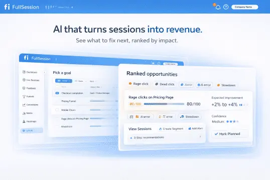
FullSession connects behavioral data to revenue impact with Lift AI. The platform helps teams prioritize the friction points most likely to affect conversions. It combines session replay, heatmaps, funnels, feedback, error tracking, and AI prioritization in one plan with transparent pricing and a simple setup.
Ready to see how it works? Book a demo, and we’ll show you how Lift AI scores real friction points in under 20 minutes.
A/B testing and experimentation depth. Does the tool support standard A/B tests, multivariate testing, and split URL testing? Does it report statistical significance clearly so marketers can call results with confidence?
Ease of use for non technical users. Can a marketer set up no code experiments without engineering help, or does every test require a developer?
Behavioral analytics. Does the tool include session recordings, heatmaps, and funnel analysis natively, or do you need third party tools for that?
Pricing transparency. Are plans and limits visible on the website, or do you have to contact sales to get a number?
Free tier or trial availability. Can you test the tool with real website visitors before committing?
Integrations. Does it connect natively to Google Analytics and other web analytics platforms, your ad platforms, CRM, and existing marketing stack?
Reporting and visual insights. Are the results easy to read and share with stakeholders who aren’t running the tests?
G2 rating and real user reviews. What do verified users say about reliability, the support team, and day-to-day usability?
We reviewed each tool against its official website as the primary source, not secondhand summaries.
Best VWO Alternatives at a Glance
The table below shows all 7 tools at a glance. G2 ratings and pricing are current as of May 2026. Use it to shortlist, then read the full entries below for more details.
Each tool below covers a different slice of the CRO and behavioral analytics market. Some focus on experimentation depth, others on qualitative insights, and a few try to do both.
Read each entry against your team’s actual workflow, not just its feature list. The right fit rarely matches the longest list of capabilities.
FullSession
FullSession is a UX analytics and behavioral intelligence platform. It combines session replay, interactive heatmaps, funnel analysis, in-page feedback, error tracking, and Lift AI in one platform, giving teams deeper insights into real user journeys from day one.
There are no surprise feature splits on the current plans. You don’t pay extra to access heatmaps after using session replays, and you don’t lose funnel analysis if you downgrade.
FullSession is built with privacy in mind, including data masking, consent controls, and GDPR, CCPA, and PCI compliance.
FullSession is useful when GA shows what happened, but your team needs session replays, heatmaps, funnels, and feedback to understand the behavior behind the numbers without separate workflows for technical and non technical users.
Key features
Session replay: Watch real user sessions on web and mobile, with rage-click and dead-click detection built in.
Interactive heatmaps: Use click maps to see where users click most, plus move maps and scroll maps across device types, with filters by traffic source.
Funnel analysis: Build multi-step funnels and jump straight from a drop-off to the replay to see what caused it.
In-app feedback: Create targeted micro-surveys triggered by behavior, not just page views.
Error and alerts: Capture JavaScript errors and rage clicks, then route alerts to Slack or email.
Lift AI: Rank pain points by expected revenue impact, and fix what costs the most first.
Mobile session replay: Get the full replay on iOS and Android with the same toolset as web.
Pricing
FullSession offers a 14-day free trial with Professional plan features and no credit card required. This lets teams test the platform’s core capabilities before choosing a paid plan.
After the trial, users can keep using the Free plan with 500 sessions/month and 1-month data retention, or upgrade anytime. Teams get a low-risk way to continue collecting behavioral data before moving to a higher-capacity plan.
The Growth plan starts at $23/month billed annually and includes 5,000 sessions/month, 4-month data retention, session replay, heatmaps, funnels, feedback, error reporting, custom events, and user attributes.
This plan suits teams that need a broader view of user behavior, conversion issues, and product friction in one platform.
Want to see how FullSession works? Book a demo, and we’ll walk you through session replay, heatmaps, funnel analysis, and Lift AI so you can understand how the platform helps teams find and prioritize user friction.
PostHog
PostHog is an open-source product analytics and experimentation suite. The platform is developer-first and self-hostable, which sets it apart from most tools on this list.
Engineering teams that want SQL access to their event data, full source code visibility, and the option to run on their own infrastructure tend to land here first. The flexibility comes at a cost: you’ll need the technical expertise to get the most out of it.
Engineering-led product teams at startups and scaleups who want one platform for A/B testing, feature flags, product analytics, and session replay in the same project. If your stack already includes a data warehouse and your PMs write SQL, PostHog fits naturally.
The catch is that the self-hosted option only pays off if you actually have spare engineering hours to maintain it. Cloud-hosted PostHog removes that overhead but moves you back into a managed-service pricing model.
Key features
A/B testing: Multi-variant experiments with statistical significance reporting.
Feature flags: Targeted rollouts that let you safely roll new features to a subset of users, plus kill switches and progressive delivery.
Product analytics: Funnels, retention, paths, and cohorts with SQL access.
Session replay: Replays tied to user identities and events.
Surveys: In-app surveys triggered by feature flags or events.
Autocapture: Track clicks and pageviews without writing tracking code for every event.
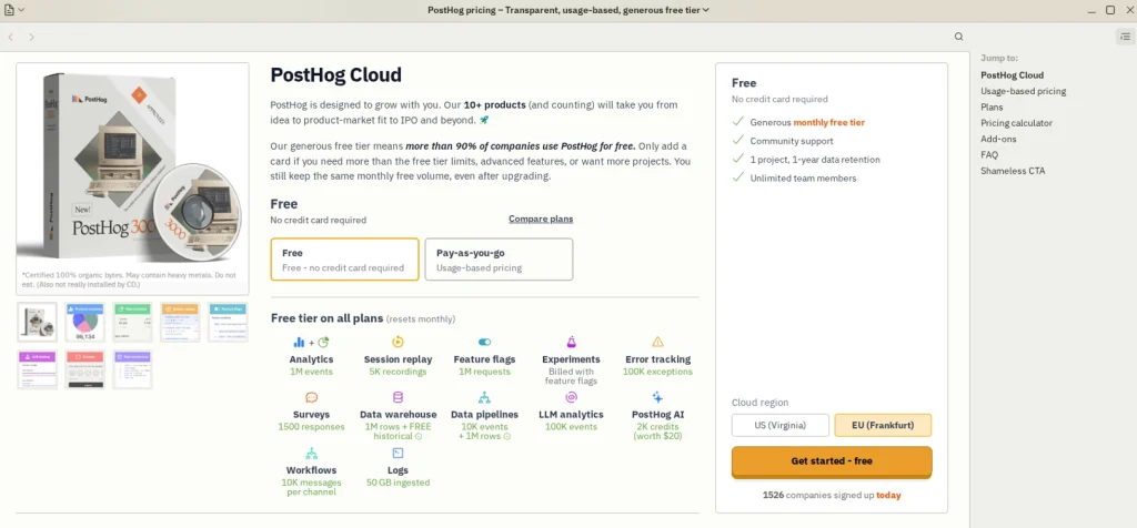
Pricing
PostHog offers a generous free tier covering 1 million analytics events per month, 5K session recordings, 1 million feature flag requests, and other monthly free limits.
Small teams get a way to run tests and use core product analytics features without paying upfront.
Paid usage scales with event volume, recording volume, feature flag requests, and other product usage. PostHog publishes pricing on the site with free and pay-as-you-go options, so you can estimate your costs without a sales call.
Optimizely
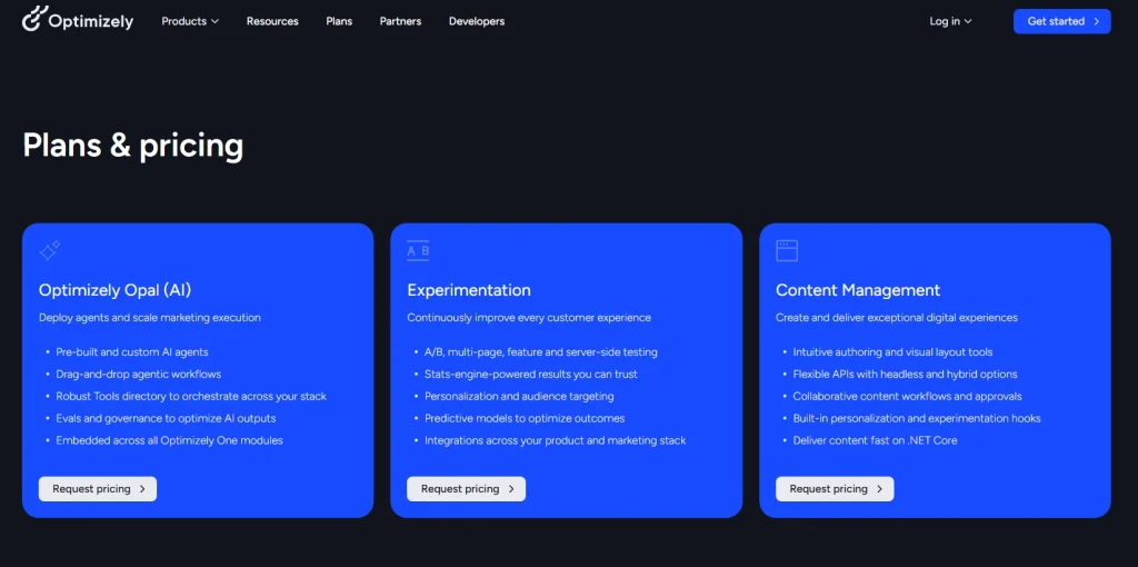
Optimizely is an enterprise digital experience platform covering web experimentation, feature experimentation, content management, and e-commerce optimization. It’s a full content-to-commerce suite, not just a testing tool.
The acquisition history (including Welcome and Zaius) reflects this expansion.
Best for
Enterprise marketing and frontend teams at large enterprises in retail, media, or B2C running complex multi-channel experimentation programs.
If you’re shipping experiments across web, app, and ecommerce simultaneously, running multi page tests in parallel, and need governance to match, Optimizely is built for that scale.
For smaller teams, that same depth becomes expensive overhead they rarely use.
Key features
Web experimentation: Visual editor for A/B and multivariate testing without code.
Feature experimentation: Server-side feature flags and rollouts.
Project management: Workflows, approvals, and stakeholder views for experiment programs.
Content management system: Headless and traditional CMS modes.
E-commerce optimization: Personalization tied to product catalogs and cart behavior.
Pricing
Optimizely doesn’t publish pricing on its website. You’ll need to book a sales call for a quote.
The exact price depends on traffic and feature scope and should be confirmed with Optimizely directly.
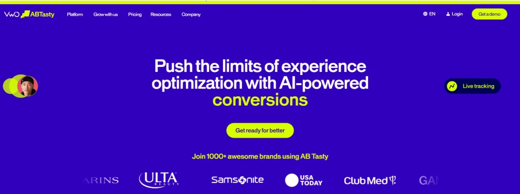
AB Tasty
AB Tasty is an omnichannel experimentation and personalization platform. The product combines A/B testing with AI-powered product recommendations and features designed to support e-commerce personalization and product discovery.
In January 2026, AB Tasty and VWO agreed to merge under Everstone Capital, the existing majority shareholder of Wingify (VWO’s parent). Worth knowing if you’re evaluating both side by side, since the two product lines are expected to consolidate over time.
Best for
Marketing teams at mid-market to large retail and entertainment companies who need web experimentation plus personalization in one platform. If your conversion lift depends on tailoring product recommendations and not just headline tests, AB Tasty leans into that use case.
Fashion and beauty retailers running personalized merchandising for repeat visitors get the most out of it. A pure B2B SaaS team running three landing page tests a quarter will leave most of the platform unused.
Key features
A/B and multivariate testing: Run concurrent variant tests across pages and elements.
Visual editor: Build experiments without code for marketing-led teams.
Personalization engine: Rule-based and AI-driven audience targeting.
AI-powered recommendations: Product recommendations tuned to user behavior.
Feature flags: Server-side flags for technical teams.
Pricing
AB Tasty doesn’t publish pricing publicly. You’ll need a sales call for a quote, and the platform positions itself as a mid-to-enterprise tool. Setup and onboarding may require more planning than lighter self-serve tools, so factor implementation time and support needs into the evaluation.
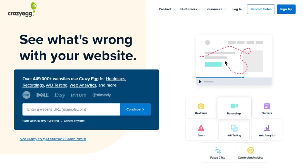
Crazy Egg
Crazy Egg is a website optimization and A/B testing tool offering heatmaps, session recordings, traffic analysis, and error tracking. It’s one of the longest-standing CRO tools on the market, designed for teams that want practical CRO insights without a complex technical setup.
Marketing-led teams at small to mid-market businesses who want A/B testing and heatmap analysis without engineering support. If you’re the only person on your team who’ll use this tool and you’re not a developer, Crazy Egg offers a simple, marketer-friendly interface.
Key features
Heatmaps: Click, scroll, and movement heatmaps across devices.
Session recordings: Replays with basic filtering by behavior.
A/B testing: Visual editor with split tests and goal tracking.
Traffic analysis: Source and referrer breakdowns tied to behavior.
Error tracking: Identify pages where users hit errors or bounce.
Surveys: Lightweight on-page feedback collection.
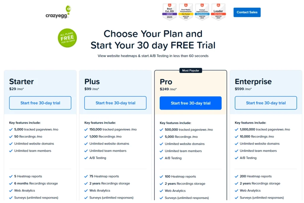
Pricing
Plans start at $29/month billed annually, with a 30-day free trial available across plans. Crazy Egg publishes pricing on the site and uses a page-views model rather than an MTU model, which can be more predictable for sites with steady traffic.
Hotjar
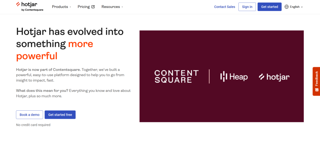
Hotjar is a behavioral analytics platform combining session recordings, heatmaps, and user feedback tools. The product leans heavily into qualitative feedback and surveys, with built in analytics for tracking page-level engagement.
Hotjar is now part of Contentsquare, and several recent product launches have leaned toward enterprise features. Whether that becomes a structural shift depends on Contentsquare’s broader roadmap.
UX researchers, product designers, and marketing teams at small to mid-market companies who prioritize qualitative insights alongside quantitative analytics. If your team relies on user feedback widgets and post-session surveys as core inputs, Hotjar is a natural fit for that workflow.
Research teams often pair it with a separate experimentation tool because Hotjar itself doesn’t run A/B tests, although it’s a strong way to gather feedback from real users. That’s fine if you’ve already settled on a testing platform.
It’s friction if you’re looking for one platform to manage both user insights and experimentation.
Key features
Session recordings: Filter by behavior, geography, or device.
Heatmaps: Click, scroll, and move heatmaps with comparison views.
Feedback widgets: On-page feedback prompts and rating widgets.
Surveys: Triggered surveys with conditional logic.
Funnel analysis: Drop-off identification across multi-step flows.
Pricing
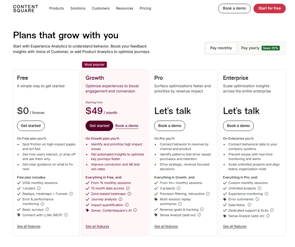
Hotjar’s free plan includes 200k monthly sessions, 1 project, replays, heatmaps, funnels, basic surveys, and error and performance monitoring.
Paid plans start at $49/month for the Growth plan, with Pro and Enterprise pricing available through a demo or sales conversation.
Hotjar pricing now appears on Contentsquare’s website, with monthly and yearly billing options listed for self-serve plans.
Statsig
Statsig is an experimentation and feature management platform. It connects with a company’s existing data warehouse, and Statsig has publicly described infrastructure built to stream more than 1 trillion events per day.
That scale shows up in how Statsig handles statistical rigor and sequential testing across heavy traffic, including spikes driven by organic visitors and paid campaigns.
Best for
Engineering and product teams at growth-stage and enterprise companies who need statistically rigorous A/B testing, feature flags, and product analytics integrated with their warehouse data. If your team cares about avoiding peeking bias and your data already lives in Snowflake or BigQuery, Statsig fits naturally.
Teams running fewer than five experiments a month rarely justify the setup cost. The platform shines when you’re shipping dozens of concurrent tests and need guardrails to keep them honest.
Key features
A/B experimentation: Sequential testing, CUPED variance reduction, and guardrail metrics.
Feature flags: Targeted rollouts with kill switches and dynamic configurations.
Product analytics: Funnels, retention, and custom dashboards.
Session replay: Replays tied to experiment exposures.
Sequential testing: Reliable early-stopping without inflating false-positive rates.
Warehouse-native deployment: Run experiments on data already in your warehouse.
Pricing
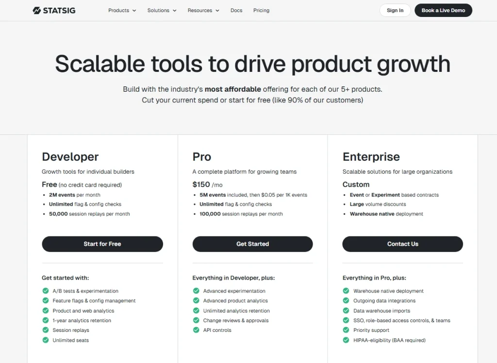
Statsig offers a free Developer plan with 2M events per month, unlimited flag and configuration checks, and 50,000 session replays per month.
The Pro plan starts at $150/month and includes 5M events, then $0.05 per 1K events, unlimited flag and config checks, and 100,000 session replays per month.
Enterprise pricing is custom for larger teams, event or experiment-based contracts, and warehouse-native deployment.
How to Choose Between These VWO Competitors
The right VWO alternative depends on what your team actually does with data, not what features fit on a pricing page.
Lean teams that combine third party tools for analytics, replay, and feedback create a fragmented workflow. The split makes it harder to connect user behavior with clear next steps.
Use the table below to match each variable to your team’s situation before you shortlist.
Decision variable
What to consider
Team technical level
Developer-first tools like PostHog and Statsig assume engineering involvement. Marketing-led tools like Crazy Egg, Hotjar, and FullSession work without it.
Qualitative vs. quantitative weighting
Need to know why users act? Prioritize session replay and feedback. Need to know what moves a metric? Prioritize experimentation depth.
Pricing model
MTU (monthly tested users) caps drain unpredictably as you scale. Session-based and event-based models are easier to forecast.
Session replay depth
Not all replays are equal. Check rage-click detection, mobile support, and filtering options before you commit.
A/B testing vs. feature flags
A/B testing improves the page. Feature flags ship the product. Your primary use case shapes the pick.
Integration requirements
Google Analytics, Google Ads, your CRM, your warehouse. If a tool can’t connect to your stack natively, the friction adds up.
For a wider lens on the field, our guide to choosing a UX analytics tool walks through the same trade-offs in more detail. The shortlist that ticks all the boxes for one team rarely matches another’s.
Why Choose FullSession
VWO focuses on experimentation. FullSession focuses on the behavior behind the experiments. The platform connects behavioral data to revenue impact through a dedicated AI feature, Lift AI. It ranks pain points by expected business outcome, so your team fixes what costs you the most first.
That’s a different starting question than “what should we test?”
Want to replace VWO without losing ground? FullSession covers the same territory and adds behavioral context on top. You can run experiments, track feature rollouts, and review session replays from one dashboard, without stitching separate tools together.
Most teams comparing VWO alternatives end up paying for three or four separate products: one for replay, one for heatmaps, one for funnels, and one for feedback. FullSession handles it all in one subscription.
VWO is strong at experimentation. FullSession is strong at showing you why users behave the way they do before you run a single test. Used together, they cover both sides. Used separately, FullSession works as a direct replacement if behavioral insight is your priority.
Every specific feature on the current Growth and above plans is available from day one. No hidden fees, no upgrade gates between you and the data you need.
Here’s what you get on every plan:
All features available on current Growth and above plans. Session replay, heatmaps, funnels, feedback, error tracking, and Lift AI are not split across tiers.
Transparent pricing starting at $23/month billed annually. No sales call required to see what you’ll pay.
GDPR, CCPA, and PCI compliant by default, with data masking and consent controls.
Set up in minutes, not days. Install the snippet, verify data, and watch your first replay the same afternoon.
A user friendly interface for everyone on your team. Product managers, marketers, engineers, and the support team don’t need training to use our platform.
Want to see how Lift AI scores actual friction points? Book a demo, and we’ll set up a 30-minute walkthrough.
Your Setup Checklist for the First 30 Days
Use this list once you’ve picked a tool and you’re ready to set it up.
Define the metric you’ll use to declare A/B test significance.
Schedule a 30-day review to assess data quality.
Eight Questions to Ask Every Vendor Before You Sign
Shortlisted two or three tools? Ask each vendor these questions before you sign anything.
How does pricing scale as our session volume or event count grows?
Are all features available on the entry-level plan, or are key features locked to higher tiers?
How do you handle statistical significance, and can we use sequential testing?
What’s the typical time from signup to first insight?
Do you support single-page application (SPA) sites?
Do you integrate with Google Analytics, Google Ads, and our CRM?
How do you handle GDPR and CCPA compliance?
What does your onboarding and support process look like for a team our size?
Got your shortlist? Book a demo with FullSession and bring these questions. We answer them all upfront, no slides.
Conclusion About VWO Competitors
There’s no universal answer to which VWO competitor is right for you. The choice depends on your team’s technical level, your data needs, and your budget model.
Engineering teams gravitate toward PostHog and Statsig. Marketing-led teams favor Crazy Egg and Hotjar. Enterprise teams lean on Optimizely and AB Tasty.
If you need behavioral analytics, session replay, and conversion intelligence in one place with transparent pricing and no feature splits, FullSession is built for that.
Wingify is the company that built VWO. VWO (Visual Website Optimizer) is the product.
Wingify launched VWO in 2010 and has expanded the product family since, but the names often get used interchangeably in marketing materials. When people compare “VWO alternatives,” they’re comparing alternatives to the Wingify-built product, not the company itself.
Is VWO a good tool?
VWO is a capable A/B testing and experimentation platform with a long track record, a strong visual editor, and a solid feature set for mid market teams. It works well if you want a dedicated CRO tool with mature testing capabilities.
Teams looking for deeper behavioral analytics, transparent pricing, or one platform that combines replay and testing often evaluate VWO alternatives like FullSession.
What is the difference between VWO and GrowthBook?
VWO is a commercial, all-in-one CRO platform with a visual editor and managed infrastructure. GrowthBook is open-source, developer-first, and integrates directly with your data warehouse.
VWO suits marketing-led teams that want a polished interface. GrowthBook suits engineering teams that want full code visibility and warehouse-native experimentation without a per-seat fee.
Is VWO a SaaS company?
Yes. Wingify, the company behind VWO, runs VWO as a software-as-a-service product.
Customers subscribe to monthly or annual plans, access the platform through a browser, and don’t host any infrastructure themselves. Wingify is headquartered in India and serves customers globally, including SaaS, ecommerce, travel, and media brands across North America and Europe.
Should you try VWO before picking an alternative?
Yes, if you have the time. A short trial on a representative landing page tells you more than any feature matrix.
Run a basic A/B test against a small percentage of traffic, then pick two VWO alternatives from this guide and run the same test on each. The tool that produces clear, fast, and trustworthy results without burning a week of engineering hours is the one to shortlist.
Roman Mohren is CEO of FullSession, a privacy-first UX analytics platform offering session replay, interactive heatmaps, conversion funnels, error insights, and in-app feedback. He directly leads Product, Sales, and Customer Success, owning the full customer journey from first touch to long-term outcomes. With 25+ years in B2B SaaS, spanning venture- and PE-backed startups, public software companies, and his own ventures, Roman has built and scaled revenue teams, designed go-to-market systems, and led organizations through every growth stage from first dollar to eight-figure ARR. He writes from hands-on operator experience about UX diagnosis, conversion optimization, user onboarding, and turning behavioral data into measurable business impact.
PostHog is a solid open source platform for product analytics, feature flags, session replay, error tracking, and A/B testing. But not every team needs a developer-first analytics stack.
Some teams need simpler reporting, clearer usage-based pricing, stronger qualitative insights, or a platform that helps non-technical users understand user behavior without relying on engineering teams.
The best PostHog alternatives help teams track product data, review real user sessions, analyze funnels, and improve business outcomes without adding unnecessary complexity.
This guide compares 10 PostHog alternatives across product analytics features, analytics session replay, feature flag capabilities, A/B testing, pricing, compliance, and team fit.
Source note for May 2026: Pricing, free tier limits, data residency, and compliance docs change often. This article avoids fixed claims where vendors use calculators, usage-based pricing, custom pricing, or sales-led enterprise plans.
Key Takeaway
FullSession is best for non-technical teams that need session replay, funnel analysis, heatmaps, user feedback, error alerts, and behavioral analytics in one workflow.
FullStory works for enterprise teams that need digital experience analytics and structured behavioral data at scale.
LogRocket fits engineering teams that need session replay, console logs, network tracking, and error tracking for frontend debugging.
Mixpanel fits growth and marketing teams that need event-based product analytics, user paths, custom dashboards, and flexible reporting.
Amplitude fits product teams that need a mature analytics core with funnel analysis, behavioral cohorts, product data, and experimentation.
Heap works for teams that want autocapture and retroactive analysis without a heavy upfront event tracking setup.
Fathom Analytics fits privacy-focused teams that need simple website analytics instead of deep product analytics session replay.
Matomo fits compliance-first teams that need an open source platform, self-hosting, and full data ownership.
Statsig fits teams that need a feature flagging platform, statistical significance, and experimentation workflows.
LaunchDarkly fits enterprise engineering teams that need advanced feature management, governance, and safe releases.
FullSession is the strongest fit for teams that need to understand user behavior without relying on multiple tools or heavy engineering support. It combines session replay, funnel analysis, heatmaps, user feedback, error tracking, and behavioral analytics in one workflow, making it easier for product teams, growth teams, marketing teams, and customer support teams to find friction and act faster.
Book a demoto see how FullSession can help your team turn real user sessions into clearer product and conversion decisions.
When to Evaluate PostHog Alternatives for Product Analytics
Teams usually compare PostHog alternatives when one of these issues starts slowing the team down:
Pricing needs tighter forecasting. PostHog’s usage-based model can work well, but teams should model event volume, session replays, feature flags, and monthly active users before scale increases.
Non-technical users need self-serve access. Product, growth, marketing, and support teams may need reports they can use without SQL or developer support.
Session replay quality matters. Compare replay fidelity, filters, retention, rage clicks, console logs, mobile coverage, and debugging workflows with dedicated replay tools.
Compliance needs a closer review. Confirm PostHog Cloud region, EU hosting, SOC 2 documentation, data export options, security features, and enterprise plans before making a switch.
A/B testing needs are more advanced. High-volume experimentation teams should compare statistical controls, multivariate testing, sequential testing, and feature flag capabilities.
These criteria help teams decide whether PostHog still fits the stack or whether another product analytics tool would reduce friction and improve decision-making faster.
Key Features to Compare Across PostHog Alternatives
Product analytics depth: Can the platform answer funnel, retention, cohort, and user journeys questions without a data engineering team?
Session replay quality: Does it capture real user sessions with enough context to explain user behavior and user interactions?
Feature flags and A/B testing: Does it support unlimited feature flags, feature management, flag-tied experiments, and statistical significance?
Non-technical usability: Can non-technical teams create reports, review sessions, and build custom dashboards without SQL?
Pricing transparency: Is pricing flat-rate, seat-based, event-based, or a usage-based pricing model?
Data controls: Does the platform support EU hosting, self-hosting, data warehouse export, and compliance documentation?
Team fit: Does the tool serve product teams, engineering teams, growth teams, marketing teams, or customer support teams best?
10 PostHog Competitors at a Glance
Use this table to compare each PostHog alternative by primary use case, strongest capability, pricing style, and limitation to check before buying.
Tool
G2 Rating
Best For
Top Feature
Pricing Model
FullSession
5.0
Non-technical e-commerce, product, and growth teams
Lift AI, session replay plus funnel analytics combined
Engineering teams running high-velocity experiments
Feature flags plus experimentation at scale
Free tier; usage-based paid pricing
LaunchDarkly
4.5
Enterprise engineering teams managing releases
Feature management, targeting, governance, and release safety
Free Developer plan; paid plans vary
Pricing verified from official pages at time of writing. Confirm before purchasing.
The 10 Best PostHog Alternatives and Competitors
The tools below are compared across product analytics, session replay, feature flags, A/B testing, web analytics, pricing, compliance, and team fit. Each platform solves a different part of the analytics stack, so start with the workflow your team needs to improve first.
1. FullSession
FullSession is a behavioral analytics platform that combines session replay, heatmaps, funnel analysis, user feedback, error alerts, and Lift AI in one workflow. It helps product teams, growth and marketing teams, and customer support teams study user behavior without moving between multiple tools.
Session replay: Replays real user sessions with timelines, rage clicks, dead clicks, and error context so teams can see what happened before drop-offs.
Heatmaps: Click maps, scroll maps, and attention maps show how users engage with pages, dynamic elements, and product flows.
Conversion funnels: Funnel analysis breaks down drop-offs by step, segment, source, device, or cohort.
User feedback: In-page feedback connects comments and ratings to matching replay sessions.
Lift AI: Prioritizes friction points by expected business impact so teams can focus on business outcomes.
Error and alert tracking: Connects JavaScript errors, network failures, and broken flows to user journeys.
FullSession offers a free plan for teams that want to start with basic session replay access.
Growth plans start at $23/month billed annually for 5,000 sessions per month, while Professional plans start at $279/month billed annually for 100,000 sessions.
Enterprise plans use custom pricing based on traffic volume, retention, and support needs.
FullStory is a digital experience analytics platform for enterprise teams that need to analyze user interactions across web and mobile apps. Its DX Data layer turns session behavior into structured product data for deeper investigation.
Enterprise product teams, UX researchers, and design teams that need high-fidelity session replay and shared behavioral data across product, engineering, and research workflows.
Key features
Session replay: Captures detailed user sessions with privacy controls and retroactive analysis options.
DX Data: Turns behavioral signals into structured data that teams can query and share.
Funnel analysis: Connects user paths and funnel drop-offs to replay clips for visual diagnosis.
Product analytics features: Tracks rage clicks, errors, conversion signals, and user behavior patterns.
Mobile apps and data export: Supports mobile replay and export workflows to data warehouse destinations such as BigQuery and Snowflake.
Pricing
FullStory offers a free plan for smaller teams. Advanced and enterprise plans are sales-led and usually depend on session volume, retention, and feature access.
3. LogRocket
LogRocket is a session replay and error tracking platform built for engineering teams that need to debug frontend issues in production. It combines session replay, console logs, network logs, and performance monitoring.
Engineering teams and front-end developers that need to reproduce bugs, investigate JavaScript errors, monitor regressions, and connect technical issues to user journeys.
Key features
Session replay with error context: Shows real user sessions with console logs, Redux state, network requests, and JavaScript errors.
Error tracking: Groups errors automatically and attaches session clips to each issue.
Performance monitoring: Tracks page load time, Core Web Vitals, and latency by session.
Product analytics and custom events: Supports basic funnel analysis, user paths, and developer-defined event tracking.
Integrations: Connects with Jira, Linear, Sentry, Datadog, Segment, and similar tools.
Pricing
LogRocket offers a limited free plan. Paid plans use usage-based pricing, with higher-volume and enterprise plans depending on sessions and features.
Mixpanel is an event-based product analytics tool for tracking how users move through a product over time. It is often used by growth and marketing teams that need flexible event tracking, retention analysis, and user paths.
Growth teams, product managers, and marketing teams at SaaS, ecommerce, and consumer app companies that need self-serve product analytics without a full data team.
Key features
Funnel analysis: Builds multi-step funnels with conversion breakdowns by cohort, property, and date range.
Retention analysis: Shows how user behavior changes after specific events or actions.
Custom events and user paths: Tracks defined user interactions and maps paths between product steps.
Custom dashboards: Lets teams share product data, campaign performance, and user journeys in one workspace.
Data export: Supports event and cohort exports to Snowflake, BigQuery, Redshift, and related warehouse tools.
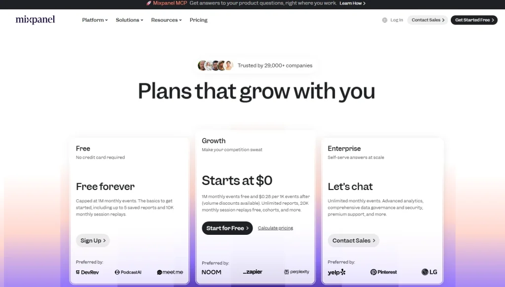
Pricing
Mixpanel offers a free tier and then usage-based pricing tied to event volume. Enterprise plans add governance, security features, and support with custom pricing.
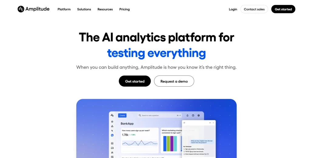
5. Amplitude
Amplitude is a product analytics platform for scaling product teams that need behavioral analysis, experimentation, and feature flags in one analytics core. It offers deeper product analytics features than basic web analytics tools and supports product managers who need cohort, funnel, and retention workflows.
Product managers and growth teams at B2C apps, mobile apps, and enterprise SaaS companies that need product analytics, experimentation, and behavioral cohorts.
Key features
Product analytics: Provides funnels, retention, user flows, user journeys, and behavioral cohorts through a visual query builder.
Behavioral analytics: Helps teams understand user behavior at individual and cohort levels.
Session replay and feature flags: Links replay to product events and supports flag-based rollouts.
Custom dashboards and multi-touch attribution: Helps marketing teams connect acquisition activity to product behavior.
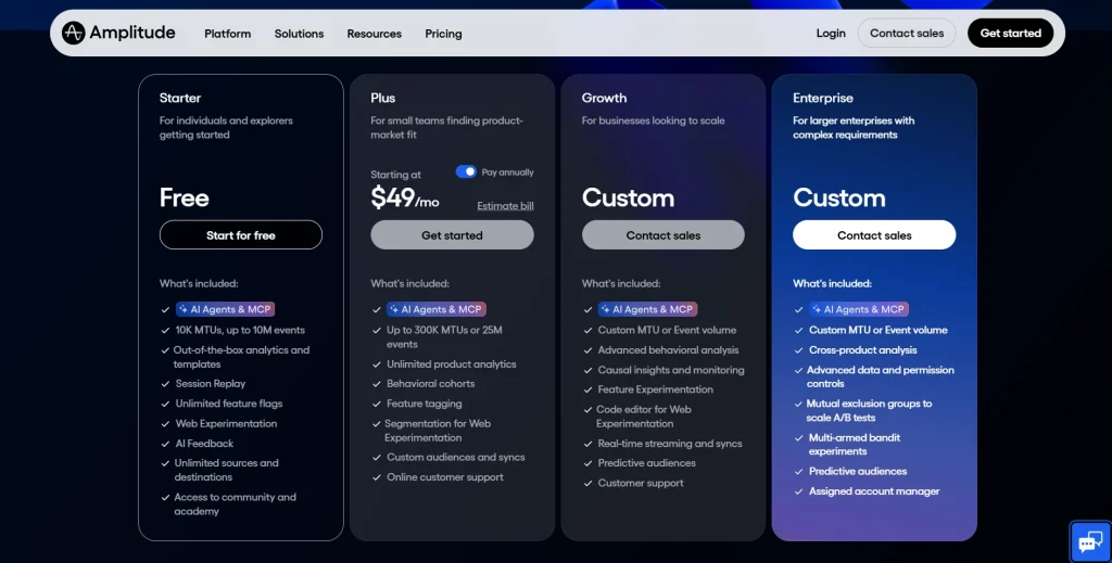
Pricing
Amplitude offers a free tier with product analytics, session replay, and feature flags. Paid plans vary by monthly tracked users, monthly active users, events, and advanced features.
6. Heap
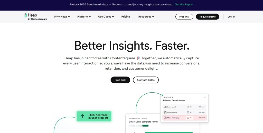
Heap is a product analytics tool built around autocapture. It records clicks, taps, swipes, form submissions, page views, and other user interactions without requiring developers to define every event upfront. For users, this means Heap is now part of the broader Contentsquare analytics platform.
Product teams that need retroactive analysis and behavioral data but have limited engineering bandwidth for detailed event tracking setup.
Key features
Autocapture: Records user interactions automatically after installation.
Retroactive analysis: Let teams analyze events that were not manually tagged in advance.
Funnel analysis and session replay: Connects funnel steps to replay clips for deeper diagnosis.
Behavioral data segmentation: Builds cohorts using behavioral and demographic attributes.
Integrations: Connects with Salesforce, HubSpot, Zendesk, and major data warehouse tools.
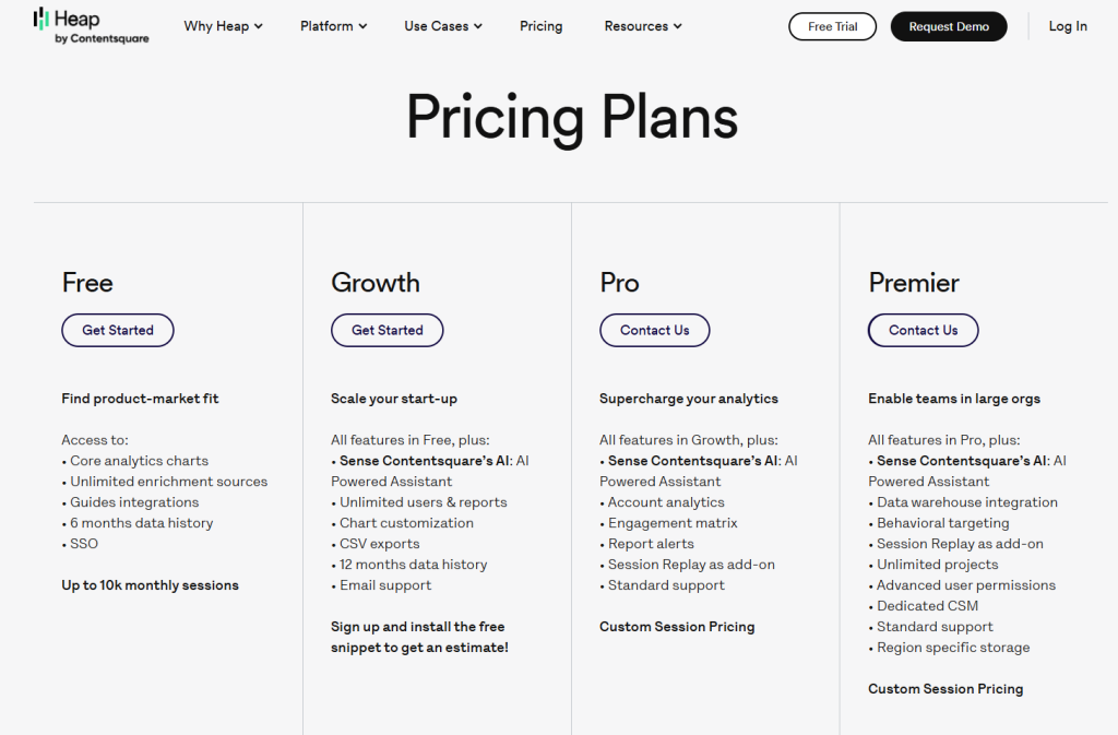
Pricing
Heap offers a free plan for smaller teams. Growth, Pro, and Enterprise plans are usually estimate-led or demo-led and depend on session volume, data retention, and feature access.
7. Adobe Analytics
Fathom Analytics is a privacy-first website analytics tool and a simple alternative to Google Analytics. It focuses on clean traffic reporting without tracking cookies. It does not provide deep product analytics, feature flags, or session replay.
Best for
Marketing teams, publishers, and marketing and ecommerce teams that need simple website analytics, referral data, lightweight custom events, and privacy-focused reporting.
Key features
Cookie-free tracking: Avoids cookies and personal data collection for privacy-focused reporting.
Uptime monitoring and email reports: Send uptime alerts and scheduled traffic summaries.
Custom events: Tracks basic conversion goals and form submissions through JavaScript.
Data export: Provides CSV and API access for traffic data.
Pricing
Fathom Analytics uses flat-rate pricing starting at $15/month for up to 100,000 monthly page views. Plans include unlimited sites, data exports, and privacy-focused analytics features.
8. Matomo
Matomo is an open source platform for web analytics and product analytics use cases where teams need full data ownership. It is often used as a self-hosted alternative to Google Analytics for privacy and compliance-focused organizations.
Best for
Compliance-first teams, public sector organizations, and businesses that need self-hosting, data ownership, and control over their analytics data.
Key features
Self-hosting: Gives teams on-premise control so product data stays within their infrastructure.
Web and mobile apps tracking: Tracks websites and mobile apps through SDKs.
Funnel analysis and event tracking: Supports conversion funnels and flexible custom events, with some capabilities tied to premium modules.
Security features: Includes role-based access control, two-factor authentication, and audit logs.
Data export: Provides raw data access through APIs and avoids vendor lock-in.
Pricing
Matomo offers a free self-hosted plan. Matomo Cloud pricing scales by traffic volume and feature requirements. Enterprise deployments and compliance-focused setups use custom pricing.
9. Statsig
Statsig is a feature flagging platform and experimentation engine for engineering and product teams. It focuses on feature flags, A/B testing, metric analysis, rollout controls, and warehouse-native experimentation workflows.
Best for
Engineering teams and product managers who run frequent experiments, manage feature rollouts, and need statistical significance controls without replacing the full analytics stack.
Key features
Unlimited feature flags: Supports targeted rollouts by segment, country, device, or custom property.
A/B testing with statistical significance: Supports sequential testing, CUPED-style variance reduction, and multi-metric experiment dashboards.
Feature management: Includes scheduled rollouts, kill switches, targeting rules, and a developer-friendly console.
Metrics layer: Connects business outcomes to warehouse-native metrics from Snowflake, BigQuery, or Redshift.
Product analytics and console logs: Offers basic product analytics features and diagnostics alongside experiment results.
Pricing
Statsig offers a generous free tier and then usage-based pricing for additional events and advanced usage. Enterprise plans include custom pricing and warehouse-native deployment options.
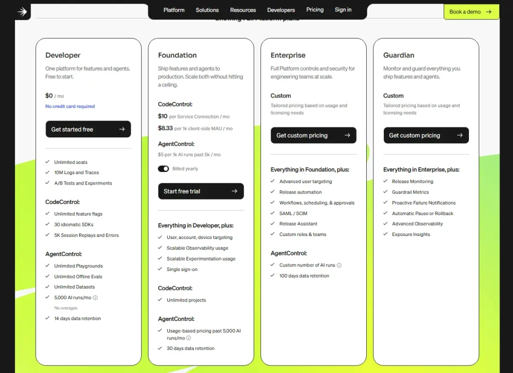
10. LaunchDarkly
LaunchDarkly is an enterprise feature management platform for safe and controlled software releases. It is not a traditional product analytics tool. Most teams pair LaunchDarkly with dedicated analytics tools for product analytics, behavioral analytics, and session replay.
Best for
Enterprise engineering teams with strict governance, audit, release safety, and multi-region infrastructure needs.
Key features
Feature flag delivery: Supports global flag evaluation with high availability requirements.
Targeting rules: Targets users by properties, device attributes, segments, and custom contexts.
Progressive rollouts: Supports percentage rollouts, controlled exposure, and rollback workflows.
Audit logs and integrations: Tracks flag changes and connects with Datadog, Dynatrace, Jira, ServiceNow, and data pipelines.
LaunchDarkly offers a free developer plan for small teams. Foundation and Enterprise plans scale based on service connections, feature flag usage, governance, and security needs. Enterprise pricing is custom.
Experimentation and A/B Testing (B Testing) Considerations
A/B testing capability varies across these tools. Some platforms include native experimentation. Others support analytics, session replay, or feature management but need another tool for controlled tests.
Teams with advanced A/B testing needs should compare statistical significance methods, multi-variate testing, sequential testing, feature flag capabilities, and experiment-to-session replay workflows before choosing a platform.
Tool
Native A/B Testing
Feature Flags
Statistical Significance
Self-Serve Setup
SOC 2
FullSession
No (integrates via flags)
No
N/A
Yes
Yes
FullStory
No
No
N/A
No
Yes
LogRocket
No
No
N/A
Yes
Yes
Mixpanel
Limited / evolving
No
Check current plan
Yes
Yes
Amplitude
Yes (Amplitude Experiment)
Yes
Yes
Yes
Yes
Heap
No
No
N/A
Yes
Yes
Fathom Analytics
No
No
N/A
Yes
N/A
Matomo
Yes (A/B Testing plugin)
No
Yes
Yes
Not publicly confirmed
Statsig
Yes
Yes (unlimited)
Yes (CUPED)
Yes
Yes
LaunchDarkly
Yes
Yes
Yes
Setup varies by plan
Yes
For a dedicated analytics tool focused on A/B testing at scale, compare Statsig and Amplitude Experiment. Both support experimentation workflows, but the right choice depends on whether your team needs deeper product analytics, feature flag capabilities, or warehouse-native metrics.
For feature flag capabilities without a full product analytics suite, compare LaunchDarkly and Statsig. LaunchDarkly is stronger for enterprise feature management, release governance, and safe rollouts, while Statsig is stronger when feature flags need to connect closely with experimentation and business outcomes.
For qualitative validation, pair experimentation with FullSession’s session replay so teams can watch what happened inside real user sessions. This helps product teams, growth teams, and engineering teams understand why users behaved a certain way after a test, feature rollout, or product change
Pricing, Data Residency, and Compliance Checklist
PostHog’s usage-based pricing model is a common evaluation point because bills can depend on event volume, session replay, feature flags, and other product activity.
Teams should forecast product data volume before making any platform their analytics core, especially if monthly active users, custom events, or replay usage may grow quickly.
Most analytics platforms use one of three models: usage-based pricing, seat-based pricing, or flat-rate freemium pricing.
Usage-based pricing can be flexible but harder to predict, seat-based pricing may be easier to budget, and flat-rate freemium pricing can work well for smaller teams with simpler analytics needs.
Enterprise plans often use custom pricing when security features, retention, support, compliance documents, data export, or advanced features are included. Before choosing a platform, confirm what is available on the selected plan and which features require a higher-tier contract.
Tool
Pricing Model
Starting Price
EU Hosting
Self-Host
SOC 2
FullSession
Session-based
From $23/month billed annually
Yes
No
Yes
FullStory
Free plus sales-led paid plans
Custom / sales-led
Yes
No
Yes
LogRocket
Usage-based
From $99/month
No
No
Yes
Mixpanel
Event-based
From $0 after free event allowance, then $0.28 per 1K events
Yes
No
Yes
Amplitude
MTU / plan-based
From about $49/month, varies by MTUs
Yes
No
Yes
Heap
Free plus estimate/demo-led
Custom / estimate-led
Yes
No
Yes
Fathom Analytics
Flat-rate
From $15/month
Yes EU servers
No
N/A
Matomo
Flat-rate / Free
Cloud pricing varies by traffic; self-hosted is free
Yes
Yes
Confirm current status
Statsig
Usage-based
Free tier, then usage-based; Pro includes 5M events with overages
Check current region options
No
Yes
LaunchDarkly
Plan / usage-based
From $12/month for Foundation
Yes
No
Yes
If your team has strict data residency needs, compare each platform’s hosting options before choosing a tool. Matomo gives the clearest self-hosting option, while Fathom Analytics supports privacy-first website metrics.
PostHog Cloud offers a separate EU region, but teams must choose the right region during setup. This matters because region selection, data export, and retention settings can affect compliance reviews later.
FullSession is also relevant here because it supports EU data hosting and SOC 2 documentation while keeping session replay, funnel analysis, heatmaps, user feedback, and error tracking in one workflow. That makes it useful for teams that need behavioral analytics but still have security, compliance, and data residency requirements.
For audits, confirm whether SOC 2 coverage is Type I or Type II, whether the selected plan includes security features, and whether data export is available without a higher-tier contract.
How to Match Tools to Teams: Engineering-First vs Growth-First vs Compliance-First
The right PostHog alternative depends on who owns the analytics stack and who needs to act on the data.
Engineering-first teams prioritize debugging, feature flag governance, console logs, and data pipeline flexibility. LogRocket fits frontend debugging, Statsig fits experimentation and feature management, and LaunchDarkly fits enterprise release governance.
Growth-first teams need self-serve product analytics, funnel analysis, qualitative insights, and user behavior context. FullSession fits session replay and funnel workflows, Mixpanel fits event-based querying, and Amplitude fits product analytics plus experimentation.
Compliance-first teams need EU hosting, self-hosting, security features, data export, and audit-ready documentation. Matomo fits full data sovereignty, Fathom Analytics fits privacy-first website analytics, and FullSession fits teams that need behavioral analytics with EU hosting support.
Decision Framework and Final Recommendations
Team profile
Priority
Recommended tools
Why
Engineering-first
Debugging, flags, data pipeline control
LogRocket, Statsig, LaunchDarkly
Deep technical telemetry, flag governance, and warehouse-native metrics
No-code usability, event-based querying, behavioral analytics, and experimentation
Compliance-first
Data sovereignty, EU hosting, audit readiness
Matomo, Fathom Analytics, FullSession
Self-hosting, cookie-free analytics, SOC 2 docs, and EU data residency options
Marketing and e-commerce
Website traffic, attribution, conversion tracking
Fathom Analytics, Mixpanel, FullSession
Privacy-first website analytics, multi-touch attribution, and low-overhead reporting
The right tool depends on workflow, budget, compliance requirements, and data needs, not the longest feature list. A compliance-first team choosing a tool without the right data controls will face friction immediately. A growth team choosing a developer-centric platform may leave product managers waiting on tickets.
Start with the team profile that owns your analytics stack, match it to a shortlist, and run a two-week parallel evaluation before migration.
For teams that need a practical middle ground, FullSession can support this evaluation by combining session replay, funnel analysis, heatmaps, user feedback, and error tracking in one workflow, so teams can validate user behavior before making a full migration decision.Start a free trial for session replay access.
Why Choose FullSession
FullSession is built for teams that need to understand user behavior, diagnose friction, and act on behavioral data without switching between multiple tools.
It combines session replay, funnel analysis, heatmaps, user feedback, error tracking, Lift AI, transparent pricing, EU data hosting, and SOC 2 documentation in one workflow for product teams, growth and marketing teams, and customer support teams.
Qualitative and quantitative insights in one place
Many product analytics tools show aggregate data but miss the context behind user behavior.
FullSession connects quantitative funnel analysis with qualitative session replay, so teams can see where users drop off and then watch the exact session clips behind that pattern.
This helps product managers, growth operators, customer support teams, and engineering teams understand real user behavior, identify broken user flows, and prioritize fixes based on evidence.
Less engineering dependency for non technical teams
PostHog is often stronger for engineering teams. FullSession is easier for non technical users who need to open a funnel report, click a drop-off, and review related session replay clips without waiting for custom setup.
That makes it easier for non technical teams to pull qualitative insights from behavioral data, monitor product usage, and act on friction faster.
One platform for replay, funnels, feedback, and errors
FullSession brings session replay, funnel analysis, heatmaps, user feedback, and error alerts into a unified platform. Teams can review what happened, why it happened, and where users struggled from the same dashboard.
This is useful for teams that currently juggle multiple tools for product analytics session replay, user surveys, funnel analysis, website analytics, and error tracking.
Lift AI helps teams prioritize fixes
Not every friction point has the same business impact. Lift AI reviews user behavioral data and helps identify issues most likely to affect conversion, user adoption, feature adoption, and customer satisfaction.
That helps teams focus on fixes that improve business outcomes, reduce support load, and move users through the product with less guesswork.
Transparent pricing and compliance support
FullSession publishes pricing with a free plan and clear plan limits, which helps teams evaluate cost before a sales call. It also supports EU data hosting and SOC 2 documentation for teams with data residency and security review needs.
FullSession is not a replacement for every feature flagging platform, data warehouse, or dedicated experimentation system. But for teams that need practical behavioral analytics in one place, it can reduce overlap in the analytics stack and help teams move from insight to decision faster.
Book a demo and see how FullSession fits your analytics stack.
Migration and Evaluation Plan From PostHog
A parallel evaluation period reduces risk and confirms whether the replacement covers what your team actually uses.
Audit your current PostHog usage. Review the last 90 days of funnels, feature flags, session replay, event tracking, custom events, dashboards, and data export usage.
Map requirements to a shortlist. Use the tables above to cut the list to two or three candidates. Include your data engineering team if your analytics stack feeds a data warehouse.
Run a two-week parallel test. Install the candidate alongside PostHog Cloud on a non-critical page or product flow. Compare event tracking completeness, session replay fidelity, dashboard usability, and non-technical team adoption.
Migrate data and deprecate PostHog. Export historical product data first. Then move event tracking, dashboards, and internal training in phases to avoid duplicated analytics data across two systems.
A clean cutover plan prevents duplicate reporting, reduces data quality issues, and gives teams time to validate user journeys before retiring the previous analytics core.
Conclusion
Choosing the right PostHog alternative depends on what your team needs most: deeper product analytics, stronger feature flag capabilities, clearer web analytics, better session replay, or simpler reporting for non-technical users.
PostHog is still a strong open source platform for engineering-led teams, but it may not be the right fit for every analytics stack. Teams that need advanced experimentation can compare Statsig and Amplitude, while teams focused on data ownership can review Matomo or Fathom Analytics.
For teams that want practical behavioral analytics without relying on multiple tools, FullSession is a strong option. It combines session replay, funnel analysis, heatmaps, user feedback, error tracking, and qualitative insights in one workflow, helping product teams, growth teams, marketing teams, and customer support teams understand user behavior faster.
Before switching, shortlist two or three tools, compare pricing, compliance, data export, and team usability, then run a parallel test before migration.
Book a demoto see how FullSession can help your team review real user sessions, find friction, and make clearer product decisions.
FAQs on PostHog Competitors
Who are PostHog competitors?
PostHog competitors in the product analytics space include Amplitude, Mixpanel, FullSession, LogRocket, Heap, FullStory, Statsig, Matomo, Fathom Analytics, and LaunchDarkly.
Each competes in a different area: Amplitude and Mixpanel on analytics depth, FullSession on session replay and behavioral analytics, Statsig and LaunchDarkly on feature flag capabilities, and Matomo on data ownership.
What is the difference between Amplitude and PostHog?
Amplitude is a dedicated analytics platform focused on self-serve behavioral analysis, retention, and experimentation. PostHog is an open source platform that combines product analytics, session replay, feature flags, and error tracking for developer-led teams.
Amplitude often fits product and growth teams. PostHog often fits engineering-led organizations.
What is the difference between PostHog and FullStory?
PostHog combines product analytics, feature flags, error tracking, and session replay. FullStory is a digital experience analytics platform focused on reconstructing user sessions and organizing behavioral data at enterprise scale.
FullStory is stronger for enterprise replay and DX analysis, while PostHog is stronger for developer-led product analytics and feature flag workflows.
What is the difference between PostHog and Matomo?
PostHog is a product analytics platform with session replay, feature flags, and experimentation for software teams. Matomo is an open source web analytics platform focused on self hosting, data ownership, and compliance.
Matomo is stronger for data sovereignty. PostHog is stronger for product analytics features and feature management.
Which PostHog alternative is best for non technical users?
FullSession, Mixpanel, and Amplitude are strong options for non technical users. FullSession is stronger when teams need session replay, funnel analysis, heatmaps, user feedback, and qualitative insights in one workflow.
Mixpanel and Amplitude are stronger when teams need deeper event-based product analytics and custom dashboards.
Which PostHog alternative is best for feature flags?
Statsig and LaunchDarkly are the strongest choices for feature flags and feature management. Statsig is useful when experimentation and metrics are central.
LaunchDarkly is useful when enterprise release governance and feature flag delivery are the main priorities.
Mouseflow is a solid tool for teams that need visual behavior analytics alongside their website analytics stack. It records user sessions, generates heatmaps, tracks form analytics, and collects feedback polls in one place.
For many teams, though, Mouseflow pricing may become less cost-effective as teams scale. Session volume caps, data retention limits, limited customization options, and a steep learning curve push organizations to look for something better suited to their needs.
This article helps you find the best Mouseflow alternative. We evaluated six platforms across the features that matter most: session recordings, heatmaps, form analytics, friction detection, data retention, mobile app analytics, and pricing transparency.
The goal is to show where each behavior analytics platform fits, including which tools support user behavior analysis, user feedback, event tracking, and actionable data without creating unnecessary cost or setup complexity.
Whether you’re dealing with budget constraints or you simply need more depth from your behavior analytics platform, the options below give you a concrete comparison to work from.
Key Takeaways
This section gives you a quick summary of which Mouseflow alternative fits each use case, so you can compare tools before reviewing the full details.
FullSession: The strongest all-in-one option for teams that need session replay, heatmaps, form analytics, funnel analysis, error tracking, mobile session replays, and AI-powered recommendations in a single subscription without hidden module costs.
Hotjar: The right pick for UX researchers and teams whose primary need is qualitative feedback, NPS surveys, and moderated user interviews alongside standard behavior analytics.
Microsoft Clarity: The only genuinely free option on this list, well-suited to small businesses and early-stage teams that need basic heatmaps and session recordings without any budget commitment.
Crazy Egg: Better suited for marketing and CRO teams that want to run A/B tests and diagnose conversion problems from the same platform, without needing deep form analytics.
FullStory: The enterprise choice for data and product teams that require retroactive event querying, data warehouse integration, and pixel-accurate session capture at scale.
Lucky Orange: A practical fit for small businesses and support teams that want to combine live visitor observation with built-in chat, at one of the lowest starting prices in the category.
FullSession keeps session recordings, heatmaps, form analytics, user feedback, friction detection, and AI insights in one behavior analytics platform, so you can understand user behavior and act faster without relying on multiple tools.
Nothing is gated behind expensive tiers or add-on purchases.
For teams moving away from Mouseflow’s session caps and limited customization, FullSession offers a full behavior analytics coverage and transparent pricing.
Our team offers a no-pressure walkthrough of the platform.
Mouseflow focuses on visual behavior data: session replay, heatmaps, form analytics, and feedback polls. It handles these features reliably. Users switch to Mouseflow competitors for four common reasons.
Pricing that jumps sharply: Mouseflow pricing starts at $31/month (annual, 5,000 sessions on the Starter tier) and escalates to $219/month on the Business plan. Teams that grow their traffic quickly get forced into expensive upgrades.
Session volume caps: Every paid tier limits the number of user sessions recorded per month. When users spend significant time on your site or your traffic spikes, these caps create blind spots.
Data retention limits: The free plan retains data for one month. Paid plans extend this to three to twelve months, depending on tier, which makes historical trend analysis difficult for teams on mid-range plans.
Limited customization: Users report that customization options are restricted on lower tiers. The user interface also carries a steep learning curve for new team members.
These limitations are why many teams compare Mouseflow competitors when they need more flexible session volume, clearer pricing, stronger customization options, and deeper behavior analytics.
Six Criteria That Separate Good Tools From Weak Ones
Before comparing Mouseflow competitors, define the criteria. Every tool in this list is assessed across six dimensions.
Session recording quality – Does the tool capture all user interactions accurately, including rage clicks, scroll depth, and mobile gestures?
Heatmap types – Does it offer click, scroll, move, and attention maps, or only a subset?
Form analytics depth – Can you see field-level data, not just overall completion rates?
Friction or error detection – Does the analytics tool show JavaScript errors, dead clicks, and rage clicks automatically?
Data retention and compliance – How long is data stored, and does the tool support GDPR requirements?
Pricing transparency – Are all features and prices published publicly, and are there hidden costs for advanced features?
These criteria reflect both qualitative and quantitative data that product, marketing, and engineering teams need to make decisions with confidence.
You can only understand where user engagement drops off (whether in a funnel step, a form field, or a page section) when your tool measures all six dimensions reliably.
Top Mouseflow Alternatives at a Glance
The table below summarizes all six tools before diving into the details. Each was evaluated across heatmap session recordings, form analytics, friction detection, and pricing.
Tool
G2 Rating
Best For
Top Feature
Starting Price
FullSession
5.0
SaaS and e-commerce teams needing all-in-one behavior analytics
This section highlights the best Mouseflow alternative for teams that need stronger behavior analytics, session replay, heatmaps, user feedback, and clearer insight into where users struggle.
FullSession
FullSession is a behavior analytics platform that combines session replay, heatmaps, funnel analysis, error tracking, and feedback collection in one platform.
Lift AI analyzes user behavior across sessions and highlights patterns that may indicate friction, such as repeated clicks, drop-offs, errors, or moments where users struggle. Instead of requiring teams to manually review every recording, it turns those patterns into AI insights that help teams decide which issues to investigate first.
FullSession also supports privacy-conscious behavior analytics with features such as data masking and controls for handling sensitive user interactions. This helps teams review session replay, user feedback, and form analytics while reducing the risk of exposing personal or confidential information.
Best For
Cross functional teams that need qualitative and quantitative data to improve user engagement, reduce drop-offs, and track user behavior across the full journey.
FullSession is especially useful for product, marketing, UX, customer service, and engineering teams at SaaS and ecommerce companies that need a complete picture of user behavior across both web and mobile apps without managing multiple tools.
Key Features
Session replay: Records user sessions so teams can see clicks, scrolls, page movement, and user interactions in context. This helps product, marketing, and engineering teams understand where users struggle instead of relying only on web analytics.
Heatmaps: Shows where users click, scroll, and spend attention across key pages, helping teams identify patterns in user behavior and improve page layouts.
Funnels and conversion analysis: Tracks conversion funnels so teams can see where users drop off and which steps create the most friction in the user journey.
Error tracking: Connects technical errors to real user sessions, so teams can reproduce issues faster and understand how broken elements affect the user experience.
Feedback tools: Collect user feedback inside the experience and link it with behavioral context, so teams can combine qualitative and quantitative data before making changes.
Lift AI: Shows AI insights from behavior patterns, helps prioritize friction points by likely impact, and validates whether fixes reduce user struggle after changes go live, so teams can focus on improvements that matter most.
Mobile app analytics: Supports behavior analysis across web and mobile apps, including mobile session replay for teams that need visibility beyond the website.
Pricing
FullSession uses transparent, session-based monthly and annual pricing. The Growth plan starts at $23/month, billed annually for 5,000 sessions/month.
The Professional plan starts at $279/month billed annually for 100,000 sessions/month and adds 8-month data retention plus Lift AI.
Enterprise uses custom pricing and starts at 500,000 sessions/month with custom retention, SSO/SAML, RBAC, audit logs, and security reviews.
Hotjar is one of the most widely adopted behavior analytics tools on the market. It pairs heatmaps and session recordings with qualitative research features such as surveys, feedback, and user interviews.
Hotjar is now part of Contentsquare. As of July 1, 2025, Hotjar’s tools, including Heatmaps, Recordings, and Surveys, are available within the Contentsquare product suite.
What distinguishes Hotjar from several other behavior analytics tools is its user interview capability through Hotjar Engage, which supports participant recruitment, scheduling, and moderated research sessions.
UX researchers, content teams, and marketing professionals who need on-site survey capabilities and qualitative research tools alongside standard heatmaps and recordings.
Key Features
Session replay : Standard recording of user sessions with filtering and segmentation options.
Heatmaps: Click and scroll maps across desktop and mobile.
Form analytics: Basic field-level drop-off tracking available on paid plans.
Feedback polls: Multi-question on-site survey flows, including NPS and open-ended responses.
User interviews: Moderated remote sessions built directly into the platform. This capability sets Hotjar apart from most competitors on this list.
Funnels: Conversion path analysis to identify where users abandon journeys.
Pricing
Hotja’s free plan includes 200k monthly sessions, 1 project, replays, heatmaps, funnels, error and performance monitoring, and basic surveys.
The paid Growth plan starts at $49/month with 700k monthly sessions, 13 months of data access, 3 projects, zone-based heatmaps, journey analysis, impact quantification, and Contentsquare AI features.
Microsoft Clarity
Microsoft Clarity is a free tool from Microsoft that provides session recordings and heatmaps with no session caps and no paid tier whatsoever.
It integrates directly with Google Analytics 4 and Microsoft Advertising, which makes it useful for teams that already rely on those platforms for their web analytics.
This makes Microsoft Clarity useful for basic user behavior visibility, but less complete for teams that need form analytics, user feedback, longer data retention, or deeper journey analysis.
What sets Clarity apart from every other tool on this list is its zero-cost model. There are no paid plans, no session limits, and minimal setup required.
The trade-off is depth: data retention is capped at 30 days, and there’s no form analytics, funnel analysis, or feedback survey capability.
Website owners, small businesses, and early-stage startups with budget constraints who need basic behavior visibility without any financial commitment.
Key Features
Session replay: Full recording of user sessions with rage click and dead click flagging.
Heatmaps: Click and scroll maps across all tracked pages.
Rage click and dead click detection: Automatic flagging of frustration signals with no configuration needed.
Copilot AI integration: Insight summaries available through Microsoft Copilot for teams in the Microsoft ecosystem.
Google Analytics integration: Direct GA4 linking, so teams can pair quantitative data from Google Analytics with session-level behavior data.
Pricing
Microsoft Clarity is free to use, with no paid plans, traffic limits, or forced upgrades. It includes session recordings, heatmaps, and behavior analytics features at no cost.
Clarity retains standard recordings for 30 days, while heatmap data and favorited or labeled sessions can be retained for up to 13 months.
Crazy Egg
Crazy Egg is a visual analytics platform that combines heatmaps and session recordings with a built-in A/B testing feature. That makes it one of the few tools on this list that covers both behavior diagnostics and on-site experimentation in a single product.
This is useful when teams want to connect what users click, where they scroll, and where they drop off with actual testing workflows. Instead of only reviewing user behavior, Crazy Egg helps marketing teams turn visual analytics into page experiments.
It targets marketing teams and CRO specialists who want to diagnose conversion problems and run tests to fix them without switching between other tools.
Unlike FullSession or Hotjar, Crazy Egg doesn’t offer dedicated form analytics or friction scoring natively. Traffic source segmentation is a standout feature that helps teams understand whether users click differently based on where they arrive from.
Small and mid-sized marketing teams and CRO specialists who run frequent split tests and need visual analytics to inform experiment design.
Key Features
Session replay: Standard recording with playback controls and basic filtering.
Heatmaps: Click, scroll, confetti, and move maps offering multiple ways to interpret page behavior.
Scroll maps: Dedicated scroll depth visualization to show how far users scroll before dropping off.
A/B testing: Built-in split testing without requiring a separate experimentation tool.
Traffic source analysis: Segments recordings and heatmap data by traffic source so teams can compare behavior from paid, organic, and referral visitors.
Error tracking: Basic JavaScript error logging. No dedicated friction scoring or automated frustration detection.
Pricing
Crazy Egg offers plans with heatmaps and recordings starting at $29/month. Its pricing is based on tracked pageviews, heatmap reports, and monthly session recordings rather than unlimited session capture.
A free plan is available, but paid features such as A/B testing, Popup CTAs, and error tracking start at higher tiers. Crazy Egg says it does not charge overages on top of the selected subscription plan.
FullStory
FullStory is an enterprise-grade digital experience intelligence platform built for organizations that need pixel-accurate session replay, retroactive data querying, and behavioral data that integrates with data warehouses.
This makes FullStory useful for enterprise teams that need deeper journey analytics, technical debugging, and long-term behavioral data analysis across complex products. It is especially relevant when product and engineering teams need to investigate user interactions after an issue has already happened.
The platform captures every user interaction without pre-tagging, so teams can query data retroactively for key events they did not define in advance. That capability distinguishes FullStory from every other tool on this list.
Journey analytics is one of FullStory’s core strengths. The platform can reconstruct full user journeys across sessions and highlight drop-offs in ways that simpler tools cannot.
Enterprise product and data teams that need advanced journey analysis, retroactive event querying, technical debugging, and behavioral data that connects with broader data infrastructure.
Key Features
Session replay: Pixel-accurate recording of all user interactions with no pre-tagging required.
Autocapture: Records all interactions retroactively, so past user sessions can be queried for new events. Useful for journey analysis after the fact.
Heatmaps: Page-level aggregated click and scroll visualization.
Funnel analysis and journey analytics: Conversion funnels and cross-session user journey mapping at enterprise scale.
Error tracking: Frustration signals, rage click detection, and console log integration for engineering teams.
Data export and warehouse integration: Direct data pipeline support for teams using Snowflake, BigQuery, or similar platforms. Mobile replay is available on enterprise-level packages.
Pricing
FullStory has a free plan with 30,000 monthly sessions, 12 months of data retention, session replay, basic analytics, and debugging tools for up to 10 users.
Paid plans are not listed with public prices. FullStory offers Business, Advanced, and Enterprise plans, with pricing available by request based on features, session volume, add-ons, and team needs.
Lucky Orange
Lucky Orange is a behavior analytics tool that combines heatmaps, session recordings, live chat, form analytics, and conversion funnels in one platform. It is designed for teams that want to understand how web visitors behave and also engage them directly when they need help.
Its intuitive interface keeps the learning curve relatively low, which makes it practical for small businesses, support teams, and website owners that need quick access to user behavior insights. The live view feature also lets teams watch active user sessions in real time, helping them spot friction and respond faster.
Small businesses and customer support teams want to combine real-time visitor observation with the ability to engage visitors directly from the same dashboard. It’s one of the more affordable tools on this list and targets small businesses and customer support-oriented teams.
Key Features
Session replay: Full recording, including a live view mode that lets teams observe active web visitors in real time.
Dynamic heatmaps: Click, scroll, and move maps that update in near real-time as new sessions come in.
Form analytics: Field-level drop-off analysis showing where users abandon form submissions.
Live chat: Built-in chat widget integrated with session data, so support agents can see exactly what a visitor did before they reached out.
Feedback polls: On-site micro-surveys to collect user feedback at key moments.
Conversion funnels: Step-by-step funnel analysis to show where drop-offs occur in multi-step flows.
Pricing
Lucky Orange pricing comparison showing plan tiers, monthly pricing, and session limits.
Lucky Orange monthly plans start at $39/month on the Build plan for up to 3,500 monthly sessions.
The Grow plan is $89/month for up to 10,000 monthly sessions, while Expand starts at $249/month for 50,000 monthly sessions.
How the Six Tools Stack Up on Core Capabilities
Capability
FullSession
Hotjar / Contentsquare
Microsoft Clarity
Crazy Egg
FullStory
Lucky Orange
Session recordings
Yes
Yes
Yes
Yes
Yes
Yes
Heatmaps
Yes
Yes
Yes
Yes
Yes
Yes
Form analytics
Yes
Basic / paid plans
No
No
Limited / custom
Yes
Friction detection
Yes, with Lift AI
Limited
Rage clicks and dead clicks
Basic error logging
Yes
Basic
User feedback
Yes
Yes
No
No
Limited
Yes
Mobile app analytics
Yes
Limited
No
No
Enterprise plans
No
Journey analysis
Yes
Yes
Limited
Limited
Advanced
Basic
AI insights
Yes
Yes, through Contentsquare AI
Copilot summaries
No
Enterprise AI capabilities
No
Data retention
Plan-based
Plan-based
Limited
Plan-based
Custom
Plan-based
Free plan
Yes
Yes
Yes
No, trial available
Yes
Yes
Transparent pricing
Yes
Yes
Free only
Yes
No
Yes
Microsoft Clarity is strongest for free basic visibility, Hotjar leads on qualitative research, Crazy Egg is useful for A/B testing, FullStory fits enterprise journey analysis, and Lucky Orange works well for small teams that want live chat with session data.
FullSession offers the broadest behavior analytics coverage across session recordings, form analytics, friction detection, mobile app analytics, user feedback, AI insights, and transparent pricing.
Why Choose FullSession
FullSession is a strong Mouseflow alternative for teams that want behavior analytics, session replay, heatmaps, form analytics, error tracking, user feedback, and AI insights in one platform.
Complete behavior analytics in one workspace
FullSession brings session replay, heatmaps, funnels, form analytics, error tracking, and feedback tools together, so teams can track user behavior across the full user journey without switching between multiple tools.
Faster friction detection with Lift AI
Lift AI reviews user behavior patterns, identifies where users struggle, and helps prioritize issues by likely business impact. After fixes go live, it can also help teams validate whether those changes reduce friction, giving product, marketing, and engineering teams a clearer path from user insights to action.
Web and mobile app coverage.
FullSession supports behavior analytics across websites and mobile apps, including mobile session replay for iOS and Android. This is useful for teams that need to understand user interactions across both web and mobile experiences.
Transparent pricing and fewer hidden costs
FullSession publishes its plans, session limits, and included features clearly. That makes it easier for teams with budget constraints to compare costs before committing and avoid surprise add-ons for core analytics features
Form analytics measures more than whether a form was submitted. It tracks field-level completion rates, the specific fields where users drop off, time spent per field, and the rate at which users re-enter values. Re-entries signal that something about the field is confusing.
This detail matters for checkout flows, lead generation pages, and onboarding sequences, where a single poorly designed field can cause significant revenue loss.
Of the six tools in this article, the following offer native form analytics:
Tool
Form Analytics Available
FullSession
Yes, all plans
Mouseflow
Yes, Growth tier and above
Lucky Orange
Yes, all plans
Hotjar
Basic, paid plans
Crazy Egg
No
Microsoft Clarity
No
For teams where form submissions are a primary conversion event, choosing a tool without form analytics means accepting a major blind spot in your event tracking data.
Friction Detection and Debugging
Friction detection helps teams find where users struggle before they leave. It can identify signals such as rage clicks, dead clicks, JavaScript errors, broken elements, and confusing interactions.
Without automation, teams often need to review session replay manually to find these issues. Friction scores make that process faster by prioritizing the user sessions most likely to show a problem.
FullSession’s Lift AI provides strong friction detection in this comparison. It combines rage click detection, JavaScript error surfacing, and impact-ranked recommendations, helping teams focus on issues that are likely to matter most. Mouseflow also includes a Friction Score feature that rates session friction automatically.
FullStory captures frustration signals and console logs, which is useful for engineering teams debugging production issues. Microsoft Clarity detects rage clicks and dead clicks. Hotjar detects rage clicks, while Crazy Egg offers basic JavaScript error logging without deeper pattern-level scoring.
For teams that know users struggle but cannot easily see why, automated friction detection can shorten the path from issue discovery to diagnosis.
Data Retention and Compliance
Data retention determines how long historical session data is available for analysis. For teams running A/B tests, seasonal campaigns, or long onboarding cycles, short retention windows mean losing context before patterns become visible.
Retention by tool:
FullSession – Growth plan includes 12+ months of data retention, while Enterprise plans cover 15+ months with custom retention options.
Mouseflow – Free plan retains data for one month. Paid plans extend to three to twelve months, depending on tier.
Hotjar – Retention varies by plan. Verify the direct given Contentsquare migration.
Microsoft Clarity – 30 days, regardless of usage level. No exceptions.
FullStory – Custom retention by contract. Typically longer for enterprise plans.
Lucky Orange – Varies by plan. Paid plans include at least 30 days with options for more.
All tools in this list support basic GDPR compliance mechanisms, including data masking and opt-out options. Teams serving EU users should verify each tool’s data processing agreement and hosting location before committing.
The combination of qualitative and quantitative data is only useful if you can retain enough history to draw valuable insights from it. Treat retention as a first-class selection criterion, not an afterthought.
Limits, Basic Features, and Customization Tradeoffs
Common complaints about Mouseflow center on three areas: limited customization on lower tiers, basic features that place advanced functionality behind higher plans, and session volume caps that can force teams into earlier upgrades.
Users also report that the user interface has a learning curve, especially for non-technical team members. Customization options for dashboards and alerting may also be restricted until higher tiers.
Across the six alternatives, FullSession and FullStory offer deeper customization options, including configurable dashboards, segment-based filtering, and flexible event tracking.
Hotjar and Lucky Orange focus more on an intuitive interface than deep customization. That can be a useful trade-off for small teams that want to get insights quickly without heavy setup.
Microsoft Clarity offers the least customization, but that is expected for a free tool with minimal setup. Crazy Egg sits in the middle, with useful configuration for heatmaps and A/B tests, but less depth for session analysis.
Pricing, Free Plan, and Hidden Costs
The table below summarizes pricing across all six tools on the lowest available paid plan.
Tool
Free Plan
Lowest Paid Plan
Sessions on Lowest Paid
Pricing Model
FullSession
Yes
$23/month annual or $29/month monthly
5,000 sessions/mo
Session-based
Contentsquare / Hotjar
Yes
$49/month
700k monthly sessions
Session-based
Microsoft Clarity
Yes
No paid plans
No traffic limits
Free only
Crazy Egg
No, 30-day trial
$29/month
5,000 tracked pageviews + 50 recordings/mo
Traffic/pageview-based
FullStory
Yes
Custom pricing
Quote-based
Custom / session-based
Lucky Orange
Yes
$39/month
3,500 monthly sessions
Session-based
Watch for four hidden cost patterns in this category: session overage fees charged when monthly caps are exceeded, add-on modules that gate form analytics or API access behind a separate purchase, data export treated as a paid feature, and API access restricted to higher tiers only.
This matters because the lowest listed price does not always reflect the real cost for teams that need advanced features, longer data retention, or higher session volume. Before choosing an analytics tool, teams should check which features are included in each paid plan and which ones require an upgrade.
Mouseflow, for example, gates form analytics and API access behind the Growth tier or higher. That detail can make the effective price significantly higher than the listed Starter plan suggests.
FullSession publishes all features and pricing publicly for every tier on its pricing page. FullStory has no transparent self-serve pricing, which makes cost evaluation difficult without a sales conversation.
This helps teams compare total cost more accurately, especially when advanced features, data retention, API access, or higher session volume are tied to specific plan levels. A lower entry price can become less useful if the required behavior analytics features are only available after upgrading.
Migration Checklist: Moving From Mouseflow
Six steps to move between platforms without losing data or disrupting your team’s workflow:
Export historical data from Mouseflow before canceling. Download session recordings, heatmap reports, and form analytics summaries for any reporting periods you’ll need to reference later.
Document your current setup. Record your existing funnel configurations, form tracking rules, feedback poll structures, and any custom event tracking definitions.
Run both tools in parallel for two to four weeks. Install the new tool’s script alongside Mouseflow to collect side-by-side data and confirm that the new platform is capturing user sessions accurately.
Recreate funnels and event tracking in the new platform. Map your existing conversion funnels and key events into the new tool’s configuration before switching over fully.
Validate data masking for sensitive fields. Confirm that credit card numbers, passwords, and personal data fields are masked correctly in the new tool before canceling Mouseflow.
Confirm data retention settings match your reporting cycle. Make sure the new platform’s retention window covers the minimum period you need before canceling your Mouseflow subscription.
Switching analytics platforms doesn’t have to be disruptive. Running tools in parallel during the transition gives teams confidence in the new data before cutting the cord on the old one.
Conclusion on Choosing the Mouseflow Alternative
Choosing a Mouseflow alternative comes down to how much visibility your team needs across user behavior, session replay, heatmaps, form analytics, user feedback, friction detection, mobile app analytics, and data retention.
Microsoft Clarity works well for small teams that need a free tool for basic website analytics.
Hotjar is useful for qualitative research and feedback.
Crazy Egg fits marketing teams that want visual analytics with A/B testing.
FullStory is better suited to enterprise teams that need advanced journey analysis and retroactive data querying.
Lucky Orange is a practical option for small businesses that want session recordings, heatmaps, and live chat in one place.
For teams that want a more complete behavior analytics platform with session recordings, form analytics, AI insights, friction detection, user feedback, and transparent pricing, FullSession is the strongest Mouseflow alternative on this list.
You can start a free trial with no credit card required.
FAQs About Mouseflow Alternative
What is similar to Mouseflow?
The tools most similar to Mouseflow are FullSession, Hotjar, and Lucky Orange. All three offer session replay, heatmaps, and form analytics in a single platform. For teams that need a completely free tool, Microsoft Clarity is the closest equivalent for session recordings and heatmaps without the cost. The best Mouseflow alternative for any given team depends on whether session depth, qualitative research, or pricing is the primary constraint.
Is Mouseflow free?
Mouseflow offers a free plan limited to 500 sessions per month with one month of data retention. Paid plans start at $31/month billed annually on the Starter tier, which includes 5,000 sessions. Form analytics and API access require the Growth tier or higher. That increases the effective cost for teams that need those capabilities.
What is the difference between Hotjar and Mouseflow?
Hotjar focuses on qualitative research (surveys, user interviews, and NPS collection) alongside standard heatmaps and session recordings. Mouseflow focuses on behavior analytics with stronger form analytics and friction scoring. Both offer session replay and heatmaps, but their strengths point in different directions: Hotjar for research and feedback, Mouseflow for form optimization and friction identification. Following Hotjar’s merger with Contentsquare in 2025, Hotjar’s pricing and plan structure are in transition, so verify current details before making a decision.
Does Mouseflow use AI?
Mouseflow includes AI-assisted friction detection and session filtering that automatically surfaces high-frustration sessions. It doesn’t offer a named AI insight layer comparable to FullSession’s Lift AI engine, which continuously analyzes user behavior data to predict, fix impact and recommend actions. FullStory’s autocapture querying also enables AI-powered retroactive analysis. Mouseflow’s AI capabilities are useful for session triage but are more limited in scope than the dedicated AI engines offered by FullSession and FullStory.
Roman Mohren is CEO of FullSession, a privacy-first UX analytics platform offering session replay, interactive heatmaps, conversion funnels, error insights, and in-app feedback. He directly leads Product, Sales, and Customer Success, owning the full customer journey from first touch to long-term outcomes. With 25+ years in B2B SaaS, spanning venture- and PE-backed startups, public software companies, and his own ventures, Roman has built and scaled revenue teams, designed go-to-market systems, and led organizations through every growth stage from first dollar to eight-figure ARR. He writes from hands-on operator experience about UX diagnosis, conversion optimization, user onboarding, and turning behavioral data into measurable business impact.