TL;DR
This is for digital product and digital experience teams running high-stakes journeys where completion rate is the KPI. You will learn a practical way to combine behavior analytics, feedback, and operational data, then prove which fixes actually moved completion. If you are evaluating platforms for high-stakes forms, see the High-Stakes Forms solution.
What is customer experience analytics?
Customer experience analytics is the practice of collecting and analyzing signals across the customer journey to explain why experiences succeed or fail, then using that evidence to prioritize and verify improvements. It is narrower than “all analytics.” The goal is to connect experience evidence to outcomes like task or journey completion.
The stakes: completion rate is a revenue and risk metric
Completion failures create cost fast, even when they look small in a dashboard.
When completion is the KPI, minor UX issues turn into abandoned applications, failed payments, incomplete claims, and support escalations. The hard part is not getting more dashboards. It is building enough evidence to answer one question: what is preventing qualified users from finishing?
Treat completion as an operating metric, not a quarterly report. If you cannot explain week-to-week movement, you cannot reliably improve it.
How teams do CX analytics today (and why it disappoints)
Most approaches break down because they cannot explain “why” at the exact step that matters.
Teams usually start with one of three paths: survey-only programs, dashboard-only product analytics, or ad-hoc session review after a fire drill. Each can work, but each fails in predictable ways. Surveys tell you what people felt, but rarely where they got stuck. Dashboards show what happened, but often lack the evidence behind the drop. Ad-hoc replay watching produces vivid stories, but weak prioritization.
Common mistake: mistaking correlation for “the cause”
A typical failure mode is shipping changes because a metric moved, without checking what else changed that week. Campaign mix, seasonality, and cohort shifts can all mimic “CX wins.” If you do not control for those, you build confidence on noise.
What CX analytics is (and what it is not)
A useful definition keeps the scope tight enough to drive action next week.
CX analytics is not a single tool category. It is an operating model: decide which journey matters, unify signals, diagnose friction, prioritize fixes, and verify impact. In high-stakes journeys, the key contrast is simple: are you measuring sentiment, or are you explaining completion?
Sentiment can be useful, but completion failures are usually driven by specific interaction issues, error states, or confusing requirements. If you are evaluating tooling, map your gaps first: can you connect user behavior to the exact step where completion fails, and to the operational reason it fails?
The signal model: triangulate feedback, behavior, and operations
Triangulation is how you avoid arguing about whose dashboard is “right.”
You get reliable answers when three signal types agree. Behavior analytics shows where users hesitate, rage click, backtrack, or abandon. Feedback tells you what they perceived and expected. Operational signals explain what the system did: validation errors, timeouts, identity checks, rule failures, queue delays.
Contradictions are normal, and they are often the clue.
Quick scenario: “CSAT is fine, but completion is falling”
This happens when only successful users respond to surveys, or when channel mix shifts toward tougher cases. In that situation, treat surveys as a qualifier, not a verdict. Use behavior evidence to locate the failing step, then use ops data to confirm whether it is user confusion, system errors, or policy constraints.
What to measure for completion rate investigations
The right metrics mix shortens the distance between “something moved” and “we know why.”
Pick a small set of outcome, leading, and diagnostic measures. The point is not to track everything. It is to build a repeatable investigation loop.
| Investigation question | Metric to watch | Diagnostic evidence to pull |
| Where does completion break? | Step-to-step conversion, drop-off rate | Funnel step definition, replay samples, click maps |
| Is it UX friction or system failure? | Error rate by step, retry rate | Error events linked to sessions, validation messages |
| Who is affected most? | Completion by cohort (device, region, risk tier) | Segment comparison, entry source, new vs returning |
| Is the fix working? | Completion trend with controls | Pre/post window, matched cohort or holdout, leading indicators |
Segmentation and bias checks that prevent “vanity wins”
If you do not segment, you can accidentally ship changes that look good and perform worse.
An overall completion rate hides the story. Segment early. New vs returning, desktop vs mobile, authenticated vs guest, and high-risk vs low-risk users often behave differently. A fix that helps one segment can hurt another.
Plan for bias too. Survey responses skew toward extremes. Sentiment models misread short, domain-specific language. Channel mix changes can make your trend look worse even when UX is improving.
The trade-off is real: deeper segmentation improves accuracy, but it increases analysis overhead. Start with two cohorts that best reflect business risk, then add more only when the result would change what you ship.
A 6-step closed-loop workflow to turn insights into verified improvements
A closed loop is how CX analytics becomes shipped fixes, not insight debt.
This workflow is designed for teams in consideration or evaluation mode. It keeps engineering time focused on changes you can prove, and it creates a clean handoff from “insight” to “done.”
- Choose one target journey with clear boundaries. Tie it to a single completion definition.
- Define completion precisely and instrument the steps that matter. If a step is ambiguous, your analysis will be too.
- Pull a balanced evidence set for the same window. Behavior sessions, feedback, and ops events, joined to the journey.
- Name the top 2–3 failure modes, not the top 20. You need a short list that can become backlog items.
- Prioritize fixes by expected completion impact and implementation effort. Ship the smallest testable change first.
- Verify impact with controls, then monitor. Use matched cohorts or phased rollout so the issue cannot quietly return.
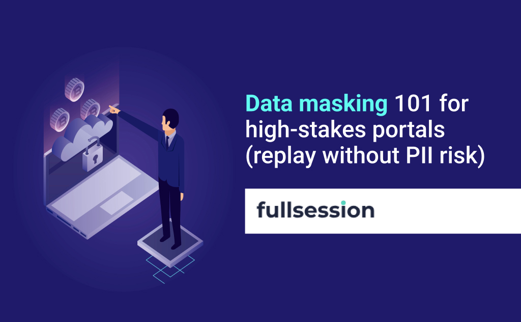
Governance and privacy for session-level CX analytics
In high-stakes journeys, trust and access control matter as much as insight speed.
If your team is considering session replay or form-level behavior data, governance is not optional. Minimize what you capture. Mask sensitive fields. Limit access by role. Set retention limits that match policy. Document the use case and keep it tied to completion and service quality.
For a starting point on governance controls and privacy language, reference the Safety & Security page
Decision rule: capture less, but capture the right moments
If a field could be sensitive, do not record it. Instead, record the interaction context around it: step name, validation state, error code, time-to-complete, and whether the user abandoned after that state change. You still get diagnostic power without expanding PII exposure.
How to evaluate CX analytics tooling for high-stakes journeys
Tooling matters when it changes speed, rigor, and governance at the same time.
The goal is not “more features.” It is faster, safer decisions that hold up under review.
- Can it connect behavior evidence to specific funnel steps and cohorts?
- Can it surface errors and failures in-context, not in a separate logging tool?
- Can non-technical teams investigate without creating tickets for every question?
- Can it meet privacy requirements, including masking and retention?
If your current stack cannot do the above, you keep paying the tax of slow diagnosis and unverified fixes.
When to use FullSession for task and journey completion
FullSession is useful when you need evidence you can act on, not just scores.
FullSession is a privacy-first, behavior analytics platform that helps digital product teams explain and improve completion in high-stakes journeys.
Use FullSession when you need to identify the exact step where qualified users fail to complete, see the interaction evidence behind drop-off (including replay and error context), and turn findings into a short backlog you can verify.
If your focus is high-stakes forms and applications, start with the High-Stakes Forms solution. If governance is a gating factor, review Safety & Security. If you want to see the workflow end-to-end on your own flows, get a demo.
FAQs
These are the questions teams ask when they are trying to operationalize CX analytics.
What is the difference between customer experience analytics and behavior analytics?
Customer experience analytics is the broader practice of explaining experience outcomes using multiple signals. Behavior analytics is one signal type focused on what users do in the product. In high-stakes journeys, behavior evidence is often the fastest path to diagnosing why completion fails.
Which CX metrics matter most for high-stakes journeys?
Completion rate is the anchor metric, but it needs context. Pair it with step conversion rates, error rates, and time-to-complete so you can explain movement. Add satisfaction metrics only after you can localize the failure mode.
How do I prove a CX change actually improved completion rate?
Use a pre/post comparison with controls. At minimum, compare matched cohorts and adjust for channel mix and seasonality. If you can, run an experiment or phased rollout so you have a clean counterfactual.
What data sources should I combine for customer experience analytics?
Start with three: behavioral sessions, feedback, and operational events. The value comes from joining them to the same journey window, not from collecting more categories. Add call logs, chat transcripts, or CRM data only if it will change decisions.
How do I avoid survey bias and misleading sentiment scores?
Treat surveys and sentiment as directional, not definitive. Check response rates by segment and watch for channel shifts that change who responds. When sentiment and behavior disagree, trust behavior to locate the problem, then use feedback to understand expectations.
Is session replay safe for regulated or sensitive journeys?
It can be, but only with deliberate controls. Mask sensitive fields, restrict access, and set retention limits. Validate the setup with security and compliance stakeholders using a reference like Safety & Security.

Roman Mohren is CEO of FullSession, a privacy-first UX analytics platform offering session replay, interactive heatmaps, conversion funnels, error insights, and in-app feedback. He directly leads Product, Sales, and Customer Success, owning the full customer journey from first touch to long-term outcomes. With 25+ years in B2B SaaS, spanning venture- and PE-backed startups, public software companies, and his own ventures, Roman has built and scaled revenue teams, designed go-to-market systems, and led organizations through every growth stage from first dollar to eight-figure ARR. He writes from hands-on operator experience about UX diagnosis, conversion optimization, user onboarding, and turning behavioral data into measurable business impact.