When a UX bug hits a high-traffic flow, stakeholders ask the same question: ‘How much revenue is this costing us?’ (here’s how to measure ROI of UX improvements). Most answers fall into “blog math” (single-number guesses with weak attribution). This guide shows a defensible, auditable method to estimate revenue at risk (RaR) from specific UX bugs-with ranges, segment breakdowns, and a validation plan you can use before reporting the number.
You’ll leave with:
A step-by-step framework (exposure → counterfactual → delta → revenue at risk)
A sensitivity model (ranges, not one number)
A validation menu (A/B, holdouts, diff-in-diff, matched cohorts)
Operational thresholds (SLA/triage rules)
What “revenue at risk” means for UX bugs
Revenue at risk is the revenue you likely failed to capture because users were exposed to a bug, compared to what would have happened if they weren’t exposed (your counterfactual).
This is different from the general “cost of poor UX.” Bugs are usually:
Time-bounded (introduced at a known time, fixed/rolled back later)
Segment-skewed (browser/device/geo specific)
Measurable via exposure (error event, affected UI state, failing action)
That makes them ideal candidates for cohort-based impact measurement.
The 6-step measurement framework (snippet-friendly)
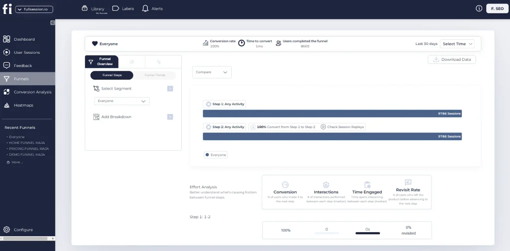
Define bug exposure (who was affected and when)
Choose one primary KPI for the impacted flow (e.g., RPV, purchase conversion)
Build a counterfactual (unexposed cohort or control segment)
Compute delta (exposed vs unexposed) and convert it to revenue at risk
Stability (does the effect persist across slices?)
Step 6 – Validate the estimate (pick a standard, then report)
Most “revenue at risk” content mentions validation but doesn’t tell you how. Here’s the practical menu.
Validation decision table
Method
When to use
What you get
Common pitfalls
A/B test (feature flag)
You can gate fix/bug safely
Strong causal estimate + CI
Contamination if exposure leaks
Holdout (5–10%)
Need quick evidence, can tolerate small risk
Directional causal proof
Too small sample if low traffic
Diff-in-diff
Clean control segment exists (e.g., only Safari affected)
Strong quasi-causal estimate
Control group not comparable
Controlled before/after
You have a clear launch + fix time
Fast read on impact
Seasonality/campaign mix
Matched cohort
No experiments; you can match key covariates
Fastest feasible
Hidden confounders, selection bias
A simple validation standard (copy/paste)
We estimate revenue at risk at ₹X–₹Y over [time window] based on [exposure definition] and [counterfactual method]. We validated the estimate using [A/B/holdout/diff-in-diff], observed a consistent effect across [key segments], and the main residual risks are [seasonality/campaign mix/sample size].
Guardrails – Avoid double-counting across funnel, churn, and support
A common mistake is stacking multiple “cost buckets” that overlap.
Double-counting traps
Counting lost purchases and future churn for the same users (without proving incremental churn beyond the lost purchase)
Adding support costs that are simply correlated with fewer conversions
Summing funnel stage drop-offs that are already captured by final purchase conversion
Guardrail rule
Pick one top-line outcome (RPV or purchase conversion) as your primary estimate.
Add secondary buckets only if you can show they’re incremental and non-overlapping (e.g., support contacts among users who still purchased).
Turn revenue at risk into triage: thresholds, SLAs, and what to do next
Checkout blocked OR RaR_per_hour above your rollback threshold
Rollback / disable feature immediately
P1
High exposure + high RaR_per_day + high confidence
Hotfix within 24–48h
P2
Segment-limited impact or medium confidence
Fix next sprint, monitor
P3
Low RaR or low confidence
Backlog; improve instrumentation first
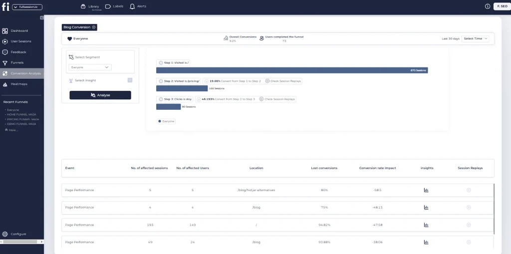
Worked example (with ranges + validation)
Bug: On mobile Safari, “Pay Now” button intermittently fails (no redirect). Window: 12 hours (from release to mitigation). Exposure definition: users who reached payment step and saw JS exception event. Exposed sessions (E): 35,000 Counterfactual: diff-in-diff using mobile Chrome as control + pre-period baseline
Option 1: Conversion-based estimate
Conv_unexposed (expected): 3.2%
Conv_exposed (observed): 2.6%
ΔConv: 0.6pp (0.3pp–0.8pp plausible range)
AOV: ₹2,400
RaR_incident (range)
Low: 0.003 × 35,000 × 2,400 = ₹252,000
High: 0.008 × 35,000 × 2,400 = ₹672,000
RaR_per_hour (12 hours)
₹21,000–₹56,000 per hour
Validation plan
Roll forward fix behind a feature flag for 24 hours
Run a 5% holdout (unfixed) on Safari only
Compare purchase conversion; report CI + segment consistency
Do the estimate, then validate before you share it
Use a simple revenue-at-risk model to prioritize the next bug fix, then validate it with a lightweight test or cohort comparison before you report it to stakeholders.
If you want, paste:
the flow (e.g., checkout/payment),
your exposure definition,
exposed sessions,
and either RPV or conversion+AOV,
…and I’ll turn it into a filled worksheet with a sensitivity range + a recommended validation method based on your constraints.
FAQ’s
1) What’s the difference between “cost of poor UX” and “revenue at risk from a UX bug”?
Cost of poor UX is broad (design debt, friction, trust, churn over time). Revenue at risk from a bug is narrower and more measurable: a time-bounded incident with a clear exposure definition (who encountered the bug) and a counterfactual (what would’ve happened if they hadn’t).
2) What’s the simplest credible way to calculate revenue at risk?
Use an exposed vs unexposed comparison and one primary KPI:
Roman Mohren is CEO of FullSession, a privacy-first UX analytics platform offering session replay, interactive heatmaps, conversion funnels, error insights, and in-app feedback. He directly leads Product, Sales, and Customer Success, owning the full customer journey from first touch to long-term outcomes. With 25+ years in B2B SaaS, spanning venture- and PE-backed startups, public software companies, and his own ventures, Roman has built and scaled revenue teams, designed go-to-market systems, and led organizations through every growth stage from first dollar to eight-figure ARR. He writes from hands-on operator experience about UX diagnosis, conversion optimization, user onboarding, and turning behavioral data into measurable business impact.
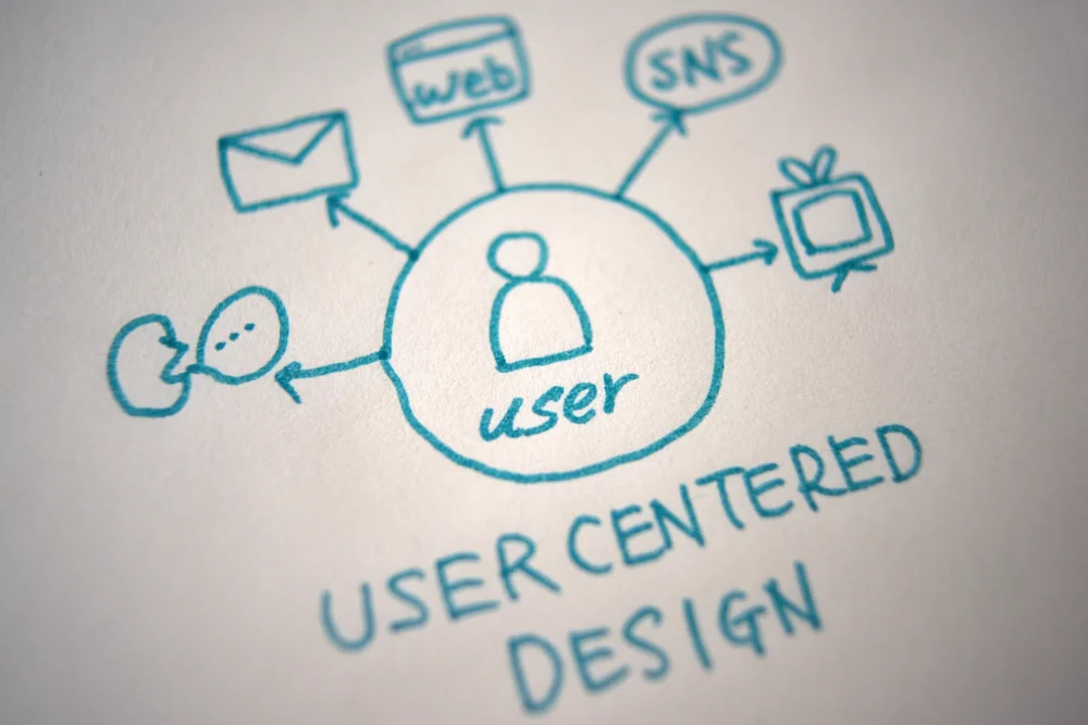
Most activation work fails for a simple reason: teams can see what happened, but not why it happened. UX analytics is the bridge between your numbers and the experience that created them.
Definition box: What is UX analytics?
UX analytics is the practice of using behavioral signals (what people do and struggle with) to explain user outcomes and guide product decisions. Unlike basic reporting, UX analytics ties experience evidence to a specific product question, then checks whether a change actually improved the outcome.
UX analytics is not “more metrics”
If you treat UX analytics as another dashboard, you will get more charts and the same debates.
Product analytics answers questions like “How many users completed onboarding?” UX analytics helps you answer “Where did they get stuck, what did they try next, and what confusion did we introduce?”
A typical failure mode is when activation drops, and the team argues about copy, pricing, or user quality because nobody has shared evidence of what users actually experienced. UX analytics reduces that ambiguity by adding behavioral context to your activation funnel.
If you cannot describe the friction in plain language, you are not ready to design the fix.
The UX analytics decision loop that prevents random acts of shipping
A tight loop keeps you honest. It also keeps scope under control.
Here is a workflow PMs can use for activation problems:
Write the decision you need to make. Example: “Should we simplify step 2 or add guidance?”
Define the activation moment. Example: “User successfully connects a data source and sees first value.”
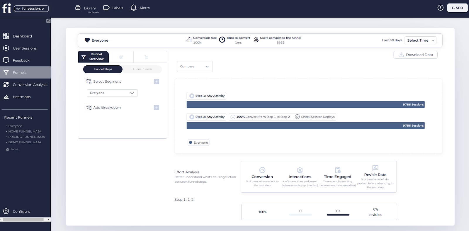
Map the path and the drop-off. Use a funnel view to locate where activation fails.
Pull experience evidence for that step.Session replays, heatmaps, and error signals show what the user tried and what blocked them.
Generate 2 to 3 plausible causes. Keep them concrete: unclear affordance, hidden requirement, unexpected validation rule.
Pick the smallest change that tests the cause. Avoid redesigning the entire onboarding unless the evidence demands it.
Validate with the right measure. Do not only watch activation rate. Watch leading indicators tied to the change.
Decide, document, and move on. Ship, revert, or iterate, but do not leave outcomes ambiguous.
One constraint to accept early: you will never have perfect certainty. Your goal is to reduce the risk of shipping the wrong fix, not to prove a single “root cause” forever.
The UX signals that explain activation problems
Activation friction is usually local. One step, one screen, one interaction pattern.
UX analytics is strongest when it surfaces signals like these:
Rage clicks and repeated attempts: users are trying to make something work, and failing.
Backtracking and loop behavior: users bounce between two steps because the system did not clarify what to do next.
Form abandonment and validation errors: users hit requirements late and give up.
Dead clicks and mis-taps: users click elements that look interactive but are not.
Latency and UI stalls: users wait, assume it failed, and retry or leave.
This is where “behavioral context over raw metrics” matters. A 12% drop in activation is not actionable by itself. A pattern like “40% of users fail on step 2 after triggering a hidden error state” is actionable.
A prioritization framework PMs can use without getting stuck in debate
Teams often struggle because everything looks important. UX analytics helps you rank work by decision value.
Use this simple scoring approach for activation issues:
Impact: how close is this step to the activation moment, and how many users hit it?
Confidence: do you have consistent behavioral evidence, or just a hunch?
Effort: can you test a narrow change in days, not weeks?
Risk: will a change break expectations for existing users or partners?
Then pick the top one that is high-impact and testable.A realistic trade-off: the highest impact issue may not be the easiest fix, and the easiest fix may not matter. If you cannot test the high-impact issue quickly, run a smaller test that improves clarity and reduces obvious failure behavior while you plan the larger change.
How to validate outcomes without fooling yourself
The SERP content often says “track before and after,” but that is not enough.
Here are validation patterns that hold up in real product teams:
Use leading indicators that match the friction you removed. If you changed copy on a permission step, track:
Time to complete that step
Error rate or retry rate on that step
Completion rate of the next step (to catch downstream confusion)
Run a holdout or staged rollout when possible. If you cannot, at least compare cohorts with similar acquisition sources and intent. Also watch for “false wins,” like increased step completion but higher support contacts or worse quality signals later.
A typical failure mode is measuring success only at the top KPI (activation) while the change simply shifts users to a different kind of failure. Validation should prove that users experienced less friction, not just that the funnel number moved.
How UX insights get used across a SaaS org
UX analytics becomes more valuable when multiple teams can act on the same evidence.
PMs use it to decide what to fix first and how narrow a test should be. Designers use it to see whether the interface communicates the intended action without extra explanation. Growth teams use it to align onboarding messages with what users actually do in-product. Support teams use it to identify recurring confusion patterns and close the loop back to the product.
Cross-functional alignment is not about inviting everyone to the dashboard. It is about sharing the same few clips, step-level evidence, and a crisp statement of what you believe is happening.
When to use FullSession for activation work
Activation improvements need context, not just counts.
Use FullSession when you are trying to:
Identify the exact step where activation breaks and what users do instead
Connect funnel drop-off to real interaction evidence, like clicks, errors, and retries
Validate whether an experience change reduced friction in the intended moment
Give product, design, growth, and support a shared view of user struggle
If your immediate goal is PLG activation, start by exploring the PLG activation workflow and real-world examples to understand how users reach their first value moment. When you’re ready to map the user journey and quantify drop-offs, move to the funnels and conversions hub to analyze behavior and optimize conversions.
Explore UX analytics as a decision tool, not a reporting task. If you want to see how teams apply this to onboarding, request a demo or start a trial based on your workflow.
FAQs
What is the difference between UX analytics and product analytics?
Product analytics focuses on events and outcomes. UX analytics adds experience evidence that explains those outcomes, especially friction and confusion patterns.
Do I need session replay for UX analytics?
Not always, but you do need some behavioral context. Replays, heatmaps, and error signals are common ways teams get that context when activation issues are hard to diagnose.If you can only pick one, RPV is often the better north star because it captures both conversion and order value. Still track CVR and AOV to understand what is driving changes in RPV.
What should I track for activation beyond a single activation rate?
Track step-level completion, time-to-first-value, retry rates, validation errors, and leading indicators tied to the change you shipped.
How do I avoid analysis paralysis with UX analytics?
Start with one product question, one funnel step, and one hypothesis you can test. Avoid turning the work into a “collect everything” exercise.
How many sessions do I need before trusting what I see?
There is no universal number. Look for repeated patterns across different users and sources, then validate with step-level metrics and a controlled rollout if possible.
Can UX analytics replace user research?
No. UX analytics shows what happened and where users struggled. Research explains motivations, expectations, and language. The strongest teams use both.
Roman Mohren is CEO of FullSession, a privacy-first UX analytics platform offering session replay, interactive heatmaps, conversion funnels, error insights, and in-app feedback. He directly leads Product, Sales, and Customer Success, owning the full customer journey from first touch to long-term outcomes. With 25+ years in B2B SaaS, spanning venture- and PE-backed startups, public software companies, and his own ventures, Roman has built and scaled revenue teams, designed go-to-market systems, and led organizations through every growth stage from first dollar to eight-figure ARR. He writes from hands-on operator experience about UX diagnosis, conversion optimization, user onboarding, and turning behavioral data into measurable business impact.
How to Choose a Session Replay Tool (And When to Pick FullSession)
You already have session replay somewhere in your stack. The real question is whether it’s giving product and engineering what they need to cut MTTR and lift activation—or just generating a backlog of videos no one has time to watch. This guide walks through how to choose the right session replay tool for a SaaS product team and when it’s worth moving to a consolidated behavior analytics platform like FullSession session replay.
Why session replay choice matters for SaaS product teams
When onboarding stalls or a release quietly breaks a core flow, you see it in the metrics first: activation drops, support tickets spike, incidents linger longer than they should.
Funnels and dashboards tell you that something is broken. Session replay is how you see how it breaks:
Where users hesitate or rage click.
Which fields they abandon in signup or setup.
What errors show up just before they give up.
For a Head of Product or Senior PM, the right session replay tool is one of the few levers that can impact both MTTR (mean time to resolution) and activation rate at the same time: it shortens debug loops for engineering and makes it obvious which friction to tackle next in key journeys.
The catch: “session replay” covers everything from simple browser plugins to full user behavior analytics platforms. Picking the wrong category is how teams end up with grainy, hard-to-search videos and no clear link to outcomes.
The main types of session replay tools you’ll encounter
Lightweight session replay plugins
These are often:
Easy to install (copy-paste a snippet or add a plugin).
Cheap or bundled with another tool.
Fine for occasional UX reviews or early-stage products.
But they tend to fall down when:
You need to filter by specific errors, user traits, or funnel steps.
Your app is a modern SPA with complex navigation and dynamic modals.
You’re debugging production incidents instead of just UI polish.
You end up “hunting” through replays to find one that matches the bug or metric you care about.
Legacy session replay tools
These tools were built when replay itself was novel. They can provide detailed timelines, but often:
Live in a separate silo from your funnels, heatmaps, and feedback.
Are heavy to implement and maintain.
Aren’t optimized for the way product-led SaaS teams work today.
Teams keep them because “we’ve always had this tool,” but struggle to tie them to activation or engineering workflows.
Consolidated user behavior analytics platforms (like FullSession)
A consolidated platform combines session replay, interactive heatmaps, funnels, and often in-app feedback and error-linked replays in one place.
The goal isn’t just to watch sessions; it’s to:
Jump from a KPI change (activation drop, error spike) directly into the affected sessions.
See behavior patterns (scroll depth, clicks, hesitations) in context.
Close the loop by validating whether a fix actually improved the journey.
If you’re responsible for MTTR and activation across multiple journeys, this category is usually where you want to be.
Evaluation criteria: how to choose a session replay tool for SaaS
Here’s a practical checklist you can use in vendor conversations and internal debates.
Depth and quality of replay
Questions to ask:
Does it accurately handle SPAs, virtual DOM updates, and client-side routing?
Can you see user input, clicks, hovers, and page states without everything looking like a blurry video?
How easy is it to search for a specific session (e.g., a user ID, account, or experiment variant)?
Why it matters: shallow or glitchy replays make it hard to diagnose subtle friction in onboarding or aha flows. You want enough detail to see layout shifts, field-level behavior, and timing—not just a screen recording.
Error-linked replays and technical signals
This is where the “session replay vs user behavior analytics” distinction shows up.
Look for tools that:
Link frontend errors and performance issues directly to replays.
Show console logs and network requests alongside the timeline.
Make it easy for engineers to jump from an alert or error ID to the exact failing session.
In a platform like FullSession, error-linked replays mean MTTR drops because engineering isn’t trying to reproduce the bug from a vague Jira ticket—they can watch the failing session complete with technical context.
Performance impact and safeguards
Any session replay tool adds some overhead. You want to know:
How it handles sampling (can you tune what you capture and at what volume?).
What protections exist for CPU, memory, and bandwidth.
How it behaves under load for high-traffic releases or spikes.
Practical test: have engineering review the SDK and run it in a staging environment under realistic load. A good tool makes it straightforward to tune capture and know what you’re paying for in performance terms.
Privacy controls and governance
Especially important if:
You capture PII during signup or billing.
You serve enterprise customers with strict data policies.
You’re evolving towards more regulated use cases.
You should be able to:
Mask or block sensitive fields by default (credit cards, passwords, notes).
Configure rules per form, path, or app area.
Control who can view what (role-based access) and have an audit trail of access and changes.
Platforms like FullSession session replay are designed to be governance-friendly: you see behavior where it matters without exposing data you shouldn’t.
Integration with funnels, heatmaps, and in-app feedback
You don’t want replay floating on its own island.
Check for:
Funnels that link directly to sessions at each step.
Heatmaps that show where users click or scroll before dropping.
In-app feedback that anchors replays (“Something broke here”) to user comments.
This is often the biggest difference between a basic session replay tool and a user behavior analytics platform. With FullSession, for example, you can go from “activation dipped on step 3 of onboarding” in funnels, to a heatmap of that step, to specific replays that show what went wrong.
Team workflows and collaboration
Finally, think about how teams will actually use it:
Can product managers and UX designers quickly bookmark, comment, or share sessions?
Can support link directly to a user’s last session when escalating a ticket?
Does engineering have the technical detail they need without jumping between tools?
If the tool doesn’t fit into your workflow, adoption will stall after the initial rollout.
Basic plugin vs consolidated platform: quick comparison
Basic session replay plugin vs consolidated behavior analytics platform
Integrated funnels, heatmaps, feedback, and replays
Fit for MTTR + activation goals
OK for ad-hoc UX reviews
Designed for product + eng teams owning core KPIs
Use this as a sanity check: if you’re trying to own MTTR and activation, you’re usually in the right-hand column.
When a consolidated behavior analytics platform makes more sense
You’ve probably outgrown a basic session replay tool if:
You’re regularly sharing replays in incident channels to debug production issues.
Product and growth teams want to connect activation drops to specific behaviors, not just rewatch random sessions.
You have multiple tools for funnels, heatmaps, NPS/feedback, and replay, and nobody trusts the full picture.
In those situations, a consolidated platform like FullSession does three things:
Connects metrics to behavior
You start from onboarding or activation KPIs and click directly into the sessions behind them.
Shortens debug loops with error-linked replays
Engineers can go from alert → error → replay with console/network logs in one place.
Makes it easier to prove impact
After you ship a fix, you can see whether activation, completion, or error rates actually changed, without exporting data across tools.
If your current tool only supports casual UX reviews, but the conversations in your org are about MTTR, uptime, and growth, you’re a better fit for a consolidated behavior analytics platform.
What switching session replay tools actually looks like
Switching tools sounds scary, but in practice it usually means changing instrumentation and workflows, not migrating mountains of historical UX data.
A realistic outline:
Add the new SDK/snippet
Install the FullSession snippet or SDK in your web app.
Start in staging and one low-risk production segment (e.g., internal users or a subset of accounts).
Configure masking and capture rules
Work with security/compliance to define which fields to mask or block.
Set up environment rules (staging vs production) and any path-specific policies.
Run side-by-side for a short period
Keep the existing replay tool running while you validate performance and coverage.
Have engineering compare replays for the same journeys to build confidence.
Roll out to product, engineering, and support
Show PMs how to jump from funnels and activation metrics into sessions.
Show engineers how to use error-linked replays and technical context.
Give support a simple workflow for pulling a user’s last session on escalation.
Turn down the old tool
Once teams are consistently using the new platform and you’ve validated performance and privacy, you can reduce or remove the legacy tool.
At no point do you need to “migrate session replay data.” Old replays remain in the legacy tool for reference; new journeys are captured in FullSession.
Who should choose what: decision guide for product teams
If you’re making the call across multiple stakeholders, this framing helps:
Stay on a basic session replay plugin if:
Your app surface is small and relatively simple.
You run occasional UX reviews but don’t rely on replay for incidents or activation work.
You’re more constrained by budget than by MTTR or activation targets.
Move to a consolidated behavior analytics platform like FullSession if:
You own activation and retention targets for complex onboarding or core flows.
Engineering needs faster context to troubleshoot production issues.
You’re tired of juggling separate tools for funnels, heatmaps, and replay.
You need better privacy controls than your current plugin provides.
For most mid-sized and enterprise SaaS teams with PLG or hybrid motions, the second description is closer to reality—which is why they standardize on a consolidated platform.
Risks of switching (and how to reduce them)
Any stack change carries risk. The good news: with session replay, most of those risks are manageable with a simple plan.
Risk: Temporary blind spots
Mitigation: run tools in parallel for at least one full release cycle. Validate that key journeys and segments are properly captured before turning the old tool off.
Risk: Performance issues
Mitigation: start with conservative capture rules in FullSession, test under load in staging, and gradually widen coverage after engineering sign-off.
Risk: Privacy or compliance gaps
Mitigation: configure masking and blocking with security/compliance before full rollout. Use environment-specific settings and review them periodically as journeys change.
Risk: Team adoption stalls
Mitigation: anchor training in real problems: a recent incident, a known onboarding drop-off, a noisy support issue. Show how FullSession session replay plus error-linked replays solved it faster than the old workflow.
Handled this way, switching is less “rip and replace” and more “standardize on the tool that actually fits how your teams work.”
FAQs: choosing a session replay tool
1. What’s the difference between session replay and a full user behavior analytics platform?
Session replay shows individual user journeys as recordings. A user behavior analytics platform combines replay with funnels, heatmaps, error-linking, and feedback so you can see both patterns and examples. FullSession is in the latter category: it’s designed to help you connect metrics like activation and MTTR to real behavior, not just watch videos.
2. How do I evaluate session replay tools for MTTR specifically?
Look for error-linked replays, console/network visibility, and tight integration with your alerting or error tracking. Engineers should be able to go from an incident to the failing sessions in one or two clicks. If that’s clunky or missing, MTTR will stay high no matter how nice the replay UI looks.
3. Do session replay tools hurt web app performance?
Any client-side capture adds some overhead, but good tools give you sampling and configuration controls to manage it. Test in staging with realistic load, and work with engineering to tune capture. Platforms like FullSession are built to be low-overhead and let you selectively capture the journeys that matter most.
4. How should we handle privacy and PII in session replay?
Start by identifying sensitive fields and flows (e.g., billing, security answers, internal notes). Choose a tool that supports masking and blocking at the field and path level, then default to masking anything you don’t need to see. In FullSession, you can configure these rules so teams get behavioral insight without exposing raw PII.
5. Is it worth paying more for a consolidated platform if we already have basic replay?
If replay is a nice-to-have, a plugin may be fine. If you’re using it to debug incidents, argue for roadmap changes, or prove activation improvements, the cost of staying fragmented can be higher than the license fee. Consolidating into a platform like FullSession saves time across product, eng, and support—and that’s usually where the real ROI sits.
6. How long does it take to switch session replay tools?
Practically, teams can add a new SDK, configure masking, and run side-by-side within days, then roll out more widely over a release or two. The slower part is shifting habits: making the new tool the default place product and engineering go for behavioral context. Anchoring adoption in real incidents and activation problems speeds that up.
7. Can we start small with FullSession before standardizing?
Yes. Many teams start by instrumenting one or two critical journeys—often signup/onboarding and the first aha moment. Once they see faster MTTR and clearer activation insights on those paths, it’s easier to make the case to roll FullSession out more broadly.
Next steps: evaluate FullSession for your product stack
If your current session replay setup only gives you occasional UX insights, but your responsibilities include MTTR and activation across complex web journeys, it’s time to look at a consolidated platform.
Start by instrumenting one high-impact journey—usually onboarding or the first aha flow—with FullSession session replay and error-linked replays. Then run it side-by-side with your existing tool for a release cycle and ask a simple question: which tool actually helped you ship a fix faster or argue for a roadmap change?
If you want to see this on your own stack, get a FullSession demo and walk through a recent incident or activation drop with the team. If you’re ready to try it hands-on, head to the pricing page to start a free trial and instrument one key journey end to end.
Roman Mohren is CEO of FullSession, a privacy-first UX analytics platform offering session replay, interactive heatmaps, conversion funnels, error insights, and in-app feedback. He directly leads Product, Sales, and Customer Success, owning the full customer journey from first touch to long-term outcomes. With 25+ years in B2B SaaS, spanning venture- and PE-backed startups, public software companies, and his own ventures, Roman has built and scaled revenue teams, designed go-to-market systems, and led organizations through every growth stage from first dollar to eight-figure ARR. He writes from hands-on operator experience about UX diagnosis, conversion optimization, user onboarding, and turning behavioral data into measurable business impact.
A UX audit can make or break your website. It’s a deep dive into how users are using your site so you can find the problems and solutions. A UX audit looks at your whole website experience, from how people use it to how your site looks.
You can see what’s working and what’s not. It leads to happier users, more people staying on your site and more sales. It’s like giving your website a health check-up to ensure it’s in top shape for visitors.
UX audits aren’t just for big companies. If you have a website, you can benefit from one. You’ll be surprised at what you learn about how people are using your site and where they get stuck.
However, to conduct a UX audit, you need to take proper steps and use an advanced UX analytics tool like FullSession. It helps you systematically evaluate your website’s user experience, identify pain points, and develop actionable insights to improve overall usability.
This article will explain how UX audit helps you create a more user-friendly, engaging, and effective website and show how to use FullSession for this purpose.
A UX audit is a health check for your website or app looking for user pain points. You can supplement Google Analytics data and see where users get stuck or confused. The goal is to make your site easier and more fun to use.
Successful UX audit helps you:
Find parts that aren’t working well
See what users like and don’t like
Come up with ideas to fix issues
You might do a user experience audit when:
Your website isn’t getting the results you want
You’re making big changes
You want to stay ahead of the competition
A good UX audit process looks at:
How easy it is to use your site
Can people find what they need
Whether your design looks good
If your site performs well on mobile devices
UX testing can make your digital product work better for your visitors. It leads to happier users and better business results.
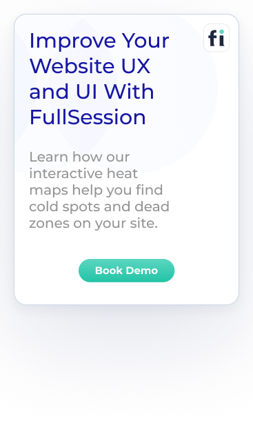
Improve Your Website UX and UI
Learn how to visualize, analyze, and optimize your site with FullSession.
UX audits can really boost your website’s performance. They help you find and fix problems that might be bugging your users. Let’s look at some key ways UX audits can make your site better.
Improved user satisfaction and retention
UX audits help you create a positive user experience. When you fix usability issues, your visitors will be happier. They’ll find what they need more easily and enjoy using your site.
Happy users are more likely to come back. They might even tell their friends about your great site. This word-of-mouth can bring in new visitors.
UX audits can also help you spot trends in user behavior. You can use this info to make your site even better. For example, you might find that users love a certain feature. You could then make that feature more prominent.
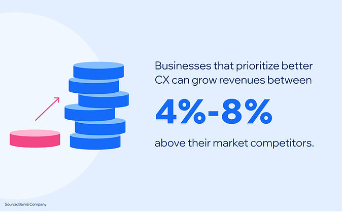
Increased conversion rates and ROI
A good user experience can lead to more sales or sign-ups. When your site is easy to use, visitors are more likely to become customers.
UX audits can help you find and fix issues in your sales funnel. Maybe there’s a confusing step that’s causing people to leave. Or perhaps your call-to-action buttons aren’t clear enough.
By fixing these issues, you can boost your conversion rates. It means more bang for your buck from your website. Your marketing efforts will be more effective, too.
Remember, even minor fixes can make a big difference. A tiny boost in conversions can mean a lot more revenue over time.
Improved brand reputation and credibility
A well-designed site shows you care about your users. It makes your brand look professional and trustworthy. UX audits help you create a site that’s appealing and works well. It can set you apart from competitors with clunky or outdated sites.
A good user experience can also lead to better search engine rankings. Search engines like Google pay attention to how users interact with your site. If people stick around and engage, your site might rank higher.
Higher rankings mean greater visibility for your business. It can lead to more traffic and more potential customers finding you online.
Turn User Behavior into Growth Opportunities
Learn how to visualize and analyze all user interactions in one intuitive dashboard.
Preparation is key to a successful UX audit. You’ll need to set clear goals, gather the right team and collect important data. This groundwork will make your audit more valuable.
Define the audit scope and objectives
Start by setting clear goals for your UX audit. Ask yourself what you want to learn about your site. Do you want to increase sales, get more signups or make your site easier to use?
Write down your business objectives. It will help you stay on track during the audit.
Think about your target audience. Who are they? What do they need from your site? Knowing this will help you focus on the right areas.
Set a time frame for your audit. Decide which parts of your site you’ll look at. It could be the whole site or just key pages.
Gathering your UX audit team
Get a team with different skills. You might need designers, developers and marketing people. Each brings a different perspective to the audit.
Choose a team leader. This person will keep everyone on track and make sure the audit runs smoothly. Think about bringing in outside help, too. A fresh pair of eyes will spot things you might miss.
Make sure everyone knows their role. Clear tasks will help the audit run smoothly. Set up regular check-ins. It will keep everyone in the loop and solve problems fast.
Collecting data and resources
Gather data from various sources. Use Google Analytics to see how people use your site. Look at page views and bounce rates.
Do user surveys to get feedback. Ask people what they like and dislike about your site.
Set up user interviews. It will give you deep insights into how people use your site.
Look at customer support logs. They will show you common issues people have on your site.
Get information on your competitors. See what they do well and where they fail.
Make sure you have access to all areas of your website. It includes backend systems and design files.
Knowing your users is key to a great website. You need to know who they are and how they use your site. It will help you make informed design and feature decisions.
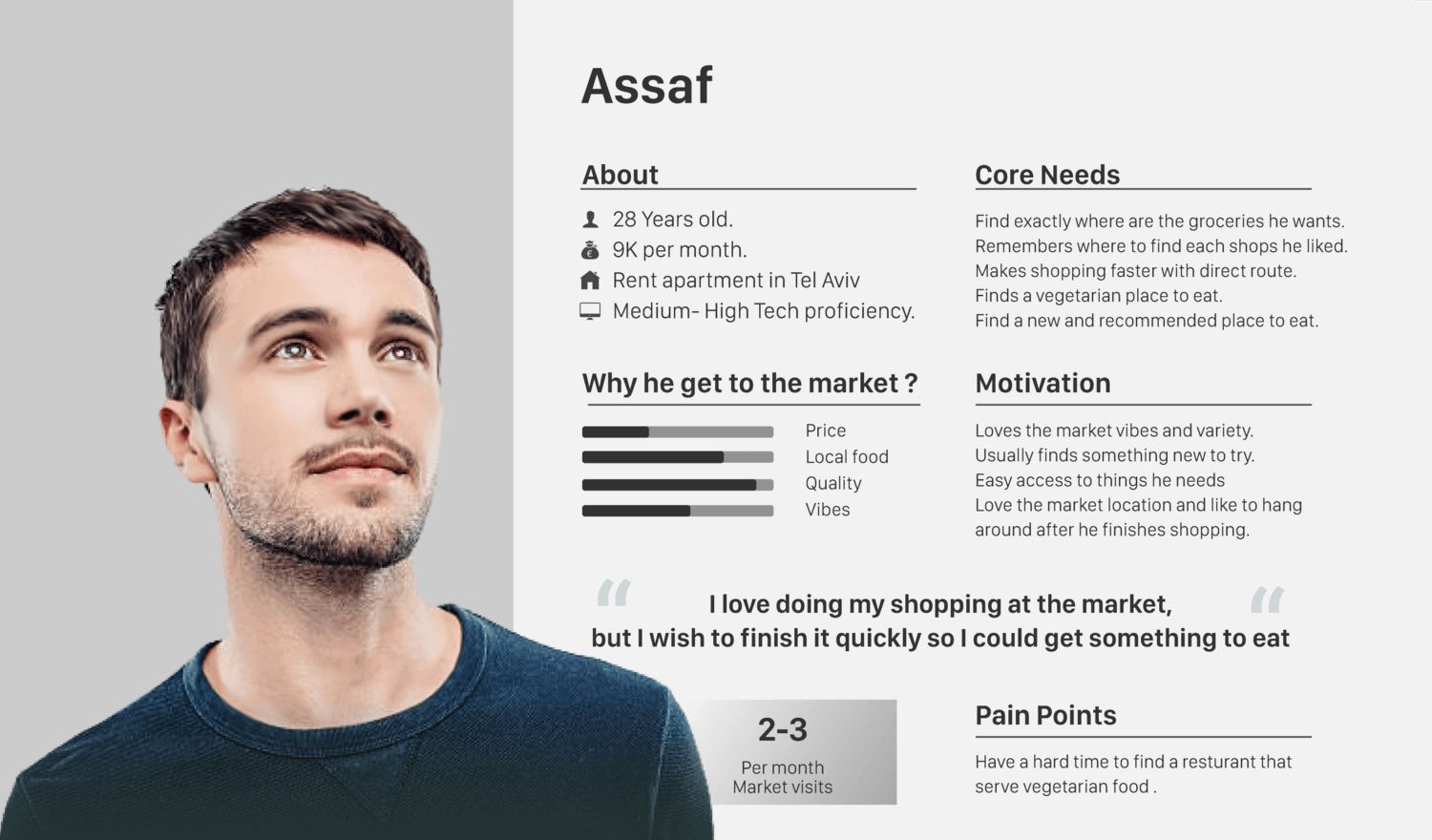
Creating user personas
User personas are like characters that represent your typical users. They help you see your site through your users’ eyes. To create good personas:
Collect real data from surveys and interviews
Look for common patterns and behaviors
Give each persona a name and backstory
Your personas should include details like age, job, goals and frustrations. It will make them feel real. With solid personas and a thorough UX audit, you can make better design decisions that fit your actual users.
Note what they’re thinking and feeling at each point
Look for parts of the journey that are frustrating or take too long. These are areas you can improve. A smooth journey keeps users happy and gets them to their goals faster.
Implementing User Behavior Analytics With FullSession
If you want to improve your website’s user experience, user behavior analytics can help you significantly.
FullSession provides the user behavior tools to observe how people use your site, visualize and analyze their interactions and optimize your UX, UI and website performance based on the insights.
With FullSession user experience analysis, you can see what visitors do on your pages and all the issues they encounter in the journey. It includes how they navigate your site, where they click, how far they scroll and what they ignore.
These real user monitoring tools will help you spot problems you might have missed using traditional analytics tools that provide only raw data.
The dashboard will give you a complete view of user behavior data. You’ll see trends and patterns over time and use these findings to make informed changes to your site.
Remember, your site is for your visitors. With FullSession’s behavioral analysis software, you can make it better for them while protecting their privacy and data security, thanks to our GDPR, CCPA, and PCI compliance.
Analyze User Behavior in Real-Time
Learn how to detect and fix website issues before they affect your customer experience.
FullSession has the tools to help you do a proper UX audit. Its features will show how users use your site and how to improve it.
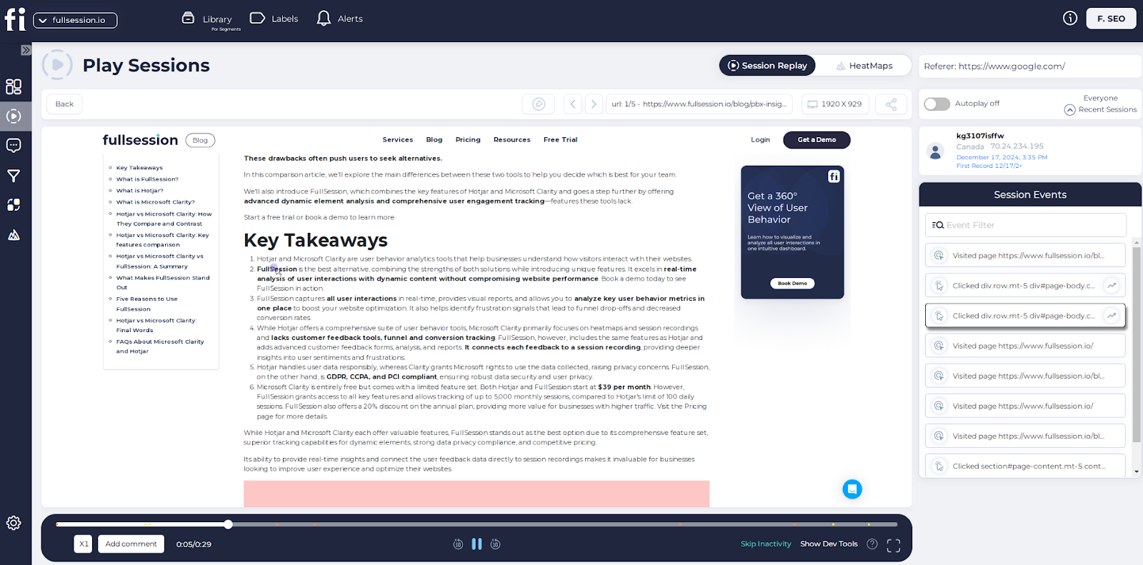
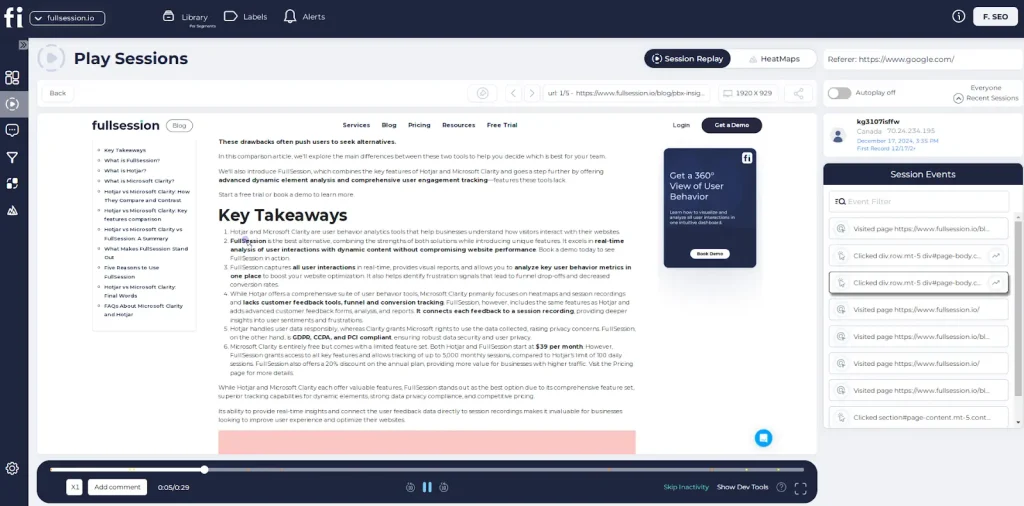
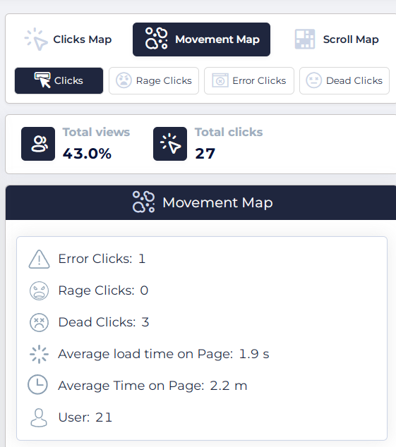
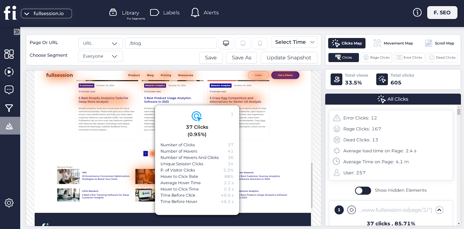
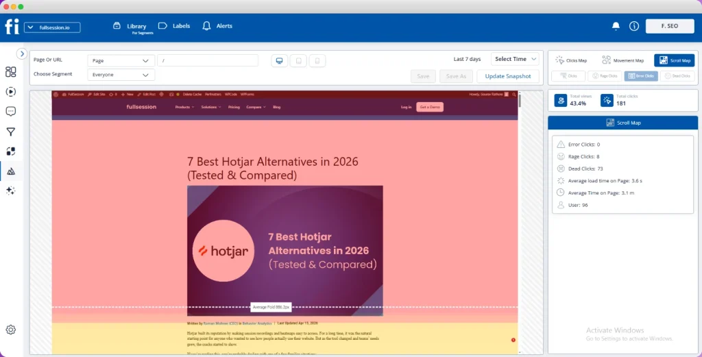
Session recordings and replays
FullSession’s session recordings will give you a front-row seat to user engagement. You can watch how people use your site in real time. It will help you spot issues faster.
Observe real-time user behavior with individual web pages
Identify scrolling patterns, rage clicks, and popular content areas
Detect broken links, bugs, and usability issues
Track time spent on pages and overall user trends
Monitor marketing campaign performance
Session recordings will capture all interactions. But don’t worry – they will keep sensitive data private. You can search for specific actions or user types to focus on what matters most.
By replaying sessions, you can see exactly where users get stuck. It will help you find and fix issues quickly. You’ll also see patterns in how people use your site, which will give you ideas for improvements.
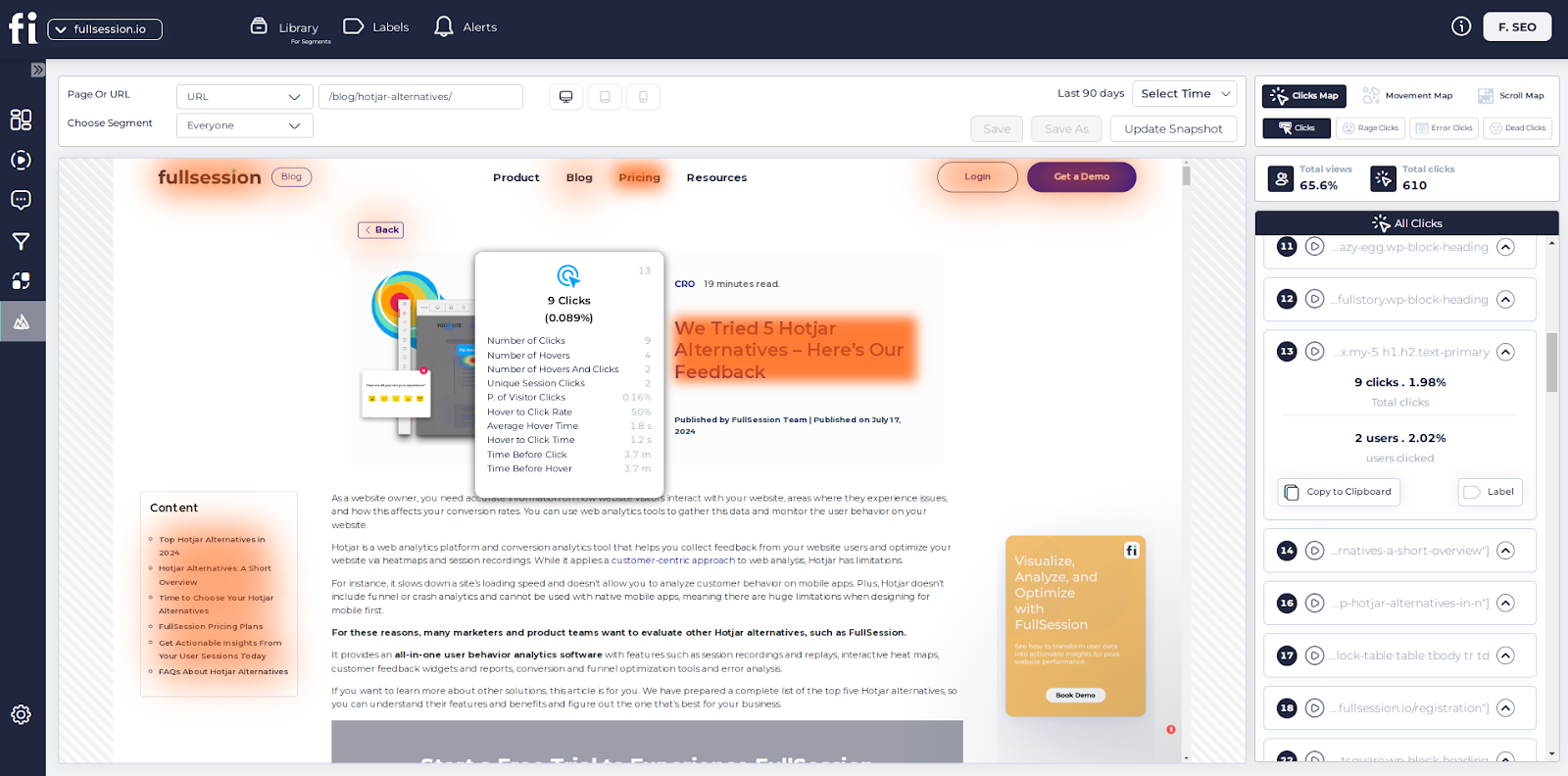
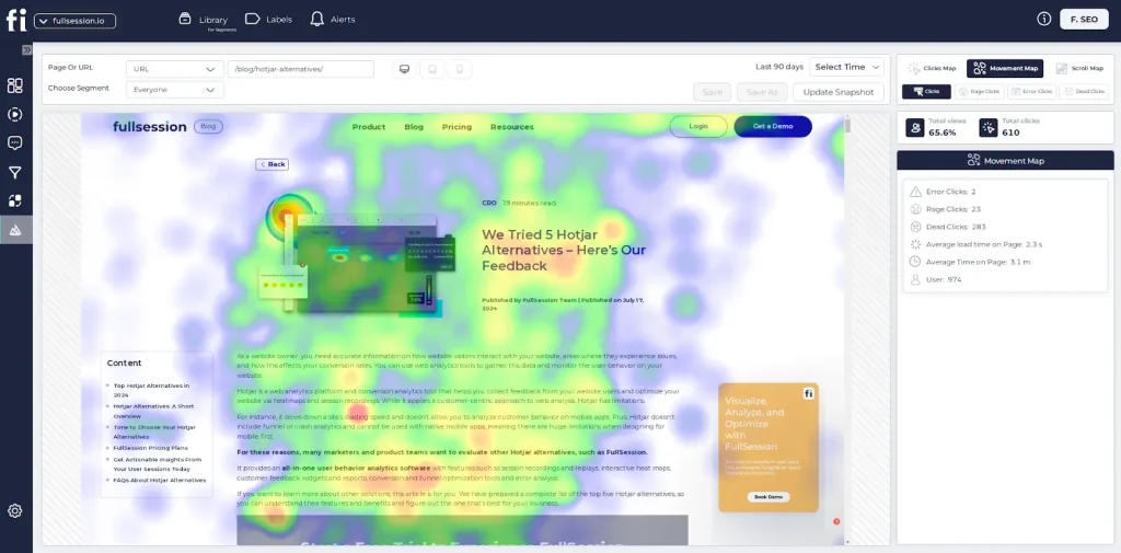
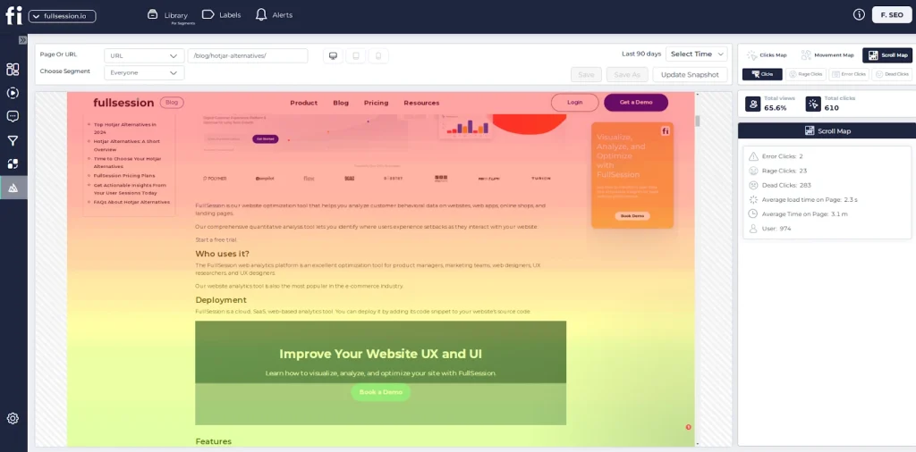
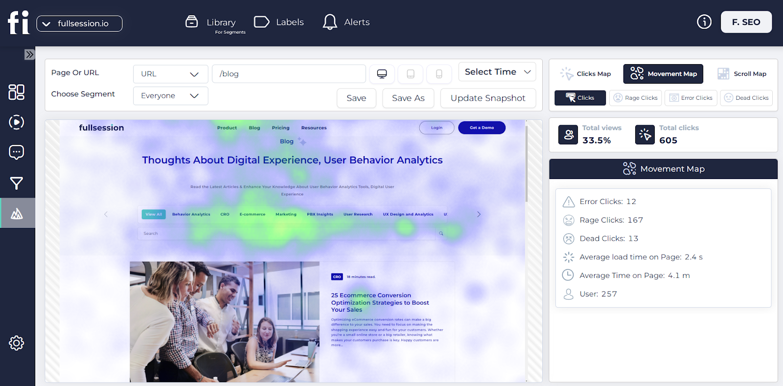
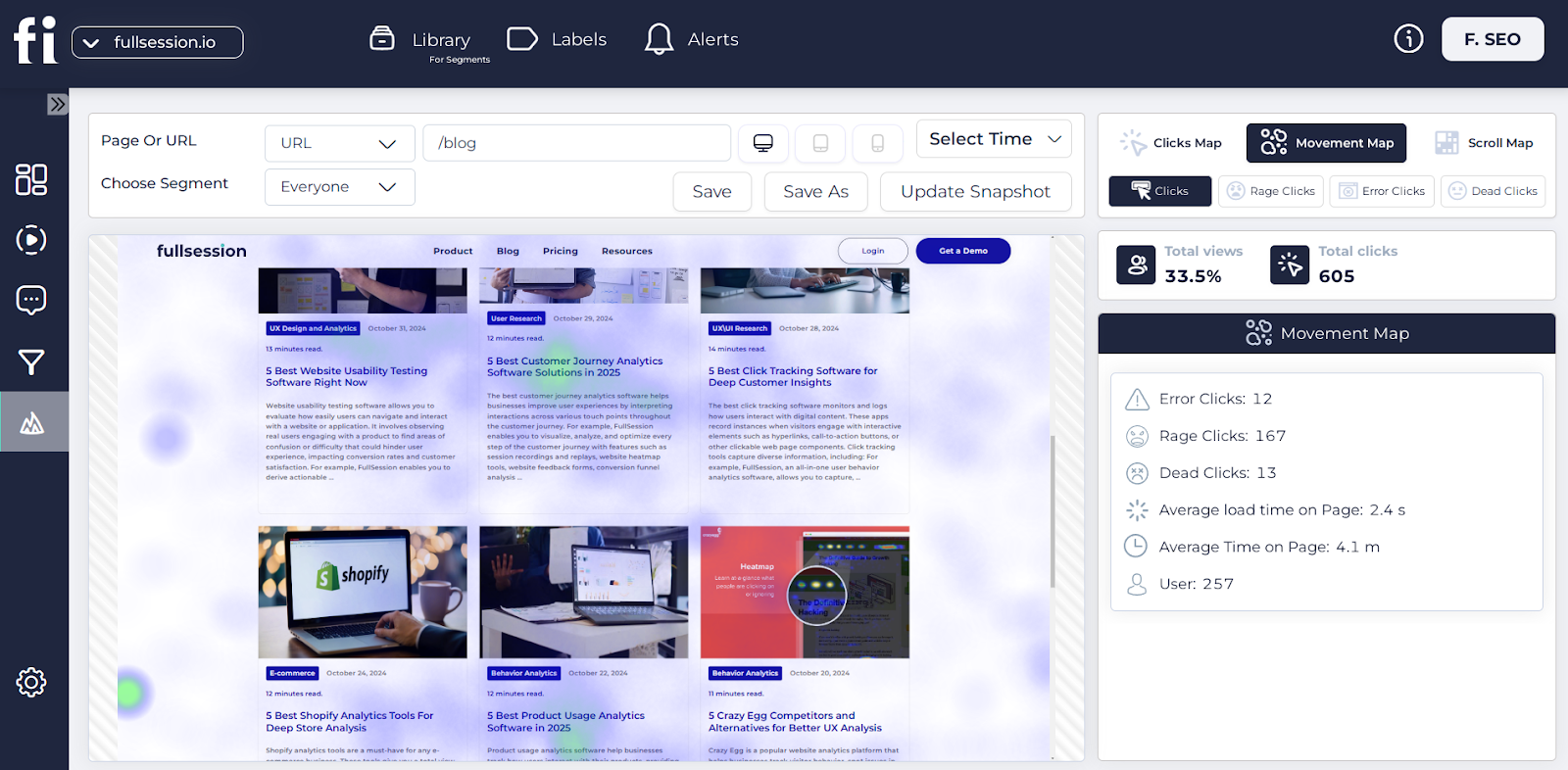
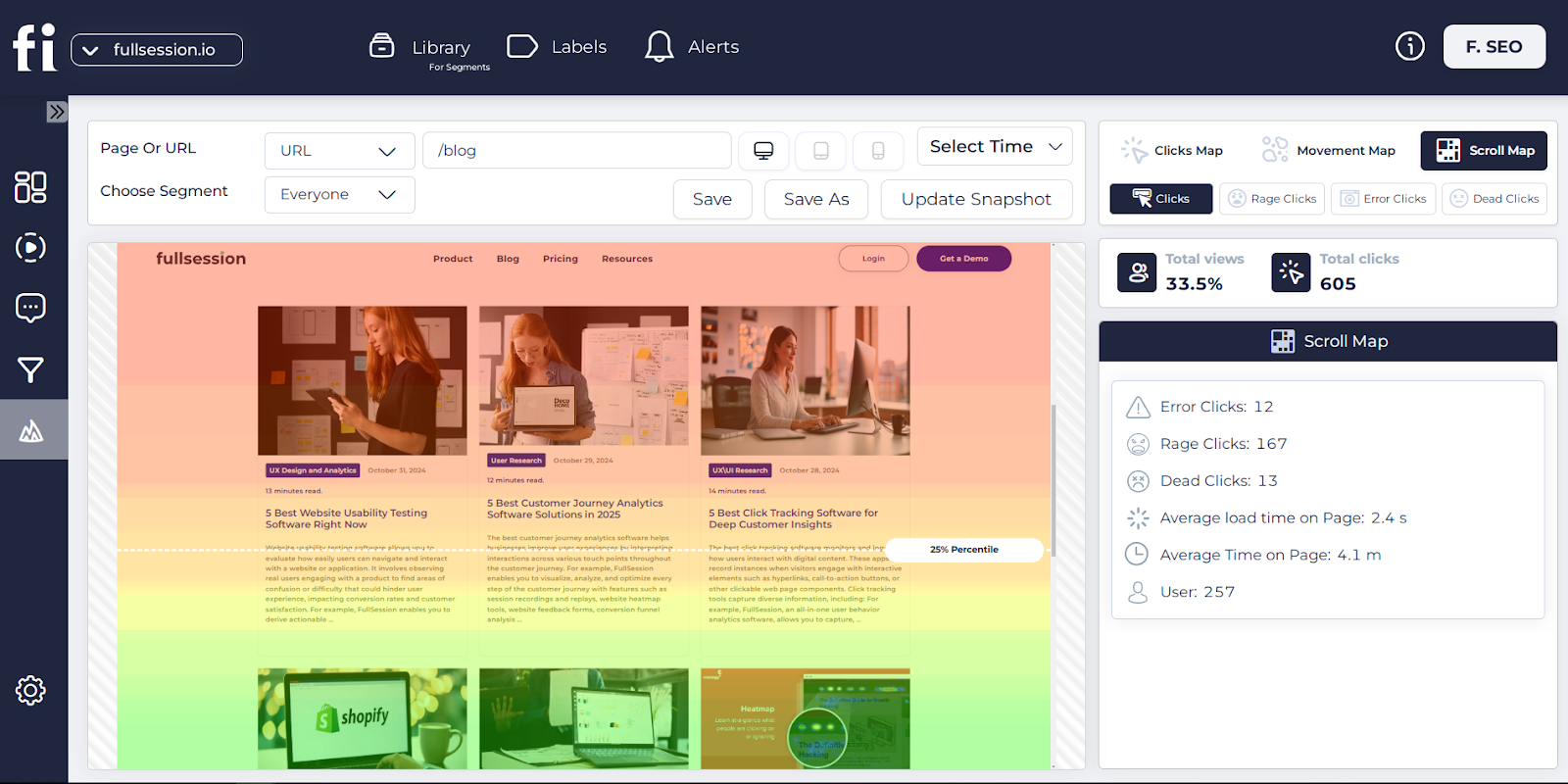
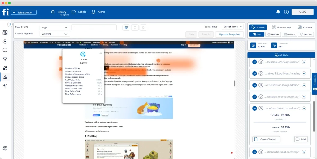
Dynamic heatmaps
FullSession’s dynamic heatmaps provide real-time data. You can switch between different types of heatmaps:
These UX research tools will help you see your site’s popular areas and ignored parts. You can use this analysis to place important content where users will see it most.
The best part is that FullSession’s heatmaps won’t slow down your site. You get fast insights without hurting your page speed.
Website feedback forms
Want to know what users really think? FullSession’s feedback forms let you ask them.
You can create custom forms to match your brand’s look, define questions, choose devices for collecting user input and set up triggers to activate these forms.
The best part? You can watch the user’s session recording along with their feedback. It will give you context for their comments and help you understand their experience better.
Use this to guide your UX changes. When users feel heard, they’ll stick around longer.
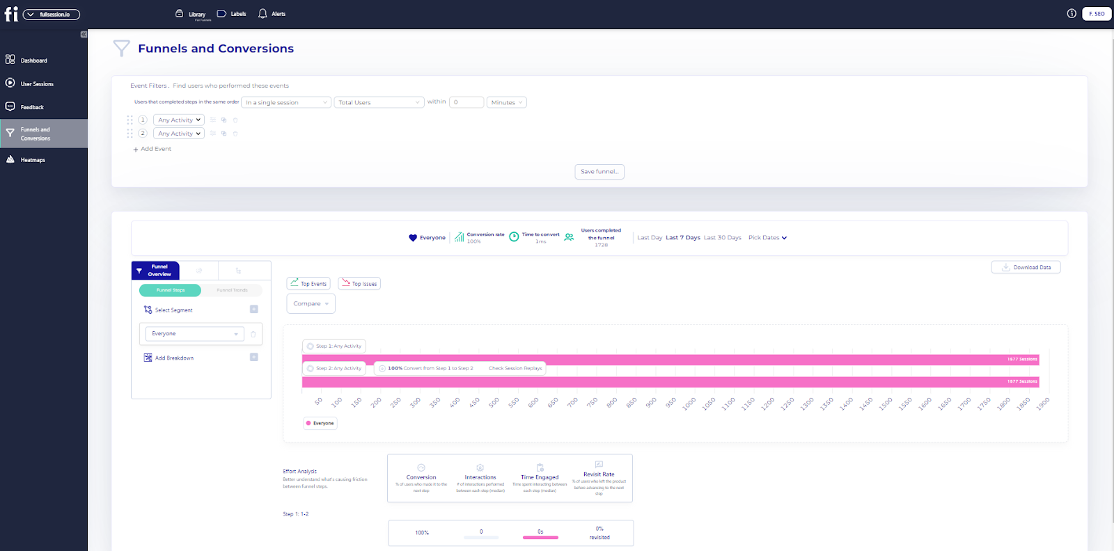
Conversion funnel analysis
FullSession will track users through your sales funnels. You can see where they drop off and why.
It will show you:
Funnel steps: Visualize user progression and drop-off rates.
Funnel trends: Monitor changes in user flows over time.
Top events: Identify key actions boosting conversions.
Top issues: Detect and fix conversion obstacles.
Time engaged: Measure interaction time to spot frustration points.
Revisit rate: Track exits before advancement.
Segment analysis: Compare performance across user groups.
Time period comparison: Analyze trends over different periods.
You can test different designs to see what works best. You’ll see hard data on what helps users complete key actions.
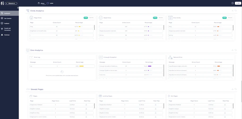
Error tracking
Nothing kills user experience like errors. FullSession will automatically detect issues on your site, such as:
JavaScript errors
Network problems
Console errors
Failed API calls
Uncaught exceptions
Error logs and trends
You’ll see which errors happen most often and how they affect users. The tool will show you the user’s journey before and after an error occurs.
It will help you fix issues fast. You’ll know exactly what went wrong and can prevent it from happening again. You’ll keep users happy and your site running smoothly by catching and eliminating errors quickly.
Maximize Your Conversion Rate With FullSession
See how our CRO tools help you improve website performance to drive conversions.
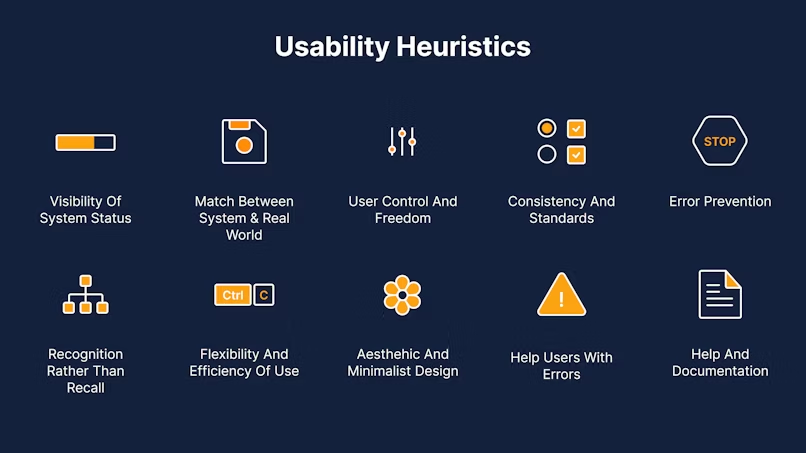
Start your UX audit with a heuristic evaluation. It means checking your site against a set of usability guidelines. These guidelines will help you spot common problems.
You can use Jakob Nielsen’s 10 usability heuristics. They cover:
Is your site’s status clear?
Does it match the real world?
Do users have control?
Is it consistent?
Then, do some usability testing. Watch real users try your site. Ask them to do common tasks. Note where they get stuck or confused.
Usability testing will show you real problems users face. They’ll often find issues you’d miss. Try to test with 5-8 users for best results.
Analyzing site information architecture and navigation
Your site’s look is a big part of the user experience. Check if your visual design is clear and user-friendly. Look at your colour scheme. Does it match your brand? Is there enough contrast for readability?
Check your fonts. Are they readable? Do they fit your brand style? Look at images and icons. Do they help explain things? Are they high-resolution?
Make sure your design is consistent across all pages. It will help users feel comfortable as they move through your site.
Don’t forget responsive design. Does your site look good on phones and tablets? It is key for user experience.
Good content is a big part of user experience. It’s what users come to your site for. Check if your content is clear and easy to understand. Is it jargon-free?
Look at your headings and subheadings. Do they help users scan the page? Are they descriptive?
Check for outdated info. Old or inaccurate content will frustrate users. Make sure everything is up to date.
See if your content matches user needs. Does it answer common questions? Is it useful?
Also, check your calls to action. Are they clear? Do they guide users to the next step?
An accessible site is suitable for all users. It’s also required by law in many places.
Check your colour contrast. Is text readable against backgrounds? Tools like WebAIM can help with this. Look at your alt text for images. Does it describe images well for screen readers?
Check if your site works only with a keyboard. Can users navigate without a mouse? Test with screen readers. How well does your site work for visually impaired users?
Look at your forms. Are they clearly labelled? Do error messages make sense?
Remember, an accessible site is a better site for everyone. It’s worth the effort to get it right.
A UX audit will help find problems that frustrate your site’s users. Let’s look at some of the common areas where issues arise.
Navigation and wayfinding
Is your site easy to navigate? Users should be able to find what they need without getting lost. Check if your menu makes sense and if the links are clear.
Look for:
Confusing menu labels
Too many options that overwhelm visitors
No search function
Broken links that go nowhere
Use a site map to see how pages connect. It will help you see where users might get stuck.
Content readability and clarity issues
Your words matter! Hard-to-read text will repel users. Look out for:
Long blocks of text without breaks
Tiny font sizes
Poor contrast between text and background
Jargon or complex language
Try reading your content out loud. If you stumble, so will your users. Use short paragraphs and bullet points to make it easy to scan.
Mobile responsiveness issues
More people are browsing on phones than ever. Your site needs to work on small screens. Look for:
Text that’s too small to read
Buttons that are hard to tap
Images that don’t fit the screen
Forms that are hard to fill out on mobile
Test your site on different devices. What looks good on a computer might not work on a phone.
Page load speed and performance issues
Slow sites are user pain points that will drive users away. Look for:
Large image files that take ages to load
Too many ads slowing things down
Clunky code that slows the site down
Plugins that add unnecessary weight
Use speed test tools to see how fast your pages load. Aim for under 3 seconds to keep users happy.
A UX audit report helps you collate your findings and plan changes. You’ll learn how to structure your report, prioritize issues and present data visually.
Structuring your findings and recommendations
Start by grouping your results into sections. It will make your UX audit report easier to read. Use sections like navigation, content and design.
For each issue, add:
A clear description of the problem
Why it’s a problem for users
How to fix it
Use bullet points or numbered lists to break up complex information. It will help readers quickly get the key points.
Add screenshots or screen recordings to show exactly where the problems are. Visuals make your report more compelling.
Prioritizing issues and suggested fixes
Not all issues are created equal. Rank problems by:
How much do they affect users
How easy they are to fix
How they impact business goals
You can use a simple scale:
High priority: Fix now
Medium priority: Fix soon
Low priority: Nice to have
Create a table to show priorities clearly:
Issue
Priority
Effort
Impact
Slow load time
High
Medium
High
Confusing menu
Medium
Low
Medium
It helps decision-makers focus on what matters most.
Presenting data visually for maximum impact
Graphs and charts make data easy to read at a glance. Use them to show:
User test results
Survey responses
Website analytics
Pie charts are good for percentages. Bar graphs are good for comparisons. Actionable recommendations become clearer with before-and-after mockups. Show how your suggested changes will look.
Make sure to explain each visual. A short caption will provide context and key points.
Implementing UX Audit Recommendations
Turning your UX audit findings into actual changes is key. You’ll need a plan, a team and a way to measure results.
Creating an action plan
Start by listing all the issues from your audit. Group them by priority and how easy they are to fix. It will help you focus on what matters most.
Set specific goals for each change. Maybe you want to increase sign ups or reduce customer service calls. Having goals will help you measure success later.
Make a timeline for each task. Be realistic about how long it will take. Don’t forget to include testing time.
Use a simple table to track progress. It will keep everyone on the same page and motivated.
Collaborating with stakeholders and developers
Get everyone involved early. Share your audit findings and action plan with the team. This will help build buy-in for the changes.
Meet with developers to discuss technical requirements. They may find issues you didn’t or have ideas to make fixes easier. Work with designers to create mockups of UX improvements. Visuals help everyone understand the goal.
Set up regular check-ins. This keeps the project moving and lets you solve problems fast.
Don’t forget to loop in customer service and sales teams. They talk to users daily and have valuable insights.
Measuring the impact of changes
Choose your key metrics before you start making changes. These might be page views, time on site or conversion rates.
Use tools like FullSession to track these numbers. Set up dashboards so you can see changes at a glance. Do user testing after each big change. It will give you direct feedback on how your fixes are working.
Compare your metrics before and after the changes. Look for trends over time, not just spikes. Be prepared to adjust if the results aren’t what you expected. UX is a never-ending process.
Don’t forget to celebrate with your team. Seeing results will keep everyone motivated to keep improving.
UX Audit Best Practices to Follow
To get the most out of your UX audit, follow these tips:
Don’t be personal: Look at your site with new eyes. Try to see it as a new user would.
Use data to back it up: Support your findings with numbers. It will make your recommendations stronger.
Get multiple perspectives: Ask others for their opinion. It will give you a broader view of how users see your site.
Combine analytics with user feedback: Look at what users do and what they say. It will give you the full picture.
Use metrics and observations: Track numbers and watch how people use your site. It will help you understand the why behind the data.
Triangulate data sources: Use multiple ways to gather info. It will make your findings more robust.
Schedule audits regularly: Don’t just do one audit. Make it a habit to keep your site in shape.
Track changes over time: See how your site is improving. It will show the value of your work.
Adapt to changing user needs: User requirements change, and so should your site. Be flexible and ready to adjust.
By following these best practices, you’ll get more out of your UX audits. It will mean a better site for users to visit.
A user-centric workplace requires everyone’s effort. It means putting users first in every decision and always trying to improve their experience.
Educating teams on the importance of UX
Start by teaching your teams why UX matters. Show them how good UX can increase conversion rates and brand reputation. Use real examples of how UX has helped other companies.
Set up training sessions to cover UX 101. Get experts to talk about user research and design thinking. Make these sessions fun and hands-on.
Create a UX library with books and online resources. Encourage team members to share UX articles and case studies. It will keep everyone learning and growing.
Integrating UX principles into product development
Make UX part of your product process. Start each project with user research to understand needs and pain points. Create user personas to guide decisions.
Use tools like wireframes and prototypes to test ideas early. It will save time and money by catching issues before full development.
Do UX reviews of your products regularly. Look for ways to improve based on user feedback and data. Make small changes often rather than big overhauls.
Encouraging ongoing user feedback and iteration
Set up ways to get constant user input. Use surveys, feedback forms, and user testing sessions. Pay attention to customer support issues as they often reveal UX problems.
Create a system to track and act on user feedback. Share insights with all teams so everyone knows what users need.
Test new features with real users before the full launch. Be ready to change based on what you learn. Celebrate when user feedback leads to changes.
Remember, building a user-centric culture takes time. Stay patient and keep working at it. Your users will reward you with loyalty and positive reviews.
Conclusion About UX Audit
A UX audit is a great way to evaluate and improve the user experience of a digital product or service. It’s a systematic look at the user interface, interaction design and overall usability. By doing a UX audit, you can find pain points, usability issues and areas for improvement in your digital offerings.
The methods and depth of a UX audit will differ depending on the project scope and resources but common elements include heuristic evaluation, user testing, analytics review and competitive analysis. The findings from a UX audit will give you actionable recommendations to improve the user experience.
When it comes to doing a proper UX audit, you need the right tools. FullSession is the best user behavior analytics software for UX professionals and teams to streamline their audits and get valuable insights.
Get a 360° View of User Behavior
Discover why top brands trust our user behavior analytics software.
Let’s answer the most common questions about user experience audit.
What is a UX audit?
A UX audit is a deep dive into your website or app. It looks at how easy it is to use. It finds problems and makes things better. A UX audit will improve user experience and make your site work.
What is a UX content audit?
A UX content audit looks at the words and information on your site. It checks if your content is clear, helpful and findable. It makes sure your text matches what users need and want.
How much to charge for a UX audit?
The cost of a UX audit can vary greatly. It depends on the size of your site and how deep you want to go. Small audits will cost a few hundred dollars. Big, detailed audits will cost thousands. Talk to a few experts to get an idea of the cost of your project.
What is the difference between UX audit and UX research?
UX audits and UX research are related but different. An audit looks at your existing site to find problems. UX research is wider. It can include talking to users, watching them use your site and testing new ideas. Research will help you know your users better.
Picture this: It’s 2026, and your digital product is a seamless extension of your users’ lives. Frustration? Gone. Confusion? A thing of the past. Engagement? Through the roof.
It isn’t a far-fetched dream—it’s the potential reality of user experience optimization done right.
But let’s be real: Users are flooded with options, their attention spans are shrinking, and their expectations are high.
You’re probably asking yourself: How do I cut through the noise? How do I not just meet but exceed user expectations? And most importantly, how do I turn casual browsers into loyal customers?
To help you answer these questions, in this post, we’ll explore the latest user experience optimization strategies to help you make your site user-friendly and engaging, increase user interaction with your digital products and prevent users from bouncing off before conversion.
Improve Your Website UX and UI
Learn how to visualize, analyze, and optimize your site with FullSession.
User experience optimization means creating a smooth interaction between users and digital products. It’s about optimizing website interfaces and digital content to improve usability and customer satisfaction.
Key aspects of user experience optimization
User experience optimization involves several key areas. By focusing on design, usability, and accessibility, you ensure that your digital product meets user needs.
It’s an ongoing process that involves regular testing and updates to keep the user interaction smooth and the website user experience optimal.
Principles of UX design
UX design principles are about usability, intuitiveness and engagement.
A usable design means users can achieve their goals quickly. Intuitive interfaces make navigation instinctive and reduce cognitive load.
Engagement happens when users find the site enjoyable and value-adding. These principles inform creating a customer experience that feels natural and rewarding.
Keeping these principles in mind helps to improve user experience across all touchpoints, making the site functional and entertaining.
Lean UX vs Agile UX
Lean UX and Agile UX are the two design methodologies that stand out.
Lean UX is about minimal deliverables and rapid iteration based on real-time user feedback. It’s about getting ideas out quickly to see what sticks with users.
Agile UX, on the other hand, integrates the flexibility of agile development. It requires cross-functional collaboration to enable continuous testing and adaptation.
By combining design work with agile practices, you can align the development process with user needs and improve the overall user experience.
The Role of User Behavior in User Experience Optimization
User experience optimization starts with understanding how users interact with products or services. Focusing on user psychology and cognitive load helps you improve how users perceive and interact with your offerings.
User psychology and behavior
Understanding how users think and behave is key to creating intuitive designs. You need to find patterns in user behavior and preferences. That means studying how the target audience feels when using a product. Get insights by observing real users to see what they like and avoid.
Surveys and interviews can give you feedback. These tools help you to understand what users care about. Pay attention to how users perceive visual elements like colors and layouts. It can have a big impact on how users interact with your platform.
Analyzing user behavior also means tracking how users move through your site or app. It will show you the most common paths and obstacles they hit before conversion. When you know the customer journey, you can optimize it to make it smoother.
The cognitive load in UX
Cognitive load refers to the mental effort required by users to complete tasks. Reducing this load is key to improving user experience. When your interface is too complex, users will get frustrated.
Simplifying navigation is a good starting point. Users can find what they need with clear labels and logical structure without extra effort. Use familiar icons and terminology to put users at ease and not overwhelm them.
A good way to manage cognitive load is to make information visually digestible. Break down content into small chunks and use formats like bullet points or tables. It makes it easier for users to process information. Observe real users to see where the load is too high and adjust accordingly.
Identifying UX Issues
UX testing is key to user happiness. You can test site usability and use user behavior analytics software like FullSession to find and fix user experience problems.
Conducting usability testing
Live usability testing is a practical way to see how real users interact with your design. You ask participants to complete tasks while you observe and take notes on any pain points.
During these tests, you’ll see if users struggle with navigation, forms or other elements. By noting where users get stuck or confused, you can find UX issues. It reveals problems and suggests fixes to make the product more user-friendly.
Use direct feedback from participants to understand user expectations and design shortcomings. This real-world insight is gold for creating an intuitive user experience.
Finding UX Issues with FullSession
FullSession is an advanced user behavior analytics platform that captures all visitor interactions and helps you visualize and analyze trends and patterns in their actions. It enables you to optimize your website’s interface, usability, experience and performance.
Our user-friendly dashboard lets you get a unified view of user behavior data. Go beyond basic statistics by observing live user interactions and mapping complete customer journeys.
Identify underperforming areas, experiment with various page components, confirm design improvements and improve your site’s overall user experience and efficiency.
Eliminate obstacles to conversion, optimize crucial stages in the user path, and reduce abandonment rates in your marketing and sales processes. Collect real-time user feedback, find the root causes of user dissatisfaction, and swiftly manage recurring problems with targeted solutions.
Our platform adheres to GDPR, CCPA, and PCI standards, protecting your users’ privacy and data security.
Implementing FullSession improves your ability to address poor user experience by providing concrete evidence of user struggles and successes.
Turn User Behavior into Growth Opportunities
Learn how to visualize and analyze all user interactions in one intuitive dashboard.
When you’re working on improving user experience, understanding user behavior is key. Two ways to do this are using quantitative data for insights and combining qualitative feedback.
Using quantitative data for UX insights
Quantitative data gives you clear metrics and patterns of user behavior. By tracking user actions, you can gather insights into click, bounce, and conversion rates. This data will show you where to improve your website.
Set specific goals and metrics so your data is actionable and relevant. Take note of user journey patterns, such as how long they stay on certain pages or the path they take through your site.
The best digital analytics tools can track behavioral data from multiple sources and give you a complete view of user engagement. It will inform changes to improve the user experience by addressing specific issues found through quantitative analysis.
Combining qualitative feedback with FullSession
While quantitative data is important, combining qualitative feedback adds more depth to your analysis. FullSession lets you add feedback forms directly to your website and capture user opinions and preferences in real time.
FullSession’s customer feedback tools allow you to ask users direct questions about their experience and gather insights into how users feel about your design and functionality.
This feedback, combined with session recordings and replays for additional context, will show you areas not visible in numbers, like navigation issues or content clarity.
Combining both data sources will give you a complete view of user behavior. This balanced perspective will help you make informed decisions to improve user experience.
Ask users to share their thoughts and make collecting feedback a continuous process.
Key User Experience Optimization Techniques
User experience analysis often involves multiple approaches to improve users’ interaction with a website or app. By simplifying user journeys, improving UI design and optimizing content accessibility, you can increase user engagement and conversion rates.
Simplifying user journeys
Simplifying user journeys makes it easy for visitors to get to your site and achieve their goals. Start by looking at your site’s current navigation paths with FullSession.
Use session recording tools to see where users spend time and what frustrates them. This user research allows you to:
Observe real-time user interactions with individual web pages
Identify scrolling patterns, rage clicks, and popular content areas
Advanced filters help you pinpoint critical events in user sessions, eliminating guesswork and providing actionable insights.
Consider a clear and simple menu and reduce the number of steps to complete a task.
Improving user interface (UI) design
The user interface design must be beautiful and functional. A good UI is about meeting user needs with clarity and style. Look at page layout, colour schemes and typography. These elements should all work together to create a user-friendly experience.
Website heatmap tools can help by showing you where users click most so you can focus on the most important bits. The goal is to remove obstacles and improve the path from entry to conversion.
FullSession’s UX heatmap tools offer visual reports of low and high-engagement areas on your web pages. These include:
Scroll maps: Analyze scroll depth across your site.
Click maps: Identify areas with the highest click rates.
You should be testing usability as part of your user experience optimization. Get real user interaction and improve based on feedback.
A tidy interface means better engagement and can directly impact conversion rates by making the site navigable and enjoyable.
Optimizing the path to conversions
Conversion funnel analysis is key when trying to improve the path to conversion. It means looking at the steps users take and their experience, from landing on your page to completing an action. Break each step down and see where users drop off.
FullSession can help you with this. Our advancedconversion funnel tracking features let you review the following:
Funnel steps: Visualize user progression and drop-off rates
Funnel trends: Monitor changes in user flows over time
Top events: Identify key actions boosting conversions
Top issues: Detect and fix conversion obstacles
Time engaged: Measure interaction time to spot frustration points
Revisit rate: Track exits before advancement
Segment analysis: Compare performance across user groups
Time period comparison: Analyze trends over different periods
Focus on the page elements that support user decisions, like strong CTAs and easy checkout. Make these steps clear and quick and you’ll increase your conversion rates and improve UX.
Removing website issues
Website errors can significantly impact user experience, often leading to frustration, decreased engagement, and potential loss of customers. FullSession’s error analysis feature lets you identify, analyze, and resolve issues that impact user experience. You can see:
Error clicks: Detect and fix non-responsive elements using session replays, improving interactivity.
Network errors: Monitor and analyze server request failures to ensure smooth data flow.
Console errors: Log and analyze JavaScript errors with session replays for quick debugging.
Error logs: Capture detailed error information to facilitate efficient troubleshooting.
Uncaught exceptions: Monitor and handle critical errors to prevent crashes and maintain app stability.
Error trends: Segment data and visualize error patterns over time for proactive problem-solving.
Alerts: Receive real-time notifications via Slack and customize alerts to stay informed of critical issues.
This feature helps you to:
Quickly identify and resolve user-facing issues
Improve website reliability and performance
Improve overall user satisfaction by minimizing disruptions
Prioritize fixes based on error frequency and impact
Streamline the debugging process with comprehensive error data
Using FullSession’s advanced dynamic element analysis ensures a reliable, error-free experience.
Analyze User Behavior in Real-Time
Learn how to detect and fix website issues before they affect your customer experience.
Making your content accessible means it can be consumed by all users, including those with disabilities. It means using a readable font size, providing text alternatives for images and making your site keyboard navigable.
When you make content accessible, you meet the law and expand your audience by ensuring everyone can interact with your site.
Using Engaging Content for Better UX
Create a positive user experience maintaining high-quality content. Dynamic and personalized content helps you keep users on your site longer and improve satisfaction and engagement.
Dynamic content for personalization
Dynamic content makes your site feel more responsive and tailored to each visitor. By using cross-platform compatibility, you ensure a frictionless experience on any device. Facial recognition or login info can customize what users see and make it more relevant.
Interactive elements like videos, quizzes or personalized product recommendations keep users engaged. This content adapts based on user interaction and creates a more interactive experience.
When users feel seen and valued through personalization, they will spend more time on your site and come back in the future.
Creating content that resonates
Creating content that connects with your audience starts with knowing what your users need and want. Survey your audience to find out what they’re interested in and what they like.
Like a clear content strategy, aligning your content to user expectations and needs is key to engagement.
Think about language and visual elements that speak to your audience’s sensibilities. For example, regional slang or local cultural references can make the content more relatable.
The balance between informative and entertaining content is key. Providing value while keeping it fun will keep users engaged and coming back for more.
Implementing and Testing UX Changes
When improving user experience, you need to make thoughtful changes and test them. By using iterative design and A/B testing, you can refine your product to meet user needs. These methods will help you create a better and more enjoyable customer experience.
Why iterative UX optimization works
Iterative design is a flexible approach that lets you adapt your product based on user feedback and testing. You make small changes, test and then adjust.
By iterating the UX optimization process, you can quickly find out what works and what doesn’t. It speeds up the user experience optimization process because you’re continually improving based on real user behaviour.
It’s like modelling clay – each tweak makes your design a little better. You learn and improve without making big, risky changes all at once.
A/B testing for user experience optimization success
A/B testing means comparing two versions of a page or app to see which one performs better. It’s a great way to test user response before making a big change.
Let’s say you have two versions of a page, A and B. You show version A to some users and version B to others. You then measure which version performs better: higher engagement, easier navigation, or more conversions.
A/B testing lets you make informed decisions to increase user satisfaction and engagement on your site or app.
Measuring User Experience Optimization Results
Knowing how your users interact with your digital product is key to a good user experience. You can measure success and improve where required by focusing on key performance indicators (KPIs) and user engagement metrics.
Defining UX key performance indicators (KPIs)
First, you need to define your KPIs. These are the metrics that directly relate to user satisfaction and engagement.
They often include task completion rates, which show how well users can complete actions on your site or app. When task completion rates are high, users find it intuitive.
Another KPI is the bounce rate. It measures how quickly users leave your site after arriving. A low bounce rate indicates a smooth user experience, which means your content or functionality is engaging.
Finally, consider user retention rates. High retention means users are returning often, which shows user loyalty. Review these KPIs regularly to see how your product is doing.
Tracking user engagement metrics
Tracking user engagement metrics gives you more insight into how users interact with your platform. User engagement covers a range of activities, including frequency of visits, interactions with certain features and time spent on your site.
Some of the key metrics include:
Active users: Track daily, weekly, and monthly active users to measure overall engagement trends.
Session duration: Measure users’ average time on your site per visit, pointing to content relevance and user interest.
Pages per session: Analyze how many pages users visit in a single session, showing navigation efficiency and content engagement.
User flow: Visualize common paths users take through your site, highlighting popular content and potential roadblocks.
Interaction rate: Track how often users engage with specific elements like buttons, forms, or menus.
Scroll depth: Measure how far users scroll down your pages, indicating content engagement and optimal placement of key information.
Return visitor rate: Assess how many users return to your site, a key indicator of overall user satisfaction and loyalty.
With detailed analytics, you can spot trends, see where users are struggling and where they’re succeeding, and improve your product’s user experience.
Optimizing User Experience Across Platforms
To have a seamless user experience you need to focus on designing responsive elements and improving performance across devices and platforms. This means different screen sizes, faster loading times and best practices.
Responsive design for mobile and web design
Responsive design is key when optimizing user experience for different devices. A flexible layout means your website can adapt to various screen sizes, so your content is always accessible and readable.
A mobile-friendly design improves usability so users can navigate their mobile devices easily. Follow Web Content Accessibility Guidelines to ensure your site is accessible to everyone.
A mobile-first approach is often effective as it prioritizes the most important features and simplifies interactions for a smoother experience.
Improving performance for multi-platform UX
When optimizing UX across platforms, speed is key. Use a Content Delivery Network (CDN) to cache content in different locations and reduce latency and load times. Fast pages keep users engaged and lower bounce rates.
Ensuring your digital platform performs across all devices also means optimizing images, compressing files and minimizing server requests.
Each improvement makes the mobile experience better, navigation quicker and more enjoyable. Prioritize these to improve overall user satisfaction regardless of device.
Maintaining a Positive User Experience
For a good user experience, focus on user-centric design, clear communication and ongoing guidance. These elements will lead to user satisfaction, trust, and more engagement with your product.
Prioritizing user-centric design
User-centric design is about empathy. It means you have to put yourself in your user’s shoes and understand their motivations, pain points and goals. It is the foundation for designing solutions that meet real user needs, not assumptions or preconceptions.
User research, including interviews, surveys, and usability testing teams, can inform every aspect of the design process.
Products designed for users have higher adoption rates, higher user satisfaction and better customer loyalty. It means lower support costs, positive word-of-mouth marketing and ultimately, better business outcomes.
Using clear and simple communication
Use plain language so your users can understand your content. Avoid jargon and complicated words. Simple instructions and labels on buttons will prevent confusion.
Organize information in a way that’s easy to consume. Breaking content into small sections with headings and bullet points makes it more readable. This clarity will build user trust and satisfaction.
If your product or service is complicated, it can be helpful to have FAQs or glossaries.
Providing ongoing user guidance
Ongoing guidance helps users through their interaction journey. Don’t overwhelm them with hints or tips. Pop-up tips, tooltips or a help section can be useful.
Onboarding is important for new users. Provide tutorials to guide them through the basics. It sets the tone for good UX so they know how to use your product effectively.
Feedback options allow users to share their experience. It could be as simple as a short survey. Listening and responding to feedback shows you value their input and will increase user trust.
Conclusion About User Experience Optimization
When it comes to user experience optimization, remember that even small changes can make a big difference for your users. Whether it’s load times or navigation, every little step helps.
Understand your user’s needs. Gather feedback and make changes to make your site feel intuitive and engaging. User expectations change over time. Stay with the trends, and your site will remain relevant and user-friendly.
Never stop testing. It will show you what works and doesn’t and help you improve the experience. You’ll find that focusing on these user experience optimization areas will not only please your users but also support your goals.
To streamline your UX optimization efforts, consider FullSession. It offers an all-in-one user behavior analytics software, allowing you to make data-driven decisions to improve user experience and boost conversion rates.
Ready to transform your UX approach?
Book a demo with FullSession today.
FAQs About User Experience Optimization
Let’s answer the most common questions about the user experience optimization process.
What is user experience optimization?
User experience (UX) optimization means improving users’ overall experience interacting with a website, application, or product.
It involves analyzing user behavior, identifying pain points, and making data-driven changes to improve usability, accessibility, and satisfaction.
The goal is to create intuitive, efficient, and enjoyable experiences that meet user needs and business objectives.
What are the 7 key factors of user experience?
The seven key factors of user experience, often referred to as Peter Morville’s User Experience Honeycomb, are:
Useful: The product should fulfill a need
Usable: It should be easy to use and navigate
Findable: Content should be easy to find and locate
Credible: Users should trust and believe in it
Desirable: It should be visually appealing and emotionally engaging
Accessible: It should be usable by people with diverse abilities
Valuable: It should deliver value to both users and the business
What are the 4 C’s of user experience?
The 4 C’s of user experience are:
Comfort: Ensuring users feel at ease when using the product
Convenience: Making the product easy to use and access
Customization: Allowing users to tailor their experience
Communication: Providing clear, consistent messaging throughout the user journey
What are the 7 pillars of user experience?
The seven pillars of user experience are:
Usability: Ease of use and learnability
Accessibility: Inclusive design for all users
Credibility: Building trust and reliability
Desirability: Creating an appealing and engaging experience
Findability: Easy navigation and content discovery
Value: Providing meaningful benefits to users
Usefulness: Meeting user needs and solving problems
These pillars form a comprehensive framework for creating effective and satisfying user experiences across various digital platforms and products.
Digital experience analytics gives you the tools to track, measure and improve users’ engagement with your digital platforms.
It lets you collect and analyze user data from websites or apps, combining behavioral data with technical metrics to give you a complete view of the customer journey across various digital touchpoints.
Whether new to digital experience analytics or looking to improve your approach, this article will cover the basics and give you a blueprint to create an optimal user journey and increase customer satisfaction.
What is Digital Experience Analytics?
Digital experience analytics helps you track users’ interactions with your digital platforms, websites and mobile apps.
You can better understand user behavior by collecting and analyzing qualitative and quantitative data that offers objective insights through user session tracking.
For example, tools like Google Analytics can be key in measuring conversion rates and tracking user progression through funnels, providing a detailed overview of user engagement metrics.
Digital analytics tools will help you make your business more agile while giving customers a seamless and satisfying digital experience.
Analyze User Behavior With FullSession
Capture all user interactions, spot trends and patterns and drive improvements without compromising your website performance.
Digital experience analytics is key for understanding your customers and driving business success. Here’s why:
Insight into user behavior and preferences: By analyzing user behavior on your website and apps, you can gain insights into their preferences and tailor user experiences to meet your customers’ needs.
Optimized marketing strategies: Marketing strategies are built on data. Advanced analytics lets you see which marketing campaigns drive traffic and engagement. It will allow you to optimize your strategy and improve conversion rates.
Increased Customer Lifetime Value (CLV): When you understand and meet customer needs, they are more likely to come back and increase their lifetime value for your business. Happy customers become loyal customers.
Competitive advantage: The insights from the data can inform decisions, improve digital interactions and drive sales and customer retention. A better user experience will differentiate your brand from the competition.
Customer understanding is key to your business strategy. When you know what your customers want, you can serve them better and drive growth for your business.
How to Use FullSession for Digital Experience Analytics
Imagine enjoying all these benefits with a single, comprehensive user behavior analytics software.
What if you could seamlessly capture all user interactions, visualize trends and patterns, analyze user behavior, and optimize site performance from one intuitive platform?
Using FullSession for digital experience analytics makes this possible. FullSession offers a robust feature set and provides accurate insights to help you improve user experience and increase conversions.
Session recordings and replays allow you to watch real-time user interactions with your website. You can see mouse movements, clicks and navigation patterns by analyzing these recordings.
Session recording and replay tools let you revisit these interactions to the smallest detail to fully understand user experience and behavior. You can identify where users get stuck or confused.
Observing what happens during these sessions helps you pinpoint the exact problem areas affecting conversions so you can fix them and improve your results.
Interactive website heatmaps
Website heatmap tools visually show user interactions on your web pages. They highlight where users are clicking, hovering and scrolling the most.
By using FullSession’s click, scroll and mouse heatmaps, you can see dead zones where interaction is lacking. It helps you test new page elements or validate design changes to improve user engagement and experience.
UX heatmap tools show you which parts of a page are getting the most attention and which are being ignored. They help you optimize your site’s visual hierarchy and focus user attention where you want it the most.
Visualize, Analyze, and Optimize with FullSession
See how to transform user data into actionable insights for peak website performance.
Conversion funnel analysis is key to understanding how users move through your sales process. FullSession allows you to track each step in your funnels. By seeing where users drop off, you can remove conversion blockers preventing users from taking desired actions.
It helps you optimize key touchpoints and the entire journey from initial interest to final purchase. You can make specific changes to increase conversion rates and user satisfaction along the funnel by identifying and optimizing problem areas.
Website feedback tools
Website feedback tools allow you to reach your users directly to get feedback on their experience. You can learn what users expect and where to improve. Customer feedback tools give practical insights to increase user satisfaction and engagement.
FullSession’s feedback mechanisms allow you to act on user input, improve the site interface, usability and performance, and ensure it meets user needs.
With customer feedback collection tools, you can make strategic changes to increase user retention and develop a more engaging online presence.
Error tracking
Error tracking is key to a smooth user experience. FullSession has tools to monitor and track website issues users are encountering on your site. By knowing these cases, you can fix them quickly to prevent a negative impact on user experience.
Tracking errors will show you technical glitches and areas that need improvement so users can interact seamlessly. Fixing errors fast can reduce frustration and improve overall satisfaction, leading to better retention and conversion rates.
Turn User Behavior into Growth Opportunities
Learn how to visualize, analyze, and optimize your site with FullSession.
Digital experience analytics has several key components that give you total visibility into user behavior and interactions on digital channels. Here are the main ones.
Real-time data
Real-time analytics lets you observe and analyze user behavior as it happens. It helps you spot and respond to issues, understand user behavior in the moment and make changes to the user experience on the fly.
User segmentation
User segmentation involves grouping users into segments based on demographics, behavior or purchase history. It lets you conduct a deeper analysis and create personalized marketing strategies to ensure different user segments get the right experience.
Cohort analysis
Cohort analysis looks at the behavior and performance of specific user groups over time. This component helps you understand how different cohorts behave, find trends and measure the impact of changes or updates on user retention and engagement.
Funnel analysis follows users’ steps to complete a specific goal, like making a purchase or signing up for a service. By examining each step of the conversion funnel, you can see where users drop off and implement changes to reduce friction and increase conversion rates.
A/B testing and experimentation
A/B testing and experimentation involve comparing two web pages or app feature versions to see which performs better. It lets you test hypotheses and make data-driven decisions to improve the user experience and get better outcomes.
Feedback and surveys
Getting direct feedback from users through surveys and website feedback forms gives you qualitative insights into their experience and satisfaction. It adds to the quantitative data and helps you better understand user needs and wants.
Performance metrics and KPIs
Performance metrics and KPIs measure the results of your digital assets. Metrics like page load time, bounce rate and user retention rate give you a snapshot of your platform and show you where to improve.
With these components of digital experience analytics tools, you can get total visibility of your user experience, make decisions, and continuously optimize your digital platforms for better user engagement and satisfaction.
Digital Experience Analytics for User Behavior Analysis
Digital experience analytics gathers extensive data points from different sources to inform understanding of user behavior. The right user behavior tools help teams turn these insights into clearer decisions about clicks, drop-offs, friction points, and customer journeys. It is key for shaping digital experiences as it influences content and design decisions.
Here are practical examples:
Identify navigation patterns: Analytics can reveal how users move through a site. If users frequently leave before reaching the checkout, this indicates a potential issue in the purchase process. Streamlining navigation or simplifying the checkout process can address this.
Detect content engagement: Tools like heatmaps show which parts of a page users interact with most. If a section consistently grabs attention, create more content around that topic. If users skip sections, consider revising or removing that content.
Monitor interactive elements: You can track interactions with forms, buttons, and sliders. If users abandon forms halfway, it might be too long or confusing. Test shorter forms or provide more precise instructions to improve completion rates.
Analyze scroll depth: Understand how far users scroll before leaving. If users don’t reach the bottom of important pages, reorganize content to ensure key information appears earlier.
Segment user behavior: Analyze behavior by different user groups. New visitors might need a guided tour, while returning visitors might appreciate quick access to frequently visited pages.
Track conversion funnels: Identify where users drop off in the conversion process. If many abandon at the payment stage, it could indicate issues with the payment gateway or lack of options.
Record sessions: Playback individual user sessions to reveal unexpected customer behavior, such as confusion over navigation. Use these insights to make targeted improvements.
Qualitative data offers contextual insights into user experiences, including motivations and frustrations, complementing quantitative data to provide a comprehensive understanding of user behavior.
This proactive approach improves user experience, boosts engagement, and drives business growth.
Digital Experience Analytics for Customer Journey Mapping
Digital experience analytics is key for customer journey mapping. It shows the entire customer decision-making process so you can identify high-value touchpoints and digital weak points to optimize user interactions.
Here are some use case examples:
Create detailed customer journey maps:Customer journey mapping tools cover stages such as Awareness, Consideration, Purchase, Retention and Advocacy. These maps give you a 360-degree view of the customer experience, capturing actions, thoughts and emotions at each stage.
Collect data from multiple sources: Getting insights from surveys, interviews and analytics is key to journey mapping. This data helps you understand user behavior, motivations, and pain points to create accurate and impactful journey maps.
Spot pain points and opportunities: The main goal of user journey mapping is to spot pain points and opportunities. Digital experience analytics helps you see where users hit friction or drop off so you can fix these problems and improve the overall experience.
Visualize the customer journey: Maps can include columns and rows for each stage. For example, the Awareness stage might include touchpoints like social media ads and blog posts, and the Purchase stage might cover the checkout process and payment options.
Break down each stage: Each stage of the customer journey map outlines the touchpoints, actions, thoughts, emotions, pain points and opportunities. For example, during the Consideration stage, users might compare products and read reviews and feel excitement and uncertainty. Knowing these emotions can help you tailor content and interactions to ease concerns and build trust.
Ensure cross-channel consistency: By mapping the customer journey, you can ensure consistency across all online and offline touchpoints, so your messaging and branding stay on track.
With these aspects of digital experience analytics, you can create more effective and engaging customer journeys. It will improve user satisfaction and engagement and drive higher conversion rates and long-term loyalty.
Digital Experience Analytics for Conversion Rate Optimization
Increasing conversion rates boosts immediate revenue and overall business performance. Here’s how to use digital experience analytics for conversion rate optimization:
Personalize user experiences: Personalised content based on user behavior increases conversion rates. For example, personalized product recommendations or targeted email campaigns can get users to take the desired action, like buying or signing up for a service.
Start A/B testing: Experiment with various elements of your website or app, such as headlines, images, CTAs and layouts. Clear call-to-action buttons increase the likelihood of conversions. Compare different versions and see which performs better to implement the winning variation to improve user experience and conversion.
Optimize landing pages: Analytics will show how users interact with your landing pages to spot areas for improvement. For example, if users are bailing out of the page quickly, it might be because the content isn’t engaging or the CTA is unclear. Optimizing landing page elements based on this data helps improve user engagement and drive higher conversion rates.
Simplify the checkout: See issues like complicated forms, limited payment options or slow page load times. Simplify the checkout and fix these points for a smoother user experience and higher conversion rates.
Improve mobile experience: With users accessing your website on mobile devices, mobile optimization is key to CRO. Optimize page load times, simplify navigation, and ensure forms and buttons are accessible on smaller screens.
Increase page load speed: Slow page load times can have a big impact on user experience and conversion rates. Monitor pages with high load times and what’s causing the delay. Optimize images, use browser caching and minimize JavaScript to keep users engaged and more likely to convert.
This proactive approach will improve user satisfaction and engagement and drive overall business performance by turning more visitors into customers.
Overcoming Challenges in Digital Experience Analytics
Digital experience analytics is useful but challenging to implement. Here are the three biggest issues and how to overcome them.
Data integration complexity
Combining data from multiple sources is complex. Different platforms use different formats and metrics, so it takes much work to get a single view.
To overcome this, invest in an analytics tool that supports data integration. FullSession, for example, combines data from multiple touchpoints to give you a single view of user behavior.
Data overload
With so much data, it’s hard to know what to focus on and what’s important. It can lead to analysis paralysis, blocking your actions.
FullSession solves this by providing intuitive dashboards and customizable reports that highlight key metrics and trends so you can focus on actionable insights and drive meaningful change.
Data accuracy
Tracking errors, inconsistent data collection methods and technical glitches can compromise data integrity. Regular audits and trustworthy analytics software like FullSession can help maintain data accuracy.
FullSession’s advanced tracking capabilities ensure precise data collection, minimize errors, and give reliable insights.
Privacy and compliance
Non-compliance can result in big fines and damage to your reputation. FullSession is designed with privacy and compliance in mind and respects PCI, GDPR and CCPA standards.
You can be sure your data practices are secure and compliant and enjoy using the power of analytics for your website optimization efforts.
By tackling these challenges, you can get the most out of digital experience analytics and improve user experiences and growth.
To get the most out of digital experience analytics, focus on clear goals, whether improving customer satisfaction or increasing your Net Promoter Score.
Use data to test hypotheses. It means testing your ideas with real user interaction and making decisions based on what you find. It will help you discover the biggest areas to improve.
Consider setting up feedback loops with your users. Listen to their experiences to build trust. A trusted platform like FullSession will encourage users to share their thoughts and give you the most useful data to work with.
Create dashboards that show key metrics. These will help you track changes over time and spot trends. Easy-to-read charts will help your team quickly understand the current state of user experience.
Don’t forget about user journeys. Analyze user paths to see what’s working and what’s not on your site. It will help you improve customer experiences by fixing the pain points in their journey.
Review your analytics tools and strategies regularly. Make sure they align with your business goals and user needs.
Conclusion About Digital Experience Analytics
Digital experience analytics is the key to managing and improving your website.
You can optimize the user journey, ensuring smoother navigation and better overall satisfaction. By addressing stumbling blocks, you can create a more seamless experience.
You can identify trends and patterns in user behavior, leading to informed decisions about design and content updates and aligning them with user expectations.
By reviewing your analytics regularly, you keep your strategies current. As user preferences change, analytics helps you stay ahead of the curve.
Using digital experience analytics tools and insights, you keep your site user-centric and efficient. It means deeper engagement with your audience and more repeat visits and loyalty.
Ready to upgrade your digital experience and boost your conversions? Discover the power of FullSession. Sign up today or request a demo to start transforming your website with actionable insights and seamless user interactions!
FAQs About Digital Experience Analytics
Let’s answer the most common questions about digital experience analytics.
What is digital experience analytics?
Digital experience analytics (DEA) refers to collecting, analyzing, and interpreting data on user interactions with digital platforms such as websites and mobile apps. The goal is to understand user behavior, optimize user experiences, and improve overall business performance.
What does a digital experience analyst do?
A digital experience analyst monitors and analyzes user interactions on digital platforms. They use platforms like FullSession to gather data, identify trends, and provide actionable insights. Their work helps improve user experience, drive conversions, and inform strategic decisions.
What do you mean by digital analytics?
Digital analytics involves measuring, collecting, analyzing, and reporting data from digital channels. It includes websites, social media, and mobile apps. The goal is to understand user behavior, optimize digital strategies, and achieve business objectives.
What are the four types of digital analytics?
The four types of digital analytics are:
Descriptive analytics: Provides insights into what has happened by analyzing historical data.
Diagnostic analytics: Explains why something happened by identifying patterns and correlations in the data.
Predictive analytics: Uses statistical models and machine learning to forecast future outcomes based on historical data.
Prescriptive analytics: Recommends actions to achieve desired outcomes by analyzing data and predicting future trends.
As a website owner, you’ve probably struggled to understand why visitors aren’t converting or why certain pages have high bounce rates. If traditional analytics leaves you confused, a mouse heatmap can solve these problems best.
Mouse heatmaps give you visual insights into user behavior so you can identify and fix website issues faster, increase user satisfaction and boost conversion rates.
FullSession is an advanced user behavior analytics tool that lets you capture all user interactions, create mouse heatmaps and get heatmap data instantly without affecting your website performance. It helps you see exactly where users are struggling with your site.
You can combine these insights with click and scroll heatmaps and other user behavior tools like session recordings and replays, website feedback forms, conversion funnel analysis and error tracking to get the complete picture of the customer journey.
In this article, we will explain the basics of mouse heatmaps and show you how to use FullSession to transform your website optimization strategy and drive better results.
Key Takeaways
A mouse heatmap visualizes user interactions on a website, showing where users click, scroll and move their mouse to help you improve design and content placement.
Heatmap shows user engagement patterns and frustration points so you can make data-driven decisions to improve user experience and conversion rates.
Combining mouse heatmaps with other website analytics tools gives you a complete picture of the customer journey.
FullSession provides one of the leading website heatmap tools for creating and analyzing mouse heatmaps, delivering accurate user behavior data to help you optimize your website for peak performance.
Improve Your Website UX and UI
Learn how FullSession’s interactive heat maps help you find cold spots and dead zones on your site.
A mouse tracking heatmap captures and visualizes user interactions by recording mouse movements and displaying them through color coding, a process called heatmap analysis.
Mouse movement heatmap helps you understand how users perceive your website content to optimize the site design and layout for fast and easy navigation.
How Mouse Tracking Heatmap Works
Mouse heatmaps record detailed user interactions, including hovering, clicking, and pausing, giving you a complete view of user behavior.
Servers process this heatmap data to analyze user behavior patterns and visualize it using color gradients. Diverse colors in a heatmap represent different levels of user engagement, with warmer colors indicating more activity on a web page.
You can overlay the heatmap directly onto a screenshot or live webpage version. It allows you to see how users interact with your site in real time and spot areas that need improvement.
Examining mouse cursor patterns helps you make a detailed user experience analysis to optimize your website, web app or landing page.
Use Cases for Mouse Tracking Heatmap
Mouse heatmaps are super useful for many scenarios. Let’s break it down.
E-commerce product pages
Mouse click heatmap is gold for e-commerce conversion optimization. It shows you what products grab users’ attention or get ignored. This info lets you strategically place products and promotions to increase sales.
Landing pages
For landing pages, mouse heatmaps reveal if visitors engage with CTA buttons or get distracted by other page elements. This info helps you optimize your landing page design to increase conversions.
Blog posts and content pages
This website heatmap type is useful for content creators. It shows how far down the page users scroll and what sections they spend the most time on. It helps create more attractive content that makes users reach the end of the page or strategically reposition key blog post sections.
Navigation and interactive elements
By looking at mouse tracking data, you can optimize navigation menus and other interactive elements for a better browsing experience. It can lead to higher user satisfaction and longer site visits.
Use this info to make better decisions to improve user experience, engagement and business results.
Visualize, Analyze, and Optimize with FullSession
See how to transform heatmap data into actionable insights for peak website performance.
Mouse heatmaps are among the best digital analytics tools for creating user-centric, high-performing websites. Here are the key benefits:
Visual data interpretation:UX heatmap tools convert complex user interaction data into easily digestible visual insights.
Instant overview of user behavior: Heatmaps provide an immediate snapshot of how users interact with your website.
Improved user experience: Heatmaps offer insights to UX/UI designers, allowing them to identify areas of interest and confusion for users.
Conversion rate optimization: Heatmaps help identify potential barriers to conversion by showing where users get stuck or distracted.
Content optimization: For content-heavy pages, heatmaps reveal how far users scroll and which sections they engage with most.
A/B testing support: Mouse heatmaps are excellent tools for comparing different page versions.
Identification of technical issues: Heatmaps can reveal if users repeatedly click on non-clickable elements or struggle to find important information.
Mobile optimization: Mouse heatmaps (or touch heatmaps for mobile) help ensure your site is optimized for various devices and screen sizes.
Reduced bounce rates: By identifying areas where users lose interest or struggle, you can make informed improvements to keep visitors engaged.
Cost-effective research: Mouse heatmaps provide practical user behavior insights without the need for expensive and time-consuming user testing sessions.
Let’s walk you through creating a mouse heatmap with FullSession and show how you can get the most out of heatmap analysis for your website optimization efforts.
How to Create Mouse Heatmap With FullSession
Adding mouse heatmaps to your site with FullSession is easy and will give you great insights.
Sign up and install FullSession
First, start a free trial. Once you’re signed up, you’ll get a unique tracking code. Add this code to your website’s HTML just before the closing </body> tag. It will start collecting user interaction data.
Configure data collection
In your FullSession dashboard go to the heatmap section. Here, you can select which page you want to track, set the heatmap name, and see who created the heatmap and when. You can track specific user segments or time periods for more targeted insights.
Collect data
Let FullSession collect the data. If you are a new user, the time will depend on your website’s traffic, but one day should be enough to get meaningful data.
View results
FullSession will show you the heatmap at the top of your webpage. Warmer colors mean more mouse activity. Look at the movement patterns, where the cursor is lingering and where it’s not being used.
Act on insights
Use the heatmap data to inform your website optimization decisions. For example, if users are hovering over nonclickable elements, consider making them clickable. If they ignore important content, you might need to reposition it or make it more visible.
Repeat and rinse
Website optimization is a continuous process. Create new heatmaps to see how changes affect user behavior and improve your site based on those insights.
How to Read Mouse Heatmap Data With FullSession
Reading a mouse heatmap with FullSession is straightforward, thanks to its user-friendly interface and extensive features. Here’s how to interpret the data effectively.
Select a page or URL
Start by choosing the specific page or URL you want to analyze. It allows you to focus on particular areas of your website that may need optimization.
Choose device type
FullSession lets you filter heatmap data by desktop or mobile devices. This feature is important as user behavior often differs significantly across different devices.
Set time period
Define the timeframe for your analysis. It could be the last day, week, month, or custom period. Comparing different periods can reveal trends or changes in user behavior.
Select user segment
FullSession allows you to analyze specific user segments, which can provide more targeted insights. For example, you might want to focus on new visitors or users from a particular geographic region.
Review key metrics
Before diving into the heatmap itself, take note of important metrics FullSession provides:
Total views and total clicks
Average load time on the page
Average time on page
Total number of users who visited the page in the selected period
Analyze click types
FullSession categorizes clicks into different types:
Regular clicks: Normal user interactions
Rage clicks: Repeated rapid clicks, often indicating user frustration
Error clicks: Clicks that result in error messages
Dead clicks: Clicks on non-interactive elements
This segmentation helps identify potential usability issues or areas of user confusion.
Interpret the heatmap
Now, look at the heatmap overlay. Areas with warmer colors (red, orange) indicate higher mouse activity, while cooler colors (blue, green) show less activity.
Pay attention to:
Hot spots: Areas with high activity that might be working well
Cold spots: Areas users are ignoring, which might need improvement
Unexpected patterns: User behavior that doesn’t align with your expectations
Compare and contrast
Use FullSession’s features to compare heatmaps across devices, periods, or user segments. It can reveal how different users interact with your site and help you tailor your design accordingly.
Remember, the goal is to use these insights to make informed decisions about design changes, content placement, and overall user experience improvements.
Turn User Behavior into Growth Opportunities
Learn how to visualize, analyze, and optimize your site with FullSession.
FullSession also has click maps and scroll heatmaps. Combined, these heatmaps give you a complete view of how visitors interact with your website.
Click heatmaps show where users click or tap on your website. They highlight the most interactive elements and show which CTAs are working. Click heatmaps help determine what’s being clicked most on your page and if users are clicking on non-clickable elements, which can help you optimize button and link placement.
Scroll heatmaps show how far down the page users scroll, where they lose interest and leave the page. These maps are key to determining the length of your pages and where to put important info for maximum visibility.
Here’s a comparison table of the three heatmap types.
Feature
Mouse heatmap
Click map
Scroll map
Tracks
Cursor movements
Clicks and taps
Scroll depth
Key insight
User attention and interest
User interaction and CTAs
Content visibility and engagement
Main benefit
Reveals areas attracting attention
Identifies most clicked elements
Shows how much content users see
Use case
Optimizing layout and navigation
Improving CTA placement
Determining optimal page length
As you can see, combining these three heatmap types in FullSession lets you create a more intuitive, engaging and high-performing website that truly serves your users’ needs.
Using Mouse Heatmaps With Other FullSession UBA Tools
FullSession has a range of User Behavior Analytics (UBA) tools that complement and build on the insights from mouse heatmaps. By using these tools together, you can gain a deeper understanding of user behavior and make better decisions about website optimization.
Session recordings and replays
Session recordings are video-like replays of individual user interactions on your website. When used with mouse tracking heatmaps, these recordings provide context for the aggregate data.
For example, if your heatmap shows an area of high mouse activity but low clicks, you can watch session recordings to see why multiple users hesitate or what’s causing the confusion.
This combination allows you to identify and eliminate pain points in the customer journey more effectively.
Website feedback forms and reports
You can strategically place website feedback forms based on mouse heat maps. For example, if your heatmap shows an area where users are pausing or showing signs of confusion, you can deploy a feedback form in that location to gather user input.
This qualitative data adds to the quantitative data from heatmaps to give a fuller picture of user experience issues and potential solutions.
Conversion funnel analysis
Mouse heatmaps can be powerful when applied to each step of your conversion funnel. You can identify potential roadblocks or distractions that prevent conversions by seeing how users interact with different elements on each funnel page.
FullSession’s conversion funnel analysis tool allows you to track user progression through these stages. When combined with heatmap data, you get a clear picture of where and why users are dropping off and can target optimizations.
Website error tracking
FullSession’s error tracking feature can show correlations between user behavior and technical issues when used with mouse heatmaps.
For example, if your heatmap shows repeated clicking in an area where errors occur frequently, it could be a frustrating user experience due to a technical problem. This combination of tools allows you to prioritize fixing errors that have the biggest impact on user behavior and satisfaction.
FullSession gives you a complete toolkit to understand and optimize the user experience. This integrated approach allows you to make data-driven decisions that will improve not only individual page elements but also the overall customer journey on your website.
Improve Your Website Performance
Learn how to visualize, analyze, and optimize your site with FullSession.
Mouse heatmaps have changed how we see and optimize website user interaction. By using mouse heatmaps, you get to see your website through your users’ eyes. It is invaluable in spotting areas of interest, pain points, and improvement opportunities that would otherwise go unseen.
When integrating them into a broader analytics strategy, mouse heatmaps deliver the most value.
The role of mouse heatmaps in website optimization will only get bigger. With machine learning and AI advancements, we can expect more advanced analysis of heatmap data and potentially predictive insights and automated optimization suggestions.
Remember, knowledge is power. Mouse heatmaps give you the knowledge to create websites users love interacting with.
FAQs About Mouse Heatmap
Let’s answer the most common questions about mouse heatmaps.
What does a heatmap tell you?
A heatmap visually represents user interactions on a webpage, showing areas of high and low engagement through color gradients.
How do you track mouse movement?
Mouse movement is typically tracked using JavaScript code embedded in the webpage that records cursor positions and movements.
What is mouse mapping?
Mouse mapping is the process of recording and analyzing cursor movements on a webpage to understand user behavior and interaction patterns.
What is the significance of a heatmap?
Heatmaps provide valuable insights into user behavior, helping identify popular content, optimize layouts, and improve user experience and conversion rates.
How do I track mouse activity?
You can track mouse activity using specialized analytics tools like FullSession, which offer heatmap functionality and cursor tracking features.
What is the best mouse movement?
There’s no “best” mouse movement, as it depends on the context and user intent. Efficient movements that achieve the user’s goal are generally optimal.
How do you simulate mouse movement?
Mouse movement can be simulated using automation tools or scripts that programmatically control cursor position and clicks, often used for testing or demonstration purposes.
Struggling to understand why visitors leave pages without converting? UX heatmap tools give you a concrete answer fast. They turn raw click and scroll activity into color-coded visual maps overlaid on your actual pages, so you can see exactly what’s working and what’s quietly costing you revenue.
The problem is that most tools in this category look identical on the surface but behave very differently once you’re actually using them.
Some don’t let non-technical users in without serious training. Others need manual event setup before they’ll capture anything meaningful. A few advertise a low price and hide the features you actually need behind a higher tier.
This guide walks through seven of the best UX heatmap tools available today with an honest look at what each one does well and where it falls short.
Key Takeaways
FullSession: All-in-one platform with session replay, heatmaps, funnels, error tracking, and Lift AI prioritization built in, so your team never has to stitch tools together or guess what to fix next.
FullStory: Powerful autocapture and retroactive analytics make it a strong fit for enterprise teams, but the lack of public pricing and a demanding onboarding process put it out of reach for most mid-market teams.
Hotjar: The go-to for lightweight UX research with built-in surveys and feedback widgets, though it covers web only and data retention limits on lower plans can become a real constraint.
Microsoft Clarity: The only genuinely free heatmap tool with no session caps, making it a solid starting point for small teams, but it lacks funnels, form analytics, and any kind of mobile coverage.
Smartlook: A good choice for cross-platform teams that need native mobile SDK support and the ability to retroactively filter historical session data without waiting for new recordings.
Mouseflow: Offers more heatmap types than any other tool on this list, including friction scoring and geo heatmaps, but it’s strictly web-only with no AI prioritization.
Contentsquare: Enterprise-grade revenue attribution at the page element level is genuinely unique, but the price point, steep learning curve, and lack of self-serve access rule it out for most teams.
Most tools on this list do one or two things well. FullSession does all of it in one place: heatmaps, session replay, funnels, error detection, mobile analytics, and Lift AI, which tells you not just what’s broken, but which fix will have the biggest revenue impact.
You get complete behavioral coverage without managing multiple subscriptions, and every feature is included from day one with no hidden tiers.
A UX heatmap tool is behavioral analytics software that records how real users interact with your website or app and overlays that activity as a color-coded map directly on your pages. Red and orange zones mark high engagement. Blue areas show where visitors scroll past, ignore, or never reach at all.
That visual layer gives your team something raw dashboards can’t: an immediate, intuitive picture of how your page layout and content actually perform with real people under real conditions.
Most platforms offer several different map types:
Click maps show where users click or tap, surfacing frustration signals like rage clicks on non-interactive elements
Scroll maps reveal scroll depth and how far users scroll down the page before leaving
Movement maps track cursor paths, which often correlate with reading attention
Attention maps blend click and scroll signals to estimate where users focus the most
Interaction maps capture how visitors interact with dynamic elements like modals, accordions, and dropdown menus
There’s an important distinction worth understanding upfront.
Heatmaps show aggregate patterns across all your visitors. Session replay lets you watch individual sessions reconstructed as a video to understand what happened during a specific visit. The best platforms give you both in one connected interface.
Standard web analytics platforms deliver quantitative metrics: page views, bounce rates, and traffic sources. What they can’t tell you is how real users interact with individual elements, which sections they focus on, and where user engagement drops before a conversion step.
Heatmap analytics closes that gap. The qualitative data these platforms show transforms abstract conversion problems into specific, visible issues your team can fix.
Here’s how teams typically put that data to work:
Identify friction points in conversion flows before small issues compound into revenue problems
Optimize page layout by repositioning CTAs and key content to where visitors actually look
Understand user behavior patterns across devices, traffic segments, and visitor types
Build A/B testing hypotheses grounded in what users actually do rather than what you assume
The combination of qualitative insights from heatmaps and quantitative data from your analytics platform gives your team the complete picture: what happened and why.
7 Best UX Heatmap Tools Compared: Quick Overview
Here’s how the seven leading options stack up at a glance.
Now, let’s share more details about each solution on our list.
1. FullSession
FullSession is an all-in-one behavioral analytics platform that brings together session recording and replay, interactive heatmaps, conversion funnels, error monitoring, in-app feedback collection, and native mobile analytics for iOS and Android in a single connected dashboard.
It sits in the user behavior analytics category and is built for teams that need to move directly from observation to prioritized action.
What separates FullSession from every other tool on this list isLift AI, its AI prioritization engine.
Rather than leaving your team to manually interpret heatmap data, Lift AI scans behavioral signals, ranks friction points by expected revenue impact, and links each finding to the specific recordings where the issue occurs.
You see the problem, evidence and fix impact in the same view.
Product teams, growth marketers, and UX researchers at SaaS and e-commerce companies that need complete behavioral coverage across web and mobile apps without managing multiple subscriptions.
Key features
Click, scroll, and movement heatmaps that update in real time and work natively across dynamic pages and single-page applications without additional setup
The Play Sessions interface that gives your team instant access to full user sessions, with a timestamped events panel showing pages visited, user interactions with each element, and the complete navigation path taken
Lift AI which scans behavioral data, ranks friction points by revenue impact, links each to the recordings where the issue occurs, and validates outcomes once you ship a fix
Errors and alerts detects frustrated taps and JavaScript errors in real time so your team responds to broken flows before customers escalate to support
Mobile session replay covers iOS and Android natively with the same behavioral fidelity as web, all within one subscription
Funnel tracking to track drop-offs at every step and see what direclty blocks coversions
GDPR, CCPA, and PCI DSS compliance is built in with default masking on sensitive form fields; no separate privacy modules required
The asynchronous SDK architecture preserves website performance, leaving Core Web Vitals unaffected
Pricing
FullSession’s free plan covers 500 sessions per month with 30 days of data retention.
The Growth plan starts at $23/month, billed annually, for 5,000 sessions and includes all key features, 4-month data retention and unlimited seats.
The Professional plan starts at $279/month for 100,000 sessions with unlimited seats and 8-month data retention.
Custom pricing is also available with 15-month data retention.
Check out the pricing page to evaluate fit before any sales conversation.
A 30-minute call shows you exactly how heatmaps, session replay, and Lift AI work together. No commitment required.
FullStory is a digital experience analytics platform that automatically captures every interaction without requiring manual tagging or pre-configured event schemas.
Its enterprise orientation puts it in a distinct category: it’s designed for large organizations that need autocapture at scale, compliance-grade privacy controls, and deep integrations with incident management workflows.
The retroactive depth is the key differentiator. Because FullStory records from the moment you install the script, you can answer behavioral questions that occurred to you months after launch. That historical coverage matters for enterprise teams rebuilding complex conversion flows.
Large product and engineering teams that need autocapture at scale, deep integrations with Slack and Jira for incident workflows, and compliance controls for regulated industries.
Key features
Autocapture records clicks, scrolls, taps, and form inputs across comprehensive session recordings without predefined event setup
Frustration signals, including dead clicks are detected and surfaced automatically across all recorded visits
Dynamic heatmaps visualize aggregate interaction patterns across pages with direct drill-down into individual recordings from any view
Advanced segmentation capabilities filter visitor behavior by user attributes, session properties, and technical events simultaneously
Data loss prevention and IP anonymization support regulatory requirements for financial services and healthcare
Custom funnel analysis lets teams map and compare user paths without predefined schemas
Pricing
FullStory offers a limited free tier.
All subscriptions require contacting their sales team, and no public pricing is available, which makes early budget evaluation difficult.
The platform also requires meaningful onboarding before most teams can work independently.
3. Hotjar
Hotjar is a UX research tool and feedback platform that combines heatmaps, recorded sessions, and survey tools in one lightweight interface. Now part of Contentsquare, it’s one of the most widely adopted tools in this space, with fast setup and a large community of users and learning resources.
What distinguishes Hotjar from the others on this list is its ability to collect direct user feedback alongside behavioral observation.
Marketing and UX teams at small and mid-market companies that want fast setup, visual behavioral data, and voice-of-customer tools without building a complex analytics infrastructure.
Key features
Click, scroll, and movement heatmaps across desktop, tablet, and mobile with device-level filtering
Recordings with AI-generated summaries that highlight key moments automatically, reducing the time your team spends reviewing footage to track user behavior
Conversion funnels show where visitor behavior breaks down at each step in a multi-page flow, with recordings accessible directly from any funnel stage
Survey builder with 40-plus templates for capturing direct user feedback on specific pages, with AI-generated analysis of responses
Form analytics capture field-level abandonment, time-per-field data, and completion rates by traffic segment
Integrations with Google Analytics, HubSpot, Optimizely, and other tools your team already uses
Pricing
Hotjar’s free plan includes up to 200k monthly sessions.
Paid plans start at $49/month and scale by session count. Data is retained for 13 months on subscriptions. Hotjar is web-only and doesn’t support native mobile apps.
Teams working across web and mobile platforms need a different tool for in-app behavioral data.
4. Microsoft Clarity
Microsoft Clarity is a free website heatmap and session recording tool that eliminates the cost for behavioral analytics entirely, with no session caps and no feature gating. It removes the barriers that make paid tools inaccessible for smaller teams or high-traffic sites.
The core proposition is simple: unlimited heatmaps with click and scroll data aggregated from every visit, no traffic thresholds or sampling applied.
However, it might not be the best fit if you need advanced features like custom event tracking, user segmentation, funnel analysis, API integrations, or exportable raw data.
Individual developers, content teams, and small businesses already using Google Analytics or Google tag manager who need basic visual behavioral data added to their stack without any spend.
Key features
Heatmap data captured across all pages from every visit, with no caps or sampling
Captured sessions include rage click detection, dead click identification, and error logging by default
Native Google Analytics 4 integration so you can view Clarity data alongside your existing quantitative metrics in one interface
Google Tag Manager deployment requires no code changes, making setup accessible without developer involvement
GDPR-compliant data handling with automatic masking of text inputs and IP addresses
Co-browsing mode lets support teams review a user session alongside customers in real time
Pricing
Microsoft Clarity is completely free with no paid tier. Teams that need advanced filtering by user segment, in-depth form analytics, actual user sessions tied to conversion tracking, or mobile app behavioral data will need a paid platform.
The data retention period is 90 days, which rules it out for analysis that requires more than three months of history.
5. Smartlook
Smartlook is a cross-platform behavioral analytics tool built natively for teams managing both web and mobile apps. It belongs to the web and mobile platforms analytics category and was designed from the start with mobile SDKs, giving it stronger mobile platform support than most web-first competitors.
The differentiating feature is retroactive analytics. You can apply new filters, event definitions, and user segments to historical data without waiting for new sessions to accumulate. This flexibility matters when you realize mid-sprint that you need to answer a question you forgot to track at launch.
Product managers and mobile app teams working across web and mobile who need event-based funnel analytics, retroactive filtering, crash reporting, and cross-platform heatmaps from a single SDK installation.
Key features
Cross-platform recordings covering both web and native mobile apps, with the ability to replay actual user sessions across platforms from one unified interface
Heatmaps show click, scroll, and hover behavior for web pages and native mobile screens without separate SDK configurations
Event-based funnels with anomaly detection that automatically flags unexpected changes in conversion rates
Retroactive analytics applies new filters and event rules to historical data so you can answer new questions without waiting for fresh sessions
Crash reporting links app crashes directly to session footage for faster engineering diagnosis
Error tracking shows frustrated tapping, dead clicks, and crash events across web and mobile experiences simultaneously
Pricing
Smartlook offers a free plan with 3,000 monthly sessions and a 30-day retention window.
Subscription tiers start at $55/month, which is higher than most entry-level options on this list.
6. Mouseflow
Mouseflow is a web analytics and conversion optimization platform. It offers seven heatmap views, including a geographic option that shows where in the world your traffic is browsing from, and a live heatmap that updates as real users interact with your site.
What makes Mouseflow different from the other tools here is automated friction detection.
The platform scores every recorded session based on repeated failed clicks, error clicks, and erratic navigation patterns. Your team sorts by friction score to identify pain points without randomly reviewing footage.
Digital marketing managers and CRO specialists focused on website conversion optimization who want a broad selection of heatmap views, solid form analytics, and built-in friction scoring without an enterprise contract.
Key features
Seven heatmap types covering click, scroll, movement, attention, friction, interactive, and geographic data
Session recordings with friction scoring flag high-frustration visits automatically, so your team knows where to focus
Conversion funnels track user journeys through your site step by step, showing exactly where drop-offs concentrate across acquisition flows
Form analytics with field-level data capture, which fields cause users to scroll past, abandon, or repeatedly correct their inputs
Journey analytics maps how users navigate from entry to exit, surfacing unexpected user paths your team would otherwise miss
GDPR and CCPA compliant with configurable masking and role-based access controls
Pricing
Mouseflow’s free plan covers 500 recorded sessions per month.
Subscriptions start at $39/month for 5,000 sessions with a 90-day retention on entry plans.
7. Contentsquare
Contentsquare is an enterprise digital experience analytics platform built for large organizations with complex multi-page journeys and dedicated analytics teams. It now includes Hotjar and Heap within the same product group.
What separates Contentsquare is revenue attribution at the element level. The platform assigns revenue credit to specific page zones, giving enterprise e-commerce and financial services teams a direct line from behavioral data to business outcomes.
Enterprise analytics teams at large retail, media, and financial services organizations that have the budget, technical resources, and organizational scale to use a full digital experience platform.
Key features
Zone-based heatmaps attribute conversion events and revenue to specific page elements rather than just recording where users click across the page
Recorded visits with AI struggle detection that automatically surfaces sessions where users show signs of confusion or intent abandonment
Customer journey mapping traces visitor behavior across multiple visits and devices, building a fuller picture than single-visit analysis alone
Advanced segmentation capabilities slice behavioral data by customer lifetime value, campaign source, device type, and custom attributes
Robust documentation and a dedicated implementation team support enterprise deployment
Compliance-grade data capture for regulated industries with configurable PII masking and audit logging
Pricing
Contentsquare provides a free plan with up to 200k monthly sessions.
Paid plans start at $49/month for up to 10M monthly sessions and 13 months of data retention.
How to Choose the Right UX Heatmap Tool
Five questions narrow the field for most teams.
What’s your primary use case? Teams debugging UX problems need strong recording capabilities and frustration signal detection above everything else. Teams running a conversion optimization program need funnel tracking and A/B testing integration. Teams collecting direct feedback need built-in survey tools alongside the heatmaps.
Do you need web-only or cross-platform coverage? Hotjar and Mouseflow are web-only tools. Smartlook, FullStory, and FullSession cover both natively. If your product includes a native mobile app, eliminate web-only platforms before you evaluate anything else.
What’s your team’s technical capacity? FullStory and Contentsquare require significant onboarding and, in most cases, engineering involvement. FullSession, Hotjar, and Microsoft Clarity are self-serve and can be deployed in minutes. Match the tool to what your team can manage independently.
How long do you need to store your data? Microsoft Clarity keeps 90 days. Hotjar subscriptions are valid for 365 days. FullSession Professional keeps it for eight months. FullSession Enterprise stores 15 months. If you need to understand how user satisfaction changes across seasons or product releases, check the data retention limits before committing.
What does the total price actually include? Many platforms advertise low entry prices and then charge separately for analytics features that should be standard. Get a full feature breakdown for the specific plan you intend to use, not just the headline number.
There are strong, well-established tools in this category, and some are genuinely worth considering depending on your situation.
For teams that need to move quickly from behavioral observation to concrete decisions, without managing multiple subscriptions or sitting through enterprise sales cycles, FullSession consistently stands out.
One platform, everything connected
Most teams end up paying for three or four separate tools to cover what FullSession handles in one subscription: session recording and replay, interactive heatmaps, conversion funnels, error monitoring, in-app feedback, and mobile analytics for iOS and Android.
Everything connects on one dashboard from day one. When you spot a drop-off in a conversion funnel analysis, you click through to the recordings for that exact step. From any recording, the heatmap tab is one click away. No advanced features are locked behind a higher plan.
From observation to action with Lift AI
The most expensive problem in analytics isn’t missing data. It’s the gap between seeing a problem and knowing which one to fix first. That’s where weeks disappear.
FullSession’s Lift AI closes it.
It scans the full behavioral data layer, ranks friction points by revenue impact, links each priority to the specific sessions where it occurs, and validates outcomes after you ship a fix. No other tool on this list offers that closed-loop prioritization at any price point.
Built for teams that don’t have time to become analysts
Behavioral analytics tools are only valuable if the people who need insights can actually use them. FullSession’s interface is clean enough for product managers, marketers, and customer success teams to work independently without a training session or engineering support.
Filters, session search, and heatmap views are all designed so non-technical users can review user flow data, identify friction points, and act on what they find.
That’s a real operational advantage over tools that require dedicated data team involvement before most people can work without help.
Proactive detection before problems escalate
On most platforms, you learn about broken flows when customers report them. FullSession’s Errors and Alerts dashboard shows exactly where users encounter problems in real time, giving your team the context to act before issues reach a support queue.
This changes the operational rhythm for teams managing conversion-critical flows where every broken visit carries a direct revenue cost.
Performance that won’t slow you down
FullSession’s SDK runs asynchronously on a separate thread. Page load times and Core Web Vitals stay untouched. You get full behavioral coverage across web and mobile apps without the overhead that heavier SDKs introduce.
Transparent pricing, no surprises
The Growth plan starts at $23/month, billed annually. It includes 5,000 sessions, full heatmaps, funnels, user feedback tools, and Lift AI. Every pricing tier is published publicly so you can evaluate fit before any sales conversation. Most competitors charge separately for the analytics features that FullSession bundles by default.
One honest caveat
FullSession currently has fewer native third-party integrations than some of the larger competitors. However, we welcome integration requests as part of any enterprise engagement. If it’s a blocker to adoption, we build it. Responsiveness is something we can still offer that the larger players can’t.
Book a demo to see how FullSession handles your specific workflows.
Conclusion About UX Heatmap Tools
The seven tools in this guide cover the full range of what the UX heatmap category offers in 2026.
For teams that need to move quickly from behavioral data to decisions without adding complexity or hidden costs, FullSession offers the strongest combination of depth, accessibility, and value in the category today.
Ready for a guided walkthrough? Book a demo, and a product specialist will show you exactly how heatmaps, session recording, and Lift AI work together on your specific pages.
FAQs About UX Heatmap Tools
What is the best free UX heatmap tool?
Microsoft Clarity is the leading free option, offering heatmaps and session recording at no cost with no session caps or traffic limits. It works well for teams already using Google Analytics or Google Tag Manager who want to add visual behavioral data.
For teams that need more than basic tracking, FullSession’s free plan covers 500 sessions per month and includes interactive heatmaps, session recording, and frustration signal detection at no charge.
How do heatmap tools provide insights into how users navigate a site?
Heatmap tools provide insight by placing a lightweight JavaScript SDK on your site or app that records how users navigate and what user interactions occur during every visit. The platform aggregates those signals into a color-coded overlay on your actual pages.
Red areas show high engagement. Blue areas show where scroll depth drops and attention falls off. This converts raw session data into something your team can act on without interpreting tables of abstract data points.
Can heatmap tools work on dynamic pages and single-page apps?
Most modern tools support dynamic pages and single-page applications natively. FullSession, Smartlook, and FullStory handle SPAs and dynamically rendered components without additional setup.
Some platforms fall back to static snapshots that miss the state of interactive elements like dropdowns, modals, and cart overlays. Test your most complex pages before committing to any platform.
What is the difference between a heatmap and a session recording?
A heatmap shows aggregate visitor behavior patterns across all visits during a selected window, giving you a macro view of where users focus, click, and abandon.
A session recording reconstructs an individual visit as a video-like playback, so you can watch user sessions and see exactly what a specific visitor clicked, where they hesitated, and where they left off.
Heatmaps identify patterns at scale. Session recording explains the behavior behind them at the individual level. Testing tools that combine both, like FullSession, let you move between views without switching platforms.
Do heatmap tools affect website performance?
Most modern tools use asynchronous loading, so the tracking script doesn’t block page rendering or delay above-the-fold content. FullSession’s SDK runs on a separate thread with no measurable impact on Core Web Vitals.
Performance impact varies across platforms; some enterprise SDKs add more overhead than lightweight tools. Run a Core Web Vitals check after installation, regardless of which platform you choose.
Roman Mohren is CEO of FullSession, a privacy-first UX analytics platform offering session replay, interactive heatmaps, conversion funnels, error insights, and in-app feedback. He directly leads Product, Sales, and Customer Success, owning the full customer journey from first touch to long-term outcomes. With 25+ years in B2B SaaS, spanning venture- and PE-backed startups, public software companies, and his own ventures, Roman has built and scaled revenue teams, designed go-to-market systems, and led organizations through every growth stage from first dollar to eight-figure ARR. He writes from hands-on operator experience about UX diagnosis, conversion optimization, user onboarding, and turning behavioral data into measurable business impact.
Crazy Egg is a popular website analytics platform that helps businesses track visitor behavior, spot issues in the user session, and improve their user experience and website performance.
However, users have reported some limitations and drawbacks.
Crazy Egg:
Lacks usability testing features
Lacks features tailored for native app analytics
Only allows comparison of two snapshots in heatmaps
Exports provide only static “screenshots” of data
Offers strong visuals but lacks detailed analytical capabilities
Some users are also frustrated by the automatic enrollment into an annual subscription, which can be unclear during sign-up. These issues have led many customers to search for Crazy Egg alternatives.
FullSession is one of the best Crazy Egg competitors. Our comprehensive user behavior analytics tools allow you to visualize all user engagement, analyze trends and patterns with laser precision and optimize your website for peak performance.
In this post, we’ll review the top five Crazy Egg competitors, enabling you to evaluate these best website analytics tools and determine which best aligns with your requirements and business goals.
The Top 5 Crazy Egg Competitors Right Now
After in-depth research, we have selected the following user behavior tools as the top five Crazy Egg competitors:
We’ll evaluate all the tools based on features, integrations, customer support, pricing, pros, and cons.
1. FullSession
Get a 360-degree view of user behavior data with FullSession. Capture all website visitors’ interactions, analyze trends and patterns in their behavior and optimize your website experience, interface and performance.
Move beyond stats and surveys and watch real-time user sessions. Analyze how users interact with your site and see every detail of their journey.
Identify inactivity areas, test different page elements, and validate design modifications.
Remove conversion barriers and optimize key touchpoints in your marketing and sales funnels.
Get direct feedback from users to understand why they are frustrated and take action on recurring issues.
Trust FullSession for behavior analytics. We prioritize user privacy and data security by complying with GDPR, CCPA and PCI standards.
Start a Free Trial to Experience FullSession
Capture all user interactions, spot trends and patterns and drive improvements without compromising your website performance.
Advanced user and event segmentation: Categorize users by diverse criteria to see patterns and trends in their behavior. Analyze customer journeys to increase engagement and conversions.
Session replays: Record user interactions to reveal pain points and predict future behavior while excluding sensitive data from session recordings.
Interactive heatmaps: Switch between mouse movement, click and scroll maps to see engagement hotspots, test page elements and measure task completion times without slowing down your site. Learn how to read a heatmap.
Conversion and funnel analysis: Find patterns in user behavior to understand why users are abandoning your funnels. Visualize drop-offs and test design changes and pop ups to improve conversions.
Error analysis: Automatically detect website issues like JavaScript errors and network problems. Analyze error data to troubleshoot and prevent damage to the customer experience.
Supported platforms
FullSession supports website tracking, progressive web applications (PWAs) and mobile websites.
Integrations
FullSession works with your entire tech stack. It integrates with open APIs, modern web hooks, and Zapier and also provides native integrations. It works best with Shopify, WordPress, Wix, and BigCommerce.
Customer support
FullSession provides live chat and email support. You can also visit the help center.
Pricing
We offer a free trial and three pricing plans—Basic, Professional and Enterprise— to suit businesses of all sizes, from startups to large corporations.
This flexible structure means you can start with a plan that fits your current needs and scale up as you grow, so you only pay for what you use.
The entry-level paid plan includes all the essentials, unlimited heatmaps and session recording for up to 5,000 monthly visits for just $39 per month. You can use advanced analytics without breaking the bank.
We also offer 20% off all plans for annual billing.
Our platform integrates with popular e-commerce and content management systems like Shopify, WordPress, Wix and BigCommerce. You can get up and running without any extra setup costs.
Google Analytics is a free tool for web and app analytics offered by Google. It helps you track and report website traffic, user engagement, and app performance.
The latest version, GA4, provides improved capabilities for understanding user interactions across platforms.
Google Analytics is a good option for marketers, online businesses, developers and business intelligence professionals.
Key features
Event tracking: GA4 uses an event-based model to track user interactions more flexibly than previous versions.
Cross-platform tracking: Enables businesses to analyze user journeys across web and mobile platforms.
Audience segmentation: Allows for creating custom audiences based on user behavior and demographics.
Predictive insights: Uses machine learning to forecast future user actions and trends.
Supported platforms
Google Analytics supports web and mobile platforms.
Integrations
You can integrate Google Analytics with Google Ads, BigQuery, Google Tag Manager and other Google marketing tools or third-party apps like WordPress, Marketo, Shopify, ZenDesk, and CallRail.
Customer support
Google Analytics provides support via email, knowledge base, FAQs, and chat.
Pricing
Google Analytics is free for most users. However, the premium version, Google Analytics 360, offers advanced enterprise features at a cost that differs based on specific business needs.
It starts at $12,500/month or $150,000/year.
This paid version provides advanced features like attribution modeling, augmented analytics, customizable reports, and more.
Pros
The standard version is free to use
Provides detailed insights into user behavior
An intuitive dashboard makes data analysis accessible even for beginners.
Works seamlessly with other Google products and third-party tools
Cons
Large datasets may result in sampled data, affecting accuracy
The wealth of features can be overwhelming for beginners
Increasing regulations around data privacy may limit tracking capabilities in the future
3. Kissmetrics
Kissmetrics is a web and mobile event tracking tool that helps you understand user behavior and optimize your marketing strategies. It tracks individual customer journeys across multiple touchpoints so you can find bottlenecks, reduce churn and increase revenue.
Best for
Kissmetrics is good for ecommerce businesses, SaaS companies and marketing teams.
Key features
Behavior tracking: Tracks individual user actions to show their journey.
Funnel analysis: Tracks the entire customer journey from discovery to conversion.
Cohort reports: Shows user behavior over time to find trends and engagement levels.
A/B testing: Tests different designs and flows for best performance.
Data privacy: Customer data is protected throughout the analytics process.
Supported platforms
Kissmetrics supports web and mobile applications.
Integrations
You can connect Kissmetrics with most email marketing tools, CRM systems and ecommerce platforms such as Shopify, Marketo, HubSpot, Salesforce, and MailChimp.
Customer support
Kissmetrics provides support via personalized onboarding for new customers, online documentation and guides, and live real-time chat.
Pricing
Kissmetrics has simple pricing based on monthly events, seats and features. The entry plan for small teams starts at $299/month and includes up to 2M monthly events, two seats and five populations.
You can also create a limited plan by choosing the number of monthly events you want to track and selecting the monthly or annual billing.
Pros
Focuses on individual user behavior, not aggregate data
Gives clear recommendations to improve marketing initiatives
Easy-to-read dashboard
The support team is responsive
Cons
May offer shorter free trials than competitors
Advanced features can be complex to learn
Costs can skyrocket as event tracking increases
4. LogRocket
LogRocket is an advanced analytics and session replay tool that helps improve user experience by identifying technical and UX issues within web and mobile applications.
Using AI technology, LogRocket provides insights into user behavior, allowing you to understand your customers’ challenges and improve product performance.
LogRocket is suited for software development teams, product managers, UX/UI designers, and customer support teams.
Key features
Session replay: Capture detailed replays of user sessions, including DOM playback, console logs, network logs, and performance data.
Product analytics: Track conversion funnels, path analysis, and time series trends to understand user engagement.
AI issues detection: Use Galileo AI to proactively identify high-impact technical and UX issues affecting conversion rates.
Error tracking: Monitor frequent errors, network failures, and crashes to prioritize fixes.
UX Analytics: Get heat maps, click maps, and scroll maps to analyze user interactions on key pages.
Supported platforms
LogRocket supports diverse web and mobile platforms, making it versatile for various development environments.
Integrations
LogRocket integrates with customer support, marketing and development tools like Slack, Intercom, Segment, Google Analytics, Drift, Trello, Optimizely, and ZenDesk.
Customer support
You can reach out for support via email and live chat or check the comprehensive guides and FAQs.
Pricing
LogRocket provides a free plan and a 14-day free trial for its premium pricing tiers. It offers three paid plans for web and mobile analytics. The Team plan starts at $69/month and lets you track up to 10,000 monthly sessions.
Pros
Provides deep analytics that helps identify both technical issues and UX problems
An easy-to-navigate dashboard that displays critical metrics
Automates the detection of issues with AI, saving time for teams
Cons
The pricing may be high for startups or small teams with limited budgets
New users may require some time to fully use all features effectively
5. SiteSpect
SiteSpect is an A/B testing and experimentation platform that helps you optimize digital experiences across various channels, including websites, mobile apps, and kiosks.
With a focus on improving customer engagement and driving conversions, SiteSpect provides tools for testing, personalization, and performance optimization, helping you enhance your online presence.
Best for
SiteSpect is suited for product managers, marketing teams, ecommerce businesses and enterprise-level organizations that want to run AB tests and optimize a web or mobile app.
Key features
A/B testing: Conduct experiments to compare different versions of web pages or app interfaces to determine which performs better
Personalization: Tailor user experiences based on behavior and preferences to increase engagement
API digital transformation engine: Optimize across complex application ecosystems, including IoT devices and OTT platforms
Visual editor: Make changes without needing extensive coding knowledge
Comprehensive analytics: Collect reliable data free from bots to inform decision-making
Supported platforms
SiteSpect supports different platforms, including web and mobile apps and kiosks and OTT devices.
Integrations
SiteSpect connects with third-party platforms like Azure, AWS, Segment, Tableau, and IBM analytics.
Customer support
You can get support via email, documentation and resources and training programs for new users.
Pricing
SiteSpect has no pricing information on its website, so you’d have to contact sales for a quote.
Pros
Fast performance
Comprehensive testing capabilities
Strong focus on security and stability
Cons
Lack of publicly available pricing information
A learning curve for new users unfamiliar with A/B testing methodologies
Crazy Egg Competitors: A Short Overview
So far, we have explained the core features and characteristics of the top five Crazy Egg alternatives. In this section, we will provide a summary so you can quickly make your decision. Check our table below to compare Crazy Egg competitors.
Features
FullSession
Google Analytics
Kissmetrics
LogRocket
SiteSpect
Real-time Session recording
✔
✘
✘
✔
✘
Advanced funnel analysis
✔
✘
✔
✘
✔
Conversion tracking
✔
✔
✔
✔
✔
Behavioral analytics
✔
✔
✔
✔
✔
Customer segmentation
✔
✔
✔
✔
✔
A/B testing
✘
✘
✘
✘
✔
Customer journey mapping
✔
✔
✔
✘
✘
Dynamic heatmaps
✔
✘
✘
✘
✘
Customer feedback and forms
✔
✘
✘
✘
✘
Survey responses
Unlimited
Limited
Limited
Limited
Limited
Free trial
✔
✔
✔
✔
✔
Free version
✘
✔
✔
✔
✔
Pricing
Starts at $39 per month
Starts at $12,500/month
Starts at $299/month
Starts at $69/month
NA
Crazy Egg Competitors: The Verdict
After reviewing all the options, FullSession is the top Crazy Egg competitor. Our conclusion is based on several key factors that make FullSession better in terms of functionality, performance, and user insights.
Complete analytics: FullSession has a full suite of user behavior tools, including interactive heatmaps, session recordings and replays, website feedback forms, conversion and funnel analysis and error tracking. This gives a more complete picture of user interactions than Crazy Egg’s limited feature set.
Real-time data processing: FullSession shows live heatmap tracking to see how users interact with dynamic page elements in real-time. This means faster data processing and faster user behavior analysis.
Zero performance impact: Unlike many others, FullSession doesn’t slow down your website. It’s optimized for speed and responsiveness so your users have a smooth experience.
Ethical data collection: FullSession is non-intrusive. We don’t track users across the internet or use data for behavioral advertising, so users trust us completely.
Seamless integration: FullSession integrates seamlessly with popular platforms like Shopify, WordPress and BigCommerce so you can get up and running without any extra complexity.
Competitive pricing: FullSession has a more competitive pricing model with the lowest-paid plan including all the features at an affordable price of $39 per month and 20% off all plans for annual billing.
Advanced data filtering and segmentation: FullSession is excellent at data analysis, and it helps you quickly process large volumes of session data and make faster decisions.
Advanced security and privacy measures: FullSession puts user security first by not capturing sensitive information, reducing the risk of unauthorized access or data misuse.
Crazy Egg is good. But if you’re looking for a complete, user-friendly, privacy-focused solution that doesn’t compromise on features or performance, FullSession is the way to go.
Let’s answer the most common questions about the Crazy Egg alternatives.
What is Crazy Egg?
Crazy Egg is a web analytics software that enables businesses to analyze user journey, traffic sources and customer behavior via a website heatmap tool, snapshots, A/B testing, and session recording among other tools used.
This analytics solution tool helps organizations better understand the customer journey, spot errors impacting conversions, target audience, and get a more precise picture of how various marketing channels perform.
How does Crazy Egg work?
You can start using Crazy Egg to monitor your website performance by adding its code snippet to your website. After that, the software begins to track individual landing pages of your website, showing how customers interact with various elements on your web pages.
For instance, you can use its heat map and snapshot tool to see where users click, the CTAs they don’t click and the elements that boost conversions. Crazy Egg also offers form analytics to analyze user interactions with forms, helping you understand how users engage with forms and identify areas where they drop off or struggle.
Apart from that, Crazy Egg provides session recording tools that can help you visualize how web visitors navigate your site. You can identify where users are coming from and where they get stuck, so you can make changes to improve your site performance.
Crazy Egg also lets you perform split testing with its AB testing tool.
What are Crazy Egg pros?
It is easy to set up and presents user actions in a simplified way. The software helps you spot where visitors and users experience issues on your site so you can improve the UX.
What are Crazy Egg cons?
While the software helps you spot various issues, it doesn’t provide a precise explanation of individual users’ actions. It comes with high pricing.
What is Crazy Egg pricing?
Crazy Egg provides three pricing plans. However, prices are not publicly available.
Does Crazy Egg work on mobile apps?
No, Crazy Egg doesn’t work on mobile apps.
What is a Crazy Egg snapshot?
A Crazy Egg snapshot helps you track individual pages on your website. It lets you visualize how people interact with your web content, so you can learn what’s working or where to make improvements.
Which is better: Optimizely or Crazy Egg?
The choice between Optimizely and Crazy Egg depends on your needs, but here’s a general comparison.
Optimizely is more robust for large-scale A/B testing and personalization. It offers more advanced features for experimentation and is often preferred by larger enterprises.
Crazy Egg is more user-friendly and focuses on heat maps and visual analytics. It’s often favored by smaller businesses and those new to website optimization.
Does Crazy Egg integrate with Google Analytics?
Yes, Crazy Egg does integrate with Google Analytics. It allows users to combine Crazy Egg’s visual data with Google Analytics’ quantitative data for more comprehensive insights into website performance and user behavior.
What is the point of Crazy Egg?
Crazy Egg is a website optimisation tool that helps businesses understand and improve user behavior on their websites.
Its main purpose is to show you visual insights into how visitors interact with your web pages through heatmaps, scroll maps and click reports.
By visualizing user engagement, Crazy Egg allows website owners and marketers to find usability issues, optimize conversions, A/B tests and see user journeys.
This data-driven approach means businesses can make informed decisions about layout, content placement and overall user experience, ultimately increasing engagement and conversions.
In short, Crazy Egg is an analytics tool for businesses that want to improve their online presence and website performance based on real user behavior.
Understanding how users interact with your website is key to creating a seamless experience, and that’s where the best UX research tools shine. These tools help you uncover hidden pain points, refine your design, and boost engagement.
Take FullSession, for example—it offers session recordings and replays, interactive heatmaps, conversion funnel optimization tools, error tracking and customer feedback tools to give you a complete picture of user behavior.
While UX tools provide valuable insights, choosing the right one can be tricky. Balancing powerful features with simplicity is often the biggest challenge. In this guide, we’ll help you find the perfect UX tool for your needs.
Visualize, Analyze, and Optimize with FullSession
See how to transform user data into actionable insights for peak website performance.
FullSessionis a user behavior analytics software designed to offer businesses visual insights into user activities on their websites. It features comprehensive session recording and replay, interactive heatmaps, customer feedback forms and analysis, conversion funnel analysis, error tracking, and seamless integration with popular platforms, making it ideal for optimizing website performance and digital experiences. It is also compliant with GDPR, CCPA, and PCI standards. The pricing starts at $39/month for 5,000 session recordings and unlimited heatmaps. Get a 20% discount with annual subscriptions. Book a demo now.
UXtweak is a UX research tool that focuses on helping teams conduct in-depth usability analysis. It allows for task-based testing and supports both low-fidelity and high-fidelity prototype testing, with customizable heatmaps offering detailed filtering options. The main drawback of UXtweak is its limited customer support hours. Pricing begins at $99/month.
Optimizely Web Experimentation is an experimentation platform for A/B testing and personalization, particularly for large-scale digital ecosystems. It enables businesses to run multiple variations of their websites or apps simultaneously, leveraging machine learning-driven personalization. Despite its features, Optimizely’s high pricing and steep learning curve can be challenging for beginners. Pricing is custom-tailored based on the specific needs of the business.
UserTestingis a human insight platform that provides real-time insights through high-quality video recordings or live sessions of user interactions. It captures detailed user feedback, including thoughts and facial expressions, making it an essential tool for diagnosing usability issues. The main drawback is the higher pricing, which can be prohibitive for smaller teams, with plans being custom-tailored to fit different needs.
Maze is a user research platform primarily focused on rapid prototype testing and gathering user feedback. It integrates with design tools like Figma, Sketch, and Adobe XD, generating detailed usability reports and linking survey responses directly to user interactions. However, advanced analytics features may require higher-tier plans. Pricing starts at $99/month, with limitations on more advanced features at lower pricing tiers.
Lyssna is a remote user research platform designed for quick and efficient tests, such as five-second tests to gauge user impressions. It’s particularly useful for measuring the initial impact of a design. The tool has limited testing options compared to more advanced platforms, with pricing starting at $89/month and a free plan available with basic features.
Mixpanelis a product analytics tool known for its event tracking and user segmentation capabilities. It allows businesses to analyze complex user funnels and understand long-term user retention trends. The platform supports real-time data tracking and integrates with tools like Salesforce and Google Analytics. However, it has a steeper learning curve for beginners. Pricing starts at $28/month, with more advanced features available in higher-tier plans.
VWO Insightsis a user behavior analytics tool that provides deep insights through session recordings and comprehensive form analytics. It includes conversion funnel tracking to optimize conversion rates. The main drawbacks are its relatively high pricing and the need for more advanced knowledge to fully leverage its features. Pricing starts at $176/month, with scalability based on usage.
Userlytics is a user testing tool for task-based testing, where users complete specific tasks while being recorded. It also offers access to a global participant panel, allowing for diverse user feedback. However, the pricing can be high for extensive testing needs, and plans are custom-tailored based on the scope of the research.
Looppanel is an AI-powered research analysis and repository tool that specializes in usability and accessibility testing. It ensures that digital products are user-friendly and accessible to individuals with disabilities. It offers session recordings and task-based testing features but has limited advanced features compared to more specialized tools. Pricing starts at $30/month, with more advanced features available in higher-priced plans.
Optimal Workshop is a UX research and design testing platform focused on information architecture, offering features like Treejack for testing website navigation and card sorting to understand how users categorize information. While it provides comprehensive tools for improving site structure, its higher pricing, starting at $129/month, may be a barrier for smaller teams.
Let’s dig deeper into each UX research platform on the list:
Best 11 UX Research Tools Right Now
Below is a list of the top 11 UX research tools you can test in 2024:
FullSession is a user behavior analytics software that can significantly improve the work of UX researchers.
It offers advanced features that directly benefit UX research processes and outcomes, helping you capture the entire user journey without affecting your website performance.
From a single intuitive dashboard, you can observe user behavior in real-time, analyze trends and patterns accurately, and use visual insights from user behavior tools to optimize your website and create relevant, user-friendly, and enjoyable experiences.
You can also:
Identify usability issues and design flaws more efficiently
Validate or refute design hypotheses with real user data
Conduct more thorough and accurate user journey mapping
Prioritize design improvements based on actual user behavior
Measure the impact of design changes over time
FullSession’s compliance with GDPR, CCPA, and PCI standards ensures that you can conduct your studies ethically without compromising user data.
FullSession benefits e-commerce businesses, SaaS companies, digital marketers, UX designers, and data analysts.
It’s ideal for optimizing websites, gaining insights into user behavior, improving product designs, and improving customer experience.
Whether you’re in product development, quality assurance, or customer support, FullSession offers valuable tools to refine and optimize digital experiences.
Key features
Advanced user and event segmentation: Effortlessly categorize website users based on multiple criteria. Spot behavior trends, patterns, and correlations, refine user journeys, improve engagement, and drive higher conversion rates.
Session recordings and replays: Capture and replay every interaction users have on your website. Diagnose issues, understand user behavior, and forecast future actions using historical data. Prioritize user privacy by excluding sensitive data from recordings.
Interactive heatmaps: Switch between maps that track mouse movements, clicks, and scrolls to pinpoint areas of high or low interaction. Test various page elements to determine which perform best, and track the time users take to complete key tasks. Get instant heatmap data with no delays or impact on your website’s performance and optimize layout and content placement.
Custom feedback forms and reports: Design branded feedback forms to collect insights on user satisfaction, challenges, and feature requests. Watch connected session recordings to understand the reasons behind the feedback and see what happened during the session.
Conversion and funnel optimization tools: Identify user behavior patterns and pinpoint the reasons for drop-offs during the conversion process. Visualize where users exit at each step and experiment with different designs and content to improve conversion rates.
Error analysis: Automatically detect website issues like JavaScript errors, network problems, and failed API calls. Analyze error data to troubleshoot issues, identify root causes, and prevent them from negatively impacting the user experience.
Supported platforms
FullSession supports tracking user behavior on web platforms and includes mobile user recordings.
Integrations
Whether you’re using APIs, webhooks, Zapier, or built-in integrations, FullSession connects seamlessly with your existing tools, automating tasks and maintaining smooth data flow across all your applications.
For instance, it integrates with popular platforms like BigCommerce, Wix, Shopify, and WordPress, enabling you to optimize your processes with minimal setup effort.
Customer support
FullSession provides live chat and email support, along with a comprehensive help center for self-service.
Pricing
You can select from three paid plans—Starter, Business, and Enterprise—tailored to suit businesses of all sizes, from small startups to large enterprises.
These scalable plans let you begin with the one that meets your current needs and upgrade as your business expands, so you only pay for the features you need.
The entry-level plan offers all essential features, including unlimited heatmaps and up to 5,000 session recordings per month, for just $39/month.
This makes it easy to access advanced analytics without breaking the bank.
Annual subscriptions offer a 20% discount on all plans.
UXtweak is a UX research tool that provides a range of usability testing options tailored to enhance your website’s user experience.
With a focus on detailed analysis and user insights, UXtweak helps you make informed decisions to improve design, functionality, and overall user satisfaction.
User rating
UXtweak has a user rating of 4.7 out of 5 out of 39 reviews on G2.
UXtweak is suitable for teams that heavily focus on usability testing and need a versatile tool that offers a variety of testing methods.
It’s suitable for UX designers, researchers, and product teams looking to gather detailed user feedback and optimize their UX design.
Key features
Usability testing: Use diverse usability testing options, including task-based testing, and see exactly how users interact with your site. Track and analyze user behavior with precision and get actionable insights that go beyond surface-level data.
Prototype testing: Test low-fidelity wireframes and high-fidelity prototypes before going live and get insights for each design stage.
Heatmaps: Get highly customizable click, scroll, and move heatmaps.
Tree testing: Evaluate the effectiveness of your website’s navigation structure. Use tree testing to get detailed reports, which highlight where users struggle to find information, helping you refine your site’s structure.
Supported platforms
UXtweak supports web-based platforms and is fully compatible with mobile devices.
Integrations
UXtweak integrates with popular project management and communication tools like Jira, Slack, and Trello, ensuring seamless workflow and easy collaboration among teams.
Customer support
UXtweak offers customer support via chat, email, and phone during business hours. They also provide an extensive knowledge base with tutorials and guides.
Pricing
UXtweak’s pricing starts at $99 per month, with a free version available that includes limited features.
The paid plans are designed to offer flexibility, allowing you to choose the one that fits your needs and budget. Each plan has limitations regarding own-sourced responses, data retention, the number of tasks per study, and the number of video recordings.
If you need a plan for multiple users, choose the Business plan, which starts at $189 per month.
Pros
Wide range of usability testing options
Customizable heatmaps with detailed filters
Free version available
Easy integration with popular tools
Separate profile for each participant
Easy setup for tests
Ability to recruit your own research participants in specific niches
Cons
Limited customer support hours
The free version has restricted features
Reports and exports are only available in higher-tier plans
Optimizely is an experimentation platform that specializes in A/B testing and personalization, making it a helpful tool for businesses looking to optimize their digital experiences.
It’s designed to help teams experiment with different variations of their websites or apps to identify what works best, driving higher engagement and conversions.
User rating
Optimizely has a user rating of 4.2 out of 5 based on 357 reviews on G2.
Optimizely is suitable for businesses and teams that prioritize A/B testing and experimentation.
It helps digital marketers, product managers, and UX testing teams who need to test different versions of content or features to find the most effective solutions.
Key features
A/B testing: Easily create and run experiments on their websites or apps. Test multiple variations simultaneously, providing detailed insights into which version performs best.
Personalization: Use advanced personalization features to tailor experiences to specific user segments. Its machine-learning capabilities automatically suggest personalized content based on user behavior.
Experimentation platform: Get a full experimentation platform that supports multivariate testing, feature flagging, and progressive rollouts. Iterate quickly and scale your testing efforts across large digital ecosystems.
Analytics: Get detailed analytics and reporting, giving you clear insights into the impact of your experiments. Integrate with third-party data sources for a holistic view of performance.
Supported platforms
Optimizely is compatible with both web and mobile platforms.
Integrations
Optimizely integrates with many tools, such as Salesforce, Google Analytics, and Marketo.
These integrations allow for seamless data flow and enhanced capabilities when analyzing experiment results.
Customer support
Optimizely offers customer support through chat, phone, and email. They also provide a comprehensive resource center with documentation, tutorials, and community forums.
Pricing
Optimizely’s pricing is custom-tailored based on your specific needs and the scale of your experiments.
You’ll need to contact Optimizely directly for a quote, as the platform is designed to accommodate a wide range of business sizes and requirements.
Pros
A/B testing and personalization features
Supports large-scale experimentation
Integration with popular tools
Comprehensive analytics and reporting
Easy-to-implement customized tests
User-friendly interface
Cons
Pricing can be high, particularly for smaller teams
Steeper learning curve for beginners
CX metrics can be hard to understand for some users
UserTesting is a user research tool that allows teams to gather real-time feedback from users through video recordings and surveys.
It’s designed to help businesses understand how users interact with their products, identify pain points, and improve the overall user experience analysis based on both qualitative and quantitative data.
With UserTesting, you can see and hear how users engage with your website, app, or prototype, providing valuable insights that can drive design and development decisions.
User rating
UserTesting has a score of 4.5 out of 5 based on 706 reviews on G2.
UserTesting is suitable for teams that need immediate user feedback on prototypes, designs, or live products.
It’s useful for UX designers, product managers, and marketers who want to validate their designs and make data-driven improvements.
Key features
Real-time user feedback: Collect real-time feedback through video recordings, where users share their thoughts as they interact with your product. It helps you capture authentic user reactions.
Video recordings: Watch users’ interactions with your product, capturing every click, scroll, and hesitation. Diagnose issues and make design decisions based on qualitative research.
User surveys: Ask targeted questions to gather specific insights from your audience. Pair surveys with video recordings to get the context for the responses.
Prototype testing: Test your prototypes before launch to identify usability issues early, from simple wireframes to fully developed designs.
Supported platforms
UserTesting supports web, mobile, and desktop platforms.
Integrations
UserTesting integrates with tools like Slack, Jira, and Trello, enabling seamless collaboration and easy sharing of user feedback across teams.
Customer support
UserTesting offers customer support via chat, email, and phone. They also provide an extensive resource library with tutorials, case studies, and best practices to help you make the most of the platform.
Pricing
Pricing for UserTesting offers various plans to accommodate different business sizes and requirements. Contact their sales team for a direct quote.
Pros
Provides quick, actionable user feedback
High-quality video recordings of user interactions
Flexible prototype testing options
Supports a wide range of platforms
Easy access to niche users
Ability to recruit participants quickly
Cons
Pricing can be on the higher side, especially for smaller teams
Maze is a UX research tool designed for rapid prototype testing and user feedback collection.
It allows teams to quickly validate design decisions and gather actionable insights without the need for in-person testing.
With its intuitive interface and robust analytics, Maze helps product teams, designers, and researchers make informed decisions that improve user experience and product success.
User rating
Maze has a user rating of 4.5 out of 5 based on 97 reviews on G2.
Maze is for teams that need to validate prototypes and gather user feedback quickly.
It’s useful for UX designers, product managers, and researchers who want to conduct online usability testing and iterate rapidly without the need for coding or extensive setup.
Key features
Prototype testing: Test interactive prototypes using tools like Figma, Sketch, and Adobe XD. Generate detailed usability reports to understand how users interact with your designs and where improvements are needed.
User surveys: Collect user feedback through customizable surveys you can integrate into your prototype tests. Link survey responses directly to user interactions, providing context-rich insights.
Heatmaps: The heatmap feature lets you visualize where existing users are clicking, scrolling, and focusing their attention on your prototypes. Identify high and low-engagement areas to refine your designs.
Usability reports: Get insights into user behavior with automatically generated reports and identify trends and areas for improvement.
Supported platforms
Maze supports web-based platforms and integrates with leading design tools, ensuring that you can test and validate designs across various digital environments.
Integrations
Maze integrates with popular design tools like Figma, Sketch, and Adobe XD, allowing for a smooth workflow from design to testing.
Additionally, it supports integrations with project management tools like Jira and Trello.
Customer support
Maze provides customer support through chat and email, with a detailed knowledge base and tutorials available to help you get the most out of the platform.
Pricing
Maze offers a free plan with basic features, making it accessible for small teams and individual designers.
Paid plans start at $99 per month, offering more advanced features and capabilities, but there are specific limitations for seats and the number of studies per month. There’s also custom pricing available for larger teams with more extensive needs.
Lyssna is a remote user research platform that provides quick and easy usability tests. It enables teams to gather valuable user feedback with minimal setup.
User rating
Lyssna has a user rating of 4.5 out of 5 based on 71 reviews on G2.
Lyssna is suited for teams that need a straightforward tool to run usability tests and collect feedback rapidly.
It’s beneficial for designers, UX researchers, and marketers who want to validate design choices, improve user interfaces, and optimize user experiences without a steep learning curve.
Key features
Five-Second Test: Use the five-second test to assess users’ first impressions by showing them an image for five seconds and then asking follow-up questions. Quickly measure the effectiveness of a design’s initial impact.
Preference tests: Present users with multiple design options and ask them to choose their preferences, helping you make data-driven decisions on design elements, colors, and layouts.
Click tests: Track where users click on a design and get insights into the intuitiveness of your interface. Identify navigation issues and optimize call-to-action placements.
Surveys: Gather qualitative feedback from users. Integrate surveys directly into your tests, providing immediate context to user responses.
Navigation tests: Evaluate the effectiveness of your website’s navigation structure, ensuring that users can easily find the information they need.
Supported platforms
Lyssna is web-based and accessible from any device with an internet connection. It supports remote usability testing for web and mobile designs.
Integrations
Lyssna integrates with popular tools like Slack and Trello, facilitating easy sharing of results and team collaboration.
It also supports CSV export, allowing for data analysis in platforms like Excel or Google Sheets.
Customer support
Lyssna offers customer support via email and live chat during business hours.
Additionally, they provide a comprehensive help center with tutorials and guides to help users maximize the platform’s potential.
Pricing
Pricing for Lyssna starts at $89 per month, with a free plan available that includes basic features.
The paid plans offer more advanced testing capabilities and allow for a higher number of responses, making it suitable for teams with more extensive testing needs. However, there’s a maximum number of seats and test lengths.
Pros
Simple and intuitive interface
Quick setup and easy to use
Affordable pricing with a free plan available
Effective for gathering quick, actionable insights
Recruit participants easily
Valuable input from participants
Cons
Limited testing options compared to more advanced tools
Basic features in the free plan might not meet all needs
There is no tool to send follow-up questions after remote user interviews
Mixpanel is a product analytics platform designed to help businesses track user interactions across their websites and apps.
It’s known for its in-depth analytics capabilities, enabling teams to understand user behavior, track conversions, and make data-driven decisions.
Whether you’re looking to optimize user flows, measure the effectiveness of marketing campaigns, or enhance product features, Mixpanel provides the insights you need to improve user engagement and retention.
User rating
Mixpanel has a user rating of 4.6 out of 5 based on 1,120 reviews on G2.
This user testing platform is suited for businesses and teams that need advanced analytics to understand user behavior in depth.
It’s valuable for product managers, data analysts, and marketers who require detailed tracking and reporting to optimize user experiences and drive business growth.
Key features
Advanced analytics: Get comprehensive analytics that allow you to track user interactions in real time. Segment users based on various criteria and analyze behavior patterns and trends in detail.
User funnels: Create and analyze user funnels and identify drop-off points and optimize the user journey. Track complex multi-step processes and compare different user segments.
A/B testing: Test different variations of your product or marketing campaigns.See how changes impact user behavior in real time.
Retention analysis: Understand how well your product retains users over time. Identify long-term trends and determine which factors contribute to user retention.
Event tracking: Monitor specific actions users take on your site or app. Track the metrics that matter most to your business.
Supported platforms
Mixpanel supports both web and mobile platforms.
Integrations
Mixpanel integrates with apps like Salesforce, Google Analytics, and HubSpot.
These integrations allow you to combine Mixpanel’s analytics with other research data sources, providing a comprehensive view of your business metrics.
Customer support
Mixpanel offers customer support through chat, email, and phone. They also provide an extensive knowledge base with tutorials, guides, and community forums to help users get the most out of the platform.
Pricing
Mixpanel offers a free plan with basic features, making it accessible for startups and small businesses.
Paid plans start at $28 per month, offering more advanced features and higher data limits. Custom pricing is also available for larger enterprises with more extensive needs.
Pros
Comprehensive and detailed analytics
User segmentation and funnel analysis
Supports real-time data tracking
Integrates with a wide range of tools
Easy to implement
Good customer service
Cons
The steeper learning curve for beginners
Advanced features may require higher-tier plans
Some report types may be difficult to use for some users
VWO Insights is a specialized suite within the VWO platform designed to provide deep, actionable insights into user behavior on your website.
It complements VWO testing and optimization tools by offering a detailed understanding of how users interact with your digital properties.
With VWO Insights, you can uncover hidden opportunities for improvement, identify friction points, and make informed decisions to enhance user experience and increase conversions.
User rating
VWO Insights has a rating of 4.2 out of 5 based on 59 reviews on G2.
VWO Insights is suitable for teams that need to understand user behavior in detail before making design changes.
It’s useful for UX designers, product managers, and CRO specialists who want to identify pain points and opportunities for optimization based on real user data.
Key features
Session recordings: Watch real user interactions on your site. Filter sessions based on specific user behaviors and focus on the most relevant data.
Heatmaps: Get heatmaps that visually represent where users click, scroll, and focus their attention. Understand which parts of your page are engaging users and which might need redesigning.
Clickmaps: See where users click on your site. Identify the effectiveness of links, buttons, and CTAs and understand if users are interacting with elements as intended.
Form analytics: Track how users interact with forms on your site and see where they might be abandoning the form. Improve conversion rates by optimizing form design and reducing friction.
On-page surveys: Gather insights directly from users. Trigger surveys based on specific user actions and get context-rich data that complements quantitative insights.
Conversion funnels: The conversion funnel analysis feature helps you track and visualize the steps users take before converting. Identify drop-off points in the funnel and test changes to improve completion rates.
Supported platforms
VWO Insights supports both web and mobile platforms.
Integrations
VWO Insights integrates with other tools within the VWO ecosystem as well as with external platforms like Google Analytics and HubSpot.
These integrations enable a holistic approach to understanding and optimizing user experience.
Customer support
VWO offers 24/7 customer support through chat, email, and phone. They also provide a robust resource library, including tutorials and case studies, to help users get the most out of VWO Insights.
Pricing
VWO Insights is available as part of VWO’s broader platform, with pricing starting at $176 per month.
The exact cost can vary depending on the specific features and volume of usage required, with custom pricing available for larger teams or enterprises.
Pros
Comprehensive suite for understanding user behavior
Session recordings and heatmaps provide detailed insights
Form analytics and conversion funnels help optimize conversion rates
Seamlessly integrates with other VWO tools and popular external platforms
Detailed segmentation of participants and focus groups
Detailed options for pop-up surveys
Cons
Pricing may be on the higher side for smaller businesses
Advanced features may require some learning and expertise to fully leverage
Participants are unable to comment on specific elements or pages
Userlytics is a user testing platform that allows businesses to conduct usability tests, gather user feedback, and analyze user interactions with websites, apps, and prototypes.
It’s designed to help teams understand the user experience from a real-world perspective, providing insights that can guide design decisions and improve product performance.
With Userlytics, you can recruit your own participants from around the world and get detailed feedback on your digital products quickly and efficiently.
User rating
Userlytics has a user rating of 4.4 out of 5 based on 148 reviews.
Userlytics is suitable for teams that need to conduct remote usability testing and gather qualitative feedback from vetted research participants.
It’s useful for UX researchers, product managers, and designers who want to validate their designs and identify areas for improvement based on actual user behavior and feedback.
Key features
Remote usability testing: Observe research participants as they interact with your product from their own environment. Capture a wide range of user interactions and get a holistic view of the user experience.
Video feedback: Record video feedback from participants as they use your website or app. Capture users’ facial expressions, spoken thoughts, and on-screen interactions, giving you deep insights into their experiences.
Task-based testing: Set up task-based tests and give users specific tasks to complete. Identify usability issues and understand how users navigate through your product.
Surveys and questionnaires: Administer built-in surveys and questionnaires before, during, or after a test session. Gather both quantitative and qualitative data from participants.
Global participant panel: Get access to a global panel of participants, enabling you to test your product with users from different demographics and regions. Understand how different audiences interact with your product.
Supported platforms
Userlytics supports testing on web, mobile, and desktop platforms.
Integrations
Userlytics integrates with popular project management and collaboration tools like Slack, Trello, and Jira, allowing you to easily share insights and results with your team.
Customer support
Userlytics offers customer support through email and live chat, with additional resources such as tutorials, FAQs, and best practice guides available in their help center.
Pricing
Userlytics offers flexible pricing plans based on the number of sessions and features required.
While pricing details are typically custom-tailored, the platform provides competitive options for both small teams and large enterprises. Custom plans are available for those with specific needs.
Pros
Suitable for remote usability testing
Captures detailed video feedback and user interactions
Access to a global participant pool
Flexible task-based testing and survey options
Good organization for tests
Cons
Pricing can be higher for extensive testing needs
Some advanced features may require a learning curve to fully utilize
Transcription may have trouble with accents
Some users may be overwhelmed by the amount of data
Looppanel is an AI-powered research analysis and repository tool that specializes in usability and accessibility testing.
It’s designed to help teams gather actionable insights on how users interact with their digital products, ensuring that both usability and accessibility standards are met.
With Looppanel, you can conduct tests that not only improve the user experience but also make your products accessible to a broader audience, including those with disabilities.
User rating
Looppanel holds a user rating of 4.6 out of 5 based on 20 reviews on G2.
Looppanel is suitable for teams that need to focus on both usability and accessibility in their product development.
It’s useful for UX designers, product managers, and accessibility specialists who want to ensure their products are easy to use and accessible to all users, including those with disabilities.
Key features
Usability testing: Conduct comprehensive usability tests to identify how intuitive and user-friendly your product is. Highlight areas where users may struggle and refine your design for a better user experience.
Accessibility testing: Focus on accessibility testing. Make sure your product meets accessibility standards, making it easier for users with disabilities to navigate and interact with your digital products.
User surveys: Create customizable surveys you can administer during or after each UX research process. Get valuable qualitative data, helping you understand the “why” behind user behaviors.
Task-based testing: Create specific tasks for users to complete during testing sessions. Pinpoint usability issues that might not be obvious in regular use.
Session recordings: Record user sessions and review how users interact with your product in real time. Identify pain points and understand user behavior in detail.
Supported platforms
Looppanel supports web-based platforms. It also supports mobile web testing, ensuring your product is optimized across devices.
Integrations
Looppanel integrates with tools like Google Analytics, Slack, and Jira, enabling smooth data sharing and collaboration across your team.
Customer support
Looppanel provides customer support via email, with a help center that includes tutorials, guides, and FAQs to assist users in getting the most out of the platform.
Pricing
Looppanel offers competitive pricing starting at $30 per month for basic features like five transcription hours, AI-powered notes, and live note-taking.
The paid plans include more advanced features and higher data limits, catering to different business sizes and needs.
Pros
Focus on both usability and accessibility testing
Affordable pricing for solo researchers
Comprehensive session recordings and task-based testing
Easy integration with popular tools
Advanced collaboration features
Significant time savings due to the transcribing tool
Cons
Limited advanced features compared to more specialized tools
Expensive plan for more than one user researcher
Customer support is primarily through email, which may not be as immediate as live chat options
Some people may have trouble organizing notes
Does not allow users to make changes to uploaded interviews after a few days
Optimal Workshop is a UX research and design testing platform that helps teams gain deep insights into user behavior, information architecture, and usability.
It offers a suite of tools that enable researchers, designers, and product managers to conduct tests that improve navigation, layout, and overall user experience.
User rating
Optimal Workshop has a user rating of 4.5 out of 5 based on 12 reviews on G2.
Optimal Workshop is suited for UX researchers, information architects, and product teams who need to conduct detailed studies on how users interact with content and navigate websites.
It’s valuable for teams focused on improving site structure, content organization, and overall usability.
Key features
Treejack (Tree Testing): Evaluate and improve the structure of your website by testing how users navigate your site’s hierarchy. Reveal where users get lost or confused and refine your site’s structure for better usability.
Card sorting: Understand how users group and categorize information to design intuitive information architectures. Organize complex content in a way that makes sense to users.
Chalkmark (First Click Testing): Test where users click first when they land on a page and get insights into whether your call-to-action buttons and key elements are in the right place. Optimize the page layout to meet user expectations.
OptimalSort: Conduct open, closed, and hybrid card sorts to understand how users organize content. Design intuitive navigation and improve user experience on content-heavy sites.
Surveys: Integrate customizable surveys with your tests to get qualitative insights alongside quantitative data. Understand user motivations and preferences, complementing your usability studies.
Reframer: Capture and analyze user feedback during research sessions. Synthesize findings from interviews, usability tests, and surveys.
Supported platforms
Optimal Workshop is web-based, making it accessible from any device with an internet connection. It allows you to conduct usability testing for both desktop and mobile web environments.
Integrations
Optimal Workshop integrates with tools like Slack, Trello, and Jira, allowing for easy sharing of research findings and collaboration across teams.
Customer support
Optimal Workshop offers customer support through email and live chat. They also provide a comprehensive knowledge base, including tutorials, guides, and webinars to help users maximize the platform’s potential.
Pricing
Pricing for Optimal Workshop starts at $129 per month for the individual plan, which comes with core tools like tree testing and card sorting. There is an additional fee if you want to include surveys.
The paid plans provide access to more advanced tools and higher data limits, catering to various research needs and team sizes.
Pros
Comprehensive suite of remote research tools
Strong focus on information architecture and usability
Intuitive and easy-to-use interface
Flexible card sorting and tree testing options
Wide variety of UX research methods
Easy to organize and track data
Cons
Higher pricing may be a barrier for smaller teams
Some advanced features are only available in higher-tier plans
Possible limitation on screening questions
Data can be skewed by users taking tests only for the participant incentives
Best 11 UX Research Tools: Comparison Table
When choosing the right UX research tool, it’s essential to find a solution that balances powerful features, ease of use, and affordability.
Below is a comparison table of some of the best UX research tools available in 2024.
FullSession
UXtweak
Optimizely
UserTesting
Maze
Lyssna
Mixpanel
VWO Insights
Userlytics
Looppanel
Optimal Workshop
Session recordings
✔
✘
✘
✔
✘
✘
✘
✔
✔
✔
✘
Heatmaps
✔
✔
✘
✘
✔
✘
✘
✔
✘
✘
✘
Customer feedback tools
✔
✘
✘
✔
✘
✘
✘
✔
✔
✔
✔
Conversion funnel analysis
✔
✘
✔
✘
✘
✔
✘
✔
✘
✘
✘
Error tracking
✔
✘
✘
✘
✘
✘
✔
✔
✘
✘
✘
A/B testing
✘
✘
✔
✘
✘
✘
✘
✔
✘
✘
✘
User interviews
✘
✘
✘
✔
✘
✘
✘
✘
✘
✘
✘
Monthly pricing
$39
$99
n/a
n/a
$99
$89
$28
$176
n/a
$30
$129
Best 11 UX Research Tools: Our Verdict
With all the UX research platforms available today, each tool brings something unique to the table, but FullSession emerges as the best overall option. Here’s why:
Real-time tracking of dynamic elements: FullSession allows you to monitor dynamic website elements as they happen, giving you precise insights into user behavior.
Fast heatmap processing: Experience accelerated heatmap data processing with FullSession, all without any impact on your site’s speed or performance.
Privacy protection: FullSession ensures user privacy by automatically excluding sensitive data from recordings so you can analyze user interactions without compromising security.
Efficient data management: Handle extensive data sets effortlessly and quickly uncover the insights that matter most to improve user experience.
Site-specific tracking: FullSession limits user behavior tracking strictly to your site, preventing any risk of data misuse.
Enhanced team collaboration: With FullSession, you can facilitate seamless collaboration across teams, bringing everyone together on a unified platform to drive better results.
Whether you’re tracking user behavior, conducting in-depth analysis, or enhancing collaboration, FullSession is the tool that delivers on all fronts.
Investing in the right tools is crucial for any online business aiming to understand its users better and improve their overall experience.
These tools provide invaluable insights into user behavior, helping businesses optimize their websites, mobile apps, and digital products to drive engagement, increase conversions, and enhance customer satisfaction.
Among the top options available, FullSession stands out as the most comprehensive and user-friendly solution.
With its advanced features, real-time tracking, and commitment to privacy, FullSession empowers businesses to make informed decisions that elevate the user experience.
If you’re serious about optimizing your digital presence, FullSession is the best UX research tool that can help you achieve your goals.
Don’t miss out on the opportunity to see how it can transform your user research efforts.
User researchers commonly use UX tools like FullSession for detailed user behavior analysis, UserTesting for real-time customer feedback and video recordings, and Optimal Workshop for organizing content through card sorting and tree testing. These are the best user research tools that help gather user insights to improve the user experience. You can also check out these Hotjar alternatives for more information.
What are the research analysis tools for UX?
For remote user research, tools such as FullSession, VWO Insights, Maze, and Mixpanel are widely used. These platforms allow researchers to track user interactions, analyze engagement patterns, and derive actionable insights to inform design decisions.
How do I get better at UX research?
To get better at UX research, it’s important to continuously learn, practice with research tools and various research projects, analyze results, and engage directly with users through a user interview tool and usability testing. Collaborating with other UX professionals also helps enhance your skills.
How do UX designers do research?
UX designers conduct research by interviewing users, distributing surveys, and observing user interactions through usability testing with tools like FullSession. They analyze this data to understand user needs and behaviors, guiding their design decisions to create user-friendly products.
What other tools do I need?
You might need other simple apps like video conferencing tools, note-taking tools, and participant recruitment platforms if they are not already built into the UX research tool you use. Determine your needs first so you can pinpoint the tools you need to meet all your research needs.
What is UX research?
UX research is the process of gathering and analyzing data about how users interact with a product or service. It helps designers and businesses understand user needs, behaviors, and pain points to create more effective and user-friendly experiences.