Traffic share of mobile traffic for all types of businesses is increasing year by year, which comes as no surprise since we spend more than half our time on mobile instead of desktop.
But what does this mean for businesses?
Simply put, you’re missing out on a big chunk of your target market if you’re not optimized for mobile. It doesn’t take a lot for a mobile user to exit a site and find something else if yours is slow, wonky, unresponsive, or simply unattractive.
So, we’ve compiled some of the best strategies for mobile conversion rate optimization. Let’s talk about mobile CRO, what it entails, and what mobile analytics data matters most in your optimization efforts.
What is CRO for Mobile and Why Does it Matter?
CRO for mobile tailors the optimization process for mobile devices and aims to increase the percentage of visitors who take desired actions on your site or app, like making a purchase or subscribing.
It’s important because a significant chunk of web traffic now comes from mobile users. If your mobile experience isn’t smooth and engaging, you’re likely missing out on conversions.
Essentially, CRO for mobile ensures your digital presence resonates well with the on-the-go lifestyle of today’s users, making every visit count. A website optimized for both mobile and desktop users is more likely to see the following advantages:
- Improved User Experience: A well-optimized mobile site or app just feels better to use. This means visitors stick around longer, explore more, and are more likely to take the actions you want them to.
- Higher Conversion Rates: This is the big one. Better mobile CRO means more visitors do what you’re hoping they’ll do, whether that’s buying something, signing up for a newsletter, or filling out a contact form.
- Increased Revenue: More conversions naturally lead to more revenue. If your mobile site is a smooth operator, you’ll see a healthier bottom line.
- Better Search Engine Rankings: Search engines love sites that deliver great mobile experiences. So, good mobile CRO can also bump you up in search results, bringing even more visitors your way.
- Lower Customer Acquisition Costs: By increasing the efficiency of your mobile site, you get more from your existing traffic. This means you don’t have to spend as much to attract new customers.
- Edge Over Competitors: If your mobile experience is top-notch and theirs isn’t, guess where customers are more likely to go? Yep, right to you.
- Higher Customer Retention: A great mobile experience doesn’t just attract new visitors; it keeps them coming back. Happy users are loyal users, and they’re more likely to recommend your brand to others.
Best Strategies for Mobile Conversion Rate Optimization
Optimizing your website for mobile devices requires multiple approaches. Of course, mobile CRO can look different from brand to brand, but in general, here are several strategies every business should adopt:
Identify Your Goals for CRO for Mobile
Start by pinpointing exactly what you’re hoping to achieve with your mobile site. Whether it’s increasing sales, boosting newsletter sign-ups, or driving app downloads, having clear objectives will shape your optimization efforts.
Understanding your target audience is crucial here; different demographics might have varied preferences and behaviors on mobile sites.
Common examples of mobile CRO goals include:
- Boost purchase numbers through the mobile site or app.
- Raise the number of mobile users signing up for newsletters or updates.
- Drive more app downloads from mobile site visitors.
- Increase completion and submission of forms on mobile.
- Increase interactions with offers exclusive to mobile users.
- Reduce the number of users abandoning their cart on mobile.
- Drive more traffic to high-value web pages or new listings on mobile.
- Increase the average time spent on the mobile site.
Use Analytics Data
Leveraging analytics is like having a roadmap to your users’ behaviors. Analyzing how the average mobile user interacts with your site—identifying where they drop off, what they click on, and how they navigate—can help you make informed decisions on what to tweak.
For example, you can use interactive heat maps to get a clear visual of where your mobile users are clicking, how they are scrolling, and what elements they pay attention to the most. With this data, you can identify potential roadblocks to conversion and strengthen your best features.
Focus on Easy Navigation
Mobile users value speed and simplicity. Your site’s navigation should be intuitive, guiding users effortlessly to their desired destination.
This means having a clear, concise menu and ensuring that calls to action (CTAs) are prominently displayed and easy to tap. Remember, if users can’t find what they’re looking for quickly, they’re likely to leave.

Consider the Thumb Zone
Designing for mobile means acknowledging that most users will navigate with one hand, typically using their thumb. This ‘thumb zone’, the easy-to-reach area of the screen, should be where you place key interactive elements.
Making sure that buttons and links are within this zone minimizes user effort and improves the overall experience.
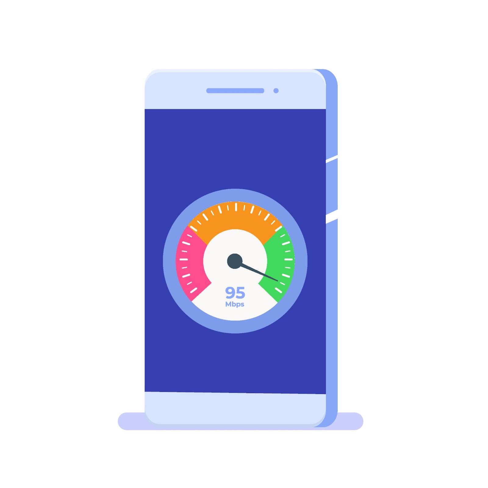
Increase Load Speed
Speed is always going to be a priority for mobile device users. These users expect pages to load almost instantaneously, and even a slight delay can lead to frustration and abandonment. According to Google, the recommended load time is 5 seconds or less on mobile devices with 3G connections.
To keep your site speedy on mobile phones and tablets, optimize image sizes to reduce load time, minimize redirects, and consider implementing Accelerated Mobile Pages (AMP) for faster loading content. Other strategies include:
- Minimize the use of redirects to cut down on additional HTTP requests.
- Leverage browser caching to store elements of your site locally on users’ devices.
- Use content delivery networks (CDNs) to distribute the load and speed up access for users worldwide.
- Enable compression to reduce the size of your CSS, HTML, and JavaScript files.
- Minify CSS, JavaScript, and HTML by removing unnecessary characters without changing functionality.
- Optimize and reduce the use of web fonts, considering the impact on load times.
- Evaluate and streamline any third-party scripts to prevent them from bogging down your site’s performance.
- Implement lazy loading for images and videos, loading these elements as they are needed rather than all at once.
Reduce Annoying Pop-Ups
Pop-ups can be a real pain on mobile, often disrupting the user’s flow or even blocking essential content. While they might be used sparingly for important messages or offers, make sure they’re not intrusive or difficult to dismiss.
A mobile-friendly approach might involve timed pop-ups that appear after the user has engaged with your site for a certain period, or exit-intent pop-ups that offer value without being a nuisance.
Simplify the Checkout Process
A complicated checkout can quickly deter potential customers. On mobile, where screen real estate is limited, and patience runs thin, simplifying this process is even more important.
This could mean reducing the number of steps to purchase, offering easy payment options like digital wallets, and minimizing the information required from the user. A straightforward, secure, and speedy checkout is key to converting those on-the-fence visitors into paying customers. For online stores, ecommerce conversion optimization for mobile can help teams improve cart flow, payment steps, trust signals, and product page journeys that affect mobile purchases.
Adapt Visual Elements for Mobile Devices
Mobile screens come in various sizes and resolutions, which makes it very important that your visual content is adaptable and responsive. Images and videos should load quickly and display correctly across all devices, text should be legible without zooming, and interactive elements should be sized for easy tapping.
The goal is to create an engaging visual experience that draws users in without sacrificing load time or usability.
Optimize for Mobile Actions
Mobile users interact with content differently than desktop users, often using gestures like swiping, tapping, and zooming. Optimizing your site to accommodate these actions can greatly improve the user experience.
This could involve swiping through product images, tapping for more details, or pulling down to refresh content. Tailoring your site’s design and functionality to these actions not only makes it more intuitive but also leverages the unique capabilities of mobile devices to engage mobile visitors more deeply.

Solve Other UX Issues
Addressing UX issues for mobile CRO goes beyond just speeding up load times. Here are other important areas to focus on when optimizing mobile websites:
- Clear Call-to-Action (CTA) Buttons: Make sure your CTA buttons stand out and are easy to tap, with compelling text that encourages action.
- Streamlined Forms: Minimize the number of fields in forms and consider using autofill to make form completion faster and easier.
- Readability: Use legible fonts and ensure there is enough contrast between text and background colors. Keep paragraphs short and sweet for easier reading on small screens.
- Touch Targets: Make buttons and links large enough to be easily tapped without the risk of hitting the wrong target.
- Accessible Design: Ensure your mobile site is accessible to all users, including those with disabilities. This includes using alt tags for images and ensuring voice control compatibility.
- User Feedback: Implement a simple way for users to give feedback about their experience. This can provide valuable insights for further improvements.
- Personalization: Tailor the mobile experience to individual users where possible, such as suggesting products based on past behavior.
- Security and Trust Signals: Clearly display security badges and use HTTPS to reassure users that their data is safe, especially on pages where they’re expected to enter personal or payment information.
Modify Your Copywriting
Since mobile screens are smaller and users often browse on the go, the copy needs to be concise, engaging, and easy to read. Start by prioritizing clarity and brevity; get straight to the point without sacrificing the message’s essence. This means using shorter sentences and paragraphs, which can help maintain the reader’s attention and make the text easier to digest on small screens.
It’s also important to front-load your content with the most important information by following the inverted pyramid style often used in journalism. This approach ensures that users get the value of your message even if they don’t scroll through the entire piece. The use of compelling headlines and subheadings can further guide users through the content, breaking it into manageable chunks that are easier to navigate on a mobile interface.
For calls-to-action, clarity and urgency are key. On a mobile website, you have less space to convince users to take action, so make sure your CTAs are direct and placed prominently within the user’s thumb zone.
Metrics that Matter in Increasing Your Mobile Conversion Rate
When aiming to increase your mobile conversion rate, monitoring specific metrics can provide insights into where you’re succeeding and where you might need to adjust your strategy.

Here are some key metrics to keep an eye on:
- Mobile Conversion Rates: The percentage of mobile visitors who take a desired action (e.g., making a purchase, signing up for a newsletter). It’s the ultimate measure of your mobile site’s effectiveness.
- Bounce Rate on Mobile: Tracks how many visitors leave your mobile site after viewing only one page. A high bounce rate could indicate that your landing pages aren’t engaging or relevant to your audience.
- Page Load Speed: The speed at which your mobile pages load. Slow load times can frustrate users and lead to higher bounce rates and lower conversion rates.
- Average Session Duration: The amount of time users spend on your mobile site during a session. Longer sessions can indicate more engaging content or effective user experience.
- Mobile Cart Abandonment Rate: The rate at which users add items to their cart but do not complete the purchase. This can highlight issues in the checkout process.
- Top Exit Pages on Mobile Version: Identifying which pages users are most likely to leave your site from can help pinpoint areas where the user experience may be lacking.
- Click-Through Rate (CTR) on Mobile: The percentage of users who click on a call-to-action link or button. This can measure how compelling your CTAs are.
- Traffic Source for Mobile Users: Understanding where your mobile traffic is coming from (organic search, social media, paid ads, etc.) can help you optimize your marketing efforts for better engagement and conversion.
- Mobile vs. Desktop Conversion Rates: Comparing conversion rates across devices can highlight if your mobile experience is underperforming compared to your desktop site.
- User Feedback and Satisfaction Scores: Direct feedback from users about their mobile experience can provide actionable insights beyond what quantitative metrics can show.
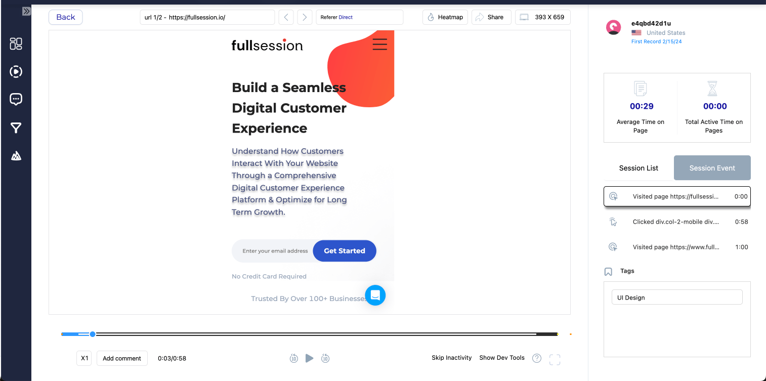
Tackle Mobile Conversion Rate Optimization with FullSession
FullSession is your new best friend when it comes to analyzing mobile user behavior. Start optimizing your site for mobile with these powerful tools:
- Heat Maps: Heat maps visually represent where users are clicking, tapping, and scrolling on your mobile site. This color-coded data helps identify which elements are attracting the most attention and which are being ignored.
- Session Recordings: Session recordings are like a window into the user’s journey, offering a play-by-play of their interactions with your mobile site. By watching real users navigate your site, you can spot friction points, confusing navigation, or issues that lead to drop-offs.
- Customer Feedback Tools: Direct feedback from users is invaluable. Customer feedback tools let you gather qualitative data on what users like or dislike about your mobile site, what features they find useful, or where they encounter problems.
- Market Segmentation and Filtering: Understanding that not all users are the same is key to effective mobile CRO. Market segmentation and filtering allow you to analyze behavior patterns across different segments of your user base—such as new versus returning visitors, users from different geographic locations, or users on different mobile devices.
FullSession Pricing Plans
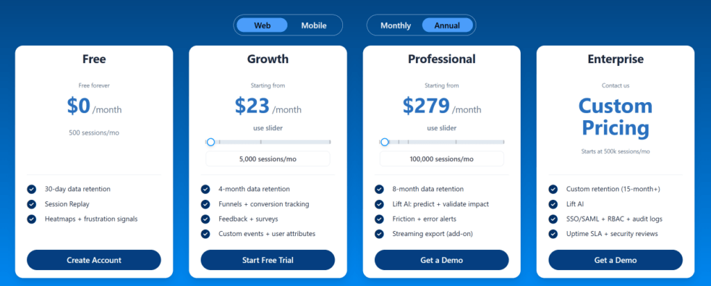
The FullSession platform offers a 14-day free trial. It provides two paid plans—Basic and Business. Here are more details on each plan.
- The Starter plan costs $39/month or $32/year and allows you to monitor up to 5,000 monthly sessions with up to 6 months of data storage.
- The Business plan costs $75/month or $60/year and helps you to track and analyze up to 100,000 monthly sessions with up to 12 months of data storage.
- The Enterprise plan has custom pricing and offers customizable sessions plus full access to all features.
Install Your First Mobile Analytics Tool Right Now
It takes less than 5 minutes to set up your first website analytics tool withFullSession, and it’s completely free!
FAQs About CRO for Mobile
Can I use the same CRO strategies for both desktop and mobile?
While some strategies overlap, mobile requires specific considerations due to screen size, navigation, and user behavior differences.
How often should I analyze my CRO performance?
Regularly. Trends change, and what worked yesterday might not work tomorrow. Keep analyzing and adapting, and always be on the lookout for possible areas for improvement.
Ideally, you should set a schedule for reviewing your CRO performance. This could range from weekly to monthly, depending on the size of your business and the volume of your web traffic.
Is CRO for mobile a one-time fix?
Far from it. CRO is an ongoing process of testing, learning, and optimizing to keep up with evolving user expectations and technological advancements. Keep looking for ways to improve the experience for mobile users.
Can I use the same design for my mobile site as my desktop site?
While you can start with the same design, it’s important to adapt and optimize the design for mobile device usage. This involves responsive design adjustments, optimizing navigation for touch screens, resizing images and text for readability, and ensuring interactive elements are easily clickable.
Mohamed oversees operations and finance at FullSession and has contributed to the company’s UX analytics knowledge base.