TL;DR: Teams that pair interactive heatmaps with funnel jump-to-replay identify friction faster and protect conversion on priority flows. Updated: Nov 2025.
Privacy: Sensitive inputs are masked by default; allow-list only when truly necessary.
Choose FullSession if you want interactive heatmaps with real-time readouts, quick funnel drop-off context, and a privacy-first capture model designed to keep payloads light—ideal for PLG teams who need fast diagnosis and fewer tools to juggle.
Choose Hotjar if you mainly want a surveys‑first UX stack and prefer its broader template library.
Note: FullSession also includes in‑app feedback, so teams can keep feedback + heatmaps + funnels in one workflow.
Risk #1: Different heatmap sampling windows create apparent discrepancies. Mitigation: Align windows (e.g., 7 days) and device filters before comparing.
Risk #2: SDK overhead on Core Web Vitals. Mitigation: Use streamed, batched capture; keep masking defaults to reduce payload.
Risk #3: Team change-management. Mitigation: Save presets (A/B Rescue, Mobile Fold, Rage-Tap) and run a 15-minute workflow enablement.
Does FullSession support the same heatmap types as Hotjar?
Yes—click/tap and scroll coverage, plus frustration signals. FullSession emphasizes interactive/near real-time readouts and quick funnel context.
How does pricing compare?
Both have public pricing pages; Hotjar highlights a free plan with session caps and paid tiers. Confirm current details on each vendor’s site.
What about privacy?
FullSession masks sensitive inputs by default with allow-lists for exceptions; Hotjar documents privacy practices across its suite. Evaluate per your data policy.
Can I migrate saved views?
Recreate your top filters (pages, devices, variants) as saved presets in FullSession; parity typically takes ~30 minutes.
Will this slow my site?
FullSession capture is engineered for low overhead via streaming/batching; keep masking defaults to minimize payload.
Can I still use surveys/polls?
If you rely heavily on Hotjar’s surveys, you can keep them and run FullSession for heatmaps/funnel triage—or consolidate as your team prefers.
Do I need replays?
Heatmaps show where; replays reveal why. Many teams use both for faster fixes, especially on mobile friction.
TL;DR: Comparing mobile vs desktop heatmaps at key steps surfaces gesture-driven friction earlier and reduces time-to-fix on responsive UX issues. Updated: Nov 2025.
Privacy: Sensitive inputs are masked by default; enable allow-lists sparingly for non-sensitive fields only.
Start with the funnel step showing the drop (e.g., address form, plan selection).
Is the drop device-specific? Mobile only → inspect tap clusters, fold position, keyboard overlap. Desktop only → check hover→no click zones, tooltip reliance, precision-required UI.
Is engagement high but progression low? Yes → likely validation or hitbox issue; review rage taps and disabled CTAs. No → content/IA problem; review scroll depth and element visibility.
Do you see API 4xx/5xx near the hotspot? Yes → jump to Session Replay to inspect request/response and DOM state. No → stay in heatmap to test layout, copy, and target sizes.
How to fix it in 3 steps (Interactive Heatmaps deep-dive)
Step 1 — Segment by device & viewport
Filter heatmaps to Mobile vs Desktop (optionally by iPhone/Android or breakpoint buckets). Enable overlays for rage taps, dead taps, and fold line. This reveals whether users are trying—and failing—to perform the intended action.
Step 2 — Isolate the misbehaving element
Use element-level stats to evaluate tap-through rate, time-to-next-step, and retry attempts. On mobile, prioritize: tap target size & spacing (44px+ recommended), keyboard overlap, disabled vs loading states.
Step 3 — Validate with a short window
Ship UI tweaks behind a flag and re-run heatmaps for 24–72 hours. Compare predicted median completion from your baseline to the observed median post-fix, and spot-check with Session Replay to ensure there’s no new friction.
A consumer subscription site saw flat desktop conversion but sliding mobile sign-ups. Heatmaps showed dense rage taps on a disabled “Continue” button and shallow scroll depth on screens ≤ 650px. Session Replay confirmed a keyboard covering an address field plus a hidden error message. The team increased tap-target size, raised the CTA above the fold for small viewports, and added a visible loading/validation state. Within 48 hours of rollout to 25% of traffic, the mobile heatmap cooled and retries dropped. A week later, mobile completion stabilized, and desktop remained unaffected. With masking on, no sensitive inputs were captured—only interaction patterns and system states required for diagnosis.
BLUF: Teams that pair error-state heatmaps with session replay surface breakpoints earlier, shorten time-to-diagnosis, and protect funnel completion on impacted paths. Updated: Nov 2025.
Privacy: Inputs are masked by default; allow-list only when necessary.
Start: Is the drop isolated to mobile? Yes → Inspect mobile error-state heatmap: tap clusters + element visibility. If taps on disabled element → likely state/validation issue. If taps off-element → hitbox / layout shift.
If not mobile-only: Cross-check by step & browser. If one browser spikes → polyfill or CSS specificity. If all browsers → API error or client-side guardrail.
Next: Jump from the hotspot to Session Replay to see console errors, network payloads (422/400) mapped to the DOM state. Masked inputs still reveal interaction patterns (blur/focus, retries).
How to fix it (3 steps) — Deep‑dive: Interactive Heatmaps
1. Target the impacted step
Filter heatmap by URL/step, device, and time window. Enable an error-state overlay (or use saved view filters) to surface clusters near sessions with failed requests.
2. Isolate the misbehaving element
Use element-level analytics to compare tap/click‑through vs success. Look for rage‑click frequency, hover‑without‑advance, or touchstart→no navigation. Mark suspect elements for replay review.
3. Validate the fix with a short window
Ship a fix behind a flag. Re-run the heatmap over 24–72 hours and compare predicted median completion to observed median. Confirm no privacy regressions (masking still on) in replay.
A PLG SaaS team saw sign‑up completions sag on mobile while desktop held flat. Error‑state heatmaps showed dense tap clusters on a disabled “Continue” button—replay revealed a client‑side guard that awaited a third‑party validation call that occasionally timed out. With masking on, the team still observed the interaction path and network 422s. They widened the hitbox, added optimistic UI copy, and retried validation in the background. Within two days, the heatmap cooled and replays showed fewer repeated taps and abandonments. The team kept masking defaults and reviewed the Help Center checklist before rolling out broadly.
TL;DR: Teams that pair interactive heatmaps with funnel drop-off context identify checkout friction faster and protect completion rates on the most valuable paths. Updated: Nov 2025.
Privacy: Inputs are masked by default; allow-list only when necessary.
SaaS checkout (subscriptions): Choose heatmaps + Funnels with device segmentation to isolate plan card interactions, below-the-fold CTAs, and disabled “Continue” states. Prioritize steps where payment + tax + address forms stack vertically on mobile.
Ecommerce checkout (carts): Choose heatmaps + Funnels focused on coupon/gift card fields, shipping method toggles, and guest vs sign-in friction. Prioritize tap clusters near Apply buttons and address auto-complete behavior.
Hybrid orgs: Standardize on Interactive Heatmaps for both flows so teams triage where (heatmap) → drop-off (funnel) → why (optional replay) in one motion.
Get started on the plan that fits your workflow. You can switch plans anytime.
FAQs
What’s the difference between SaaS and ecommerce checkout heatmaps?
SaaS emphasizes plan selection + form validation, while ecommerce emphasizes cart/coupon and shipping/payment toggles. Heatmaps reveal where attention stalls; Funnels quantify impact.
Do I need session replay to optimize checkout?
Heatmaps + Funnels identify where and how much. Replay is optional but useful to verify why (e.g., disabled states, API errors).
How do we avoid exposing sensitive data?
FullSession masks inputs by default. Only allow-list non-sensitive fields required for UX diagnosis and document the decision.
Will adding heatmaps slow checkout?
FullSession capture is streamed/batched to minimize overhead and avoid blocking render.
Can I compare pre- and post-fix quickly?
Yes—re-run heatmaps for 24–72h, then compare predicted median vs observed median completion in Funnels.
What should we test first?
Start with mobile fold position, coupon “Apply” UX, tap-target sizes, and disabled-state feedback. These drive frequent, high-leverage wins.
How do we scale this across brands/locales?
Create saved views for common steps and replicate filters by brand/locale; review daily during promo periods.
Heatmaps + A/B Testing: Prioritize Winners Faster
:root{–fs-max:920px;–fs-space-1:8px;–fs-space-2:12px;–fs-space-3:16px;–fs-space-4:24px;–fs-space-5:40px;–fs-radius:12px;–fs-border:#e6e6e6;–fs-text:#111;–fs-muted:#666;–fs-bg:#ffffff;–fs-accent:#111;–fs-accent-contrast:#fff}
@media (prefers-color-scheme: dark){:root{–fs-bg:#0b0b0b;–fs-text:#f4f4f4;–fs-muted:#aaa;–fs-border:#222;–fs-accent:#fafafa;–fs-accent-contrast:#111}}
html{scroll-behavior:smooth}
body{margin:0;background:var(–fs-bg);color:var(–fs-text);font:16px/1.7 system-ui,-apple-system,Segoe UI,Roboto,Helvetica,Arial,sans-serif}
.container{max-width:var(–fs-max);margin:0 auto;padding:var(–fs-space-4)}
.eyebrow{font-size:.85rem;letter-spacing:.08em;text-transform:uppercase;color:var(–fs-muted)}
.hero{display:flex;flex-direction:column;gap:var(–fs-space-2);margin:var(–fs-space-4) 0}
.bluf{background:linear-gradient(180deg,rgba(0,0,0,.04),rgba(0,0,0,.02));padding:var(–fs-space-4);border-radius:var(–fs-radius);border:1px solid var(–fs-border)}
.cta-row{display:flex;flex-wrap:wrap;gap:var(–fs-space-2);margin:var(–fs-space-2) 0}
.btn{display:inline-block;padding:12px 18px;border-radius:999px;text-decoration:none;border:1px solid var(–fs-border);transition:transform .04s ease,background .2s ease,border-color .2s ease,box-shadow .2s ease}
.btn:hover{transform:translateY(-1px)}
.btn:active{transform:translateY(0)}
.btn:focus-visible{outline:2px solid currentColor;outline-offset:2px}
.btn-primary{background:var(–fs-accent);color:var(–fs-accent-contrast);border-color:var(–fs-accent)}
.btn-primary:hover{box-shadow:0 6px 18px rgba(0,0,0,.15)}
.btn-ghost{background:transparent;color:var(–fs-text)}
.btn-ghost:hover{background:rgba(0,0,0,.05)}
.sticky-wrap{position:fixed;right:20px;bottom:20px;z-index:50}
.sticky-cta{background:var(–fs-accent);color:var(–fs-accent-contrast);border:none;border-radius:999px;padding:10px 18px;display:inline-flex;align-items:center;gap:8px;box-shadow:0 10px 24px rgba(0,0,0,.2)}
@media (max-width:640px){.sticky-wrap{left:16px;right:16px}.sticky-cta{justify-content:center;width:100%}}
.section{margin:var(–fs-space-5) 0; scroll-margin-top:80px}
.section h2{margin:0 0 var(–fs-space-2)}
.kicker{color:var(–fs-muted)}
.grid{display:grid;gap:var(–fs-space-3)}
.grid-2{grid-template-columns:1fr}
@media(min-width:800px){.grid-2{grid-template-columns:1fr 1fr}}
.table{width:100%;border-collapse:separate;border-spacing:0;margin:var(–fs-space-3) 0;border:1px solid var(–fs-border);border-radius:10px;overflow:hidden}
.table th,.table td{padding:12px 14px;border-top:1px solid var(–fs-border);text-align:left;vertical-align:top}
.table thead th{background:rgba(0,0,0,.04);border-top:none}
.table tbody tr:nth-child(odd){background:rgba(0,0,0,.02)}
.caption{font-size:.9rem;color:var(–fs-muted);margin-top:8px}
.faq dt{font-weight:650;margin-top:var(–fs-space-2)}
.faq dd{margin:6px 0 var(–fs-space-2) 0}
.sr-only{position:absolute;width:1px;height:1px;overflow:hidden;clip:rect(0 0 0 0);white-space:nowrap}
.pill-nav{display:flex;gap:10px;flex-wrap:wrap}
.pill-nav a{padding:10px 14px;border-radius:999px;border:1px solid var(–fs-border);text-decoration:none}
/* TOC */
.toc{background:linear-gradient(180deg,rgba(0,0,0,.02),rgba(0,0,0,.01));border:1px solid var(–fs-border);border-radius:var(–fs-radius);padding:var(–fs-space-4)}
.toc h2{margin-top:0}
.toc ul{columns:1;gap:var(–fs-space-3);margin:0;padding-left:18px}
@media(min-width:900px){.toc ul{columns:2}}
/* Cards on mobile for tables */
.cards{display:none}
.card{border:1px solid var(–fs-border);border-radius:10px;padding:12px}
.card h4{margin:0 0 6px}
.card .meta{font-size:.9rem;color:var(–fs-muted)}
@media(max-width:720px){.table{display:none}.cards{display:grid;gap:12px}}
/* Optional tiny style enhancement */
a:not(.btn){text-decoration-thickness:.06em;text-underline-offset:.2em}
a:not(.btn):hover{text-decoration-thickness:.1em}
.related{border-top:1px solid var(–fs-border);margin-top:var(–fs-space-5);padding-top:var(–fs-space-4)}
.related ul{display:flex;gap:12px;flex-wrap:wrap;padding-left:18px}
{
“@context”:”https://schema.org”,
“@type”:”Article”,
“headline”:”Heatmaps + A/B Testing: How to Prioritize the Hypotheses That Win”,
“description”:”Use device-segmented heatmaps alongside A/B tests to identify friction, rescue variants, and focus on changes that lift conversion.”,
“mainEntityOfPage”:{“@type”:”WebPage”,”@id”:”https://www.fullsession.io/blog/heatmaps-ab-testing-prioritization”},
“datePublished”:”2025-11-17″,
“dateModified”:”2025-11-17″,
“author”:{“@type”:”Person”,”name”:”Roman Mohren, FullSession CEO”,”jobTitle”:”Chief Executive Officer”},
“about”:[“FullSession Interactive Heatmaps”,”FullSession Funnels”],
“publisher”:{“@type”:”Organization”,”name”:”FullSession”}
}
{
“@context”:”https://schema.org”,
“@type”:”FAQPage”,
“mainEntity”:[
{“@type”:”Question”,”name”:”How do heatmaps improve A/B testing decisions?”,”acceptedAnswer”:{“@type”:”Answer”,”text”:”They reveal why a result is neutral or mixed by showing attention, rage taps, and below-fold CTAs—so you can rescue variants with targeted UX fixes.”}},
{“@type”:”Question”,”name”:”Can I compare heatmaps across experiment arms?”,”acceptedAnswer”:{“@type”:”Answer”,”text”:”Yes. Filter by variant param, device, and date range to see A vs B patterns side-by-side.”}},
{“@type”:”Question”,”name”:”Does this work for SaaS onboarding and pricing pages?”,”acceptedAnswer”:{“@type”:”Answer”,”text”:”Absolutely. Pair heatmaps with Funnels to see where intent stalls and to measure completion after UX tweaks.”}},
{“@type”:”Question”,”name”:”What about privacy?”,”acceptedAnswer”:{“@type”:”Answer”,”text”:”FullSession masks sensitive inputs by default. You can allow-list fields when strictly necessary; document the rationale.”}},
{“@type”:”Question”,”name”:”Will this slow my site?”,”acceptedAnswer”:{“@type”:”Answer”,”text”:”FullSession capture is streamed and batched to minimize overhead and avoid blocking render.”}},
{“@type”:”Question”,”name”:”How do I connect variants if I’m using a testing tool?”,”acceptedAnswer”:{“@type”:”Answer”,”text”:”Pass the experiment ID or variant label as a query param or data layer variable; FullSession lets you filter by it.”}},
{“@type”:”Question”,”name”:”How is FullSession different from other tools?”,”acceptedAnswer”:{“@type”:”Answer”,”text”:”FullSession combines interactive heatmaps with Funnels and (optional) session replay so you can move from where to why to fix in one workflow.”}}
]
}
Skip to content
TL;DR: Teams that pair device‑segmented heatmaps with A/B test results identify false negatives, rescue high‑potential variants, and focus engineering effort on the highest‑impact UI changes. Updated: Nov 2025.
Privacy: Input masking is on by default; evaluate changes with masking retained.
Neutral experiment, hot interaction clusters. Variant B doesn’t “win,” yet heatmaps reveal dense click/tap activity on secondary actions (e.g., “Apply coupon”) that siphon intent.
Mobile loses, desktop wins. Aggregated statistics hide device asymmetry; mobile heatmaps show below‑fold CTAs or tap‑target misses that desktop doesn’t suffer.
High scroll, low conversion. Heatmaps show attention depth but also dead zones where users stall before key fields.
Rage taps on disabled states. Your variant added validation or tooltips, but users hammer a disabled CTA; the metric reads neutral while heatmaps show clear UX friction.
How to fix (3 steps) — Deep‑dive: Interactive Heatmaps
Step 1 — Overlay heatmaps on experiment arms
Compare Variant A vs B by device and breakpoint. Toggle rage taps, dead taps, and scroll depth. Attach funnel context so you see drop‑off adjacent to each hotspot. Analyze drop‑offs with Funnels.
Step 2 — Prioritize with “Impact‑to‑Effort” tags
For each hotspot, tag Impact (H/M/L) and Effort (H/M/L). Focus H‑impact / L‑M effort items first (e.g., demote a secondary CTA, move plan selector above fold, enlarge tap target).
Step 3 — Validate within 72 hours
Ship micro‑tweaks behind a flag. Re‑run heatmaps and compare predicted median completion to observed median (24–72h). If the heatmap cools and the funnel improves, graduate the change and archive the extra A/B path.
A PLG team ran a pricing page test: Variant B streamlined plan cards, yet overall results looked neutral. Heatmaps told a different story—mobile users were fixating on a coupon field and repeatedly tapping a disabled “Apply” button. Funnels showed a disproportionate drop right after coupon entry. The team demoted the coupon field, raised the primary CTA above the fold, and added a loading indicator on “Apply.” Within 72 hours, the mobile heatmap cooled around the coupon area, rage taps fell, and the observed median completion climbed in the confirm step. They shipped the changes, rescued Variant B, and archived the test as “resolved with UX fix,” rather than burning another sprint on low‑probability hypotheses.
TL;DR: Teams that monitor real-time heatmaps during the first 48 hours of a launch surface friction sooner, shorten time-to-diagnosis, and protect conversion on high-intent paths. Updated: Nov 2025.
Privacy: Sensitive inputs are masked by default; enable allow-lists sparingly for non-sensitive fields only.
How to run the checklist in 3 steps (deep-dive: Interactive Heatmaps)
Step 1 — Create real-time launch views (15 min)
Set Saved Views for: “Launch Lander (Mobile)”, “Onboarding Modal”, “Checkout/Paywall”, and “Post-Install Step.” Enable overlays: rage taps, dead taps, fold line, device/viewport filters. For ecommerce, add Coupon Apply and Order Summary views; for SaaS, add Plan Grid and Billing.
Step 2 — Tie heatmaps to outcome context (10 min)
Open Funnels in a split workflow: for each hotspot, jump to the adjacent drop-off step to quantify impact. Tag hotspots with Impact (H/M/L) and Effort (H/M/L); queue H/L changes first (copy, layout, hitbox, loading state).
Step 3 — Validate fixes within 24–48 hours (15–30 min)
Ship micro-fixes behind flags. Re-run heatmaps and compare predicted median completion to observed median—spot-check a handful of sessions with replay.
A PLG team launched a new “Pro” plan on a Friday. In the first two hours, real-time heatmaps showed dense mobile tap clusters below the fold on the pricing page. Funnels confirmed a sharp Plan → Billing drop on small viewports. Session Replay revealed a disabled “Continue” state that waited for plan confirmation from a feature flag service. The team moved the CTA above the fold for ≤700px screens, added a visible loading state, and pre-confirmed the plan client-side with a server check after. Within 24 hours, the mobile heatmap cooled, rage taps dropped, and observed median plan completion rose directionally. No sensitive inputs were captured—masking remained on by default. By Monday, they rolled out the fix to 100% of traffic and kept the real-time view pinned for the week.
Watch: Comprehension • Signals: High attention; no advance • Monitor: Modal → Next step • Fix: Shorten copy; clearer CTA • Updated: Nov 2025
FAQs
What makes heatmaps “real-time” and why does it matter at launch?
Near real-time rendering surfaces where users are struggling while traffic is hottest, so you can push micro-fixes before word-of-mouth or paid spend is wasted.
Can I segment by device and viewport quickly?
Yes—filter by device and breakpoint to locate below-the-fold CTAs and tap-target issues on mobile.
How do I connect heatmaps to outcomes?
Use Funnels to measure drop-offs adjacent to each hotspot; compare predicted vs observed median completion after fixes.
Do I need session replay for the launch window?
Replay is optional but powerful for validating why (validation states, API timing). Start with heatmaps, escalate to replay.
How do I avoid exposing PII during a hectic launch?
Keep masking on by default; allow-list only non-sensitive fields if absolutely necessary and document it.
Will adding capture slow pages under surge traffic?
FullSession capture is streamed/batched to minimize overhead and avoid blocking render.
What should be in my “first 48 hours” runbook?
Saved Views for launch lander, onboarding, and checkout; mobile-first checks; rage/dead-tap overlays; funnel linkage; flag-based micro-fixes; 24–48h validation.
Heatmaps for Conversion: From Insight to A/B Test Wins
By Roman Mohren • Last updated: Nov 2025
BLUF: Teams that pair interactive heatmaps with funnel context and quick validation tests ship fixes faster and see directional gains in form completion and checkout conversion.
Updated: Nov 2025.
Privacy: Inputs are masked by default; enable allow-lists sparingly for non-sensitive fields only.
Signal: Below-fold CTA on mobile Likely causes: Responsive layout pushes primary action under order summary or long copy. Action: Move CTA above fold for small breakpoints; reduce vertical padding/margins.
Signal: High attention without comprehension (desktop-biased UI) Likely causes: Hover-dependence; tooltips as the only instruction. Action: Replace hover tips with inline helper text on mobile; increase contrast and affordances.
Signal: Neutral/mixed A/B result Likely causes: Unbalanced device outcomes; friction localized to one step. Action: Segment heatmaps by device and step; rescue the winner by fixing the hotspot, then re-measure.
How to fix it in 3 steps (deep-dive: Interactive Heatmaps)
Step 1 — Create conversion views (15 min)
Set Saved Views for: Pricing/Plan, Sign-up/Billing, Cart/Shipping/Payment, and Confirm/Thank-you. Enable overlays: rage taps, dead taps, fold line, device/viewport filters, and element stats (tap-through, retries).
Step 2 — Tie “where” to “how much” with Funnels (10 min)
For any hotspot, open Funnels to the adjacent step and quantify drop-off deltas. Tag each issue with Impact (H/M/L) and Effort (H/M/L); schedule H/L items first (copy/layout/hitbox) before component refactors.
Step 3 — Validate in 24–72 hours (15–30 min)
Ship micro-tweaks behind flags. Compare predicted p50 completion to observed p50; spot-check a handful of sessions (optional replay) to ensure the heatmap has cooled and the funnel tightened.
A subscription SaaS team saw flat desktop conversion but a slide on mobile. Heatmaps showed dense tap clusters on a collapsed coupon section and a below-fold purchase CTA. Funnels confirmed a disproportionate drop between Plan → Billing. The team demoted the coupon, moved the primary CTA above the fold for ≤700px viewports, and added a visible loading/validation state on submit. Within 48 hours, the mobile heatmap cooled, retries fell, and the observed p50 completion ticked upward directionally. Because input masking stayed on, no sensitive data was captured—only the interaction patterns and DOM states needed to confirm the fix. The same playbook later rescued a neutral A/B test on pricing by removing a “learn more” siphon that was attracting clicks without advancing the flow.
Cause: Mobile comprehension gap • Checks: Low advance post-attention • Watch: Same step • Fix: Inline helper text on mobile • Updated: Nov 2025
FAQs
How are heatmaps different from traditional analytics for conversion work?
Heatmaps reveal where attention concentrates; when paired with Funnels, you see how much it costs in drop-offs—so you can prioritize fixes by impact.
Do I need session replay to use heatmaps effectively?
Replay is optional; it helps confirm why (validation timing, API errors). Start with heatmaps + funnels; escalate to replay when a fix needs visual evidence.
Will heatmaps slow my site or app?
FullSession capture is streamed/batched and designed to minimize overhead. Keep masking defaults to reduce payload.
What are high-leverage fixes we can test first?
Move CTAs above fold (mobile), demote distracting secondaries, enlarge tap targets, and add visible loading/validation states.
How do we integrate heatmaps with A/B testing?
Use heatmaps to triage neutral tests: find hotspots, fix friction, then re-measure. Promote winners after the heatmap cools and the funnel improves.
How should we handle privacy?
Inputs are masked by default. Only allow-list non-sensitive fields when strictly necessary and document the rationale.
Does this work for SPAs and modern frameworks?
Yes. Ensure route changes and virtual-DOM mutations are tracked; then segment by device and viewport in your views.
PostHog: A self-hosted product analytics platform with customer data tracking, analysis, and extensive integrations. Pricing starts from $0.0000500/event.
Optimizely: A digital experience analytics platform focusing on A/B testing, experimentation, and personalization with advanced targeting capabilities. It provides feature-based pricing not available publicly.
Heap: A digital insights platform automatically capturing web and mobile app data, offering behavioral data visualization and funnel analysis. It has a tiered pricing structure that is available upon request.
AB Tasty: A digital experience optimization platform for marketing teams, providing easy A/B testing and personalization features. Pricing is available upon request.
Amplitude: Product intelligence and event tracking software, offering customer engagement and retention insights. Its scalable pricing starts from$61/month.
LaunchDarkly: A feature management platform with real-time flagging and experimentation features. Its feature-based pricing starts at $12/month.
Crazy Egg: A web analytics tool specializing in website optimization through visual reports like heatmaps. It offers simple pricing with multiple plans starting at $99/month.
FullStory: A digital experience analytics platform providing in-depth insights into user interactions on websites and mobile applications with automatic data capture. Its custom pricing is available upon request.
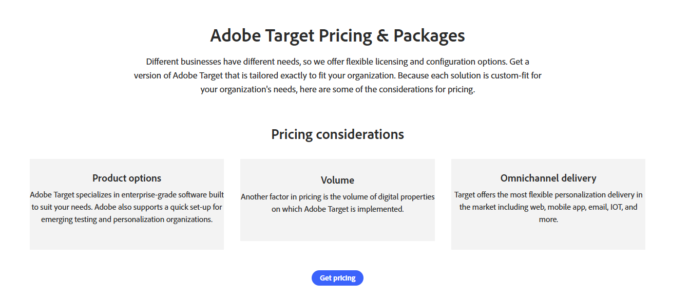
Adobe Target: Enterprise-level A/B testing and optimization platform with automated personalization and multivariate testing features. Pricing suits large companies and is available upon request.
When choosing the best solution, consider the specific features and pricing that best align with your requirements.
Let’s start with our review.
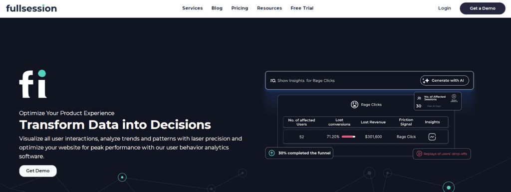
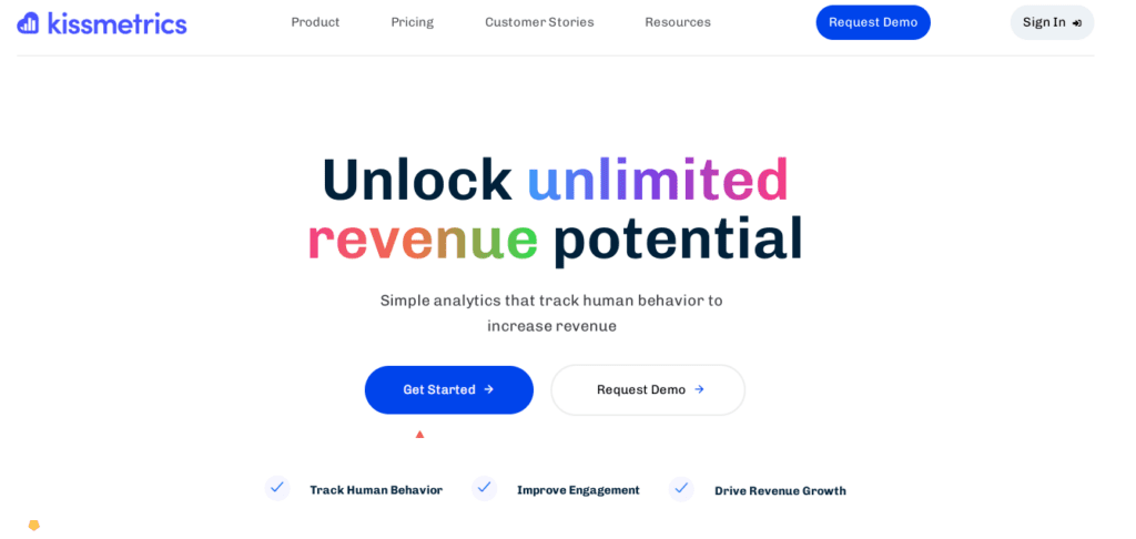
1. FullSession
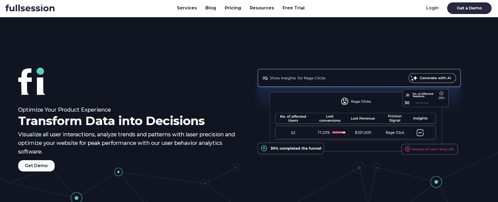
Capture all user interactions, observe how users engage with your website, and improve its interface, usability, experience, and performance with FullSession, an advanced user behavior analytics platform.
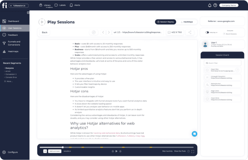
Our intuitive dashboards make visualizing and analyzing all user behavior data easy, helping you spot trends and patterns effortlessly.
Dive deeper with real-time session replays to see how visitors navigate your site. Our platform gives you a complete view of the customer journey, capturing every action for accurate insights.
Pinpoint problem areas, test design updates, and improve usability with UX heatmap tools that show you where your site can perform better. Identify inactive zones, optimize page elements, and strengthen your interface based on real user monitoring.
Use conversion funnel analysis to streamline your path to conversions. Remove barriers, improve key steps in the user journey, and reduce drop-offs to increase your success rates.
Employ customer feedback collection tools to discover the “why” behind user frustrations and deliver immediate solutions to recurring problems, boosting user satisfaction and building loyalty.
Stay secure and compliant with analytics that respect user privacy. We follow GDPR, CCPA, and PCI standards to ensure ethical and legal data collection practices.
Visualize, Analyze, and Optimize with FullSession
See how to transform user data into actionable insights for peak website performance.
E-commerce businesses to optimize sales funnels and boost conversions
SaaS companies to analyze user engagement and increase product adoption rates
Marketing teams to optimize campaigns based on real-time user behavior data
UX designers to improve interface design and functionality through user insights
Data analysts to get in-depth metrics on user interactions and trends
Quality assurance teams to identify and resolve website issues promptly
Product developers to understand user feedback for new feature implementation
Customer support teams to improve response times and issue resolution processes
Customer experience professionals to create seamless online user journeys
Conversion rate optimization specialists to fine-tune website performance
Key features
Advanced filters and tags: Identify behavior trends and patterns to optimize user journeys and improve engagement and conversion rates.
Session recordings and replays:Replay user interactions to diagnose issues, analyze user flows, and understand user behavior without compromising sensitive data.
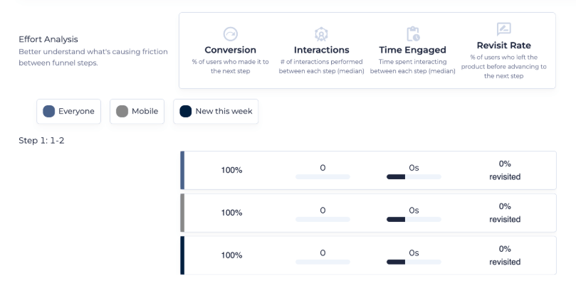
Interactive heatmaps: Analyze click, scroll, and mouse heatmaps to identify areas of high or low user interaction and measure task completion times.
Website feedback forms and reports: Collect user feedback through branded forms and connect responses with session recordings for deeper insights.
Conversion funnel analysis: Detect patterns that lead to user drop-offs and test new ideas to optimize conversion rates.
Error analysis: Quickly detect and address website issues like JavaScript errors and network problems to prevent disruptions in the user experience.
FullSession vs VWO
FullSession goes beyond the traditional A/B testing capabilities offered by VWO by capturing, visualizing and analyzing data with its advanced user behavior tools.
While VWO primarily focuses on optimizing website variations, FullSession provides granular insights into user engagement, making it a better choice for businesses that prioritize understanding user behavior rather than running extensive A/B tests.
Turn User Behavior into Growth Opportunities
Learn how to visualize, analyze, and optimize your site with FullSession.
FullSession integrates with your entire tech stack. It connects with open APIs, modern webhooks, and Zapier and also provides native integrations. It works best with Shopify, WordPress, Wix, and BigCommerce.
Support
FullSession is known for responsive customer support. You can reach out by email or chat or visit the knowledge base with articles and tutorials that help you troubleshoot common issues yourself.
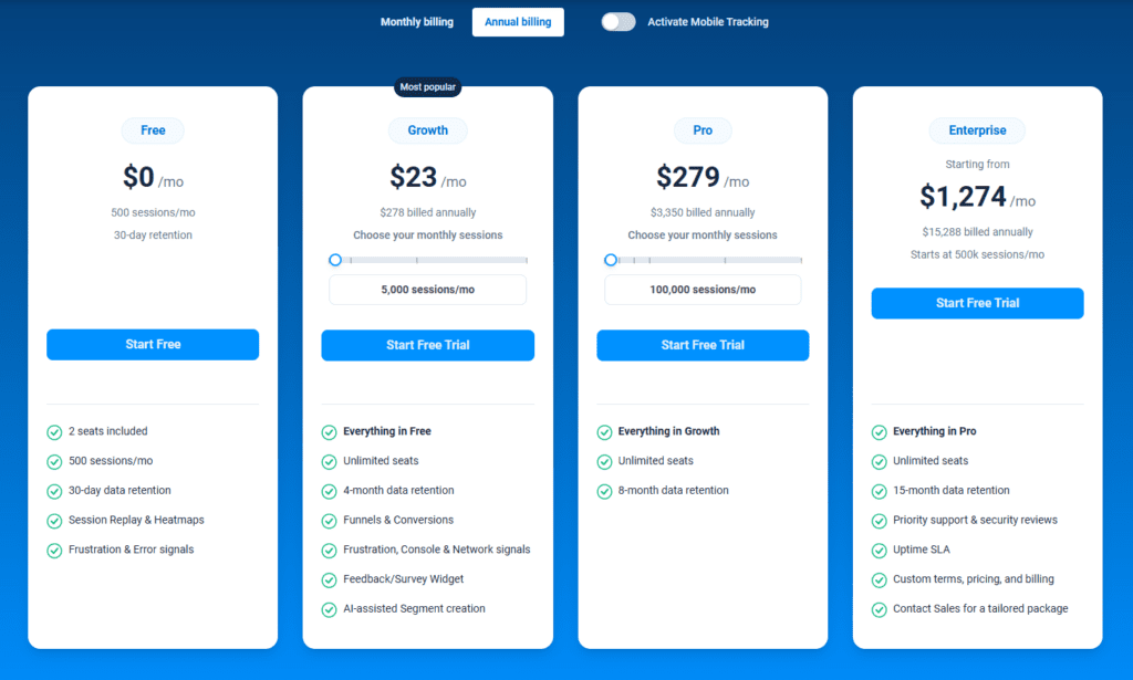
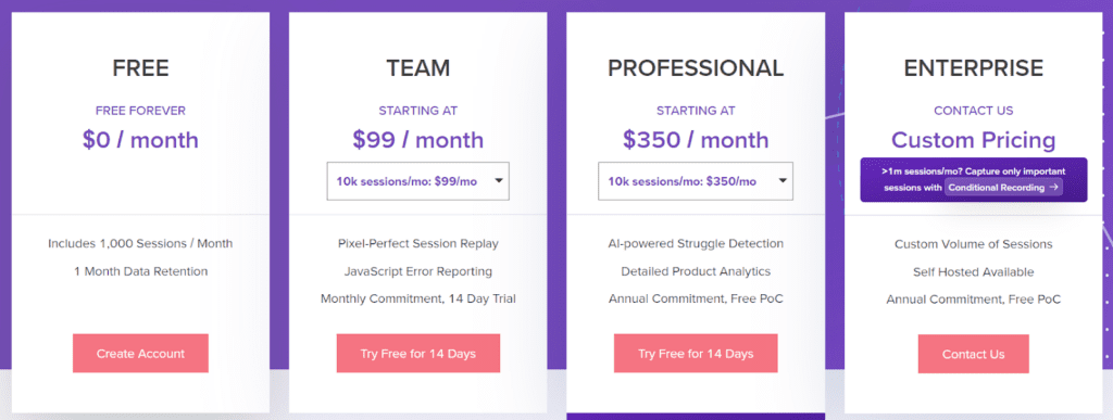
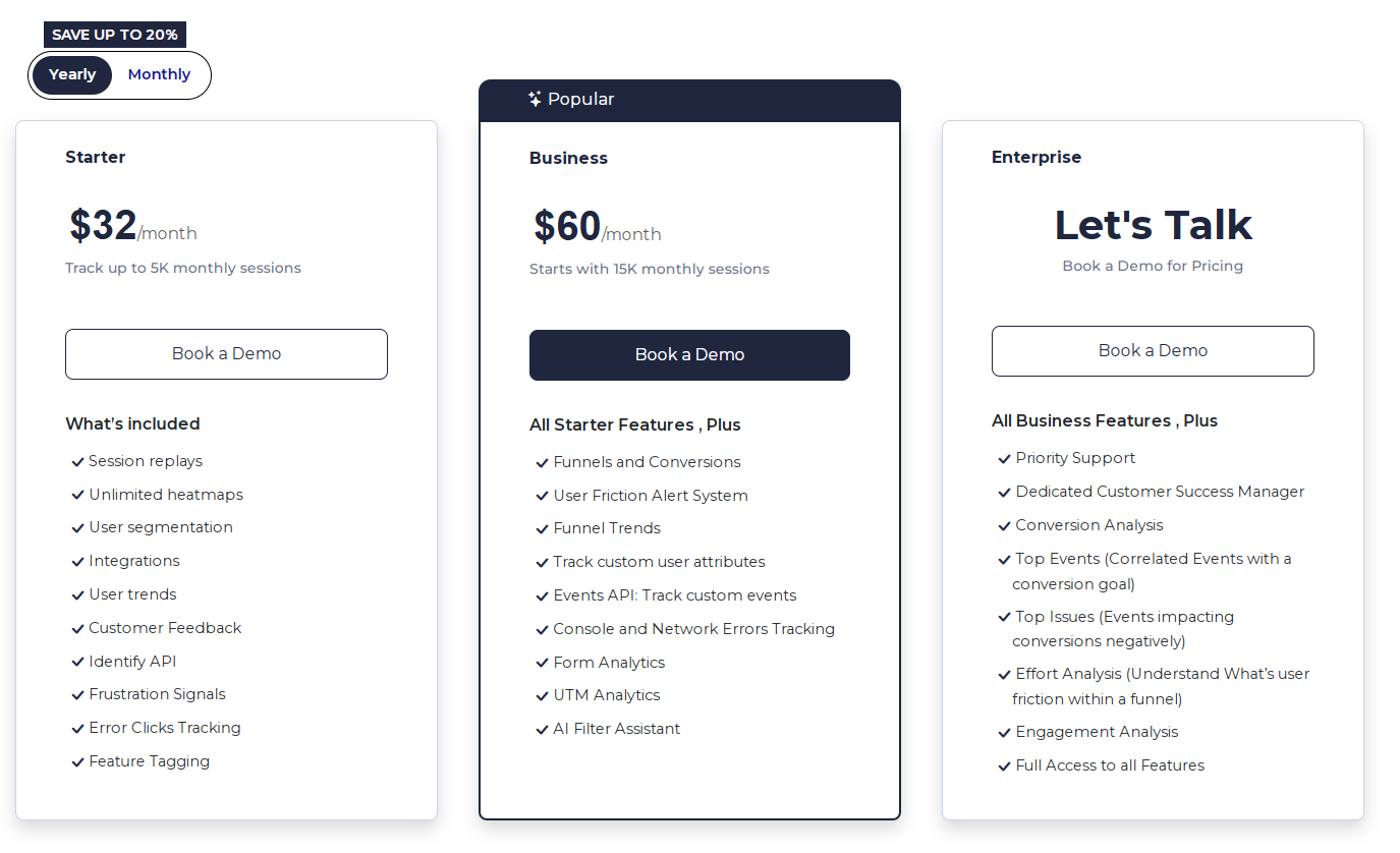
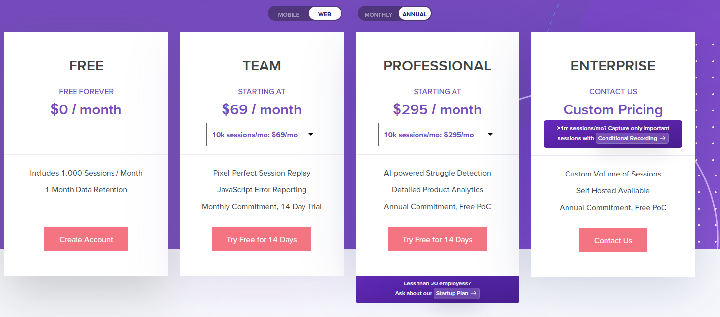
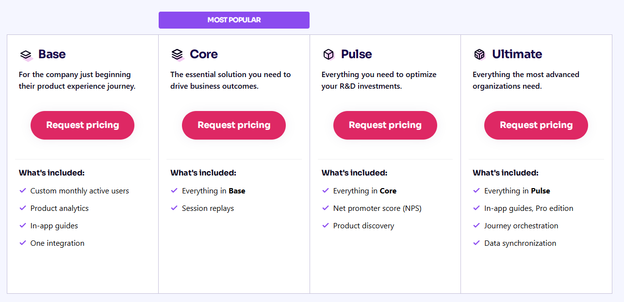
Pricing
FullSession offers multiple tools, a free trial and flexible pricing structure with three tiers—Starter, Business, and Enterprise—designed to accommodate businesses of all sizes, from emerging startups to large corporations.
Our scalable plans allow you to begin with a package that suits your current needs and easily upgrade as your business expands, ensuring you only invest in the required features.
The entry-level paid plan, priced at an accessible $39/month, includes all essential features with unlimited heatmaps and recording up to 5,000 monthly sessions. It allows you to leverage advanced analytics without a significant financial commitment.
We offer a 20% discount on all plans for annual subscriptions, providing advanced features and additional value for long-term users.
Drive Revenue Growth With FullSession
Learn how to visualize and improve each step in your sales or marketing funnel.
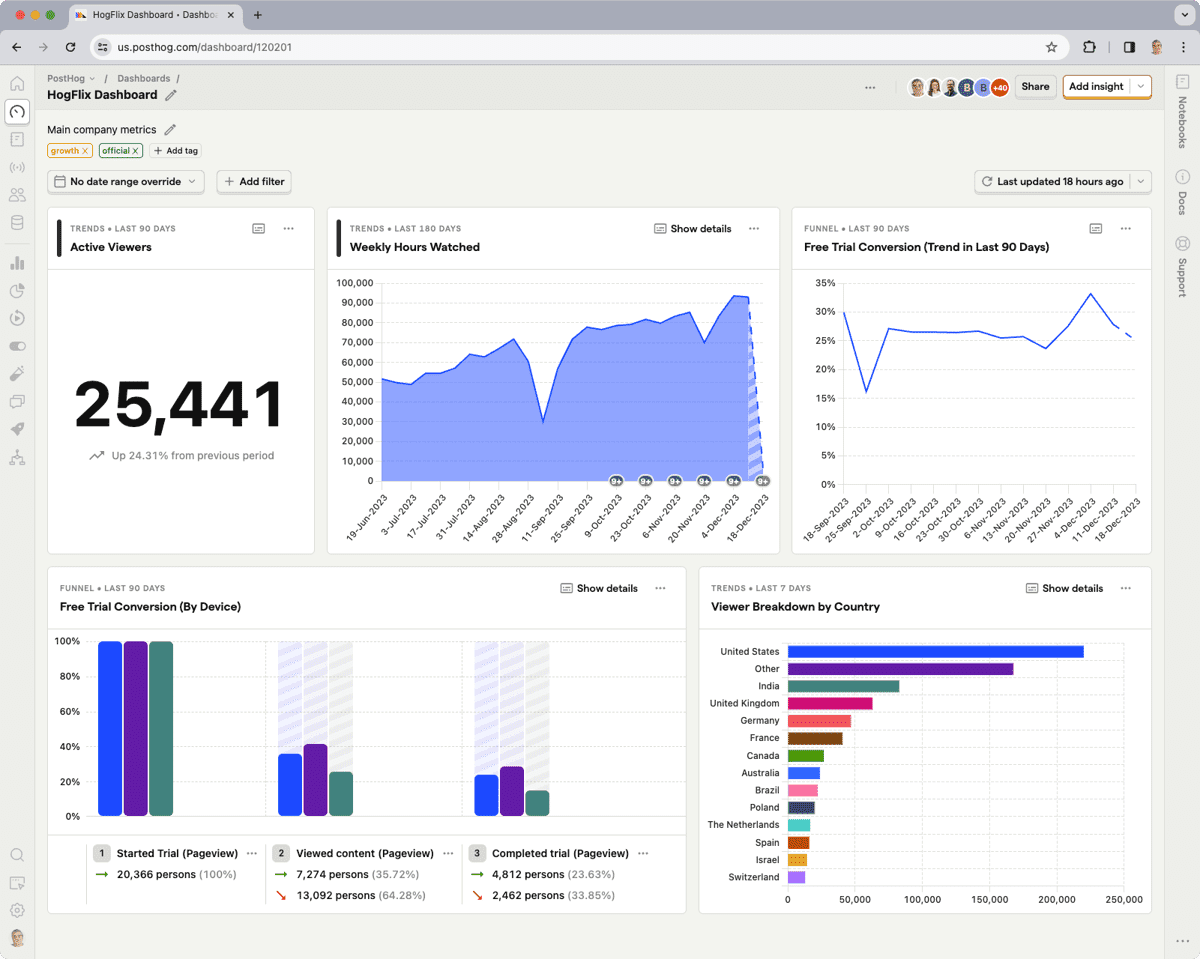
PostHog is an open-source analytics platform for startups and scaleups. It has core product analytics, experimentation and user behavior tracking features. It’s self-hosted, so you have full control over your data.
The platform is attractive to tech-savvy companies that prefer having direct access to and ownership of their analytics tools. PostHog is also popular in the tech sector for its flexibility and adaptability.
PostHog helps you measure user engagement, find problem areas and run A/B tests to optimize user experience. Companies use it for feature flagging so they can roll out changes gradually and measure the impact.
It’s good for teams focused on retaining users, reducing churn and increasing conversion rates. PostHog also helps product managers and developers looking to improve their products.
Key features
Open-source: Gives you full access to modify and use the code.
Event tracking: Captures user interactions across your product.
Heatmaps: Visualize user navigation patterns easily.
Session recording: Replay user sessions to understand behavior.
Integrations: Works seamlessly with other tools in your stack.
Scalability: Handles large volumes of data efficiently.
Privacy-focused: Keeps your user data secure and compliant with regulations.
PostHog vs VWO
PostHog is free and open-source, unlike VWO, a paid service. It makes it cost-effective for smaller companies or startups. While VWO focuses heavily on A/B testing with broad testing options, PostHog incorporates a wider set of analytics tools, appealing to technical teams.
PostHog’s ability to host data on your servers offers greater privacy control than VWO’s cloud-based model. This setup benefits companies with strict data privacy requirements or those who want more control over their data.
Integrations
PostHog works well with Kafka, Slack, AWS, Google Cloud, GitHub, Tableau, and Looker. These integrations make it easy to plug PostHog into your existing tech stack and get more out of it.
Support
PostHog has a community and loads of documentation to support you. While it doesn’t have traditional support channels, it has paid support plans that give you direct access to the developers who can help you solve issues.
Pricing
PostHog offers a tiered pricing structure with a free plan for startups and hobbyists, allowing up to 1 million monthly events with essential analytics features.
After the free plan, you can switch to usage-based plans, starting at $0.00005/event.
3. Optimizely
Optimizely is popular for companies looking for A/B testing and personalization features. It helps you improve your websites and apps through experimentation and integrations with other tools.
The platform allows you to test different website versions for better conversion rates. Optimizely has a user-friendly interface, so it’s suitable for both technical and nontechnical users.
Use cases
Optimizely is used across e-commerce, healthcare and finance. You can use it to improve user engagement on websites and mobile apps. It’s good for testing different design layouts, content variations and marketing messages.
You can also use it to personalize user experiences based on behavior or demographics. Your visitors can see content that resonates with them, improving conversion rates and customer satisfaction.
Key features
A/B testing: Run experiments to find what works best for your audience.
Multivariate testing: Dive deeper into how users interact with different elements on your site.
Personalization: Show tailored content to specific audience segments.
Feature management: Control which features are released and when.
Experimentation platform: Conduct experiments on web, mobile, and full-stack applications.
Optimizely vs VWO
Optimizely has more advanced experimentation features than VWO. It’s particularly strong in multivariate testing and personalization. VWO is also a great tool but more geared towards ease of use with slightly fewer features.
Optimizely might be better for larger companies or those with complex testing needs, and VWO might be better for smaller teams or companies just starting with optimization.
Integrations
Optimizely connects with Google Analytics, Adobe Analytics, WordPress and Salesforce. It allows you to gather data from multiple sources and use it to inform your experiments.
Support
Optimizely has good customer support, including a help center and community forum. You can access documentation and tutorials to get started with the platform.
They also have 24/7 support via chat or email, so help is always available when needed.
Pricing
Optimizely doesn’t share its pricing details publicly. You need to contact their sales team directly for more information.
4. Heap
Heap is a digital insights platform that auto-captures data on user interactions, providing comprehensive analytics features so you can see how people use your website or app. You can start analyzing without coding or tagging, which is suitable for fast-paced environments.
With its full data collection, Heap works for teams that want to see the complete picture of user behavior without manual tracking.
Key features
Automatic data capture: Collects all user interactions automatically.
User segmentation: Helps you segment users based on their behavior.
Retroactive analysis: Allows analysis of past user interactions without prior tracking setup.
Journey analysis: Maps and analyzes user journeys on your site or app.
Event visualizer: Provides visual insights and patterns of user behavior.
Heap vs VWO
Heap gives you a complete view of user behavior with its auto-capture, which differs from VWO’s manual approach.
VWO is suitable for A/B testing and personalization, while Heap is useful for deep behavioral analysis, so it’s a good choice for teams that want to see user engagement patterns.
Integrations
Heap connects to CRM systems, marketing platforms and data warehouses. Key integrations include Salesforce, Google Analytics and Slack so that you can have consistent data across all tools.
Support
Heap offers documentation, webinars and training sessions. You can get support via email and chat or check out the community forum for more help.
Pricing
Heap provides a free plan and three pricing tiers. You need to contact sales to get more information.
5. AB Tasty
AB Tasty is a digital optimization platform that focuses on user experience. It has a user-friendly interface for A/B testing and personalization experiments and also includes a customer data platform you can integrate with third-party applications.
AB Tasty supports web and mobile platforms and has broad features for user engagement analysis.
Use cases
AB Tasty lets you launch and manage A/B tests and personalize user journeys. Marketers use it to improve website performance by testing different layouts, content and features.
It’s good for e-commerce sites to optimize their checkout process and increase sales. Content creators can use it to tailor messaging and design to different audience segments to improve user engagement.
Key features
A/B testing: Create and test different versions of your website content.
Personalization: Customize user experiences based on behavior and preferences.
Feature management: Control feature rollouts and optimize the user experience.
Widgets: Use pre-built options like banners and modals to engage visitors.
Reporting: Access data to track the performance of your tests and campaigns.
AB Tasty vs VWO
AB Tasty is easier to use for personalization tasks than VWO. It has more widgets so you can launch and manage experiments and engage users through different creative formats.
But it doesn’t have all the advanced analytics tools that VWO has. So AB Tasty is good for companies seeking basic but effective experimentation tools. If you want to get projects up and running fast, AB Tasty is a quick and easy solution.
Integrations
AB Tasty integrates with Google Analytics, Shopify, Magento, and Salesforce. These integrations make it easier to link test results to business performance data.
Support
AB Tasty has extensive online resources, including a knowledge base and tutorials to get you started. AB Tasty also provides personalized support through customer service representatives and offers consultation services to make the most of the platform’s features.
Pricing
AB Tasty doesn’t share its pricing information publicly. You need to contact the team for more details.
6. Amplitude
Amplitude is a product analytics and event-tracking platform to understand user behavior and improve digital products.
It helps you get insights into customer journeys, segment users and measure the impact of product decisions.
It’s known for its user-friendly interface and in-depth analytics that integrate easily into your existing tech ecosystem.
Amplitude is for businesses that want to analyze user behavior. You can track engagement, measure conversion rates and understand user retention.
It’s also for product teams that want to optimize their products based on user feedback and behavior data.
Key features
User segmentation: Allows you to segment users based on behavior.
Behavioral cohorts: Create groups of users based on their actions.
Funnel analysis: Track conversion rates and identify drop-off points.
Retention analysis: Measure how often users return to your product.
Pathfinder: Visualize user journeys to understand how they interact with your product.
Amplitude vs VWO
Amplitude and VWO are different but can work together. Amplitude is for in-depth analytics and user behavior, while VWO is for A/B testing and conversion rate optimization.
VWO helps you test changes on your site, while Amplitude gives you the data to understand the impact of those changes. Businesses often use both to cover all their optimization needs.
Integrations
Amplitude integrates with Slack, Segment and Google Analytics. It gives a single view of your data across all platforms and can make better decisions.
Support
You can get help through email, live chat and an extensive online help center. Amplitude also has webinars and training sessions to help you get the most out of the platform.
Pricing
Amplitude provides a free plan and three paid plans, starting at $61/month. The pricing depends on the monthly tracked users and available feature set. You need to contact the sales team for higher plans to get more information.
7. LaunchDarkly
LaunchDarkly is a feature management tool built for developers. It makes software releases easier and helps create better user experiences. It’s a platform where you can roll out features gradually with a kill switch to revert if needed.
LaunchDarkly gives you control over feature distribution and monitoring and reduces risk when delivering new features. With the sunsetting of Google Optimize, LaunchDarkly offers a strong alternative for feature management and experimentation.
Use cases
Software teams get reduced risk during feature deployment, staged rollouts or beta testing. Marketing teams can test features or campaigns without affecting all users.
It is also helpful for geographic targeting, enabling features in specific regions first. Developers working on large-scale software or apps use it for better experiment management and ease of use during updates.
Features
Feature flags: Enable or disable features for different user groups.
Granular targeting: Select who sees specific features based on user attributes.
Real-time updates: Adjust settings quickly without redeploying code.
Kill switch: Instantly reverse a feature rollout when needed.
Detailed analytics: Gain insights into user interaction with new features.
Custom workflows: Create custom pathways for feature management teams.
LaunchDarkly vs VWO
LaunchDarkly is concentrated on feature management through feature flags, while VWO is focused on A/B testing and personalization. If you need feature control in complex environments, LaunchDarkly might be better for you.
VWO has more specialized tools for conversion rate optimization and detailed user behavior insights. Both are good but serve different purposes in software development and marketing.
Integrations
LaunchDarkly connects with Jira and Slack as well as data platforms, analytics tools and cloud services.
Support
LaunchDarkly has email and chat for real-time support. They also include documentation and a community forum where you can ask questions and share tips.
Pricing
LaunchDarkly offers a free plan and three paid plans. The pricing starts at $12 monthly with unlimited seats, projects and environments.
8. Crazy Egg
Crazy Egg is a website optimization tool that helps you visualize your website data. It shows you how visitors interact with your site through heatmaps, scroll maps and click reports.
It suits businesses that want to improve user experience and conversion rate. Its simple interface makes it accessible even if you’re not tech-savvy.
If you’re a web designer, you can see how users interact with different elements. Marketers can use it to increase conversion rates by seeing which page parts get the most attention.
Small business owners can use it to increase online sales by improving customer navigation and overall site engagement.
Features
Heatmaps: Visualize where users are clicking and interacting.
Scroll maps: See how far down a page users are scrolling.
Overlay reports: Get detailed insights on each element on the page.
A/B testing: Test variations of pages to see which performs better.
Snapshot reports: Capture website activity over specific timeframes.
Confetti reports: Break down clicks based on referral sources or campaigns.
User recordings: Watch real user sessions to understand their path.
Crazy Egg vs VWO
Crazy Egg is known for its simplicity and focuses on heatmaps, click tracking and user session recordings, so it’s good for businesses looking for basic user insights.
VWO has a full-featured suite of tools that includes advanced A/B testing, multivariate testing and extensive personalization options to run complex experiments and target specific audience segments.
VWO also supports more integrations with marketing tools and has more customer support resources, whereas Crazy Egg has more straightforward pricing and fewer integrations.
Integrations
Crazy Egg integrates with WordPress, Shopify and Google Analytics. It also works with CRM systems and marketing automation platforms like HubSpot.
Support
You can access online resources, tutorials and webinars to learn more about using the platform. There’s also email support and one-on-one consultations.
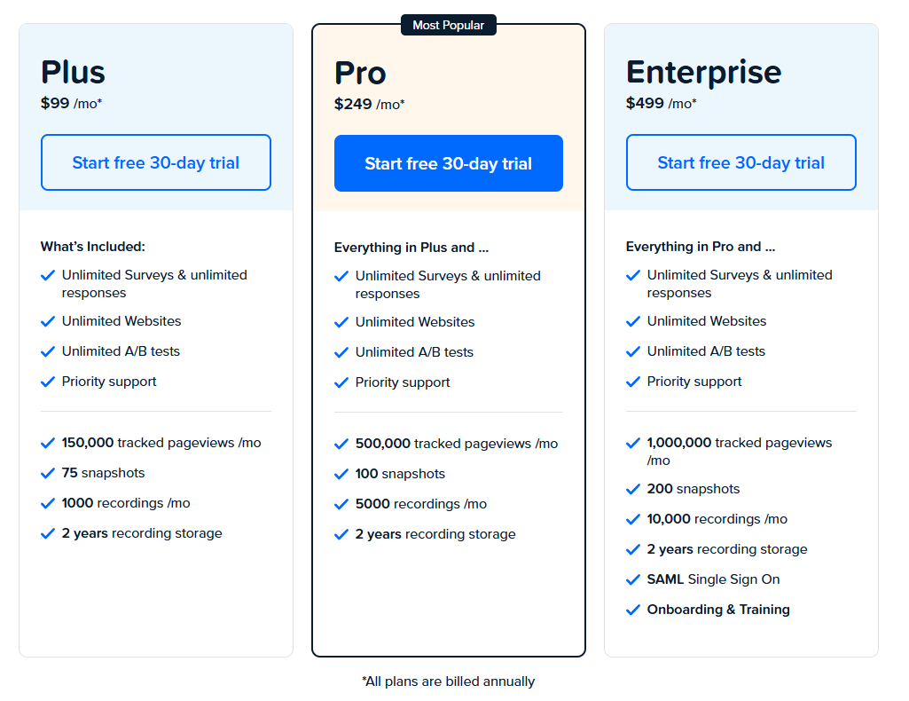
Pricing
Crazy Egg offers three pricing plans, starting at $99/month. All plans are billed annually. The cost depends on the tracked pageviews per month. Each plan has unlimited surveys, websites and A/B tests.
9. FullStory
FullStory is a digital experience analytics platform that shows you everything your users do on your site. It records browsing sessions so you can see how people interact with your content.
It gives you insights into user behavior to find areas for improvement. The platform is intuitive, making it easy to analyze user data immediately.
Use cases
For eCommerce, it’s good for figuring out why users are abandoning their shopping carts. For SaaS, it helps understand user engagement with the software.
Also, it helps UX teams to test website navigation. Marketers can see how campaigns drive traffic to specific site parts.
Key features
Session replay: Watch what users do on your site.
Heatmaps: Visualize user clicks and taps.
Funnel analysis: Track steps users take to achieve a goal.
User insights: Get detailed information on user behavior.
Custom events: Track specific user actions.
FullStory vs VWO
Compared to VWO, FullStory focuses more on qualitative data. While VWO is strong in A/B testing, FullStory stands out in session replay and heat mapping.
It makes FullStory more helpful in determining complex user behavior. If your priority is experimentation, VWO may be the better choice, but for in-depth analysis of user paths, FullStory is a better solution.
Integrations
FullStory integrates with Google Analytics, Slack, Salesforce and Optimizely for experimentation.
Support
You can get access to a help center with guides and tutorials.
Their support team is available by email for more complex questions. They also have live chat for instant help.
Pricing
FullStory has four paid plans but doesn’t publicly share its pricing. Due to limited features, you need to pay for mobile analytics as a separate add-on.
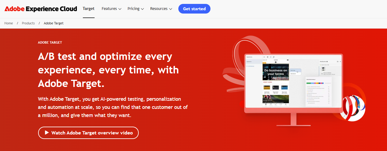
10. Adobe Target
Adobe Target is part of the Adobe Experience Cloud. It’s for businesses looking to optimize digital experiences. The platform allows you to personalize content across all digital channels so you can better connect with your audience.
It provides beginner and advanced users with easy setups and detailed testing options. The interface is user-friendly, making it easier to create and analyze tests.
Use cases
Adobe Target is good for conversion rate optimization by testing different page layouts. It’s suitable for personalizing content for specific audience segments.
Another use is delivering personalized product recommendations for e-commerce, improving user experiences. Adobe Target can personalize in-app content for mobile apps based on user behavior.
Key features
A/B testing: Test different page versions to find what works best.
Multivariate testing: Test multiple elements together to optimize designs.
Automated personalization: Use AI to deliver personalized content in real-time.
Mobile app optimization: Improve app experiences with testing and personalization.
Geolocation targeting: Tailor content based on users’ locations.
Audience segmentation: Group users to deliver targeted experiences.
Recommendation engine: Suggest tailored products or content to users.
Visual experience composer: Create and test experiences without coding.
Adobe Target vs VWO
Adobe Target has deep integration with other Adobe products which can be a big plus if you’re already in the ecosystem. Compared to VWO, Adobe Target is more complex and has more advanced targeting and personalization options.
VWO is simple, easy to use, and suitable for those new to testing. Adobe Target is robust, with more personalization options but less emphasis on testing.
Integrations
Adobe Target integrates with Adobe Experience Manager, Adobe Campaign, Adobe Experience Platform and Demandbase.
Support
Users can access documentation, tutorials, and community forums for self-help. Adobe provides dedicated customer support, including phone and email assistance. For complex issues, Adobe offers consulting services.
Pricing
Adobe Target provides custom plans based on your needs. You need to contact their team for more information.
VWO Alternatives: Comparison Table
Here’s a quick overview of VWO alternatives to help you decide what you really need for your business.
Tool
Key features
Best for
Pricing
FullSession
User behavior analytics, session recordings and replays, dynamic heatmaps, conversion funnel analysis and error tracking
UX/UI analysis, customer journey mapping, website and conversion rate optimization
Conversion rate optimization; For e-commerce and SaaS companies focusing on personalized user experiences
Custom pricing
Amplitude
Advanced analytics, cohort analysis, data analysis
In-depth product analytics; For data-driven teams needing advanced user behavior insights
Free plan available, pricing starts at $61/month
LaunchDarkly
Feature flags, experimentation
Feature management and controlled rollouts; For development teams practicing continuous delivery and experimentation
Free plan, pricing starts at $12/month
Crazy Egg
Heatmaps, scroll maps, A/B testing
Visual website optimization; For marketers and designers wanting to understand user interactions visually
Free trial, pricing starts at $99/month with annual payment
FullStory
Session replay, funnel analysis
Digital experience analytics; For teams needing detailed insights into individual user sessions and overall user flows
Custom pricing
Adobe Target
A/B testing, AI-powered personalization
Enterprise marketing optimization; For large organizations needing advanced personalization and testing capabilities integrated with other Adobe products
Custom pricing
VWO Competitors: The Best on the List
While all the VWO competitors offer valuable features for website optimization and user behavior analysis, FullSession stands out as the best solution.
One of FullSession’s key strengths is that it can track dynamic elements in real-time, giving precise user insights. This feature lets you understand how users interact with your site’s most complex and changeable parts, giving you a competitive edge in optimizing user experience.
FullSession accelerates heatmap processing without impacting your site’s speed. It means you get rapid insights into user behavior patterns without sacrificing your website’s performance – a critical factor for user experience and SEO.
Since data privacy is a top priority, FullSession takes the lead by excluding sensitive data recording. It means you get the insights you need while respecting your users’ privacy, maintaining trust, and complying with data regulations.
FullSession also excels in handling large data volumes. The platform gives you key insights from massive data sets in seconds so you can make data-driven decisions faster and more confidently.
Unlike competitors that might track user behavior across multiple sites, FullSession limits tracking to your specific site. It prevents potential data misuse and ensures that the insights you receive are directly relevant to your website’s performance.
FullSession is also a single platform for cross-team collaboration. Bringing all team efforts onto one platform enables better communication and coordination between different departments, from marketing to development to UX design.
FullSession offers the tools and insights to drive your online success. Its comprehensive approach to website optimization, coupled with its commitment to user privacy and data management, makes it the standout choice among VWO competitors.
Visualize, Analyze, and Optimize with FullSession
See how to transform user data into actionable insights for peak website performance.
VWO (Visual Website Optimizer) is an A/B testing and conversion optimization platform. It helps businesses improve their website by testing different versions of a page to see which one performs better.
What are VWO limitations?
High cost and complex features that are overwhelming for small businesses. It’s less flexible than some open-source alternatives like PostHog, which also offers free and self-hosted solutions.
What’s better than VWO?
FullSession, Optimizely and UXtweak are often mentioned as better options for different user needs. FullSession is for e-commerce businesses, Optimizely is for big enterprises while UXtweak has comprehensive user research tools.
Is VWO a long term investment?
VWO is a good investment if your business needs advanced testing and optimization tools. However, it is not cost-effective for small businesses looking for simple solutions.
Is VWO a SaaS company?
Yes, VWO is a SaaS company. They provide web-based access to their testing and optimization tools.
What is VWO used for?
A/B testing, multivariate testing, conversion rate optimization. Test different versions of web pages to improve user experience and conversions.
PostHog is a product analytics platform that helps developers and engineering teams enhance product development and user experience. Its key features include web analytics, feature flags, session replays, heatmaps and surveys. However, some users have experienced difficulties with data loading, limited data tracking, technical complexity and a high learning curve, leading them to seek PostHog alternatives.
One such alternative is FullSession, which offers an all-in-one user behavior analytics software that helps you visualize all user interactions, analyze trends and patterns with laser precision and optimize your website for peak performance.
In this article, we’ll explore the top PostHog competitors, comparing features, pricing, and use cases to help you find the right tool for your business.
Key Takeaways
FullSessionis a user behavior analytics software that helps optimize website usability, interface, experience and performance. It offers session recordings and replays, dynamic heatmaps, website feedback tools, conversion funnel analysis, and error tracking. FullSession prioritizes user privacy and data security and complies with GDPR, CCPA, and PCI standards. It integrates easily with platforms like Shopify, WordPress, Wix, and BigCommerce. Pricing starts at $39 per month, with a 20% discount for annual subscriptions. Book a demo now.
Pendo is a product experience and digital adoption platform focusing on user behavior analytics and in-app guidance. It provides product usage insights, in-app guides, feedback collection, and user segmentation, making it useful for product teams and customer success managers. However, it can be expensive for smaller businesses, and the setup can be complex. Pendo integrates with tools like Salesforce, Slack, Jira, and HubSpot. Pricing suits mid-sized companies and enterprises.
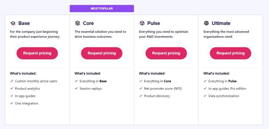
Mixpanel is a product analytics tool centered around event tracking and behavioral analysis. Its key features include event tracking, cohort analysis, funnel analysis, A/B testing, and retention analysis. While it offers powerful insights, its interface can be overwhelming for non-technical users and advanced features are limited to higher pricing tiers. Mixpanel integrates with Salesforce, Slack, Segment, and Google Analytics. Mixpanel offers a free plan with up to 20 million data points, while more advanced plans start at $24 per month.
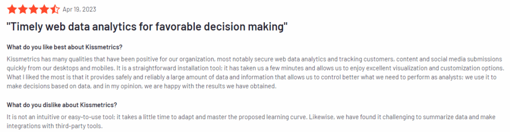
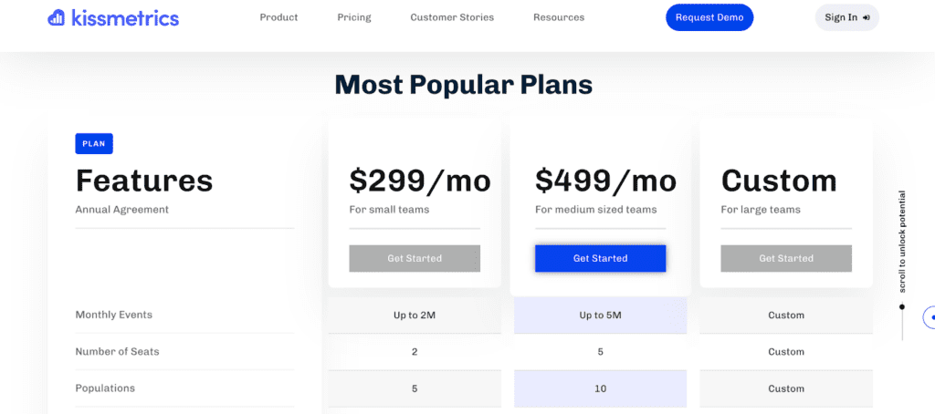
Kissmetrics is an event analytics tool that tracks user actions to improve conversions and retention. It offers funnel reporting, cohort analysis, behavioral segmentation, and revenue tracking. The platform is somewhat outdated and lacks modern data visualizations, and it can be expensive for startups. Kissmetrics integrates with tools like Google Ads, HubSpot, and Stripe. Pricing starts at $299 monthly, with higher-tier plans offering more features.
LogRocket is a product analytics tool focused on increasing conversions and improving product engagement on mobile and desktop apps. Its core features include session replays, error tracking, performance monitoring, heatmaps, and user feedback collection. LogRocket is useful for developers but may not work for teams focused on marketing or UX design. It integrates with Jira, Slack, Trello, and GitHub. Pricing starts at $99 monthly for larger teams, with a free plan available for smaller projects.
Visualize, Analyze, and Optimize with FullSession
See how to transform user data into actionable insights for peak website performance.
If you’re looking for PostHog competitors to fully understand how users interact with your product, here are some of the most popular product analytics tools to consider:
Let’s move on to reviewing each tool and its product analytics features.
1. FullSession
FullSession is an all-in-one user behavior analytics platform that captures all customer interactions and provides extensive insights into how people engage with your website.
Visualize and analyze user behavior data to identify trends and patterns with exceptional accuracy and improve your site’s performance and user experience.
Get a complete overview of user behavior metrics in one place and track website issues with our easy-to-use dashboard.
Move beyond basic statistics by observing real-time user interactions. Our session recordings and replays capture every step of the user journey, providing a detailed view of how visitors navigate your site.
Find problem areas, assess page elements, confirm design changes, and make your site more functional, user-friendly, and efficient with UX heatmap tools.
Identify and fix barriers to conversions, optimize key parts of the user journey, and reduce abandonment rates in your sales funnels with conversion funnel analysis.
Use our customer feedback platform to collect direct user input and quickly understand and resolve common issues.
FullSession offers one of the best website analytics tools while protecting user privacy. We comply with GDPR, CCPA, and PCI standards to increase data security.
Turn User Behavior into Growth Opportunities
Learn how to visualize, analyze, and optimize your site with FullSession.
SaaS companies that need to analyze user interactions and optimize their platforms.
Digital marketers aiming to reduce drop-offs in conversion funnels.
UX designers who want to track how users engage with different page elements.
Data analysts working on identifying behavior patterns to improve engagement.
Product development teams wanting to validate design changes.
Customer support teams aiming to resolve user frustrations.
Quality assurance teams for testing the user interface.
Key features
Advanced filters: Create custom dashboards, spot trends, patterns, and correlations in customer behavior to optimize user journeys, boost engagement, and improve conversion rates.
Session recordings and replays: Record every user interaction on your website to troubleshoot issues and understand user behavior. Use session replay, filter recordings by specific criteria, and predict future actions based on past data. FullSession ensures privacy by excluding sensitive information from recordings.
Interactive heatmaps: Switch between mouse movement, click maps, and scroll maps to find areas with high or low user activity. Test page elements to discover top performers and measure task completion times. Get instant heatmap data with zero delays and no impact on website performance.
Website feedback forms and reports: Create branded forms to collect insights on user satisfaction, pain points, and feature requests. Link feedback to session recordings for deeper context and to understand what led to the comment.
Conversion funnel optimization: Discover why users drop off at specific stages. Visualize user behavior at each step, identify weak points, and test different designs or content to boost conversions.
Error analysis: Automatically detect JavaScript errors, network failures, or API problems. Use error data to troubleshoot, find root causes, and prevent these problems from affecting user experience.
How FullSession compares to PostHog
FullSession is primarily a user behavior analytics tool to visualize user engagement and analyze interaction patterns, while PostHog offers a broader range of product analytics features.
FullSession suits professionals and teams looking to improve user experience and website performance, while PostHog targets product and development teams looking for feature experimentation capabilities.
FullSession has an intuitive dashboard and is easy to implement. PostHog may have a steeper learning curve due to its more complex feature set.
FullSession also provides a flat monthly fee for all its pricing plans, with a 20% discount on annual plans. PostHog offers pricing per tracked event, recording, request and similar.
Limitations
FullSession doesn’t support collecting user behavior data in native mobile apps.
Integrations
FullSession connects with popular platforms like Shopify, WordPress, Wix, and BigCommerce. It also integrates with other apps through Zapier and Open APIs, making it easy to connect with your existing tech stack and automate workflows.
Customer support
FullSession provides excellent customer support via live chat and email. The support team is highly responsive, and they offer a detailed help center for users who prefer to troubleshoot issues on their own.
Pricing
FullSession offers a free trial and three paid plans – Starter, Business, and Enterprise.
Our flexible pricing lets you choose a plan that matches your current needs, with the option to upgrade as your business grows. This way, you only pay for the features you truly need.
The Free plan is available at $0/month and lets you track up to 500 sessions per month with 30 days of data retention, making it ideal for testing core features like session replay, heatmaps, and frustration signals. It’s an free way to access advanced analytics without stretching your budget.
Opt for an annual subscription to save 20% on all plans if you want to:
Track dynamic elements in real time for precise user insights
Accelerate heatmap processing with zero impact on site speed
Protect user privacy by excluding sensitive data recording
Manage extensive data sets effectively and quickly reveal key insights
Limit user behavior tracking to your site, preventing data misuse
Facilitate cross-team collaboration and unify team efforts on one platform
Drive Revenue Growth With FullSession
Learn how to visualize and improve each step in your sales or marketing funnel.
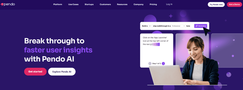
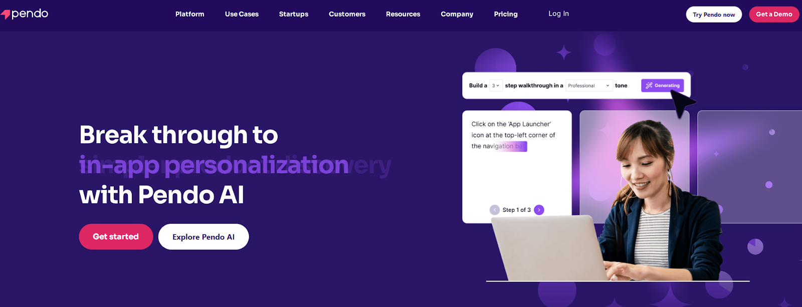
Pendo is a product experience and digital adoption platform that helps businesses understand user behavior, onboard new customers, and provide in-app guidance.
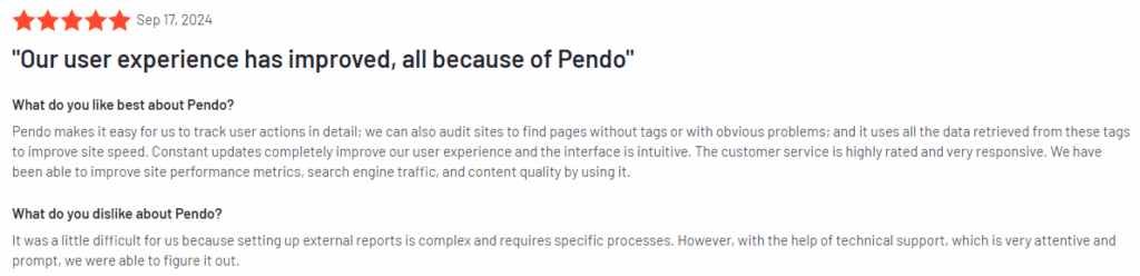
Pendo has an average user rating of 4.4 out of 5 stars based on over 1,445 reviews on G2.
Use cases
Pendo is used by product teams, marketing departments, and customer success teams to:
Onboard new users with in-app guides and tooltips.
Track user behavior to improve product design and features.
Collect feedback directly from users with surveys.
Monitor product usage to identify areas for improvement.
Engage users with timely in-app messages and notifications.
Key features
Product usage analytics: Get detailed insights into how users interact with your product, which features they use most, and where they drop off.
In-app guides: Create onboarding flows, product walkthroughs, and tooltips to help users understand your product better.
Feedback collection: Gather user feedback directly within your app through customizable user surveys.
Segmentation: Segment users based on behavior to provide personalized experiences.
Mobile app analytics: Track user interactions on both web and mobile apps.
How Pendo compares to PostHog
While Pendo and PostHog provide practical analytics tools, Pendo excels in its in-app guidance features. PostHog concentrates on event tracking and technical insights, whereas Pendo focuses on improving user engagement and providing direct user support.
Pendo’s combination of product usage insights and user guidance tools makes it a good choice for product managers looking to boost onboarding and user satisfaction.
Limitations
One of the main drawbacks of Pendo is its pricing, which can be expensive for small businesses or startups. It also doesn’t have feature flags, which is one of the key features of PostHog. Additionally, it can be complex to set up and customize, especially for teams without technical expertise.
Integrations
Pendo offers native integrations with Salesforce, Slack, Jira, and HubSpot. It also supports open APIs, enabling you to connect Pendo with your existing tech stack for a smooth data flow between platforms.
Customer support
Pendo offers live chat, email, and an extensive help center with resources like webinars and documentation. Their customer success team is also available for more personalized guidance.
Pricing
Pendo’s pricing is designed for mid-sized and enterprise businesses. Although exact costs aren’t listed publicly, it’s considered a premium tool, with starting packages priced higher than some competitors.
3. Mixpanel
Mixpanel is a product analytics platform that allows businesses to track and analyze how users engage with their websites or mobile apps. It focuses on event tracking and user behavior, making it useful for teams that want to understand their users’ actions across different touchpoints.
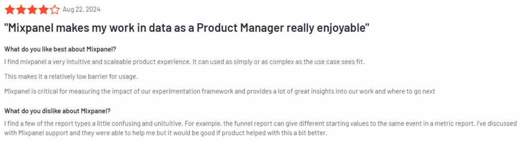
Mixpanel has an average user rating of 4.6 out of 5 stars, based on 1,126 reviews on G2.
Use cases
Mixpanel is often used by product managers, data analysts, and marketers for:
Tracking user interactions across websites and mobile apps.
Analyzing customer journeys to find drop-off points and areas of improvement.
Monitoring feature adoption to determine which product features are most used.
Segmenting users based on their behavior to deliver personalized experiences.
Key features
Event tracking: Track specific actions users take, like clicks, form submissions, and purchases, across your app or website.
Cohort analysis: Group users based on their behavior and analyze how different cohorts behave over time.
Funnel analysis: Identify where users drop off in key flows, such as onboarding or checkout processes.
A/B testing: Experiment with different versions of your app or website to determine which performs better with users.
Retention analysis: Understand how well your product retains users and what actions contribute to long-term engagement.
How Mixpanel compares to PostHog
Mixpanel focuses heavily on event-based tracking and analysis, making it suitable for teams that need in-depth insight into specific user actions.
PostHog offers similar event tracking but includes session replays and self-hosting options, which may appeal to teams with stricter data privacy needs.
Mixpanel’s emphasis on A/B testing and cohort analysis can provide value for businesses that prioritize continuous improvement based on user behavior.
Limitations
Mixpanel’s interface can be overwhelming for non-technical users, especially those unfamiliar with event-based tracking systems. Additionally, while Mixpanel offers a free plan, its more advanced features are locked behind higher-tier pricing, which can be expensive for smaller businesses.
Integrations
Mixpanel integrates with Figma, Slack, Segment, and HubSpot. It also supports open API, allowing for custom integrations with other tools in your tech stack.
Customer support
Mixpanel provides customer support through live chat, email, and extensive documentation.
Pricing
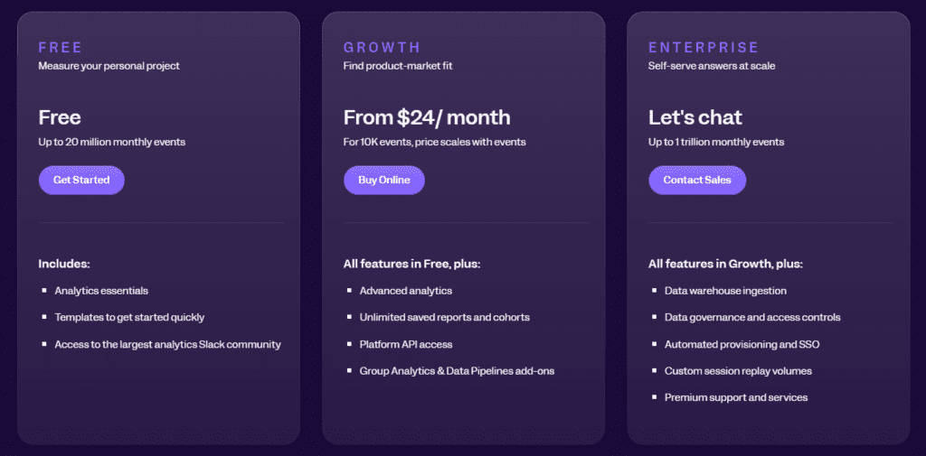
Mixpanel offers a free plan for up to 20M data points per month, but more advanced features, such as data pipelines and A/B testing, require a paid plan. Pricing starts at $24 per month for the Growth plan, with additional costs for enterprise-level features.
4. Kissmetrics
Kissmetrics is a person-based event analytics platform designed to track user behavior and provide insights into how customers interact with your website or app.
Unlike traditional web analytics tools, Kissmetrics focuses on individual user actions, helping you understand customer journeys and improve retention, engagement, and conversion rates.
Track cohort retention to see how user engagement changes over time.
Key features
User behavior tracking: Track user activity on your site or app to understand how visitors interact with your product.
Funnel reports: Analyze where users drop off in your funnels and optimize these stages to improve conversion rates.
Cohort analysis: View how groups of users behave over time and identify patterns in user retention and engagement.
Revenue reporting: Tie user behavior to revenue metrics, helping you understand which actions lead to purchases or other desired outcomes.
Email campaign tracking: Track the effectiveness of your email campaigns and how they contribute to user behavior.
How Kissmetrics compares to PostHog
Kissmetrics focuses more on marketing funnels and user retention, making it a better fit for teams that need product and marketing insights.
PostHog offers a more technical focus, including event tracking, session replays, and self-hosting options.
Kissmetrics doesn’t offer session replays, so if you’re looking for visual representations of user behavior, FullSession might be a better PostHog alternative.
Limitations
Kissmetrics is often seen as less flexible and modern than newer analytics tools. Some users report that it can be harder to use and lacks competitors’ advanced visualizations.
Its pricing model can also challenge smaller businesses, as many advanced features are only available on higher-tier plans.
Integrations
Kissmetrics integrates with popular marketing and sales platforms like Google Ads, HubSpot, Optimizely, and Stripe. It also supports custom integrations through its API, enabling you to sync Kissmetrics with other tools in your stack.
Customer support
Kissmetrics offers customer support through email and chat, with a dedicated help center for users who want to troubleshoot issues on their own.
Pricing
Kissmetrics offers several pricing plans depending on the size and needs of your business. Pricing starts at $299 per month, making it one of the more expensive options for businesses just starting out.
For larger companies looking to track extensive data and integrate with multiple tools, enterprise pricing is available, though it requires direct consultation with Kissmetrics to get a custom quote.
5. LogRocket
LogRocket is a product analytics tool that focuses on session replays, error tracking, and performance monitoring. It allows teams to capture and replay user sessions, providing detailed insights into how users interact with websites and applications.
LogRocket has an average user rating of 4.6 out of 5 stars based on 1,610 reviews on G2.
Use cases
LogRocket is commonly used by:
Development teams to debug and fix issues faster by reviewing session replays and logs.
Product managers to understand how users interact with specific features.
QA teams to reproduce bugs reported by users and ensure a smoother product experience.
Customer support teams to help troubleshoot user-reported problems by viewing what the user experienced.
Key features
Session replays: Record and replay user sessions to see exactly how users interact with your site or app, helping you understand and resolve user issues.
Error tracking: Automatically capture JavaScript errors, network requests, and console logs, so you can identify and fix problems that may impact the user experience.
Performance monitoring: Track page load times, slow resources, and other performance metrics to optimize your site’s speed and responsiveness.
Heatmaps: Visualize where users click, scroll, and hover to better understand user behavior with website heatmap tools.
User feedback: Collect direct feedback from users and link it with session replays to get a complete picture of their experience.
Crash reporting: Get detailed crash reports to identify technical issues causing apps or pages to fail.
How LogRocket compares to PostHog
LogRocket focuses on session replays, error tracking, and performance monitoring. It makes it more developer-friendly than PostHog, which concentrates on event tracking and data analytics.
If you want to understand user behavior in sessions and diagnose technical problems, LogRocket may provide more value than PostHog.
On the other hand, PostHog offers more advanced behavioral analytics features and customizable data tracking, which may better suit product and marketing teams.
Limitations
LogRocket targets developers and troubleshooting. While it does offer analytics features, teams looking for detailed behavioral data or event tracking may find FullSession or PostHog more suitable.
Additionally, LogRocket may not be as beneficial for teams solely focused on user experience design or marketing analytics.
Integrations
LogRocket integrates with tools like Jira, Salesforce, Trello, and GitHub, allowing you to connect your error reports and session replays with your existing development and project management workflows. It also integrates with digital analytics tools such as Google Analytics and Segment for more comprehensive data reporting.
Customer support
LogRocket provides customer support via live chat, email, and an extensive knowledge base with articles, guides, and tutorials.
Pricing
LogRocket offers a free plan for small-scale projects. Its paid plans start at $99 per month for larger teams. The paid plans include additional session recordings and advanced features, such as performance monitoring and detailed error tracking.
Enterprise pricing is also available for companies that need custom solutions and support.
PostHog Alternatives: Comparison Table
If you’re looking for alternatives to PostHog, it’s important to compare features that matter most for your business. Below is a quick overview of the top PostHog alternatives, highlighting key capabilities of each platform.
FullSession
Pendo
Mixpanel
Kissmetrics
LogRocket
Conversion funnel analysis
✔
✔
✔
✔
✘
Error tracking
✔
✘
✘
✘
✔
Session replays
✔
✘
✘
✘
✔
Heatmaps
✔
✘
✘
✘
✔
Feedback collection
✔
✔
✘
✘
✘
User segmentation
✔
✔
✔
✔
✘
Monthly pricing
$39
n/a
$24
$299
$99
PostHog Alternatives: The Best Solution On the List
FullSession is the best alternative to PostHog for businesses that want in-depth user insights without compromising performance or privacy.
FullSession’s real-time tracking of dynamic elements provides precise and accurate data, enabling faster decision-making and immediate website optimization—an area where it exceeds PostHog.
Unlike PostHog, FullSession offers fast heatmap processing without affecting site speed. It ensures seamless access to user interaction data while maintaining website performance, vital for user engagement and SEO.
FullSession prioritizes privacy by allowing you to exclude sensitive data from recordings. It ensures compliance with regulations like GDPR and builds user trust, giving it a clear advantage in privacy-conscious markets.
FullSession is designed to handle large datasets so you can find important insights faster than PostHog’s broader analytics approach.
FullSession restricts tracking to your website alone, preventing data misuse and offering a controlled, secure approach to analytics—perfect for businesses cautious about wider tracking methods.
FullSession brings teams together on one platform. It simplifies workflows, improves communication, and provides a more cohesive user experience than PostHog’s multi-tool approach.
Ready to see the difference? Schedule a demo today and discover how FullSession can transform your user behavior insights.
Visualize, Analyze, and Optimize with FullSession
See how to transform user data into actionable insights for peak website performance.
Are you tired of using Mouseflow for your website analytics? Do you need more advanced features or a fresh approach to understanding your users?
Don’t worry, you’re not alone!
In this article, we will help you find the best Mouseflow alternative that can help you dig deeper into user behavior, satisfaction, and retention. You’ll discover new ways to improve your website performance and keep visitors happy.
Which Mouseflow Alternative Should You Pick?
We’ve got a great list of choices for the Mouseflow alternative that might be just what you need. Let’s share the top options:
ProProfs Qualaroo: Customer feedback collection and survey tool that provides targeted surveys, sentiment analysis, and A/B testing to gather user opinions and insights about your product. Pricing for this qualitative analytics solution starts at $39.99/month.
LogRocket: Error tracking and session replay platform featuring JavaScript error tracking, performance monitoring, and session replay with console logs. Paid plans start at $69/month.
Lucky Orange: Website optimization tool offering session recordings, dynamic heatmaps, form analytics, and conversion funnels to improve conversion rates. Pricing starts at $39/month.
Pendo: Product experience and digital adoption software with in-app guides, feature usage tracking, and user feedback collection to improve product adoption. Pricing info is unavailable.
Take some time to check out each option and see which one feels right for you!
1. FullSession
Capture all user interactions, visualize trends and patterns, analyze user behavior, and optimize your site’s interface, usability, experience and performance with FullSession, our user behavior analytics software.
View all user behavior data in one clear, simple dashboard.
Look beyond basic stats – watch live session recordings and see precisely how people engage with your site from start to finish.
Find underperforming areas, try out different designs, confirm what works, and make your site easier and faster to use with UX heatmap tools.
Spot and fix issues that stop sales, improve key user journey stages and keep more visitors moving through your funnel with conversion funnel analysis.
Hear directly from users about their problems, understand why they get frustrated, and quickly solve common issues with customer feedback collection tools.
Choose FullSession for safe, private analytics. We protect your users’ privacy through GDPR, CCPA, and PCI compliance.
Smart filters: Find trends, patterns and correlations in user behavior to improve user journeys and boost conversions.
Session playback: Observe all interactions, spot issues, and predict future behavior while protecting users’ privacy.
Dynamic heatmaps: See where users click, move, and scroll to find hot and cold spots on your site. Get heatmap data with zero impact on site speed.
User feedback: Collect insights with branded website feedback forms and link them to session recordings for additional context.
Conversion funnel analysis: Identify drop-off points and experiment with design, content or layout to improve conversion rates.
Error tracking: Automatically detect and fix website issues by finding JavaScript errors, network problems and failed API calls to keep the user experience smooth.
FullSession also integrates with Shopify, WordPress, Wix, and BigCommerce. It connects with open APIs, modern webhooks, and Zapier and also provides native integrations.
Pros
Track dynamic elements in real time for precise user insights
Accelerate heatmap processing with zero impact on site speed
Protect user privacy by excluding sensitive data recording
Manage extensive data sets effectively and quickly reveal key insights
Limit user behavior tracking to your site, preventing data misuse
Facilitate cross-team collaboration and unify team efforts on one platform
Enterprise: For big businesses with lots of visitors
The Starter plan costs $39 per month. It lets you track up to 5,000 visitors monthly and includes all the main features.
Want to save some money? With annual payment, you get 20% off.
Not sure which plan is right for you? No worries! You can start small and upgrade later if you need to. FullSession grows with your business, so you only pay for what you need.
ProProfs Qualaroo is a user feedback and survey tool that helps you gather actionable insights from your website visitors and customers.
It offers broad features for creating and deploying targeted surveys, analyzing responses, and improving user experience.
Whether you’re figuring out why customers abandon their carts or how they feel about your site navigation, ProProfs Qualaroo offers the user feedback tools to ask the right questions at the right time.
Key features
Targeted surveys: Create and deploy surveys based on user behavior and demographics.
AI-powered insights: Automatically analyze open-ended responses using natural language processing.
Skip logic: Customize survey flow based on user responses.
Multiple question types: Choose from various question formats to suit your needs.
Integration capabilities: Connect with popular analytics and CRM tools.
Pros
Easy to set up and use
Flexible targeting options
Real-time reporting and analytics
Mobile-friendly surveys
A/B testing capabilities
Cons
Limited customization options for survey design
Higher pricing compared to some competitors
Some advanced features are only available in higher-tier plans
Pricing
ProProfs Qualaroo provides a free plan with up to 50 responses and a Business plan starting at $79.99 monthly. You can also include a White Label Package for $30 per month.
3. LogRocket
LogRocket is a comprehensive product analytics and session replay platform that helps software teams improve user experience and troubleshoot issues.
It combines session replay, product analytics, and error tracking to provide a holistic view of user interactions and application performance.
Session replay: Capture and replay user sessions to visualize interactions and diagnose issues.
Product analytics: Track user behavior and engagement across web and mobile apps.
Error tracking: Automatically detect and report JavaScript errors and API failures.
Performance monitoring: Measure and optimize application speed and responsiveness.
User frustration detection: Identify pain points in user experience using AI-powered analysis.
Pros
Comprehensive suite of tools in one platform
Detailed session replay with console logs and network requests
Advanced filtering and search capabilities
Integrations with popular development and analytics tools
Privacy-focused with data masking options
Cons
Steeper learning curve due to extensive features
It can be resource-intensive on client-side
Pricing may be high for smaller teams or projects
Pricing
LogRocket provides a free plan to record up to 1,000 sessions/month with three available seats and one month of data retention.
Paid plans start at $99/month for tracking 10,000 sessions/month with up to 10 seats and one-month data retention.
4. Lucky Orange
Lucky Orange is a comprehensive website optimization tool that helps you understand user behavior. It provides real-time insights into visitor interactions, helping you boost conversions and improve user experience.
It includes features like real-time analytics, heatmaps, and session replay, and it even has interactive polls and a live chat option.
It lets you chat with users directly as they browse, which can help you provide support and collect feedback on the fly.
Dynamic heatmaps: Visualize user clicks, movements, and scrolls on your website.
Session recordings: Replay visitor sessions to understand user behavior and pain points.
Live chat: Engage with visitors in real-time to provide support and collect feedback.
Form analytics: Track form submissions and identify where users abandon forms.
Conversion funnels: Analyze user journeys and identify drop-off points in your conversion process.
Pros
User-friendly interface with an intuitive dashboard
Real-time data updates for immediate insights
Extensive suite of tools in one platform
Affordable pricing options
Integration with popular platforms like HubSpot
Cons
Limited customization options for some features
Can be resource-intensive on websites with high traffic
Some advanced features only available in higher-tier plans
Pricing
Lucky Orange provides a free plan with up to 100 monthly sessions and four paid plans, starting at $39/month for recording up to 5,000 sessions with 60 days of data storage.
5. Pendo
Pendo is a product experience platform that helps software teams understand and guide their users.
It combines product analytics, user feedback, and in-app guidance to improve user onboarding, feature adoption, and overall product experience.
Pendo is helpful for SaaS companies and enterprise software providers.
Product analytics: Track user behavior, feature usage, and engagement metrics.
In-app guides: Create and deploy targeted in-app messages, tooltips, and walkthroughs.
Feedback collection: Gather user insights through in-app surveys and polls.
User segmentation: Create custom segments based on user behavior and attributes.
Roadmapping: Prioritize product development based on user data and feedback.
Pros
A comprehensive suite of product experience tools
Advanced analytics with custom event tracking
No-code guide builder for easy in-app messaging
Integrations with popular tools and platforms
Strong data visualization capabilities
Cons
Steeper learning curve due to extensive features
It can be resource-intensive for smaller applications
Higher pricing compared to some competitors
Some users report occasional performance issues
Pricing
Pendo’s pricing is custom-based, and specific rates are not publicly disclosed. Prospective customers are encouraged to contact Pendo for a personalized quote.
Mouseflow Alternatives: How They Stack Up
Let’s look at how some popular Mouseflow alternatives compare.
Tool
Key Features
Best For
Pricing
FullSession
User behavior analytics, session recordings and replays, dynamic heatmaps, conversion funnel analysis and error tracking
UX/UI analysis, customer journey mapping, website and conversion rate optimization
Each alternative to Mouseflow has its strengths, so think about what matters most for your business. Do you need detailed user behavior data? Are you more interested in gathering feedback? Your choice will depend on your specific needs and budget.
What is the Best Mouseflow Alternative? Our Verdict
Among the many Mouseflow alternatives for website optimization and user behavior analysis, FullSession is the top choice because of its advanced features and functionality.
FullSession’s real-time tracking of dynamic elements gives you exceptional insights into user interactions with complex, changeable website components.
The platform’s fast heatmap processing doesn’t slow down your website, which is important for user experience and SEO.
FullSession prioritizes user privacy and security by excluding sensitive data from recordings so you comply with data regulations, building customer trust.
The software gives you key insights from large datasets in seconds so you can make fast and confident data-driven decisions.
Unlike some competitors, FullSession limits tracking to your site, so you prevent data misuse and get super relevant insights.
As a single platform for cross-team collaboration, FullSession helps improve communication and coordination across marketing, development and UX design teams.
Let’s answer the most common questions about Mouseflow.
What is Mouseflow?
Mouseflow is a website analytics and user behavior tracking tool that offers features like session replay, heatmaps, funnels, and form analytics to help businesses understand and optimize their users’ experiences.
Mouseflow’s key features include session recordings, heatmaps (click, move, and scroll), conversion funnels, form analytics, user feedback tools, and website analytics.
What is better than Mouseflow?
While “better” is subjective, FullSession offers advantages over Mouseflow, such as real-time tracking of dynamic elements, faster heatmap processing, superior data privacy measures, and efficient handling of large data volumes. Google Analytics is another free alternative to Mouseflow for website owners looking for raw data.
Why do you need a Mouseflow alternative?
You might consider a Mouseflow alternative if you need more advanced features, better performance, improved privacy controls, enhanced data handling capabilities, or a more cost-effective solution for your specific use case.
Is Mouseflow legal?
Yes, Mouseflow is legal when used in compliance with data protection regulations like GDPR and CCPA. However, it’s crucial to implement it correctly and inform users about data collection practices.
Why use Mouseflow?
Mouseflow can help businesses understand user behavior, identify user interface issues, optimize conversion rates, and improve website performance through its analytics and visualization tools.
How do I set up Mouseflow?
To set up Mouseflow:
Create a Mouseflow account
Add your website
Install the Mouseflow tracking code on your site (either manually or via a plugin)
Configure your settings and preferences
Start collecting and analyzing data
Review and adjust your privacy settings and ensure compliance with relevant data protection laws.
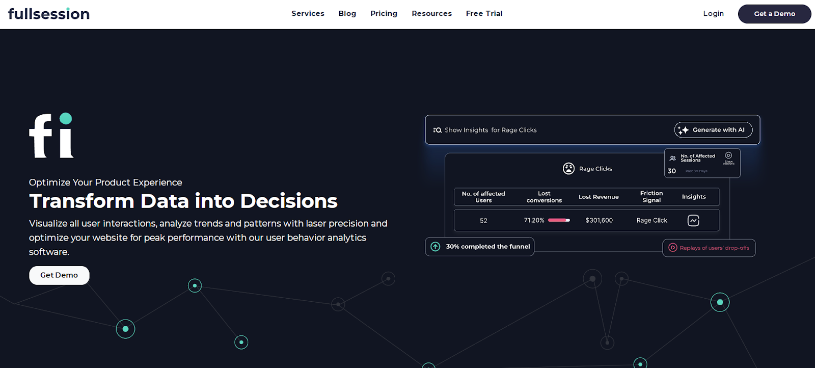

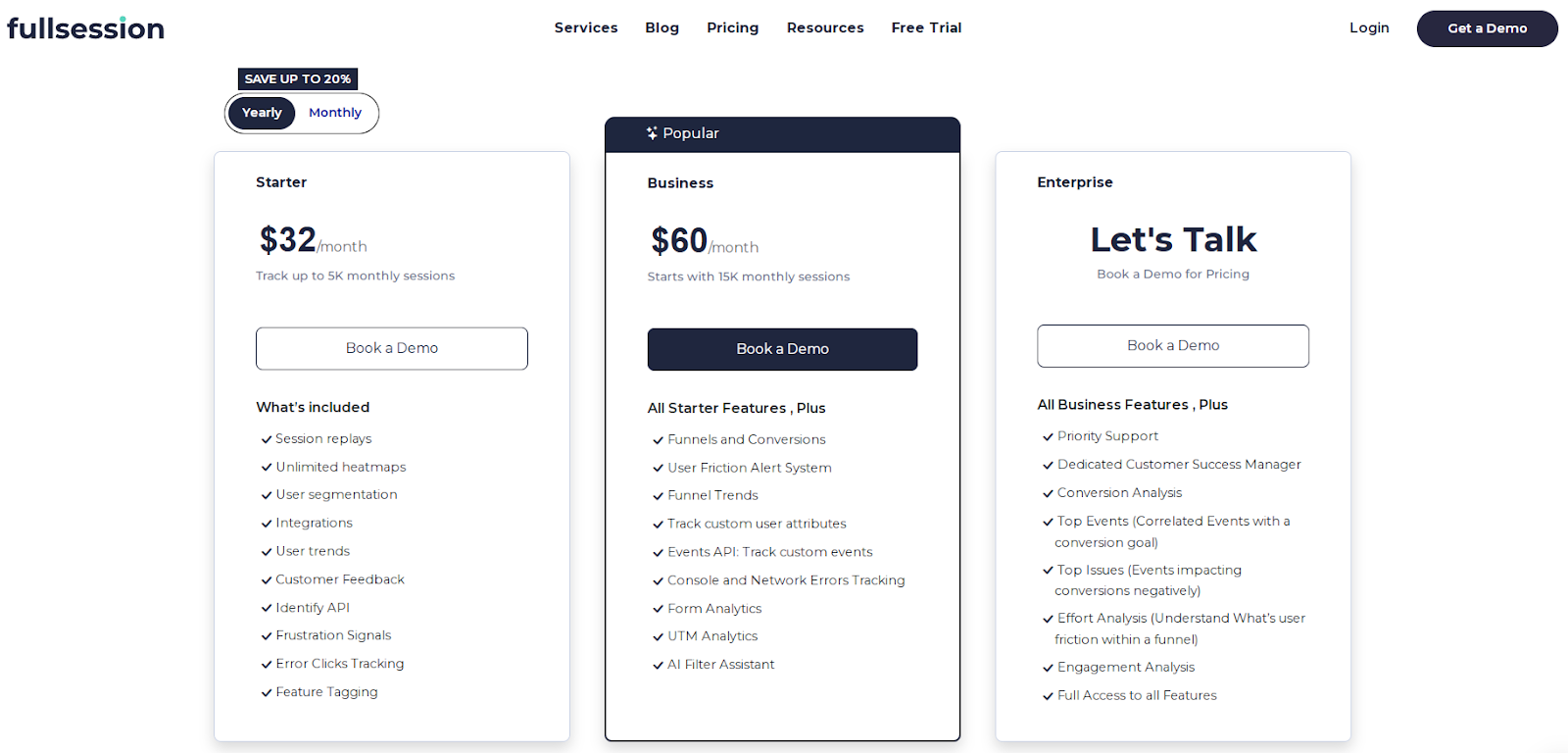
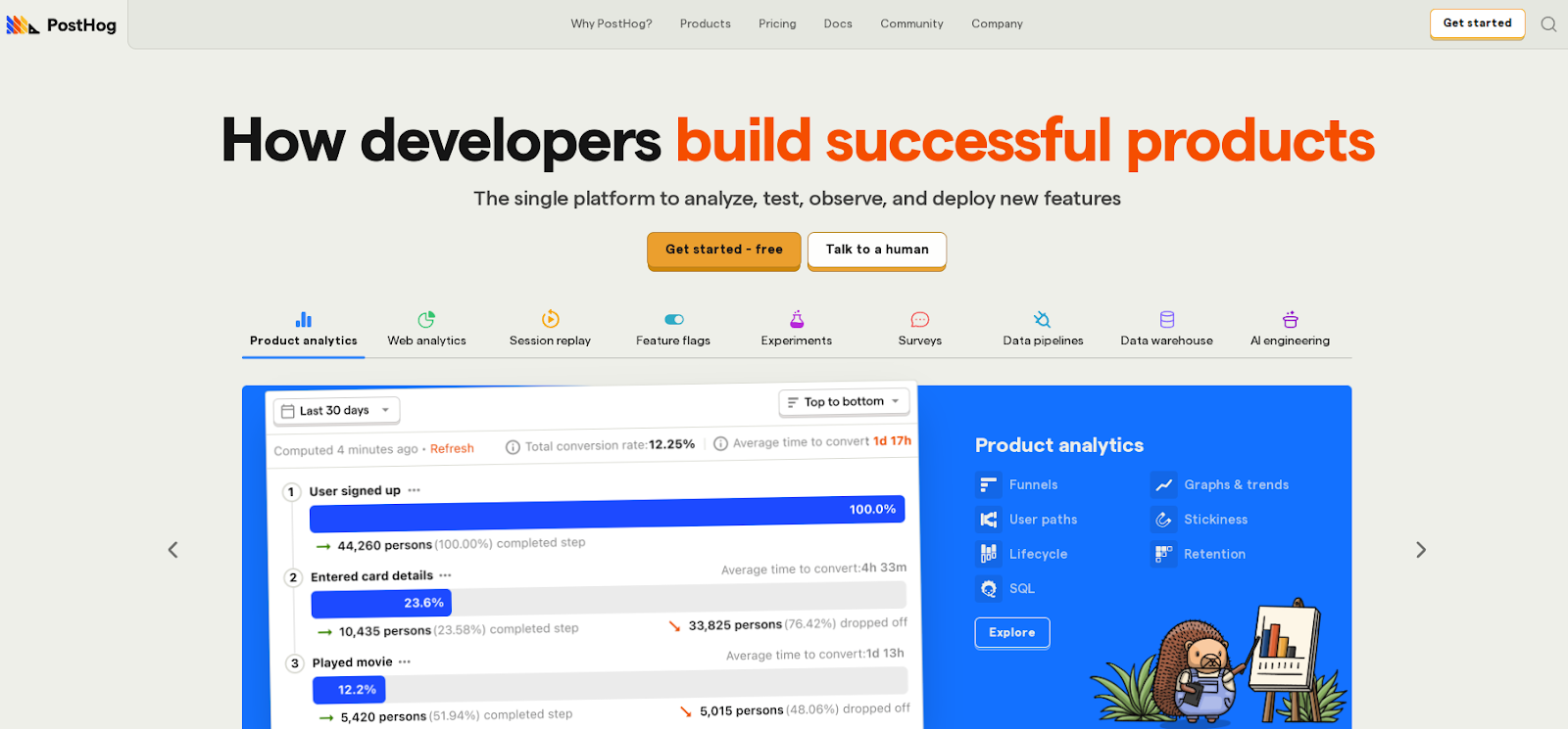
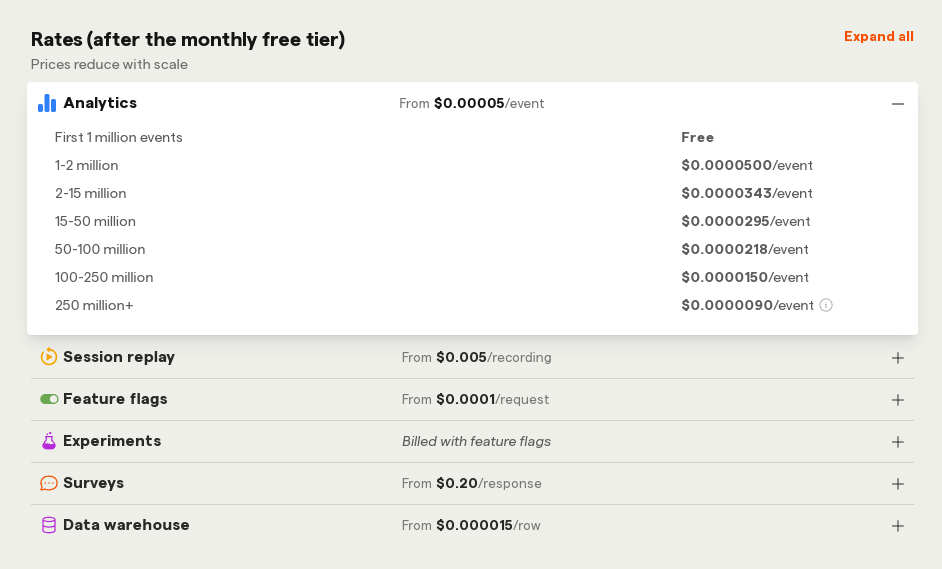
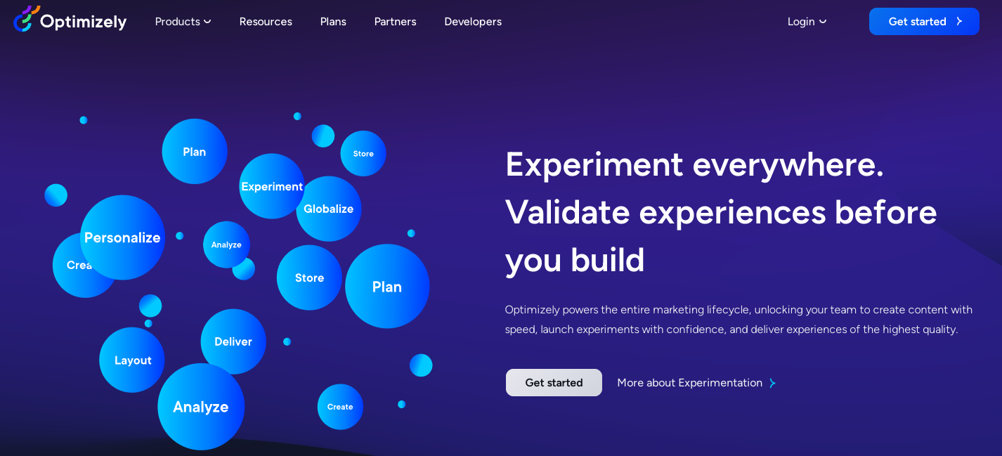
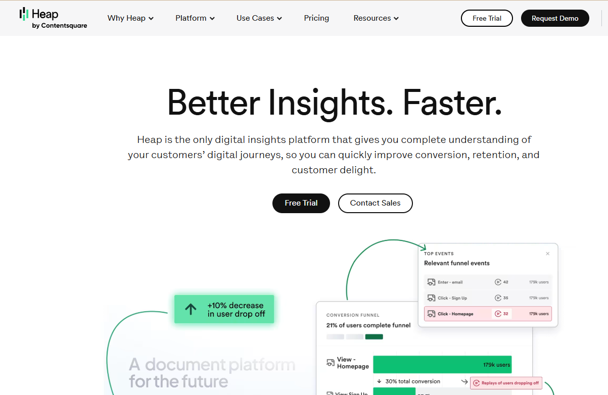
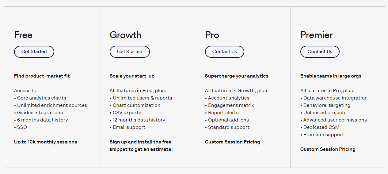
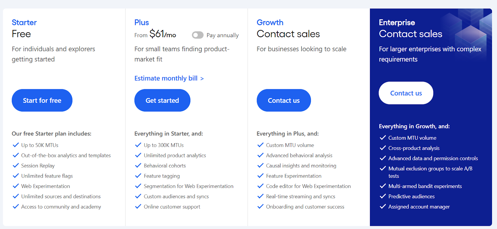
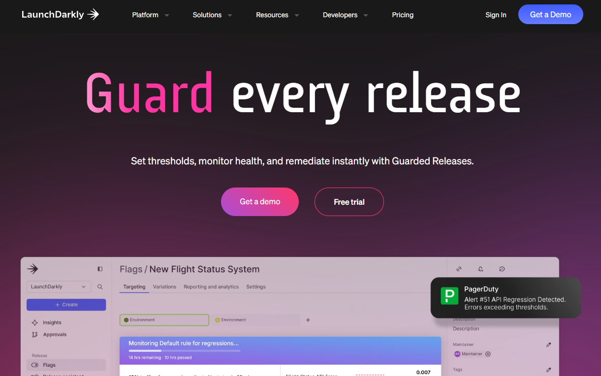
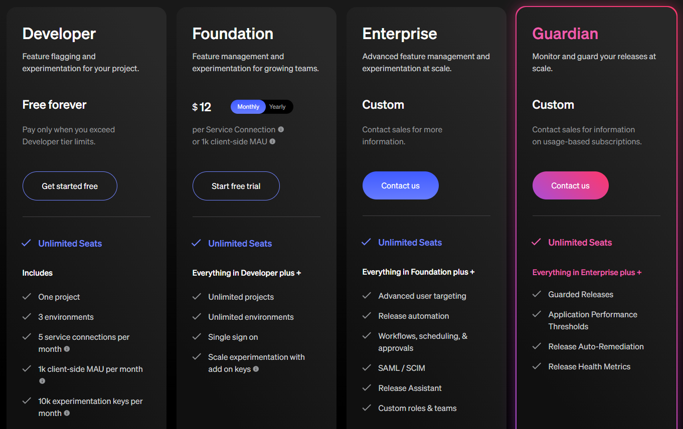
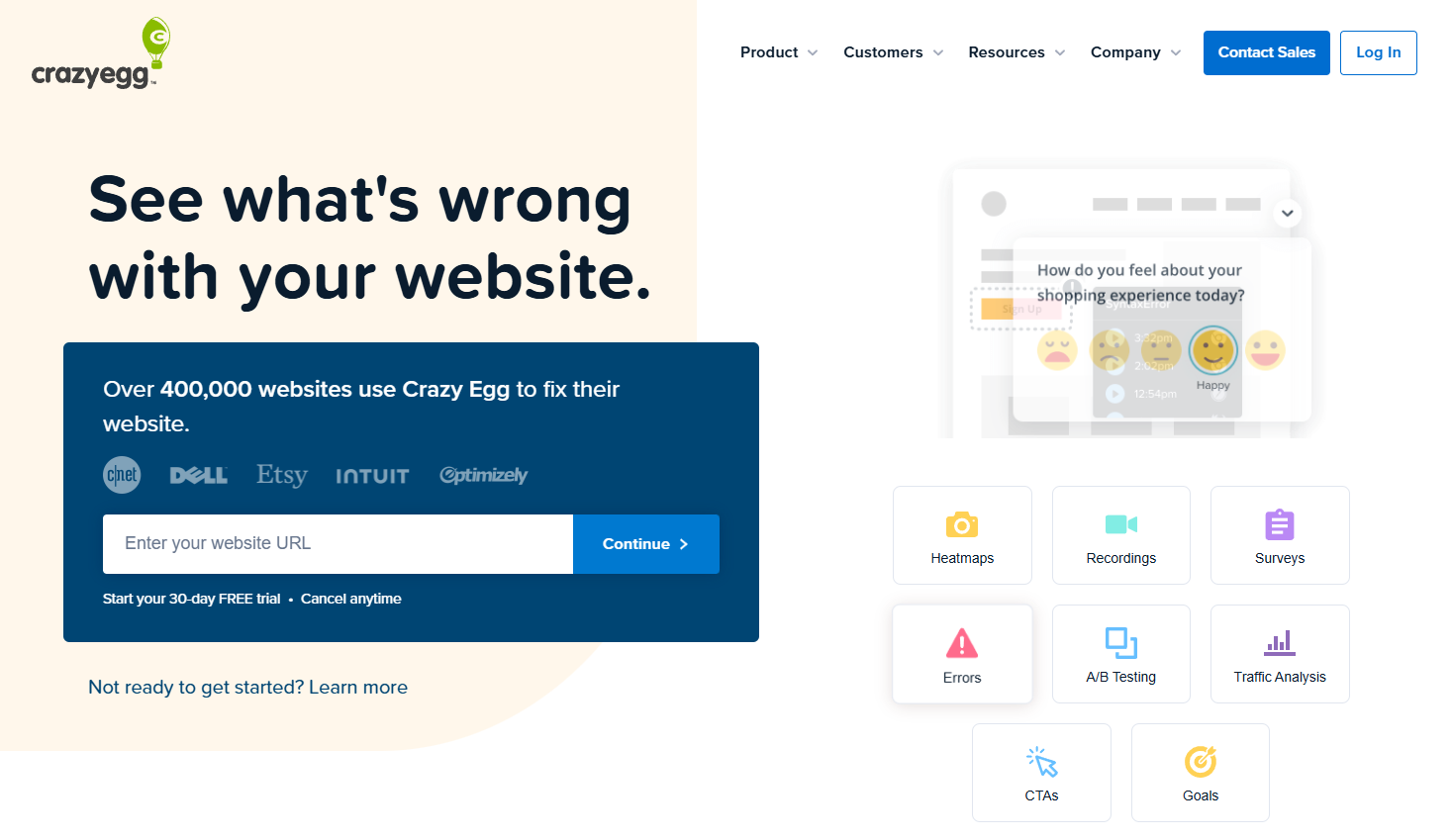 Crazy Egg is a website optimization tool that helps you visualize your website data. It shows you how visitors interact with your site through heatmaps, scroll maps and click reports.