Category: Behavior Analytics

  • Rage Clicks vs Dead Clicks: What’s the Difference and Which UX Problems Matter Most?

    Rage Clicks vs Dead Clicks: What’s the Difference and Which UX Problems Matter Most?

    Quick takeaway

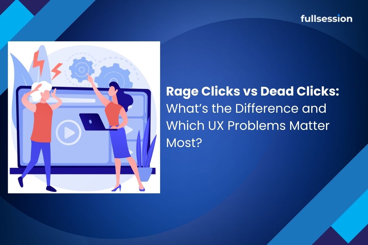
    Dead clicks are clicks with no visible response, rage clicks are repeated rapid clicks that suggest frustration. In PLG SaaS, both matter most when they cluster on activation-critical steps. Use session replay to confirm whether it’s a broken interaction, slow feedback, or an analytics artifact, then prioritize fixes by segment impact and downstream activation lift.

    If your PLG signup or onboarding metrics look fine but activation is flat, these two signals are often the missing “why”. Use session replay for context and prioritize what matters most for PLG activation.

    Table of contents

    • Problem signals that usually show up first
    • Key definitions (and the one nuance most teams miss)
    • Rage clicks vs dead clicks: a decision framework (with edge cases)
    • Symptom-to-cause map: what each signal usually means
    • The 6-step triage workflow (built for activation)
    • How to prioritize fixes for PLG activation rate
    • How to measure outcomes after you ship
    • Common follow-up questions
    • Related answers

    Problem signals that usually show up first

    In PLG SaaS, you rarely hear “rage clicks” in a ticket. You hear: “The button does nothing.” “Invite flow feels broken.” “I got stuck at verification.” The metric version is often: stable signup volume, worse step completion inside onboarding, then flat activation.

    A useful mental model: dead clicks often show up at the first moment your UI fails to acknowledge intent, rage clicks show up when a user tries to brute-force past that failure. Use session replay to validate what actually happened, and keep the work anchored to activation-critical steps.

    Key definitions (and the one nuance most teams miss)

    • Rage clicks: repeated rapid clicks in the same area, typically signaling frustration or confusion.
    • Dead clicks: clicks that produce no visible response (no navigation, no state change, no feedback).
    • Error clicks: clicks that lead to an error state (front-end error, validation error, failed request).
    • Frustration signals: behavioral patterns that correlate with “something is wrong” moments.
    • Activation-critical step: any step that reliably predicts activation (not just signup), like first invite sent, first integration connected, first project created.

    The nuance most teams miss: one user can generate both signals in one moment. A dead click can be the trigger, rage clicks can be the escalation.

    Rage clicks vs dead clicks: a decision framework (with edge cases)

    Use this framework to label the signal correctly before you prioritize it.

    1) What did the UI do after the first click?

    • Nothing changed: start by treating it as a dead click.
    • Something changed, but slowly: treat it as slow feedback, which can create rage clicks that look like UX bugs.
    • Something changed, but not what the user expected: treat it as misleading affordance.

    2) Where is it happening in the journey?

    • Activation-critical step (invite, integration, first key action): escalate severity by default.
    • Non-critical exploration: investigate, but don’t steal cycles from activation.

    3) Is it clustered or isolated?

    A single occurrence might be a mis-tap or impatience. A hotspot cluster usually means a real UX/performance issue or a repeated instrumentation pattern.

    Edge cases (common false positives)

    • Habitual double-clicking on desktop
    • Slow network/device making normal users look “angry”
    • Disabled states that still look clickable
    • Overlays intercepting clicks (cookie banners, modals)
    • Tracking mismatch between click events and UI outcomes

    Symptom-to-cause map: what each signal usually means

    What you seeLikely causeHow to verify fastTypical fix
    Dead clicks on primary CTA (same element)Broken handler, overlay intercept, disabled stateWatch sessions, check click target + element stateFix click binding, adjust overlay, clarify disabled state
    Rage clicks after a spinner appearsLatency or unacknowledged loadingLook for slow API response or long waitAdd immediate feedback, optimistic UI, speed up endpoint
    Dead clicks concentrated on mobileTap target too small, sticky elements blockingSegment by device, compare tap area vs UIIncrease hit area, adjust layout, remove blockers
    Rage clicks on “Next” in a form stepValidation friction with unclear errorsRepeated submits + error state in replayInline validation, clearer error copy, preserve input
    Dead clicks on nav itemsRouting bug, blocked by auth/feature flagNavigation intent vs resulting stateFix routing, tighten flag logic, add fallback states
    Rage clicks on “Connect integration”OAuth popup blocked, third-party step confusionReplay shows popup blocked or context switchDetect blockers, add instruction, retry/continue states

    The 6-step triage workflow (built for activation)

    This workflow reduces false positives and gets you to the fix that can move activation.

    1. Pick the activation-critical slice: Choose one onboarding path that correlates with activation and anchor it to your PLG activation funnel.
    2. Find clustered hotspots: Look for repeated patterns on the same step, element, or segment.
    3. Watch the sessions behind the cluster: Use session replay to confirm what the user experienced.
    4. Classify the root cause: UX/affordance, performance/latency, technical failure, or measurement artifact.
    5. Estimate impact on activation: Prioritize blockers that cluster on steps before activation and align with drop-off.
    6. Ship the smallest trust-restoring fix: Feedback states, clearer validation, removing intercepting overlays, or fixing failures.

    How to prioritize fixes for PLG activation rate

    When everything looks like a UX bug, your roadmap becomes noise. Use a simple rubric: journey criticality, blocker severity, cluster strength, segment concentration, and downstream correlation with activation. Hotspots that are on the activation path and block progress should win, even if raw volume is lower.

    Keep the work anchored to PLG activation, and validate the experience end-to-end using session replay.

    How to measure outcomes after you ship

    • Activation rate (primary)
    • Step completion rate on the affected step
    • Drop-off rate immediately after the affected step
    • Error rate (if technical)
    • Support/contact rate (if you tag it)

    If the frustration signal drops but completion does not improve, you likely hid the symptom without fixing the underlying friction. Re-check sessions in session replay and keep the prioritization aligned to activation outcomes.

    Common follow-up questions

    How many clicks count as a “rage click”?

    There isn’t a single universal threshold. Treat it as a pattern: rapid repeat clicks in the same area that coincide with lack of feedback, delay, or confusion.

    Can dead clicks be intentional?

    Yes. Users sometimes click non-interactive text or icons to test clickability. If it clusters, it still signals an affordance problem.

    Are rage clicks always a UX problem?

    No. Rage clicks can be performance (slow feedback), technical failures (request fails), or measurement artifacts. Session context is the tie-breaker.

    How do I detect dead clicks reliably?

    Combine click activity with “no visible response” signals, like no navigation, no state change, or no downstream event. Connecting clicks to replay context reduces false positives.

    Which matters more for activation: rage clicks or dead clicks?

    Whichever occurs on an activation-critical step and blocks progress. Dead clicks often identify the initial failure, rage clicks often reveal where frustration peaks.

    How do I avoid prioritizing false positives?

    Don’t prioritize by click counts alone. Validate via session context, segment concentration, and whether the hotspot aligns with step drop-off toward activation.

    Related answers

    Next steps

    Pick one activation-critical flow and identify the top cluster of dead clicks or rage clicks. Then validate root cause in session replay and ship the smallest fix that restores trust.

  • Mobile Session Replay: What It Is, How Teams Use It, and What to Look For

    Mobile Session Replay: What It Is, How Teams Use It, and What to Look For

    If you own mobile onboarding and activation, you already know the pattern: you can see the drop in the funnel, you can read the support ticket, you can even reproduce it once, but you cannot explain why it happens across real devices, real network conditions, and messy edge cases.

    Mobile session replay is most useful when it stops being “watching videos” and becomes a repeatable operating system: decide when replay is the right tool, prioritize which sessions matter, turn findings into fixes or experiments, and then validate whether Week-1 activation actually moved.

    Early note for tool evaluation: if you are exploring vendors, start with the category overview at mobile session replay and the activation-specific rollout angle at PLG activation workflows.

    Quick Takeaway

    Mobile session replay is a way to reconstruct what a real user experienced inside your app (taps, swipes, screens, state changes, and often context like events or errors) so you can diagnose activation blockers that analytics and crash logs cannot fully explain. For activation work, the leverage comes from triaging which sessions to watch first, standardizing a cross-functional review workflow, and closing the loop by measuring whether fixes changed Week-1 activation. If you are evaluating tools, use mobile session replay for baseline requirements, then map your rollout to PLG activation workflows so replay becomes part of your activation system, not an occasional debugging trick.

    Table of contents

    • What mobile session replay is (and what it is not)
    • When replay is the right tool for activation work
    • A prioritization system for which sessions to watch first
    • A 60-minute cross-functional workflow (PM, QA, engineering, support)
    • Mobile-specific tradeoffs you should evaluate before rollout
    • What to look for in a tool (activation-focused checklist)
    • How to prove impact on Week-1 activation
    • Common follow-up questions
    • Related answers

    What mobile session replay is (and what it is not)

    Mobile session replay helps you reconstruct a user’s path through your app: screen transitions, gestures, UI interactions, and app-state context. Done well, it answers questions you routinely hit in activation work.

    What it is not: a perfect camera recording of the screen with complete meaning baked in. Mobile apps do not have a browser DOM, and native rendering, custom components, and offline behavior introduce fidelity and interpretation tradeoffs. That is why the operational layer matters: you need a consistent way to decide what to review and how to turn a replay into an actionable backlog item.

    If you want a category baseline before you operationalize it, start with the mobile session replay overview and then anchor your rollout to PLG activation workflows so the work stays KPI-driven.

    When replay is the right tool for activation work

    Activation problems tend to fall into three buckets. Your first job is to route the problem to the right primary instrument: measurement integrity, explanation of drop-offs, or reproducibility for errors and crashes.

    A practical rule for activation teams: use analytics to find the cliff, then use replay to explain the cliff, then use analytics again to validate the fix. The mobile session replay hub is useful for baseline capabilities, and PLG activation workflows is where you keep the work outcome-tied.

    A prioritization system for which sessions to watch firs

    1. Define the activation-critical segment first so your review time stays tied to Week-1 activation.
    2. Filter by activation harm signals such as repeated taps, long dwell time, or onboarding errors.
    3. Rank by business impact, not curiosity, prioritize hard stops on high-volume steps.
    4. Convert each watched session into a structured output: bug, UX fix, tracking fix, or messaging change.

    A 60-minute cross-functional workflow (PM, QA, engineering, support)

    Activation issues cross roles. Replay gets leverage when the review ritual is shared and time-boxed, with a small ranked queue and clear outputs.

    If you want an example of how teams operationalize this around onboarding, map your ritual to PLG activation workflows and align tooling requirements through the mobile session replay hub.

    Mobile-specific tradeoffs you should evaluate before rollout

    Mobile replay has real constraints. Your rollout plan should explicitly cover fidelity gaps, performance impact, offline behavior, and privacy governance so you do not discover them mid-incident.

    What to look for in a tool (activation-focused checklist)

    Focus on triage and filtering, context that reduces handoffs, governance your org can operate, and sampling you can explain.

    Ecommerce teams should also evaluate whether a replay platform can capture mobile checkout friction, product page hesitation, cart abandonment signals, and broken buying flows. If your main goal is improving online store conversions, this comparison of session replay tools for ecommerce can help you assess tools built for ecommerce-specific workflows.

    How to prove impact on Week-1 activation

    Replay does not increase activation by itself. Use a closed-loop proof model: write a measurable hypothesis, choose a leading indicator and a lagging KPI, validate in a release-aware window, and re-check sessions post-fix.

    If you want to align this proof loop to a practical rollout plan, anchor your approach in PLG activation workflows and use the mobile session replay hub to pressure-test tool capabilities against your operating model.

    Common follow-up questions

    • Does mobile session replay record video? Most tools reconstruct sessions from instrumentation and UI state, treat it as reconstruction with context.
    • How many sessions should we watch per week for activation? Start with a fixed budget you can sustain, then expand after triage is stable.
    • Who should own replay review? PM owns prioritization and outcomes, engineering owns fixes, QA validates, support supplies pattern signals.
    • Can replay replace funnels and analytics? No, use analytics to find where, replay to explain why, analytics to validate.

    Related answers

    Next steps

    Start from the category baseline at mobile session replay, then operationalize it with an activation-first rollout using PLG activation workflows.

  • Crazy Egg vs Microsoft Clarity: how to choose for activation, not just price (as of March 2026)

    Crazy Egg vs Microsoft Clarity: how to choose for activation, not just price (as of March 2026)

    If you are a Growth PM owning activation and onboarding, the “crazy egg vs microsoft clarity” decision is rarely about heatmaps versus recordings. It is about whether your team needs fast exploratory diagnosis, repeatable segmentation workflows, and reliable validation after you ship changes.

    Crazy Egg and Microsoft Clarity overlap on core behavior visuals (heatmaps + session recordings), but they diverge on (1) experimentation maturity, (2) operational limits and retention, and (3) consent and data continuity.

    Quick Takeaway (Answer Summary)
    Choose Microsoft Clarity when you need free, broad coverage for exploratory onboarding diagnosis and can live with consent-driven gaps in continuous journey stitching. Choose Crazy Egg when you need structured optimization workflows, including A/B testing, and you can manage plan limits like recording quotas and retention. If your priority is activation decisions that hold up in stakeholder review, use a workflow that ties segments → evidence → changes → validation, ideally in one place like FullSession Lift AI for prioritization and PLG activation workflows for rollout.

    On this page

    • Why most comparison pages do not help you decide
    • The decision framework: Budget × Workflow × Optimization maturity
    • The 4-step workflow that makes the choice obvious
    • Operational limits that change fit
    • Consent and privacy: the hidden decision driver
    • Tool-fit cheat sheet and scenario
    • FAQs and next steps

    Why most “Crazy Egg vs Clarity” pages do not help you decide

    Most SERP results are template comparisons. They answer “which is cheaper” and “which has higher reviews,” but they do not answer which tool fits your activation diagnosis workflow, when insights should become experiments versus direct fixes, or how consent and retention affect data quality for onboarding funnels.

    The decision framework: Budget × Workflow × Optimization maturity

    1) Budget and procurement reality

    Microsoft Clarity is commonly positioned as free-to-use, which makes it easy to deploy broadly. Crazy Egg is positioned as paid, and its plans include operational constraints like tracked pageviews, recording quotas, heatmap report counts, and storage duration. (Details vary by plan.)

    Rule of thumb: If budget is the only constraint, Clarity will look like the default. But budget-only decisions often fail later when you need validation, governance, or scalable workflows.

    2) Workflow fit: exploratory diagnosis vs repeatable decision-making

    Ask what you need to do weekly, not what features exist in a checkbox list. If your workflow is “spot friction fast, fix it, move on,” Clarity can be enough. If your workflow is “diagnose, propose variants, validate impact,” Crazy Egg aligns more naturally because it emphasizes testing workflows alongside observation.

    3) Optimization maturity: observation-only vs experimentation-led

    Early maturity: observation + lightweight validation is often sufficient. Higher maturity: you need a consistent path from insight → hypothesis → change → validation, and you need to document what you learned. If your activation KPI is sensitive, your team will outgrow “watch recordings and ship edits” faster than you think.

    The workflow that makes the choice obvious (4 steps)

    Run this workflow once on your onboarding flow, then choose the tool that makes it easiest to repeat.

    Step 1: Define the activation question and the slice

    Do not start with “watch sessions.” Start with a question your team can act on. Examples: where does the biggest drop-off happen, and which segment is failing. Pick one activation slice.

    Step 2: Investigate with heatmaps + replays, but tag the evidence

    Use heatmaps for aggregate attention and replays for sequence and intent. Capture the exact step where friction occurs, the pattern, and a small set of representative sessions. Repeated hesitation before the first key action.

    Step 3: Decide: direct fix vs experiment

    Direct fix when the issue is obvious and low-risk. Experiment when you have competing hypotheses. Ship a fix only when the hypothesis is singular.

    Step 4: Validate impact and write down what changed

    Compare activation rate before vs after, check segment variance, and confirm you did not create new friction downstream. Prove the activation lift holds by segment.

    If you want the “segment → evidence → priority” loop in one place, start with FullSession Lift AI and map changes to your PLG activation workflow.

    Operational limits that change real-world fit

    Crazy Egg: quotas and retention are part of the product reality

    Crazy Egg plans can include constraints like tracked pageviews per month, recordings per month, heatmap report limits, and recordings storage duration. If your activation work requires steady sampling across multiple onboarding variants, quotas can shape what you measure and how often you revisit problems.

    Clarity: “free” is real value, but you still have to manage data quality

    Clarity’s value is breadth, deployment ease, and cost. The trade-off is that consent can materially change what you can interpret.

    Consent and privacy: the hidden decision driver

    Microsoft’s documentation notes that if cookie consent is not provided, Clarity cannot track a continuous user journey and may treat pages in the same visit as separate sessions. For activation analysis, that can make funnels noisier and “where did they go next?” harder to answer.

    If you operate in consent-constrained regions or your consent rates are volatile, choose the tool and workflow that stays trustworthy when journey continuity is imperfect. If you need governance-ready behavior analytics that still supports activation decisions, use PLG activation workflows alongside FullSession Lift AI.

    A tool-fit cheat sheet for Growth PMs (activation-led)

    If your reality looks like this… Clarity tends to fit when… Crazy Egg tends to fit when…
    You need broad coverage fast you want quick exploratory diagnosis and wide rollout you can budget for tighter sampling and structured optimization
    Your team ships changes weekly you mostly ship direct fixes from clear evidence you often need to test competing onboarding hypotheses
    Stakeholders demand proof you validate with adjacent metrics and lightweight checks you need a stronger experimentation narrative and tooling
    Consent affects data continuity you can interpret results with discontinuities you invest in a more controlled measurement approach

    Common follow-up questions

    • Is Microsoft Clarity enough for activation work?
      Yes if your team is early in maturity and primarily needs broad, free visibility for exploratory diagnosis. It becomes harder when you need consistent journey continuity, stakeholder-proof validation, or a repeatable experiment loop.
    • When is Crazy Egg worth paying for?
      When you need a more structured optimization workflow that includes testing, and you can manage plan constraints like quotas and retention as part of your operating cadence.
    • What is the biggest consent-related risk with Clarity?
      If cookie consent is not provided, Clarity cannot track a continuous user journey and may treat pages in the same visit as separate sessions, which can distort onboarding interpretation.
    • Should I always run experiments after watching replays?
      No. Run direct fixes when the hypothesis is singular and low-risk. Run experiments when multiple plausible explanations exist or when activation impact is uncertain.
    • How do I avoid “watching sessions forever” without decisions?
      Use a strict loop: define a slice, capture evidence, decide fix versus test, then validate impact. If your tooling does not make this loop fast, the team will stall.

    Next steps

    Run the 4-step workflow once on your onboarding flow. If your bottleneck is “we need broad visibility now,” start with Clarity. If your bottleneck is “we need to validate competing hypotheses,” Crazy Egg will map better to experimentation-led optimization.

    If you want to reduce tool sprawl while making activation decisions more defensible, start with FullSession Lift AI and route it into PLG activation workflows. Then, if you prefer a guided evaluation, you can book a demo or start a free trial.

    Apply the framework on your onboarding flow

    Start with FullSession Lift AI for prioritization and route the rollout through PLG activation workflows. If you want help validating fit, book a demo or start a free trial.

  • How to Use Heatmaps to Improve Activation Rate in SaaS Onboarding

    How to Use Heatmaps to Improve Activation Rate in SaaS Onboarding

    Heatmaps can improve activation rate when you use them to diagnose friction in onboarding, not just to spot clicks. The winning workflow is to isolate new users, review heatmaps alongside session replay and funnels, rank issues by likely activation impact, then validate changes against the activation milestone with a user behavior analytics platform like FullSession.

    You ship a new onboarding flow. Signups go up, but activation stays flat. The problem is usually not a lack of ideas. It is a lack of evidence about where new users actually get stuck.

    This guide is for SaaS product managers and product leaders who need a practical way to use a heatmap tool to improve activation rate. The goal is not to produce prettier dashboards. It is to find the friction that blocks first value, fix the right things first, and confirm that activation actually moved.

    Early in the process, it helps to anchor your analysis in interactive heatmaps for onboarding journeys and a clear activation framework like PLG activation workflows. Heatmaps alone rarely answer the whole question, but they are one of the fastest ways to see where attention, hesitation, and dead clicks cluster inside onboarding.

    Why activation work often stalls

    Most teams can describe their activation metric. Fewer can explain why it is not moving.

    That gap shows up when a team sees a drop between signup and first key action, but still cannot tell whether the real blocker is confusing UI, weak onboarding copy, an empty state, a setup dependency, or a hidden technical issue. Funnel metrics tell you where users drop. Heatmaps help you see where they hesitate, over-focus, or interact in ways that signal confusion.

    For SaaS PMs, this is a roadmap problem as much as an analytics problem. If the backlog is full of opinions, every onboarding change becomes a guess. You need a workflow that ties visible friction to the activation milestone, then helps you decide which fix is worth shipping first.

    What heatmaps are good at, and where they fall short

    Heatmaps are strong at showing patterns of interaction density across a page or step in the journey. In onboarding, that usually means click concentration, scroll behavior, and hover or move patterns around setup steps, empty states, checklists, invitations, and first-use flows. For online stores, ecommerce heatmaps can reveal similar interaction patterns across product pages, category pages, cart flows, and checkout steps.

    They are especially useful for questions like these:

    • Are new users clicking a non-clickable element because it looks actionable?
    • Are they skipping the area that explains the next step?
    • Are they stopping before a key setup section comes into view?
    • Are they concentrating clicks around one field or control in a way that suggests confusion?

    What heatmaps do not do well on their own is explain intent. A hot area can mean progress, curiosity, distraction, or frustration. That is why activation analysis works best when you pair heatmap analysis for onboarding friction with replay and milestone validation inside activation-focused product workflows.

    A better workflow: use heatmaps inside an activation diagnosis loop

    Step 1: Start with the activation milestone, not the page

    Before opening a heatmap, define the milestone that represents activation for this flow. In a SaaS onboarding journey, that might be completing setup, importing data, creating the first project, inviting a teammate, or using the core feature for the first time.

    Then narrow your analysis to users who are realistically in the activation window:

    • first session
    • first day
    • first week
    • specific acquisition channel, if relevant
    • users who reached a given onboarding step but did not activate

    This matters because broad all-user heatmaps often blur the signal. Existing users know the interface. New users do not. If you want activation insight, segment for new-user cohorts first.

    Step 2: Read the heatmap for activation-critical friction

    Look for patterns that block progress to the next meaningful action, not just areas with high activity.

    The most useful activation-specific signals usually fall into three buckets:

    PatternWhat it may meanWhy it matters for activation
    Repeated clicks on the wrong elementThe UI suggests an action that is not available or not clearUsers spend effort without progressing
    Shallow scroll before key contentUsers are not reaching setup instructions, trust signals, or the next actionThe onboarding path may be too long or weakly structured
    Heavy interaction around one field, menu, or stepUsers may be confused, cautious, or blocked by complexityA single setup dependency can stall first value

    This is where interpretation matters. A “hot” area is not automatically a success. In onboarding, high interaction often signals hesitation. Treat every strong pattern as a hypothesis, not a conclusion.

    Step 3: Use session replay to add behavioral context

    Once the heatmap shows where to look, replay tells you why the pattern is happening.

    Watch a small set of sessions from the same segment:

    • users who reached the step but did not activate
    • users who completed the step and did activate
    • users from the same acquisition or persona segment, if your onboarding varies

    This contrast is what turns a heatmap observation into a useful diagnosis. Maybe users click the checklist repeatedly because the copy is vague. Maybe they abandon a setup form because the required data is not available yet. Maybe the “next” action sits below the fold on smaller screens.

    When teams combine heatmaps with behavior analytics for product teams and PLG activation analysis, they move faster because they stop debating whether friction is “real.” They can see it in context.

    Step 4: Prioritize by activation impact, not visual drama

    Not every friction point deserves a sprint.

    A simple prioritization rule works well here: fix issues that are both close to the activation milestone and common among non-activated new users.

    Use these questions:

    1. Does this issue appear on a step directly tied to activation?
    2. Does it affect a meaningful share of new users?
    3. Is the likely fix small enough to test quickly?
    4. Can you measure activation movement after the change?

    If the answer is yes across all four, it belongs near the top of the queue. If a pattern looks noisy, cosmetic, or disconnected from first value, capture it and move on.

    Step 5: Validate the change against activation, not clicks

    This is the step most articles skip.

    After you ship a change, check whether the activation milestone improved for the relevant new-user cohort. Do not stop at click-through rate or checklist completion unless those are truly part of the activation definition.

    A clean validation loop looks like this:

    1. Observe friction in heatmaps
    2. Confirm the cause in replay
    3. Ship one focused change
    4. Compare activation movement for the affected new-user segment
    5. Review whether downstream usage improved or simply shifted

    You can support that validation with funnel and conversion analysis while keeping the business goal anchored in PLG activation.

    What teams currently do instead, and why it breaks down

    Dashboard-only analysis

    This works for spotting drop-off, but not for diagnosing cause. You learn where activation stalls, not what users experienced there.

    Ad hoc replay watching

    This can surface useful examples, but it is hard to scale and easy to bias. Without cohort filters and page-level patterns, teams often overreact to memorable sessions.

    Heatmaps in isolation

    This is better than guessing, but still incomplete. You can see attention and interaction density, yet miss whether users progressed, hesitated, or failed.

    Multiple disconnected tools

    This can work, especially for mature teams, but it usually slows decision-making. If segmentation, replay, heatmaps, and validation live in separate tools, it takes longer to move from observation to action.

    Three onboarding patterns where heatmaps are especially useful

    1. Setup checklists that get attention but not completion

    If the checklist draws clicks but the next milestone does not move, the issue may be wording, task order, or unclear prerequisites.

    2. Empty states that fail to direct first action

    Empty states often carry the burden of product education. A heatmap can show whether users focus on supporting copy, ignore the primary CTA, or get distracted by secondary navigation.

    3. Invitation and collaboration flows

    Activation often depends on inviting teammates or connecting data sources. If users hover, click around, or abandon these steps at high rates, the friction may be trust, timing, or perceived effort.

    A practical prioritization framework for PMs

    Use this simple rubric to decide what to fix first:

    Friction signalActivation relevanceConfidence after replayPriority
    Blocks first key actionHighHighFix first
    Slows setup but users recoverMediumMediumTest next
    Creates noise but no milestone impactLowLowDeprioritize
    Affects only edge casesLow to mediumHighQueue for later

    This is the real value of heatmaps in onboarding. They make friction visible. The surrounding workflow helps you decide whether that visibility should change the roadmap.

    Mini scenario: a SaaS PM diagnosing flat activation

    A product manager at a PLG SaaS company saw plenty of signup volume, but too few users reached the first meaningful action: creating and sharing a dashboard. Funnel data showed a drop between workspace creation and the first dashboard step, but the team could not agree on the cause.

    They isolated first-week users, reviewed a heatmap for the dashboard setup screen, and found concentrated clicks on a static template preview. Replay showed users assumed the preview was interactive and ignored the actual “Start from template” control lower on the page. The team changed the layout, made the intended action visually dominant, and simplified the supporting copy. Then they compared activation performance for the affected cohort after release. The useful outcome was not just more clicks on the button. It was a cleaner path to the first shared dashboard, which was the milestone tied to activation.

    How to evaluate a heatmap tool for activation work

    If activation is the KPI, do not evaluate heatmaps as a standalone feature. Evaluate whether the tool supports the full diagnosis and validation loop.

    Look for:

    • segmentation for first-session, first-week, and onboarding-step cohorts
    • session replay tied closely to the same journeys
    • funnel or milestone analysis to confirm activation movement
    • easy collaboration between product, growth, and UX teams
    • privacy and governance support if your onboarding captures sensitive data

    A strong fit is not just “good heatmaps.” It is the ability to move from pattern to decision without stitching together too many tools. That is the reason teams often compare a point solution with a broader behavior analytics platform for activation teams.

    Common failure modes

    • Treating high interaction as proof of success
    • Looking at all users instead of new-user cohorts
    • Prioritizing visible friction that is not activation-critical
    • Shipping multiple onboarding changes at once, which makes validation fuzzy
    • Measuring clicks on intermediate steps instead of activation itself

    Next steps

    Run this workflow on one onboarding journey this week:

    1. Pick one activation milestone.
    2. Segment first-session or first-week users.
    3. Review the heatmap for the step right before activation stalls.
    4. Watch a small sample of replays from users who did and did not activate.
    5. Ship one focused fix and validate the change against activation.

    If you want to see this workflow on real user journeys, start with interactive heatmaps for onboarding analysis and compare them to FullSession’s PLG activation workflow. If your current stack shows where users drop but not why, this is a strong use case for a more connected setup.

    FAQ’s

    Can heatmaps improve activation rate on their own?

    Not usually. Heatmaps help you spot friction, but activation improves when you connect those observations to replay, cohort segmentation, and a clear activation milestone. The workflow matters more than the visualization alone.

    What kind of heatmap is most useful for onboarding?

    Click heatmaps are often the fastest starting point because they reveal false affordances, missed CTAs, and concentrated confusion. Scroll heatmaps also matter when key instructions or setup actions sit below the fold.

    Should I analyze all users or only new users?

    For activation work, start with new users. Existing users behave differently because they already understand the product. Mixing the two groups often hides the signal you need.

    How many sessions should I review after seeing a heatmap pattern?

    You do not need hundreds. Start with a focused sample from the same cohort and step, then compare users who activated with users who did not. The goal is to confirm the likely cause, not produce a giant research study.

    What is the difference between heatmaps and session replay?

    Heatmaps show aggregate interaction patterns across many users. Session replay shows the step-by-step behavior of individual users. Heatmaps help you find where to look, and replay helps you understand why the pattern appears.

    How do I validate that an onboarding change improved activation?

    Compare the activation milestone for the affected new-user segment before and after the change. Avoid relying only on micro-metrics like button clicks unless they are directly part of the activation definition.

    When is a standalone heatmap tool enough?

    It can be enough for occasional UX review or layout questions. If your team is responsible for activation and needs faster prioritization and validation, a connected workflow with replay and funnels is usually a better fit.

    Related answers

  • Introducing Lift AI: Stop Guessing What to Fix Next

    Introducing Lift AI: Stop Guessing What to Fix Next

    Every product team has the same dirty secret: they collect more behavioral data than they can act on.

    Session replays pile up unwatched. Heatmaps confirm what everyone already suspected. Funnels show where users drop off, but not why, and definitely not what to do about it. The real bottleneck was never data collection. It’s prioritization.

    That’s why we built Lift AI.

    Most analytics tools are excellent at telling you what happened. A smaller number can tell you why. Almost none can tell you what to do next, ranked by business impact, with evidence attached.

    This is the gap where teams lose weeks. The PM pulls data one way. The designer interprets it another. Engineering asks for clearer requirements. Growth wants revenue attribution. Alignment meetings multiply. Meanwhile, users keep dropping off at the same checkout step.

    We’ve heard this pattern from dozens of teams. It’s not a data problem. It’s a decision problem.

    Lift AI sits on top of FullSession’s behavioral data layer (session replays, heatmaps, funnels, error tracking) and transforms raw signals into a prioritized action plan.

    Here’s the workflow:

    1. Set a goal

    Choose the business outcome you’re optimizing for: Checkout completion, Revenue per visitor, Visitor-to-Signup, or any custom funnel goal. This anchors every recommendation to revenue.

    2. Lift AI determines the attribution window

    The system automatically selects the optimal lookback and forward analysis window based on your funnel metrics. No manual configuration required.

    3. Get ranked opportunities

    Lift AI analyzes friction, failures, and slowdowns across real sessions. It surfaces a ranked list of opportunities, each with an expected improvement estimate, confidence score, the specific funnel step it impacts, affected pages, and links to example sessions as proof.

    That’s it. No dashboards to configure. No segments to build first. No analyst required to interpret the output.

    A lot of analytics tools have started bolting on AI features that generate text summaries of your data. These read well but rarely change behavior. They describe what you’re already looking at in slightly different words.

    Lift AI is different in three ways:

    1. Goal-anchored, not dashboard-anchored

    Every recommendation ties back to the specific business outcome you selected. Lift AI doesn’t summarize your heatmap. It tells you which friction point, if resolved, would have the largest estimated effect on your chosen goal.

    2. Evidence-backed, not vibes-based

    Each opportunity includes the funnel step it affects, the pages involved, and direct links to session replays where the problem manifests. Your team can verify the recommendation before committing engineering time.

    3. Confidence-scored, not binary

    Not all opportunities are created equal. Lift AI provides a predicated lift impact and when you implemented a recommendation and the post window is complete, it also provides the actual lift. Just be careful not to do lots of changes within the testing timeframe, or the actual lift calculation will be flawed.

    Lift AI is designed for teams responsible for revenue-critical user journeys:

    • Ecommerce and DTC teams focused on checkout completion and basket value.
    • PLG SaaS teams optimizing signup-to-paid conversion and onboarding activation.
    • Growth and Product teams who need a shared, goal-based opportunity list instead of scattered insights across tools.
    • UX, Engineering, and Analytics teams who want to see exactly where technical and experience issues hurt revenue, with sessions attached.

    We’re transparent about what Lift AI is and isn’t. It provides estimates, not guarantees. The recommended workflow is straightforward:

    1. Review the recommendation and its linked evidence (sessions, impacted steps, affected pages).
    2. Ship the fix (UX, copy, flow, or technical) and let Lift AI know you completed the recommended action.
    3. Measure impact using a pre/post comparison.

    Your measurement is always the source of truth.

    Lift AI is available now as a beta feature for all FullSession users. Start a free trial to see it in action, or book a demo if you want a guided walkthrough of how it applies to your specific funnels.

    We built this because we believe the next generation of analytics isn’t about more data. It’s about better decisions. Lift AI is our first step toward that.

  • How to set up heatmaps for single-page applications (SPAs): route changes, view identity, and validation

    How to set up heatmaps for single-page applications (SPAs): route changes, view identity, and validation

    Quick Takeaway 

    To set up heatmaps for a single-page app (SPA), you need a consistent view identity (routes and key UI states), a reliable navigation signal (router events or History API changes), and a validation loop to confirm views are bucketed correctly. Without that, multiple screens merge, and heatmaps mislead debugging and MTTR work.

    If you are already using a heatmap tool, start by auditing how it defines “page” and align it to your SPA’s routing and state model. If you need a place to centralize the workflow, start with FullSession heatmaps and route findings into your Engineering & QA workflow.

    Why heatmaps break on SPAs (and why it looks like “the tool is wrong”)

    A traditional heatmap assumes “new page = new load.” SPAs do not reload the page on most navigation. They often reuse the same DOM container and swap content via routing and component state.

    That creates two failure modes:

    • Merged views: multiple screens get recorded under one URL or one heatmap “page.”
    • Wrong timing: your tool captures before the UI is actually rendered (hydration, async data, lazy routes), so click zones look shifted or missing.

    If your goal is faster root-cause analysis and lower MTTR, you cannot treat heatmaps as “set and forget.” You need a definition of “view,” a signal that a view changed, and a QA checklist.

    Step 1: Define “what counts as a view” in your SPA

    Before you touch tooling, decide how you want to separate behavior. This is the part most setup guides skip.

    SPA view taxonomy (use this as your decision tree)

    A. Route-based view (most common)
    Use when each route represents a meaningful screen: settings, billing, onboarding step, admin pages.

    B. Route + query-param view (selectively)
    Use when query parameters materially change intent, not just filtering.
    Good: ?step=2, ?tab=security, ?mode=edit (if it changes the workflow).
    Risk: “filter soup” creates too many buckets.

    C. Hash-based view (legacy or embedded flows)
    Use when your app is built around hash routing or embedded screens.

    D. Virtual screen name (component state view)
    Use when the URL does not change but the UI state does, and you need a separate heatmap:

    • modal open vs closed
    • tab A vs tab B
    • accordion expanded view
    • “infinite scroll: loaded 3 pages of results”
    • experiment variation if you want analysis by variant

    Quick rubric: should this be a separate heatmap?

    Make a new view only if:

    • The UI layout changes enough that merged clicks would mislead decisions, or
    • The state correlates with a distinct outcome (conversion step, error recovery, support deflection), or
    • The team will take different actions depending on what you see.

    Otherwise, keep it grouped. Fewer, cleaner heatmaps usually beat dozens of noisy ones.

    Step 2: Capture navigation signals (route changes and “virtual pageviews”)

    Your heatmap tool needs a way to know the user moved to a different view.

    There are two practical patterns:

    Pattern 1: Router-driven (preferred when you can touch app code)

    Hook into your router’s navigation events and emit a “view change” signal that includes:

    • view name (your taxonomy)
    • route path
    • optional state (tab, modal, step)
    • timestamp

    In practice, this becomes the same concept analytics teams call “virtual pageviews” for SPAs.

    Google’s GA4 SPA guidance explicitly recommends triggering new virtual page views on browser history changes when your SPA uses the History API (pushState / replaceState).

    Pattern 2: History API driven (good when you rely on GTM)

    If your app updates the URL through the History API, you can treat history changes as navigation and trigger tags or tool events from that.

    Google Tag Manager’s History Change trigger exists specifically to fire when URL fragments change or when a site uses the HTML5 pushState API, and it is commonly used for SPA virtual pageviews.

    Important: route changes are necessary, but not sufficient. You still need view identity rules so “/settings” and “/settings?tab=billing” do not collapse if you consider those distinct.

    Step 3: Configure heatmap bucketing rules (match rules + grouping)

    Most tools give you some combination of:

    • Exact match (safest, most specific)
    • Contains (fast, risky if you have nested routes)
    • Regex (powerful, easiest to overdo)
    • Grouping rules (combine routes into one heatmap)

    A practical match strategy that prevents merged views

    1. Start with an exact match for your top 5–10 routes (highest traffic, highest friction, highest value).
    2. Add grouping only when you are confident the layouts are effectively equivalent.
    3. Use regex only after you have a naming convention. Regex is not a view model. It is just a filter.

    Avoid the “contains trap”

    If you use “contains /settings,” you may accidentally merge:

    • /settings/profile
    • /settings/security
    • /settings/billing

    Those are often different intent screens. Merged heatmaps slow debugging because you chase ghosts.

    Step 4: Handle non-URL UI states (modals, tabs, infinite scroll)

    This is where SPA heatmaps are often the most misleading.

    Option A: Promote state into the URL (when it makes sense)

    If “tab” or “step” is a real workflow state, consider reflecting it in query params:

    • /onboarding?step=2
    • /settings?tab=security

    Then your bucketing rules can separate it cleanly, and analytics and heatmaps stay aligned.

    Option B: Emit a virtual “screen name” (when URL cannot change)

    For modals, accordions, infinite scroll, and component-driven states:

    • define a screen_name convention (example: settings/security_modal_open)
    • send it as a custom property/event to your heatmap tool (and optionally to analytics)
    • create heatmaps that target by screen_name, not URL

    This prevents DOM reuse from contaminating analysis.

    Step 5: Validation and QA workflow (do not skip this)

    If you do not validate, you will confidently debug the wrong thing.

    Validation checklist (10 minutes per view)

    In the browser

    • Navigate route A → route B → back to route A.
    • Confirm the URL and title change as expected (if applicable).
    • Confirm your view identity fields update (route, screen_name, step, tab).

    In your tag/debug tooling

    • If you use GTM: confirm a history event fires on route change (and only when it should).
    • If you use GA4 as a reference: confirm virtual page_view style events are firing on navigation changes (your implementation may vary).

    In the heatmap tool

    • Confirm a new heatmap bucket is created (or the correct one receives data).
    • Generate a few deliberate clicks in different areas and verify they land in the right view.
    • Repeat once on mobile viewport.

    If any step fails, fix identity or timing first, not analysis.

    Data quality pitfalls specific to SPAs (and mitigations)

    1) DOM reuse causes click zones to “bleed” across screens

    Why it happens: many SPAs reuse containers and swap content. Tools that key off URL alone may merge views.
    Mitigation: stricter view identity, and separate key screens by exact rules or screen_name.

    2) Hydration and async rendering shift the UI after “navigation”

    Why it happens: route change fires, then async data loads, then layout changes.
    Mitigation: delay the “view ready” signal until the UI is stable (after route resolve, data loaded, and key element present).

    3) Infinite scroll creates mixed intent inside one URL

    Why it happens: “page 1” and “page 5” are very different layouts and attention patterns.
    Mitigation: treat scroll depth or content batch as a state, or constrain heatmaps to “above the fold” for those screens. For ecommerce SPAs, this can also help teams identify where shoppers lose momentum and reduce bounce rate on ecommerce pages with clearer product lists, faster page feedback, and stronger above-the-fold content.

    4) Masking strategy changes what you can interpret

    SPAs often render sensitive data dynamically. If you mask too aggressively, you lose context; if you mask too little, you create risk.
    Mitigation: define a masking policy by component type (inputs, PII containers, billing screens) and test it on real routes before rolling out widely.

    Troubleshooting matrix (symptom → likely SPA cause → fix)

    SymptomLikely SPA causePractical fix
    Heatmap merges multiple screensView identity is only URL, and routing does not create distinct bucketsUse exact matching on critical routes; add screen_name for UI states
    “No clicks recorded” on a screenNavigation signal not firing, or tool is capturing before content rendersValidate history/router events; add a “view ready” checkpoint
    Click zones look shiftedLayout changes after capture (hydration, async content)Delay view signal until key element exists; retest
    Data is too fragmentedOveruse of query params or regexCollapse to a smaller taxonomy; group only truly equivalent layouts
    Tabs/modals look wrongURL does not change but UI state doesPromote state to URL, or emit virtual screen_name
    Rage/dead clicks do not match what engineers seeHeatmap view includes multiple states, or timing is offSeparate states, then validate with deliberate clicks

    What “success” looks like after setup (MTTR-focused)

    You will know your SPA heatmap setup is working when:

    • Engineers can reproduce issues faster because heatmaps map cleanly to the same view users saw.
    • “Merged data” debates go away, and the team spends time fixing rather than arguing about instrumentation.
    • You can connect behavior to a specific route or state and then confirm the fix through a before/after comparison (fewer dead clicks, fewer loops, faster task completion).

    If you want to operationalize this, treat heatmaps as one piece of an Engineering & QA loop: heatmap for pattern detection, session replay for exact reproduction, and error visibility for prioritization. The fastest teams keep those signals in one workflow, not scattered across tools. See how teams structure that in Engineering & QA.

    Key definitions

    • Single-page application (SPA): An app where navigation happens without full page reloads, often by swapping UI through a router and component state.
    • View identity: The rule set that decides what counts as a distinct “screen” for measurement (route, query state, or virtual screen name).
    • Virtual pageview: A synthetic page-view style signal emitted on route changes in an SPA so analytics and behavior tools can separate views.
    • History API navigation: SPA navigation driven by pushState/replaceState and back/forward behavior, rather than full reloads.
    • Bucketing: How a heatmap tool groups captured interactions into a specific heatmap “page” or view.

    FAQ’s

    1) Should I create one heatmap per route, or group similar routes?

    Start with one heatmap per high-value route. Group only when layouts and intent are truly equivalent. Over-grouping is how SPAs end up with misleading “average” heatmaps.

    2) What is the simplest way to detect route changes without touching app code?

    If your SPA uses the History API, GTM’s History Change trigger can detect those changes and fire tags that represent navigation.

    3) How do I handle “tabs” inside a route like /settings?

    If the tab changes meaningfully change layout and intent, either promote tab state into the URL (?tab=) or emit a virtual screen name for each tab.

    4) How do I validate that heatmap data is not merging views?

    Do deliberate clicks on view A and view B, then confirm in the heatmap tool that clicks land in separate buckets. Repeat after a hard refresh and on mobile viewport.

    5) My heatmap tool says it supports SPAs. Why is it still wrong?

    “Supports SPAs” usually means it can detect route changes. It does not mean your app’s view identity is defined well, or that async rendering timing is handled correctly.

    6) Should I separate heatmaps by experiment variant?

    Only if the variant changes layout or the decision you will make depends on the variant. Otherwise, analyze variants with experiment tooling and use heatmaps for broader friction patterns.

    7) What routes should I instrument first for MTTR?

    Start with routes that generate the most production issues, support tickets, or error volume, plus the “recovery” screens users hit when something fails (settings, billing, auth, error states).

    8) Can I rely on URL regex as my whole strategy?

    Regex helps with matching. It does not define what a “view” is. If your UI changes without URL changes, regex cannot fix it.

    If you want, compare your current SPA routing and UI state model against a heatmap view taxonomy and validation checklist so your heatmap data does not merge across views.

    Start with Interactive heatmaps and connect it to your Engineering & QA workflow so route changes, UI state, and validation are part of one repeatable process.

  • How to Quantify Revenue Loss From Friction Heatmaps

    How to Quantify Revenue Loss From Friction Heatmaps

    You can spot friction in seconds on a heatmap.
    The harder part is proving what that friction is worth in lost revenue.

    Teams often see the same thing: users clicking where they should not, getting stuck in forms, or dropping off right before conversion. The issue is not identifying the friction. The issue is translating that behavior into a number the business will act on.

    From a user-behaviour analysis perspective, this is where many optimization efforts stall. The heatmap tells you something feels wrong, but stakeholders usually need more than “this area looks frustrating.” They need a commercial estimate.

    Why friction matters more when it has a number attached

    A friction heatmap highlights moments where users appear confused, blocked, or forced into extra effort, and an interactive heatmap tool helps you visualize those patterns across clicks, scroll depth, and engagement. Depending on the tool, that may include dead clicks, rage clicks, repeated field attempts, or similar frustration signals. Microsoft Clarity and Contentsquare both frame these behaviors as meaningful signs of poor experience, especially when users expect something to happen and nothing does.

    In practice, friction usually does not look dramatic. It looks small. A few extra clicks. A form field that seems minor. A product image that invites interaction but does nothing.

    But small frictions compound. Baymard’s long-running research places average documented cart abandonment at roughly 70.22%, and some specific checkout issues can meaningfully increase abandonment on their own. In one Baymard finding, strict password requirements caused up to 19% abandonment among existing account users in testing.

    I’ve seen this play out in many analysis environments: once a friction issue is expressed as “we may be losing $40k a month here,” it moves from a UX backlog item to a leadership conversation.

    What a friction heatmap is really showing you

    A heatmap does not measure revenue loss directly. It shows you where the journey becomes harder than it should be.

    That might look like:

    • dead clicks on something users assume is interactive,
    • rage clicks on checkout controls,
    • scroll drop-off before trust signals or pricing,
    • repeated attempts to complete a form field.

    The important thing is not to overreact to every red zone. The important thing is to ask: does this pattern align with weaker conversion performance?

    That is the point where qualitative evidence starts becoming quantifiable.

    The friction signals most likely to cost you revenue

    Dead clicks on high-intent elements

    Dead clicks matter most when they appear close to decision-making moments. If users click a product image, size guide, price element, or shipping selector and get no response, you are not just seeing confusion. You may be seeing hesitation introduced at a key commercial moment. Clarity specifically notes dead clicks can signal broken elements, latency, or misleading UX.

    Rage clicks in forms or checkout

    Repeated clicking often means users think something is broken or lagging, especially in checkout optimization journeys where intent is already high. On a checkout or lead form, that is especially expensive because intent is already high. Fullstory’s recent checkout-friction guidance reinforces this point: behavioral data is most useful when it reveals where shoppers struggle and stop.

    Scroll drop-off before essential content

    Sometimes the friction is not technical at all. It is structural. If users are not reaching social proof, pricing details, delivery information, or the main CTA, the revenue problem may be page hierarchy rather than copy or traffic quality. Heatmap guidance from Hotjar and Fullstory regularly points to this visibility gap as a core use case.

    Repeated field attempts

    This is one of the most underappreciated friction signals. When users re-enter data or trigger validation repeatedly, completion drops fast. In real-world analysis, these moments often look minor until you quantify how many high-intent sessions they affect. Contentsquare explicitly includes repeated form attempts in frustration scoring, which is a useful clue for prioritization.

    A simple formula to estimate revenue loss

    The easiest working model is:

    Lost revenue = sessions × friction rate × conversion gap × conversion value

    Here is what each part means:

    • Sessions: how many users reach the page or step
    • Friction rate: what share of them show the friction pattern
    • Conversion gap: the difference between friction-session performance and non-friction-session performance
    • Conversion value: AOV, lead value, or average revenue per completed action

    This is not a perfect attribution. It is practical estimation.

    That distinction matters. In behavioural analysis, you usually do not need a mathematically perfect number to make a good decision. You need a model strong enough to rank opportunities confidently.

    A worked example: checkout friction

    Let’s say:

    • 40,000 users reach checkout in a month
    • 18% experience payment-step rage clicks or dead clicks
    • Non-friction checkout completion is 42%
    • Friction-session completion is 31%
    • Average order value is $120

    The model becomes:

    40,000 × 0.18 × (0.42 – 0.31) × 120
    = $95,040 estimated monthly revenue at risk

    That is already a useful number. It gives product, UX, and growth teams a shared language for priority.

    And there is precedent for this kind of impact. A Clarity case study describes an Android booking issue that led to five-figure weekly revenue loss before it was identified and fixed.

    The same model works beyond checkout

    On product pages

    If users repeatedly click a non-clickable image area, hover around key information, or fail to engage with the intended CTA, compare add-to-cart or next-step conversion for friction vs non-friction sessions.

    For example:

    • 100,000 product page sessions
    • 12% affected by a specific dead-click pattern
    • 1.3 percentage point weaker add-to-cart rate
    • $85 AOV

    That points to roughly $13,260 in monthly revenue at risk.

    On lead-gen forms

    The same logic works for B2B.

    If 22% of form starts show validation friction, and those sessions complete at a meaningfully lower rate, multiply that gap by your average qualified lead value.

    This is often where teams get the biggest internal buy-in. A “form usability issue” can sound subjective. A pipeline-value estimate feels operational.

    How to decide what to fix first

    The best issues to prioritize usually score high on four things:

    • traffic volume,
    • friction frequency,
    • closeness to conversion,
    • and conversion value.

    That is why a small issue on checkout can matter more than a louder-looking one on a blog page. When teams want to increase revenue per visitor, they should prioritize friction fixes closest to conversion because those improvements usually have a clearer path to revenue impact.

    In my experience, the strongest workflow is:

    1. use heatmaps to find the hotspot,
    2. use segmentation and funnels to measure the gap,
    3. use session replay tool to confirm the cause,
    4. then attach revenue value and prioritize.

    Website heatmaps are where the investigation starts. They should not be where it ends.

    Mistakes teams make with friction heatmaps

    One common mistake is assuming every hotspot is harmful, which is why teams need a better framework for interpreting heatmap signals. Sometimes a high-click area simply shows engagement.

    Another is skipping segmentation. Device, channel, campaign, and visitor type can completely change the meaning of a friction pattern. The Android-specific Clarity example is a good reminder that revenue loss is often concentrated in a segment, not spread evenly.

    The biggest mistake, though, is stopping at diagnosis. If you do not estimate the commercial impact, it is easy for the issue to sit in a backlog for months.

    Turning heatmap insight into action

    A practical action plan looks like this:

    • identify the friction event,
    • isolate the affected audience,
    • compare their conversion performance,
    • apply a value model,
    • fix or test the issue,
    • then measure lift.

    This approach keeps the work grounded. You are not just redesigning because something looks messy. You are improving an experience because there is evidence it is suppressing revenue.

    Conclusion

    Friction heatmaps are most valuable when they move beyond observation and into prioritization.

    Once you can estimate the revenue attached to a friction pattern, your team can stop debating whether the issue “feels important” and start deciding whether it is worth fixing now.

    Want help quantifying friction on your site? Book a Demo and we can map your heatmap signals, conversion gaps, and revenue impact into a clear optimization roadmap.

    Key takeaways

    • Heatmaps show where users struggle, but the real value comes from linking that struggle to conversion outcomes.
    • A simple model – sessions × friction rate × conversion gap × conversion value – is often enough to estimate revenue at risk.
    • Prioritize friction issues by traffic, commercial proximity, and business value, not by visual intensity alone.
    • The best workflow combines heatmaps, segmentation, funnels, and session replay before testing a fix.

    FAQ’s

    What is a friction heatmap?
    A friction heatmap shows where users struggle on a page, such as rage clicks, dead clicks, repeated taps, or drop-off points that may reduce conversions.

    How do friction heatmaps affect revenue?
    Friction heatmaps reveal where users face obstacles that can lower conversion rates, increase abandonment, and reduce completed purchases or leads.

    Can you quantify revenue loss from friction heatmaps?
    Yes. You can estimate revenue loss by combining affected sessions, the conversion gap, and the average value of each conversion.

    What is the formula for revenue loss from friction?
    A simple formula is: sessions × friction rate × conversion gap × conversion value. This estimates revenue at risk from a UX issue.

    What are common friction signals in a heatmap?
    Common signals include rage clicks, dead clicks, repeated form attempts, shallow scroll depth, and clicks on non-interactive elements.

    What is a dead click?
    A dead click happens when a user clicks something and nothing happens, often signaling confusion, poor design, or a broken interaction.

    What is a rage click?
    A rage click is when a user clicks repeatedly in the same area, usually because they expect a response and the page does not behave as expected.

  • How to Use Session Replay to Diagnose Insurance Claim Form Drop-Off (and Validate Fixes Safely)

    How to Use Session Replay to Diagnose Insurance Claim Form Drop-Off (and Validate Fixes Safely)

    If you own the digital claims experience, you’ve seen the pattern: submission volume dips, support tickets spike, and your funnel shows a cliff, but not a cause. That’s the core problem behind session replay for insurance claims drop off: analytics tells you where claimants leave, not why they couldn’t finish.

    A practical way out is to pair funnel metrics with governed replay. Use the funnel to isolate the failing step, then use replay to classify the friction and ship the smallest safe fix. This guide shows a repeatable loop using FullSession session replay routed through high-stakes forms workflows.

    Quick Takeaway 

    To reduce insurance claim form drop-off, pair funnel metrics with session replay: use the funnel to isolate the exact step where claimants abandon, then watch governed replays to classify friction (UX confusion, upload failures, errors, verification loops). Fix the highest-impact issues first, then validate safely with pre/post comparisons and guardrail segments.

    Why claims drop-off feels different

    Most “form abandonment” content assumes checkout or lead-gen. Claims flows have different failure modes and higher stakes. For teams comparing regulated form journeys with online store behavior, session recording for ecommerce can show how shoppers move through product pages, carts, checkout steps, and abandonment points.

    • Document upload breaks (size/type limits, mobile picker quirks, stalled progress states)
    • Identity verification loops or timeouts
    • Policy lookup friction and “record not found” dead ends
    • Multi-channel continuation (save-and-resume via email/SMS)
    • Handoffs to adjusters or call centers that look like abandonment if you don’t instrument them

    The key point: claims drop-off is often a mix of UX, technical reliability, and governance constraints. You need a workflow that finds the real blockers without turning replay into a compliance risk.

    The funnels-to-replay workflow (quant + qual together)

    Session replay is not a benchmarking system by itself. Treat replay as qualitative evidence that explains the “why” behind step-level funnel metrics.

    Here’s a workflow that holds up in regulated, high-intent journeys:

    1. Start in the funnel, not in replay.
      Define your claim submission steps and identify the sharpest drop. Use a funnel view (for example, funnels and conversion analysis) to quantify where the leak is.
    2. Segment before you watch.
      Narrow to the journeys that matter most. In claims, the highest-yield segments are usually:
      • device and browser
      • upload file type/size (when uploads exist)
      • claim type (simple vs document-heavy)
      • authenticated vs guest
      • network conditions
      • accessibility settings and input methods
    3. Watch replays at the moment of drop-off.
      Open replays for sessions that reached the failing step and did not complete. In FullSession session replay, focus on repeatable patterns: validation loops, stuck spinners, UI confusion, rage clicks, unexpected redirects, broken buttons, and slow responses.
    4. Classify friction using a shared taxonomy.
      Without a shared language, teams argue from anecdotes. With a taxonomy, Product, Engineering, and Ops can agree on root cause categories and prioritize fixes consistently.
    5. Turn findings into a shipped fix, not a “replay highlight reel.”
      Every investigation should end with a small “issue bundle”:
      • reproduction notes (what the claimant tried)
      • evidence (what you saw, and where)
      • owner (team and person)
      • expected outcome (what should change in the funnel)
      • risk notes (what needs extra validation because it’s regulated)
    6. Validate outcomes with guardrails.
      Use the funnel to prove the fix helped completion rate, then spot-check replay post-release to confirm the intended recovery path is actually used.

    Claims drop-off taxonomy (use this table to stop guessing)

    Use this as your team’s shared language. It keeps investigations from turning into “I watched a few sessions and had a hunch.”

    Step where it happensFriction pattern (claims-specific)What replay evidence looks likeFix class
    Policy lookup / claimant infoAmbiguous fields, format mismatch, “record not found” loopsrepeated edits, toggling, unclear errorsfield rules, copy, inline help, resilient matching
    Document uploadUpload stalls, file size/type rejection, mobile picker quirksspinner never resolves, retries, claimant leaves flowupload resilience, clearer requirements, better error states
    Identity verificationtimeouts, resets, third-party redirectsunexpected page changes, back-button dead ends, repeated OTP attemptsstate persistence, retry logic, clearer recovery paths
    Review and submitvalidation only at submit, slow API responses, blocked button statesrage clicks on submit, scroll hunting for bad field, long idle waitsinline validation, performance fixes, error-to-session debugging via errors and alerts

    Prioritize what to fix first (impact × effort × risk)

    Claims teams typically have more friction than they can fix in one sprint. A simple rubric works well in regulated flows:

    • Impact: how many claimants hit it, and does it block submission or just slow it?
    • Effort: copy/validation tweak vs frontend vs backend/integration
    • Risk: does it touch compliance steps, verification, disclosures, or regulated messaging?

    Start with high-impact, low-effort, low-risk items first. For high-impact but higher-risk issues, plan a controlled rollout and stricter validation.

    Validate fixes safely (and avoid sample bias)

    If replay helps you decide what to fix, you still need quantitative proof the fix improved claim submission completion rate.

    A conservative validation checklist:

    1. Define success and guardrails up front.
      Primary: submission completion rate. Guardrails: error rate, performance regressions, and segment-specific drop-off.
    2. Do a clean pre/post read.
      Keep funnel step definitions stable. Avoid changing tracking definitions at the same time as the UX fix.
    3. Protect the segments that matter.
      Always break out at least: mobile vs desktop, upload-heavy vs simple claims, verification-required vs not.
    4. Confirm behavior, not just numbers.
      After release, spot-check replay on the affected step to confirm the recovery path is used as intended.
    5. Watch for sampling traps.
      If you only review “worst sessions,” you can overfit to edge cases. Validate against overall funnel trends and your top segments.

    Governance checklist for replay in claims (table stakes, not an afterthought)

    In high-stakes journeys, “can we record it?” is not the only question. The operational question is: can we record enough to diagnose drop-off, while enforcing masking, access controls, and retention rules?

    Start from safety and security expectations, then work backwards to what you need to observe.

    Minimum checklist:

    • Masking and capture rules: define what must never be captured (PII, claim details, IDs), then validate masking on the actual form.
    • Access controls: limit replay access by role, align with incident response and audit expectations.
    • Retention: keep only what you need to investigate and validate changes, then expire it.
    • Auditability: be able to explain who viewed what and why, especially when replays are shared cross-functionally.

    Product-truth note: confirm exact governance capabilities and configuration options for your FullSession plan during security review.

    Operational loop: from insight to shipped fix

    A repeatable loop prevents “one-off investigations” that never become outcomes:

    1. Triage: funnel identifies the steepest claim-step drop
    2. Reproduce: replay shows what claimants tried to do
    3. Log: issue bundle created with evidence + owner + expected outcome
    4. Ship: smallest safe fix released with risk notes
    5. Verify: replay confirms intended behavior and recovery paths
    6. Monitor: funnel step trend validates sustained lift, segmented by key cohorts

    Common follow-up questions

    How many replays should we watch per issue?
    Enough to confirm whether a pattern repeats across real journeys. If every replay tells a different story, tighten segmentation and re-check which step you’re investigating.

    How do we avoid chasing edge cases?
    Start with the biggest funnel drop, then segment by the largest volume drivers (device, claim type, verification path). Use replay to confirm the dominant pattern, not to collect anecdotes.

    What’s the difference between session replay and form analytics?
    Funnels and form analytics quantify where users drop. Session replay explains why by showing the interaction sequence. The strongest approach uses metrics for prioritization and replay for diagnosis and post-fix verification.

    How do we handle multi-channel claims that continue later?
    Instrument save-and-resume as its own “success path,” not abandonment. Segment the funnel by resumed vs first-pass sessions so intentional pauses don’t look like failures.

    What should we do when a third-party verification step breaks?
    Treat it like an incident. Segment to the verification path, capture replay evidence, correlate with errors, escalate to the vendor, and add a claimant-friendly recovery path.

    How do we make sure fixes shipped the intended behavior?
    Spot-check replays after release on the affected step, then monitor the funnel trend by cohort. If the metric improves but behavior looks wrong, you may be measuring the wrong “completion.”

    Related answers

    • Funnels and conversion analysis to quantify where claimants drop.
    • Errors and alerts to connect failures to impacted sessions and prioritize fixes.
    • Safety and security for governance expectations in regulated journeys.

    Next step

    See how session replay plus funnel views can pinpoint where claimants abandon the flow, and use a repeatable validation checklist before rolling out changes. Start with FullSession session replay and route the investigation through high-stakes forms workflows.

  • How Session Replay Helps You Fix Appointment Booking Issues

    How Session Replay Helps You Fix Appointment Booking Issues

    TL;DR

    If users are starting your appointment booking flow but not completing it, session replay helps you see why.

    It shows where users hesitate, rage click, re-enter form fields, get confused by location or provider selection, or abandon before confirmation. That makes it easier to spot the friction analytics alone cannot explain.

    Session replay is especially useful for appointment booking because it helps uncover:

    • dead clicks on calendars, CTAs, or provider cards
    • mobile usability problems
    • confusing booking steps
    • form fatigue
    • weak trust signals before confirmation

    The best way to use it: review high-intent drop-off sessions first, identify recurring friction patterns, and prioritize fixes based on business impact.

    When someone decides to book an appointment, they are rarely browsing casually. They usually have a goal, a timeline, and a reason for taking action now.

    That is why booking drop-offs matter so much.

    If someone clicks into your booking flow and leaves, it does not automatically mean they were not interested. In many cases, the demand is there. The problem is that something in the experience makes the process feel harder, slower, or less certain than it should.

    That is where session replay becomes valuable. It helps teams move beyond “users dropped off here” and start understanding what users were actually trying to do before they abandoned the journey.

    Why appointment booking journeys break so easily

    Appointment booking looks simple on the surface, but in practice it is one of the easiest conversion journeys to disrupt.

    A user may need to:

    • choose a service
    • select a location
    • pick a provider
    • compare available times
    • complete a form
    • trust that the booking has gone through correctly

    That is a lot of decision-making in one journey.

    And unlike low-intent browsing, booking sessions often happen when the user wants to complete a task quickly. They may be on mobile. They may be multitasking. They may already be comparing options. Even small UX issues can create enough doubt or friction to stop the conversion.

    In real projects, this is often where teams misread the problem. They assume the offer is weak or that users are not motivated enough. But once you review behavior closely, the issue is often much more practical: users cannot confidently move forward.

    What session replay actually shows you in a booking flow

    Analytics tells you where users drop off.Session replay helps explain what happened just before that drop-off.

    That difference matters.

    When you review session replays for booking journeys, you can see things like:

    • repeated taps on an element that looks clickable but is not
    • hesitation before selecting a time slot
    • users scrolling up and down to double-check information
    • repeated edits to form fields
    • users going back and forth between booking and information page

    For online stores, ecommerce session recording and replay can show similar behavior across product pages, cart steps, checkout forms, and payment flows so teams can understand what shoppers did before abandoning

    7 appointment booking issues session replay can uncover

    1. Dead clicks on key booking elements

    Sometimes the biggest blocker is also the easiest to miss internally.

    A user clicks a time slot, provider card, or “Book now” area and nothing happens. Or the page responds in a way that is too subtle to feel reliable.

    From the team’s side, that may seem minor. From the user’s side, it creates immediate doubt.

    This is especially common when banners, cards, or labels look interactive but are not. In booking flows, that confusion can break momentum very quickly.

    2. Mobile tap-target and layout issues

    A booking flow that feels manageable on desktop can feel frustrating on mobile.

    Buttons may be too close together. Dropdowns may be awkward to use. Sticky elements may block key actions. Time slots may require too much precision to tap properly.

    This is one of those issues that stands out almost instantly in replay. You can often see users trying more than once, zooming visually through their behavior, or abandoning after a few failed attempts.

    A lot of teams underestimate how much booking friction comes from mobile interaction quality alone.

    3. Confusing service, provider, or location selection

    Many users do not abandon it because they changed their mind. They abandon because they are no longer sure they are making the right choice.

    That uncertainty tends to show up in behaviors like:

    • returning to location pages
    • checking provider details multiple times
    • comparing service pages before progressing
    • pausing on selection steps without moving forward

    If the booking journey makes users work too hard to understand who they are booking with, where the appointment will take place, or whether the selected option matches their need, conversions slow down.

    In practice, this is often a clarity issue rather than a persuasion issue.

    4. Form fatigue and repeated corrections

    A booking form may not look especially long from an internal perspective. But session replay often tells a different story.

    Users slow down when they hit:

    • unclear required fields
    • date or phone number formatting issues
    • too many personal-detail requests upfront
    • fields that feel unnecessary before the booking is confirmed

    When users repeatedly edit the same field or stop at the same step, that is usually a sign that the form is demanding too much effort or creating avoidable confusion.

    I have seen forms lose conversions not because they were broken, but because they asked for just enough extra work to interrupt momentum.

    5. Broken back-button or restart behavior

    Booking journeys are not always linear.

    Users often want to check availability again, compare providers, revisit a location page, or change a previous selection. If the flow does not handle that gracefully, the experience starts to feel fragile.

    Replay can reveal moments where users:

    • go back and lose their progress
    • return to a prior step and get stuck
    • restart the entire journey
    • abandon after trying to correct one earlier choice

    This is the kind of friction that rarely shows up clearly in high-level reporting, but it has a real impact on completion rate.

    6. Weak trust signals before confirmation

    Even when the booking flow works technically, users often need a final layer of reassurance before they commit.

    They may want to know:

    • what happens after submission
    • whether the appointment is confirmed instantly
    • whether they chose the right location
    • whether they can reschedule later
    • whether someone will contact them next

    If those answers are missing or hard to find, users often hesitate right near the finish line.

    That hesitation matters. In replay, it often appears as long pauses, upward scrolling, repeated review behavior, or exits right before form submission.

    7. Users looping between pages instead of moving forward

    One of the most useful patterns in session replay is looping.

    Users move between the same few pages repeatedly because they are still trying to answer a question before they feel comfortable continuing.

    In appointment funnels, this often happens between:

    • booking pages and pricing pages
    • provider profiles and time-slot selection
    • location pages and booking forms
    • FAQ content and final submission steps

    That loop is not random. It usually means the booking journey is missing key information at the exact point where users need confidence.

    How to analyze session replay for booking issues without wasting hours

    One of the biggest mistakes teams make is reviewing session recordings randomly.

    That usually leads to interesting observations, but not a clear action plan.

    A better approach is to start with high-intent drop-off sessions.

    Review users who:

    • clicked into the booking journey but did not complete
    • reached the calendar but exited
    • started the form and stopped
    • returned to the booking page multiple times without converting

    Then break the review down by context:

    • mobile vs desktop
    • traffic source
    • landing page entry point
    • new vs returning users
    • service type or location

    From there, tag recurring friction patterns.

    A simple framework works well:

    • what happened
    • where it happened
    • how often it appears
    • likely cause
    • likely impact on booking completion

    This makes replay analysis much more useful. It shifts the process from “watching users struggle” to “collecting evidence that informs prioritization.”

    What to fix first in an appointment booking funnel

    Not every booking issue deserves the same urgency.

    The most effective teams prioritize based on three things:

    1. Frequency – how often the issue appears
    2. Severity – whether it slows users down or stops them completely
    3. Business impact – how close it is to the booking completion point

    For example:

    • a dead click on the main booking CTA is a high-priority issue
    • a confusing optional field mid-flow is a medium-priority issue
    • a minor layout distraction higher up the page is lower priority unless it is repeatedly affecting decision-making

    This matters because replay can reveal dozens of issues. The goal is not to fix everything at once. The goal is to fix the friction most likely to unlock more completed bookings.

    A practical example

    Imagine a clinic, salon, or service brand sees strong traffic to its booking pages but lower-than-expected appointment completions.

    Analytics shows a drop-off after service selection.

    Replay reveals the real story:

    • mobile users tap time slots but hesitate because provider details disappear
    • users go back to location pages to confirm the correct branch
    • several people click a visual banner that looks interactive but is not
    • form completion slows at contact fields
    • some users abandon before submission because they are not sure what happens next

    That is a much more actionable diagnosis.

    Now the team knows what to improve:

    • keep location and provider context visible during the flow
    • remove misleading interface elements
    • simplify the form
    • improve mobile interaction design
    • reinforce confirmation and next-step messaging

    That is the real value of a session replay tool. It helps teams stop guessing.

    Key Takeaways

    • Session replay helps explain booking drop-offs by showing what users were doing just before they abandoned.
    • Appointment funnels often fail because of friction, not lack of intent.
    • The most common issues include dead clicks, mobile usability problems, confusing selection steps, long forms, and weak trust signals.
    • The smartest way to use replay is to review high-intent drop-off sessions first and prioritize fixes based on frequency, severity, and conversion impact.

    Conclusion

    If users are entering your appointment booking flow but not completing it, there is a good chance the problem is not demand. It is friction.

    Session replay helps you find that friction faster by showing where users hesitate, struggle, second-guess themselves, or stop moving forward.

    For businesses that rely on booked appointments, that visibility is incredibly valuable. It gives you a more realistic view of the customer journey and a clearer path to improving conversion performance.

    If you want to uncover what is getting in the way of completed bookings, Book a Demo with FullSession and we’ll help you identify the behavioral friction points that matter most.

    FAQ’s

    What is session replay in appointment booking?

    Session replay is a behavior analysis method that shows how users interact with an appointment booking flow, including clicks, taps, scrolling, form behavior, and drop-off moments.

    How does session replay help reduce booking abandonment?

    It helps reduce booking abandonment by revealing friction points such as broken CTAs, confusing steps, form fatigue, and weak confirmation signals that prevent users from completing the process.

    What booking issues can session replay uncover?

    Session replay can uncover dead clicks, mobile UX issues, unclear provider or location selection, long or confusing forms, broken back-navigation, and trust gaps before confirmation.

    Why is session replay better than analytics alone for booking flows?

    Analytics shows where users drop off, but session replay shows what they experienced before they left. That makes it easier to diagnose and fix the real cause of abandonment.

  • Integrating Session Replay With Website Optimization Platforms: Setups, Tagging, and Validation (for Ecommerce CRO)

    Integrating Session Replay With Website Optimization Platforms: Setups, Tagging, and Validation (for Ecommerce CRO)

    Quick Takeaway (Answer Summary)
    Yes, you can integrate session replay tools with website optimization platforms. The reliable setups either use a native suite or pass experiment and variant IDs into replay as session metadata. The key is validation: confirm exposure, assignment, and sampling so “sessions by variant” comparisons reflect real user journeys, especially on checkout.

    If you’re a CRO manager, you already have the symptoms: you shipped an A/B test, conversion moved, and you still can’t explain why. Watching recordings helps, but only if you can confidently tie each session to the exact experiment variant.

    This guide covers what’s possible, how teams typically wire it up, and a QA checklist that makes the integration trustworthy.

    Related product context: Session replay gives you the “why” behind drop-off and friction, and it pairs naturally with ecommerce optimization workflows.

    Why pairing replay with optimization changes what you can fix

    Session replay shows how shoppers actually experience your checkout, not just where they dropped out. Optimization platforms tell you which variant won. Replay helps you understand what changed in behavior between variants: hesitation, rage clicks, form resets, field confusion, performance stalls, and error states.

    That matters for ecommerce because many “wins” and “losses” are caused by small moments:

    • A shipping method that looks selectable but is not.
    • A promo code that appears applied but does not update totals.
    • A field validation that triggers late and wipes inputs on mobile.
    • A payment step that fails silently and forces retry loops.

    You do not want replay because it is interesting. You want it because it changes your next action: fix, roll back, iterate, or ship the winning pattern to more traffic.

    Can you integrate session replay tools with website optimization platforms?

    Yes. In practice, teams do it in two modes:

    Mode 1: Native bundle (optimization suite includes replay)

    This is the “one vendor, fewer moving parts” setup. It is often good enough when:

    • You want fast rollout and minimal engineering involvement.
    • Your team is running straightforward tests on a small set of pages.
    • You can accept the platform’s default sampling and segmentation rules.

    Where it breaks: you may get limited control over what constitutes “exposure,” how SPA route changes are handled, or how you join identities across tools.

    Mode 2: Connector approach (experimentation platform + replay tool linked by metadata)

    This is the best-of-breed setup. You run experiments in one platform, capture replay in another, and connect them via:

    • experiment ID
    • variant ID
    • exposure timestamp or exposure event
    • session ID, user ID, or another join key

    It is the right choice when:

    • Checkout is complex (SPAs, multi-step flows, third-party payment).
    • You need high trust in variant filtering, not “pretty close.”
    • Engineering wants a clean, testable contract for attribution and consent.

    The architecture that makes “filter by variant” trustworthy

    Most articles stop at “filter recordings by variation.” The real question is:

    What, exactly, must be true for a replay to be labeled as Variant B?

    At minimum, you need three things available inside replay data:

    1. Assignment: which variant the user was assigned (A, B, etc.)
    2. Exposure: confirmation the user actually saw the variant (not just assigned on page load)
    3. Join key: a stable identifier to tie the experiment system’s context to the replay session

    If any of these are missing, your variant-based replay review can lie to you:

    • Sessions labeled “B” that never saw the B UI
    • SPA navigations where the experiment applies after route change but replay never records the updated variant
    • Sessions sampled out disproportionately in one variant, causing biased conclusions

    For checkout, exposure is the most common failure mode. Many tests “assign” on product page but “expose” in checkout. If you only tag assignment, your replay filtering will include sessions that never reached the tested step.

    Three implementation patterns to pass experiment + variant into replay

    Pattern 1: Set session attributes client-side (direct)

    When the experiment platform decides the variant, your site sets:

    • experiment_id
    • variant_id
    • optionally exposure=true at the moment the variant is rendered

    Best for: client-side experiments where you control the render point.

    Watch-outs:

    • SPAs: ensure the attribute updates on route transitions.
    • Late-loading experiments: avoid tagging before the UI actually changes.

    Pattern 2: Data layer or tag manager bridge (indirect)

    The experiment tool pushes an event into the data layer, and your replay tool reads it to set session attributes.

    Best for: teams that already operate via GTM or a data layer contract.

    Watch-outs:

    • Order-of-operations bugs (replay loads before the data layer event fires).
    • Multiple experiments: ensure consistent naming so attributes do not collide.

    Pattern 3: Exposure events + join key (most robust)

    You log a dedicated “experiment_exposed” event with experiment and variant, and you ensure a stable join key (session ID or user ID) is shared between systems.

    Best for: high-stakes flows like checkout where you need auditability.

    Watch-outs:

    • Identity changes mid-session (logged out → logged in).
    • Third-party checkout steps where you lose JavaScript context.

    Validation and QA playbook (do not skip this)

    If you do nothing else, do this: prove the integration works before you trust it.

    Step 1: Known-user test plan

    Create a short test plan with:

    • a controlled user or test account
    • a forced-variant method (if available) or repeated attempts until you hit both variants
    • a checklist of expected UI differences per variant

    Step 2: Verify exposure tagging, not just assignment

    For each variant:

    • confirm the replay session contains the expected experiment_id and variant_id
    • confirm the replay includes the moment of exposure (the UI actually changes)
    • confirm the exposure occurs at the correct step (checkout, not earlier)

    Step 3: Event parity checks

    Look for “phantom differences” caused by tracking drift:

    • Are key events firing equally across variants?
    • Did one variant accidentally break a tracking call?
    • Are errors more frequent because of code changes, not UX changes?

    Step 4: Sampling and bias checks

    Replay tools often sample sessions. Optimization tools may also sample or bucket traffic.

    Before you draw conclusions from “sessions by variant”:

    • confirm both variants have similar replay capture rates
    • confirm capture is not skewed toward one device type or region
    • if replay is sampled, use it for qualitative pattern finding, not precise quantification

    Step 5: Debug checklist when variant data is missing

    If replays are not labeled with variants, the cause is usually one of these:

    • replay script loads before the experiment decides the variant
    • attributes set too early (assignment) and never updated on exposure
    • SPA route changes apply variant after navigation but tagging never re-runs
    • consent gating blocks replay capture on the pages where exposure occurs
    • third-party payment step breaks continuity of session identifiers

    Operational workflow: how teams actually use this (so it produces action)

    A practical rhythm for ecommerce CRO teams:

    1. Run the test with a clear hypothesis and a defined “where to look” list (product page, shipping step, payment step).
    2. Review replays by variant to find repeatable patterns, not one-off weird sessions.
    3. Turn patterns into tickets with:
      • a clipped replay link
      • what the shopper tried to do
      • what blocked them
      • the suspected cause (UX, performance, error, tracking)
    4. Decide the next move:
      • ship the winning pattern
      • fix the bug and rerun
      • refine the variant
      • stop the test because the data is compromised

    If you already use behavior analytics, the fastest path to action is usually consolidating the view across replay + funnels + errors, because it reduces the “handoff tax” between CRO and engineering.

    Privacy, consent, and masking: the non-negotiables for replay + experimentation

    Session replay plus experimentation increases the chance you capture sensitive inputs at the exact moment a shopper struggles.

    At minimum, define:

    • Consent gating: where replay is allowed to run, and under what consent state
    • Masking rules: fields and selectors that must never be captured (address, payment, identifiers)
    • Retention: keep only what you need for analysis and debugging
    • Access control: who can view replays, and who can share clips externally

    Also plan for a common conflict: you may want experimentation cookies, but regional rules and policy interpretations can constrain what is “strictly necessary.” If consent blocks replay on checkout, your “variant filtering” workflow may work perfectly on product pages and fail exactly where you need it most.

    Decision framework: which setup should you use?

    Decision factorNative bundle is usually enoughConnector approach is usually better
    Checkout complexitySimple flowsMulti-step, SPA, third-party payment
    Trust requirementsDirectional insight is acceptableYou need reliable variant attribution
    Engineering involvementMinimal bandwidthWilling to implement tagging contract
    Governance needsBasic controlsClear consent, masking, retention, access patterns
    Team workflowCRO mostly self-serveCRO + engineering triage loop is formal

    If your checkout is revenue-critical and engineering is involved in every release, it is usually worth doing the connector setup properly once, then reusing the pattern for future tests.

    For teams focused on checkout performance, this is the kind of workflow we see most: instrument the journey, tag experiments, validate attribution, and then use replay to shorten the path from “test result” to “what to fix next.” For more on that outcome, see checkout recovery workflows.

    Next steps (with a practical checklist)

    If you want a concrete checklist your team can run through, start here:

    • Define the “variant attribution contract” (experiment ID, variant ID, exposure moment, join key).
    • Pick one critical flow (checkout is the usual first pick).
    • Implement tagging using one of the patterns above.
    • Run the QA plan and fix gaps before you rely on variant-filtered replay review.

    To see how a behavior analytics platform supports this end-to-end, explore FullSession session replay and map it to your test workflow.

    Common follow-up questions

    1) Do I need both assignment and exposure, or is assignment enough?

    Assignment alone is often misleading. Exposure tells you the user actually saw the variant UI. For checkout, exposure is frequently later than assignment, so tagging exposure prevents false “variant sessions.”

    2) How do SPAs break variant tagging in replay?

    In SPAs, route changes and re-renders can apply the experiment after the initial page load. If your tagging only runs once, the replay keeps the old value or no value. Make tagging update on route transitions and on exposure.

    3) If replay is sampled, can I still compare variants?

    Yes for qualitative pattern discovery. Sampling can bias counts, so avoid treating replay volume as a reliable measure of “how often” without validating capture rates by variant.

    4) What is the fastest way to validate the integration?

    Use a known-user test plan that forces each variant, then confirm the replay session includes experiment and variant metadata and shows the exposure moment at the correct step.

    5) How do I avoid turning replay review into busywork?

    Define what you are looking for before you watch: the step, the expected behavior, and the failure patterns you care about. Then turn recurring patterns into tickets with clips and clear ownership.

    6) What usually causes “variant missing” in replay?

    Most often it is load order (replay loads before variant decision), tagging too early, SPA transitions not handled, or consent gating blocking capture on the pages where exposure happens.

    7) How should CRO and engineering split responsibilities?

    CRO defines hypothesis, success metrics, and the “what to look for” checklist. Engineering owns the attribution contract and validation steps. Both share triage: CRO flags patterns, engineering confirms root cause and ships fixes.

    8) What privacy steps matter most for checkout replay?

    Consent gating, strict masking for sensitive fields, short retention, and tight access control. You want enough visibility to diagnose friction without exposing customer data.

    Related answers (internal links)

    • Session replay for understanding variant behavior
    • Checkout recovery workflows for ecommerce teams
    • Heatmaps to spot tap and scroll friction
    • Funnels and conversions to quantify drop-off points
    • Errors and alerts to connect failures to sessions