.svg)

Mobile App UX Friction: How to Find What Users Won’t Tell You


Your app funnel shows a clean drop at step three. No error was logged, no support ticket came in, no survey explained it. The user reached the step, hesitated, and left, and every system you have recorded the exit without the reason. That is what mobile app UX friction is: moments in the app experience that make users slow down, get confused, or abandon the flow, often silently and without reporting the issue.
Users who hit friction on mobile almost never tell you. They just go. For Product, UX, Growth, and Engineering teams at B2B SaaS, e-commerce, and digital product companies, that makes behavior—not complaints—the evidence you need to protect conversion and user satisfaction. This guide covers how to spot silent app friction through behavioral signals, diagnose the root cause, prioritize fixes near conversion, validate that the fix worked, and use tools like session replay, heatmaps, funnels, and feedback to improve mobile UX.
QUICK TAKEAWAY
Most app friction is silent, so behavioral signals are your evidence. Rage taps, dead taps, loops, hesitation, and repeat submissions each point to a different problem. Trace the signal to a root cause by segmenting, watching replays, and reading feedback, fix the high-frequency issues nearest conversion first, then confirm both the signal and the completion rate moved.
Why mobile friction hides so well
Friction is any point where the experience resists the user enough that they slow down, get confused, or quit. On desktop you get some warning: desktop users are typically in more stable, distraction-free settings, a cursor changes to show what is clickable, screens are roomy, and connections are stable; mobile users are more often on the go with fewer interaction cues. Mobile strips those cues away. Fingers are imprecise, so a target that looked fine in the mockup gets mis-tapped in one-handed use on a train. There is no hover to preview whether something works. Keyboards slide up and cover the error message. Permission prompts interrupt. Networks swing from 5G to almost nothing mid-flow.
Those constraints add up, and the numbers show it. Baymard’s research puts documented cart abandonment near 70 percent, and mobile consistently abandons at a higher rate than desktop. Performance makes it worse: Google found that as mobile page load moves from one second to three, the probability of a bounce rises 32 percent. Mobile app users prefer load times under 3 seconds, and even a slow load increases abandonment. The friction is real and expensive. It is just quiet, which is why you have to go looking for its fingerprints.
The behavioral signals that expose silent cognitive friction
When users will not tell you something is wrong, their behavior does. Each of these signals points to a different kind of problem, and each is easiest to catch on mobile by watching sessions from real users rather than reading aggregate charts.
Signal |
What it means |
Common mobile cause |
|---|---|---|
Rage taps |
Rapid repeat taps on one element in frustration |
Slow response, no tap feedback, or a broken control |
Dead taps |
Taps on something that looks tappable but is not |
Decorative elements styled like buttons, no hover to warn |
Repeat submissions |
The same form sent more than once |
Error hidden under the keyboard, no loading state |
Looping |
Backtracking to the same screen repeatedly; when it reaches about 30% of users on a step, it usually points to a structural flow issue |
Missing info (price, policy) or unclear labels |
Long hesitation |
A freeze before a tap at a decision point |
Surprise cost, unclear next step, or a trust worry |
Slow performance |
Abandonment from lag, not from disinterest |
Variable networks and low-end devices |
Silent errors |
A failure with no visible message |
JavaScript or API errors and crashes; the user blames themselves |
Permission friction |
Resistance at a permission prompt |
The prompt appears before its value is clear |
Touch-target friction |
Mis-taps on the wrong element |
Targets below the 44pt or 48dp minimum, cramped spacing |
Nine signals, nine different root causes. The signal tells you where to look; it does not yet tell you why.
A few of these are worth separating, because they get confused. Rage taps and dead taps look similar but mean opposite things: a rage tap is a user pounding on something that should work and is not responding, while a dead tap is a user discovering that something which looked interactive never was. Our breakdown of rage clicks versus dead clicks covers why the fix differs. Touch-target friction has a concrete standard behind it: Apple’s guidelines call for a minimum tap area of 44 by 44 points and Android’s Material guidance for 48 by 48 density-independent pixels. Poor touch interactions raise cognitive load and increase user frustration on mobile interfaces, and a surprising amount of mobile friction is simply targets built smaller than that.
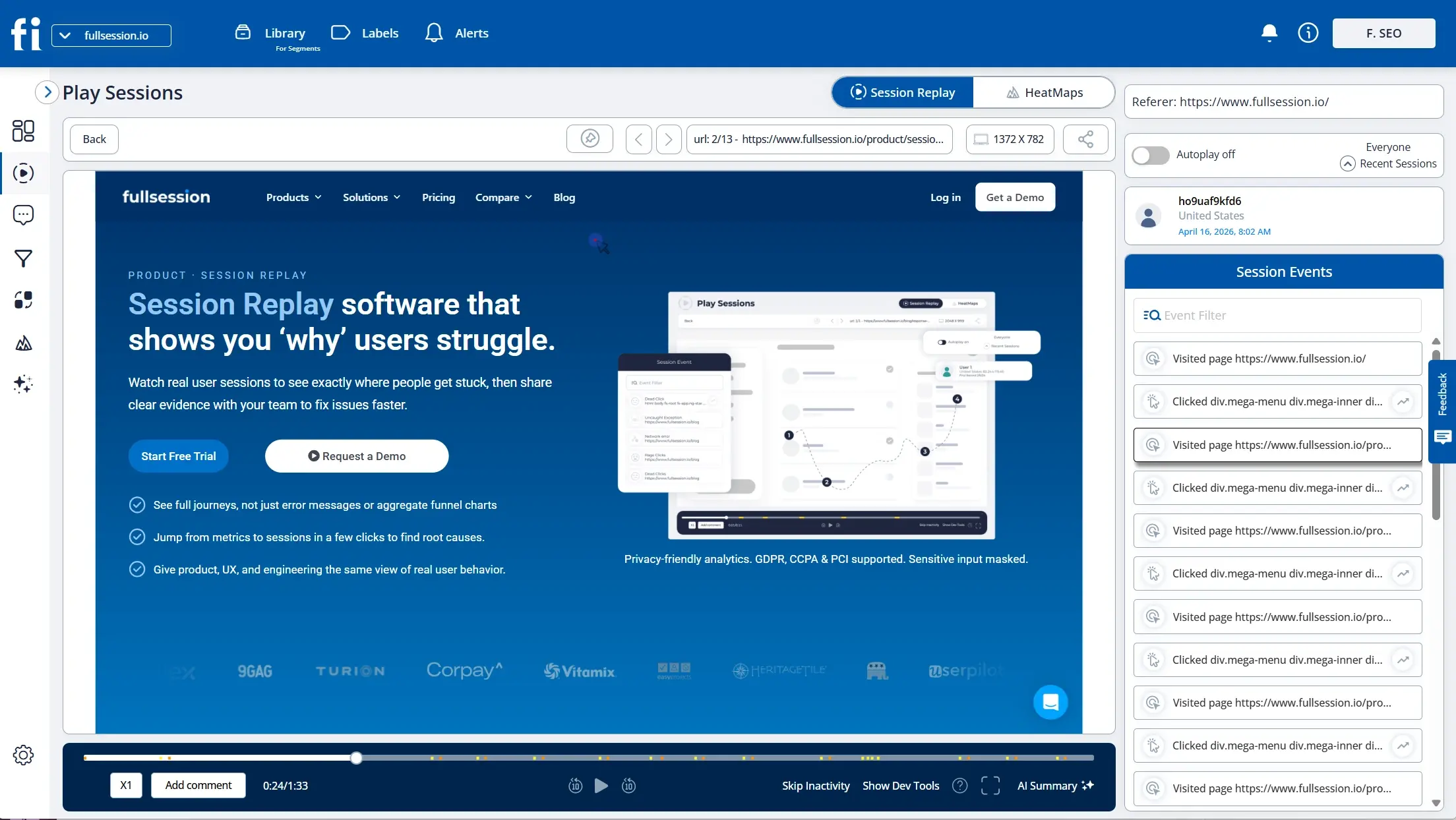
Session replay captures the gesture-by-gesture moment friction happens, including the taps a funnel never records.
From signal to root cause
A signal tells you where user friction is happening, not why. Fixing the symptom is how teams redesign a button that was never the problem, when the real cause was an API error that made it unresponsive. A short, repeatable diagnosis avoids that. Start with a funnel to find the step with the highest exit, and treat it as a hypothesis, not a verdict. Then segment that drop by device, OS version, and connection, because patterns tied to varied device capabilities or variable network conditions across mobile devices are almost always technical, not a design flaw. Next, watch session replays of users who dropped there to see the exact interaction that failed, and confirm it at scale with a heatmap. Finally, add the why with in-app feedback so user feedback and product analytics point to the same cause.
Symptom you see |
Root cause you find |
|---|---|
High drop-off at the payment step |
An API error on card validation returning no visible message |
Rage taps on the submit button |
A delay before any loading indicator appears |
Looping between cart and product page |
Shipping cost not shown until checkout |
Long hesitation on account creation |
Password rules only revealed after the first failed attempt |
Early drop-off in onboarding |
Mandatory upfront account creation or an overly complicated onboarding flow |
The same drop-off can have very different causes. Segment and watch before you decide.
Errors deserve special attention on mobile because they are the quietest of all. A silent JavaScript or API failure blocks the step and shows nothing, so the user assumes they did something wrong, retries, and abandons. Tying an error signal to the interaction that triggered it turns a vague “high drop-off at checkout” into “API timeout on payment validation,” which is a fix an engineer can act on. Notification interruptions can also break the user journey in mobile applications even when no visible error appears. For deeper diagnosis workflows, see our guides to onboarding funnel analysis and form analysis.
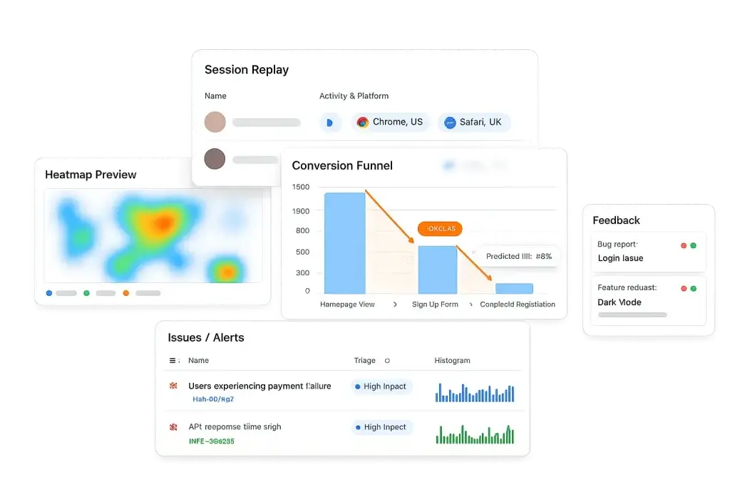
Segment the funnel by device and network, then confirm the pattern with a heatmap before you build a fix.

Consistent design elements help users understand the flow and strengthen trust during the user journey.
Fix the right friction first to prevent app abandonment
Not all friction is worth the same. A rage tap on a help link and a rage tap on the checkout button produce the same signal and very different losses, so prioritization should run on four factors: frequency, or how many users hit it; position, or how close it sits to conversion; severity, or whether it causes a slowdown, a retry, or a full abandonment; and business impact, or how much the issue affects outcomes. Plot issues on frequency against severity and fix the high-high corner first, weighting anything near checkout or sign-up more heavily.
The fixes themselves follow the cause. Interaction problems call for larger touch targets, visible loading states, and removing elements that look tappable but are not. Form problems need inline errors surfaced above the keyboard and specific, actionable messages. Flow problems want clearer labels, clearer navigation, and critical information, like price and required permissions, moved earlier, with familiarity and consistency maintained throughout the app to reduce friction. Cluttered layouts increase cognitive friction by overwhelming users with excessive information. Removing unnecessary effort from key tasks helps improve retention and overall user experience. To keep the ranking honest, Lift AI scores friction by estimated impact, so the payment API error outranks a cosmetic redesign without a meeting to argue about it.
FIND THE FRICTION USERS WON’T REPORT
See every rage tap, loop, and silent error in your app with session replay
FullSession pairs session replay, heatmaps, and funnels with Lift AI, including mobile session replay, so silent friction becomes visible and ranked. Start your free trial Book a demo
Prove the fix actually worked
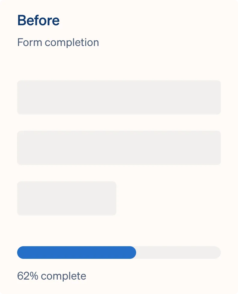
Removing a signal is not the same as solving the problem. You can make a rage-tap cluster disappear by deleting the element and still lose the conversion, so validation should confirm the change helped reduce friction on two fronts. First, compare the completion rate for the affected step before and after, controlling for traffic and campaign swings. Second, confirm the specific signal, the rage taps, repeat submissions, or loop rate, actually fell at that step; if it did not, the root cause is still live. Then watch the neighboring steps, and for mobile fixes also verify them in portrait mode, since 94% of mobile users prefer portrait mode for usability, and against thumb-driven navigation patterns such as bottom tabs, because friction removed at one point sometimes reappears downstream. When the signal drops, completion rises, and nothing new breaks nearby, the fix held. Our walkthrough of conversion funnel analysis covers how to run that before-and-after cleanly, and teams shipping mobile changes often pair this with the engineering and QA workflow.
Turn silent app friction into fixes you can prove
Visualize, analyze, and act on real user behavior with FullSession. Spot the signal, trace the cause, and confirm the fix moved the number. No credit card needed to start. Start free trial Book a demo
Mobile app UX friction: FAQ
UX friction is any point in an app flow where bad UX creates enough resistance that users slow down, get confused, or abandon. It shows up during onboarding, search, checkout, and upgrade flows. Most apps should keep onboarding to 3–5 screens and let users complete a meaningful action quickly. On mobile it is often invisible in your metrics, because users who hit friction rarely file a ticket or answer a survey. They just leave, which means behavioral signals are your main evidence for what went wrong.
Read the behavioral signals to identify friction issues instead of waiting for complaints. Rage taps, dead taps, repeat form submissions, looping between screens, and long hesitation before a tap each reveal different pain points that no survey captures. Session replay lets you watch the moment it happens, heatmaps show where taps land on non-interactive elements, and funnels show where users drop, so you can spot the pattern at scale rather than one session at a time. Once the signal is confirmed, allowing users to complete the next action easily and reach value quickly is a practical way to reduce friction.
Mobile adds constraints desktop does not have. Fingers are imprecise, so small or crowded touch targets cause mis-taps. There is no hover to preview whether something is tappable. Keyboards cover error messages, permission prompts interrupt flows, and connectivity swings from fast to slow. For example, camera access can create trust friction when it is requested before its value is clear. Baymard’s data shows mobile carts are abandoned at a higher rate than desktop, and these compounding constraints are a large part of why, especially when users expect familiar mobile patterns and contextual permission timing.
Rank by frequency, position, and severity. Frequency is how many users hit it, position is how close it sits to conversion, and severity is whether it causes a slowdown, a retry, or a full abandonment. A rage tap on the checkout button matters more than one on a help link. Fix high-frequency, high-severity friction nearest the conversion point first because it can cause lost revenue, and let an impact score rather than opinion break ties.
Confirm two things: that the behavior improved and that the outcome improved. Compare the completion rate for the affected step before and after the fix, and check that the specific signal, such as rage taps or repeat submissions, actually dropped, while also confirming that app crashes and JavaScript errors did not persist. Then watch adjacent steps, because removing friction at one point sometimes pushes it downstream. If the signal fell and completion rose without a new problem appearing, the fix held.
See what’s costing you, and prove whats fixing it is worth
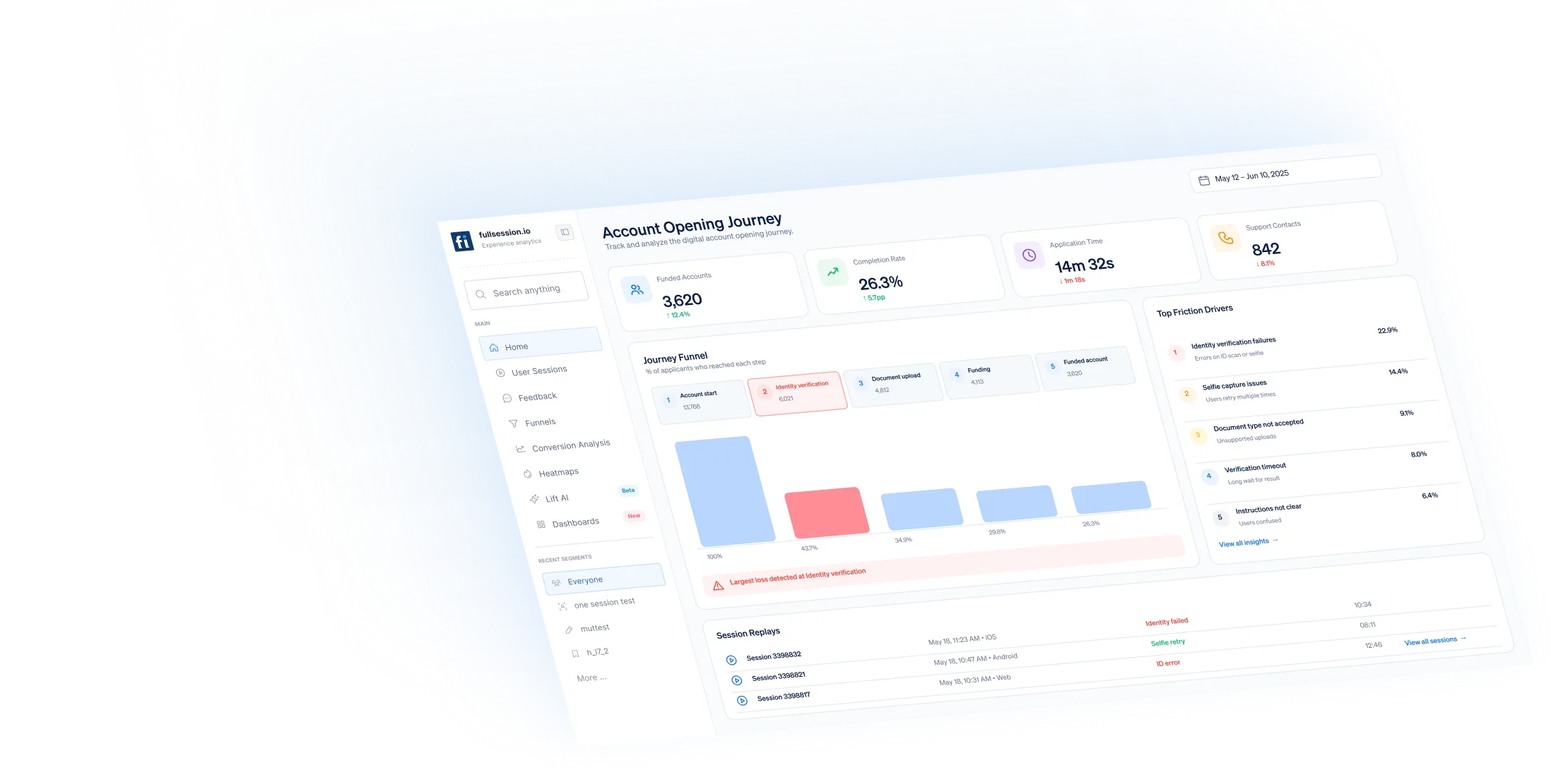
Watch the real journey, rank every issue by revenue impact, and validate the result against baseline.


.svg)
.svg)
212 E Stone Path St Derby, KS 67037 Phone: +1 415-649-4222



All systems operational.