.svg)

Ecommerce UX: Best Practices to Boost Conversions in 2026


You can spend more on traffic and still miss revenue if the ecommerce UX on your store makes shoppers search too hard. For an ecommerce team, the real issue is usually not demand; it is the gap between what online shoppers expect and what the ecommerce store actually delivers.
If your ecommerce user experience is unclear on mobile, inconsistent on product pages, or full of friction in the checkout process, your conversion rates will show it.
This guide walks through the practical side of ecommerce UX design, from quick wins to a full implementation roadmap, so you can improve customer experience instead of guessing your way through the customer journey.
Along the way, you will see where FullSession helps you measure the real friction behind ecommerce website design decisions, so you can actually boost conversions rather than hope the redesign works.
Key Takeaway
- Most ecommerce losses come from friction, not traffic quality.
- Fix the biggest leaks first, usually search, product pages, mobile, and checkout.
- Good UX requires measurement to prove which change removed the friction.
- Small improvements in the journey often matter more than a full redesign.
- Privacy-compliant measurement helps you prioritize fixes by revenue impact.
FullSession helps teams find the specific behavior, device, or page causing conversion drops and validates fixes with session replay, heatmaps, and funnel analysis, all in one privacy-compliant workflow.
What Is Ecommerce UX
Ecommerce UX in 2026 goes beyond visual design. It covers discovery, product evaluation, checkout flow, mobile performance, site speed, trust signals, and measurement. The difference between browsers and buyers often comes down to whether your online store reduces hesitation at every step of the customer journey.
Customers expect fast, intuitive experiences, and in 2026, those customer expectations have never been higher. The retail industry has raised the bar: shoppers compare your store against every slick experience they’ve had elsewhere, and poor UX will send them to a competitor within seconds.
Modern ecommerce user experience requires both privacy-compliant analytics and behavioral insights to identify which friction points actually cost revenue. Potential customers form a positive impression within seconds of landing on a page, or they don’t. Successful teams diagnose before they redesign.
Quick Actions to Improve Your Ecommerce UX
If you need to improve ecommerce UX quickly, start with the parts of the shopping flow that create the most friction. These fixes improve the customer experience without rebuilding your entire site.
A UX designer reviewing your store for the first time will spot these five friction points almost immediately. Fix them first.
Five rapid improvements that reduce friction
- Fix site speed: Compress images, replace static images with optimized WebP files, and remove heavy scripts. Target pages that load under three seconds. According to Think with Google, pages slower than three seconds risk significant bounce rate increases.
- Make guest checkout obvious: Place a clear guest option on the first checkout step. Forced account creation is a major abandonment trigger for online sales.
- Make the search field obvious: Put search in the header where it cannot be missed, since many users arrive with the intent to find specific items rather than browse categories.
- Audit mobile tap targets: Check that buttons meet the 44×44px minimum size. Small or crowded tap areas create accidental clicks and exits on mobile sites.
- Remove surprise costs early: Display shipping and fees before payment. According to Baymard’s research, unexpected costs are a primary cart abandonment trigger.
Priority matrix for quick fixes
Use FullSession to Measure the Fixes That Matter
See which UX changes actually move buyers with session replay, heatmaps, and funnel analysis that prioritizes improvements by revenue impact.
Ecommerce UX Design Principles for Customer Experience

Strong ecommerce UX design reduces cognitive load and removes barriers to purchase. Each principle addresses a common friction point that slows the customer journey. These UX elements form the foundation of every high-converting store.
Clarity over cleverness
Shoppers move faster when the store behaves as expected. Creative navigation or unique labels force users to decide between interpretations of your interface, adding friction where you want momentum. This is especially true on desktop sites where users have more screen real estate but also higher expectations for efficiency.
- Use familiar navigation patterns for categories and filters
- Keep CTAs where shoppers expect them, especially on cards and product pages
- Avoid creative copy for standard actions like add to cart, view cart, and checkout
- Match layout to task so pages feel predictable
Visual hierarchy and layout
The eye should first land on key decision points. Strategic use of whitespace and typography makes product pages easier to scan. Product descriptions should sit in clear hierarchy below the main image, not buried in tabs or hidden below the fold.
- Place main product images and prices where they are immediately visible
- Use whitespace to separate product images from descriptions
- Keep essential details above the fold when possible
- Use product videos to support decisions, not interrupt them
Trust signals at every touchpoint
Purchase hesitation often comes from unanswered trust questions. Every customer touchpoint, from a social media post that drives traffic to your site to the checkout confirmation page, is a chance to build or break confidence.
- Show reviews and ratings on listing pages, not only on product detail pages
- Make return policy details accessible from the header or footer
- Place security badges near the checkout CTA
- Show user-generated content before the checkout process starts
Feedback and error states
Clear feedback prevents small mistakes from becoming abandoned sessions. When shoppers cannot tell whether something worked, uncertainty kills momentum. Every action a user takes should produce a visible, immediate response.
- Confirm add-to-cart with an obvious visual response
- Validate form fields inline as users type
- Show helpful guidance when the search returns zero results
- Display loading states so users know the system is responding
Consistency across the journey
Consistent patterns reduce the learning curve for shoppers as they move through your ecommerce store. Inconsistency forces users to relearn interface rules on every page. Across multiple pages, that cognitive tax adds up fast and hurts customer loyalty.
- Maintain button styles from homepage to checkout
- Use identical link styling across all templates
- Keep navigation logic the same on category and product pages
- Avoid changing interaction patterns without clear benefit
Design principles comparison matrix
Homepage and Category Best Practices for Ecommerce Website

Your homepage and category pages set expectations for the entire ecommerce website. These pages should orient shoppers and provide clear paths forward, not overwhelm with choices.
Homepage UX essentials
The homepage is often a shopper’s first direct link into your brand. It needs to orient and reassure within seconds.
- Keep the search bar visible in the header
- Show featured product categories above the fold
- Use high-quality images that support decisions, not distract from them
- Include country and language selection if you serve international markets, because forcing shoppers to the wrong regional store is a friction point that kills conversions before they start
- Place trust signals where they are easy to see
Category page navigation
Category pages help shoppers narrow choices efficiently. If the navigation context is unclear or filters are buried, users spend energy on orientation rather than product evaluation. Always show product availability directly on listing cards, because shoppers shouldn’t have to click through to discover an item is out of stock.
- Use breadcrumbs on all relevant pages
- Show the current result count clearly
- Keep category labels clickable and consistent
- Persist filters across pagination
Mobile homepage considerations
Mobile users experience your store very differently from desktop visitors. On smaller screens, the homepage should collapse to essentials. The best mobile sites prioritize search and top categories over full-width graphics, keeping the experience fast and thumb-friendly.
- Prioritize search and category entry points
- Use thumb-friendly navigation
- Keep menus simple
- Avoid pushing useful content below the fold
Homepage versus category page priorities
ElementHomepage PriorityCategory Page PriorityPrimary goalOrient the shopperNarrow the shopper’s choiceKey navigation elementHighlight search and categoriesHighlight filters and scopeTrust signal placementTrust at first glanceTrust through clarity and consistencyMobile priorityMobile should stay lightweightMobile should stay easy to browseMost common UX mistakeToo much promotionHidden navigation
Search and On-Site Discovery Best Practices for Ecommerce Site
Search represents the highest-intent action on any ecommerce site. When search fails, you lose shoppers who already know what they want. According to Baymard’s 2026 research, 56% of sites fail to adequately support users’ search needs.
Search field placement and design
Make the search field obvious. This is non-negotiable. If your product catalog runs into the thousands, search is often the fastest path to conversion, and hiding it is leaving money on the table.
- Keep the search bar in the header on every page
- Make it wide enough to feel usable (minimum 27 characters visible)
- Use contrast so the field is easy to find
- Include placeholder text that suggests search scope
Search results quality
Poor search results make your catalog feel smaller than it is. Support voice search queries and natural language inputs, because more mobile users now search by speaking than typing, and your search engine needs to handle it.
- Prioritize exact matches near the top
- Show product images in results
- Handle slang searches and natural language queries
- Display availability directly in result lists
Zero-result and low-result handling
Never let the search end in a dead end. Good fallbacks keep sessions active when exact matches fail and ensure user expectations are met even when the catalog doesn’t have an exact match.
- Never show blank no-results pages
- Suggest related product categories
- Show popular products as a fallback
- Offer to widen the query automatically
Search UX best practice comparison
Product Lists, Filters, and Browsing UX

Product discovery friction directly reduces add-to-cart rates. If listing cards hide essential information or filters confuse rather than clarify, shoppers abandon before reaching product pages.
Product listing page optimization
Listing cards should answer basic questions without requiring clicks. Showing product availability and price upfront means shoppers stay on the same page instead of bouncing between product views to gather basic information.
- Show availability directly on cards
- Display price and key variants without click-through
- Use consistent image sizing
- Include ratings and review counts
Product comparison capabilities
High-consideration categories need comparison tools. Many users want to compare items side by side before committing. If your store forces them across multiple pages to do that, they’ll open tabs and lose momentum. Letting shoppers compare items in a single view is one of the highest-impact improvements you can make for complex product catalog categories.
- Enable side-by-side comparison for complex products
- Include a broad range of comparable attributes
- Keep comparison available without navigation
The design process behind good filtering
The design process for filters is often underestimated. Filters that show just the right amount of options, not too many and not too few, keep shoppers focused without overwhelming them. This is one of the most overlooked pain points in ecommerce UX.
- Keep filters sticky on the desktop where helpful
- Persist selected filters across pagination
- Allow multiple attributes simultaneously
- Make the active filter count visible at all times
Pagination method decision matrix
Checkout Process and Checkout Page Optimization
The checkout process is where intent meets friction. According to Baymard’s research, the average site has 32 unique checkout improvements that could lift conversion rates. Every unnecessary step or confusing element risks abandonment at the final decision point.
Guest checkout implementation
Forced account creation is a primary checkout killer. A clear guest path removes the biggest barrier to purchase completion. For any ecommerce business, this is usually the single fastest win available.
- Offer guest checkout on the first step
- Allow account creation after purchase
- Accept social login as a shortcut
- Never gate checkout behind mandatory registration
Form friction reduction
Field count directly correlates with abandonment rates. Every required input should justify its presence. Multiple items in the cart shouldn’t mean a longer form, and the checkout experience should stay lean regardless of order size.
- Target 12–14 fields maximum for checkout forms
- Auto-fill addresses via browser autofill and postcode lookup
- Use real-time inline validation, not batch errors
- Pre-populate known fields for returning users
Transparent pricing strategy
Hidden costs break trust at the critical moment. Showing all fees upfront is one of the most direct ways to improve online sales and reduce abandonment at the final step.
- Show total cost (product + shipping + taxes + fees) before payment step
- Offer shipping cost calculation early in checkout
- Surface free shipping thresholds prominently
- Display all applicable taxes and fees upfront
Checkout optimization impact assessment
Use FullSession to Find Checkout Friction Before It Costs Revenue
Watch sessions from abandoned checkouts to identify exactly where users get stuck, then validate fixes with before-and-after funnel analysis.
Mobile-First and Performance Best Practices

Image source: Unsplash
With mobile users representing a significant portion of ecommerce store visits, mobile optimization is critical for revenue. Mobile sites need dedicated attention because desktop patterns often fail on smaller screens.
Mobile-first design principles
Mobile-first design prioritizes touch interaction and limited screen space. The gap between desktop sites and mobile experiences is where most ecommerce businesses lose conversions. A seamless experience across devices isn’t a nice-to-have; it’s a baseline expectation.
- Design for thumb reach zones (bottom 2/3 of screen)
- Use hamburger or bottom navigation for categories
- Keep CTAs large and centered
- Remove hover-dependent interactions
- Simplify mobile homepages to prioritize search and key categories
Mobile commerce checkout optimization
Mobile checkout represents the biggest conversion gap between devices. Google Analytics data consistently shows mobile checkout abandonment outpacing desktop. Use it to identify exactly where mobile users drop off.
- Use single-column checkout layouts
- Support biometric payment options
- Maintain a persistent cart across sessions
- Offer express payment options (Apple Pay, Google Pay) on first screen
- Enable address autocomplete to reduce typing
Site speed and core web vitals
Load performance affects user experience more than aesthetics. According to Shopify’s guidance, targeting LCP under 2.5 seconds and INP under 200ms improves checkout responsiveness.
- Compress and serve images in WebP format
- Use lazy loading for below-fold images
- Eliminate render-blocking scripts
- Set separate performance budgets for mobile devices versus desktop
Desktop versus mobile UX comparison
Measurement, Research, UX and Conversion Optimization with FullSession
Best practices without measurement are guesswork. Every tool below connects a specific ecommerce UX problem to its diagnostic, helping teams prioritize fixes by actual revenue impact rather than assumption.
Identifying your real pain points
Before you change anything, you need to know where the pain points actually live. Google Analytics tells you where traffic drops off. FullSession tells you why. Together, they give you a complete picture of where the customer journey breaks down and what it costs your ecommerce business.
Lift AI for prioritized recommendations
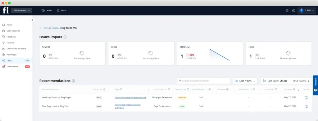
Lift AI analyzes friction, failures, and slowdowns across real sessions and produces a ranked list of opportunities, each with expected improvement estimates and confidence scores. No dashboards to configure, no analyst required.
- Review top recommendations with linked session evidence
- Ship fixes (UX, copy, flow, or technical) based on ranked impact
- Measure results with pre/post funnel comparison
- Mark recommendations complete, so Lift AI tracks outcomes
Session replay for behavior analysis
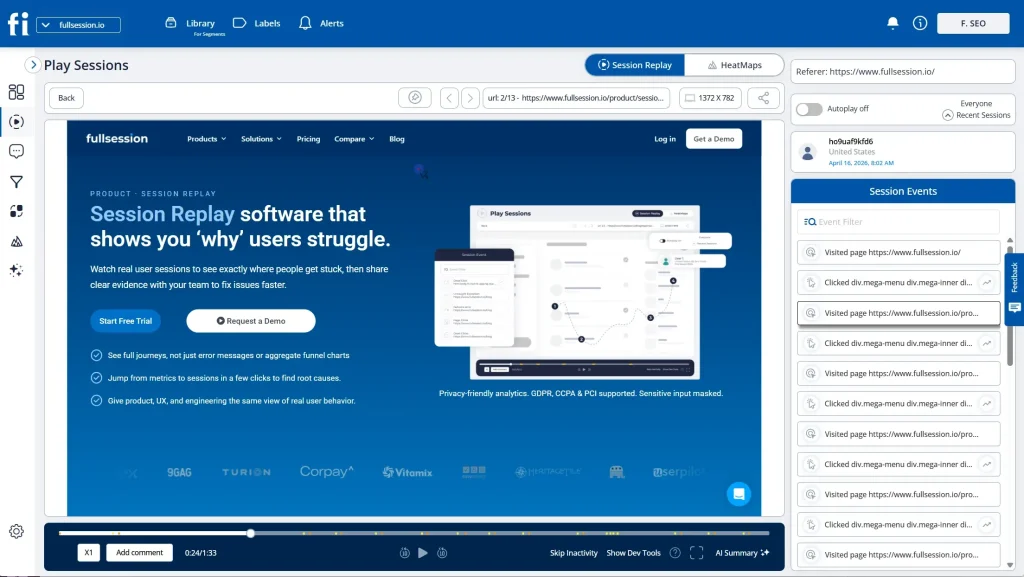
Ecommerce session replay shows the complete cross-page journey, revealing friction that metrics alone cannot explain. Watch exactly what happens before a user takes action, or doesn’t.
- Filter sessions by rage clicks, dead clicks, or funnel drop-off points
- Watch sessions from the exact pages where users abandon
- Identify hesitation patterns before the add-to-cart steps
- Reproduce errors reported by customers with full session context
Heatmaps for visual behavior patterns
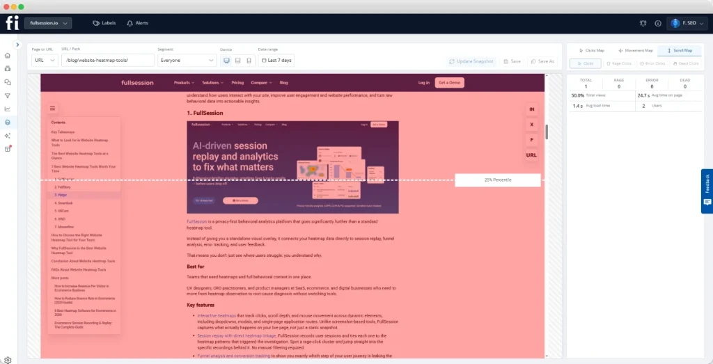
Ecommerce heatmaps provide aggregated visual evidence of user behavior patterns, showing where attention goes and where interfaces fail.
- Use click maps to find dead zones and missed CTAs
- Use scroll maps to find where visitors stop reading on product pages
- Use movement maps to identify confusion patterns
- Compare heatmaps across device types (mobile versus desktop)
Funnel tracking for conversion analysis
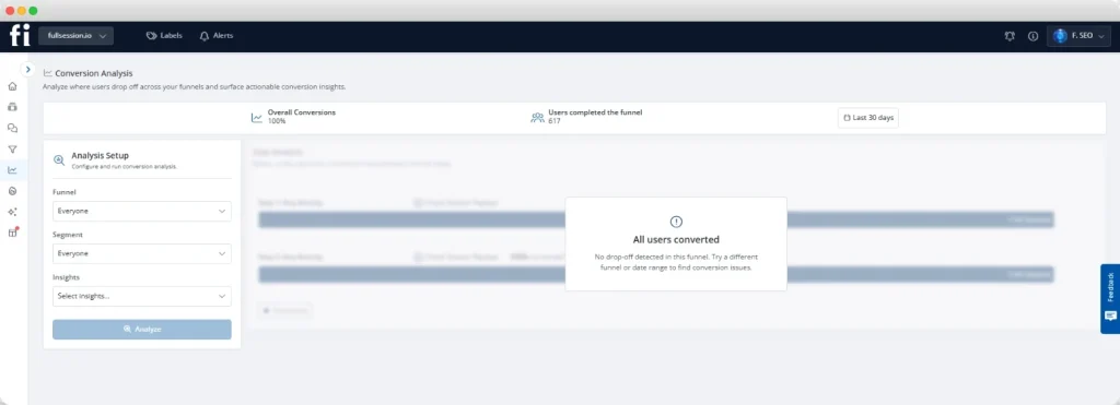
Conversion funnel analysis makes drop-off measurable, connecting behavior to business impact at each step of the customer journey.
- Map checkout as step-by-step funnels (product view → add to cart → checkout → payment → confirmation)
- Identify the single biggest drop-off step
- Click any step to watch sessions behind the metric
- Compare funnel performance across traffic sources and devices
FullSession tool comparison matrix
See Every Friction Point in Your Funnel With FullSession
Watch sessions, analyze heatmaps, and track funnels to find exactly where online shoppers abandon and why.
Privacy-Friendly Analytics and Data Governance
US ecommerce teams cannot ignore privacy compliance when implementing behavioral analytics. Privacy-first measurement helps maintain customer trust while optimizing the customer experience.
GDPR compliance requirements
GDPR applies to any US ecommerce store with EU customers. Compliance requires consent management and data residency considerations.
- Integrate with consent management platforms
- Capture behavioral data only from consenting visitors
- Use EU data residency options where available
- Provide clear opt-out mechanisms
CCPA requirements
CCPA requirements affect California resident data handling for any US ecommerce store. Automated exclusion mechanisms simplify compliance.
- Automatically exclude opted-out users from session capture
- Avoid sharing California resident session data with third parties
- Surface clear opt-out mechanisms on the site
- Maintain California-specific data deletion procedures
PCI DSS and field masking
Payment pages require sensitive data protection at the capture level. Field masking prevents payment data from leaving the browser.
- Mask card numbers, CVV, and payment fields before data leaves the browser
- Use configurable masking rules for different field types
- Verify masking is active before going live on checkout pages
- Apply masking to address fields containing sensitive data
Compliance requirements matrix
Implementation Roadmap and Ecommerce UX Best Practices Checklist
This framework gives teams a systematic approach to ecommerce UX optimization. The FullSession Ecommerce UX Roadmap prioritizes measurement alongside implementation.
The FullSession ecommerce UX roadmap
- Phase 1 (Week 1-2): Audit and quick wins: Install FullSession, review session replays on your 3 highest-traffic pages, fix tap target issues and guest checkout immediately. Use Lift AI to get an initial ranked list of opportunities.
- Phase 2 (Week 3-6): Prioritize with data: Review Lift AI recommendations, fix the top 3 opportunities ranked by expected revenue impact, and validate results using funnel comparison before and after the fix.
- Phase 3 (Month 2-3): Systematic optimization: Work through checkout, product page, and mobile UX best practices in priority order. Use heatmaps to validate layout changes. Review error tracking weekly.
- Phase 4 (Ongoing): Validation and iteration: Implement post-purchase UX improvements, deploy customer feedback widgets on key pages, review Lift AI recommendations on a rolling basis.
Best practices implementation checklist
Ready to Optimize Your Ecommerce UX?
Start with our proven roadmap and measure every improvement for maximum impact on conversion rates.
Conclusion About Ecommerce UX
Ecommerce UX is the gap between the traffic you have and the revenue you keep. The difference between browsers and buyers often comes down to small friction points that measurement can reveal and fixes can resolve.
See FullSession in action to identify your highest-impact ecommerce UX improvements with session replay, heatmaps, and AI-powered recommendations.
Turn UX Insights Into Revenue Growth With FullSession
Start measuring and optimizing your ecommerce store with privacy-compliant behavioral analytics.
FAQs About Ecommerce UX
Ecommerce UX, or user experience, refers to every interaction a shopper has with an ecommerce store, from landing page to post-purchase confirmation.
The 80/20 rule in UX, also called the Pareto Principle, states that approximately 80% of outcomes come from 20% of causes.
The four primary types of e-commerce are B2C, B2B, C2C, and D2C. B2C means business to consumer, B2B means business to business, C2C means consumer to consumer, and D2C means direct to consumer. Each has distinct UX requirements.
See what’s costing you, and prove whats fixing it is worth
Watch the real journey, rank every issue by revenue impact, and validate the result against baseline.





.svg)
.svg)
212 E Stone Path St Derby, KS 67037 Phone: +1 415-649-4222



All systems operational.