You’ve searched for the Hotjar free plan and landed on a pricing page that looks nothing like you expected. That’s not a glitch.
Hotjar is now fully integrated under the Contentsquare umbrella, and the old pricing tiers are gone. This review covers exactly what the free plan includes today, how it compares to FullSession’s free tier, and which platform gives you more at $0.
Key Takeaways
- Hotjar is now fully rebranded as Contentsquare. The old pricing tiers are gone.
- Contentsquare’s free plan is modular. Experience Analytics, Voice of Customer, and Product Analytics are separate products with separate upgrade costs.
- The 200,000 monthly sessions on Hotjar’s free tier are an analytics figure, not a replay figure. Only 5% of sessions are recorded, capped at 10,000 replays.
- FullSession’s free plan includes session replay, heatmaps, funnels, feedback, error reporting, custom events, user attributes, and four months of data retention, all at $0. It captures 100% of sessions up to its 500-session limit. Every session is available for full replay, no sampling.
- FullSession Growth starts at $23/month (billed annually) with everything bundled. Hotjar’s equivalent costs $49/month for Experience Analytics alone, $148/month if you add Voice of Customer.
- Neither platform includes AI features on the free plan. Both require a Growth upgrade.
For most growing teams, FullSession is the more practical starting point. Full session capture, frustration signals, and a straightforward upgrade path, all without managing separate module subscriptions or sitting through a sales call.
The Growth plan at $23/month (billed annually) bundles everything you need for serious funnel and conversion analysis.
Book a FullSession demo and get a detailed walkthrough.
What Happened to Hotjar?
The brand, the pricing structure, and the product packaging have all changed. Here’s a quick overview of what happened and what it means for you.
Hotjar is now Contentsquare
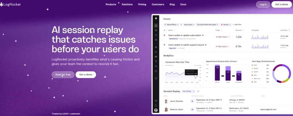
Hotjar was acquired by Contentsquare and fully rebranded under the Contentsquare platform. The old standalone Hotjar pricing structure, with its familiar Observe, Ask, and Engage tiers, no longer exists.
Teams searching for Hotjar pricing model details now land directly on the Contentsquare pricing page, where things look quite different.
The platform still retains Hotjar’s core capabilities: session recordings, heatmaps, and feedback tools. How these are packaged, priced, and accessed has changed significantly.
Understanding the new structure matters before you decide whether the free plan fits your team, and whether the Hotjar cost at the first paid tier is worth it.
How Contentsquare’s product structure now works
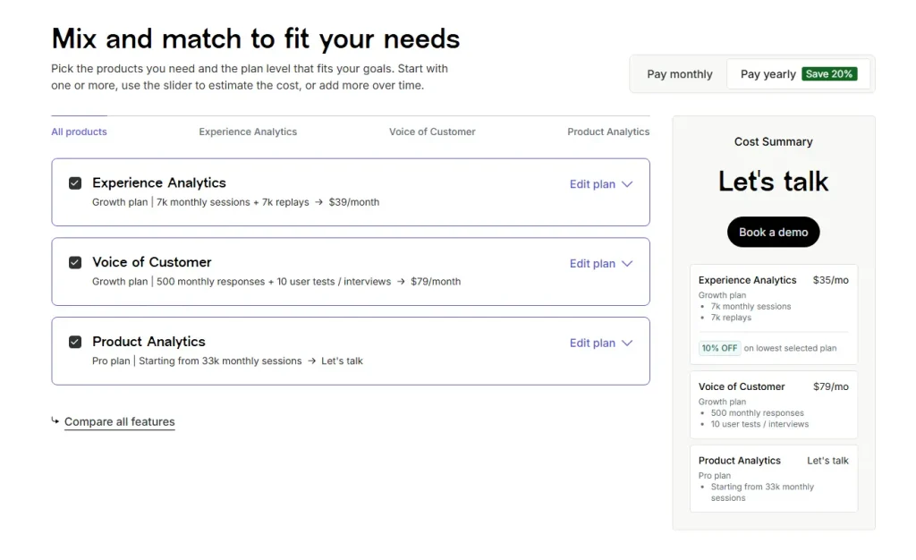
Contentsquare has three modular products:
- Experience Analytics: session replay, heatmaps, funnels, error monitoring, and core web vitals
- Voice of Customer: surveys, feedback widgets, user interviews, and user tests
- Product Analytics: funnel analysis, Illuminate insights, and data governance
Each product has its own Free, Growth, Pro, and Enterprise tiers. Plans are mix-and-match, so you can activate one or more products at different levels.
The modular approach is flexible, but teams that need all three modules pay multiple plan costs. That affects the overall Hotjar pricing comparison when you look at the full picture.
Where FullSession fits in
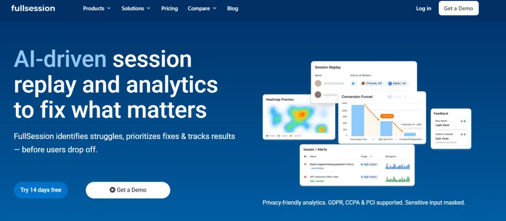
FullSession is a dedicated behavior analytics platform with session replay, heatmaps, funnels, in-app feedback, error tracking, and AI-driven insights, all bundled in a single plan.
Like Hotjar/Contentsquare, it offers a free plan as the entry point. This article compares what each platform actually delivers at $0 so you can evaluate real-world value before committing to paid plans.
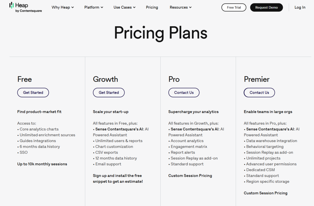
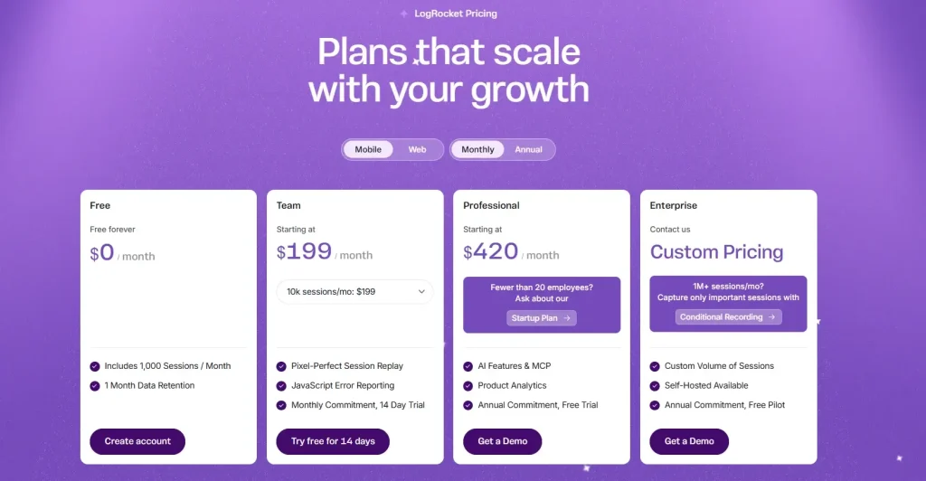
The Hotjar (Contentsquare) Free Plan: Key Details
Hotjar’s free plan is split across three separate modules, each with its own limits, inclusions, and upgrade path. Here’s what each one offers at no cost.
Experience Analytics free tier
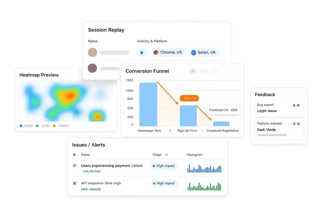
The Experience Analytics free tier is the most relevant module for teams coming from Hotjar. It covers session replay, heatmaps, funnels, and error monitoring.
Session volume and replay
- Tracks up to 200,000 monthly sessions for analytics purposes
- Only 5% of sessions are captured as session replay recordings
- Replay is hard-capped at 10,000 replays per month
- You can track user interactions at scale, but you’re working with a sample when it comes to replays, not a complete picture
Data retention
- Analytics data: 1 month
- Session replay data: 1 month
- After 30 days, access to historical recordings and aggregate reports is gone
Features included
- URL targeting, heatmaps, funnels, JavaScript errors, and basic error metrics
- Synthetic performance tests and core web vitals
- Standard filtering and segmentation; filter by new vs. returning users, pages, country, and devices
- Integrations with Google Analytics and Jira, plus seven pre-built integrations
- MCP access (up to 300 tool calls per month) and Connect with LLMs for AI-native workflows
Features excluded
- Frustration score, journey analysis, zone-based heatmaps, and page comparator
- Side-by-side comparison, impact quantification, and form analysis
- AI features: Sense chat, heatmap summaries, and session replay summaries (Growth+)
- Advanced filtering by user ID, frustration behaviors, custom variables, and sequential behaviors (Growth+)
Voice of Customer free tier
Hotjar offers a Voice of Customer module as a separate free product. It’s useful for teams that want to collect user feedback alongside behavioral data.
What’s included at no cost
- 100 monthly responses and up to five user interviews from own network
- Zero interviews from the Hotjar participant pool (panel interviews require a paid plan)
- Three feedback widgets and surveys with unlimited questions per survey
- Responses stored for one month
- AI survey generator and AI summary report
- Basic user tests, custom screener questions, and built-in video calling
- Nine pre-built integrations including Google Analytics, Slack/Teams, and HubSpot
What’s locked behind paid plans
- AI-automated survey analysis and advanced targeting
- Embedded surveys, concept testing, and advanced filtering
- Clipping and downloading interview replays, and transcriptions
- Custom branding (colors, logo) and third-party video calling
- More than one spectator per interview, more than one task per test
- Interview sessions longer than 30 minutes
Product Analytics free tier
The Product Analytics module doesn’t follow a self-serve model. Access requires contacting sales, which makes it inaccessible for most teams evaluating the tool independently.
What’s included (with a sales call)
- Up to 10,000 monthly sessions and seven months of data access
- Analytics and reporting, Illuminate insights, data governance, APIs, and enrichment sources
Unlike FullSession, you can’t access this module without a demo call first.
Hotjar free plan at a glance
| Product | Key Limit | Key Inclusions | Key Exclusions |
| Experience Analytics | 200k sessions tracked / 10k replays (5%) | Heatmaps, funnels, JS errors, core web vitals, GA integration | Frustration score, journey analysis, AI features, advanced filters |
| Voice of Customer | 100 survey responses / 5 interviews | 3 feedback widgets, AI survey generator, basic user tests | Transcriptions, concept testing, custom branding, panel interviews |
| Product Analytics | 10k sessions / 7 months data | Analytics, Illuminate, APIs | Requires sales call, not self-serve |
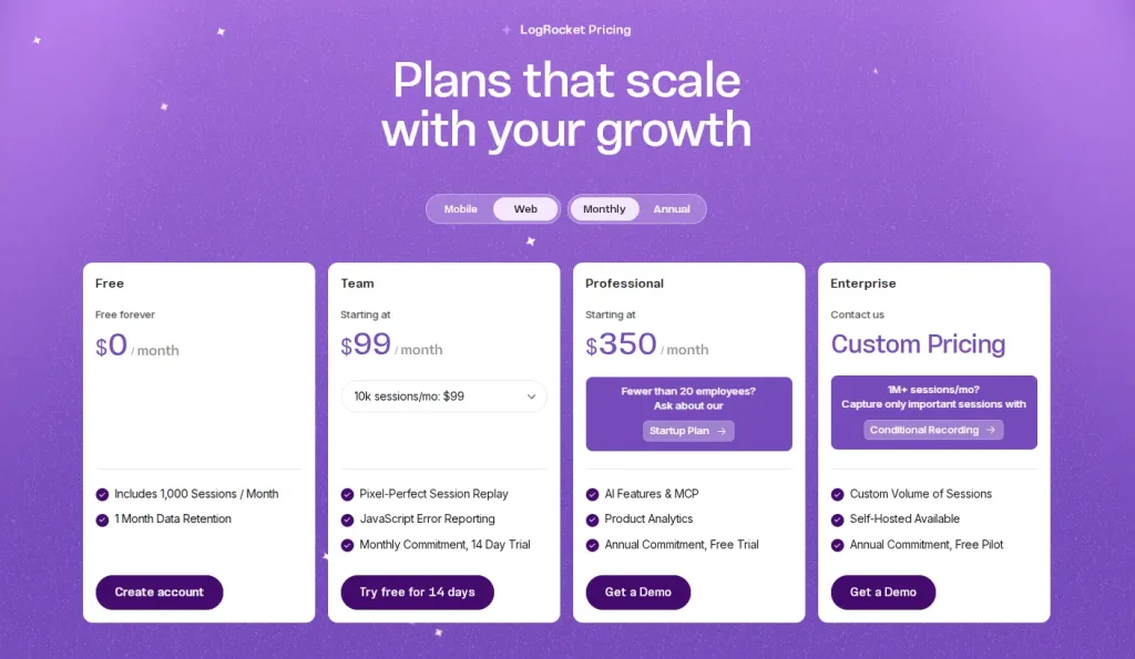
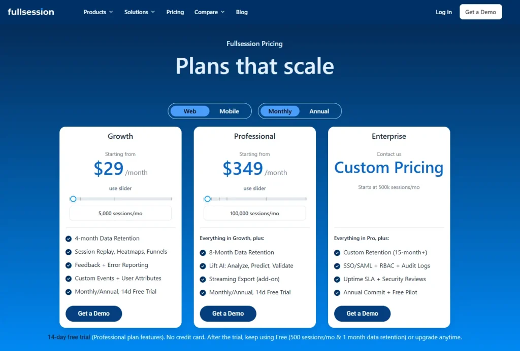
FullSession Free Plan: What You Get at $0
FullSession takes a different approach: fewer sessions, but every single one fully captured. Here’s what’s included and what requires an upgrade.
Sessions, retention, and seats
FullSession’s free plan is built for teams who want to get started without friction:
- 500 sessions/month, fully captured with no sampling
- 30 days data retention
- 2 seats and 1 domain
- No credit card required; fully self-serve signup
- A 14-day Professional free trial precedes the free plan, so you can test advanced features first
The free forever tier continues indefinitely after the trial ends. FullSession records 100% of user sessions up to the limit, so every one of those 500 sessions is available for full replay and investigation. There’s no sampling percentage and no separate replay cap.
Start a free trial to see how it works.
Features included on the free tier
The FullSession free version gives smaller teams a genuinely functional investigative workflow:
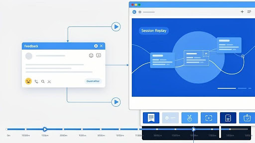
- Session replay and live session view, so you can watch how users interact with your pages in real time
- Basic filters and user segmentation, including saved segments for repeat analysis
- Frustration signals: rage clicks, dead clicks, and error clicks are all captured at the free tier, showing broken UI elements and friction points without an upgrade
- Page performance tracking, basic dashboards, and event metrics overview
- Pinned sessions and share/export for team collaboration
These key features let you visualize user behavior through heatmaps and session replay, alongside rage clicks and frustration data, from day one. As one of the more capable analytics tools at the free tier, FullSession gives teams actionable valuable insights without a paid plan.
Book a demo today.
What’s locked behind paid plans
Several capabilities are reserved for paid tiers.
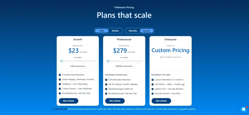
Growth plan ($23/month annually) unlocks:
- Funnels, goals, conversion analysis, and funnel trends
- Recording rules, Identify API, custom events, and user attributes
- AI filter assistant for session segmentation
Professional plan ($279/month annually) unlock:
- Advanced dashboards, error alerts, and developer tools (console and network logs)
- Lift AI for predictive behavior analysis and automated insights
- Form analytics, sequence-based segments, and campaign (UTM) analytics
For teams that need in depth analytics across the full funnel, an upgrade is necessary. At $23/month (billed annually), though, the Growth plan is one of the most affordable entry points across comparable analytics tools.
FullSession free plan at a glance
| Feature Category | Included | Excluded |
| Session Replay | Yes (500 sessions/month, 100% capture) | Live session filtering beyond basics |
| Heatmaps | Yes | Advanced heatmap filters |
| Funnels | No | Funnels, goals, conversion analysis (Growth+) |
| Frustration Signals | Yes (rage/dead/error clicks) | Frustration score trends |
| AI Features | No | AI filter assistant, Lift AI (Growth+) |
| Form Analytics | No | Form analytics (Growth+) |
| Identify API | No | Identify API (Growth+) |
Hotjar Free vs. FullSession Free: Head-to-Head Comparison
Both platforms offer free plans, but they’re built around very different assumptions about what you need. Here’s how they stack up across the dimensions that matter most.
Session volume and data retention
The session volume gap is the most obvious difference, but the headline numbers can mislead.
- Hotjar free: Tracks up to 200,000 monthly sessions for analytics, but only 5% are captured as replays (max 10,000)
- FullSession free: 500 sessions per month, every one fully captured and available for replay
- Data retention: Both platforms retain data for 30 days on the free tier
The 200k figure sounds impressive. It’s an analytics number, not a replay number. FullSession’s 500-session cap is genuinely smaller, but you can watch all 500.
For teams with high traffic who need broad website analytics coverage, Hotjar’s volume advantage is real. For teams doing granular debugging or conversion investigation, FullSession’s full-capture approach is more practical.
Core features available at $0
| Feature | Hotjar Free | FullSession Free |
| Heatmaps | Yes | Yes |
| Session replay | Yes (sampled) | Yes (full capture) |
| Funnels | Yes | No |
| Frustration signals | No (Growth+) | Yes |
| Surveys / feedback | Yes (100 responses) | No |
| MCP / LLM connectivity | Yes | No |
Hotjar’s advantage at $0: funnels, basic error monitoring (JS errors, core web vitals), and a full surveys and feedback module with 100 survey responses and up to five user interviews. FullSession doesn’t offer any of these at the free tier.
FullSession’s advantage at $0: frustration signals and rage/dead/error clicks are included natively. That helps teams identify where site visitors are struggling without paying for a Growth plan. Hotjar locks this to Growth.
Ease of access and upgrade path
- Both platforms are fully self-serve on the free tier, except Hotjar’s Product Analytics, which requires a sales call even at $0
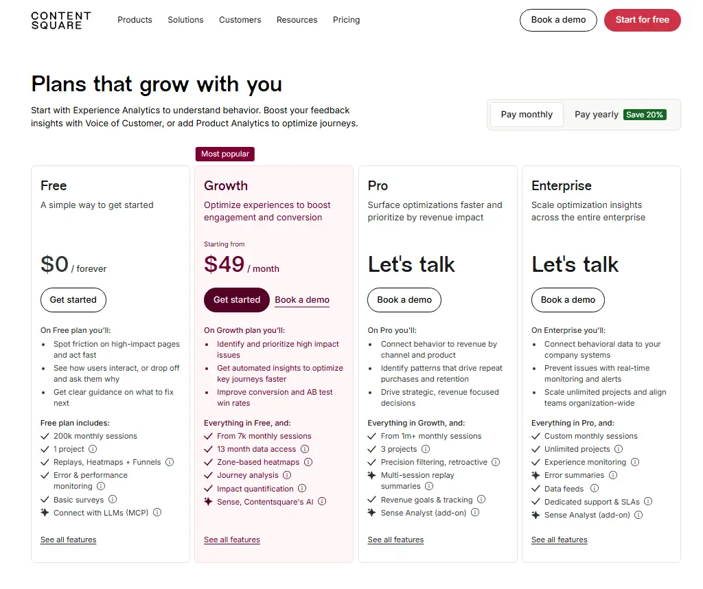
- Hotjar pricing at Growth: Experience Analytics starts at $49/month; Voice of Customer Growth adds $99/month, so teams needing both pay $148/month
- FullSession Growth: $23/month (billed annually), all core features bundled in one plan
- Priority support and a dedicated customer success manager are available on Hotjar’s higher-tier plans; FullSession’s Growth tier includes standard support
FullSession’s pricing structure is simpler and more predictable. There are no per-module costs and no surprise add-ons.
Visit our pricing page to learn more.
Free plan comparison table
| Criteria | Hotjar (Contentsquare) | FullSession |
| Monthly sessions (analytics) | Up to 200,000 | 500 |
| Monthly replays | 5% of sessions / max 10,000 | 500 (100% capture) |
| Data retention | 1 month | 30 days |
| Heatmaps | Yes | Yes |
| Session replay | Yes (sampled) | Yes (full capture) |
| Funnels | Yes (Experience Analytics) | No (Growth+) |
| Surveys / feedback | Yes (100 responses, 3 widgets) | No |
| Frustration signals | No (Growth+) | Yes |
| AI features | Basic (MCP access) | No |
| Entry-level paid price | $49/month (EA only) | $23/month (all features) |
Key Differences Beyond Pricing
Price tells part of the story. The two platforms also differ at the architectural level in ways that affect how you work with the tool every day.
For a detailed breakdown, see our FullSession vs Hotjar comparison.
All-in-one vs. modular structure
Hotjar’s rebrand into Contentsquare introduced a modular product architecture:
- Experience Analytics, Voice of Customer, and Product Analytics are priced and upgraded independently
- Teams needing all three manage multiple plan tiers and separate billing cycles
- Unlimited projects and enterprise-grade controls, like dedicated support and custom pricing, require higher-tier plans across each module separately
FullSession bundles session replay, heatmaps, funnels, errors, and feedback in a single plan with no per-module pricing.
For product and growth teams who want a unified workflow, this reduces both Hotjar cost complexity and operational overhead. No juggling separate invoices for each capability.
Session capture philosophy
Hotjar and FullSession collect data differently, and that shapes what you can actually do with it.
Hotjar’s approach (sampling):
- Captures 5% of sessions as replays, up to 10,000/month from a 200,000-session pool
- Well-suited for aggregate analysis of user behavior patterns at scale
- Heatmaps, funnels, and core web vitals remain statistically valid even at 5% capture
- Best for high-traffic teams who need engagement scores and broad user engagement trend data over individual session depth
FullSession’s approach (full capture):
- Records 100% of sessions up to the plan limit; session limits apply, but within that cap every replay is available
- No guessing whether a specific session was captured
- Better for debugging, onboarding analysis, and investigation of specific user experience issues
- Uses streamed, batched capture designed for minimal website performance impact
Neither approach is universally better. The right choice depends on your traffic volume and how you use session data.
AI capabilities compared
Both platforms are moving toward AI-native workflows, but their current feature sets differ.
Hotjar (Contentsquare Sense AI):
- Includes heatmap summaries, session replay summaries, Sense chat, and Sense Mapping assistant
- All AI features sit at Growth-tier and above; none are available on the free plan
- AI-powered sentiment analysis for survey responses is available at the Growth tier in Voice of Customer
FullSession Lift AI:
- Predicts behavior impact, highlights what to fix next based on the revenue impact and lets you validate fixes
- Includes an AI filter assistant for session segmentation, useful for surfacing deeper insights from large session libraries
- Provides comprehensive insights that flag conversion blockers and UX friction without manual analysis
- Also Growth-tier and above, not on the free plan
Hotjar’s Sense is more mature and enterprise-oriented. FullSession’s Lift AI is more focused on conversion triage and error investigation.
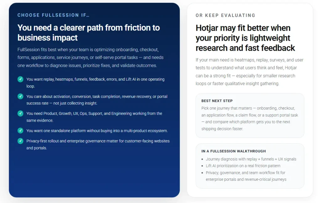
Who Should Use Hotjar vs. FullSession?
Both tools have a clear sweet spot. Here’s how to know which one fits your situation.
When Hotjar makes sense
Hotjar (Contentsquare) is the stronger choice for:
- Enterprise and mid-market teams that need breadth across experience analytics, user feedback collection, and product analytics from a single vendor
- Teams with daily sessions well above 10,000 who benefit from analytics-level aggregate data even at the free tier
- Organizations that prioritize surveys and feedback and user interviews alongside session replay; the Voice of Customer module is genuinely powerful
- Teams already integrated with the broader Contentsquare ecosystem or coming from a legacy Hotjar setup
Hotjar support at the Growth tier includes live chat and email. A dedicated customer success manager and priority support are reserved for Pro and Enterprise tiers.
For larger teams, Hotjar’s scale plan and enterprise options provide the governance, integrations, and Hotjar API access needed for custom workflows.
When FullSession is the better fit
FullSession is the better choice for:
- Growth-stage SaaS and ecommerce teams who need self-serve access to funnels, error tracking, and conversion analysis without a sales process
- Product and engineering teams who need every session captured, not just a sample, for debugging and UX investigation
- Teams looking for the lowest all-in cost at entry: FullSession Growth at $29/month vs. Hotjar’s Experience Analytics Growth at $49/month (plus $99/month if you also need Voice of Customer)
- Companies with under 10,000 monthly sessions where FullSession’s 500-session free plan and 100% capture rate makes the free plan genuinely useful for real investigation
- Teams that need basic surveys or feedback at a later stage can explore other tools, but for pure behavior analytics and session based limitations comparisons, FullSession’s bundled approach wins on simplicity
FullSession also includes unlimited users on its Growth plan, unlike per-seat models at some competitors. Higher tiers offer unlimited heatmaps, unlimited surveys, and unlimited responses.
Teams running ongoing user surveys will find this particularly useful, since there are no per-response caps at the paid tier level. Support for unlimited projects at paid tiers also makes it well-suited for agencies managing multiple sites.
Switching and trial considerations
- FullSession offers a 14-day free trial on Professional features before the free plan activates; no credit card required
- That trial lets you evaluate funnels, error alerts, and Lift AI before committing, making the basic plan comparison more concrete
- Hotjar’s free plan is self-serve for Experience Analytics and Voice of Customer; Product Analytics requires a demo request
- Both platforms support tag manager installation, so setup takes minutes
Book a demo with FullSession today to learn more.
The Hotjar Free Plan Verdict: Volume vs. Depth
Hotjar’s free tier covers a lot of ground: 200k analytics sessions, heatmaps, funnels, basic error monitoring, and 100 feedback responses at $0. Replay coverage is capped at 5% (max 10k), and features like frustration scoring, engagement zones, and AI tools require a Growth upgrade at $49/month.
FullSession’s free plan is narrower in volume (500 sessions/month) but captures every session fully. It includes user clicks analysis and frustration signals at no cost, and it unlocks a richer investigative workflow sooner. For teams focused on website optimization, full-capture depth often beats broad sampling.
For sites with under 10,000 website visitors per month, FullSession delivers more actionable value at $0. For high-traffic sites on a business plan budget, Hotjar’s volume advantage is real; just know you’re working with sampled replays, not a complete customer journey record.
Start a FullSession free trial and see the difference yourself. No credit card needed.
Hotjar Free Plan: Your Most Common Questions Answered
Is Hotjar now Contentsquare?
Yes. Hotjar was acquired by Contentsquare and is now fully rebranded under the Contentsquare platform. The old Hotjar pricing structure no longer applies; all plans are managed through Contentsquare.
Does Hotjar have a free plan?
Yes. The free tier for Experience Analytics includes up to 200,000 analytics sessions per month, with 5% captured as replays (max 10,000 replays) and one month of data retention. Voice of Customer includes 100 monthly responses and up to five user interviews. Product Analytics requires contacting sales even for free access.
How many session replays does the Hotjar free plan include?
The free plan captures 5% of sessions as replays, with a maximum of 10,000 replays per month drawn from up to 200,000 tracked analytics sessions.
Does FullSession have a free plan?
Yes. FullSession’s free plan includes 500 fully captured sessions per month, 30-day data retention, session replay, heatmaps, frustration signals, and basic segmentation. No credit card required.
How much does Hotjar’s Growth plan cost?
Experience Analytics Growth starts from $49/month. Voice of Customer Growth starts from $99/month. These are separate costs if you need both products.
Is FullSession cheaper than Hotjar?
At the first paid tier, FullSession Growth starts at $29/month for 5,000 sessions with all core features bundled. Hotjar’s Experience Analytics Growth starts at $49/month; adding Voice of Customer Growth adds $99/month on top. For a full feature-level breakdown, read theFullSession vs. Contentsquare comparison page.
Where can I find a full Hotjar review?
Ourfull Hotjar/Contentsquare review covers session replay, heatmaps, pricing, and limitations in detail. You can also explore thebest website heatmap tools andtop session recording and replay tools for broader context.
For multi-tool comparisons, theHotjar vs. Crazy Egg vs. Mouseflow comparison andHotjar vs. Mixpanel vs. Contentsquare pieces are worth reading before you decide. You can also browsefree and paid website tracking tools for a broader market overview.

Roman Mohren is CEO of FullSession, a privacy-first UX analytics platform offering session replay, interactive heatmaps, conversion funnels, error insights, and in-app feedback. He directly leads Product, Sales, and Customer Success, owning the full customer journey from first touch to long-term outcomes. With 25+ years in B2B SaaS, spanning venture- and PE-backed startups, public software companies, and his own ventures, Roman has built and scaled revenue teams, designed go-to-market systems, and led organizations through every growth stage from first dollar to eight-figure ARR. He writes from hands-on operator experience about UX diagnosis, conversion optimization, user onboarding, and turning behavioral data into measurable business impact.

![5 Best Mixpanel Alternatives for 2026 [Compared & Reviewed]](https://www.fullsession.io/wp-content/uploads/2026/04/best-mixpanel-alternatives-2026-compared-and-reviewed.webp)