Category: Blog

Blog

  • Click Heatmap vs Scroll Heatmap vs Move Heatmap: What Each One Shows and When to Use It

    Click Heatmap vs Scroll Heatmap vs Move Heatmap: What Each One Shows and When to Use It

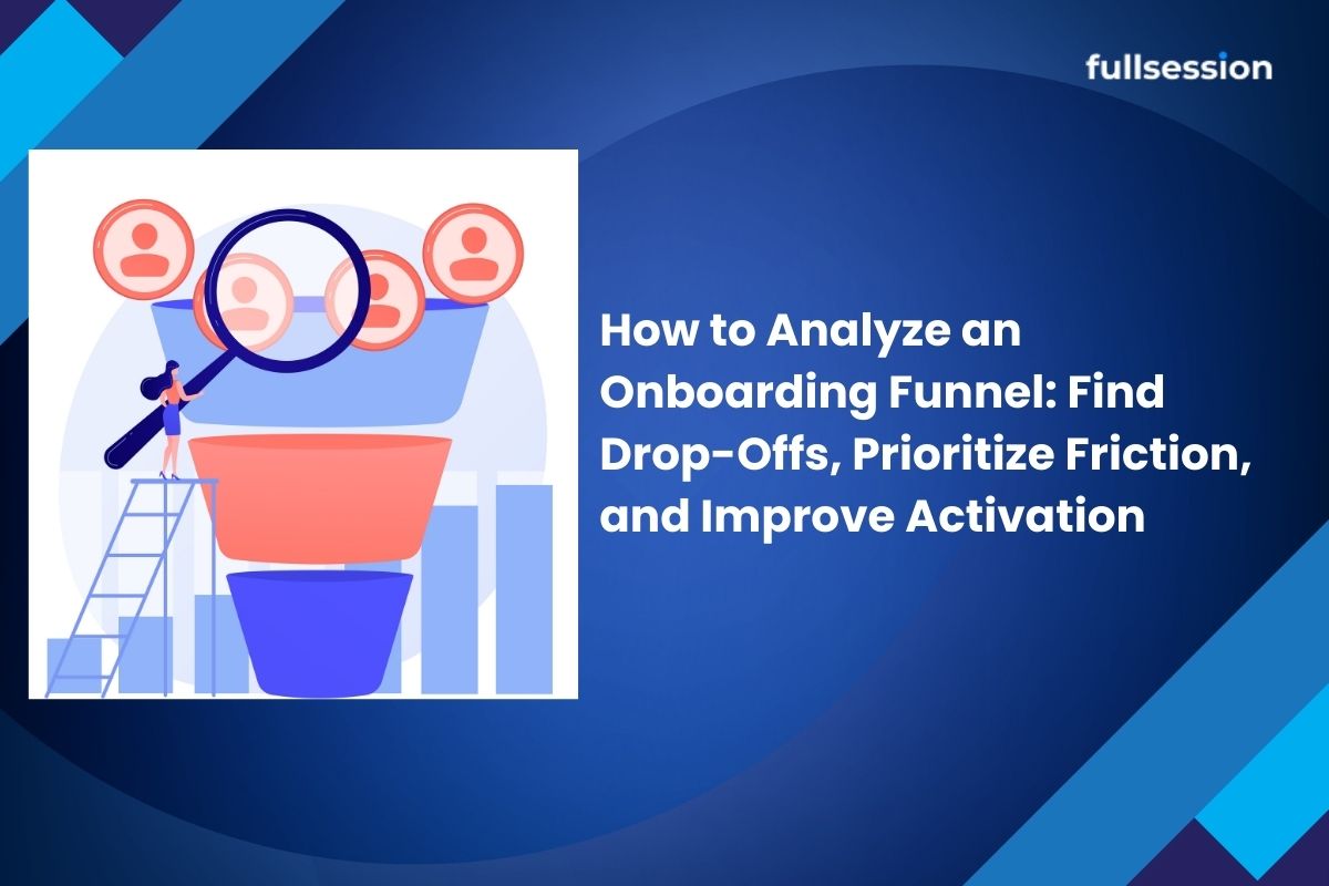
    If you are trying to improve Activation in a SaaS PLG funnel, heatmaps can feel like three versions of the same answer: “users clicked here,” “users scrolled this far,” “users moved their cursor there.” The real value is knowing which map to open first for the problem you have, and how to validate the signal before you ship a change.

    In this guide, you will learn what each heatmap type actually measures, what it cannot prove, and a practical sequence for using heatmaps plus replay to diagnose activation drop-offs. If you are evaluating tools, start with the FullSession heatmaps product page: FullSession Heatmaps.

    • If the problem is low clicks or mis-clicks, start with a click heatmap (action and intent).
    • If the problem is users not reaching key content, start with a scroll heatmap (visibility and exposure).
    • If the problem is confusion or scattered attention, use a move heatmap last (attention proxy), then validate with replay.

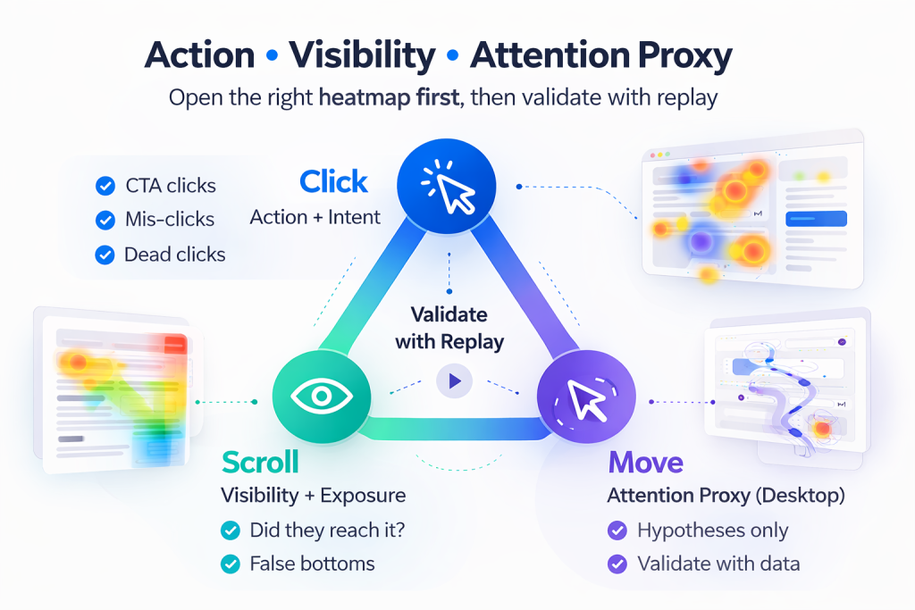
    A reliable workflow is: Click (action), then Scroll (visibility), then Move (attention proxy), and finally Replay (ground truth). Pairing heatmaps with session replay is where teams stop guessing and start confirming: Session Replay.
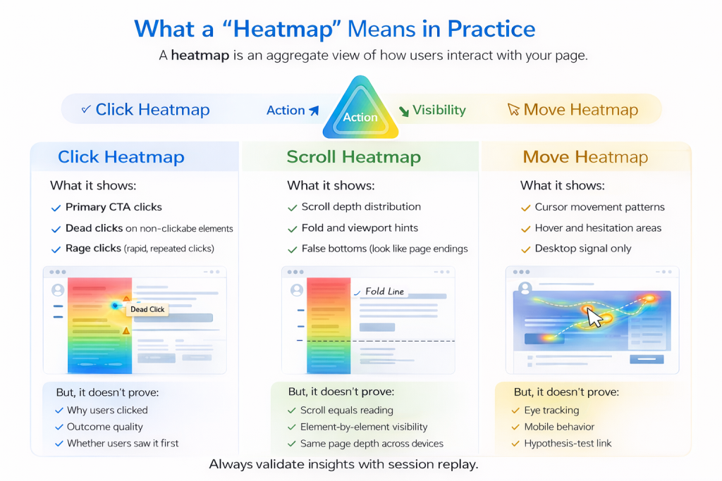
    A heatmap is an aggregate visualization of user interaction on a page or screen. It helps you answer questions like: where users try to act, what content is actually seen, and what areas might pull attention (cautiously for move maps). The key is to match the map to the kind of evidence you need: action, visibility, or attention proxy.

    What it shows

    A click heatmap aggregates where users click or tap. For activation work, it is strongest when you suspect users are trying to progress but failing, hesitating, or choosing the wrong path.

    • Primary CTA clicks
    • Navigation and secondary action clicks
    • Dead clicks (depending on tooling)
    • Rage clicks (depending on tooling)

    What it does not prove

    Click heatmaps do not tell you why a user clicked, whether a click led to a successful outcome, or whether the user saw the content before clicking. Treat clicks as intent signals, then confirm outcomes with funnel steps or replay.

    What it shows

    A scroll heatmap summarizes how far users scroll. It is most useful when activation depends on content that is below the initial view, such as setup guidance, proof, or the next step module.

    • Scroll depth distribution (who reaches 25%, 50%, 75%, 100%)
    • Fold and viewport interpretation hints
    • False bottoms where users stop because the page looks finished

    What it does not prove

    Scroll depth is not reading. Treat scroll as visibility and exposure, not engagement. Confirm real behavior with replay, segmented by device.

    What it shows

    Move heatmaps visualize cursor movement patterns on desktop. They can suggest exploration and deliberation areas, but they are best used as hypothesis generators.

    What it does not prove

    Cursor movement is not eye tracking. It can be distorted by device type, user habits, and the absence of a cursor on mobile. Use move maps cautiously, and validate with click, scroll, and replay.

    “Users are not converting on the CTA”

    Start with a click heatmap. Look for primary CTA share, dead clicks, and click dispersion. Then confirm the drop-off step using Funnels and Conversions.

    “Users do not seem to see the thing we need them to see”

    Start with a scroll heatmap. Look for early stop zones and false bottoms. Validate behavior with Session Replay, segmented by device.

    “Users look lost or distracted”

    Start with click, then scroll, then move (last). Confirm confusion patterns on replay, and check whether errors are involved with Errors and Alerts.
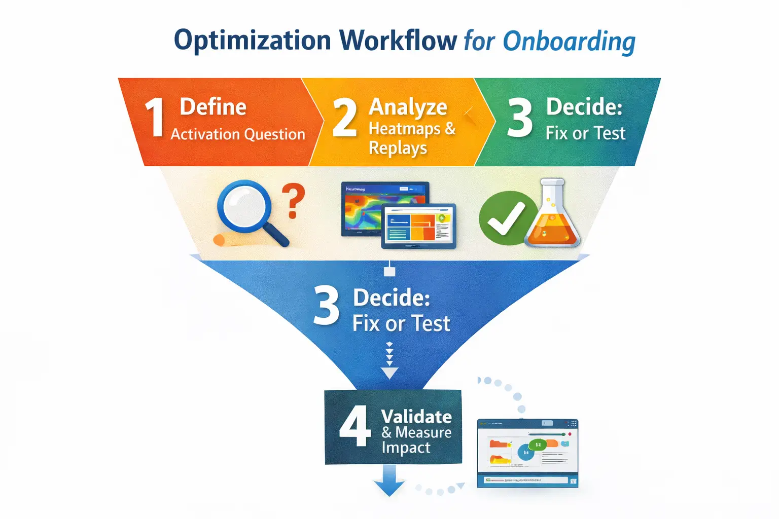
    This sequence turns heatmaps into a decision system for activation work.

    Step 1: Define the page job and success event

    Action label: Define the activation micro-conversion. Choose one success event, such as “Connect integration,” “Create first project,” or “Invite teammate.”

    Step 2: Segment before you interpret

    Action label: Split by device and intent context. At minimum segment by device, new vs returning, and traffic source or entry path.

    Step 3: Open the click heatmap first

    Action label: Find intent and friction clicks. Look for CTA share, dead clicks on UI, and click dispersion that implies uncertainty.

    Step 4: Use the scroll heatmap to confirm exposure

    Action label: Check whether key modules were seen. Look for depth drop-offs and false bottoms created by layout cues.

    Step 5: Use move heatmap only to form hypotheses

    Action label: Spot attention hotspots carefully. If the hotspot is meaningful, you should see clicks nearby or replay evidence of deliberation.

    Step 6: Validate with session replay before changing UI

    Action label: Confirm the story in real sessions. Heatmaps show what happens in aggregate. Replay shows how it happens. Start with FullSession Heatmaps, then validate with Session Replay.

    Misread: “Scroll to 80% means they read it”

    Fix: Treat scroll as visibility, not engagement. Validate with replay and downstream events.

    Misread: “Move heatmap is attention”

    Fix: Treat movement as a proxy. Confirm with corresponding clicks or replay evidence of hesitation.

    Misread: “Click heatmap proves the CTA is bad”

    Fix: Clicks do not equal outcomes. Pair with funnel outcomes and error signals using Errors and Alerts.

    Are move heatmaps useful on mobile?

    Not directly. Mobile lacks cursor movement, so use click or tap maps, scroll exposure, and replay for mobile behavior.

    Should I start with scroll heatmaps for landing pages?

    Only if your main question is visibility. If the issue is action, start with click heatmaps.

    What is the difference between dead clicks and rage clicks?

    Dead clicks are clicks on non-interactive elements. Rage clicks are repeated clicks in a small area in a short time window. Replay is the best way to confirm the cause.

    How many sessions do I need before trusting a heatmap?

    Enough to represent the segment you care about. Use heatmaps for direction, then validate with targeted replay samples and conversion outcomes.

    If you want heatmaps to drive activation improvements, treat them as a system: click for intent, scroll for visibility, move for hypotheses, and replay for validation. Start with FullSession Heatmaps, confirm behavior in Session Replay, and route the work into your activation program via PLG Activation Solutions.

  • Why Your Dropdown Click Isn’t Working: A Practical Debugging Guide

    Why Your Dropdown Click Isn’t Working: A Practical Debugging Guide

    If you’re searching “dropdown click not working,” you’re not looking for theory. You’ve got a menu that won’t open, won’t select, or opens then immediately closes. This guide gives you a failure-mode workflow that reduces MTTR by isolating whether the issue is event handling, state toggling, visibility/layering, or framework lifecycle.

    Quick takeaway

    A dropdown click usually fails for one of four reasons: the click never reaches your handler, the component toggles state but can’t render, the menu opens but is hidden by CSS or overlays, or your framework re-render/hydration breaks initialization. Use a failure-mode workflow and validate fixes with replays and error traces to cut MTTR.

    What “dropdown click not working” actually means in the wild

    Most dropdown failures fall into one of these symptoms: dead click, state toggles but menu is invisible, opens then instantly closes, works in static HTML but breaks in app, or works manually but fails in automation. If you can name the symptom, you can usually cut the search space before touching code.

    Key definitions

    • FullSession: FullSession is a behavior analytics platform that combines session replay, heatmaps, conversion funnels, user feedback, and error tracking in a single tool. Built for product, growth, and engineering teams at SaaS, ecommerce, and regulated organizations, FullSession helps teams see where users struggle, identify what to fix, and validate the impact of changes.
    • Session Replay: Session replay records and plays back real user sessions so teams can see exactly what users did (clicks, scrolls, hesitation, rage clicks, and errors) in the context of their actual journey. It turns abstract analytics data into visible, shareable evidence of user friction that teams can act on.
    • Errors & Alerts: Errors and alerts detect JavaScript errors, network failures, and console issues as users encounter them, then link each error to the session replay where it occurred. This lets engineering and QA teams see the exact user impact of every error: not just that it happened, but what the user experienced.
    • Pointer-events: pointer-events is a CSS property that can determine whether an element can become the target of pointer interactions, which means an invisible overlay can swallow clicks without looking “broken.”
    • Popper: Popper is the positioning library Bootstrap uses for dropdown placement; missing or misordered Popper is a common “click does nothing” root cause in Bootstrap setups.

    A failure-mode workflow to debug dropdown clicks (reduce MTTR)

    Use this workflow in order. Each step has a fast check and a likely fix.

    1. Confirm the click reaches the element
      Fast checks: in DevTools, attach a temporary listener (click, pointerdown) and see if it fires; inspect whether another element is on top of the trigger. If it never fires, you’re in event-capture land.
    2. Confirm state changes on interaction
      Fast checks: does aria-expanded, a show/open/active class, or your component state toggle? If state never changes but the click fires, the handler isn’t running or it’s returning early.
    3. Confirm the menu is actually visible and above the page
      Fast checks: inspect the menu node. Is it display:none, visibility:hidden, opacity:0, clipped by overflow:hidden, or behind a stacking context? If state changes but you can’t see it, this is nearly always CSS.
    4. Confirm initialization and lifecycle behavior
      Fast checks: does the dropdown work on first load but not after route change? Does it fail only when HTML is rendered dynamically? If yes, you’re likely missing initialization, binding, or you’re fighting hydration timing.
    5. Confirm environment-specific differences (mobile and automation)
      Fast checks: does it fail only on mobile (touch), only inside a collapsed nav, or only in Playwright/Selenium? If yes, it’s usually click target, timing, or focus/outside-click logic, not core dropdown code.

    Mid-body links: use FullSession Errors & Alerts and the Engineering & QA solution workflow to validate the failure mode against real sessions.

    Failure mode 1: The click never reaches your dropdown

    This is where invisible overlays, pointer-event rules, and event interception live. If the listener never fires, inspect overlays and propagation. If an overlay is swallowing clicks, pointer-events can be part of the diagnosis.

    If this is happening in production, validate with FullSession Session Replay to see dead clicks and repeated attempts.

    Failure mode 2: The click fires, but state never toggles

    If the click fires but state never changes, your handler is not running (or returns early). Breakpoint inside the handler, compare target vs currentTarget, and confirm delegated selectors still match after markup changes.

    Failure mode 3: State toggles, but the menu is hidden

    If aria-expanded is true (or your “open” class appears) but nothing shows, it’s usually CSS: display/opacity/visibility, overflow clipping, or z-index/stacking context. Force display and opacity in DevTools to confirm it can render, then fix the real constraint.

    Failure mode 4: Framework lifecycle and initialization issues (SPA/hydration)

    If it works in static HTML but breaks after navigation, treat it as lifecycle. In Bootstrap setups, dropdown docs note Popper is required for dropdown positioning and should be included before Bootstrap JS, or included via the bundle that contains Popper.

    Late links: keep your playbook anchored on FullSession Errors & Alerts and the Engineering & QA solution pages for repeatable incident response.

    Failure mode 5: Mobile nav and test automation edge cases

    Mobile failures often come from overlays and nav-collapse logic. Automation failures often come from timing, stale nodes, or clicking the wrong target. Match the real tap target and wait for the trigger to be visible and stable.

    Common follow-up questions

    Why does my Bootstrap dropdown click do nothing?
    Most often it’s dependency order or a missing Popper build. Bootstrap dropdown docs note Popper is required for dropdown positioning, and recommend including Popper before Bootstrap JS, or using the Bootstrap bundle that includes Popper.

    My dropdown opens but I can’t see it, what should I check first?
    Look for display:none, opacity:0, visibility:hidden, clipping from overflow:hidden, and z-index/stacking context issues. If state toggles but it’s invisible, it’s usually CSS.

    Can pointer-events break a dropdown click?
    Yes. If an overlay or container has pointer-event rules that make the trigger non-targetable, clicks can appear dead even though the UI looks fine.

    Why does my dropdown open then immediately close?
    Outside-click logic or propagation is common. A parent listener can interpret the same click as an outside click, or a blur/focus change can trigger close.

    Why does it work in static HTML but not in my SPA?
    Dynamic insertion, re-rendering, or hydration can replace nodes and lose listeners, or plugin initialization may only run on first load. Treat it as lifecycle and confirm init happens after render.

    Why does it fail only on mobile?
    Touch timing and layout differences can expose overlay and nav-collapse conflicts. Reproduce on a real device, then check overlays and focus/outside-click behavior.

    Why does Playwright/Selenium click fail but manual click works?
    Automation can click a container, a stale node, or a covered element. Make sure the trigger is visible, stable, and the click target is the same element a user taps.

    Next steps

    Pick one failing page and classify the symptom. Run the 5-step workflow, stop as soon as you isolate the failure mode. If the bug is production-impacting, validate the fix using Engineering & QA solution and FullSession Errors & Alerts.

    See the workflow on your own UI

    If you want to see this workflow on your own UI, you can book a demo or start a free trial and instrument the one journey where this dropdown matters most.

  • How to Analyze an Onboarding Funnel: Find Drop-Offs, Prioritize Friction, and Improve Activation

    How to Analyze an Onboarding Funnel: Find Drop-Offs, Prioritize Friction, and Improve Activation

    If your trial or self-serve motion is healthy, onboarding is not “a checklist,” it’s the shortest path to first value. Onboarding funnel analysis helps you see where new users stall, why they stall, and which leak to fix first so activation moves, not just step completion.

    Quick Takeaway (Answer Summary)
    Onboarding funnel analysis maps new users’ steps from signup to first value, then measures where they drop, stall, or detour. The goal is to prioritize the leak that most impacts activation, validate root cause with session context, and confirm your fix improved activation quality, not just onboarding completion.

    CTA context: Explore Funnels & Conversions to quantify drop-offs, then route investigations into user onboarding workflows with session context.

    On this page

    • What onboarding funnel analysis means
    • Before you start
    • Key definitions
    • Common broken approaches
    • 7-step workflow
    • Symptom-to-cause table
    • Mini scenario
    • Pitfalls
    • Tool evaluation
    • Next steps + FAQs

    What “onboarding funnel analysis” actually means (and what it is not)

    Onboarding funnel analysis is the process of defining the steps between “new account created” and “user reached first value,” then measuring conversion, drop-off, and time-between-steps so you can prioritize fixes and validate impact on activation.

    • Treating onboarding completion as activation (users can click through setup and still not reach value).
    • Using a generic stage list that does not match your product’s value moment (activation definition drives the funnel).

    Before you start: what you need ready

    • A clear activation definition (one observable “first value” milestone).
    • A stable onboarding scope (which flows count: self-serve, invite flow, workspace setup).
    • Identity rules (user vs workspace vs account, plus cross-device assumptions).
    • Segment list you will compare (role/persona, acquisition source, plan tier, device).

    Key definitions (for consistent measurement)

    • Activation: the user reaches a first value milestone that predicts retention or expansion for your product.
    • Onboarding completion: a user finished guided steps (tour, checklist, setup), regardless of value reached.
    • Time-to-value (TTV): time from signup (or first session) to activation milestone.
    • Drop-off: users who do not proceed to the next defined step.
    • Stall: users who do proceed eventually, but with long time gaps between steps.
    • Segment: a comparable cohort slice (persona, device, source, plan, use case) that changes the funnel shape.

    How teams usually analyze onboarding (and why it breaks)

    • Dashboard-only: sees where conversion drops, but not why.
    • Random replay sampling: sees some friction, but cannot quantify impact.
    • Event overload: tracks too many steps, then cannot decide what matters.
    • “Fix everything” sprints: increases completion, but activation stays flat.

    Mid-article routing: The quantitative spine lives in Funnels & Conversions. The onboarding-specific interpretation and fixes map cleanly to user onboarding workflows.

    A 7-step workflow for onboarding funnel analysis (activation-first)

    Step 1: Define “first value” precisely

    Write one sentence: “A new user is activated when they ______.” Make it observable (event, URL, or action) and tied to user value, not UI progress.

    Step 2: Build a value-based funnel (not a UI checklist)

    Start from activation and work backward. Include only steps that enable value, not “nice to have” setup.

    Step 3: Add time as a first-class metric

    Track conversion per step and time between steps. Stalls often reveal confusion, missing requirements, or broken states.

    Step 4: Segment before you decide what to fix

    Compare the same funnel across persona, source, plan, and device. If it behaves differently, you have multiple funnels hiding in one.

    Step 5: Pull the sessions behind the biggest leak

    Investigate what users experienced behind the drop: hesitation, loops, rage clicks, detours, and errors. This is where session context turns a leak into a fixable cause.

    Step 6: Prioritize with impact logic, not gut feel

    Score leaks by volume affected, proximity to activation, severity (hard block vs mild friction), and confidence from evidence. Prefer removing blockers over polish.

    Step 7: Validate impact on activation, not completion

    Re-measure the same funnel for the same segments after the fix. Confirm activation moves, and watch for side effects (faster completion, worse downstream use).

    Late routing reminder: Keep analysis anchored in Funnels & Conversions, and keep fixes anchored in user onboarding workflows.

    A symptom-to-cause table you can reuse

    What you see in the funnelWhat session context often showsLikely root causeWhat to do next
    Big drop right after signupUsers bounce after seeing “verify email”Misaligned expectation or deliverability frictionClarify value earlier, reduce verification friction, check deliverability
    Drop at “create workspace”Confusion about naming, teammates, or permissionsToo many required decisions too earlyDefer choices, offer defaults, add “skip for now” where safe
    High completion, flat activationUsers finish checklist but never do key actionChecklist measures effort, not valueRedefine steps around value milestone, move key action earlier
    Long stalls between setup and key actionUsers wander through settings, docs, or billingMissing guidance on next best actionTighten next-step guidance, simplify navigation, add contextual prompts
    Segment A converts, segment B collapsesDifferent paths, different confusionsOne funnel does not fit allSplit onboarding by persona, tailor steps, measure separately

    Mini scenario: how a PLG team uses this workflow

    A Growth Lead notices activation rate drifting down, but signup volume is steady. Funnel data shows the biggest drop is between “workspace created” and “first key action started.” Segmenting reveals the issue is concentrated in invited teammates. Session context shows invited users land in a blank state with unclear permissions, then bounce or loop. The team fixes the landing experience and error path, then re-measures and confirms activation improves for that segment.

    Pitfalls to avoid (these will waste your sprint)

    • Optimizing the earliest step just because it has the biggest percentage drop, even if later steps are closer to activation.
    • Changing steps without confirming event quality or identity stitching (bad tracking can create fake drop-offs).
    • Forcing setup steps that increase completion but reduce downstream usage.
    • Looking at averages only, instead of segment variance.

    How to evaluate tools for onboarding funnel analysis (PLG edition)

    • Funnel definition flexibility (URL, event, or custom steps).
    • Segmentation that matches PLG reality (persona, source, plan, device).
    • Session context attached to funnel steps.
    • Error visibility tied to user impact.
    • Qual input tied to behavior.
    • Governance basics (masking, capture controls, access controls).

    If you want the funnel view plus investigation context in one place, start with Funnels & Conversions and the onboarding workflow framing on user onboarding workflows. Optional: review integrations for stack fit.

    Next steps

    • Pick one onboarding funnel tied to activation.
    • Run the 7-step workflow on one high-volume segment first.
    • Ship one fix, then validate activation movement, not just completion.

    If you want to see where new users stall and what they experienced, start in Funnels & Conversions and then apply the fixes through user onboarding workflows. For a hands-on walkthrough, book a demo or start a free trial.

    Common follow-up questions

    What is the difference between onboarding and activation?
    Onboarding is the guided path you present, activation is the user reaching first value. A user can complete onboarding steps without becoming activated if the steps do not force meaningful product use.

    How many steps should my onboarding funnel have?
    Enough to isolate where users stall, not so many that every tiny UI action becomes a “step.” For most PLG products, 5–8 steps is a good starting range, then adjust based on investigation needs.

    Should I include email verification as a funnel step?
    Include it only if it is required for value. If verification is optional, track it separately so it does not hide product-value leaks.

    How do I decide whether to fix an early leak or a late leak first?
    Use impact logic: early leaks often affect more users, late leaks are closer to activation. Prioritize the leak with the highest combined impact, then validate root cause with session context.

    What segments matter most for PLG onboarding analysis?
    Role/persona, acquisition source, plan tier, and device are usually the fastest to reveal multiple funnels hiding in one.

    How do I analyze time-to-value inside the funnel?
    Track time between key steps, not just overall TTV. Long gaps usually indicate confusion, missing requirements, or a broken state that users cannot recover from.

    How many sessions should I watch to diagnose a drop-off?
    Watch enough to see repeating patterns in the same segment. Stop when you can name the top 2–3 failure modes and they map clearly to funnel behavior.

    What if my funnel data contradicts what I see in session replays?
    Assume an instrumentation or identity issue until proven otherwise. Validate event definitions, stitching, and cross-device behavior before making product changes.

    Related answers

    See where users stall, then prove what worked

    See where new users stall in onboarding, identify the highest-impact leak, and validate whether the fix improves activation. Start with Funnels & Conversions and apply it to user onboarding workflows.

  • Rage Clicks vs Dead Clicks: What’s the Difference and Which UX Problems Matter Most?

    Rage Clicks vs Dead Clicks: What’s the Difference and Which UX Problems Matter Most?

    Quick takeaway

    Dead clicks are clicks with no visible response, rage clicks are repeated rapid clicks that suggest frustration. In PLG SaaS, both matter most when they cluster on activation-critical steps. Use session replay to confirm whether it’s a broken interaction, slow feedback, or an analytics artifact, then prioritize fixes by segment impact and downstream activation lift.

    If your PLG signup or onboarding metrics look fine but activation is flat, these two signals are often the missing “why”. Use session replay for context and prioritize what matters most for PLG activation.

    Table of contents

    • Problem signals that usually show up first
    • Key definitions (and the one nuance most teams miss)
    • Rage clicks vs dead clicks: a decision framework (with edge cases)
    • Symptom-to-cause map: what each signal usually means
    • The 6-step triage workflow (built for activation)
    • How to prioritize fixes for PLG activation rate
    • How to measure outcomes after you ship
    • Common follow-up questions
    • Related answers

    Problem signals that usually show up first

    In PLG SaaS, you rarely hear “rage clicks” in a ticket. You hear: “The button does nothing.” “Invite flow feels broken.” “I got stuck at verification.” The metric version is often: stable signup volume, worse step completion inside onboarding, then flat activation.

    A useful mental model: dead clicks often show up at the first moment your UI fails to acknowledge intent, rage clicks show up when a user tries to brute-force past that failure. Use session replay to validate what actually happened, and keep the work anchored to activation-critical steps.

    Key definitions (and the one nuance most teams miss)

    • Rage clicks: repeated rapid clicks in the same area, typically signaling frustration or confusion.
    • Dead clicks: clicks that produce no visible response (no navigation, no state change, no feedback).
    • Error clicks: clicks that lead to an error state (front-end error, validation error, failed request).
    • Frustration signals: behavioral patterns that correlate with “something is wrong” moments.
    • Activation-critical step: any step that reliably predicts activation (not just signup), like first invite sent, first integration connected, first project created.

    The nuance most teams miss: one user can generate both signals in one moment. A dead click can be the trigger, rage clicks can be the escalation.

    Rage clicks vs dead clicks: a decision framework (with edge cases)

    Use this framework to label the signal correctly before you prioritize it.

    1) What did the UI do after the first click?

    • Nothing changed: start by treating it as a dead click.
    • Something changed, but slowly: treat it as slow feedback, which can create rage clicks that look like UX bugs.
    • Something changed, but not what the user expected: treat it as misleading affordance.

    2) Where is it happening in the journey?

    • Activation-critical step (invite, integration, first key action): escalate severity by default.
    • Non-critical exploration: investigate, but don’t steal cycles from activation.

    3) Is it clustered or isolated?

    A single occurrence might be a mis-tap or impatience. A hotspot cluster usually means a real UX/performance issue or a repeated instrumentation pattern.

    Edge cases (common false positives)

    • Habitual double-clicking on desktop
    • Slow network/device making normal users look “angry”
    • Disabled states that still look clickable
    • Overlays intercepting clicks (cookie banners, modals)
    • Tracking mismatch between click events and UI outcomes

    Symptom-to-cause map: what each signal usually means

    What you seeLikely causeHow to verify fastTypical fix
    Dead clicks on primary CTA (same element)Broken handler, overlay intercept, disabled stateWatch sessions, check click target + element stateFix click binding, adjust overlay, clarify disabled state
    Rage clicks after a spinner appearsLatency or unacknowledged loadingLook for slow API response or long waitAdd immediate feedback, optimistic UI, speed up endpoint
    Dead clicks concentrated on mobileTap target too small, sticky elements blockingSegment by device, compare tap area vs UIIncrease hit area, adjust layout, remove blockers
    Rage clicks on “Next” in a form stepValidation friction with unclear errorsRepeated submits + error state in replayInline validation, clearer error copy, preserve input
    Dead clicks on nav itemsRouting bug, blocked by auth/feature flagNavigation intent vs resulting stateFix routing, tighten flag logic, add fallback states
    Rage clicks on “Connect integration”OAuth popup blocked, third-party step confusionReplay shows popup blocked or context switchDetect blockers, add instruction, retry/continue states

    The 6-step triage workflow (built for activation)

    This workflow reduces false positives and gets you to the fix that can move activation.

    1. Pick the activation-critical slice: Choose one onboarding path that correlates with activation and anchor it to your PLG activation funnel.
    2. Find clustered hotspots: Look for repeated patterns on the same step, element, or segment.
    3. Watch the sessions behind the cluster: Use session replay to confirm what the user experienced.
    4. Classify the root cause: UX/affordance, performance/latency, technical failure, or measurement artifact.
    5. Estimate impact on activation: Prioritize blockers that cluster on steps before activation and align with drop-off.
    6. Ship the smallest trust-restoring fix: Feedback states, clearer validation, removing intercepting overlays, or fixing failures.

    How to prioritize fixes for PLG activation rate

    When everything looks like a UX bug, your roadmap becomes noise. Use a simple rubric: journey criticality, blocker severity, cluster strength, segment concentration, and downstream correlation with activation. Hotspots that are on the activation path and block progress should win, even if raw volume is lower.

    Keep the work anchored to PLG activation, and validate the experience end-to-end using session replay.

    How to measure outcomes after you ship

    • Activation rate (primary)
    • Step completion rate on the affected step
    • Drop-off rate immediately after the affected step
    • Error rate (if technical)
    • Support/contact rate (if you tag it)

    If the frustration signal drops but completion does not improve, you likely hid the symptom without fixing the underlying friction. Re-check sessions in session replay and keep the prioritization aligned to activation outcomes.

    Common follow-up questions

    How many clicks count as a “rage click”?

    There isn’t a single universal threshold. Treat it as a pattern: rapid repeat clicks in the same area that coincide with lack of feedback, delay, or confusion.

    Can dead clicks be intentional?

    Yes. Users sometimes click non-interactive text or icons to test clickability. If it clusters, it still signals an affordance problem.

    Are rage clicks always a UX problem?

    No. Rage clicks can be performance (slow feedback), technical failures (request fails), or measurement artifacts. Session context is the tie-breaker.

    How do I detect dead clicks reliably?

    Combine click activity with “no visible response” signals, like no navigation, no state change, or no downstream event. Connecting clicks to replay context reduces false positives.

    Which matters more for activation: rage clicks or dead clicks?

    Whichever occurs on an activation-critical step and blocks progress. Dead clicks often identify the initial failure, rage clicks often reveal where frustration peaks.

    How do I avoid prioritizing false positives?

    Don’t prioritize by click counts alone. Validate via session context, segment concentration, and whether the hotspot aligns with step drop-off toward activation.

    Related answers

    Next steps

    Pick one activation-critical flow and identify the top cluster of dead clicks or rage clicks. Then validate root cause in session replay and ship the smallest fix that restores trust.

  • Mobile Session Replay: What It Is, How Teams Use It, and What to Look For

    Mobile Session Replay: What It Is, How Teams Use It, and What to Look For

    If you own mobile onboarding and activation, you already know the pattern: you can see the drop in the funnel, you can read the support ticket, you can even reproduce it once, but you cannot explain why it happens across real devices, real network conditions, and messy edge cases.

    Mobile session replay is most useful when it stops being “watching videos” and becomes a repeatable operating system: decide when replay is the right tool, prioritize which sessions matter, turn findings into fixes or experiments, and then validate whether Week-1 activation actually moved.

    Early note for tool evaluation: if you are exploring vendors, start with the category overview at mobile session replay and the activation-specific rollout angle at PLG activation workflows.

    Quick Takeaway

    Mobile session replay is a way to reconstruct what a real user experienced inside your app (taps, swipes, screens, state changes, and often context like events or errors) so you can diagnose activation blockers that analytics and crash logs cannot fully explain. For activation work, the leverage comes from triaging which sessions to watch first, standardizing a cross-functional review workflow, and closing the loop by measuring whether fixes changed Week-1 activation. If you are evaluating tools, use mobile session replay for baseline requirements, then map your rollout to PLG activation workflows so replay becomes part of your activation system, not an occasional debugging trick.

    Table of contents

    • What mobile session replay is (and what it is not)
    • When replay is the right tool for activation work
    • A prioritization system for which sessions to watch first
    • A 60-minute cross-functional workflow (PM, QA, engineering, support)
    • Mobile-specific tradeoffs you should evaluate before rollout
    • What to look for in a tool (activation-focused checklist)
    • How to prove impact on Week-1 activation
    • Common follow-up questions
    • Related answers

    What mobile session replay is (and what it is not)

    Mobile session replay helps you reconstruct a user’s path through your app: screen transitions, gestures, UI interactions, and app-state context. Done well, it answers questions you routinely hit in activation work.

    What it is not: a perfect camera recording of the screen with complete meaning baked in. Mobile apps do not have a browser DOM, and native rendering, custom components, and offline behavior introduce fidelity and interpretation tradeoffs. That is why the operational layer matters: you need a consistent way to decide what to review and how to turn a replay into an actionable backlog item.

    If you want a category baseline before you operationalize it, start with the mobile session replay overview and then anchor your rollout to PLG activation workflows so the work stays KPI-driven.

    When replay is the right tool for activation work

    Activation problems tend to fall into three buckets. Your first job is to route the problem to the right primary instrument: measurement integrity, explanation of drop-offs, or reproducibility for errors and crashes.

    A practical rule for activation teams: use analytics to find the cliff, then use replay to explain the cliff, then use analytics again to validate the fix. The mobile session replay hub is useful for baseline capabilities, and PLG activation workflows is where you keep the work outcome-tied.

    A prioritization system for which sessions to watch firs

    1. Define the activation-critical segment first so your review time stays tied to Week-1 activation.
    2. Filter by activation harm signals such as repeated taps, long dwell time, or onboarding errors.
    3. Rank by business impact, not curiosity, prioritize hard stops on high-volume steps.
    4. Convert each watched session into a structured output: bug, UX fix, tracking fix, or messaging change.

    A 60-minute cross-functional workflow (PM, QA, engineering, support)

    Activation issues cross roles. Replay gets leverage when the review ritual is shared and time-boxed, with a small ranked queue and clear outputs.

    If you want an example of how teams operationalize this around onboarding, map your ritual to PLG activation workflows and align tooling requirements through the mobile session replay hub.

    Mobile-specific tradeoffs you should evaluate before rollout

    Mobile replay has real constraints. Your rollout plan should explicitly cover fidelity gaps, performance impact, offline behavior, and privacy governance so you do not discover them mid-incident.

    What to look for in a tool (activation-focused checklist)

    Focus on triage and filtering, context that reduces handoffs, governance your org can operate, and sampling you can explain.

    How to prove impact on Week-1 activation

    Replay does not increase activation by itself. Use a closed-loop proof model: write a measurable hypothesis, choose a leading indicator and a lagging KPI, validate in a release-aware window, and re-check sessions post-fix.

    If you want to align this proof loop to a practical rollout plan, anchor your approach in PLG activation workflows and use the mobile session replay hub to pressure-test tool capabilities against your operating model.

    Common follow-up questions

    • Does mobile session replay record video? Most tools reconstruct sessions from instrumentation and UI state, treat it as reconstruction with context.
    • How many sessions should we watch per week for activation? Start with a fixed budget you can sustain, then expand after triage is stable.
    • Who should own replay review? PM owns prioritization and outcomes, engineering owns fixes, QA validates, support supplies pattern signals.
    • Can replay replace funnels and analytics? No, use analytics to find where, replay to explain why, analytics to validate.

    Related answers

    Next steps

    Start from the category baseline at mobile session replay, then operationalize it with an activation-first rollout using PLG activation workflows.

  • Crazy Egg vs Microsoft Clarity: how to choose for activation, not just price (as of March 2026)

    Crazy Egg vs Microsoft Clarity: how to choose for activation, not just price (as of March 2026)

    If you are a Growth PM owning activation and onboarding, the “crazy egg vs microsoft clarity” decision is rarely about heatmaps versus recordings. It is about whether your team needs fast exploratory diagnosis, repeatable segmentation workflows, and reliable validation after you ship changes.

    Crazy Egg and Microsoft Clarity overlap on core behavior visuals (heatmaps + session recordings), but they diverge on (1) experimentation maturity, (2) operational limits and retention, and (3) consent and data continuity.

    Quick Takeaway (Answer Summary)
    Choose Microsoft Clarity when you need free, broad coverage for exploratory onboarding diagnosis and can live with consent-driven gaps in continuous journey stitching. Choose Crazy Egg when you need structured optimization workflows, including A/B testing, and you can manage plan limits like recording quotas and retention. If your priority is activation decisions that hold up in stakeholder review, use a workflow that ties segments → evidence → changes → validation, ideally in one place like FullSession Lift AI for prioritization and PLG activation workflows for rollout.

    On this page

    • Why most comparison pages do not help you decide
    • The decision framework: Budget × Workflow × Optimization maturity
    • The 4-step workflow that makes the choice obvious
    • Operational limits that change fit
    • Consent and privacy: the hidden decision driver
    • Tool-fit cheat sheet and scenario
    • FAQs and next steps

    Why most “Crazy Egg vs Clarity” pages do not help you decide

    Most SERP results are template comparisons. They answer “which is cheaper” and “which has higher reviews,” but they do not answer which tool fits your activation diagnosis workflow, when insights should become experiments versus direct fixes, or how consent and retention affect data quality for onboarding funnels.

    The decision framework: Budget × Workflow × Optimization maturity

    1) Budget and procurement reality

    Microsoft Clarity is commonly positioned as free-to-use, which makes it easy to deploy broadly. Crazy Egg is positioned as paid, and its plans include operational constraints like tracked pageviews, recording quotas, heatmap report counts, and storage duration. (Details vary by plan.)

    Rule of thumb: If budget is the only constraint, Clarity will look like the default. But budget-only decisions often fail later when you need validation, governance, or scalable workflows.

    2) Workflow fit: exploratory diagnosis vs repeatable decision-making

    Ask what you need to do weekly, not what features exist in a checkbox list. If your workflow is “spot friction fast, fix it, move on,” Clarity can be enough. If your workflow is “diagnose, propose variants, validate impact,” Crazy Egg aligns more naturally because it emphasizes testing workflows alongside observation.

    3) Optimization maturity: observation-only vs experimentation-led

    Early maturity: observation + lightweight validation is often sufficient. Higher maturity: you need a consistent path from insight → hypothesis → change → validation, and you need to document what you learned. If your activation KPI is sensitive, your team will outgrow “watch recordings and ship edits” faster than you think.

    The workflow that makes the choice obvious (4 steps)

    Run this workflow once on your onboarding flow, then choose the tool that makes it easiest to repeat.

    Step 1: Define the activation question and the slice

    Do not start with “watch sessions.” Start with a question your team can act on. Examples: where does the biggest drop-off happen, and which segment is failing. Pick one activation slice.

    Step 2: Investigate with heatmaps + replays, but tag the evidence

    Use heatmaps for aggregate attention and replays for sequence and intent. Capture the exact step where friction occurs, the pattern, and a small set of representative sessions. Repeated hesitation before the first key action.

    Step 3: Decide: direct fix vs experiment

    Direct fix when the issue is obvious and low-risk. Experiment when you have competing hypotheses. Ship a fix only when the hypothesis is singular.

    Step 4: Validate impact and write down what changed

    Compare activation rate before vs after, check segment variance, and confirm you did not create new friction downstream. Prove the activation lift holds by segment.

    If you want the “segment → evidence → priority” loop in one place, start with FullSession Lift AI and map changes to your PLG activation workflow.

    Operational limits that change real-world fit

    Crazy Egg: quotas and retention are part of the product reality

    Crazy Egg plans can include constraints like tracked pageviews per month, recordings per month, heatmap report limits, and recordings storage duration. If your activation work requires steady sampling across multiple onboarding variants, quotas can shape what you measure and how often you revisit problems.

    Clarity: “free” is real value, but you still have to manage data quality

    Clarity’s value is breadth, deployment ease, and cost. The trade-off is that consent can materially change what you can interpret.

    Consent and privacy: the hidden decision driver

    Microsoft’s documentation notes that if cookie consent is not provided, Clarity cannot track a continuous user journey and may treat pages in the same visit as separate sessions. For activation analysis, that can make funnels noisier and “where did they go next?” harder to answer.

    If you operate in consent-constrained regions or your consent rates are volatile, choose the tool and workflow that stays trustworthy when journey continuity is imperfect. If you need governance-ready behavior analytics that still supports activation decisions, use PLG activation workflows alongside FullSession Lift AI.

    A tool-fit cheat sheet for Growth PMs (activation-led)

    If your reality looks like this… Clarity tends to fit when… Crazy Egg tends to fit when…
    You need broad coverage fast you want quick exploratory diagnosis and wide rollout you can budget for tighter sampling and structured optimization
    Your team ships changes weekly you mostly ship direct fixes from clear evidence you often need to test competing onboarding hypotheses
    Stakeholders demand proof you validate with adjacent metrics and lightweight checks you need a stronger experimentation narrative and tooling
    Consent affects data continuity you can interpret results with discontinuities you invest in a more controlled measurement approach

    Common follow-up questions

    • Is Microsoft Clarity enough for activation work?
      Yes if your team is early in maturity and primarily needs broad, free visibility for exploratory diagnosis. It becomes harder when you need consistent journey continuity, stakeholder-proof validation, or a repeatable experiment loop.
    • When is Crazy Egg worth paying for?
      When you need a more structured optimization workflow that includes testing, and you can manage plan constraints like quotas and retention as part of your operating cadence.
    • What is the biggest consent-related risk with Clarity?
      If cookie consent is not provided, Clarity cannot track a continuous user journey and may treat pages in the same visit as separate sessions, which can distort onboarding interpretation.
    • Should I always run experiments after watching replays?
      No. Run direct fixes when the hypothesis is singular and low-risk. Run experiments when multiple plausible explanations exist or when activation impact is uncertain.
    • How do I avoid “watching sessions forever” without decisions?
      Use a strict loop: define a slice, capture evidence, decide fix versus test, then validate impact. If your tooling does not make this loop fast, the team will stall.

    Next steps

    Run the 4-step workflow once on your onboarding flow. If your bottleneck is “we need broad visibility now,” start with Clarity. If your bottleneck is “we need to validate competing hypotheses,” Crazy Egg will map better to experimentation-led optimization.

    If you want to reduce tool sprawl while making activation decisions more defensible, start with FullSession Lift AI and route it into PLG activation workflows. Then, if you prefer a guided evaluation, you can book a demo or start a free trial.

    Apply the framework on your onboarding flow

    Start with FullSession Lift AI for prioritization and route the rollout through PLG activation workflows. If you want help validating fit, book a demo or start a free trial.

  • Heatmaps vs Session Replay: What Each Tool Actually Reveals and When to Use Them

    Heatmaps vs Session Replay: What Each Tool Actually Reveals and When to Use Them

    You can see your traffic numbers.
    You can see your conversion rate.

    But those numbers rarely explain one important question.

    What are users actually doing on your website?

    Traditional analytics tools show outcomes such as bounce rate, page views, and conversions. They rarely explain the behavior behind those metrics.

    This is where behavior analytics tools like heatmaps and session replay become essential. These tools allow teams to observe how visitors interact with pages, identify friction points, and uncover usability issues that affect conversions.

    However, many teams misunderstand how these tools should be used.

    Heatmaps and session replay are not competing solutions. They answer different behavioral questions and work best when used together.

    What Is the Difference Between Heatmaps and Session Replay?

    Heatmaps and session replay are two behavioral analytics techniques used to understand how visitors interact with websites.

    • Heatmaps visualize aggregated behavior across many users. They show where visitors click, scroll, and focus attention on a page.
    • Session replay records individual user sessions so teams can watch how visitors navigate through pages and interact with elements.

    In simple terms, heatmaps help identify engagement patterns, while session replay explains the reasons behind those patterns.

    Most product teams and CRO specialists combine both tools to detect usability issues, improve user experience, and increase conversion rates.

    Heatmaps vs Session Replay: Quick Comparison

    FeatureHeatmapsSession Replay
    PurposeIdentify engagement patternsDiagnose UX problems
    Data TypeAggregated behavior from many usersIndividual user sessions
    Best UseLanding page optimizationFunnel and usability analysis
    Speed of AnalysisFast overviewDetailed investigation
    Typical InsightsClick patterns, scroll depthUser hesitation, rage clicks, form errors

    Heatmaps provide a broad view of engagement behavior, while session replay provides detailed behavioral context.

    Together they give teams a complete understanding of how users interact with a digital experience.

    Why Heatmaps and Session Replay Are Not Competing Tools

    One of the most common questions from teams exploring behavioral analytics is:

    Which tool is better: heatmaps or session replay?

    This comparison assumes that both tools serve the same purpose.

    They do not.

    Each tool focuses on a different layer of behavioral insight.

    Heatmaps reveal patterns across large numbers of users.
    Session replay reveals the detailed journey of individual visitors.

    A useful analogy is this:

    • Heatmaps provide a satellite view of user behavior.
    • Session replay provides a close-up view of individual interactions.

    In many UX audits and conversion optimization projects, teams start with heatmaps to detect unusual engagement patterns. Once a pattern appears, session replay helps investigate the underlying cause.

    This workflow allows teams to move from pattern detection to root cause analysis.

    What Heatmaps Actually Show

    Heatmaps aggregate interaction data from many sessions and visualize where engagement occurs on a page.

    They help answer questions such as:

    • Where are users clicking?
    • Which sections attract the most attention?
    • How far do visitors scroll?
    • Which areas of a page are ignored?

    Most behavior analytics platforms provide three main heatmap types.

    Click Heatmaps

    Click heatmaps display where users click or tap on a page.

    Example scenario

    A SaaS landing page includes:

    • product screenshot
    • headline
    • call-to-action button

    Click heatmap analysis reveals:

    • 35 percent of clicks occur on the product screenshot
    • 10 percent occur on the CTA button

    This suggests that users expect the screenshot to open a demo or interactive element.

    In many landing page optimization projects, converting the image into a clickable product demo improves engagement and increases trial conversions.

    Scroll Heatmaps

    Scroll heatmaps show how far users move down a page.

    Consider a typical landing page structure:

    • Hero section
    • Product benefits
    • Social proof
    • Pricing section
    • Signup form

    Scroll heatmap results might look like this:

    SectionUsers Reaching
    Hero100%
    Benefits78%
    Testimonials55%
    Pricing34%
    Signup19%

    This shows that most visitors never reach the signup form.

    In many conversion rate optimization studies, improving page structure and reducing friction can increase conversions by 10 to 30 percent, depending on the complexity of the page.

    Movement or Engagement Heatmaps

    Movement heatmaps visualize cursor activity across a page.

    Although cursor movement is not a perfect indicator of attention, it often reveals where visitors pause or explore.

    Teams frequently discover that users hover around certain sections but never click anything. This behavior usually indicates curiosity without a clear next step.

    Adding a stronger call-to-action or simplifying page structure often resolves the issue.

    When Heatmaps Are Most Useful

    Heatmaps are best for investigating large-scale engagement patterns.

    Common use cases include:

    • analyzing landing page design
    • evaluating CTA placement
    • measuring engagement on long content pages
    • comparing mobile and desktop interaction patterns
    • understanding product feature discovery

    Heatmaps help answer the question:

    Where are users interacting with the page?

    However, they rarely explain why those interactions occur.

    For deeper insight, teams use session replay.

    What Session Replay Actually Shows

    Session replay records real user sessions so teams can watch exactly how visitors interact with a website.

    Session recordings typically capture:

    • mouse movement
    • scrolling behavior
    • clicks and taps
    • page navigation
    • form interactions
    • hesitation patterns

    Watching session recordings often reveals usability issues that traditional analytics cannot detect.

    Many product teams describe their first session replay analysis as the moment they finally see their product through the user’s perspective.

    Example: Diagnosing Checkout Abandonment

    Consider a typical ecommerce funnel:

    1. Product page
    2. Cart
    3. Shipping form
    4. Payment
    5. Confirmation

    Analytics data shows that 42 percent of users abandon the process at the shipping form.

    Heatmaps show interaction but do not explain the problem.

    Session replay reveals a consistent pattern:

    • users enter their address
    • they click Continue
    • an unclear validation error appears
    • users leave the page

    The issue is not the form layout. The issue is unclear validation messaging.

    Improving field validation and error messages often recovers a significant portion of lost conversions.

    Heatmaps vs Session Replay: Core Differences

    FeatureHeatmapsSession Replay
    Data scopeAggregated user behaviorIndividual session recordings
    Insight typeEngagement patternsBehavioral causes
    SpeedFast analysisDetailed investigation
    Best usePage optimizationUX debugging and funnel analysis

    Experienced teams use heatmaps to detect patterns and session replay to investigate the underlying cause.

    When Should You Use Heatmaps vs Session Replay?

    Use heatmaps when you want to understand engagement patterns across large numbers of visitors.

    Heatmaps are particularly helpful for:

    • landing page optimization
    • content engagement analysis
    • CTA placement evaluation
    • feature discovery

    Use session replay when diagnosing specific usability problems.

    Session recordings are useful for:

    • funnel drop-off analysis
    • rage clicks and dead clicks
    • form usability issues
    • onboarding friction

    Most teams gain the best insights by combining both tools.

    Tools That Offer Heatmaps and Session Replay

    Many modern analytics platforms provide both capabilities.

    Popular tools include:

    • Hotjar
    • FullStory
    • Microsoft Clarity
    • Smartlook
    • LogRocket
    • Contentsquare
    • FullSession

    These tools help product teams, marketers, and UX researchers analyze how users interact with digital experiences.

    A Practical Workflow for Behavioral Analysis

    Experienced teams follow a simple investigation workflow.

    Step 1: Identify the problem

    Example: conversion rate drops from 8 percent to 5 percent.

    Step 2: Analyze heatmaps

    Heatmaps show heavy click activity on a product image instead of the CTA.

    Step 3: Segment behavior

    Mobile users show significantly lower engagement with the CTA.

    Step 4: Review session recordings

    Session replay shows users tapping the image expecting a demo.

    Step 5: Implement improvement

    Turning the image into a clickable demo video increases conversion rates to above 9 percent.

    This workflow allows teams to move from observation to actionable insight quickly.

    Privacy and Data Considerations

    Behavior tracking should always respect user privacy.

    Best practices include:

    • masking sensitive form fields
    • respecting consent requirements
    • anonymizing user session recordings
    • limiting data retention

    Responsible data practices ensure behavioral insights remain ethical and compliant.

    FAQ

    What is the difference between heatmaps and session replay?

    Heatmaps visualize aggregated interaction data across many users, such as clicks and scrolling behavior. Session replay records individual user sessions so teams can observe how visitors interact with pages and diagnose usability issues.

    Are heatmaps better than session replay?

    Neither tool is better. Heatmaps help identify engagement patterns across users, while session replay explains the behavior behind those patterns. Most product teams use both tools together.

    When should you use session replay?

    Session replay is best for diagnosing usability issues such as funnel drop-offs, rage clicks, form errors, and other user experience problems that require detailed observation.

    Expert Perspective: When to Use Heatmaps vs Session Replay

    Most experienced product teams use heatmaps and session replay together as part of a behavioral analysis workflow.

    Heatmaps are typically used first to detect patterns across large groups of users. Once a pattern appears such as low CTA engagement or unexpected click behavior, session replay helps investigate the underlying cause.

    This combination allows teams to move from pattern discovery to root cause diagnosis, which leads to more effective UX improvements and stronger conversion performance.

    Key Takeaways

    • Heatmaps reveal engagement patterns across large groups of users.
    • Session replay explains the reasons behind individual user behavior.
    • Combining both tools helps teams move from pattern detection to UX diagnosis.
    • Segmenting behavior by device and traffic source significantly improves insights.

    Conclusion

    Understanding user behavior requires more than traditional analytics metrics.

    Heatmaps provide a visual overview of engagement patterns across pages. Session replay reveals the detailed journey behind individual user interactions.

    Together, these tools help teams uncover usability issues, improve digital experiences, and increase conversion performance.

    Platforms like FullSession combine heatmaps and session replay so teams can identify patterns, diagnose problems, and continuously improve their product experience based on real user behavior.

  • How to Use Heatmaps to Improve Activation Rate in SaaS Onboarding

    How to Use Heatmaps to Improve Activation Rate in SaaS Onboarding

    Heatmaps can improve activation rate when you use them to diagnose friction in onboarding, not just to spot clicks. The winning workflow is to isolate new users, review heatmaps alongside session replay and funnels, rank issues by likely activation impact, then validate changes against the activation milestone with a user behavior analytics platform like FullSession.

    You ship a new onboarding flow. Signups go up, but activation stays flat. The problem is usually not a lack of ideas. It is a lack of evidence about where new users actually get stuck.

    This guide is for SaaS product managers and product leaders who need a practical way to use a heatmap tool to improve activation rate. The goal is not to produce prettier dashboards. It is to find the friction that blocks first value, fix the right things first, and confirm that activation actually moved.

    Early in the process, it helps to anchor your analysis in interactive heatmaps for onboarding journeys and a clear activation framework like PLG activation workflows. Heatmaps alone rarely answer the whole question, but they are one of the fastest ways to see where attention, hesitation, and dead clicks cluster inside onboarding.

    Why activation work often stalls

    Most teams can describe their activation metric. Fewer can explain why it is not moving.

    That gap shows up when a team sees a drop between signup and first key action, but still cannot tell whether the real blocker is confusing UI, weak onboarding copy, an empty state, a setup dependency, or a hidden technical issue. Funnel metrics tell you where users drop. Heatmaps help you see where they hesitate, over-focus, or interact in ways that signal confusion.

    For SaaS PMs, this is a roadmap problem as much as an analytics problem. If the backlog is full of opinions, every onboarding change becomes a guess. You need a workflow that ties visible friction to the activation milestone, then helps you decide which fix is worth shipping first.

    What heatmaps are good at, and where they fall short

    Heatmaps are strong at showing patterns of interaction density across a page or step in the journey. In onboarding, that usually means click concentration, scroll behavior, and hover or move patterns around setup steps, empty states, checklists, invitations, and first-use flows.

    They are especially useful for questions like these:

    • Are new users clicking a non-clickable element because it looks actionable?
    • Are they skipping the area that explains the next step?
    • Are they stopping before a key setup section comes into view?
    • Are they concentrating clicks around one field or control in a way that suggests confusion?

    What heatmaps do not do well on their own is explain intent. A hot area can mean progress, curiosity, distraction, or frustration. That is why activation analysis works best when you pair heatmap analysis for onboarding friction with replay and milestone validation inside activation-focused product workflows.

    A better workflow: use heatmaps inside an activation diagnosis loop

    Step 1: Start with the activation milestone, not the page

    Before opening a heatmap, define the milestone that represents activation for this flow. In a SaaS onboarding journey, that might be completing setup, importing data, creating the first project, inviting a teammate, or using the core feature for the first time.

    Then narrow your analysis to users who are realistically in the activation window:

    • first session
    • first day
    • first week
    • specific acquisition channel, if relevant
    • users who reached a given onboarding step but did not activate

    This matters because broad all-user heatmaps often blur the signal. Existing users know the interface. New users do not. If you want activation insight, segment for new-user cohorts first.

    Step 2: Read the heatmap for activation-critical friction

    Look for patterns that block progress to the next meaningful action, not just areas with high activity.

    The most useful activation-specific signals usually fall into three buckets:

    PatternWhat it may meanWhy it matters for activation
    Repeated clicks on the wrong elementThe UI suggests an action that is not available or not clearUsers spend effort without progressing
    Shallow scroll before key contentUsers are not reaching setup instructions, trust signals, or the next actionThe onboarding path may be too long or weakly structured
    Heavy interaction around one field, menu, or stepUsers may be confused, cautious, or blocked by complexityA single setup dependency can stall first value

    This is where interpretation matters. A “hot” area is not automatically a success. In onboarding, high interaction often signals hesitation. Treat every strong pattern as a hypothesis, not a conclusion.

    Step 3: Use session replay to add behavioral context

    Once the heatmap shows where to look, replay tells you why the pattern is happening.

    Watch a small set of sessions from the same segment:

    • users who reached the step but did not activate
    • users who completed the step and did activate
    • users from the same acquisition or persona segment, if your onboarding varies

    This contrast is what turns a heatmap observation into a useful diagnosis. Maybe users click the checklist repeatedly because the copy is vague. Maybe they abandon a setup form because the required data is not available yet. Maybe the “next” action sits below the fold on smaller screens.

    When teams combine heatmaps with behavior analytics for product teams and PLG activation analysis, they move faster because they stop debating whether friction is “real.” They can see it in context.

    Step 4: Prioritize by activation impact, not visual drama

    Not every friction point deserves a sprint.

    A simple prioritization rule works well here: fix issues that are both close to the activation milestone and common among non-activated new users.

    Use these questions:

    1. Does this issue appear on a step directly tied to activation?
    2. Does it affect a meaningful share of new users?
    3. Is the likely fix small enough to test quickly?
    4. Can you measure activation movement after the change?

    If the answer is yes across all four, it belongs near the top of the queue. If a pattern looks noisy, cosmetic, or disconnected from first value, capture it and move on.

    Step 5: Validate the change against activation, not clicks

    This is the step most articles skip.

    After you ship a change, check whether the activation milestone improved for the relevant new-user cohort. Do not stop at click-through rate or checklist completion unless those are truly part of the activation definition.

    A clean validation loop looks like this:

    1. Observe friction in heatmaps
    2. Confirm the cause in replay
    3. Ship one focused change
    4. Compare activation movement for the affected new-user segment
    5. Review whether downstream usage improved or simply shifted

    You can support that validation with funnel and conversion analysis while keeping the business goal anchored in PLG activation.

    What teams currently do instead, and why it breaks down

    Dashboard-only analysis

    This works for spotting drop-off, but not for diagnosing cause. You learn where activation stalls, not what users experienced there.

    Ad hoc replay watching

    This can surface useful examples, but it is hard to scale and easy to bias. Without cohort filters and page-level patterns, teams often overreact to memorable sessions.

    Heatmaps in isolation

    This is better than guessing, but still incomplete. You can see attention and interaction density, yet miss whether users progressed, hesitated, or failed.

    Multiple disconnected tools

    This can work, especially for mature teams, but it usually slows decision-making. If segmentation, replay, heatmaps, and validation live in separate tools, it takes longer to move from observation to action.

    Three onboarding patterns where heatmaps are especially useful

    1. Setup checklists that get attention but not completion

    If the checklist draws clicks but the next milestone does not move, the issue may be wording, task order, or unclear prerequisites.

    2. Empty states that fail to direct first action

    Empty states often carry the burden of product education. A heatmap can show whether users focus on supporting copy, ignore the primary CTA, or get distracted by secondary navigation.

    3. Invitation and collaboration flows

    Activation often depends on inviting teammates or connecting data sources. If users hover, click around, or abandon these steps at high rates, the friction may be trust, timing, or perceived effort.

    A practical prioritization framework for PMs

    Use this simple rubric to decide what to fix first:

    Friction signalActivation relevanceConfidence after replayPriority
    Blocks first key actionHighHighFix first
    Slows setup but users recoverMediumMediumTest next
    Creates noise but no milestone impactLowLowDeprioritize
    Affects only edge casesLow to mediumHighQueue for later

    This is the real value of heatmaps in onboarding. They make friction visible. The surrounding workflow helps you decide whether that visibility should change the roadmap.

    Mini scenario: a SaaS PM diagnosing flat activation

    A product manager at a PLG SaaS company saw plenty of signup volume, but too few users reached the first meaningful action: creating and sharing a dashboard. Funnel data showed a drop between workspace creation and the first dashboard step, but the team could not agree on the cause.

    They isolated first-week users, reviewed a heatmap for the dashboard setup screen, and found concentrated clicks on a static template preview. Replay showed users assumed the preview was interactive and ignored the actual “Start from template” control lower on the page. The team changed the layout, made the intended action visually dominant, and simplified the supporting copy. Then they compared activation performance for the affected cohort after release. The useful outcome was not just more clicks on the button. It was a cleaner path to the first shared dashboard, which was the milestone tied to activation.

    How to evaluate a heatmap tool for activation work

    If activation is the KPI, do not evaluate heatmaps as a standalone feature. Evaluate whether the tool supports the full diagnosis and validation loop.

    Look for:

    • segmentation for first-session, first-week, and onboarding-step cohorts
    • session replay tied closely to the same journeys
    • funnel or milestone analysis to confirm activation movement
    • easy collaboration between product, growth, and UX teams
    • privacy and governance support if your onboarding captures sensitive data

    A strong fit is not just “good heatmaps.” It is the ability to move from pattern to decision without stitching together too many tools. That is the reason teams often compare a point solution with a broader behavior analytics platform for activation teams.

    Common failure modes

    • Treating high interaction as proof of success
    • Looking at all users instead of new-user cohorts
    • Prioritizing visible friction that is not activation-critical
    • Shipping multiple onboarding changes at once, which makes validation fuzzy
    • Measuring clicks on intermediate steps instead of activation itself

    Next steps

    Run this workflow on one onboarding journey this week:

    1. Pick one activation milestone.
    2. Segment first-session or first-week users.
    3. Review the heatmap for the step right before activation stalls.
    4. Watch a small sample of replays from users who did and did not activate.
    5. Ship one focused fix and validate the change against activation.

    If you want to see this workflow on real user journeys, start with interactive heatmaps for onboarding analysis and compare them to FullSession’s PLG activation workflow. If your current stack shows where users drop but not why, this is a strong use case for a more connected setup.

    FAQ’s

    Can heatmaps improve activation rate on their own?

    Not usually. Heatmaps help you spot friction, but activation improves when you connect those observations to replay, cohort segmentation, and a clear activation milestone. The workflow matters more than the visualization alone.

    What kind of heatmap is most useful for onboarding?

    Click heatmaps are often the fastest starting point because they reveal false affordances, missed CTAs, and concentrated confusion. Scroll heatmaps also matter when key instructions or setup actions sit below the fold.

    Should I analyze all users or only new users?

    For activation work, start with new users. Existing users behave differently because they already understand the product. Mixing the two groups often hides the signal you need.

    How many sessions should I review after seeing a heatmap pattern?

    You do not need hundreds. Start with a focused sample from the same cohort and step, then compare users who activated with users who did not. The goal is to confirm the likely cause, not produce a giant research study.

    What is the difference between heatmaps and session replay?

    Heatmaps show aggregate interaction patterns across many users. Session replay shows the step-by-step behavior of individual users. Heatmaps help you find where to look, and replay helps you understand why the pattern appears.

    How do I validate that an onboarding change improved activation?

    Compare the activation milestone for the affected new-user segment before and after the change. Avoid relying only on micro-metrics like button clicks unless they are directly part of the activation definition.

    When is a standalone heatmap tool enough?

    It can be enough for occasional UX review or layout questions. If your team is responsible for activation and needs faster prioritization and validation, a connected workflow with replay and funnels is usually a better fit.

    Related answers

  • Introducing Lift AI: Stop Guessing What to Fix Next

    Introducing Lift AI: Stop Guessing What to Fix Next

    Every product team has the same dirty secret: they collect more behavioral data than they can act on.

    Session replays pile up unwatched. Heatmaps confirm what everyone already suspected. Funnels show where users drop off, but not why, and definitely not what to do about it. The real bottleneck was never data collection. It’s prioritization.

    That’s why we built Lift AI.

    Most analytics tools are excellent at telling you what happened. A smaller number can tell you why. Almost none can tell you what to do next, ranked by business impact, with evidence attached.

    This is the gap where teams lose weeks. The PM pulls data one way. The designer interprets it another. Engineering asks for clearer requirements. Growth wants revenue attribution. Alignment meetings multiply. Meanwhile, users keep dropping off at the same checkout step.

    We’ve heard this pattern from dozens of teams. It’s not a data problem. It’s a decision problem.

    Lift AI sits on top of FullSession’s behavioral data layer (session replays, heatmaps, funnels, error tracking) and transforms raw signals into a prioritized action plan.

    Here’s the workflow:

    1. Set a goal

    Choose the business outcome you’re optimizing for: Checkout completion, Revenue per visitor, Visitor-to-Signup, or any custom funnel goal. This anchors every recommendation to revenue.

    2. Lift AI determines the attribution window

    The system automatically selects the optimal lookback and forward analysis window based on your funnel metrics. No manual configuration required.

    3. Get ranked opportunities

    Lift AI analyzes friction, failures, and slowdowns across real sessions. It surfaces a ranked list of opportunities, each with an expected improvement estimate, confidence score, the specific funnel step it impacts, affected pages, and links to example sessions as proof.

    That’s it. No dashboards to configure. No segments to build first. No analyst required to interpret the output.

    A lot of analytics tools have started bolting on AI features that generate text summaries of your data. These read well but rarely change behavior. They describe what you’re already looking at in slightly different words.

    Lift AI is different in three ways:

    1. Goal-anchored, not dashboard-anchored

    Every recommendation ties back to the specific business outcome you selected. Lift AI doesn’t summarize your heatmap. It tells you which friction point, if resolved, would have the largest estimated effect on your chosen goal.

    2. Evidence-backed, not vibes-based

    Each opportunity includes the funnel step it affects, the pages involved, and direct links to session replays where the problem manifests. Your team can verify the recommendation before committing engineering time.

    3. Confidence-scored, not binary

    Not all opportunities are created equal. Lift AI provides a predicated lift impact and when you implemented a recommendation and the post window is complete, it also provides the actual lift. Just be careful not to do lots of changes within the testing timeframe, or the actual lift calculation will be flawed.

    Lift AI is designed for teams responsible for revenue-critical user journeys:

    • Ecommerce and DTC teams focused on checkout completion and basket value.
    • PLG SaaS teams optimizing signup-to-paid conversion and onboarding activation.
    • Growth and Product teams who need a shared, goal-based opportunity list instead of scattered insights across tools.
    • UX, Engineering, and Analytics teams who want to see exactly where technical and experience issues hurt revenue, with sessions attached.

    We’re transparent about what Lift AI is and isn’t. It provides estimates, not guarantees. The recommended workflow is straightforward:

    1. Review the recommendation and its linked evidence (sessions, impacted steps, affected pages).
    2. Ship the fix (UX, copy, flow, or technical) and let Lift AI know you completed the recommended action.
    3. Measure impact using a pre/post comparison.

    Your measurement is always the source of truth.

    Lift AI is available now as a beta feature for all FullSession users. Start a free trial to see it in action, or book a demo if you want a guided walkthrough of how it applies to your specific funnels.

    We built this because we believe the next generation of analytics isn’t about more data. It’s about better decisions. Lift AI is our first step toward that.

  • How to set up heatmaps for single-page applications (SPAs): route changes, view identity, and validation

    How to set up heatmaps for single-page applications (SPAs): route changes, view identity, and validation

    Quick Takeaway 

    To set up heatmaps for a single-page app (SPA), you need a consistent view identity (routes and key UI states), a reliable navigation signal (router events or History API changes), and a validation loop to confirm views are bucketed correctly. Without that, multiple screens merge, and heatmaps mislead debugging and MTTR work.

    If you are already using a heatmap tool, start by auditing how it defines “page” and align it to your SPA’s routing and state model. If you need a place to centralize the workflow, start with FullSession heatmaps and route findings into your Engineering & QA workflow.

    Why heatmaps break on SPAs (and why it looks like “the tool is wrong”)

    A traditional heatmap assumes “new page = new load.” SPAs do not reload the page on most navigation. They often reuse the same DOM container and swap content via routing and component state.

    That creates two failure modes:

    • Merged views: multiple screens get recorded under one URL or one heatmap “page.”
    • Wrong timing: your tool captures before the UI is actually rendered (hydration, async data, lazy routes), so click zones look shifted or missing.

    If your goal is faster root-cause analysis and lower MTTR, you cannot treat heatmaps as “set and forget.” You need a definition of “view,” a signal that a view changed, and a QA checklist.

    Step 1: Define “what counts as a view” in your SPA

    Before you touch tooling, decide how you want to separate behavior. This is the part most setup guides skip.

    SPA view taxonomy (use this as your decision tree)

    A. Route-based view (most common)
    Use when each route represents a meaningful screen: settings, billing, onboarding step, admin pages.

    B. Route + query-param view (selectively)
    Use when query parameters materially change intent, not just filtering.
    Good: ?step=2, ?tab=security, ?mode=edit (if it changes the workflow).
    Risk: “filter soup” creates too many buckets.

    C. Hash-based view (legacy or embedded flows)
    Use when your app is built around hash routing or embedded screens.

    D. Virtual screen name (component state view)
    Use when the URL does not change but the UI state does, and you need a separate heatmap:

    • modal open vs closed
    • tab A vs tab B
    • accordion expanded view
    • “infinite scroll: loaded 3 pages of results”
    • experiment variation if you want analysis by variant

    Quick rubric: should this be a separate heatmap?

    Make a new view only if:

    • The UI layout changes enough that merged clicks would mislead decisions, or
    • The state correlates with a distinct outcome (conversion step, error recovery, support deflection), or
    • The team will take different actions depending on what you see.

    Otherwise, keep it grouped. Fewer, cleaner heatmaps usually beat dozens of noisy ones.

    Step 2: Capture navigation signals (route changes and “virtual pageviews”)

    Your heatmap tool needs a way to know the user moved to a different view.

    There are two practical patterns:

    Pattern 1: Router-driven (preferred when you can touch app code)

    Hook into your router’s navigation events and emit a “view change” signal that includes:

    • view name (your taxonomy)
    • route path
    • optional state (tab, modal, step)
    • timestamp

    In practice, this becomes the same concept analytics teams call “virtual pageviews” for SPAs.

    Google’s GA4 SPA guidance explicitly recommends triggering new virtual page views on browser history changes when your SPA uses the History API (pushState / replaceState).

    Pattern 2: History API driven (good when you rely on GTM)

    If your app updates the URL through the History API, you can treat history changes as navigation and trigger tags or tool events from that.

    Google Tag Manager’s History Change trigger exists specifically to fire when URL fragments change or when a site uses the HTML5 pushState API, and it is commonly used for SPA virtual pageviews.

    Important: route changes are necessary, but not sufficient. You still need view identity rules so “/settings” and “/settings?tab=billing” do not collapse if you consider those distinct.

    Step 3: Configure heatmap bucketing rules (match rules + grouping)

    Most tools give you some combination of:

    • Exact match (safest, most specific)
    • Contains (fast, risky if you have nested routes)
    • Regex (powerful, easiest to overdo)
    • Grouping rules (combine routes into one heatmap)

    A practical match strategy that prevents merged views

    1. Start with an exact match for your top 5–10 routes (highest traffic, highest friction, highest value).
    2. Add grouping only when you are confident the layouts are effectively equivalent.
    3. Use regex only after you have a naming convention. Regex is not a view model. It is just a filter.

    Avoid the “contains trap”

    If you use “contains /settings,” you may accidentally merge:

    • /settings/profile
    • /settings/security
    • /settings/billing

    Those are often different intent screens. Merged heatmaps slow debugging because you chase ghosts.

    Step 4: Handle non-URL UI states (modals, tabs, infinite scroll)

    This is where SPA heatmaps are often the most misleading.

    Option A: Promote state into the URL (when it makes sense)

    If “tab” or “step” is a real workflow state, consider reflecting it in query params:

    • /onboarding?step=2
    • /settings?tab=security

    Then your bucketing rules can separate it cleanly, and analytics and heatmaps stay aligned.

    Option B: Emit a virtual “screen name” (when URL cannot change)

    For modals, accordions, infinite scroll, and component-driven states:

    • define a screen_name convention (example: settings/security_modal_open)
    • send it as a custom property/event to your heatmap tool (and optionally to analytics)
    • create heatmaps that target by screen_name, not URL

    This prevents DOM reuse from contaminating analysis.

    Step 5: Validation and QA workflow (do not skip this)

    If you do not validate, you will confidently debug the wrong thing.

    Validation checklist (10 minutes per view)

    In the browser

    • Navigate route A → route B → back to route A.
    • Confirm the URL and title change as expected (if applicable).
    • Confirm your view identity fields update (route, screen_name, step, tab).

    In your tag/debug tooling

    • If you use GTM: confirm a history event fires on route change (and only when it should).
    • If you use GA4 as a reference: confirm virtual page_view style events are firing on navigation changes (your implementation may vary).

    In the heatmap tool

    • Confirm a new heatmap bucket is created (or the correct one receives data).
    • Generate a few deliberate clicks in different areas and verify they land in the right view.
    • Repeat once on mobile viewport.

    If any step fails, fix identity or timing first, not analysis.

    Data quality pitfalls specific to SPAs (and mitigations)

    1) DOM reuse causes click zones to “bleed” across screens

    Why it happens: many SPAs reuse containers and swap content. Tools that key off URL alone may merge views.
    Mitigation: stricter view identity, and separate key screens by exact rules or screen_name.

    2) Hydration and async rendering shift the UI after “navigation”

    Why it happens: route change fires, then async data loads, then layout changes.
    Mitigation: delay the “view ready” signal until the UI is stable (after route resolve, data loaded, and key element present).

    3) Infinite scroll creates mixed intent inside one URL

    Why it happens: “page 1” and “page 5” are very different layouts and attention patterns.
    Mitigation: treat scroll depth or content batch as a state, or constrain heatmaps to “above the fold” for those screens.

    4) Masking strategy changes what you can interpret

    SPAs often render sensitive data dynamically. If you mask too aggressively, you lose context; if you mask too little, you create risk.
    Mitigation: define a masking policy by component type (inputs, PII containers, billing screens) and test it on real routes before rolling out widely.

    Troubleshooting matrix (symptom → likely SPA cause → fix)

    SymptomLikely SPA causePractical fix
    Heatmap merges multiple screensView identity is only URL, and routing does not create distinct bucketsUse exact matching on critical routes; add screen_name for UI states
    “No clicks recorded” on a screenNavigation signal not firing, or tool is capturing before content rendersValidate history/router events; add a “view ready” checkpoint
    Click zones look shiftedLayout changes after capture (hydration, async content)Delay view signal until key element exists; retest
    Data is too fragmentedOveruse of query params or regexCollapse to a smaller taxonomy; group only truly equivalent layouts
    Tabs/modals look wrongURL does not change but UI state doesPromote state to URL, or emit virtual screen_name
    Rage/dead clicks do not match what engineers seeHeatmap view includes multiple states, or timing is offSeparate states, then validate with deliberate clicks

    What “success” looks like after setup (MTTR-focused)

    You will know your SPA heatmap setup is working when:

    • Engineers can reproduce issues faster because heatmaps map cleanly to the same view users saw.
    • “Merged data” debates go away, and the team spends time fixing rather than arguing about instrumentation.
    • You can connect behavior to a specific route or state and then confirm the fix through a before/after comparison (fewer dead clicks, fewer loops, faster task completion).

    If you want to operationalize this, treat heatmaps as one piece of an Engineering & QA loop: heatmap for pattern detection, session replay for exact reproduction, and error visibility for prioritization. The fastest teams keep those signals in one workflow, not scattered across tools. See how teams structure that in Engineering & QA.

    Key definitions

    • Single-page application (SPA): An app where navigation happens without full page reloads, often by swapping UI through a router and component state.
    • View identity: The rule set that decides what counts as a distinct “screen” for measurement (route, query state, or virtual screen name).
    • Virtual pageview: A synthetic page-view style signal emitted on route changes in an SPA so analytics and behavior tools can separate views.
    • History API navigation: SPA navigation driven by pushState/replaceState and back/forward behavior, rather than full reloads.
    • Bucketing: How a heatmap tool groups captured interactions into a specific heatmap “page” or view.

    FAQ’s

    1) Should I create one heatmap per route, or group similar routes?

    Start with one heatmap per high-value route. Group only when layouts and intent are truly equivalent. Over-grouping is how SPAs end up with misleading “average” heatmaps.

    2) What is the simplest way to detect route changes without touching app code?

    If your SPA uses the History API, GTM’s History Change trigger can detect those changes and fire tags that represent navigation.

    3) How do I handle “tabs” inside a route like /settings?

    If the tab changes meaningfully change layout and intent, either promote tab state into the URL (?tab=) or emit a virtual screen name for each tab.

    4) How do I validate that heatmap data is not merging views?

    Do deliberate clicks on view A and view B, then confirm in the heatmap tool that clicks land in separate buckets. Repeat after a hard refresh and on mobile viewport.

    5) My heatmap tool says it supports SPAs. Why is it still wrong?

    “Supports SPAs” usually means it can detect route changes. It does not mean your app’s view identity is defined well, or that async rendering timing is handled correctly.

    6) Should I separate heatmaps by experiment variant?

    Only if the variant changes layout or the decision you will make depends on the variant. Otherwise, analyze variants with experiment tooling and use heatmaps for broader friction patterns.

    7) What routes should I instrument first for MTTR?

    Start with routes that generate the most production issues, support tickets, or error volume, plus the “recovery” screens users hit when something fails (settings, billing, auth, error states).

    8) Can I rely on URL regex as my whole strategy?

    Regex helps with matching. It does not define what a “view” is. If your UI changes without URL changes, regex cannot fix it.

    If you want, compare your current SPA routing and UI state model against a heatmap view taxonomy and validation checklist so your heatmap data does not merge across views.

    Start with Interactive heatmaps and connect it to your Engineering & QA workflow so route changes, UI state, and validation are part of one repeatable process.