AI can now generate a wireframe, write the microcopy, and spin up five layout variations before your coffee is cold. What it cannot do is tell you which of those five a real person will understand, trust, and get through without stalling. That gap, between producing a design and knowing it works, is the whole challenge of using AI in UX.
The useful question is not whether to use AI in design. Most teams already do. It is where AI genuinely helps, where it quietly leads you astray, and how to tell the difference. This guide covers all three, and the step most articles skip: validating an AI-assisted design against how users actually behave.
QUICK TAKEAWAY
AI is excellent at the making: research analysis, prototyping, copy, accessibility checks, and UI production. It is unreliable at judgment, because it copies common patterns rather than what is right for your users. Treat AI output as a fast first draft, then confirm it against real behavior with funnels, replays, and heatmaps before you trust it.
Where AI actually helps in the UX workflow
AI is not one feature bolted onto design; it shows up at several stages, and it is far more useful at some than others. Over half of designers now report using AI weekly, and the average toolkit has grown from a few tools to many in a single year, according to the State of AI in Design report. The table below maps where it fits and what it does at each stage.
Stage
What AI does well
Example capabilities
Research and analysis
Summarize research, find patterns in behavior
Clustering feedback, flagging anomalies
Ideation and prototyping
Turn a sketch or prompt into a working prototype
Sketch-to-UI, variant generation
UX copy
Draft microcopy, labels, and error messages
Generative copy from persona and context
Accessibility
Catch common barriers early
Contrast, alt text, WCAG checks
Personalization
Adapt content and layout to segments
Dynamic content, adaptive interfaces
UI production
Generate assets and speed up handoff
Icons, color palettes, design-to-code
AI helps most in exploration and production. Judgment, strategy, and validation stay human.
The pattern across that table is consistent. AI is strong wherever the task is generating options or processing volume, and it saves real hours in the exploration and production stages. What it does not do is tell you whether the option it produced is the right one for the people who will use it. For that, you have to leave the design tool and look at behavior. Our overview of UX analytics tools covers the measurement side that pairs with these generation tools.
AI models are trained on what is common, so they are very good at producing designs that look correct because they resemble everything else. That is a strength for speed and a trap for quality. A layout that follows the average can still confuse your particular users, and a model optimizing for engagement can slide into dark patterns without anyone deciding to. In the State of AI in Design survey, a notable share of designers named exactly that risk, worrying AI would spread manipulative patterns under the banner of optimization.
Accessibility is the clearest example of the gap between looking done and being done. Even with AI tooling widely available, the 2025 WebAIM Million found an average of 51 detectable accessibility errors per home page. AI can flag contrast and missing alt text, but it cannot feel what it is like to navigate your product with a screen reader. The lesson generalizes: a design that passes an automated check has cleared a low bar, not proven it works. The only proof is watching real people use it.
The loop that makes AI-assisted UX work
The way to get the speed of AI without the risk is a simple loop: generate with AI, observe real behavior, validate, then keep or discard. AI supplies the candidate design quickly; behavior analytics decides whether it earns a place in the product.
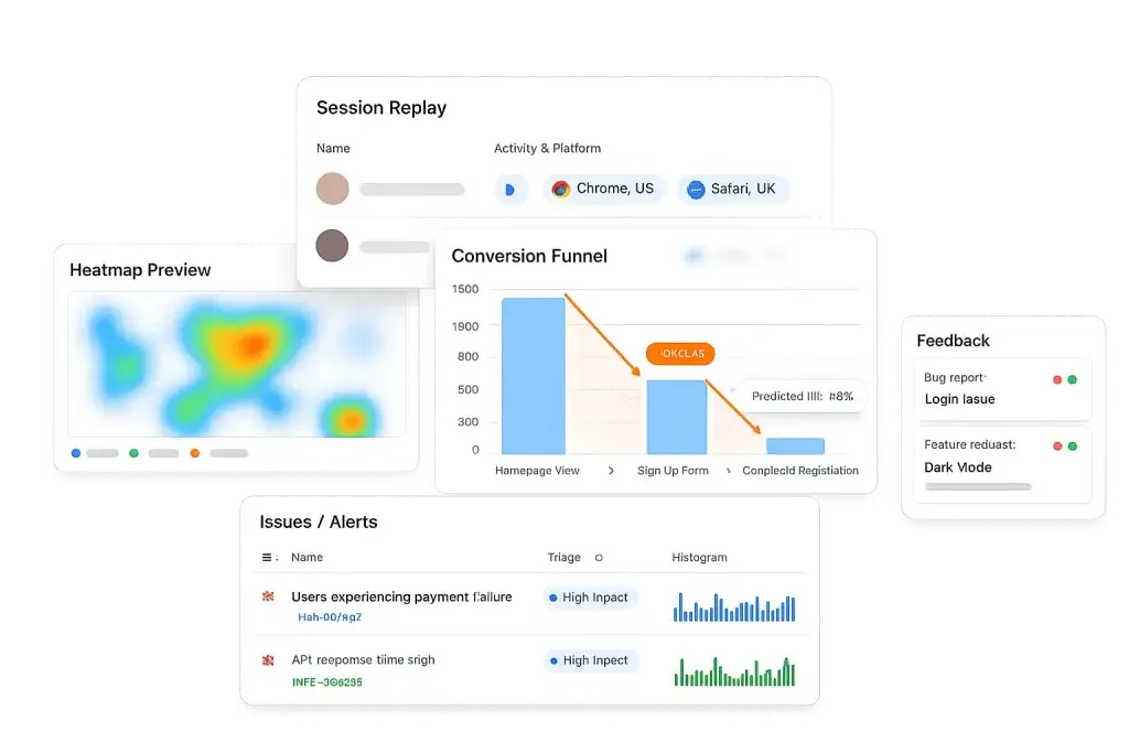
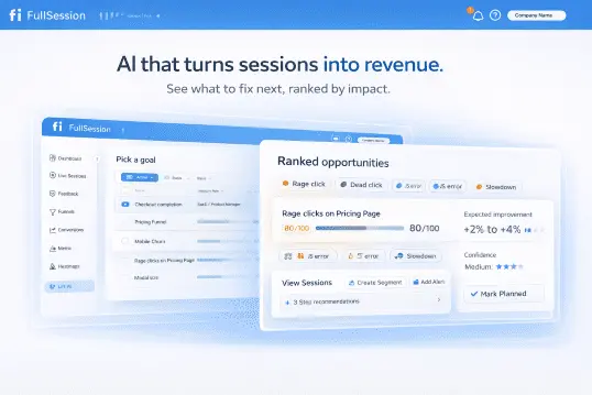
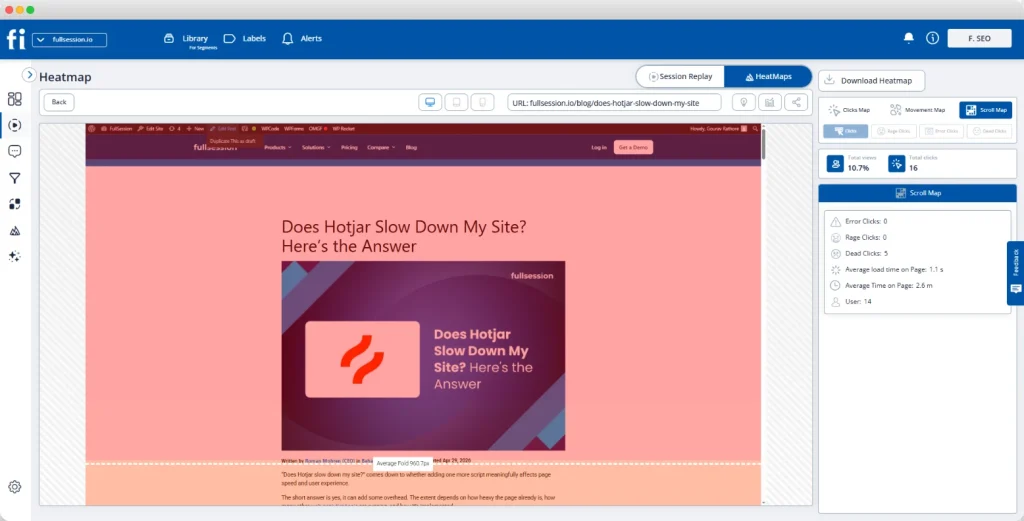
Say AI rewrites a checkout form and drafts new field labels. Ship it to a slice of traffic and watch what happens. A conversion funnel tells you whether completion went up or down at that step. A session replay shows why: maybe the cleaner label reads well but the new inline validation rejects valid input, and you can watch people retry and give up. A heatmap confirms whether the redesigned section even draws attention, or whether a cluster of rage clicks is forming on a control that looks interactive but is not. To skip the guesswork of which page to inspect first, Lift AI ranks the friction by impact so you start where the losses are largest.
Funnels and heatmaps turn an AI-generated design into a measured before-and-after, not a guess.Lift AI ranks friction by impact, so you validate the AI-assisted change that matters most before the rest.
Run that loop and AI becomes safe to move fast with, because nothing ships permanently on faith. Add a short in-page feedback prompt and you also capture the reason in the user’s own words, which is the context a model cannot infer. For a deeper method, our guide to measuring the ROI of UX improvements shows how to attach a dollar value to the lift, and UX testing tools covers the validation stack.
VALIDATE EVERY AI-ASSISTED DESIGN
Let AI draft it, then prove it with behavior
FullSession pairs session replay, heatmaps, and funnels with Lift AI, so you can tell which design actually works, not just which one looks right.
The parts of UX that decide whether a product is good, understanding what users actually need, weighing an ethical trade-off, and choosing a direction that fits the strategy, are exactly the parts AI cannot own. Use it to remove the grunt work and to generate options faster, then apply human judgment to pick among them and behavioral evidence to confirm the choice. A designer who uses AI to move faster and validates against real users will beat both the designer who refuses the tool and the one who ships whatever it produces. Our notes on user experience analysis and content design go deeper on keeping that judgment sharp.
Turn AI-assisted design into experiences you can prove
Visualize, analyze, and act on real user behavior with FullSession. Ship the AI draft, watch how users respond, and keep only what works. No credit card needed to start.
AI speeds up specific parts of the workflow: analyzing user research, generating wireframes and prototypes, drafting UX copy, checking accessibility, personalizing content, and producing UI assets. It is strongest in the exploration and production stages, where it removes repetitive work. It is weakest at judgment, because it is trained on what is common, not on what is right for your users. The reliable pattern is to let AI accelerate the making and to validate the result against real behavior.
Will AI replace UX designers?
No. AI takes over repetitive tasks and gives designers a faster first draft, but the empathy, strategic thinking, and ethical judgment that define good UX remain human work. AI can generate a hundred variations and still not know which one respects the user. It is a tool that raises a designer’s output, not a replacement for the person deciding what to build and why.
Can AI design a good user experience on its own?
Not reliably. AI produces designs that look right because they match common patterns, but a design that follows the average can still confuse your specific users or quietly exclude some of them. Automated tools also miss real accessibility barriers: the WebAIM Million found an average of 51 detectable errors per home page in 2025. AI can draft the design, but only observed behavior confirms whether it works.
How do I know if an AI-assisted design actually works?
Watch real users interact with it. A funnel shows whether the new design lifts or hurts completion, session replay shows where people hesitate or misread it, and a heatmap shows what they actually notice. Ship the AI-generated change to a segment, observe the behavior, and keep it only if the numbers and the recordings agree. The AI produces the candidate; behavior analytics decides the winner.
Roman Mohren is CEO of FullSession, a privacy-first UX analytics platform offering session replay, interactive heatmaps, conversion funnels, error insights, and in-app feedback. He directly leads Product, Sales, and Customer Success, owning the full customer journey from first touch to long-term outcomes. With 25+ years in B2B SaaS, spanning venture- and PE-backed startups, public software companies, and his own ventures, Roman has built and scaled revenue teams, designed go-to-market systems, and led organizations through every growth stage from first dollar to eight-figure ARR. He writes from hands-on operator experience about UX diagnosis, conversion optimization, user onboarding, and turning behavioral data into measurable business impact.
Your dashboard says conversion is 3 percent, the average session runs 90 seconds, and NPS sits at 32. Clean numbers, easy to report, easy to track week over week. The trouble is that two products with identical numbers on that dashboard can be having completely different experiences, and the average will never tell you which one is yours.
That is the exact warning behind Anscombe’s quartet, a small set of datasets that has been quietly embarrassing summary statistics since 1973. It is worth understanding, not as a stats-class curiosity, but because almost every metric you report about your users is a summary statistic with the same blind spot.
QUICK TAKEAWAY
Anscombe’s quartet is four datasets with the same mean, variance, correlation, and regression line that look nothing alike when plotted. The lesson for analytics: your average conversion rate, session time, and NPS can hide two very different groups of users. Compute the number to know something changed, then visualize and segment to learn what actually happened.
What Anscombe’s quartet is
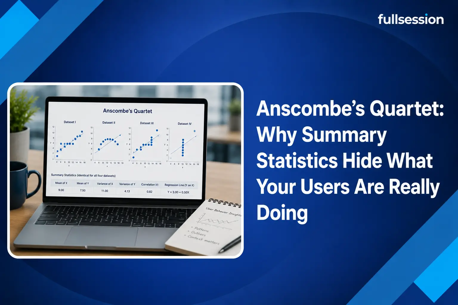
In 1973 the statistician Francis Anscombe built four small datasets, each with eleven points, to make a point that a table of numbers could not. Across all four, the summary statistics are almost identical: the mean of x is 9, the mean of y is 7.50, the variance of x is 11 and of y is 4.12, the correlation between x and y is 0.816, and the line of best fit is the same equation, y = 3 + 0.5x. Read the summary and you would swear the four datasets are basically the same.
Then you plot them, and they fall apart. The first is a loose linear cloud, the honest case the statistics describe. The second is a clean curve that is not linear at all, so a straight-line model is simply the wrong tool. The third is a tight straight line dragged off course by one extreme outlier. The fourth has x fixed at a single value except for one point that props up the entire correlation. Same numbers, four different stories, and only the picture tells you which is which.
Four datasets, identical summary statistics, four completely different shapes. The average cannot see the difference.
The modern version: a dinosaur hiding in the numbers
If a quartet from 1973 feels easy to dismiss, researchers at Autodesk updated the joke for the data-science era. In 2017, Justin Matejka and George Fitzmaurice generated a set of thirteen datasets, the Datasaurus Dozen, that share the same mean, standard deviation, and correlation to two decimal places. One of them, when plotted, is a picture of a dinosaur. The others are stars, circles, and lines. Every one reports the same tidy statistics, and every one is a different beast. The point is the same as Anscombe’s, made impossible to ignore: matching summaries are no guarantee of matching realities.
Why this matters for your product and marketing metrics
Here is the part the textbook version leaves out. Nearly every number on a product or marketing dashboard is a summary statistic, which means every one carries the Anscombe risk. The danger is not theoretical; it changes what you decide to fix.
Take an average time on page of 90 seconds. That can describe a page where most visitors read for a minute and a half, or a page where half bounce in five seconds and half stay for three minutes, with almost nobody near the average. Those are opposite problems, and the mean hides which one you have. A 3 percent conversion rate can be a steady 3 percent across the board, or it can be one segment converting at 8 percent while another sits near zero, which means your real job is to figure out why one group fails. An average NPS of 32 can come from lukewarm neutrality or from a fierce split of promoters and detractors that needs two different responses. In each case the summary is a bimodal distribution wearing a single-number disguise, exactly like dataset four of the quartet leaning on one point.
Segmenting a metric splits the average back into the distinct groups it was hiding.Image source: Pixabay
How to see the distribution behind the average
Anscombe’s fix was simple: plot the data. For user behavior, plotting means two things, splitting the number apart and watching the raw behavior it came from. Both turn a flat average into a shape you can act on.
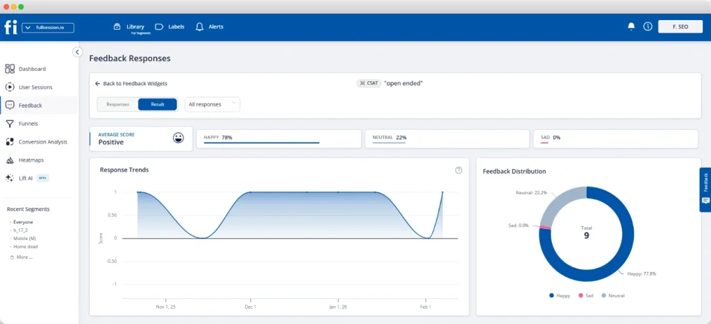
Start by segmenting. Break any metric down by source, device, plan, or stage and the bimodal cases reveal themselves; a conversion funnel segmented that way shows exactly where one group drops while another sails through. Then look at the raw behavior, which is the analytics equivalent of graphing every point. Session replay is each individual data point made visible, one real user moving through the flow, so you can see the five-second bounce and the three-minute struggle that the 90-second average blended together. A heatmap shows the distribution of attention across a page rather than a single scroll-depth number. And in-page feedback adds the why, turning a quiet detractor score into a sentence you can act on. Our piece on qualitative versus quantitative data covers how these two views reinforce each other.
To skip the manual hunt for which segment or page is dragging a number, Lift AI ranks where friction concentrates, pointing you at the part of the distribution that is actually costing you. That is the whole Anscombe lesson operationalized: the summary tells you a number moved, and the behavior tells you which group moved it and why.
Funnels and heatmaps show the shape of behavior, the picture a single averaged metric leaves out.
SEE THE SHAPE, NOT JUST THE AVERAGE
Plot the behavior behind every metric
FullSession pairs session replay, heatmaps, and funnels so a flat average opens up into the real distribution of what your users do.
None of this makes averages useless. A single number is efficient, and it is exactly what you want for tracking a trend over time or getting an alert when something shifts. The error is treating the summary as the answer instead of the prompt. Compute the average to notice that conversion dropped this week, then segment and watch replays to learn that the drop lives entirely in mobile checkout. Used that way, summary statistics and behavioral detail are partners: the number is a fast, cheap alarm, and the distribution behind it is the diagnosis. Our guides to product metrics and SaaS metrics show how to keep both views in play.
Turn flat metrics into decisions you can trust
Visualize, analyze, and act on real user behavior with FullSession. Get past the average and see the distinct groups of users behind every number. No credit card needed to start.
Anscombe’s quartet is a set of four datasets built by statistician Francis Anscombe in 1973. All four share nearly identical summary statistics: the same mean of x and y, the same variance, the same correlation of 0.816, and the same regression line. Yet when you plot them, they look completely different: one is roughly linear, one is a curve, and two are dominated by a single outlier. It is the classic proof that summary numbers alone can hide the real shape of your data.
Why can summary statistics be misleading?
Because a single number collapses a whole distribution into one point, and very different distributions can produce the same number. An average conversion rate can hide two segments, one converting well and one not at all. An average session time can be a mix of instant bounces and long readers, with almost nobody near the average. The statistic is not wrong, it is just incomplete, and it can point you at the wrong fix if you never look at the shape behind it.
How does this apply to product and marketing analytics?
Most product and marketing dashboards are summary statistics: average time on page, overall conversion rate, mean NPS. Each one can mask a bimodal or segmented reality the same way Anscombe’s quartet does. The fix is to look at the distribution behind the number: segment by source, device, or plan, and watch the behavior itself with session replay, heatmaps, and funnels so you see the shape, not just the average.
Are summary statistics still useful?
Yes. They are efficient for tracking trends and monitoring a metric over time once you understand the distribution underneath it. The mistake is using them as the only view. Compute the summary to spot that something moved, then visualize and segment to learn what actually happened. Summary statistics are a good alarm and a poor diagnosis.
Roman Mohren is CEO of FullSession, a privacy-first UX analytics platform offering session replay, interactive heatmaps, conversion funnels, error insights, and in-app feedback. He directly leads Product, Sales, and Customer Success, owning the full customer journey from first touch to long-term outcomes. With 25+ years in B2B SaaS, spanning venture- and PE-backed startups, public software companies, and his own ventures, Roman has built and scaled revenue teams, designed go-to-market systems, and led organizations through every growth stage from first dollar to eight-figure ARR. He writes from hands-on operator experience about UX diagnosis, conversion optimization, user onboarding, and turning behavioral data into measurable business impact.
Your signup numbers look fine. Your trial volume looks fine. Then you check trial-to-paid conversion and the number makes no sense, because somewhere between those two points, you’re losing people and you don’t know where.
That gap is exactly what SaaS funnel analytics fixes.
SaaS funnel analytics is the practice of tracking how users move through the stages of your product. It measures conversion and drop-off at each step, then uses that data to find and fix the points where you lose the most customers.
This guide covers the key metrics that matter and how to set up funnels without a data team. You’ll also find how AI can prioritize what to fix first, plus the compliance basics most SaaS guides skip entirely.
Key Takeaway
SaaS funnel analytics turns “users are dropping off somewhere” into a specific, fixable answer about which step and why.
A handful of funnel metrics drive most decisions: conversion rate, customer acquisition cost, churn rate, and customer lifetime value.
You don’t need SQL knowledge to build a reliable simple funnel. FullSession, a behavioral analytics platform for SaaS teams, lets you define steps visually and watch the sessions behind every drop.
Predictive analytics and AI prioritization, like FullSession’s Lift AI, help product teams act on funnel insights without drowning in dashboards.
Funnel tracking touches personal and demographic data, so GDPR and CCPA basics belong in your rollout plan.
FullSession brings funnel tracking, session replay, and AI-driven prioritization into one platform, so you don’t need a separate tool for each piece of the puzzle. That combination makes it easier to go from “users are dropping off” to a specific fix you can ship this week.
The Model Context Protocol is an open standard from Anthropic (November 2024) that lets AI assistants connect to Funnel analysis turns acquisition spend into a clear, fixable system instead of a black box. Every dollar you spend on ads, content, or outreach only pays off if the people it brings in actually convert. When your funnel leaks, you’re quietly inflating your customer acquisition cost on every channel you run.
You can’t out-spend a broken funnel, which is why funnel analysis tools matter more for business growth than almost any other lever you have.
The math behind a leaky funnel
Say you spend $10,000 to bring in 1,000 trial signups, and 5% convert to paid. That’s 50 satisfied customers at $200 each. Improve trial-to-paid conversion to 10% with the exact same traffic and spend, and you’ve doubled your customer count without touching your marketing budget.
Sustainable growth comes from understanding where in your sales process users actually stall, then fixing that specific step.
What happens when teams skip funnel analysis
Marketing teams who skip this step run into a familiar set of problems:
They debate opinions instead of looking at data-driven decisions.
They spend more to chase the same number of customers, instead of converting more of the traffic they already have.
They optimize the loudest complaint instead of the step actually losing the most users.
That’s a slower way to grow. The real question isn’t how many users you can attract. It’s about moving the users you already have forward through your SaaS marketing funnel.
Key SaaS Funnel Stages (and How to Define Them)
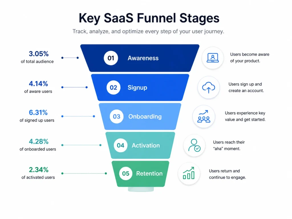
A SaaS funnel has four core stages: awareness, trial or activation, conversion, and retention. Unlike simple sales funnels built for a single purchase, SaaS conversion funnels keep going after the first payment. Each stage represents a different decision the user is making, and each needs its own funnel metrics.
Awareness: A potential customer discovers your product and decides whether it’s worth a closer look.
Trial or activation: A signed-up user decides whether your product actually solves their problem.
Conversion: A trial user decides whether to upgrade to a paid version and become one of your converting users.
Retention: An existing customer decides, every renewal cycle, whether to stay.
Notice that retention isn’t an afterthought here. It’s a full stage with its own simple conversion tracking, because in a subscription business, the sale doesn’t end the customer journey. It starts it.
For a full breakdown of how these stages map to specific conversion benchmarks and a 30/60/90 day action plan, see our guide to the SaaS conversion funnel. This article focuses on the funnel analysis tools you need to measure each stage well.
Core SaaS Funnel Metrics to Track
Six metrics drive most funnel decisions: conversion rate, customer acquisition cost, churn rate, customer lifetime value, net promoter score, and feature adoption. These SaaS funnel metrics work together, and tracking them consistently helps you catch issues before they become revenue problems.
Conversion rate
Conversion rate is the percentage of users who move from one funnel step to the next, and the benchmark you should compare against depends heavily on your trial model.
According to ChartMogul, in partnership with ProductLed, the SaaS growth community and content platform, the median free-to-paid conversion rate across 200 B2B software products surveyed in January 2026 was 8%. Free trials requiring a credit card converted at roughly 30%.
According to First Page Sage, opt-in free trials convert to paid at an average of 18.2%, while opt-out trials requiring a credit card upfront convert at 48.8%. Know your model before tracking conversion rates against a generic average.
Customer acquisition cost and churn rate
Customer acquisition cost (CAC) is your total sales and marketing spend divided by new customers gained. You need it next to customer lifetime value, often shortened to CLV, to know if your funnel is actually profitable.
Churn rate measures the percentage of paying customers who cancel in a given period. A 5% monthly churn rate sounds small until you realize it means losing more than half your user base in a year.
Customer satisfaction, loyalty, and NPS
Customer satisfaction feeds directly into both churn rate and customer loyalty. Teams that survey existing customers right after a cancellation or a downgrade learn far more than teams that only ask happy customers for feedback.
Net promoter score (NPS) measures how likely satisfied customers are to recommend you, and it’s a leading indicator of churn long before the cancellation actually happens.
Feature adoption
Feature adoption tracks what percentage of new users actually use a given feature. Feature usage data often explains weak product adoption better than any survey can.
The SaaS funnel metrics map
Funnel Stage
Core Metrics
Benchmark Range
How to Track It
Awareness
Organic traffic, bounce rate
Varies by channel and industry
Web analytics tools, heatmaps
Trial/Activation
Activation rate, time to first value
35-45% activation is typical mid-range
Funnel analysis tools, session replay
Conversion
Trial-to-paid conversion rate
18.2% (opt-in) to 48.8% (opt-out), per First Page Sage
Conversion funnel analysis platforms
Retention
Churn rate, NPS, customer lifetime value
Under 5% monthly churn is the common target
Retention analysis dashboards, customer feedback
Want to see how many users actually move through each of these stages on your own site? Our guide on measuring and shortening time to value breaks down the activation metric in more detail.
Implementing Funnels With FullSession
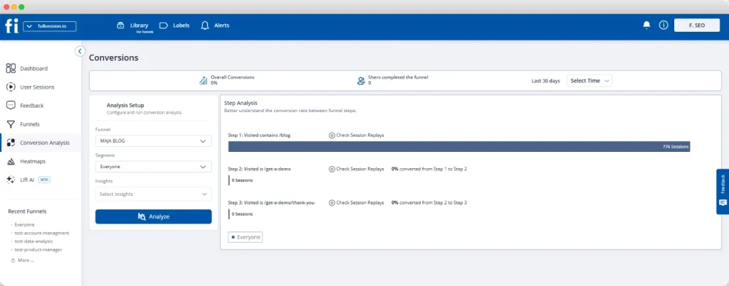
You can build a working SaaS funnel without writing a single SQL query. FullSession’s funnel analysis tool turns scattered events into a clear funnel. It shows how many users reach each step, where they drop, and how conversion changes over time, without manual tracking code.
The product is built around three actions: define, segment, and diagnose.
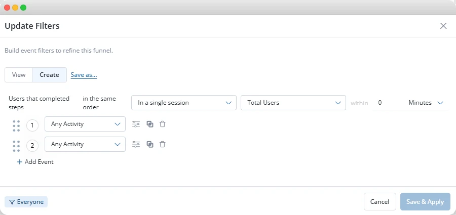
Define your steps
Choose a journey. Pick one path that matters, like signup to onboarding flow to activation.
Add three to seven steps. Name each one clearly so anyone on your product team understands it at a glance.
Set a conversion window. Decide how long users have to move through the funnel before they’re counted as dropped.
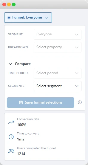
Segment your results. Break the funnel down by device, source, region, or plan.
Click into the drop-offs. Watch the actual session recordings of users who exited at any given step.
Segment and diagnose
Filtering by device, country, traffic source, or user segment turns “conversion dropped 8% last month” into “conversion dropped 8% for mobile users on checkout.”
Different user segments hide inside one average until you split them apart. This matters even more once you run multiple funnels at once, since each one can hide a different segment problem.
Clicking into a drop-off is where most analytics tools stop short. Plenty can show you that 40% of trial users stalled at “connect your first data source.” Very few let you jump from that number straight into session replay on the same screen.
It shows deeper insights a dashboard alone can’t provide about the real user experience behind it.
Why this matters without a data team
Many tools come with a steep learning curve before you can build your first useful funnel. Without SQL knowledge or a dedicated analyst, that requirement becomes a bottleneck you didn’t budget for.
Google Analytics alone won’t close the gap either, since it shows aggregate numbers without session-level context.
FullSession is built for product, growth, and operations teams to share one funnel view and base decisions on it together.
From Setup to Fix, in One Platform
Set up your funnel, segment the results, and watch the sessions behind every drop, all in one place.
Turning Funnel Data Into Actionable Insights With Lift AI
Most product managers have more friction signals than they have time to review. A funnel might show five separate drop-off points, three demographic data gaps, and a handful of rage-click spikes, all in one week.
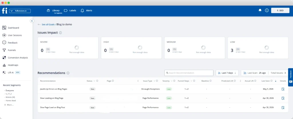
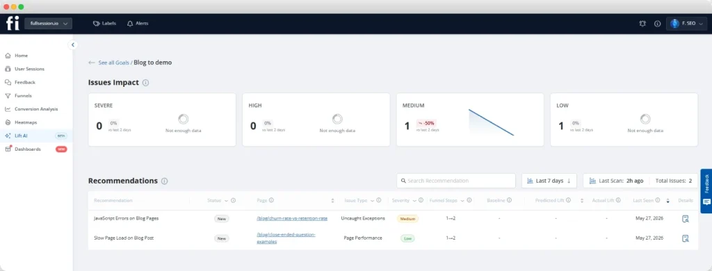
Lift AI, FullSession’s AI prioritization feature, turns real sessions into a ranked list of opportunities tied to your goals and funnels instead of a wall of charts.
How Lift AI works
The feature runs on three steps. First, you set a goal, like checkout completion, revenue per visitor, or visitor-to-signup. Second, Lift AI determines the best attribution window automatically and analyzes friction, failures, and slowdowns in the sessions tied to that goal.
Third, you get a ranked list of opportunities, each with an expected goal improvement, a confidence score, and evidence links attached.
That evidence matters more than the ranking itself. You’re not just told “fix onboarding step 3.” Opening any opportunity shows the step it hurts, the affected pages, and example sessions.
That structure is what turns a list of optimization opportunities into something your team can actually act on, instead of an AI-generated guess you have to take on faith. It’s what lets Lift AI provide actionable insights instead of vague priorities.
How to validate a recommendation
The validation loop closes the gap that trips up most teams: knowing whether a fix actually worked.
Review. Open the recommendation and review the linked evidence, including sessions and the impacted step or pages.
Ship. Make the fix, whether it’s a UX change, new copy, a flow adjustment, or a technical patch.
Measure. Check impact against a pre/post window or a holdout experiment. Lift AI provides the estimate; your measurement is the source of truth.
This doesn’t replace your product managers or analysts. It gives Growth, Product, UX, and Engineering a shared starting point so they spend time designing solutions, not hunting through dashboards.
Different teams respond to the same fix differently, and advanced segmentation shows which group is driving a drop-off before you build the wrong solution.
Not Ready to Talk Yet?
See your first Lift AI recommendations on your own data within the hour.
Experimentation and Conversion Rate Optimization (CRO)
Finding a drop-off and fixing it are two different skills, and the gap between them is where most funnel work stalls for any SaaS business. A reliable testing process turns conversion tactics into a validated fix, using targeted experiments instead of broad guesses.
Find the biggest absolute leak. A step losing 300 users out of 1,000 matters more than a step losing 5 users out of 100, even if the second one has a worse percentage rate.
Watch the sessions behind it. Review 10 to 20 replays of users who exited at that exact step before you guess at a cause.
Write one specific hypothesis. State the change, the expected outcome, and the evidence behind it in a single sentence.
Test one variable at a time. Changing the page elements, the copy, and the layout all at once tells you nothing about which single change actually worked.
Measure the whole funnel, not just the tested step. A fix that improves one step but pushes the same users to drop off one funnel step later isn’t a real fix.
The highest-return tests tend to live in the simplest places: signup form length, onboarding sequence, and the copy on your trial-end upgrade prompt.
None of these require a redesign. They require evidence, a hypothesis, and a willingness to test one thing at a time.
For the full diagnostic workflow behind this process, including how to segment drop-offs and confirm root cause with behavioral proof, see our guide to conversion funnel analysis
Measuring ROI of Funnel Optimization
The ROI of funnel optimization compounds because every improvement applies to every future user, not just this month’s cohort. A one-point lift in your conversion rate isn’t a one-time win. It’s a permanent change to how much revenue the same traffic produces, month after month.
A worked example
Say your trial-to-paid rate sits at 8%. You run 1,000 trial signups a month, so that’s 80 new customers.
Lift that rate to 10% without spending another dollar on acquisition, and the math looks like this:
Before: 1,000 signups x 8% = 80 new customers a month.
After: 1,000 signups x 10% = 100 new customers a month, simply by converting more users you were already attracting.
Revenue impact: 20 extra customers x $150 average revenue per customer = an extra $3,000 in new monthly recurring revenue, every single month, from a fix you made once.
Why this compounds over time
Multiply that across a year and you start to see why optimization often beats a bigger ad budget for sustainable growth. This is also why campaign performance and funnel performance need to be evaluated together.
A campaign that drives potential customers who never convert isn’t actually performing well. It’s just moving the leak earlier in your pricing model funnel, where it’s harder to see.
Privacy, Governance, and Compliance in Funnel Analytics
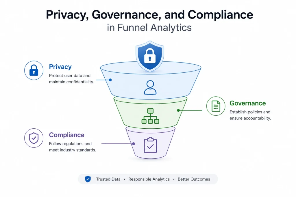
Funnel and session data often qualifies as personal data, which means GDPR and CCPA apply the moment you start tracking real user behavior. This isn’t optional paperwork. It’s a real legal requirement that shapes how you collect and store the user feedback and event data behind your funnels.
A few practical steps keep your tracking compliant without slowing your team down.
Mask sensitive fields at capture. Passwords, payment details, and other private inputs should never leave the user’s browser in a readable form.
Set a clear retention window. Decide how long session and funnel data is kept, and document that decision in your privacy policy.
Use role-based access. Not everyone on your team needs to see every session. Limit access to what each role actually requires.
Keep a record of consent where required. Depending on your jurisdiction and tracking method, you may need explicit consent before recording begins.
GDPR and CCPA exist to protect individuals, not to block teams from understanding their customer experience.
Built correctly, privacy controls and useful funnel insights aren’t in conflict. They just require you to think about governance before you flip on tracking, not after a customer asks what data you have on them.
FullSession’s safety and security features cover this ground directly. Configurable masking rules hide sensitive fields and elements at capture, role-based access and SSO control who can see what, and audit logs show who accessed which sessions and when.
That combination means your security and legal teams can sign off on funnel tracking without slowing your rollout down.
Common SaaS Funnel Analytics Mistakes
Most analytics failures come from a handful of repeatable mistakes, not from bad tools. Here are the ones that show up most often among SaaS companies.
Treating Google Analytics, Google’s free traffic and conversion tracking platform, as sufficient on its own. It shows you that users dropped off, but it can’t show you why, because it has no view into session-level user actions.
Tracking too many funnels at once. A simple funnel with three to seven clear steps beats five overlapping funnels nobody fully understands.
Ignoring the retention stage focuses everyone needs. Teams obsess over the top of the funnel and treat churn as someone else’s problem.
Skipping segmentation by signup date or cohort analysis. A funnel that looks stable in aggregate often hides a brand-new problem in last week’s cohort alone.
Chasing the worst percentage instead of the worst absolute number. A step losing 5% of 10,000 users matters more than a step losing 50% of 100 users find frustrating.
Assuming real funnel work requires a data engineer. Plenty of teams never start because they think they need SQL knowledge they don’t have, when a visual tool would do the job.
If your current setup mirrors any of these, it’s worth comparing what’s actually available. Our roundup of SaaS analytics tools breaks down the options by what each one is actually built to do.
Conclusion About SaaS Funnel Analytics
SaaS funnel analytics comes down to a short list of habits: track the right metrics, build funnels you can maintain, and pair the numbers with session-level evidence. Add AI prioritization to point you toward the fix worth shipping first, and you stop debating where the problem is and start fixing it.
None of this requires a data team or a SQL course. It just takes a funnel built around your actual user journey and a way to see what happened at the step where users gave up.
See Funnel Tracking and Lift AI Work Together
We’ll walk through how the two connect, from spotting a drop-off to knowing exactly what to fix first.
SaaS funnel analytics is the practice of tracking how users move through the stages of a SaaS product, from signup to activation to paid conversion and retention. It measures conversion and drop-off at each step, with the goal of finding which step is losing the most users, then fixing it with evidence instead of guesswork.
What are the key metrics in a SaaS funnel?
The core metrics are conversion rate, customer acquisition cost, churn rate, customer lifetime value, net promoter score, and feature adoption. Conversion rate and churn rate matter most for spotting problems quickly. CAC and lifetime value together tell you whether your funnel is actually profitable.
How do I track a conversion funnel without SQL knowledge?
Use a behavioral analytics platform that lets you define funnel steps visually instead of writing queries. Tools like FullSession let you name each step, set a conversion window, and segment results without touching a database. You click directly from a drop-off into the sessions that explain it.
What is a good SaaS trial-to-paid conversion rate?
According to First Page Sage, opt-in trials convert at an average of 18.2%, while opt-out trials requiring a credit card convert at 48.8%. According to ChartMogul, the broader 2026 median across 200 surveyed products was 8%. Compare your rate against your specific trial model, not a generic average.
How does AI help prioritize funnel fixes?
AI prioritization tools like Lift AI scan behavioral data tied to a specific goal and rank friction points by predicted revenue impact. Each recommendation comes with a confidence score and linked evidence, like affected pages and example sessions. This replaces manual dashboard review with a ranked, evidence-backed list.
Is funnel analytics data covered by GDPR?
Yes, funnel and session data often qualifies as personal data under GDPR and CCPA once it can be tied to an individual user. This means masking sensitive fields, setting clear retention windows, and managing access by role. Compliance requirements apply regardless of which tool collects the data.
Roman Mohren is CEO of FullSession, a privacy-first UX analytics platform offering session replay, interactive heatmaps, conversion funnels, error insights, and in-app feedback. He directly leads Product, Sales, and Customer Success, owning the full customer journey from first touch to long-term outcomes. With 25+ years in B2B SaaS, spanning venture- and PE-backed startups, public software companies, and his own ventures, Roman has built and scaled revenue teams, designed go-to-market systems, and led organizations through every growth stage from first dollar to eight-figure ARR. He writes from hands-on operator experience about UX diagnosis, conversion optimization, user onboarding, and turning behavioral data into measurable business impact.
Most SaaS signups never stick. New users sign up, poke around for a few minutes, and disappear before experiencing any real value. For product teams, that gap between signup and value is the most expensive problem in the business.
SaaS user onboarding is the process that guides new users from their first login to a meaningful outcome: the moment a product finally clicks, known as the aha moment. Everything between signup and that moment is onboarding.
This guide covers how to design onboarding for different SaaS models, how behavioral analytics reveals what your metrics can’t, and a 20-point SaaS onboarding checklist you can apply today.
Key Takeaway
Activation beats completion. A user who finishes every onboarding step without reaching a real value moment can still churn. Define one observable activation event before you design anything else, and measure success against that, not checklist completion.
PLG and enterprise onboarding are different products. Self-serve users need instant access and a single guided win within hours. Enterprise users need coordinated, CSM-led rollouts across multiple stakeholders. One flow designed for both will underserve both.
Your metrics tell you where. Your replays tell you why. Funnel drop-off rates show that a problem exists. Session replays show what the user actually experienced at that step. You need both to fix issues with confidence.
Friction kills onboarding before it starts. Every unnecessary form field, password setup, and permission screen between signup and the first user action creates churn risk. The fastest path to the aha moment wins.
Onboarding is never finished. Teams that outperform their competitors treat onboarding as an ongoing process. They run a 90-day improvement cycle: measure drop-off, form a hypothesis, test one variable, and validate the results with behavioral data. One focused improvement per cycle compounds over time.
FullSession gives SaaS product teams the one thing standard analytics cannot: visual evidence behind every drop-off. When a user abandons your onboarding funnel, FullSession lets you jump directly into their session replay to see what they saw, where they hesitated, and what went wrong.
Pair that with heatmaps that show layout issues on empty-state screens, rage click detection that shows broken UI before it hurts day-one retention, and in-app feedback linked directly to session recordings, and you have a complete diagnostic toolkit built for continuous onboarding optimization.
User onboarding is the most important stage in the entire SaaS user lifecycle. It determines whether a new user becomes an active, paying customer or a churn statistic. Every dollar spent on acquisition is wasted if the user onboarding experience fails to deliver value before the user loses interest.
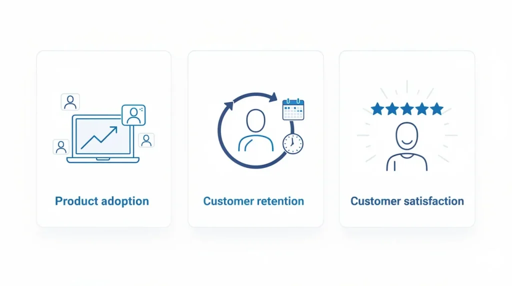
Strong onboarding drives three outcomes that product managers and customer success teams care about most:
Product adoption. Users who experience a product’s key features in their first session are far more likely to become loyal customers who stick. Onboarding is the bridge between signup and sustained feature adoption.
Customer retention. The aha moment, the specific action that makes the product’s value obvious, must happen early. Users who miss it in the first few days rarely return.
Customer satisfaction. A smooth onboarding journey builds confidence. A confusing one builds resentment. First impressions in SaaS are durable.
The initial onboarding process sets the baseline for customer engagement throughout the entire relationship. Users who complete a well-designed onboarding program are more likely to explore advanced workflows, invite teammates, and generate expansion revenue.
Read our guide for a full breakdown of how to measure and shorten your time-to-value in a SaaS context.
Aligning Onboarding with SaaS Business Goals
Onboarding completion and activation are not the same thing. A SaaS user can complete every step in your onboarding checklist and still churn without ever receiving real value. That gap makes completion rate a misleading primary metric for any SaaS business.
To build a customer onboarding process that actually drives business outcomes, answer three questions before designing any flow:
What is the activation event? Define one observable action that predicts long-term retention for your product. This decision shapes every onboarding choice that follows.
What is your time-to-value target? For self-serve SaaS models, users should reach the activation event within 24 hours of first login. Every step that delays that moment increases churn risk.
Which business metric does onboarding move? Tie every onboarding decision to activation rate, Day 7 retention, or trial-to-paid conversion. If a step does not move one of these, it does not belong in the initial onboarding process.
Build your SaaS customer onboarding process around these answers, and onboarding becomes a growth driver. Without this alignment, the customer onboarding journey turns into a series of disconnected steps instead of a clear path to the aha moment.
See Which Steps in Your Onboarding Flow Are Actually Moving Activation
Find out exactly where users stall before reaching their first value moment and see how FullSession helps you fix it.
How Onboarding Differs for Enterprise vs PLG Models
Not all SaaS companies onboard users the same way. The model you operate, whether product-led growth (PLG) or enterprise sales, fundamentally shapes the speed, support structure, and success metrics of the onboarding journey. One flow does not serve both.
PLG onboarding: speed and self-serve
Product-led growth onboarding is fully self-serve. New users complete account setup without human involvement, guided by in-app messaging, interactive walkthroughs, and onboarding checklists. The goal is instant access to the aha moment before users lose patience or open a competitor tab.
SaaS onboarding examples from PLG-native SaaS companies like Notion, the collaborative workspace tool, show what speed-first onboarding looks like: minimal signup fields, immediate product access, and a single guided task that delivers the first win within minutes.
Enterprise onboarding: depth and coordination
Enterprise onboarding is high-touch and human-led. A customer success team manages the process across not just individual users but multiple stakeholders, including procurement, IT, department leads, and end users.
It is not just individuals getting access, it is an organization adopting a platform.
Complex workflows, technical setup requirements, permissions, and integrations mean the onboarding program often spans days or weeks. The success metric shifts from hours to value to full account adoption within a defined window.
PLG Onboarding
Enterprise Onboarding
Speed
Hours to first value
Days to weeks
Support model
Self-serve, in-app
CSM-led, high-touch
Primary channel
In-app messaging, tooltips
Calls, email, live training
Success metric
Activation rate, time-to-value
Account adoption, NPS
Key risk
User drops before aha moment
Slow ramp erodes ROI before renewal
Most FullSession customers operate in a PLG or hybrid model. The behavioral analytics layer described in this guide applies to both. The onboarding journey looks different, but using real user behavior to find and fix friction works the same way.
What Makes an Effective SaaS Onboarding Process
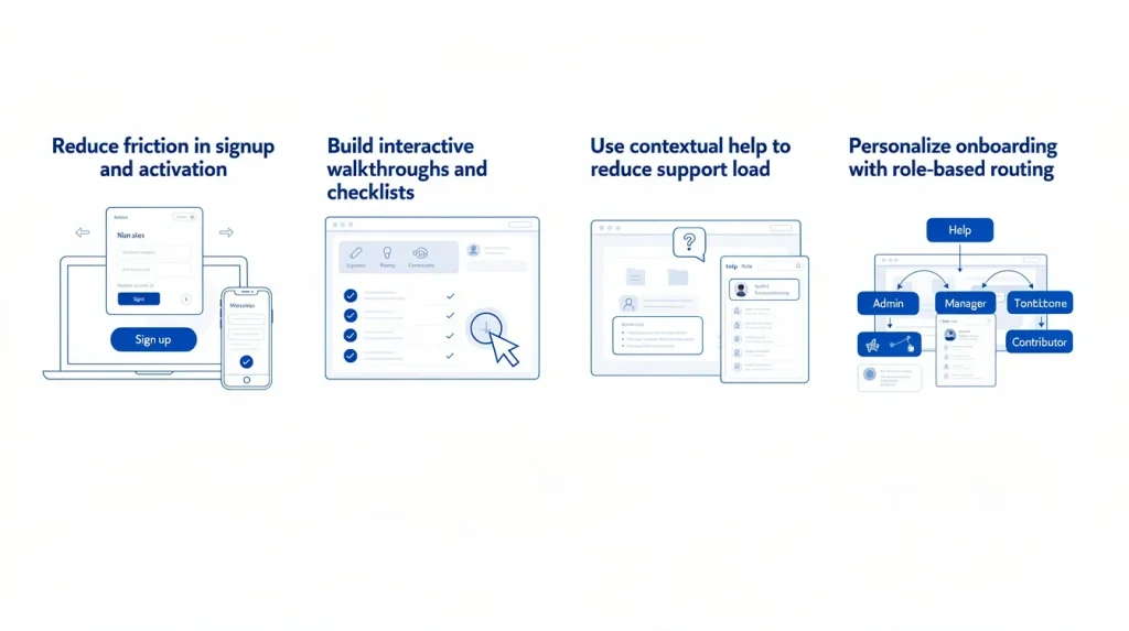
An effective SaaS customer onboarding relies on four pillars: friction reduction, guided activation, contextual help, and personalization. Addressing only one or two produces a customer experience that works for some users and quietly loses the rest.
These are not sequential phases. They run in parallel throughout the customer onboarding experience.
Reducing friction in signup and activation
Friction is the enemy of the signup process. Every extra form field, required technical setup step, and permission screen that appears before a user has seen any value increases the probability they abandon account setup.
The core rule: collect only what is necessary for the user to complete their first task. Collect everything else progressively as they engage.
Proven friction-reduction tactics:
Use SSO or OAuth so the user signs in without creating a new password. Instant access beats a registration wall every time.
Ask only one qualifying question at signup to route users into the correct flow without delaying the moment a user signs into the product
Show a visible progress indicator so users know they’re close to completing setup and are motivated to complete tasks
Make all non-essential steps optional with a clear skip path, so a user who skips a step now can complete it later
Remove any step that doesn’t directly contribute to the activation event
Take Slack, the team communication software, as an example. It uses email-code verification with no password setup. That single decision creates a faster, lower-friction path from signup to the first user action. Best practices like this are easy to replicate.
Building interactive walkthroughs and checklists
An interactive walkthrough is not a product tour. A product tour shows users what exists. A walkthrough guides them through doing something, specifically the task sequence that leads to the aha moment.
Each walkthrough step should end with a completed user action. If the activation event is “create first project,” the walkthrough must lead directly to that outcome. Showing a finished project is not onboarding.
Onboarding checklists give users a persistent view of progress. Keep the checklist on the main dashboard and link directly to the next incomplete step.
What to include in your onboarding checklist:
Each item maps to one specific action, not a general concept.
Order items from easiest to hardest to build momentum as users progress.
Core features appear first. Save complex workflows for after the initial value is delivered.
The final item is the activation event itself.
Watch session replays of users who abandon your walkthrough mid-flow to see exactly which step caused hesitation. No completion metric tells you what a replay does.
Using contextual help to reduce support load
Contextual help is assistance delivered at the exact moment and place a user needs it. It replaces the need for users to search documentation with guidance embedded directly in the interface.
Common formats and when to use them:
Tooltips: field-level explanations triggered by hover or pause, ideal for complex form inputs.
Hotspots: visual markers that draw attention to key features users might miss.
Video tutorials: short walkthroughs of complex workflows, ideally under 90 seconds.
Knowledge base links: contextual links that open relevant documentation without breaking flow.
In-app messaging: behavior-triggered messages based on user actions, not timers.
A strong self-serve support layer reduces support tickets and shortens time to value without increasing headcount.
Turn User Confusion Into a Fix in One Click
With FullSession, every piece of in-app feedback links automatically to the session recording so your team sees exactly what went wrong, without asking the user to explain it.
One onboarding flow does not fit all user personas. A product manager evaluating a SaaS analytics tool needs a different experience than a software engineer setting up the same tool for their development team.
Generic onboarding penalizes both.
Role-based routing is the practical starting point for user segmentation. Ask one qualifying question at signup, such as “What best describes your role?” Use the answer to segment users into different onboarding flows. This single step consistently improves activation rates across audiences.
How to design different onboarding flows by segment:
Identify the two or three most distinct user personas in your current active users base
Define a separate activation event and aha moment for each segment
Build separate onboarding flows with different walkthrough content and onboarding checklist items per persona
Use customer data from early sessions to refine each flow over time
AI-driven personalization goes further. Behavioral signals from early sessions can adapt in-app messaging dynamically, sending push notifications or targeted emails to inactive users who drop off before reaching the activation event.
Use survey data from these sessions to understand which step causes disengagement.
How FullSession Helps Improve SaaS Product Adoption
FullSession, a behavioral analytics platform for SaaS product teams, closes the gap between quantitative drop-off data and the qualitative evidence needed to act on it. Standard analytics tools show you where user drops happen. FullSession shows your onboarding team what that drop looked like from the user’s perspective.
That’s the foundation of the Behavior-First Onboarding Audit: a four-step diagnostic workflow built around FullSession’s toolset.
Use FullSession’s funnel analysis to measure drop-off, its session replays to watch exactly what users experienced at the exit point, its rage click and error tracking to identify the root cause, then fix and retest with the next cohort.
The sections below walk through each layer.
Spot friction with session replays
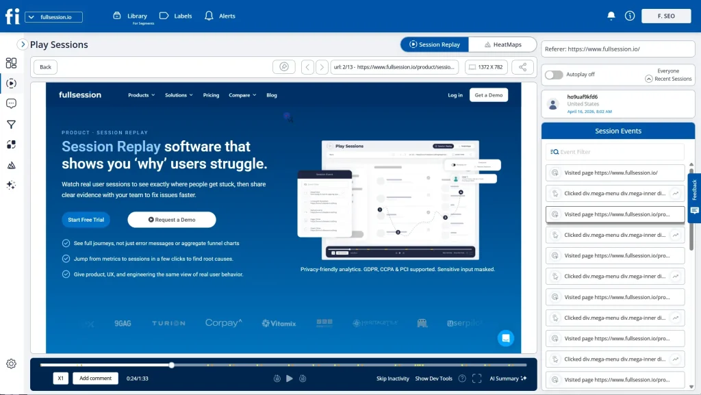
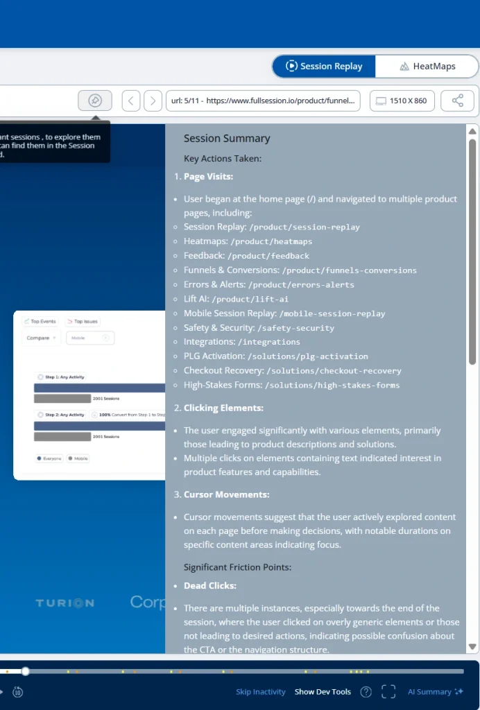
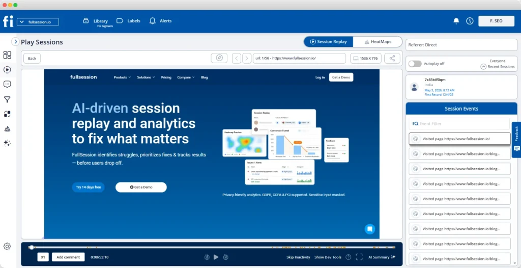
Session replays are recordings of individual user sessions, reconstructed as visual playback of exactly what a user saw and did on screen. Product teams can watch new users navigate the signup process, click through interactive walkthroughs, or attempt dashboard setup, all filtered by behavioral signals. See how session replays work in FullSession.
What session replays expose that no metric can:
A user clicking a tooltip that doesn’t open
Users navigating through three menus trying to find a required setup field
A user re-reading a setup instruction four times before abandoning the flow
A user who completes all visible steps but misses the activation event because the final step isn’t clearly signposted
Watch at least 10 replays of users who dropped off at each funnel step before forming any hypothesis about root cause.
Analyze funnel drop-offs and milestones
An onboarding funnel maps each step of the customer onboarding journey as a measurable stage. A standard SaaS funnel covers email verification, profile setup, first key action, invite teammates, and create first project.
Each transition produces a conversion rate and a drop-off rate.
FullSession’s funnel analysis tool lets product teams click directly from any drop-off point into the session replays of the specific users who exited there. That diagnostic link is what makes funnel drop-offs actionable rather than just visible.
The funnel gives you the where. The replay gives you the why.
Tracking rage clicks and UX errors
Rage clicks and dead clicks are user behavior signals that FullSession automatically flags. A rage click happens when a user clicks the same element repeatedly: they expected a response and the product didn’t deliver one. A dead click happens when a user clicks a non-interactive element, signaling layout confusion.
Both are especially damaging during onboarding.
A new user who hits a broken button on day one has no goodwill buffer. They leave. FullSession’s errors and alerts module maps JavaScript errors and broken flows directly to the session, so a software engineer can reproduce and resolve the bug in context.
The rage clicks guide covers the full detection-through-resolution workflow for these frustration signals.
Visualizing engagement with heatmaps
Heatmaps aggregate user behavior across thousands of sessions into a single visual layer. Click maps show where users tap, scroll maps show how far they read, and movement maps trace attention patterns across onboarding screens.
For onboarding teams, the highest-value application is empty-state dashboard pages, the screens new users see before they have created any data.
Common heatmap findings on first-login screens:
The onboarding checklist sits below the fold, so most new users never see it.
Users engage heavily with secondary navigation instead of the primary call to action.
Key features receive almost no click attention because they are visually buried.
These patterns can look like disinterest. In reality, they are layout problems, and event-tracking tools will not show them.
Gathering contextual in-app feedback
In-app feedback tools let users report confusion or errors directly from the screen where the problem occurs. No support ticket, no survey, and no context lost in translation. FullSession links every feedback submission automatically to the user’s session recording.
That’s what makes in-app feedback more useful than any post-session customer feedback method.
When in-app feedback volume spikes at a particular step, that signal correlates directly with the drop-off data visible in the funnel. Behavioral data and qualitative user feedback together give your onboarding team the evidence needed to prioritize fixes with confidence.
Prioritizing fixes with Lift AI
Lift AI scans your session data and ranks every onboarding friction point by its revenue impact. Instead of manually working through replays, funnel data, and feedback submissions to decide what to fix next, your team gets a prioritized list of issues with behavioral evidence already attached.
For onboarding, this matters because product teams almost always have more friction signals than capacity to address them. Lift AI reduces that backlog.
It shows the specific onboarding steps where fixing the issue would have the biggest effect on activation and trial-to-paid conversion, so your team works on what actually changes outcomes rather than what is easiest to spot.
It also validates whether those fixes actually worked. After changes go live, Lift AI tracks the same behavioral signals to measure impact on activation, drop-off, and conversion, so teams can confirm if a fix improved outcomes or had no meaningful effect.
Run the Behavior-First Onboarding Audit on Your Own Product
Connect your onboarding funnel, session replays, and error tracking in one place and see exactly where new users get stuck and why.
The right customer onboarding metrics tell you whether users are reaching value, not just clicking through steps. Use quantitative metrics to identify where problems exist, and session replays to understand why.
% of signups who complete the defined activation event
Low rate = users not reaching the aha moment; watch session replays of non-activated users
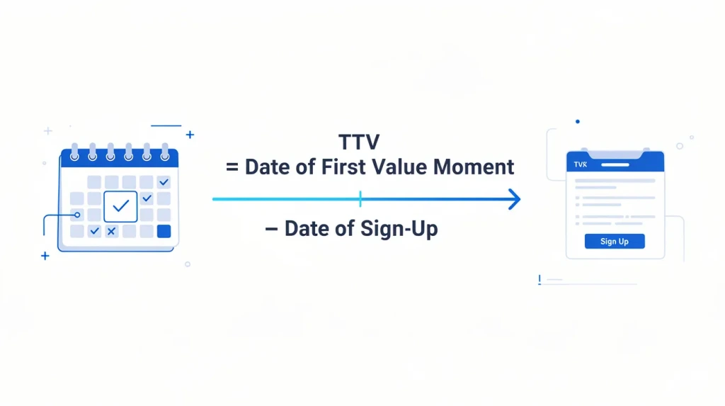
Time to Value (TTV)
Hours from first login to first value milestone
Long TTV = too many steps before activation; audit the onboarding process for friction
Onboarding Completion Rate
% of users who finish all onboarding steps
High completion + low retention = steps complete but no real value reached
Day 7 Retention
% of users still active 7 days after signup
Low Day 7 = onboarding didn’t create a habit; check for missing re-engagement triggers
Rage Click Rate
% of sessions with rage click events
Rate above 5% on onboarding screens = broken UI element; investigate with session replay
Customer Support Tickets
Tickets opened per 100 new users in first 30 days
Rising ticket rate = onboarding contextual help is insufficient; add tooltips or video tutorials
Feature Adoption Rate
% of users who use a key feature within 7 days
Low adoption = key features aren’t visible or reachable during the onboarding journey
Watch the combination most closely: high completion rate alongside low Day 7 retention. It means your onboarding program is finishing users. It’s just not activating them.
Not ready for a full demo? Start a free trial with FullSession and set up session replay and funnel tracking on your onboarding flow in under 15 minutes, no engineering required.
How to Experiment and Improve SaaS Onboarding Continuously
Onboarding isn’t a project with a launch date and a done state. SaaS companies with the strongest user engagement rates treat it as a product with its own plan and active improvement cycle.
The four-step improvement loop
Measure. Review funnel data, rage click trends, and in-app feedback from the current flow to identify the highest-impact drop-off point. Focus on volume, not instinct.
Hypothesize. Form one specific hypothesis: “Users are abandoning at the invite step because the value of inviting a teammate isn’t visible before they reach that screen.”
Change. Test one variable at a time: copy, step order, CTA placement, or field count. Testing multiple variables at once makes root cause identification impossible.
Validate. Measure activation rate and onboarding completion after a sufficient sample. Use session replays to confirm the behavioral change, not just the metric movement.
What to review each cycle
Run this loop on a 90-day cadence at minimum. Each review should cover:
Funnel conversion rates at every onboarding step to catch new drop-off patterns
Rage click rates on key onboarding screens and customer feedback volume by step
Activation rates by user segment to identify which user personas are underperforming
Survey data from existing users who completed onboarding 30-plus days ago, to identify which key features drove long-term retention
User segmentation is the most powerful lever in this cycle. Identify which segment has the lowest retention: onboarding users who churned as inactive users before activation, or existing users who stopped using basic features.
Fix that group’s flow before improving for the broader user base.
The 20-Point SaaS User Onboarding Checklist
Use this SaaS user onboarding checklist to audit your current flow or build a new one from scratch.
Group 1: Strategy and goals
Define your activation event as one observable action that predicts long-term customer retention
Map your onboarding program to a specific business goal: activation rate, time-to-value, or trial-to-paid conversion
Document the aha moment separately for each of your primary user personas
Set a time-to-value target. For self-serve SaaS, users should reach activation within 24 hours of first login.
Confirm that the customer success team and product manager agree on the activation event before building any flow
Group 2: Signup and first login
Reduce the signup form to three fields or fewer and collect additional customer data progressively
Implement SSO or OAuth to remove password creation from the signup process entirely
Add a role-based routing question at signup to guide users into the correct onboarding flows for their persona
Write a welcome email that restates the value proposition and links to the specific first action
Design a first-login screen with one clear next step, not a full product overview or feature tour
Group 3: In-app guidance
Build an interactive walkthrough where every step ends with the user completing a task, culminating in the activation event
Create a persistent onboarding checklist on the main dashboard with real-time progress and links to the next incomplete step
Add contextual tooltips at the two to three steps where session replays show the most confusion and user hesitation
Build a knowledge base covering the top five questions new users ask customer support in their first 30 days
Add in-app feedback widgets on the highest drop-off steps so you gather user feedback from the exact screen where confusion occurs
Group 4: Analytics and improvement
Build an onboarding funnel with at least four steps from signup to the activation event and monitor conversion rates weekly
Enable rage click and error tracking to automatically catch broken UI elements and JavaScript errors in the onboarding flow
Watch at least 10 session replays of users who dropped off at each funnel step before drawing any conclusion about root cause
Set a 90-day improvement cycle: review customer onboarding metrics and ship one focused change each quarter
Compare session replays of activated users against those of inactive users who churned before activation. That behavioral gap is your next improvement priority.
If you want to run through this checklist with real behavioral data from your product, book a demo with FullSession and see where your users are actually getting stuck.
Conclusion About SaaS User Onboarding
SaaS user onboarding is the most important stage in the user lifecycle. Every decision between signup and the aha moment either builds customer loyalty or erodes it. The product teams that treat onboarding as a discipline, with their own metrics, improvement cycles, and evidence from real user behavior, consistently out-retain those who treat it as a one-time setup task.
Strategy without behavioral data produces guesswork. Behavioral data without strategy produces noise. Together they form the foundation of a good onboarding process that gets stronger with every improvement cycle.
Building a better customer onboarding experience isn’t about adding more steps, more tooltips, or more in-app messages. It’s about understanding what your users actually do, finding where the customer onboarding journey breaks down, and fixing those breaks with evidence.
Set Up Session Replay and Funnel Tracking in Under 5 Minutes
With FullSession, every piece of in-app feedback links automatically to the session recording so your team sees exactly what went wrong, without asking the user to explain it.
The 5 C’s of onboarding are Clarity, Confidence, Connection, Capability, and Commitment. Clarity means users immediately understand the product’s value. Confidence grows when they complete early wins. Connection links the product to their specific goal. Capability is built through walkthroughs and contextual help. Commitment comes when users reach a repeatable value moment and choose to stay.
What are the 4 phases of onboarding?
The 4 phases of SaaS customer onboarding are Signup and Account Setup, Activation, Habit Formation, and Expansion. In the Signup phase, users create their account. Activation is when they complete the core action that signals real engagement. Habit Formation is where regular use develops, and Expansion is where users adopt advanced features or invite teammates.
What are the 5 stages of the onboarding process?
The 5 stages of the SaaS onboarding process are Welcome, Setup, Education, Activation, and Retention. Welcome covers first login and orientation. Setup handles account configuration. Education delivers walkthroughs, tooltips, and contextual help. Activation is the defined first-value action. Retention is when the user returns and expands usage. Each stage should be a discrete funnel step with its own completion rate.
Is SaaS onboarding safe?
Yes. Reputable SaaS platforms protect user data during onboarding through encryption, SOC 2 compliance, and role-based access controls. Behavioral analytics onboarding tools used to monitor user flows, including session replay and heatmaps, mask sensitive fields automatically. FullSession applies privacy-first data collection by default, excluding passwords and personal data from all session recordings.
What metrics matter most for SaaS user onboarding?
The four most important SaaS onboarding metrics are Activation Rate, Time to Value, Onboarding Completion Rate, and Day 7 Retention. Track them together: a high completion rate alongside low Day 7 retention means users are finishing guided steps without reaching real, repeatable value. Customer support ticket volume in the first 30 days is an important secondary signal.
Roman Mohren is CEO of FullSession, a privacy-first UX analytics platform offering session replay, interactive heatmaps, conversion funnels, error insights, and in-app feedback. He directly leads Product, Sales, and Customer Success, owning the full customer journey from first touch to long-term outcomes. With 25+ years in B2B SaaS, spanning venture- and PE-backed startups, public software companies, and his own ventures, Roman has built and scaled revenue teams, designed go-to-market systems, and led organizations through every growth stage from first dollar to eight-figure ARR. He writes from hands-on operator experience about UX diagnosis, conversion optimization, user onboarding, and turning behavioral data into measurable business impact.
According to Artisan Strategies, which analyzed data from more than 500 SaaS companies, 60 to 70% of SaaS churn happens during the first 90 days of a customer’s journey. Most of that churn is preventable, but only if your team can see exactly where users stall.
A SaaS customer journey is the complete path a user takes from first discovering your product to becoming a loyal, recurring customer or churning out. For SaaS product managers, growth marketers, and CS teams working to improve customer retention, mapping that journey is the most direct path to protecting customer lifetime value.
In this guide, you’ll find the six core stages, a practical journey map template, a step-by-step framework for collecting behavioral data, and a walkthrough of how FullSession turns that data into retention improvements.
Key Takeaway
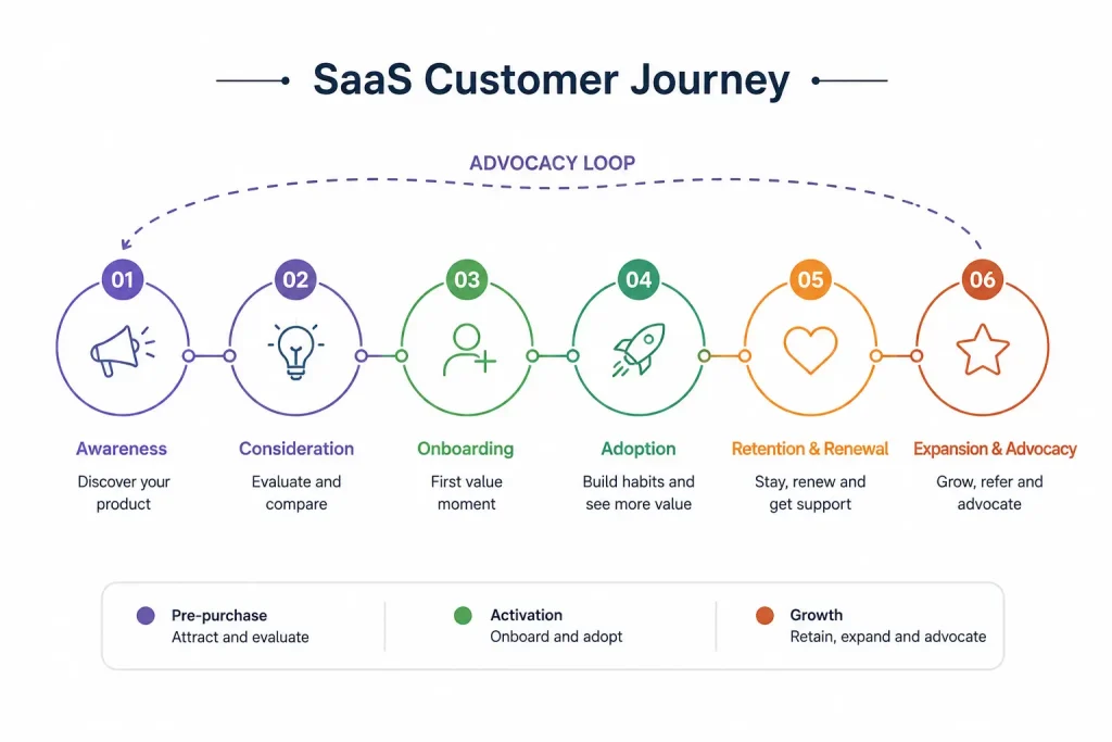
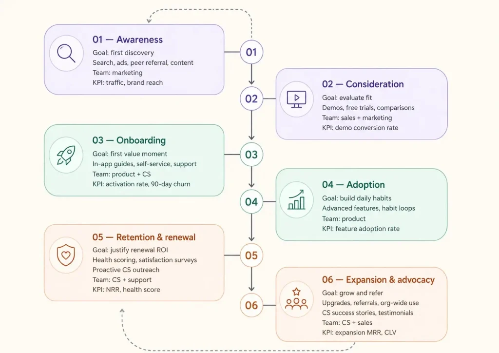
The SaaS customer journey spans six stages: Awareness, Consideration, Onboarding, Adoption, Retention and Renewal, and Expansion and Advocacy.
Journey mapping identifies which stage is leaking users and revenue so teams can prioritize fixes with evidence.
Most churn signals appear weeks before cancellation: drops in product usage, repeated friction, and stalled feature adoption are all detectable with behavioral analytics, but only if your team is watching.
Accurate maps need both quantitative funnel data and qualitative behavioral evidence like session replays and customer feedback.
FullSession, a privacy-first UX analytics platform offering session replay, heatmaps, conversion funnels, error tracking, and Lift AI, is purpose-built for tracking and improving the SaaS customer journey at every stage. See it in action today.
A SaaS customer journey maps every way customers interact with your product, from first awareness through renewal, expansion, or churn. It covers customer touchpoints across the full customer lifecycle, making the experience visible to every team.
Key characteristics that define a SaaS customer journey:
Ongoing, not one-time: The journey doesn’t end at purchase. Customers re-evaluate value at every renewal.
Customer-centered, not brand-centered: It maps customer needs, emotions, and friction at every stage, not just your team’s conversion actions.
Post-sale stages carry equal weight: Onboarding, adoption, and retention drive the recurring revenue that keeps a SaaS business growing.
Distinct from a marketing funnel: A funnel measures your conversion rate. A journey map captures why customers behave the way they do across the full lifecycle.
That’s what makes it one of the most powerful alignment tools a SaaS team can have.
Six Core Stages of SaaS Customer Journeys
The SaaS customer journey consists of six stages. Each has distinct customer goals, touchpoints, and team priorities.
Awareness
Potential customers first learn your product exists through search, ads, peer referral, or marketing campaigns. Focus on educational content that reaches your target audience at the initial awareness stage, before customers engage with competing solutions.
Consideration
During the initial consideration phase, customers compare options, watch demos, and sign up for free trials. The sales team often coordinates across multiple decision makers, each with different business goals, to simplify the buying process for complex B2B accounts.
Onboarding
New customers sign up and attempt to reach their first meaningful product outcome. This is the most critical stage for activation and early retention. A guided onboarding process combining self service plays, in-app prompts, and timely support dramatically reduces first-90-day churn.
Existing customers build daily habits and begin exploring advanced features, allowing users to discover value at their own pace. User adoption depth at this stage predicts renewal more reliably than any satisfaction survey.
Retention and renewal
Customers evaluate whether the product still meets their needs and delivers renewal-worthy ROI. Health scoring, customer satisfaction surveys, and continuous support from CS reduce drop-off points before they become cancellations.
Satisfied customers upgrade, refer colleagues, and grow usage across the entire organization. Ongoing support from CS at this stage drives expansion revenue and builds long term loyalty that compounds customer lifetime value.
Get Real Behavioral Data With FullSession
See exactly where users stall, drop off, and convert at every stage of the journey. Capture your first 500 sessions at no cost.
Collect Customer Data and Feedback Across Touchpoints
Accurate journey maps are built on real data, not assumptions. Before you build customer personas or define each stage, gather data on customer behavior from two categories: quantitative, which tells you what’s happening, and qualitative, which tells you why.
Quantitative data sources
Product analytics: Funnel completion rates, activation milestone progress, and product usage frequency by stage
CRM and billing data: Purchase history, upgrade and downgrade patterns, and demographic data by segment
Website analytics: Traffic source, bounce rate, and session depth on key pages
Qualitative data sources
Session replay: Understanding what session recordings reveal about what users actually experience shows friction that no aggregate metric captures
Customer interviews and sales calls: Direct conversations with CS and sales uncover customer expectations that never appear in dashboards
In-app feedback: Collect contextual feedback at key lifecycle moments such as post-onboarding and pre-renewal
Customer satisfaction surveys: Structured surveys at renewal moments generate consistent, comparable data across cohorts
A journey map template provides a visual representation of every stage, organized across six components: customer goals, key touchpoints, customer emotions, pain points, team owner, and a trackable metric per stage.
Turn Maps Into Action: From Insights to Customer Success
A journey map sitting in a slide deck doesn’t reduce churn. These five steps move a map from documentation into ongoing work.
Assign team ownership per stage. Every stage needs a named owner: marketing owns awareness, product and CS own onboarding, the customer success team owns retention. Without named ownership, actionable insights become nobody’s problem.
Define one KPI for each stage. Activation rate for onboarding, feature adoption rate for adoption, net revenue retention for renewal.
Prioritize your highest drop-off points. Use funnel data to find where customers disengage most, then watch session replays from users who exited at those steps to understand why.
Run a monthly cross-functional journey review. Bring product, marketing, sales, and CS into one fixed meeting to review the map against live data.
Build a library of customer success stories and customer testimonials. Real outcomes from real customers anchor the map to business results and give every team a shared definition of success.
Consistency is what keeps the map alive.
Measure, Iterate, and Scale Customer Journey Mapping with FullSession
FullSession, a privacy-first UX analytics platform, captures customer interactions at every stage of the SaaS customer journey so teams can identify friction, prioritize fixes, and validate improvements.
Acquisition and conversion (sign-up funnels)
Funnel analytics: Tracks the path users take to sign up, highlighting which step causes potential customers to drop off before completing registration.
Form optimization: Analyzes how users interact with trial registration forms so you can eliminate fields that create hesitation and reduce completion rates.
Landing page assessment: Couples heatmaps with session data to reveal whether users miss primary CTA buttons, enabling faster page improvements.
Onboarding and activation (the “Aha!” moment)
Session replays: Lets product teams watch video-like replays of new users navigating the platform for the first time, making invisible friction visible.
Friction identification: Shows UX bugs, dead clicks, and confusing navigation that prevent users from realizing the product’s value during critical first sessions.
Drop-off analysis: Pinpoints the exact feature setup step where new sign-ups abandon the interactive walkthrough so CS can intervene early.
Adoption and value realization (daily active use)
Interactive heatmaps: Visualizes which product modules, menus, and tabs receive the most engagement, guiding feature placement and UI decisions.
Feature adoption tracking: Monitors whether users find and adopt newly released tools, supporting continuous user testing and iteration cycles.
Error analysis: Isolates technical errors, broken links, and UI glitches before they damage customer experience and generate support tickets.
Retention and churn prevention (the renewal phase)
Pre-churn signal detection: Uncovers disengagement patterns such as drops in session frequency or repetitive rage clicks on non-responsive elements.
In-app feedback forms: Collects real-time, contextual customer satisfaction metrics directly inside the platform, tied to the exact session where feedback was given.
Lift AI prioritization: Uses algorithmic scoring to rank issue severity by predicted revenue impact, helping teams fix high-impact friction points before users abandon the platform.
FullSession works across web and mobile and connects to your existing tools through native integrations including HubSpot, Intercom, and Zapier.
It supports an MCP server that lets AI assistants and coding agents query your FullSession data directly, so your team can get behavioral insights without leaving the tools they already work in.
Collecting behavioral data across the SaaS customer journey creates real legal and ethical obligations.
GDPR: Capture behavioral data only from users who have opted in. Confirm your vendor offers EU data residency if you serve EU customers.
CCPA: California residents who opt out must be excluded from behavioral tracking automatically.
PCI DSS: Payment card inputs must be masked at the tracking script level and never transmitted inside session recordings.
Data minimization: Collect only the data necessary to improve the journey. Your vendor should proactively update compliance tooling as privacy regulations evolve.
FullSession is GDPR, CCPA, and PCI compliant by default, with masking, consent controls, and data residency options built into the platform.
Advanced: AI for Customer Journey Analytics and Prioritization
AI-assisted journey analytics identifies patterns across thousands of sessions that no human review team could surface manually, delivering earlier churn signals and faster prioritization decisions.
What AI detects
Behavioral patterns that historically precede churn: short sessions, low feature engagement, or repeated error encounters
Sudden drops in product usage frequency that signal disengagement before a customer contacts support
Friction clusters across specific devices, browsers, or user segments that aggregate data misses entirely
How Lift AI turns signals into priorities
Lift AI, FullSession’s AI-powered prioritization feature, assigns a predicted revenue impact to each identified friction point. Instead of debating which issue to fix first, teams see a ranked list sorted by expected effect on retention and activation.
Fewer decisions driven by guesswork means faster progress.
Lift AI shows the pattern, sets the priority, and automatically validates the revenue impact after a fix ships. No manual review required.
Stop Guessing What to Fix Next
Lift AI ranks every friction point by revenue impact so your team always works on what matters most.
Use this step by step guide before, during, and after building your journey map.
Define your ideal customer profile and create 1-2 buyer profiles before mapping any stages
Map all the touchpoints across all six stages, from awareness through advocacy
Assign a named team owner for each journey stage
Set up funnel tracking across your onboarding and activation flows
Collect user behavior data using session replay and heatmaps
Gather customer feedback at key lifecycle moments such as post-onboarding and pre-renewal
Identify your highest drop-off points from funnel data
Watch session replays of users who churned or stalled at critical stages
Hold a monthly cross-functional journey review using live data
Iterate: ship one fix per cycle, re-measure the funnel, and update the map
Conclusion About SaaS Customer Journey
A SaaS customer journey map isn’t a one-time deliverable. It’s a living system that connects your team’s understanding of the customer lifecycle to real behavioral data, so every decision is grounded in evidence rather than assumptions.
FullSession gives SaaS teams the funnels, session replay, heatmaps, and Lift AI prioritization to keep that data current and actionable at every stage.
Book a demo to see how FullSession maps your SaaS customer journey in real time. Or start your free trial and capture your first 500 sessions today.
FAQs About SaaS Customer Journey
What are the 5 stages of a customer journey?
The five stages of a customer journey are Awareness, Consideration, Purchase or Decision, Retention, and Advocacy.
In SaaS, these stages extend beyond the purchase because customers pay recurring fees and must continuously see value to renew. Retention and advocacy are just as important as acquisition, especially given the high cost of acquiring new customers.
What is the SaaS customer lifecycle?
The SaaS customer lifecycle is the complete relationship between a customer and a SaaS product, from first awareness through renewal, expansion, or churn.
Unlike a one-time purchase, the lifecycle is ongoing. It is commonly divided into six stages: Awareness, Consideration, Onboarding, Adoption, Retention and Renewal, and Expansion and Advocacy.
What are the 4 stages of the customer journey?
The traditional four-stage customer journey model includes Awareness, Consideration, Decision, and Retention.
Customers identify a problem, evaluate possible solutions, commit to one, and either stay or leave. In SaaS, most teams expand this model to five or six stages because onboarding and advocacy directly impact recurring revenue.
What are the 5 A’s of the customer journey?
The 5 A’s of the customer journey, defined by Philip Kotler, marketing professor and author of Marketing 4.0, are Aware, Appeal, Ask, Act, and Advocate.
A customer learns about a brand, is drawn in by its message, researches it, makes a purchase, and then recommends it to others. SaaS teams adapt this model with an ongoing adoption and renewal loop tailored to their specific target market and subscription structure.
Roman Mohren is CEO of FullSession, a privacy-first UX analytics platform offering session replay, interactive heatmaps, conversion funnels, error insights, and in-app feedback. He directly leads Product, Sales, and Customer Success, owning the full customer journey from first touch to long-term outcomes. With 25+ years in B2B SaaS, spanning venture- and PE-backed startups, public software companies, and his own ventures, Roman has built and scaled revenue teams, designed go-to-market systems, and led organizations through every growth stage from first dollar to eight-figure ARR. He writes from hands-on operator experience about UX diagnosis, conversion optimization, user onboarding, and turning behavioral data into measurable business impact.
The moment a customer starts using your SaaS product, the clock starts ticking. Every hour without a real result is an hour closer to cancellation, and that window is one of the most underestimated levers in your retention strategy.
Time to value (TTV) in SaaS is the elapsed time between a user’s first product interaction and the moment they reach their first meaningful outcome: the specific in-product result that proves the product does what they signed up for.
Get it right and you activate new customers faster, reduce early churn, and build loyalty that compounds. Get it wrong and you lose users before your customer success team notices the problem.
This guide covers what TTV means, how to calculate it, which metrics to track, and how to use FullSession’s behavioral data to find and fix the friction blocking your users from reaching value.To see exactly where your users stall, book a FullSession demo and we’ll show you.
Key Takeaway
Time to value SaaS (TTV) measures the gap between sign-up and the moment a user gets a result they actually care about. The shorter it is, the higher your retention.
Mapping your customer journey to first value before making any changes ensures you fix the right steps, not just the most visible ones.
Visual behavioral data (session replay, heatmaps, and funnel analysis) tells you why users drop off, not just where. Numbers alone can’t give you that.
The 30-60-90 plan gives SaaS teams a structured, evidence-based way to diagnose friction, test one fix at a time, and scale what works.
Faster TTV doesn’t just improve activation. It compounds across retention, word-of-mouth, and trial-to-paid conversion, making it one of the highest-leverage metrics in your entire growth stack.
Most SaaS teams know their TTV is too long but can’t pinpoint why. FullSession closes that gap by combining session replay, visual heatmaps, funnel tracking, error analysis, and contextual feedback in one platform.
It gives you the exact behavioral evidence you need to find friction, prioritize fixes by revenue impact with Lift AI, and confirm improvements hold across cohorts. It’s the diagnostic layer that turns TTV from a number you track into a metric you can actually move.
Understanding time to value (SaaS) starts with a precise definition and a formula you can actually track.
Time to value (TTV) measures the gap between two events: the moment a user starts using your product and the moment they get a result they actually care about.
TTV = Date of First Value Moment − Date of Sign-Up
Defining “first value moment” is where most teams trip up. It’s not logging in. It’s not finishing the onboarding checklist. It’s the specific outcome that proves the product works: sharing the first workflow for a project management tool, or generating the first report that changes a decision for an analytics platform.
Your users don’t care about your features. They care about their outcomes. TTV is the distance between those two things.
Types of TTV in SaaS
Three TTV types matter for SaaS teams:
TTV Type
When It Applies
SaaS Example
Immediate Time to Value (ITTV)
Users get instant value in their first session or before sign-up
An interactive demo that lets prospects try the core feature before creating an account
Time to Basic Value / First Value
Users get the most fundamental benefit quickly, even if full value comes later
A reporting tool where a user generates their first data visualization in session one
Long TTV
Complex products with complex integrations where full value requires significant setup
An ERP system that delivers measurable ROI weeks after implementation
For most SaaS businesses, immediate time to value is the goal. When product complexity rules that out, the strategy shifts to quick wins early and a carefully managed journey through to full value.l. The funnel is where unit economics are won or lost.
Map the Customer Journey to First Value
Mapping the customer journey before optimizing means you fix the right steps, not just the most obvious ones.
Start by defining your value event: the single in-product action most strongly correlated with long-term retention. Then trace every step a new user must complete to reach it.
A standard first-value journey
Sign-up and email verification
Profile or account setup (name, company, role)
Core configuration step (connecting an integration, importing data, or inviting a teammate)
First key action (the step that directly produces the value event)
Value confirmation (the user sees or receives the outcome)
Segment it after you’ve mapped it. A solo founder and a five-person product team use the same tool very differently. Tailor onboarding experiences to each segment and customers reach their first value faster than any generic flow allows.
The step with the highest drop-off rate is your biggest TTV opportunity. Use onboarding funnel analysis to make that step visible before guessing at the fix.
Assign a Customer Success Manager for High-Touch Accounts
For enterprise accounts and complex products, a dedicated customer success manager removes blockers before they become churn signals.
The CSM’s job in the first 30 days isn’t to check in. It’s to understand the customer’s specific value goal and clear every obstacle between sign-up and achieving it. A good CSM confirms what “value” means to each account, finds quick wins early, and catches technical blockers before customers get frustrated.
Most SaaS businesses can’t assign a CSM to every account. The practical approach is to use behavioral data to identify which new clients are stalling, then trigger high-touch intervention for those accounts only.
Your customer success team spends time where it matters most, and customers reach meaningful value without unnecessary delays.y.
Measure Time to Value TTV
Measuring TTV starts with defining two events: when a user begins and when they first succeed.
Once those events are defined, measuring TTV is straightforward. The diagnostic work happens between those two points.
Calculate time and calculate TTV
Define your start event. This is typically the sign-up timestamp or the first login, depending on whether your onboarding process begins before or after account creation.
Define your value event. Choose the specific in-product action most predictive of long-term retention. If you’re unsure, run a cohort analysis: which users who performed action X in week one showed the highest 90-day retention?
Measure the gap. TTV = Date of Value Event − Date of Start Event. Calculate this for every user and average across cohorts.
Track changes over time. After each onboarding improvement, measure the delta in average TTV. A drop means the change worked.
Metrics and dashboards to track TTV
Your TTV dashboard should track these SaaS metrics:
Average TTV and median TTV by user segment and acquisition channel
Onboarding funnel drop-off rate at each step
Activation rate: the percentage of new users who reach the value event within a defined window
Early churn rate: users who cancel within 30 days of sign-up
Time to first login and time to first key action
FullSession, our behavioral analytics platform for SaaS teams, maps these metrics directly onto session and funnel data.
The funnel tracking and conversion analysis feature shows conversion rates at each onboarding step, the exact drop-off points, and cohort-level TTV trends without manual aggregation.
The Lift AI prioritization engine scans all session and funnel data and ranks friction points by predicted revenue impact, so your team knows which fixes will move the needle most.
Once you ship a change, Lift AI also lets you validate the actual impact against the prediction, closing the loop between diagnosis and result.
See It All on a Live Demo
Watch how FullSession shows onboarding friction, ranks fixes by revenue impact, and shows you exactly where users stall.
Use Session Replay, Heatmaps and Funnels to Cut TTV
Numbers tell you where users drop off. Visual behavioral data tells you why.
FullSession’s TTV diagnostic stack combines five tools: session replay, visual heatmaps, funnels, error analysis, and contextual feedback. Together, they give your team the evidence to find and fix onboarding friction without guessing.
Actionable session replay
FullSession’s session replay lets you watch exact user sessions from the critical first login. Filter for new users and watch for patterns numbers can’t show: cursor hesitation before a key button, repeated clicks on a non-interactive element, a form field abandoned mid-entry.
Watching the first five to ten sessions reveals friction fast. You’ll know within an hour which step is causing confusion and what the user was actually trying to do.
Visual heatmaps
FullSession heatmap data preview
Visual heatmaps filtered to new users show whether your core features and value-driving buttons are getting the attention you designed them for. If the primary onboarding action button shows low click density, the layout is slowing users down.
Build an onboarding funnel that maps every step from sign-up to your value event. The step with the steepest drop-off is your priority.
Error and alert monitoring shows JavaScript errors and broken flows that block users silently, including bugs that never generate a support ticket because users give up and leave.
Contextual feedback
FullSession’s in-app feedback surveys deploy at the exact moment a user pauses or stalls. One well-timed question, “What stopped you from completing this step?”, gives direct answers no replay can provide. The answers cut diagnostic time from weeks to days.
Start Diagnosing Your Onboarding Friction Today
Connect your onboarding flow in minutes and start watching real user sessions. No credit card required.
Improve Product Usability to Shorten Time to Value
Product usability problems are the leading cause of long TTV, and most are fixable without a full product rebuild.
Users don’t struggle because they lack intelligence. They struggle because the path to value wasn’t designed with their mental model in mind.
Four changes move the needle fastest:
Remove Day 1 friction. Complex integrations, billing setup, and team configurations don’t need to happen in the first session. Strip the onboarding process to the minimum required to reach first value. Every extra step increases TTV and drop-off risk.
Use progressive disclosure. Show users only what they need to reach basic value in session one. Show new features after the aha moment. Users who aren’t overwhelmed early are far more likely to explore deeper functionality later.
Add in-app checklists. Users expect a clear path, not an empty interface. A visible checklist of steps to first value reduces cognitive load and creates a sense of progress, so customers reach their expected value faster.
Design quick wins. Build one action into the first session that delivers instant value. This gives users a concrete reason to return before they’ve decided whether the product is worth keeping.
Diagnose mobile usability gaps with FullSession
Mobile SaaS products face the same usability challenges, but they’re harder to spot with desktop-only analytics. Taps, swipes, and screen transitions behave differently from mouse interactions, and standard funnels don’t capture what happens between steps.
FullSession’s mobile session replay reconstructs real user sessions inside your mobile app: every tap, swipe, screen change, and error state.
Filter by new users, watch sessions where someone stalled before a key action, and identify the exact screen blocking first value.
It’s the same diagnostic workflow as desktop, applied to the mobile onboarding experience where product improvements often carry the largest untapped TTV impact.ssion replay from that same user, giving your team both the written reason and the full behavioral context behind it.
How Faster TTV Drives Customer Retention
Shorter TTV directly predicts retention. Users who reach value quickly stay. Users who don’t are already drifting toward churn.
Here’s what the data shows and why each signal matters for your business.
Signal
What It Means for TTV
Over 20% of voluntary SaaS churn is linked to poor onboarding (SERPsculpt)
Most of that churn is preventable if customers reach meaningful value in session one
43% of SMB SaaS losses happen in the first 90 days (Focus Digital)
The onboarding window is where retention is won or lost for SMB accounts
Users who reach value fast feel confident in their choice
Customer satisfaction correlates directly with how quickly users experience expected value
Users who struggle develop doubt
Doubt formed in the first week is very hard to reverse, even with strong support
Reducing TTV by even a day or two shifts trial-to-paid conversion rates, helps increase customer satisfaction, and lowers customer frustration during the period when customer expectations are highest.
For SaaS teams that rely on product-led marketing strategies, shorter TTV is also the most direct path to word-of-mouth growth: users who reach value fast become advocates.
How many users are you losing before they ever reach value? FullSession’s user onboarding analytics solution makes that number visible and specific.
Use Experimentation Playbook to Reduce TTV
TTV improvement is a repeatable loop that compounds over time.
Here’s the six-step cycle that SaaS teams use to reduce SaaS TTV systematically and build a library of product improvements that hold across cohorts:
Baseline measurement. Calculate your current average TTV across all new users. Segment by user type, company size, and acquisition channel. Different user segments have different aha moments.
Identify the highest drop-off step. Find the step with the largest gap between users entering and users proceeding. That’s your first target.
Form a hypothesis. For example: “Removing the billing setup step from the first session will reduce TTV by 20% for SMB accounts.” Keep it specific and measurable.
Run the change. Apply the fix and capture session replays and funnel data for the new cohort alongside the control group.
Measure the delta. Compare average TTV for the test cohort against the baseline. If it drops, ship the change. If it doesn’t, use the replays to identify patterns and form the next hypothesis.
Document and iterate. Real-world examples of what reduced TTV for your product become the foundation of every future onboarding improvement.
Session replay’s main role in this cycle is evidence: replacing assumptions with observed behavior at each step of the loop.
Start a 30-60-90 Plan to Shrink Time to Value
New to measuring TTV? This three-phase sprint gives your team a structured starting point.
Phase
Days
Focus
FullSession Action
Success Signal
Diagnose
1-30
Measure current average TTV, map the journey to first value, watch 20 first-session replays, build the onboarding funnel
Session Replay + Funnels
TTV baseline established, top 3 friction points documented
Fix
31-60
Address the single highest drop-off step, add contextual feedback at the stall point, A/B test the change
Error Analysis + Feedback + Heatmaps
Average TTV drops by a measurable amount
Scale
61-90
Prioritise remaining friction, segment TTV by user type, document the playbook, report results to leadership
Lift AI + Funnels
Scaled onboarding improvements, TTV tracked in dashboard
The 30-day phase is diagnostic only. Don’t change anything until you know what to change. The 60-day phase targets one problem at a time, because changing multiple steps simultaneously makes it impossible to know what worked.
By day 90, you have a documented, evidence-based playbook that applies to every new onboarding flow you ship.
Your Onboarding Playbook Starts With One Demo
See how FullSession’s session replay, heatmaps, and funnel analysis give you the diagnostic data to run every phase of this plan.
Measuring TTV once isn’t enough. Sustained shorter TTV comes from building measurement into your regular reporting rhythm.
Track it weekly. Add average TTV and median TTV to your team dashboard alongside MRR and churn. When TTV regresses after a product update, you catch it fast.
Find patterns in cohorts. Which acquisition channels show consistently longer TTV? Did a recent product change slow down the configuration step? Cohort analysis at the session level turns the TTV metric from a number into a diagnostic tool. Measuring TTV across cohorts over time also helps you identify patterns early, before they show up in churn data.
Make the evidence visible. Share session replay findings with your product team when prioritising the roadmap. Showing a product manager five replays of users failing at the same step is more persuasive than a drop-off percentage alone. Visual evidence drives product improvements faster than any spreadsheet.
Validate improvements hold. Use the heatmaps vs session replay combination to confirm that onboarding changes are holding across new user batches, not just the initial test cohort.
Connect TTV to revenue. Link your average TTV trend to trial-to-paid conversion rates and early churn reduction. Those are the numbers that shift roadmap priorities and justify investment in new software for onboarding analytics.
Conclusion About Time to Value (SaaS)
TTV isn’t just a metric for new software teams to track. It’s the clearest signal of whether your product is keeping its promise to new customers.
Shorter TTV means more paying customers who stick around, a stronger customer experience from day one, and a feedback loop that continuously improves how you provide customers with value.
The SaaS companies that consistently hit lower TTV share one practice: they watch their users. They don’t rely on aggregate numbers. They look at real sessions, real friction, and real evidence.
FullSession, the behavioral analytics platform for SaaS teams, gives you session replay, heatmaps, funnels, error tracking, and contextual feedback in one place. Everything you need to find what’s blocking first value and fix it before it becomes churn.
Stop Guessing Where Users Drop Off
We’ll show you exactly how FullSession surfaces the friction points that slow down your onboarding.
Time to value in SaaS is the elapsed time between a user’s first product interaction and their first meaningful outcome: the specific in-product result that proves the product delivers on its promise.
It is one of the strongest leading indicators of long-term customer retention and a key signal in any SaaS onboarding strategy.
How do you calculate time to value?
TTV = Date of First Value Moment − Date of Sign-Up.
Define your value event first: the specific in-product action most predictive of 90-day retention. Track when each new user reaches that action and average the elapsed time across all users.
Segment by user type and acquisition channel to identify where TTV is longest.
What is the difference between time to value and activation?
Activation means a user completed a defined setup action. TTV measures when they actually felt the product’s benefit.
You can activate users without delivering value, for example by completing an onboarding checklist without performing the action that produces the outcome.
Delivering value, by contrast, almost always means activation has also occurred.
How do you shorten time to value in SaaS onboarding?
Remove non-essential steps from the onboarding process, add in-app checklists that guide users to the value event, watch session replays to find where new users stall, and fix the funnel step with the highest drop-off rate.
Every change to the user onboarding flow should be validated with behavioral data before and after.
What is immediate time to value (ITTV)?
Immediate time to value (ITTV) is a sub-type of TTV where users experience value during their first session or before they sign up, for example through a free version or interactive demo.
ITTV protects against early churn by giving users a concrete reason to commit before investing time in a full account setup.
Roman Mohren is CEO of FullSession, a privacy-first UX analytics platform offering session replay, interactive heatmaps, conversion funnels, error insights, and in-app feedback. He directly leads Product, Sales, and Customer Success, owning the full customer journey from first touch to long-term outcomes. With 25+ years in B2B SaaS, spanning venture- and PE-backed startups, public software companies, and his own ventures, Roman has built and scaled revenue teams, designed go-to-market systems, and led organizations through every growth stage from first dollar to eight-figure ARR. He writes from hands-on operator experience about UX diagnosis, conversion optimization, user onboarding, and turning behavioral data into measurable business impact.