Two dashboards disagree because each one holds its own copy of the chart definition, not because the underlying data is wrong. In FullSession, reuse runs through the Charts library, shipped 2026-07-30, which stores chart cards independently of any dashboard so a definition can be reused instead of rebuilt. When a metric is rebuilt by hand on each dashboard, any later change to a filter, date grain or aggregation applies to one copy and silently leaves the others behind.
This is a definition-layer problem, not a data-layer one. A FullSession dashboard, shipped 2026-05-17, is assembled from eight card types — Metric, Time Series, Breakdown, Pages, Sessions, Feedback, User Journey (Sankey) and Label — under a shared filter and segment bar that applies across every card on that dashboard. Seven of those eight are chart types in the Charts library; Label is a dashboard card only and is not a chart. Build “conversion rate” once on the Executive Overview template and again on the Growth / CRO / RevOps template and you now maintain two configurations.
The four reasons dashboard numbers disagree
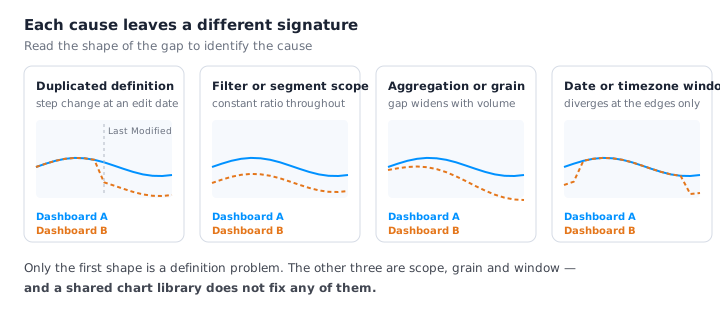
Two dashboards showing different numbers for the same metric fail in one of four ways. Diagnose by the shape of the divergence, not by re-checking the raw data:
- Duplicated chart definitions — the same metric rebuilt independently on each dashboard, so an edit lands on one copy only. The tell: the numbers agree on old, closed dates and diverge from one date forward. In FullSession that date is checkable — the Charts library is a searchable, paginated table showing Name, Type, Owner and Last Modified, with Name, Type and Last Modified sortable. The Last Modified column dates the change; the Owner column names the person to ask.
- Different filter or segment scope — a filter set on one dashboard’s shared filter and segment bar and not on the other’s. That bar applies across every card on that dashboard, so one filter set there moves every number on the page at once and nothing on the other dashboard. The tell: the ratio between the two numbers is stable. If dashboard A reads 0.72× dashboard B in January, March and last week, that is scope, not definition.
- Different aggregation or grain — median versus average, or sessions versus unique users. The tell: the divergence scales with traffic, because it scales with repeat visits. Sessions versus unique users is a grain trap in session analytics because one person can open many sessions, so the two counts drift apart exactly as repeat visits accumulate. FullSession exposes the switch in more than one place: a funnel counts sessions or unique users at each step, switchable, and the Top Elements report shows both “% of sessions” that clicked an element and “% of unique users” who did. A card fed by sessions and a funnel switched to unique users will never agree, and neither is wrong.
- Different date range or timezone boundary — two windows that overlap but do not match at the ends. The tell: divergence is confined to the edges of the window while the middle of the range matches exactly. FullSession surfaces also expose different window controls — a heatmap filters by page, segment, device, date range and minimum page duration — so a number lifted from one surface is not automatically on the same window as a dashboard card.
Why “just document the metric definition” doesn’t hold
A metric definitions document is a promise; a shared chart object is an enforcement.
Writing down that “conversion rate = sessions reaching step 4 ÷ sessions entering step 1” changes nothing about what two dashboards render, and nothing breaks when the document and the dashboards drift apart. The document has no owner attached to the rendering object, no last-modified timestamp tied to the thing that produced yesterday’s number, and no permission model.
The FullSession Charts library supplies all three of those: an owner, a last-modified timestamp and a permission model. Every chart carries Name, Type, Owner and Last Modified in one searchable table, with Type rendered as a badge — Timeseries, Breakdown, Journey, Metric — and a distinct Owner shown row by row. Create, edit and delete each require their own permission, which makes changing a definition a governed act rather than a wiki edit nobody made. A definitions doc can be right while the dashboards are wrong; a chart object reused across dashboards cannot be, because every one of those dashboards renders the same stored definition.
How a shared chart library fixes it structurally
FullSession’s Charts library, shipped 2026-07-30, is a standalone library for building and managing reusable chart cards, independent of any dashboard — which is what makes it a definition layer rather than another place to keep cards. The page describes itself in one line: “Start from a chart template or build a custom chart, then add it to any dashboard.” Seven chart types are available — Time Series, Breakdown, Metric, Pages, Sessions, Feedback and User Journey — and each has a template card with the chart type preselected. Create Chart opens a blank builder as a three-step flow: Chart Type → Segmentation → Review & Save. The builder supports measures, aggregations, group-by dimensions, visualizations and up to five filtered series, with live preview.
The propagation behaviour is what ends the disagreement. In FullSession’s own words: “Saving updates the chart everywhere it is used — dashboards that already include the chart reflect the change immediately.” One edit, every dashboard, at once — no copy is left behind to drift, because there is no copy.
Deleting a chart in FullSession is governed the same way: FullSession warns that a deleted chart “will be permanently removed and detached from every dashboard currently using it”, and it cannot be undone. That warning does diagnostic work before you click it, naming the blast radius of the definition you are removing.
One precision that matters more than it looks: a shared chart still renders under each dashboard’s own filter bar. Reuse standardises the definition, not the scope. The same chart object on two FullSession dashboards shows different numbers if one dashboard’s shared filter and segment bar is set to mobile traffic and the other’s is not — correct behaviour, not a bug. Reuse eliminates duplicated definitions as a cause of disagreement; it does nothing about differing filter or segment scope.
Access is gated: viewing charts requires the charts:view permission, with create, edit and delete each requiring their own permissions. The Charts library is included on all paid FullSession plans — Growth, Professional and Enterprise. If Charts is not visible in your workspace, the permission is the thing to check.

What a shared chart library does not fix
A chart library is a definition layer inside one product. Three things stay broken after adopting one, and they should be said out loud before anyone is promised a single number.
It does not reconcile FullSession against GA4 or a warehouse. FullSession’s Charts library governs definitions inside FullSession and nowhere else. GA4 is the clearest case: Google documents three identity spaces and three reporting identity settings for GA4 (support.google.com/analytics/answer/10976610, checked 2026-08-12), so the same visitor can be resolved differently there than in FullSession before any dashboard is drawn. A warehouse table applies whatever counting rules its models encode, and will keep producing different totals however clean the FullSession side is.
It does not stop someone building a second near-duplicate chart. Create Chart opens a blank builder to anyone holding the create permission, so “Checkout CR” and “Checkout conversion” can coexist in the same library and feed different dashboards. The library is searchable, and its search field reads “Search by chart name”, but searching before creating is a discipline, not an enforcement.
It does not fix a wrong definition — it propagates it faster. That follows from the guarantee itself: “Saving updates the chart everywhere it is used — dashboards that already include the chart reflect the change immediately.” If the shared definition counts sessions where the business means unique users, every dashboard is now consistently wrong, and the disagreement that used to expose the error is gone. Reuse buys consistency, not correctness.
A shared FullSession chart renders under each dashboard’s own filter and segment bar, so two dashboards using the identical chart object can still disagree on scope, by design.
How to audit your dashboards for duplicate metric definitions
Audit one metric at a time, and start by pinning down the divergence shape: list every dashboard showing the metric, compare a closed historical month (agreement there plus disagreement on the current month means a duplicated definition and a recent edit), compute A ÷ B across three periods (a stable ratio is filter or segment scope, a ratio growing with traffic is sessions versus unique users), and check the ends of the window (first and last days only means a date range or timezone boundary, and no definition change will fix it). Those checks are available in most dashboard tools. The three steps that follow are specific to FullSession dashboards and the Charts library.
- Open the FullSession Charts library and search by chart name. Read Type, Owner and Last Modified, and sort by Last Modified to put recent edits at the top. Two similar names with different Owners is a duplicated definition with a person attached to each; a Last Modified date adjacent to the divergence date is the change event you are looking for.
- Rebuild the metric once in the Charts builder, then reuse that object. Run
Create Chartthrough its three steps — Chart Type, Segmentation, Review & Save — using measures, aggregations, group-by dimensions and up to five filtered series with live preview, add that single chart to each dashboard, then delete the duplicates — reading the warning that a deleted chart “will be permanently removed and detached from every dashboard currently using it” before confirming. - Set each dashboard’s shared filter and segment bar deliberately, and record it. Reuse fixed the definition; scope is still per dashboard. If you reconcile by export instead, FullSession’s per-card CSV export is capped at 10,000 rows, and drill-down is limited to table-based cards — Breakdown and Pages support “Add to Filter” and “View Sessions”, while clicking a point on a line or bar chart does not drill.
For what belongs on the dashboard in the first place, see what a conversion dashboard built from session data should show. For element-level metrics that get rebuilt inconsistently across dashboards, see which elements actually drive conversions.
See what your analytics cannot tell you
FullSession pairs session replay, heatmaps, funnels, and error tracking with Lift AI, so you can find the friction costing you revenue and prove the fix worked. No credit card needed to start.
Frequently asked questions
Why do two dashboards show different numbers for the same metric?
Because each dashboard holds its own copy of the chart definition. An edit to a filter, aggregation or date grain applies to one copy and leaves the others behind. If the two numbers agree on old dates and diverge only after a recent edit, the cause is duplicated definitions, not bad data. In FullSession, the Charts library stores a chart independently of any dashboard so there is one definition to edit.
How do I know if it’s a filter difference or a definition difference?
Compare the ratio between the two numbers across three separate periods. A stable ratio — the same 0.72x in January, March and last week — indicates a filter or segment scope difference. A gap that widens as traffic grows indicates a grain difference, such as sessions counted against unique users. In FullSession’s Charts library, the Last Modified column dates the change and the Owner column names the person to ask.
Does a shared chart make two dashboards show the same number?
Not necessarily. In FullSession, a shared chart still renders under each dashboard’s own filter and segment bar, so reuse standardises the definition, not the scope. Two dashboards using the identical chart object will disagree if one bar is filtered to mobile traffic and the other is not.
What does FullSession’s Charts library actually do?
Shipped 2026-07-30, it is a standalone library for building and managing reusable chart cards, independent of any dashboard, listing Name, Type, Owner and Last Modified in a searchable, paginated table. It offers seven chart types, and Create Chart runs Chart Type, Segmentation, Review & Save. Per FullSession: “Saving updates the chart everywhere it is used — dashboards that already include the chart reflect the change immediately.”
Do I need a specific plan to use Charts in FullSession?
Yes. Viewing charts in FullSession requires the charts:view permission, and creating, editing and deleting each require their own permissions on top of that. The Charts library is included on all paid plans – Growth, Professional and Enterprise – so if it is not visible in your workspace, the permission is the thing to check.
Will a shared chart library make my FullSession numbers match GA4?
No. FullSession’s Charts library governs metric definitions inside FullSession only. Google documents three identity spaces and three reporting identity settings for GA4 (support.google.com/analytics/answer/10976610, checked 2026-08-12), so the same visitor can be resolved differently in each tool. Reconciling across tools is separate work from removing duplicate definitions inside one tool.

Roman Mohren is CEO of FullSession, a privacy-first UX analytics platform offering session replay, interactive heatmaps, conversion funnels, error insights, and in-app feedback. He directly leads Product, Sales, and Customer Success, owning the full customer journey from first touch to long-term outcomes. With 25+ years in B2B SaaS, spanning venture- and PE-backed startups, public software companies, and his own ventures, Roman has built and scaled revenue teams, designed go-to-market systems, and led organizations through every growth stage from first dollar to eight-figure ARR. He writes from hands-on operator experience about UX diagnosis, conversion optimization, user onboarding, and turning behavioral data into measurable business impact.