A dashboard built on session data should show numbers you can open — every card leading to the specific sessions behind it. Two of FullSession’s eight card types, Breakdown and Pages, drill into the sessions behind them; the other six do not. That ratio, not the card count, is what you design around.
Call it the openable-card rule. FullSession Dashboards, shipped 2026-05-17, offers eight card types — Metric, Time Series, Breakdown, Pages, Sessions, Feedback, User Journey (Sankey) and Label — plus five role templates or an empty canvas. An aggregate earns its place when the path from “conversion dropped 8%” to “watch the eleven people it happened to” is one click.
Card count is not the quality signal. Openable-card count is.
—
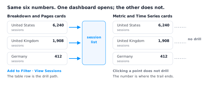
Which dashboard cards can you drill into?
Two of FullSession’s eight dashboard card types. In FullSession Dashboards, as of August 2026, Breakdown and Pages support “Add to Filter” and “View Sessions”; clicking a point on a line or bar chart does not drill. Drill-down is limited to table-based cards.
Sessions by Country is a real chart in FullSession’s library, so take that as the example. A Breakdown row reading Canada — 2.1% is a doorway: narrow every card on the dashboard to Canada, or go watch the sessions behind the number. The same 2.1% drawn as a bar is a fact you re-derive elsewhere, filters retyped by hand.
So the layout rule is: never place a chart on a FullSession dashboard without the table that resolves it. Time Series for shape, Breakdown beneath it for the click. The test — every card either drills or supports a card that does. A card doing neither is a screenshot with a refresh cycle.
FullSession’s Funnels split any step into Dropped off and Converted session lists, both replayable, and the Top Elements report carries per-element rage, error and dead click counts. Build cards that inherit that property.

Where drill-down doesn’t reach, the escape hatch is export: each card in FullSession Dashboards exports to CSV, capped at 10,000 rows per card.
—
The eight card types in FullSession Dashboards, and what each one is for
| Card type | What it does, and the question it answers | When it’s the wrong choice |
|---|---|---|
| Metric | “Single KPI value with optional previous-period comparison.” | When the next question is “which ones?” It can’t hand you sessions, and its comparison is fixed to the previous period, not the date you shipped. |
| Time Series | “Visualise metrics over time.” | Whenever it stands alone: clicking a point does not drill, so it raises a question the dashboard can’t answer. |
| Breakdown | “Categorical distribution of a metric.” One of the two cards that drills. | When the split has two values — 96/4 is a Metric card in a table costume. Also when nobody owns the grouping: nobody acts on “Canada converts worse than Germany.” |
| Pages | “Top pages by views, load time, and heatmap.” The other card that drills. | On dashboards read by people who don’t own pages. Also when URLs carry IDs, shattering one page into hundreds of rows. |
| Sessions | “Browse and replay user sessions matching your filters.” | When it’s the only card. With no Breakdown above it narrowing the filter, it’s a raw feed. |
| Feedback | “Track feedback sentiment over time.” | On an engineering triage dashboard: a sentiment series doesn’t reproduce a bug. |
| User Journey (Sankey) | “Visualise how users flow through pages in a Sankey chart.” | When someone must act this week. It isn’t table-based — a ribbon gives a shape, not a session list. |
| Label | The eighth card type, and the one that isn’t a chart: the Charts library holds seven chart types, and Label is not among them. | Not stated. No source describes what the card renders, so this row makes no claim about it. |
—
What belongs on each role’s dashboard?
FullSession ships five role-based templates — Growth / CRO / RevOps, Product Management, Engineering / QA / SRE, Executive Overview, CS / Digital Ops — or an empty canvas. A template is a layout, not a point of view. Here is the point of view.
Growth / CRO / RevOps
On a FullSession Growth / CRO / RevOps dashboard, keep a Breakdown, a Pages card, and one Metric for conversion rate. The first two drill; that’s the point.
Build it knowing what it isn’t competing with. FullSession’s Lift AI runs every 8 hours per activated goal, unprompted, and returns findings ranked by severity — Severe, High, Medium or Low. Each finding carries a Rationale, the AI’s explanation of the root cause; a Recommendation, the suggested fix; an Impact, given as an estimated conversion loss plus a breakdown of affected versus unaffected sessions; and sample sessions you can open in the player. Prioritisation happens there, with the evidence attached.
It also happens on a clock you don’t control: there’s no “run now” button. Analysis is schedule-driven only, every 8 hours. That is where the dashboard earns its keep — it holds the goal’s own metric continuously, so between runs you can see whether the ranked list is shrinking.
Don’t add: the User Journey (Sankey). Not a taste call — it isn’t table-based, so it has no “View Sessions”, and it sits beside a ranked list that ships sample sessions with every finding.
Product Management
On a FullSession Product Management dashboard, keep the User Journey (Sankey), Pages and Feedback — flow, surface and sentiment.
Anchor it to the measurement loop, not the numbers. A FullSession finding carries predicted lift as a range, then actual lift measured over a validation window you set in days, moving through seven statuses: New → Undecided → Dismissed → Planned → Change is live → Validating → Validation complete. This dashboard earns its place by being readable against that sequence: while something sits in Validating, it’s the view you read beside the window.
Don’t add: a Metric card for total sessions or traffic volume. The Metric card compares to the previous period, while a validation window runs in days from the day the change went live. Those are two different windows, so the card answers a comparison nobody asked for — and can’t hand you sessions either. (Which engagement metrics do respond to what you ship.)
Engineering / QA / SRE
On a FullSession Engineering / QA / SRE dashboard, keep a Breakdown, Pages, and Sessions. This one owes an engineer a reproducible case, not a score: “Browse and replay user sessions matching your filters” is the card that pays that debt.
Its spine is FullSession’s six named issue types: rage click, dead click, error click, page-load error, uncaught exception, network error. Charts in the library map onto them directly — Sessions with Errors (“sessions containing at least one error event — error clicks, logs, exception…”), Network / XHR Errors Over Time, Rage Clicks Trend, Dead Clicks Trend. Build it as those series plus the table that opens them.
Why notifications can’t replace it. FullSession’s alerts watch exactly one thing: “the number of unique users matching a segment, over a time window” — on daily, weekly or monthly periods, against a fixed threshold or the previous period. The documentation states the rest of the boundary outright: “Alerts do not fire on error spikes, rage/dead clicks, conversion-rate drops, funnel steps, feedback scores, session duration, or custom events.” Nothing pages you when uncaught exceptions climb, so the only place those six issue types surface on a schedule is a dashboard someone opens.
Don’t add: Feedback. The card tracks sentiment over time, a different series from an error series — and on a triage board it competes with the one thing the board exists to produce.
Executive Overview
On a FullSession Executive Overview dashboard, keep two or three Metric cards and one Time Series, carrying money rather than counts.
Money is available here, through the goal definition. For Revenue Per Visitor goals, you supply the Average Order Value yourself, one of two ways: enter it directly, or point Lift AI at a numeric value on one of your FUS.event(...) events and let it average those automatically. Do that and the goal Lift AI works against is denominated in revenue per visitor, not conversion rate. Denominate the dashboard the same way and the two can be argued against each other.
Say the cost plainly. Metric and Time Series do not drill, so this is the dashboard where you accept less drill-down than on any other — a real loss, not a design choice dressed up. When the line moves, nobody in the room can see who it moved for, and the meeting produces an action item to go and look rather than the looking. Every card here defers a question, which is why it should be the shortest dashboard in the account.
Don’t add: Pages. It is one of the two cards that drills, which is exactly the problem: the drill lands on URLs, and nobody in an executive review owns a URL.
CS / Digital Ops
On a FullSession CS / Digital Ops dashboard, keep Feedback, Sessions, and one Breakdown you can re-group mid-week.
This one sits closest to FullSession’s survey triggers, and there are nine of them: Page Load, Rage Clicks, Dead Clicks, Error Click, Exits Page, Scrolled To — the visitor scrolls to a given percent, configurable from 1 to 100% — Time After Page Load, a set number of seconds after load from 1 to 1000, Time After Inactivity, the same 1 to 1000 second range measured against inactivity, and Manual, fired from your own code with window.FUS.triggerWidget().
Whichever fires, each response includes a link to the session replay. The Feedback card here isn’t a sentiment gauge; it’s the top of a queue where every item still has its session attached.
Don’t add: a Time Series. Every response here arrives with a replay link, and clicking a point on a line chart does not drill. The trend card is the one artefact that takes the replay away.
Across all five templates, the shared filter/segment bar is what makes a role dashboard worth having: one date range and one segment reframe every card at once.
—
When is a session-data dashboard the wrong tool?
When the question crosses sources. A session-data dashboard reports what happened in the browser on your web property. Three cases where it’s the wrong place to look:
- Cross-source revenue attribution. Blended CAC, payback by channel, contracted versus recognised revenue — these need ad spend, CRM and billing joined together. A session-data dashboard holds none of those sources.
- Metrics that live in a warehouse. Anything modelled — an account health score, a definition maintained in dbt, a number finance signs off — belongs in a BI tool on the warehouse. Rebuilding it from session data creates a second definition, and a meeting about why two dashboards report different numbers.
- Anything off the web. FullSession is delivered by a snippet and a Chrome extension, so what reaches a card is what happens in a web browser.
Session data explains a number; it does not reconcile one. Keep the reconciled number where it is reconciled, and use the session dashboard for the click that follows.
—
How to build a session-data dashboard in FullSession
- Start from a template or an empty canvas. The layout is only a suggestion.
- Add cards drill-first. Place Breakdown and Pages before anything decorative. If a Metric or Time Series card has no table near it resolving the question it raises, the dashboard isn’t finished.
- Set the shared filter/segment bar. One date range, one segment, at the narrowest scope the dashboard’s question needs.
- Set visibility and permissions. FullSession dashboards are private or team-wide; permissions control view, create, edit and delete.
- Export only where you need to leave the tool. CSV export runs per card, capped at 10,000 rows.
- Build a repeated card once, in the Charts library. Build it in the Charts builder — Chart Type → Segmentation → Review & Save — then add that one chart to every dashboard that needs it. Saving updates it everywhere it is used, immediately. The library is included on all paid plans — Growth, Professional and Enterprise — and viewing charts requires the
charts:viewpermission. Delete carefully: FullSession warns a deleted chart “will be permanently removed and detached from every dashboard currently using it.”
See what your analytics cannot tell you
FullSession pairs session replay, heatmaps, funnels, and error tracking with Lift AI, so you can find the friction costing you revenue and prove the fix worked. No credit card needed to start.
Frequently asked questions
What should a conversion dashboard built from session data actually show?
It should show numbers you can open — every card leading to the sessions behind it. Two of FullSession’s eight card types, Breakdown and Pages, drill into the sessions behind them via Add to Filter and View Sessions. Card count is not the quality signal; openable-card count is.
Can you click into a chart on a FullSession dashboard to see the sessions?
Not on charts. Drill-down in FullSession Dashboards is limited to table-based cards: Breakdown and Pages support Add to Filter and View Sessions, while clicking a point on a line or bar chart does not drill. Pair every chart with a table beneath it so the question the chart raises has somewhere to land.
What card types can I add to a FullSession dashboard?
Eight: Metric, Time Series, Breakdown, Pages, Sessions, Feedback, User Journey (Sankey) and Label. Seven of those are also chart types in FullSession’s Charts library; Label is a dashboard card type only. Dashboards shipped 2026-05-17 with five role templates or an empty canvas.
Is there a limit on exporting dashboard data to CSV?
Yes. CSV export in FullSession Dashboards runs per card and is capped at 10,000 rows per card. Export is the escape hatch for cards that don’t drill, since only Breakdown and Pages open the sessions behind a number in-app.
What should go on an engineering dashboard built from session data?
Build it around FullSession’s six named issue types: rage click, dead click, error click, page-load error, uncaught exception and network error. Charts such as Sessions with Errors and Network / XHR Errors Over Time cover the series; a Sessions card — browse and replay sessions matching your filters — supplies the reproducible case.
Can FullSession alerts notify me when errors or rage clicks spike?
No. FullSession alerts watch one dimension only: the number of unique users matching a segment, over a time window, on daily, weekly or monthly periods. The documentation states the boundary directly: “Alerts do not fire on error spikes, rage/dead clicks, conversion-rate drops, funnel steps, feedback scores, session duration, or custom events.” That is why an engineering dashboard has to be opened rather than waited on.
How often does Lift AI run, and what does a finding contain?
Lift AI runs every 8 hours per activated goal, unprompted, and there’s no run-now button — analysis is schedule-driven only. Each finding carries a severity (Severe, High, Medium or Low), a Rationale explaining the root cause, a Recommendation, an Impact given as estimated conversion loss plus an affected-versus-unaffected session breakdown, and sample sessions you can open in the player.
What can trigger a FullSession survey?
Nine triggers: Page Load, Rage Clicks, Dead Clicks, Error Click, Exits Page, Scrolled To (a given percent, 1–100%), Time After Page Load (1–1000 seconds), Time After Inactivity (1–1000 seconds), and Manual, fired from your own code with window.FUS.triggerWidget(). Each response includes a link to the session replay.
How does FullSession price a finding in revenue?
Through the goal. For Revenue Per Visitor goals you supply the Average Order Value yourself — either enter it directly, or point Lift AI at a numeric value on one of your FUS.event(…) events and let it average those automatically.
When is a session-data dashboard the wrong tool?
When the question crosses sources. Cross-source revenue attribution needs ad spend, CRM and billing joined together, and modelled metrics maintained in a warehouse belong in a BI tool over that warehouse. FullSession is also web-only, delivered by a snippet and a Chrome extension. Session data explains a number; it does not reconcile one.
Can the same chart appear on more than one dashboard in FullSession?
Yes. Build it once in FullSession’s Charts library — Chart Type, Segmentation, Review & Save — then add that chart to every dashboard that needs it. Saving updates it everywhere it is used. The library is included on all paid plans – Growth, Professional and Enterprise – and viewing charts requires the charts:view permission. Deleting a chart detaches it from every dashboard using it.

Roman Mohren is CEO of FullSession, a privacy-first UX analytics platform offering session replay, interactive heatmaps, conversion funnels, error insights, and in-app feedback. He directly leads Product, Sales, and Customer Success, owning the full customer journey from first touch to long-term outcomes. With 25+ years in B2B SaaS, spanning venture- and PE-backed startups, public software companies, and his own ventures, Roman has built and scaled revenue teams, designed go-to-market systems, and led organizations through every growth stage from first dollar to eight-figure ARR. He writes from hands-on operator experience about UX diagnosis, conversion optimization, user onboarding, and turning behavioral data into measurable business impact.