Category: Uncategorized

  • App Engagement Metrics: How to Measure What Actually Keeps Users Coming Back

    App Engagement Metrics: How to Measure What Actually Keeps Users Coming Back

    You shipped the feature three weeks ago. The release notes went out, a few hundred people clicked it, and the usage chart shows a line that points up and to the right. So it worked. Probably. Except renewal conversations keep circling back to the same gap the feature was supposed to close, and nobody on the team can say whether the people who needed it ever actually found it.

    That uncertainty is the whole problem with feature adoption. A raw usage count tells you something happened. It does not tell you whether the right users reached the feature, whether they got value, or whether they came back. This guide covers how to measure adoption properly, the formulas and current benchmarks behind each metric, and the part most guides skip: how to see the behavior that explains why a feature is or is not landing.

    QUICK TAKEAWAY

    Feature adoption is a funnel, not a number. Users move from exposed, to activated, to used, to used again, and each stage fails for a different reason. Measure the adoption rate against eligible users, not everyone, then watch the recordings behind each drop. The metric tells you a feature is stuck. The behavior tells you where.

    What feature adoption actually measures

    Feature adoption is the path from a user noticing a feature exists to using it often enough that it becomes part of how they work. Most teams collapse that path into one figure and lose the detail that matters. A feature can have a thousand first clicks and almost no second clicks, which means people tried it and walked away. Another feature can show modest numbers that are entirely repeat users, which means it found its audience and stuck. Same usage chart, opposite stories.

    So the useful frame is a funnel with four stages: exposed (the user sees the feature), activated (they take the first real action), used (they complete the workflow it was built for), and used again (they come back). This model is common in product analytics, and on its own it is just a diagram. The value comes from measuring each stage and, more importantly, being able to look at the behavior behind the stage where users fall out.

    Get the denominator right before anything else

    The single most common way teams fool themselves on adoption is the math. Feature adoption rate looks simple:

    Feature adoption rate = (eligible users who completed the adoption event / eligible users) × 100

    The trap is the word eligible. Suppose you ship a feature to your Pro tier and 1,800 people use it in the first month. Divide that by your 30,000 monthly active users and you get a discouraging six percent. But only 4,200 of those users are on Pro and can even see the feature. Measured against the people who actually had access, adoption is 1,800 of 4,200, or roughly 43 percent. Those are two completely different decisions: one says kill the feature, the other says it is doing well and the job now is to widen access.

    Eligible means the users whose plan, role, permissions, or device give them a real path to the feature. Get that denominator right and most adoption debates resolve themselves. The practical wrinkle is that eligibility is messy to track by hand, which is where segmenting by plan, role, or device inside your analytics earns its keep.
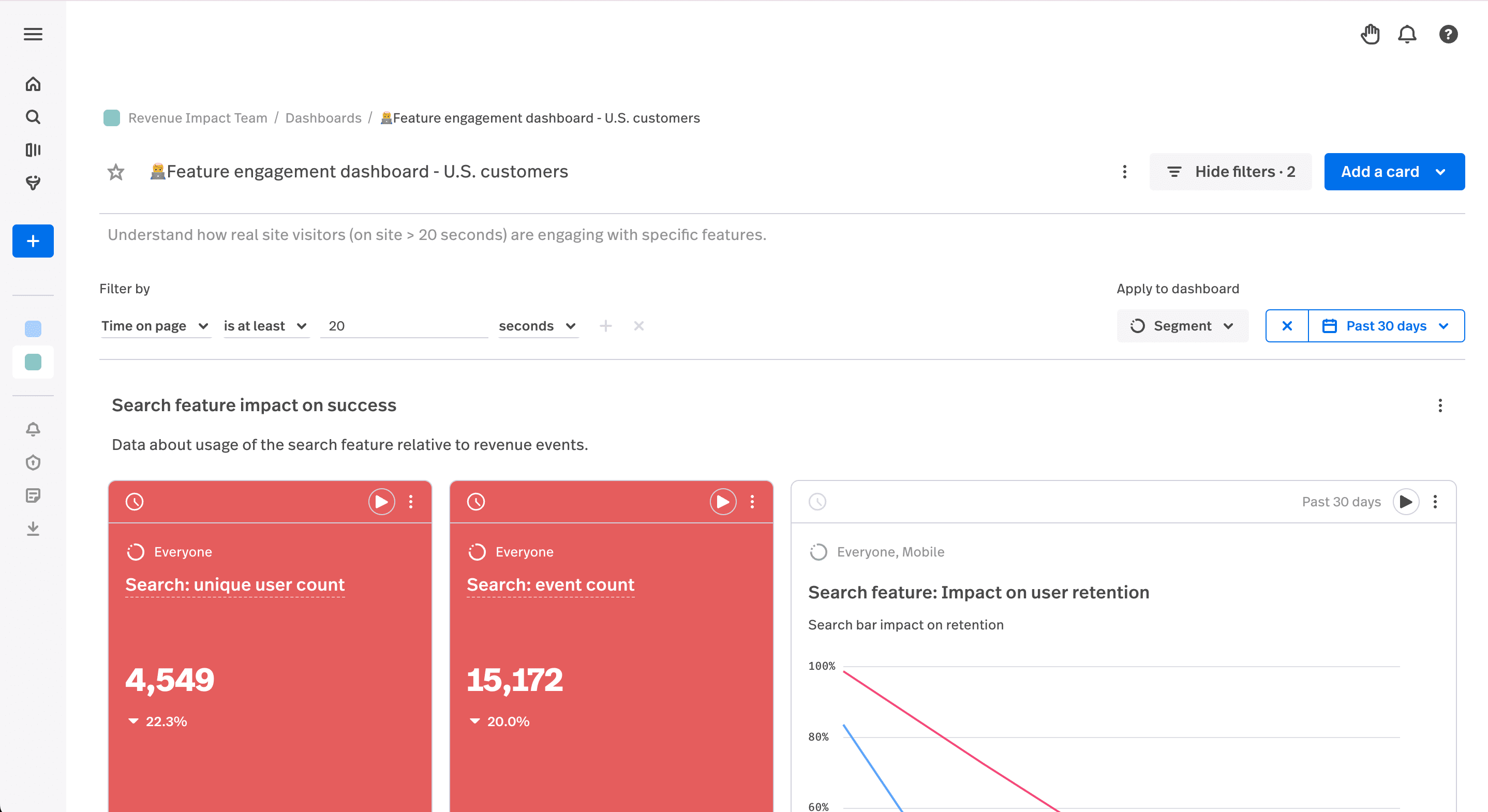
    FullSession dashboard showing feature engagement and adoption by segment
    A FullSession engagement dashboard lets you measure adoption against the segment that can actually reach the feature.

    The adoption metrics that matter, with formulas and benchmarks

    Adoption rate is the headline, but it hides the diagnosis. A short stack of supporting metrics tells you not just whether a feature is adopted, but where it is failing. Treat the benchmarks below as a starting line, since they shift by category and by how central the feature is to the product.

    Breadth and depth

    Breadth is how many eligible users tried the feature at all. Depth is how hard the ones who tried it lean on it. The two answer different questions. Low breadth means a discovery problem, since people never reached the feature. Healthy breadth with shallow depth means the feature is easy to find but not worth returning to. You want both numbers in view, because a single adoption rate can look fine while hiding a feature that everyone opens once and nobody uses twice.

    Time to adopt

    Time to adopt measures how long it takes an eligible user to reach first use. Speed matters more than it looks. High-performing products see a median time to first use of two to five days for strategic features, while products that bury features behind menu discovery often stretch to two or three weeks. The same research finds that every extra day of delay shaves roughly three to five percent off the chance the user ever adopts at all. A feature that is hard to find is a feature slowly dying.

    Activation rate

    Activation is the share of exposed users who take the first meaningful action, not just glance at the feature. Well-designed features tend to land activation rates of 40 to 60 percent, and anything under 30 percent usually signals onboarding friction or a value proposition that is not clear at the moment of the click. Activation is the stage where a confusing first-run experience does the most damage.

    Duration: habit versus curiosity

    Duration tracks how long a user keeps using a feature after that first action. It is what separates a habit from a passing look. Someone who opens a feature every day for a week and then never again was curious. Someone who returns weekly for three months has adopted it. Without duration, a launch spike reads as success right up until the cohort quietly disappears.

    Friction signals: rage clicks, dead clicks, and errors

    Numbers tell you a feature is stuck. Friction signals start to tell you why, before the adoption rate even moves. A cluster of rage clicks on a feature’s control means people are trying and failing. Dead clicks on something that looks interactive but is not means the affordance is misleading. An error spike means the feature broke quietly while users watched. None of these appear in an adoption chart, yet each is often the reason the chart is flat.

    Metric Question it answers Formula Rough benchmark
    Feature adoption rate Are eligible users adopting it? Adopters / eligible users × 100 ~24.5% average for core features; 28%+ is healthy
    Breadth How many eligible users tried it? Users who tried / eligible users Compare to the feature’s reach goal
    Time to adopt How fast do they reach first use? Median days from exposure to first use 2-5 days for strategic features (high performers)
    Activation rate Did exposed users take a real first action? Activated / exposed users × 100 40-60% for well-designed features; under 30% signals friction
    Duration Habit or curiosity? Time still active after first use Repeat use over weeks, not a one-week spike
    Feature adoption metrics at a glance. Benchmarks are directional and category-dependent.

    SEE IT IN YOUR PRODUCT

    Watch the behavior behind every adoption number

    FullSession pairs session replay, heatmaps, and conversion funnels so a low adoption rate links straight to the recording that explains it.

    Start your free trial   Book a demo

    The adoption funnel, and how to actually see each stage

    The four-stage funnel is only useful if you can look at the stage where users leave. Each stage has a behavioral artifact that proves what went wrong, and this is where measurement turns into a fix.

    For exposed, the question is whether users ever saw the feature. A heatmap answers it directly: if attention and scroll depth never reach the part of the screen where the feature lives, you have a discovery problem, not an adoption problem, and no amount of feature polish will help. For activated, open session replays of users who saw the feature but did not take the first action, and you will usually watch the hesitation happen in a handful of recordings. For used and used again, a funnel report quantifies the drop between first use and repeat use, and segmenting it by plan or device shows which group is driving the loss.
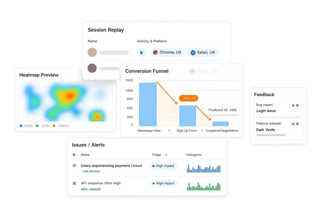
    FullSession heatmap and conversion funnel showing where users drop off adopting a feature
    Heatmaps confirm whether users saw the feature; funnels show where they dropped between first and repeat use.

    Run that loop and adoption stops being a guessing game. Heatmap to confirm exposure, replay to see the activation friction, funnel to measure the repeat-use drop, ship the change, and watch the metric respond. For a related walkthrough of tracing these drops, see our piece on onboarding funnel analysis.

    Why most feature-adoption dashboards mislead

    Here is the uncomfortable backdrop to every adoption chart. When Pendo analyzed usage across 615 products, it found that about 80 percent of features are rarely or never used, and that the median product has only 6.4 percent of its features driving most of the clicks. Your new feature is, by default, far more likely to land in the ignored majority than in the small set that carries the product.

    That reality breaks the most common dashboard read. Total product usage climbs, everyone relaxes, and the new feature sits untouched inside the aggregate, invisible because the headline number went up for unrelated reasons. The second trap is the launch spike that activation campaigns create, where a burst of first clicks looks like adoption until the cohort never returns and duration quietly flatlines. The fix for both is the same: measure each feature against its eligible users, watch breadth and depth separately, and read the funnel by cohort rather than trusting one rolled-up line. Our guide to product metrics goes deeper on segmenting these views.

    How to lift adoption once you can see the cause

    Diagnosis points to the fix. If the heatmap shows users never reach the feature, the work is discovery: surface it in the flow where the need arises, not in a settings menu nobody opens. If replays show people reach it and stall, the work is the first-run experience: make the first action obvious and show value before asking for effort. If breadth is healthy but depth is shallow, the feature is findable but not yet worth a second visit, which is a value question, not a UI one.

    None of this requires a redesign or a data team. It requires seeing which stage of the funnel is leaking and matching the fix to the cause. For teams driving activation, our notes on app engagement metrics and the PLG activation workflow pair well with this. Setting up adoption tracking in FullSession takes a few minutes, and you can watch the behavior behind your first feature the same day.

    Turn feature usage into adoption you can prove

    Visualize, analyze, and act on real user behavior with FullSession. No credit card needed to start.

    Start free trial   Book a demo

    Product team reviewing feature adoption on laptops in a meeting
    Image source: Pixabay

    Feature adoption: FAQ

    What is feature adoption?

    Feature adoption is the share of users who find a feature, use it, and keep using it because it delivers value. It is best measured as a funnel, not a single number: users move from exposed, to activated, to used, to used again. The headline metric is the feature adoption rate, but it only means something when measured against the users who can actually reach the feature.

    How do you calculate feature adoption rate?

    Feature adoption rate is the eligible users who completed the adoption event divided by total eligible users, times 100. The key is the denominator. Use eligible users, meaning the people whose plan, role, permissions, or device give them access, not your entire active base. Dividing by all active users hides real adoption behind users who were never able to see the feature.

    What is a good feature adoption rate?

    Userpilot’s 2025 benchmark puts the average core-feature adoption rate near 24.5 percent, with anything above 28 percent reading as healthy. It varies by category: HR tools trend higher near 31 percent, while fintech and insurance sit closer to 22 to 23 percent. Compare against your own segment rather than a single universal number.

    Why do most features go unused?

    Pendo’s analysis of 615 products found that about 80 percent of features are rarely or never used, and that the median product sees only 6.4 percent of its features drive most of the click volume. Features usually fail at one of two points: users never discover them, or they find them and the feature does not earn the next click. Those need different fixes, so you have to see which one you have.

    How can I see why a feature is not being adopted?

    An adoption number tells you a feature is underused, not why. Heatmaps show whether users even saw the feature, session replay shows where they hesitate or abandon after clicking it, and funnel reports quantify the drop between exposure, first use, and repeat use. FullSession connects these so a low adoption rate leads straight to the behavior behind it.

  • Customer Acquisition Cost (CAC): How to Calculate, Benchmark, and Lower It in 2026

    Customer Acquisition Cost (CAC): How to Calculate, Benchmark, and Lower It in 2026


    The quarterly review lands and the customer acquisition cost line is pointing the wrong way. Spend is up, the pipeline looks busy, and each new customer somehow costs more than the last. Someone asks the obvious question: where is the money going? The dashboard shows CAC climbing but not the reason, and that gap is where most acquisition budgets quietly bleed.

    CAC is one of the few numbers that decides whether growth is a business or just an expensive habit. This guide covers what it really measures, how to calculate it without fooling yourself, current benchmarks by industry with sources, and the part most articles skip: why the CAC you report is often wrong, and how to see the on-site behavior that is inflating it.

    QUICK TAKEAWAY

    CAC is the total sales and marketing cost to win one customer. You set it when you spend, but you decide it on-site, through how much of the traffic you paid for actually converts. Cut the wasted spend hiding in funnel drop-off, form friction, and dead ends, and CAC falls without a bigger budget. Read it next to lifetime value, never alone.

    What customer acquisition cost actually is

    Customer acquisition cost is the total amount you spend on sales and marketing to acquire one new customer over a defined period. It is the price of growth, expressed per customer, and it is the counterweight to every optimistic revenue projection.

    One quick clarification, because the term gets muddied. In accounting, “acquisition cost” can mean the fully loaded cost of buying an asset, a building, a machine, a company, which is capitalized on the balance sheet and then depreciated over its useful life. That is a different metric with a different purpose. When marketing, growth, and product teams talk about acquisition cost, they mean customer acquisition cost: the operating spend it takes to convince someone to become a customer. That is the version this guide is about, because it is the one you can influence week to week.

    CAC matters for three reasons. It tells you whether a channel is profitable, it sets the pace you can afford to grow at, and it is half of the single most important efficiency ratio in any subscription or repeat-purchase business: lifetime value to CAC. A number this central deserves to be measured precisely, and most teams measure it loosely.

    How to calculate CAC (and the versions that matter)

    The core formula is simple:

    CAC = total sales and marketing spend / new customers acquired in the same period

    Spend 60,000 dollars in a quarter across ads, tools, salaries, and creative, win 200 new customers, and your CAC is 300 dollars. The arithmetic is not the hard part. The hard part is what you include and how you segment, because three different CAC numbers can come from the same quarter.

    Fully loaded versus media-only. Media-only CAC counts just ad spend and flatters every channel. Fully loaded CAC adds the salaries of the people running acquisition, the software they use, agency fees, and content and creative production. Fully loaded is the honest number, and it is usually far higher than the one in your ad platform.

    Blended versus paid. Blended CAC divides all acquisition spend by all new customers, including the ones who arrived through organic search, referrals, and word of mouth. Paid CAC isolates the customers who came from money you spent to reach them. Blended almost always looks better, because free channels subsidize the average. If you only watch blended CAC, a paid channel can run at a loss for months while the healthy blended figure hides it. Track both, and track paid CAC by channel so the loss has nowhere to hide.

    This is also where organic pays off. First Page Sage’s 2026 benchmarks show organic CAC coming in lower than paid CAC in nearly every industry, which is why a strong customer acquisition funnel and good marketing analytics compound in a way that paid media never does. You rent paid traffic. You own organic.

    Acquisition funnel diagram showing traffic narrowing from visitors to paying customers
    Every dollar of CAC is decided as visitors move down the acquisition funnel toward a paid conversion.

    CAC benchmarks: what good looks like in 2026

    Benchmarks are a starting line, not a scoreboard. Your model, price point, and sales motion move the number more than any industry average. Still, it helps to know the neighborhood. The table below uses First Page Sage’s 2026 B2B analysis, which splits the blended figure into its organic and paid halves.

    Industry Blended CAC Organic CAC Paid CAC
    eCommerce $86 $87 $81
    B2B SaaS $239 $205 $341
    Cybersecurity $387 $345 $512
    Software development $720 $680 $841
    Manufacturing $723 $662 $905
    Legal services $749 $584 $1,245
    Financial services $784 $644 $1,202
    Education $1,143 $862 $1,985
    Blended, organic, and paid CAC by industry. Source: First Page Sage, 2026. Paid CAC runs higher than organic in almost every category.

    The absolute number matters less than what sits next to it. CAC only tells you something when you read it against lifetime value. The widely used floor is an LTV to CAC ratio of 3 to 1: a customer should be worth at least three times what you paid to win them. Below that, you are buying revenue at a loss, or close to it. Far above it, you may be underinvesting and leaving growth unclaimed.

    The second half of the picture is CAC payback period, or how many months of margin it takes to earn the acquisition cost back. The old rule of thumb is twelve months, though recent SaaS medians reported in Benchmarkit’s 2025 metrics sit well beyond that, which is one reason acquisition efficiency is under more scrutiny than it has been in years. For a fuller view of how these fit together, our guide to SaaS metrics maps CAC alongside the rest of the unit economics.

    Marketing analytics charts on a desk during an acquisition cost review
    Image source: Pixabay

    Why your reported CAC lies to you

    Here is the uncomfortable truth behind the tidy CAC figure in your dashboard. That number is set the moment you spend, but the cost you actually pay per customer is decided later, on your own site, by how many of the visitors you paid for make it through to a conversion. Reported CAC assumes your funnel converts the way it is supposed to. Effective CAC is the real cost after your landing pages, forms, and checkout take their cut.

    Ad platforms keep getting more expensive, so this gap keeps widening. WordStream’s 2025 benchmarks put the average Google Ads cost per click at 5.42 dollars, up from 4.66 dollars a year earlier, with costs rising across most industries. When traffic costs more, every conversion you lose on-site costs more too. The waste does not show up as a line item. It hides inside the funnel as drop-off, and inside sessions as friction.

    Walk through the math. Say you buy 20,000 visitors at 3 dollars per click, which is 60,000 dollars. Your landing-page-to-paid conversion rate is 1.0 percent, so you win 200 customers, and CAC is 300 dollars. Now suppose a broken step in your signup flow, an error on mobile, a form field that rejects valid input, is quietly costing you conversions. Fix it, lift paid conversion from 1.0 percent to 1.4 percent, and the same 60,000 dollars now produces 280 customers. CAC falls to 214 dollars. That is a 29 percent cut in acquisition cost with zero extra media spend, purely from converting more of the traffic you already bought.

    If your LTV is 900 dollars, that same fix moves your LTV to CAC ratio from a shaky 3 to 1 up past 4 to 1. Nothing changed about the market or the budget. You just stopped paying for visitors you were letting fall through the floor.

    Find the leak: where paid traffic actually drops

    To lower effective CAC you have to see where the traffic you paid for disappears, and then why. This is where a raw analytics number stops helping and observed behavior takes over. The loop has three moves.

    First, quantify the leak. A conversion funnel lays out each step from paid landing to activated customer and shows the exact stage where the biggest share of paid traffic falls out. That step is your biggest opportunity to cut CAC, because a small percentage recovered there flows straight through to a lower cost per customer. Our walkthrough of conversion funnel analysis covers how to build one that maps to spend.

    Second, see the cause. A funnel tells you where, not why. Open session replays of the users who dropped at that step and you will watch the reason happen: a confusing form, a price that surprises them, a button that does nothing, a mobile layout that hides the call to action. A cluster of rage clicks on a stuck control tells you people are trying and failing, which is expensive traffic bouncing off a fixable wall.

    Third, confirm the scale. One replay is a story; a heatmap is the proof. It shows how many people hit the same friction point, so you can tell a rare edge case from a leak draining budget every day. Together these turn “CAC is up” into “the mobile checkout loses 18 percent of paid traffic at the payment step, here is the recording, here is the heatmap.” That is a fix you can prioritize and defend.

    FullSession funnel and heatmap showing where paid traffic drops off before converting
    The funnel shows where paid traffic leaks; the heatmap confirms how many users hit the same wall.

    LOWER CAC ON THE TRAFFIC YOU ALREADY BUY

    See exactly where paid visitors drop, and why

    FullSession pairs conversion funnels, session replay, and heatmaps so a rising CAC leads straight to the on-site behavior behind it.

    Start your free trial   Book a demo

    How to actually lower CAC

    Once you can see the cause, the work sorts itself into a short list of moves that each push CAC down from a different direction.

    Fix the highest-cost step first. Rank your funnel drops by how much paid traffic they cost, not by how easy they are to fix. FullSession’s Lift AI scores where friction is costing you the most conversions so you spend engineering time on the leak that moves CAC, not the one that is merely annoying.

    Match the landing experience to the ad. Expensive clicks arrive with an expectation set by the ad. If the page does not deliver on it in the first few seconds, they leave and you paid for nothing. Replays of paid sessions show the mismatch faster than any bounce-rate chart. Teams focused here often start with the growth marketing workflow.

    Ask the users who almost converted. Sometimes the funnel and the replay show the where and the how, but not the objection in the user’s head. In-page feedback at the moment of hesitation captures the “too expensive” or “I could not tell if this integrates with my stack” that no behavioral signal spells out.

    Lift retention to lower effective CAC. CAC does not live alone. Raise lifetime value and you can afford a higher CAC, or hold CAC flat and widen the margin. Better activation and retention mean each acquired customer is worth more, which loosens the whole constraint. This is why activation-focused teams pair acquisition work with the PLG activation motion. If you want to put a number on the return, our guide to measuring the ROI of UX improvements shows how to tie a conversion lift back to dollars.

    FullSession session replay with an event timeline showing where a paid visitor hesitated
    Session replay with an event timeline turns a lost paid visitor into a specific, fixable cause.

    The most expensive leak in ecommerce: the checkout

    Nowhere is the gap between reported and effective CAC wider than at the online checkout. Baymard Institute’s ongoing research puts the average documented cart abandonment rate at 70.22 percent, which means roughly seven in ten shoppers who signaled real intent still leave before paying. Every one of them was acquired at full cost. The click was paid for, the interest was real, and the sale evaporated at the last step.

    That makes checkout the single highest-return place to attack CAC in ecommerce. A funnel scoped to the cart and payment steps shows where abandonment concentrates, replay shows the surprise shipping cost or the coupon field that sends people hunting elsewhere, and a heatmap confirms whether the trust signals and payment options are even being seen. Recovering a few points of checkout completion drops effective CAC across every channel feeding that store at once. Teams working this problem tend to start with the checkout recovery workflow, and our piece on the funnel drop-off pattern goes deeper on the diagnosis.

    Shopper completing an online purchase on a smartphone
    Image source: Pixabay

    Pull these threads together and CAC stops being a number you react to at the end of the quarter. You buy traffic, you watch where it leaks, you fix the step that costs the most, and you recover cost per customer from conversion instead of chasing it with more budget. The teams with the lowest CAC are rarely the ones spending the least. They are the ones wasting the least of what they spend.

    Turn rising acquisition costs into recoverable conversions

    Visualize, analyze, and act on real user behavior with FullSession. See where paid traffic drops, fix the step that costs the most, and lower CAC without a bigger budget. No credit card needed to start.

    Start free trial   Book a demo

    Customer acquisition cost: FAQ

    What is customer acquisition cost (CAC)?

    Customer acquisition cost is the total sales and marketing spend it takes to win one new customer over a set period. You calculate it by dividing that spend by the number of new customers acquired in the same window. It is different from the accounting idea of acquisition cost, which is the capitalized cost of buying an asset. CAC measures how efficiently you turn budget into customers, and it only makes sense when read next to customer lifetime value.

    How do you calculate CAC?

    CAC equals total sales and marketing costs divided by the number of new customers acquired in the same period. Fully loaded CAC adds salaries, ad spend, software, and creative costs, not just media. Spend 60,000 dollars in a quarter and win 200 customers, and your CAC is 300 dollars. Measure paid CAC and blended CAC separately, because a healthy blended number can hide one paid channel that is losing money.

    What is a good CAC by industry?

    It varies widely by business model. First Page Sage’s 2026 data puts blended B2B CAC near 86 dollars in ecommerce, 239 dollars in B2B SaaS, 720 dollars in software development, and over 1,100 dollars in education. Across almost every industry, organic CAC comes in lower than paid CAC, which is why on-site conversion and retention matter as much as media budgets. Compare against your own segment rather than a single universal figure.

    What is a good LTV to CAC ratio?

    The widely used floor is 3 to 1, meaning a customer should return at least three times what it cost to acquire them. Below that, growth burns cash faster than it builds value. Well above it, you may be underspending and leaving growth on the table. Pair the ratio with CAC payback period: the old rule of thumb is to recover CAC within 12 months, though recent SaaS medians sit well beyond that.

    How can behavior analytics lower CAC?

    Your reported CAC is set when you spend, but your effective CAC is decided on-site, by how many of the visitors you paid for actually convert. Behavior analytics finds the leak and shows the cause: a funnel report pinpoints the step where paid traffic drops, session replay shows why users hesitate or abandon, and heatmaps confirm how many people hit the same wall. Fixing those raises conversion on traffic you already bought, which lowers CAC without adding budget.

  • AI in Customer Experience: What Actually Works in 2026 (and What Is Just Hype)

    AI in Customer Experience: What Actually Works in 2026 (and What Is Just Hype)


    The mandate arrives from above: add AI to the customer experience. So the stack grows another tool, a new dashboard lights up, and a model starts scoring things. A quarter later the reports are prettier, the demos went well, and customers are still rage-clicking through the same checkout step they were stuck on before. The AI got added. The experience did not get better.

    That gap is the real story of AI in customer experience right now. The technology is genuinely useful, but most of the spend goes to features that sound impressive and change nothing, while the parts that move the needle get ignored because they are less glamorous. This guide separates the two. It covers what AI in CX actually means, where it earns its keep today, where it wastes money, and the one thing every useful application depends on: knowing what your customers are really doing.

    QUICK TAKEAWAY

    AI does not create a good customer experience. It scales your understanding of one. Point it at real behavior (sessions, heatmaps, funnels, feedback) and it will surface friction, personalize, and summarize sentiment faster than any team could by hand. Point it at thin data or a broken journey, and it just produces confident noise. The data foundation is the whole game.

    What AI in customer experience actually means

    Strip away the marketing and AI in customer experience does three jobs. It helps you understand behavior at scale, it personalizes what each customer sees, and it automates parts of service. Everything sold under the CX and AI banner is some combination of those three.

    Understanding is the foundation. Models read the raw signals of a session, the clicks, scrolls, hesitations, errors, and open-text feedback, and turn millions of them into patterns a human could never sort by hand. Personalization acts on that understanding, adjusting the next message, offer, or screen to fit the person. Automation handles the repetitive front line: answering the common question, routing the ticket, drafting the reply.

    The important part is what AI is not. It is not a strategy, and it is not a substitute for knowing your customer. It is a layer that sits on top of your behavioral data and makes that data faster to act on. If the data underneath is incomplete or wrong, the AI inherits every blind spot and states them with confidence. That single fact explains most of the difference between AI CX projects that work and the ones that quietly get shelved.

    Why so much AI CX spend underdelivers

    Start with the customers themselves. PwC’s 2025 Customer Experience Survey found that 58 percent of consumers are only somewhat or not at all comfortable using AI tools to engage with brands, and that 70 percent of executives say customer expectations are evolving faster than their company can adapt. People are wary, and the teams serving them are already behind. Dropping an AI chatbot in front of a frustrated customer does not close that gap. It can widen it.

    The second failure is more common and more expensive: using AI to automate a journey that is broken. If users cannot find the feature, if the form rejects valid input, if the mobile checkout hides the payment button, then a faster, AI-powered version of that flow just delivers the same failure more efficiently. Automation multiplies whatever it is pointed at, including the friction.

    The third is the quiet one. Most AI CX tools run on whatever data they can reach, which is often event counts and survey scores. That tells you what happened and how people rated it, but not why. A model trained on outcomes without the behavior behind them will confidently recommend fixes for the wrong problem. Garbage in, confident garbage out. The way past all three is not more AI. It is better ground truth for the AI to stand on.

    Abstract network representing an AI layer reading customer behavior data
    Image source: Pixabay

    Where AI genuinely improves CX today

    Set the hype aside and four applications hold up. Each one earns its place because it does something people cannot do fast enough by hand, and each one only works when it sits on accurate behavioral data.

    1. Detecting and ranking friction automatically

    The most valuable thing AI does in CX is unglamorous: it finds where users are struggling and tells you which struggle costs the most, in seconds instead of days. A team can watch recordings and read heatmaps, but not across every page and segment at once. A model can. It flags the spike in rage clicks on a checkout button, the error cluster on one browser, the step where a whole segment stalls, and it ranks them so you fix the expensive problem before the annoying one. FullSession’s Lift AI does exactly this, scoring friction so the fix queue is ordered by impact rather than by whoever complained loudest.

    2. Personalization earned from real behavior

    Personalization is where AI pays off in revenue, but only when it is based on what people actually do rather than a crude demographic guess. McKinsey’s research found that 71 percent of consumers expect personalized interactions and 76 percent get frustrated when they do not get them, and that faster-growing companies drive 40 percent more of their revenue from personalization than slower-growing peers. The gap between good and bad personalization is the data behind it: behavioral signals from real customer journey analytics beat a segment built on age and postcode every time.

    3. Understanding sentiment at scale

    Open-text feedback is a goldmine that most teams cannot mine, because reading ten thousand survey responses by hand is not realistic. This is a natural fit for language models: they cluster the comments, surface the recurring complaint, and tie sentiment to the moment it happened. Paired with in-page feedback, that turns a wall of text into a ranked list of what is bothering people and where. It is one of the few AI CX features that is both easy to trust and easy to act on, because you can go straight from the summarized complaint to the session where it occurred.

    4. Predicting churn and intent

    Behavioral signals are leading indicators. A drop in feature use, a stalled onboarding step, a rise in errors for one account: these predict churn well before the renewal date, and AI is good at spotting the pattern across a whole base. The catch is the same as everywhere else. A churn model is only as good as the behavioral inputs it reads, which is why teams that take prediction seriously invest in real-time customer analytics first and the model second.

    FullSession Lift AI scoring and ranking friction points by business impact
    Lift AI ranks friction by impact, so teams fix the costliest issue first instead of the loudest.

    GROUND YOUR AI IN REAL BEHAVIOR

    Give your AI something true to stand on

    FullSession pairs session replay, heatmaps, and conversion funnels with Lift AI, so the model ranks friction from behavior you can actually watch.

    Start your free trial   Book a demo

    The data foundation every AI CX feature depends on

    Here is the point the glossy platform launches skip. None of the four applications above works without ground truth about what users actually do, and most stacks do not have it. They have page views, event counts, and NPS. That is the shadow of behavior, not the behavior itself.

    Ground truth has four parts. Session replay shows how a real person moved through a page, where they hesitated, and what they abandoned. Heatmaps show what the whole population saw and ignored, so you can tell a discovery problem from a value problem. Funnel data shows exactly where people drop between steps. And error and alert signals show where the experience broke while nobody was watching. Feed those into a model and its outputs get sharp. Withhold them and it guesses.

    This is also the honest answer to the tool-sprawl problem that vendors love to describe. The fix is not one more platform that promises to unify everything. It is making sure the behavioral layer, the raw record of what customers do, is complete and trustworthy before you put any AI on top of it. Our take on the AI interpretation layer goes deeper on why that ordering matters.

    FullSession heatmaps and conversion funnel providing behavioral ground truth for AI
    Heatmaps, funnels, and replay give an AI model the behavioral ground truth that event counts alone cannot.

    Keep the humans where judgment matters

    AI is good at the excavating. It reads the thousand sessions, ranks the friction, and drafts the summary so a person does not spend a week doing it. What it should not own is the judgment: which trade-off to make, how to word the apology, whether a fix is worth the engineering time. That belongs to people, and the PwC finding that most consumers are still uneasy with AI-led interactions is a reminder to keep a human in the loop where it counts.

    The pattern that works is simple. Let AI hand your team a short, evidence-backed list of what is hurting the experience and why, then let people decide and act. That keeps the speed of automation and the trust of human judgment. For teams organizing this work, the customer success and product management workflows show how the prioritized list turns into shipped fixes, and our roundup of CX tools covers where these pieces fit together.

    Customer support professional working with a headset at a desk
    Image source: Pixabay

    How to roll out AI in CX without the hype

    A practical sequence beats a big platform bet. Start by fixing the behavioral data: make sure you are actually capturing sessions, heatmaps, funnels, and feedback across web and app, because that is the fuel for everything else. Then pick one narrow, painful problem, a checkout drop, a stalled onboarding step, a support queue clogged with one repeated question, and apply AI to that alone.

    Measure it against a real baseline. If the AI-driven change lifts completion or cuts resolution time, expand it. If it does not, you learned that cheaply instead of after a year-long rollout. Watch the behavior after every change, not just the score, because a metric can improve for the wrong reason while the underlying experience gets worse. Our guide to measuring customer experience covers how to set those baselines, and NPS detractor analysis shows how to tie a score back to the sessions behind it.

    Do this and AI stops being a line item you have to justify and becomes what it should be: a way to understand your customers faster than you could alone. The teams getting real value from AI in CX are not the ones with the most models. They are the ones whose models can see what their customers are actually doing.

    Turn AI ambition into experiences you can prove

    Visualize, analyze, and act on real user behavior with FullSession, then let Lift AI rank what to fix first. No credit card needed to start.

    Start free trial   Book a demo

    AI in customer experience: FAQ

    What is AI in customer experience?

    AI in customer experience is the use of machine learning and generative models to understand customer behavior at scale, personalize what each person sees, and automate parts of service. It is not one feature. It is a layer that reads signals like clicks, journeys, errors, and feedback, then predicts intent, flags friction, or tailors the next step. Its usefulness depends entirely on the quality of the behavioral data underneath it.

    Does AI actually improve customer experience?

    It can, when it is pointed at a real problem and fed good data. AI is strong at surfacing friction fast, personalizing from real behavior, and summarizing feedback at scale. It underdelivers when it automates a broken journey or runs on thin data. PwC’s 2025 survey also found 58 percent of consumers are only somewhat or not at all comfortable using AI to engage with brands, so where you apply it matters as much as whether you use it.

    Where does AI help most in CX today?

    Four areas are reliable right now: automatically detecting and ranking friction so teams fix the costliest issues first, personalizing content and offers based on observed behavior, analyzing open-text feedback and sentiment at scale, and predicting churn or intent from behavioral signals. Each one improves the experience only when it sits on top of accurate session, heatmap, funnel, and feedback data.

    What data does AI need to improve CX?

    AI needs ground truth about what users actually do, not just what they say or buy. That means session replays that show how people move through a page, heatmaps that show what they see and miss, funnel data that shows where they drop, and error and feedback signals that show where they struggle. Without that behavioral foundation, an AI model is confidently guessing.

    Can AI replace human customer experience teams?

    No. AI removes grunt work: it excavates issues, drafts summaries, and ranks problems so people do not have to. The judgment about what to fix, how to word an apology, and which trade-off to make still belongs to humans. The best results come from AI that hands a team a prioritized, evidence-backed shortlist, then lets people decide and act.

  • AI Tools for Advanced Analytics: What They Actually Do and How to Choose in 2026

    AI Tools for Advanced Analytics: What They Actually Do and How to Choose in 2026


    Search for AI analytics tools and you get the same thing every time: a list of seven products that have nothing to do with each other. A social listening tool sits next to a business intelligence suite, next to an A/B testing platform, next to a behavior analytics product. Each one is fine. Together they answer the question “what tools exist?” and completely dodge the one you actually have, which is “which of these solves my problem?”

    This guide takes a different route. Instead of ranking unrelated tools, it explains what AI genuinely does in analytics, sorts the tools into the jobs they are built for, and gives you a way to choose based on the decision in front of you. The goal is not a longer list. It is a shorter shortlist.

    QUICK TAKEAWAY

    AI does five useful things in analytics: prepares data, finds patterns, predicts, reads language at scale, and ranks issues by impact. Tools cluster into categories (behavior analytics, product analytics, BI, voice of customer, testing, competitive intel), and the right pick starts from the question you need answered. For understanding what users do on your site, behavior analytics with AI prioritization is the place to begin.

    What AI actually does in analytics

    Before comparing tools, it helps to be precise about what the AI inside them is really doing. Strip the marketing and it comes down to five jobs, each one a task a skilled analyst could do given unlimited time, done faster and at larger scale.

    The first is data preparation: cleaning, joining, and shaping raw data so it can be analyzed at all. This is the unglamorous majority of analytics work, and automating it is where AI quietly saves the most hours. The second is pattern and anomaly detection, finding correlations and outliers across datasets too large to scan by eye. The third is prediction, using historical data to estimate what happens next, such as which accounts are likely to churn. The fourth is language at scale, reading thousands of open-text comments, reviews, or survey responses and turning them into themes and sentiment. The fifth, and the most underrated, is prioritization: ranking a pile of issues by their impact so a team fixes the expensive problem before the trivial one.

    Notice what is not on that list. AI does not decide what matters to your business, it does not know your strategy, and it does not supply the judgment to act. McKinsey’s 2025 survey found that 88 percent of organizations now use AI in at least one function, up from 78 percent a year earlier, yet the same research notes that scaled, measurable impact is still rare. The gap is almost always human: the value shows up when people apply judgment on top of the automation, not when they buy the tool.

    Advanced analytics dashboard with charts on a screen
    Image source: Pixabay

    How to choose: start from the question, not the tool

    The reason those seven-tool listicles fail is that they compare products across categories that are not substitutes. A business intelligence suite and a session replay tool are not competitors any more than a spreadsheet and a microscope are. So the first move is to name the decision you are trying to make, because that decision points to a category, and the category shortlists the tools.

    If you need to know why users hesitate, abandon, or rage-click on your site, you want behavior analytics. If you need retention curves and journey trends across many sessions, that is product analytics. If you need to blend and visualize data from a warehouse, that is business intelligence. If you need to understand what customers are saying in their own words, that is voice of customer. If you need to prove a change works, that is experimentation. If you need to see how you stack up against rivals, that is competitive intelligence. Pick the category, shortlist two tools inside it, and test them on one real question you already care about. Comparing AI feature lists comes last, not first.

    The categories of AI analytics tools

    Here is the same universe of tools the listicles cover, organized by the job each one is actually for. The representative names are examples, not endorsements, and most teams end up using one tool from two or three of these rows rather than one tool that claims to do everything.

    Category The question it answers What the AI adds Representative tools
    Behavior analytics Why do users struggle on our site? Auto friction scoring, anomaly alerts, replay search FullSession, Hotjar, Contentsquare
    Product analytics How do users retain and progress over time? Predictive churn, natural-language queries Amplitude, Mixpanel
    Business intelligence What do our warehouse numbers say? Auto-generated narratives, ask-a-question queries Power BI, Tableau
    Voice of customer What are customers telling us in words? Sentiment analysis, theme clustering, summaries Survey and feedback tools
    Experimentation Does this change actually work? Variant and copy generation, result analysis Optimizely, VWO
    Competitive intelligence How do we compare to rivals? Traffic estimation, AI query assistants Similarweb, Semrush
    AI analytics tools sorted by job. Most teams combine one tool from a few rows rather than betting on a single all-in-one.

    Two rows deserve a closer look because they are where most teams get the fastest return. Product analytics answers the “what happened over time” question and is strong for retention and cohort work; our guide to product metrics covers how to read those trends. Behavior analytics answers the “why did it happen” question, and for a lot of teams that is the one blocking real improvement, because a chart can tell you conversion dropped without ever telling you what went wrong on the page. That is the category we will go deeper on, both because it is our field and because it is the one the source listicles treated as an afterthought.

    Abstract representation of a machine learning model processing data
    Image source: Pixabay

    Where AI earns its keep in behavior analytics

    Behavior analytics is a natural home for AI, because the raw material is enormous and the signal is buried. A busy site produces more sessions than any team could ever watch, and the moment that explains a conversion drop might be hiding in one recording out of fifty thousand. This is exactly the kind of needle-in-a-haystack problem machine learning is built for.

    The highest-value application is prioritization. Instead of watching recordings at random, you want the tool to tell you where users are struggling and which struggle costs the most in lost conversions. FullSession’s Lift AI does this by scoring friction across sessions and ranking it by impact, so your fix queue is ordered by money rather than by whoever complained loudest. That turns a wall of data into a short, ranked list of pages to look at first.

    Once the tool points you to the right moments, the human work is fast. A session replay shows what actually happened, a heatmap confirms how many people hit the same wall, and a funnel quantifies the drop. The AI does the searching and ranking; you do the diagnosing and deciding. For the language side of behavior, pairing this with in-page feedback lets a model summarize what users say at the exact moment they struggle, which is the sentiment analysis job from the table applied where it is most useful.

    FullSession Lift AI scoring and ranking friction across sessions by business impact
    Lift AI ranks friction by impact, turning tens of thousands of sessions into a short list of pages to fix first.

    AI ANALYTICS, GROUNDED IN REAL BEHAVIOR

    Let AI rank the friction, then watch the proof

    FullSession pairs session replay, heatmaps, and funnels with Lift AI, so advanced analytics starts with the sessions that explain your numbers.

    Start your free trial   Book a demo

    A quick hype check: where AI analytics still falls short

    An honest guide has to name the limits, because most AI analytics disappointment comes from expecting the wrong thing. AI is good at correlation and bad at causation: it will tell you two things move together, not which one caused the other. It is confident even when wrong, so an unverified model output can send a team chasing a fix for a problem that does not exist. And it inherits every flaw in its inputs, which means a model running on thin or dirty data produces clean-looking nonsense.

    The practical guardrail is to treat AI output as a lead, not a verdict. When a tool flags an anomaly or ranks a friction point, confirm it against the actual behavior before you act: watch the sessions, read the feedback, check the funnel. That is why grounding matters so much. An AI layer sitting on real customer analytics can be verified in seconds; one sitting on event counts alone cannot. Our take on the AI interpretation layer goes deeper on why the data underneath decides whether the AI helps or misleads.

    FullSession heatmaps and conversion funnel used to verify an AI-flagged friction point
    Verify an AI-flagged issue against real behavior: heatmaps and funnels confirm whether the model was right.

    Where most teams should start

    If you are choosing one place to begin, begin with the question that is actually blocking you. For the majority of teams trying to improve a website or app, that question is “why are users dropping here,” and the answer lives in behavior analytics with AI prioritization on top. It gives you the fastest path from a number that moved to the reason it moved, and it is quick to stand up: you can watch the behavior behind your first ranked friction point the same day you install it.

    From there, add categories as new questions appear. Reach for product analytics when retention becomes the focus, business intelligence when you need to blend warehouse data, and competitive intelligence when the market context matters. For teams weighing the options, our roundups of marketing analytics tools, UX analytics tools, and CX tools break down the specific choices, and the product management workflow shows how the pieces fit together in practice. The best AI analytics stack is not the one with the most tools. It is the smallest set that answers your real questions with data you can trust.

    Turn advanced analytics into fixes you can prove

    Visualize, analyze, and act on real user behavior with FullSession, then let Lift AI rank what to fix first. No credit card needed to start.

    Start free trial   Book a demo

    AI tools for advanced analytics: FAQ

    What are AI tools for advanced analytics?

    They are analytics platforms that use machine learning and language models to do work a human analyst would otherwise do by hand: cleaning and joining data, spotting patterns and anomalies, predicting outcomes, summarizing text feedback, and ranking what matters most. They span several categories, from behavior analytics and product analytics to business intelligence, voice of customer, testing, and competitive intelligence. The right one depends on the question you are trying to answer, not on which has the most AI features.

    What does AI actually do in analytics?

    Five things reliably. It automates data preparation, the cleaning and joining that eats most of an analyst’s day. It finds patterns and anomalies across data too large to eyeball. It predicts, using history to flag likely churn or demand. It reads language at scale, turning thousands of open-text comments into themes. And it prioritizes, ranking issues by impact so teams fix the costly problem first. It does not supply judgment or business context, which is still human work.

    How do I choose an AI analytics tool?

    Start from the decision you need to make, then match it to a category. If you need to know why users struggle on your site, that is behavior analytics. If you need retention and journey trends across sessions, that is product analytics. If you need to model warehouse data, that is business intelligence. Pick the category first, shortlist two tools in it, and test them on a real question before comparing AI feature lists.

    Do AI analytics tools replace data analysts?

    No. They remove the grunt work and speed up the first pass, but the analyst still frames the question, checks the model’s assumptions, and decides what the finding means for the business. McKinsey’s 2025 survey found 88 percent of organizations use AI in at least one function, yet scaled impact is still rare, largely because value comes from human judgment applied on top of the automation, not from the tool alone.

    What is the best AI tool for understanding user behavior?

    For understanding what people actually do on your site, a behavior analytics platform that pairs session replay, heatmaps, and funnels with AI prioritization is the strongest fit. FullSession uses Lift AI to score and rank friction by impact, so the tool points you straight to the sessions that explain a drop, rather than leaving you to search recordings by hand. The best choice is the one whose AI is grounded in real behavioral data, not just event counts.

  • Customer Experience Analytics Software: How to Evaluate Platforms by Data Sources, Use Cases, and Measurable Outcomes

    Customer Experience Analytics Software: How to Evaluate Platforms by Data Sources, Use Cases, and Measurable Outcomes

    If you own CX Ops in SaaS, you’ve probably got the same problem wearing different masks: churn risk shows up as “NPS dipped,” “ticket volume spiked,” “activation stalled,” and “renewal is shaky,” but your tooling can’t connect those dots fast enough to act.

    You do not need more dashboards. You need a platform that can tell you which customers are experiencing what friction, where it happens in the journey, and which fixes actually move NRR and churn.

    Quick Takeaway / Answer Summary (verbatim)
    Customer experience analytics software helps SaaS teams connect customer feedback, behavioral signals, and operational data to find churn drivers and validate fixes. Evaluate platforms by data sources first, then by identity stitching, workflow automation, and measurement support. In a 60 to 90 day pilot, prove impact with baselines, cohorts, and guardrails against vanity metrics.

    What CX analytics software is (and what it is not)

    Customer experience analytics software is a system that combines signals across the customer journey, like feedback, product behavior, and support operations, so you can (1) identify experience friction and (2) operationalize fixes with measurable outcomes.

    A quick boundary check, because category drift is real:

    • CX analytics answers: What is the experience friction, who is affected, where does it happen, and what changed after we fixed it?
    • Customer analytics often leans commercial: segmentation, LTV, pipeline, usage scoring. Useful, but not always “experience-first.”
    • CX management / VoC suites excel at collecting feedback, but can struggle to tie it to behavioral root causes unless integrated well.
    • BI is a layer, not a solution: it can display results, but it rarely creates the workflow for detection, triage, and action.

    If your churn problem lives in product friction and “why did this customer fail here,” you will almost always need behavioral visibility, like session replay, journey funnels, and error context. (If you’re evaluating behavior analytics approaches, this is where a hub like FullSession session replay becomes relevant early in your shortlist.)

    Start with your data sources and the friction questions you must answer

    Most teams pick tools by feature labels. A better approach is: match tools to the data you already have, the data you can realistically add, and the questions you must answer to reduce churn.

    Step 1: Inventory your “sources of truth”

    Typical CX analytics sources in SaaS:

    • Feedback: NPS/CSAT, surveys, in-app feedback, reviews, open text comments
    • Conversations: support tickets, chat transcripts, call notes
    • Behavior: product events, journeys, clicks/taps, sessions
    • Ops and outcomes: plan tier, renewal date, expansion, churn reason, refund, SLA
    • Reliability: errors, performance, outages, incident tags

    Step 2: Turn sources into “must-answer” questions

    A simple mapping you can use in stakeholder interviews:

    • Retention / churn risk: “What experience patterns show up 30–60 days before churn?”
    • Activation failure: “Where do new accounts stall and why?”
    • Support cost: “Which issues repeat and which are self-inflicted by UX or bugs?”
    • Renewals: “What did accounts experience in the 90 days leading to renewal?”

    Step 3: Decide your minimum viable data model

    For a churn-focused pilot, your minimum viable model usually needs:

    1. Account and user identity (including anonymous to known where possible)
    2. Journey stage (onboarding, key workflow, billing, admin)
    3. Reason taxonomy (topics, reasons, sentiment where appropriate)
    4. Outcome markers (activated, downgraded, renewed, churned)

    If a vendor cannot explain how they handle identity stitching and journey stage mapping, their “CX analytics” will turn into a reporting exercise.

    The evaluation scorecard: shortlist 3 to 5 platforms with confidence

    Use this scorecard to compare vendors in a way that survives internal scrutiny. The goal is not “best tool.” The goal is “best fit for our data reality and our first measurable outcomes.”

    Scorecard table (use in demos)

    Evaluation areaWhat “good” looks likeDemo questions to askWhy it matters for churn/NRR
    Data sources and ingestionNative connectors or sane pipelines for feedback, conversations, behavior, and ops“Show me the full path from ticket text to a journey stage view.”If ingestion is brittle, adoption dies
    Identity stitchingHandles account-level mapping and user-level stitching; supports anonymous-to-known where relevant“How do you dedupe users and join to accounts? What breaks?”Churn is account-level, but friction is often user-level
    Unstructured feedback and taxonomyTagging, topic clustering support, governance for taxonomy changes“Who owns taxonomy changes and how do they propagate?”Without taxonomy, you cannot operationalize insights
    Workflow operationalizationAlerts, assignment, routing to playbooks/backlog, auditability“Show alert -> triage -> owner -> resolution loop.”Insights that do not create action do not move churn
    Outcome validationCohorts, baselines, experiment support, before/after comparison controls“How do you avoid ‘dashboard vanity’?”You need proof, not vibes
    Governance and privacyPII handling, access controls, retention policies, redaction/masking“What gets stored, for how long, and who can see it?”CX data is sensitive and often messy

    This is also where you should be honest about trade-offs. Some teams will keep a survey-first VoC tool and add a behavior analytics platform for root cause. Others will consolidate more aggressively if they need a tighter workflow.

    Mid-way through evaluation, it helps to map your CX operating motion to a platform that supports behavior visibility and action loops. If customer success outcomes are your core KPI, use the CS lens and evaluate against a page like solutions for customer success teams as a reality check for “how this gets used on Monday.”

    What to implement first: a practical sequence by data maturity

    This is the part most listicles skip. Use this sequence to avoid boiling the ocean.

    Maturity level 1: Fragmented signals (most teams)

    You have surveys, a ticketing system, and product analytics, but they are not joined.

    Start here:

    1. Identity basics: account_id, user_id, plan tier, lifecycle stage
    2. One journey: pick one churn-adjacent flow (onboarding, billing, permissions, a core feature)
    3. Baseline metrics: define “good” for that journey (completion, time-to-value proxy, repeat errors)
    4. Reason taxonomy v1: 10–20 reasons max, mapped to journey stage
    5. Alerting rules: spikes in failure patterns, not generic “traffic changed”

    If you need behavioral truth quickly, build your pilot around a behavior hub like session replay plus a simple funnel view for the chosen journey.

    Maturity level 2: Joined data, weak operationalization

    You can build dashboards but action is slow.

    Upgrade to:

    1. Triage workflow: who owns which alert types
    2. Backlog routing: create a standard “insight ticket” template (what happened, who, where, evidence)
    3. Closed-loop follow-up: did we fix the issue, and did the metric move for the affected cohort

    Maturity level 3: Operationalized workflows, weak proof

    You ship fixes, but renewal leaders still ask, “Did it matter?”

    Add:

    1. Cohort design: affected vs not affected, or before vs after for comparable accounts
    2. Guardrails: make sure “better” did not shift pain elsewhere (support load, errors, latency)
    3. Change log discipline: tie releases to experience shifts

    Proving outcomes in 60 to 90 days: how to validate impact without fake certainty

    A churn and NRR pilot needs credibility. That means measurement that can survive skeptical questions.

    What “good proof” looks like in CX analytics

    In a 60–90 day window, you are rarely proving “churn dropped.” Churn cycles are longer. You are proving leading indicators that plausibly drive churn and showing a repeatable loop.

    Use this framework:

    1. Pick one outcome hypothesis
      Example: “Fixing billing flow errors reduces downgrade and support escalations for expansion-eligible accounts.”
    2. Define baselines before you change anything
      Track current completion rate, repeat failure rate, ticket volume for that reason, and time-to-resolution.
    3. Use cohorts, not averages
      Compare accounts exposed to the friction vs those not exposed, or compare pre-fix vs post-fix for similar account cohorts.
    4. Avoid vanity metrics
      Time on page is not proof. “More dashboards viewed” is not proof. Proof ties to a behavior or operational outcome that matters.
    5. Add guardrails
      If you reduce one failure but create a new support burden, your “win” is fragile.

    A practical implementation tip: if your pilot is focused on a journey, pair funnels with diagnostics and build review rituals around them. A page like funnels and conversions is often the simplest way to make “where the drop happens” visible, then you validate why with deeper evidence (sessions, errors, feedback).

    The operating model: who does what on Monday

    CX analytics fails most often because nobody owns the loop.

    Here’s a workable operating model for a SaaS CX Ops team:

    Ownership

    • Taxonomy owner: CX Ops (with quarterly review input from Support and Product)
    • Alert triage owner: rotating on-call between CX Ops and Support Ops
    • Fix owner: Product for UX issues, Engineering/QA for bugs, Support for playbook updates
    • Measurement owner: CX Ops partners with Product Ops or Analytics

    Weekly cadence (lightweight but real)

    • Mon: Review top friction alerts and top reasons; assign owners
    • Wed: Evidence review: sessions, error traces, tickets; decide fix vs doc vs playbook
    • Fri: “Did it move?” check: cohort trend review, guardrails, next hypotheses

    If a platform cannot support this as a workflow, you will end up exporting to spreadsheets and losing speed.

    Privacy, security, and governance: CX analytics questions buyers should ask

    Generic “we take security seriously” is not enough for CX data.

    Use this checklist in vendor conversations:

    • PII handling: Can you mask/redact sensitive fields in feedback and transcripts? What is stored vs never stored?
    • Access controls: Can you restrict sensitive data by role and team?
    • Retention policies: Can you enforce retention windows appropriate for transcripts and session data?
    • Auditability: Can you see who accessed what and when?
    • Data minimization: Can you run a pilot on a single flow with strict masking and short retention?

    If your CX analytics platform includes behavioral evidence like sessions, you should also evaluate how it handles errors and sensitive UI states. For example, it can be useful to connect experience friction to technical context using something like errors and alerts during pilot triage, without turning CX into an engineering-only project.

    When FullSession fits in the stack (and when it does not)

    FullSession is a user behavior analytics platform. It tends to fit best when your churn and NRR problem is tied to product and journey friction that traditional VoC tools and BI cannot explain on their own.

    FullSession is a strong fit when you need:

    • Behavioral truth for “why” questions (sessions, journeys, friction patterns)
    • Faster triage loops across CX, Product, and Engineering
    • Governance-friendly visibility so teams can act without creating privacy risk

    FullSession is not the right first tool if:

    • Your primary need is survey program management and you do not yet have the operational muscle to act on insights
    • Your churn drivers are mostly commercial (pricing, contract, competitor) rather than experience friction

    A common pattern is to keep a feedback collection tool and use FullSession to connect friction evidence to specific journeys, then operationalize fixes via shared workflows.

    Next steps: run the shortlist workflow (and make it measurable)

    Use the evaluation scorecard to shortlist 3 to 5 CX analytics platforms, then map each to your data sources and the outcomes you need to validate in the first 60 to 90 days.

    Here’s the shortlist workflow (and a quick primer on session recording and replay):

    1. Pick one churn-adjacent journey and define baseline metrics.
    2. Run two vendor demos using the same demo script and the same scorecard.
    3. Choose a pilot winner based on identity stitching, workflow support, and validation capability, not feature count.
    4. Ship one fix and validate it with cohorts and guardrails.

    If you want to see what a behavior-first pilot looks like in practice, start with FullSession session replay and evaluate it through a CS lens on customer success solutions. When you’re ready to validate on your own stack, get a demo or start a free trial and instrument one critical journey first.

    FAQs

    1) What is customer experience analytics software?

    It is software that connects experience signals across feedback, behavior, and operations so teams can identify friction, prioritize fixes, and validate outcomes tied to business KPIs like churn and NRR.

    2) How is CX analytics different from VoC or survey tools?

    VoC tools focus on collecting and analyzing feedback. CX analytics expands the scope by tying feedback to behavioral and operational evidence so teams can identify root cause and operationalize fixes.

    3) What should I evaluate first when choosing a CX analytics platform?

    Start with your data sources and identity model. If a platform cannot reliably stitch account and user context, your insights will not be actionable at churn and NRR level.

    4) How do you prove ROI from CX analytics in 60 to 90 days?

    You typically prove leading indicators, not churn itself. Use baselines, cohorts, and guardrails to validate that fixes reduce friction, errors, or repeat support issues for the affected accounts.

    5) What data and privacy risks are common in CX analytics?

    Unstructured text, transcripts, and session data can contain sensitive information. You need masking/redaction, role-based access, and retention controls that match your internal policies.

    6) Who should own CX analytics: CX Ops, Product Ops, or Analytics?

    CX Ops can own taxonomy, triage, and workflow. Analytics or Product Ops often partners on measurement design. The key is one clear owner for “insight to action” and a shared weekly cadence.

  • Frontend Error Monitoring: How to Choose Tools and Run an Impact-Based Triage Workflow

    Frontend Error Monitoring: How to Choose Tools and Run an Impact-Based Triage Workflow

    Frontend error monitoring is easy to “install” and surprisingly hard to operate well. Most teams end up with one of two outcomes:

    • an inbox full of noisy JavaScript errors no one trusts, or
    • alerts so quiet you only learn about issues from angry users.

    This guide is for SaaS frontend leads who want a practical way to choose the right tooling and run a workflow that prioritizes what actually hurts users.

    What is frontend error monitoring?

    Frontend error monitoring is the practice of capturing errors that happen in real browsers (exceptions, failed network calls, unhandled promise rejections, resource failures), enriching them with context (route, browser, user actions), and turning them into actionable issues your team can triage and fix.

    It usually sits inside a broader “frontend monitoring” umbrella that can include:

    • Error tracking (issues, grouping, alerts, stack traces)
    • RUM / performance monitoring (page loads, LCP/INP/CLS, route timings)
    • Session replay / UX signals (what happened before the error)
    • Synthetics (scripted checks, uptime and journey tests)

    You don’t need all of these on day one. The trick is choosing the smallest stack that supports your goals.

    1) What are you optimizing for?

    Before you compare vendors, decide what “success” means for your team this quarter. Common goals:

    • Lower MTTR: detect faster, route to an owner faster, fix with confidence
    • Release confidence: catch regressions caused by a deploy before users report them
    • UX stability on critical routes: protect onboarding, billing, upgrade flows, key in-app actions

    Your goal determines the minimum viable stack.

    2) Error tracking vs RUM vs session replay: what you actually need

    Here’s a pragmatic way to choose:

    A) Start with error tracking only when…

    • You primarily need stack traces + grouping + alerts
    • Your biggest pain is “we don’t know what broke until support tells us”
    • You can triage without deep UX context (yet)

    Minimum viable: solid issue grouping, sourcemap support, release tagging, alerting.

    B) Add RUM when…

    • You need to prioritize by impact (affected users/sessions, route, environment)
    • You care about performance + errors together (“the app didn’t crash, but became unusable”)
    • You want to spot “slow + error-prone routes” and fix them systematically

    Minimum viable: route-level metrics + segmentation (browser, device, geography) + correlation to errors.

    C) Add session replay / UX signals when…

    • Your top issues are hard to reproduce
    • You need to see what happened before the error (rage clicks, dead clicks, unexpected navigation)
    • You’re improving user journeys where context matters more than volume

    Minimum viable: privacy-safe replay/UX context for high-impact sessions only (avoid “record everything”).

    If your focus is operational reliability (alerts + workflow), start by tightening your errors + alerts foundation. If you want an operator-grade view of detection and workflow.

    3) Tool evaluation: the operator criteria that matter (not the generic checklist)

    Most comparison posts list the same features. Here are the criteria that actually change outcomes. Ecommerce teams comparing ecommerce error tracking tools should prioritize impact context, route-level visibility, session evidence, and checkout-specific error signals:

    1) Grouping you can trust

    • Does it dedupe meaningfully (same root cause) without hiding distinct regressions?
    • Can you tune grouping rules without losing history?

    2) Release tagging and “regression visibility”

    • Can you tie issues to a deployment or version?
    • Can you answer: “Did this spike start after release X?”

    3) Sourcemap + deploy hygiene

    • Is sourcemap upload straightforward and reliable?
    • Can you prevent mismatches across deploys (the #1 reason debugging becomes guesswork)?

    4) Impact context (not just error volume)

    • Can you see affected users/sessions, route, device/browser, and whether it’s tied to a critical step?

    5) Routing and ownership

    • Can you assign issues to teams/services/components?
    • Can you integrate with your existing workflow (alerts → ticket → owner)?

    6) Privacy and controls

    • Can you limit or redact sensitive data from breadcrumbs/session signals?
    • Can you control sampling so you don’t “fix” an error by accidentally filtering it out?

    4) The impact-based triage workflow (step-by-step)

    This is the missing playbook in most SERP content: not “collect errors,” but operate them.

    Step 1: Normalize incoming signals

    You want a triage view that separates:

    • New issues (especially after a release)
    • Regressions (known issue spiking again)
    • Chronic noise (extensions, bots, flaky third-party scripts)

    Rule of thumb: treat “new after release” as higher priority than “high volume forever.”

    Step 2: Score by impact (simple rubric)

    Use an impact score that combines who it affects and where it happens:

    Impact score = Affected sessions/users × Journey criticality × Regression risk

    • Affected sessions/users: how many real users hit it?
    • Journey criticality: does it occur on signup, checkout/billing, upgrade, key workflow steps?
    • Regression risk: did it appear/spike after a deploy or config change?

    This prevents the classic failure mode: chasing the loudest error instead of the most damaging one.

    Step 3: Classify the issue type (to choose the fastest fix path)

    • Code defect: reproducible, tied to a route/component/release
    • Environment-specific: browser/device-specific, flaky network, low-memory devices
    • Third-party/script: analytics/chat widgets, payment SDKs, tag managers
    • Noise: extensions, bots, pre-render crawlers, devtools artifacts

    Each class should have a default owner and playbook:

    • code defects → feature team
    • third-party → platform + vendor escalation path
    • noise → monitoring owner to tune filters/grouping (without hiding real user pain)

    Step 4: Route to an owner with a definition of “done”

    “Done” is not “merged a fix.” It’s:

    • fix shipped with release tag
    • error rate reduced on impacted route/cohort
    • recurrence monitored for reintroduction

    5) Validation loop: how to prove a fix worked

    Most teams stop at “we deployed a patch.” That’s how regressions sneak back in.

    The three checks to make “fixed” real

    1. Before/after by release
      • Did the issue drop after the release that contained the fix?
    2. Cohort + route confirmation
      • Did it drop specifically for the affected browsers/routes (not just overall)?
    3. Recurrence watch
      • Monitor for reintroductions over the next N deploys (especially if the root cause is easy to re-trigger).

    Guardrail: don’t let sampling or filtering fake success

    Errors “disappearing” can be a sign of:

    • increased sampling
    • new filters
    • broken sourcemaps/release mapping
    • ingestion failures

    Build a habit: if the chart suddenly goes to zero, confirm your pipeline—not just your code.

    6) The pitfalls: sourcemaps, noise, privacy (and how teams handle them)

    Sourcemaps across deploys (the silent workflow killer)

    Common failure patterns:

    • sourcemaps uploaded late (after the error spike)
    • wrong version mapping (release tags missing or inconsistent)
    • hashed asset mismatch (CDN caching edge cases)

    Fix with discipline:

    • automate sourcemap upload in CI/CD
    • enforce release tagging conventions
    • validate a canary error event per release (so you know mappings work)

    Noise: extensions, bots, and “unknown unknowns”

    Treat noise like a production hygiene problem:

    • tag known noisy sources (extensions, headless browsers)
    • group and suppress only after confirming no user-impact signal is being lost
    • keep a small “noise budget” and revisit monthly (noise evolves)

    Privacy constraints for breadcrumbs/session data

    You can get context without collecting sensitive content:

    • redact inputs by default
    • whitelist safe metadata (route, component, event types)
    • only retain deeper context for high-impact issues

    7) The impact-based checklist (use this today)

    Use this checklist to find the first 2–3 workflow upgrades that will reduce time-to-detect and time-to-fix:

    Tooling foundation

    • Errors are grouped into issues you trust (dedupe without losing regressions)
    • Sourcemaps are reliably mapped for every deploy
    • Releases/versions are consistently tagged

    Impact prioritization

    • You can see affected users/sessions per issue
    • You can break down impact by route/journey step
    • You have a simple impact score (users × criticality × regression risk)

    Operational workflow

    • New issues after release are reviewed within a defined window
    • Each issue type has a default owner (code vs 3p vs noise)
    • Alerts are tuned to catch regressions without paging on chronic noise

    Validation loop

    • Fixes are verified with before/after by release
    • The affected cohort/route is explicitly checked
    • Recurrence is monitored for reintroductions

    CTA

    Each issue type should have a default owner and playbook especially when Engineering and QA share triage responsibilities 

    FAQ

    What’s the difference between frontend error monitoring and RUM?

    Error monitoring focuses on capturing and grouping errors into actionable issues. RUM adds performance and experience context (route timings, UX stability, segmentation) so you can prioritize by impact and identify problematic journeys.

    Do I need session replay for frontend error monitoring?

    Not always. Teams typically add replay when issues are hard to reproduce or when context (what the user did before the error) materially speeds up debugging—especially for high-impact journeys.

    How do I prioritize frontend errors beyond “highest volume”?

    Use an impact rubric: affected users/sessions × journey criticality × regression risk. This prevents chronic low-impact noise from outranking a new regression on a critical flow.

    Why do sourcemaps matter so much?

    Without reliable sourcemaps and release tagging, stack traces are harder to interpret, regressions are harder to attribute to deploys, and MTTR increases because engineers spend more time reconstructing what happened.

  • Cart Abandonment Analysis: How to Identify, Prioritize, and Fix Checkout Drop-Off

    Cart Abandonment Analysis: How to Identify, Prioritize, and Fix Checkout Drop-Off

    Cart abandonment is easy to measure and deceptively hard to improve.

    Most teams stop at a blended “abandonment rate,” brainstorm a few best practices, and ship changes that feel right. Then revenue stays flat because the real issue wasn’t the average shopper. It was one high-impact segment failing for one specific reason.

    This guide gives you a practical cart abandonment analysis workflow designed for CRO managers who need to decide what to fix first, prove impact, and improve Revenue per Visitor (RPV)not just clicks, pop-up submissions, or “engagement.”

    Cart abandonment vs checkout abandonment (don’t mix these up)

    These two get used interchangeably in a lot of content. They shouldn’t be.

    • Cart abandonment: A shopper adds items to cart but doesn’t complete a purchase.
    • Checkout abandonment: A shopper starts checkout but drops before completing payment.

    Why it matters:

    • Cart abandonment often includes a lot of low-intent behavior (price checking, shipping discovery, saving for later).
    • Checkout abandonment is more likely to contain high-intent shoppers being blocked by friction (form complexity, errors, payment failure, trust concerns).

    If you lump them together, you’ll optimize the wrong thing usually at the wrong step.

    The RPV-first workflow (overview)

    Here’s the loop that turns “analysis” into measurable improvement:

    1. Find the leak in funnel data
    2. Segment until you isolate high-impact drop-offs
    3. Review sessions to see the actual friction
    4. Write a hypothesis tied to a step and a failure mode
    5. Prioritize by Impact × Confidence × Effort
    6. Test (or roll out with measurement discipline)
    7. Validate using checkout completion rate + RPV

    Step 1  Start with segmentation, not averages

    Averages hide the only thing you actually need: where revenue is being lost.

    Start by segmenting abandonment in three ways:

    1) Segment by intent proxy

    Use signals that separate “window shoppers” from “likely buyers”:

    • Cart value (high vs low)
    • Returning vs new visitors
    • Product type (commodity vs considered purchase)
    • Repeat purchasers vs first-time buyers

    A small abandonment issue in a high-value segment can matter more than a large issue in low-value carts.

    2) Segment by context

    Checkout behavior changes dramatically based on context:

    • Device (mobile vs desktop)
    • Browser / OS (especially for payment flows)
    • Traffic source (paid social vs search vs email)
    • Geo (shipping, currency, address formats)
    • Payment method availability (wallets, BNPL, local methods)

    If your mobile shoppers drop at payment while desktop shoppers don’t, that’s not “general abandonment.” That’s a diagnosable funnel failure.

    3) Segment by step + failure mode

    Instead of “they dropped,” ask:

    • Which step? (shipping → address → payment → review)
    • What kind of failure? (validation error, slow load, unexpected cost, payment decline, UI confusion)

    This is where you stop guessing and start narrowing.

    Step 2  Quantify revenue impact (so you fix the right thing first)

    Once you isolate segments, quantify where you’re losing the most RPV.

    A practical way to do this without pretending you have perfect attribution:

    • Identify the segment’s traffic share
    • Identify its drop-off point and relative severity
    • Compare to a “healthy” segment (e.g., desktop returning shoppers)
    • Estimate directional upside by asking:
      “If this segment performed like the healthier benchmark segment, how much more revenue would we capture per visitor?”

    You’re not trying to predict lift down to the decimal. You’re trying to rank opportunities so your team spends cycles where it matters.

    If you want this to be easier to operationalize, this is the point where behavior-level insight platforms can help connect segment + session evidence + revenue impact in one place. (See: /product/lift-ai)

    Step 3  Diagnose friction with the right evidence

    Use the right tool for the question you’re answering:

    Funnel reports tell you where the leak is

    Great for:

    • Step-to-step drop-off
    • Segment comparisons
    • Detecting sudden regressions after releases

    Weak for:

    • Explaining why it happened
    • Seeing micro-friction (rage clicks, field confusion, payment UI issues)

    Session-level review shows you why it’s leaking

    Session evidence is how you see:

    • Coupon hunting loops (back-and-forth behavior)
    • Hidden validation errors
    • Confusing shipping option presentation
    • Payment method friction or missing trust cues
    • “Looks fine in aggregate” problems that block real users

    The key is to review sessions inside your high-impact segments, not a random sample.

    Heatmaps and surveys provide context (but don’t over-trust them)

    • Heatmaps can tell you where attention went, not necessarily what caused drop-off.
    • Surveys can tell you what people say, which is often helpful, just not always causal.

    Treat these as supporting evidence, not the main diagnostic.

    Step 4  Prioritize fixes with Impact × Confidence × Effort (ICE)

    Once you have candidate issues, rank them with a simple scoring model:

    • Impact: How much RPV this could move if fixed (based on segment size + severity + cart value)
    • Confidence: Strength of evidence (session proof > hunch)
    • Effort: Engineering/design effort + risk

    A common trap is choosing the easiest changes first even when they don’t touch the highest-value drop-off.

    Example: what rises to the top

    High-priority usually looks like:

    • High cart value segment + clear session evidence of friction
    • Payment or shipping step failures (late-stage drop-off)
    • Regressions tied to a recent release
    • Mobile-specific issues affecting a large share of sessions

    Low-priority usually looks like:

    • Cosmetic checkout tweaks with no evidence
    • “Best practice” changes that don’t map to a specific segment failure
    • Engagement improvements that don’t connect to completion

    Step 5  Close the loop: test + validate outcomes (not vibes)

    This is where most abandonment content stops short.

    If you don’t validate against the right outcomes, you’ll ship changes that improve behavior signals while revenue stays flat.

    Primary success metrics

    • Checkout completion rate (for the targeted step/segment)
    • Revenue per Visitor (RPV) (the business outcome)

    Guardrails (so you don’t “win” the wrong way)

    • AOV (did you “fix” abandonment by pushing discounts that lower value?)
    • Payment success rate (did wallet changes increase declines?)
    • Refund/cancel rate (did you create low-quality conversions?)
    • Page performance (speed regressions often show up as abandonment)

    Common false positives to watch for

    • More checkout starts, no improvement in completions
    • More clicks on “Apply coupon,” no revenue lift
    • Heatmap “engagement” up, payment failures unchanged
    • Better completion in low-value carts, RPV unchanged

    Common causes of abandonment and how to diagnose each

    Instead of a generic list, here’s how to connect causes to evidence:

    • Shipping cost shock
      • Evidence: drop spikes at shipping step; sessions show “total” surprise; back navigation
    • Forced account creation
      • Evidence: drop at account/login step; repeated failed password flows; session exits
    • Slow checkout / performance issues
      • Evidence: long pauses, reloads, repeated taps; segment concentrated on mobile or specific browsers
    • Payment trust concerns
      • Evidence: hesitations at payment step; exits after selecting method; missing reassurance elements
    • Coupon hunting
      • Evidence: switching tabs, leaving checkout to search; repeated “coupon” interactions
    • Form validation / errors
      • Evidence: repeated attempts, rage clicks, error messages, address format issues by geo
    • Mismatch between expectation and total cost
      • Evidence: exits after taxes/fees appear; higher drop for certain products or geos

    Tools (no checklist): what to use when

    • Use analytics when you need to quantify where drop-off happens and which segments are affected.
    • Use session replay when the drop-off is real but the cause is unclear (micro-friction, UI confusion, errors).
    • Use heatmaps to understand attention patterns but confirm with sessions and outcomes.
    • Use surveys to capture stated objections then validate behaviorally.
    • Use experimentation to prove causality and measure RPV change.

    If you’re trying to connect segmentation + session evidence + prioritization + validation in one workflow, that’s the gap most stacks don’t cover cleanly especially when multiple teams are involved.

    A practical “first 7 days” plan for CRO managers

    Day 1–2: Baseline + segmentation

    • Separate cart vs checkout abandonment
    • Create a shortlist of segments (device, source, cart value, returning/new)
    • Identify the worst-performing high-impact segment

    Day 3–4: Session diagnosis

    • Review sessions only within the target segment
    • Tag the top friction patterns (errors, confusion, payment issues, shipping shock)

    Day 5–7: Prioritize + test plan

    • Score candidates with ICE
    • Write hypotheses tied to a step + friction pattern
    • Define primary outcome = checkout completion + RPV
    • Launch the top 1–2 tests (or phased rollout with rigorous measurement)

    If you want an end-to-end workflow for identifying high-impact friction and routing it into measurable fixes, start here: checkout recovery

    Conclusion

    Cart abandonment analysis isn’t “find a benchmark and ship a popup.” It’s a decision system:

    Segment → quantify impact → diagnose with evidence → prioritize → test → validate with RPV.

    If you apply that loop consistently, you’ll stop chasing generic best practices and start fixing the specific friction that blocks revenue.

    CTA: Want to prioritize checkout fixes by revenue impact (not guesses)? Explore behavior-level insight workflows in Lift AI

    FAQ’s

    Q1: What is cart abandonment analysis?
    Cart abandonment analysis is the process of identifying where shoppers drop after adding items, segmenting those drop-offs to isolate high-impact patterns, diagnosing root causes with behavioral evidence, and validating fixes with outcome metrics like checkout completion rate and RPV.

    Q2: What’s the difference between cart abandonment and checkout abandonment?
    Cart abandonment happens after add-to-cart but before checkout begins; checkout abandonment happens after checkout starts but before payment completes. Cart abandonment often contains more low-intent behavior; checkout abandonment more often indicates solvable friction.

    Q3: How do you prioritize what to fix first?
    Rank issues using a model like Impact × Confidence × Effort, where impact is tied to segment size, cart value, and where in checkout the drop happens (later-step friction often has higher revenue leverage).

    Q4: What metrics validate checkout improvements?
    Use checkout completion rate (for the targeted segment/step) and Revenue per Visitor (RPV) as primary outcomes, with guardrails like AOV and payment success rate.

    Q5: When should you use session recordings vs funnel reports?
    Use funnel reports to find where drop-off occurs and which segment is affected; use session recordings to see why it happens (errors, confusion, friction) and to build confident hypotheses.

  • Top website feedback tools for marketing agencies: how to choose based on workflow, clients, and outcomes

    Top website feedback tools for marketing agencies: how to choose based on workflow, clients, and outcomes

    Agencies do not lose time because they lack feedback. They lose time because feedback arrives in the wrong format, from the wrong people, at the wrong moment, and with no clean path to “shipped”.

    If you lead delivery, your real job is to prevent review churn while still improving your SaaS clients’ activation. That requires a different selection approach than most “best tools” lists.

    The agency problem with website feedback tools

    Agencies pay for feedback twice: once to collect it, and again to translate it into work.

    Most teams end up with a familiar failure mode. The client leaves comments. Users submit opinions. Analytics shows drop-off. Nobody can connect those signals into one prioritized queue, so the backlog becomes politics.

    A practical rule: if feedback does not turn into a ticket within 48 hours, it becomes noise.

    Common mistake: buying “more feedback” instead of fixing the pipeline

    A typical agency stack adds another widget, another survey, another inbox. The result is more volume with the same triage bottleneck.

    Your selection criteria should start with ownership. Who reviews new inputs daily? Who decides “fix now vs later”? Who closes the loop with the client?

    What is a website feedback tool?

    A website feedback tool is any system that captures qualitative signals from humans about a website experience, then helps teams route that signal into action.

    That includes client annotations, on-page widgets, surveys, and user testing. It can also include behavior evidence like replays, heatmaps, funnels, and error context, because agencies often need proof of what actually happened before they change the site.

    The categories that matter for agencies

    You are not choosing a “best tool”. You are choosing which feedback input you trust most for a given engagement.

    Client-facing annotation and QA feedback

    This category reduces approval churn. It works when the main risk is miscommunication: “I meant this headline”, “that button is off”, “this state is broken”.

    Trade-off: it reflects expert or stakeholder opinion, not real-user behavior.

    Voice-of-customer and on-page prompts

    This category helps you learn intent and objections. It works when the main risk is message mismatch: “I do not get it”, “pricing is unclear”, “I am not ready”.

    Trade-off: the signal is easy to bias through targeting rules, and it can annoy users if overused.

    Research-grade user testing

    This category helps you catch comprehension failures early. It works when the main risk is onboarding clarity: “users cannot find step 2”, “setup is confusing”.

    Trade-off: it is slower to operationalize. Agencies often under-resource it, then wonder why it does not change the roadmap.

    Behavior evidence: replay, heatmaps, funnels, errors

    This category helps you validate. It works when the main risk is hidden friction: rage clicks, dead elements, confusing scroll depth, form errors, and “cannot reproduce” activation bugs.

    Trade-off: it requires governance. You need privacy controls and clear rules about what is captured.

    An agency decision tree that actually narrows the shortlist

    Choosing well starts with your delivery model, not a feature checklist.

    Decision rule

    If your engagement is “ship work fast”, prioritize annotation-to-task routing first.
    If your engagement is “improve activation”, prioritize behavior evidence first.
    If your engagement is “fix positioning”, prioritize voice-of-customer first.

    Now apply it to real agency work.

    If you sell landing pages and conversion sprints: you need fast iteration plus proof. Prioritize behavior evidence plus lightweight prompts.

    If you run onboarding and activation retainers: you need repeatable triage and impact validation. Prioritize funnels, replay, and outcome reporting.

    If you do ongoing site QA for multiple clients: you need governance and clean handoffs. Prioritize permissions, workspaces, and controlled access.

    The repeatable agency workflow: collect → triage → ticket → verify → close

    Tools only help if your workflow is explicit. Otherwise the loudest feedback wins.

    1. Collect feedback into two lanes: stakeholder lane (client annotations) and user lane (prompts, surveys, testing).
    2. Attach behavior evidence before you decide: replay or error context beats opinions when activation is on the line.
    3. Triage daily with a single owner: one person decides “act, park, or dismiss”, then assigns.
    4. Convert to tickets with acceptance criteria: define “done” as a measurable behavior change, not “looks better”.
    5. Ship and verify with the same evidence: confirm the friction is gone, and the target activation step improved.
    6. Close the loop with the client: show what you changed, why it mattered, and what you will watch next.

    This is where many agency teams get stuck: steps 2 and 5 are missing. Without evidence, feedback becomes debate.

    Multi-client governance and privacy

    When you manage multiple SaaS clients, governance is not a checkbox. It is the difference between scalable delivery and constant risk reviews.

    What “good governance” looks like in practice

    You want workspace separation by client, permissioning that matches agency roles, and a clear policy for what you capture and what you never capture.

    A practical constraint: scripts add weight. If your tool slows pages or breaks tag governance, engineering will push back and you will lose adoption.

    Instrumentation pitfalls to avoid

    Over-collection is the most common failure mode.

    If you collect everything, you increase the chance of capturing sensitive data unintentionally. If you target prompts too broadly, you bias the sample and fatigue real users. If you run too many tools, you cannot trust any single dataset.

    How agencies prove outcomes without building a reporting burden

    If you cannot prove value, you will end up defending hours instead of outcomes.

    The trick is to measure a small set of “activation-adjacent” proxies plus operational metrics that clients actually feel.

    A mobile-friendly measurement table you can reuse

    Agency service linePrimary feedback inputWhat you must be able to showActivation outcome proxy
    Onboarding optimizationBehavior evidence + targeted promptsFriction moments tied to stepsStep completion rate trend
    Website QA + bug fixClient annotations + error contextFaster reproduce-to-fix loopFewer blocked signups
    Conversion sprintHeatmaps + replay + light surveysWhy drop-off happens, not just whereMore users reaching “aha” step
    Messaging refreshVoice-of-customer + testingObjection patterns by segmentHigher intent actions (demo, trial)

    Quick scenario: what “proof” looks like for an activation retainer

    A common setup is weekly activation work with multiple stakeholders. The client wants quick wins, but “quick” often becomes random.

    A better pattern is to pick one activation milestone, baseline it, then run a two-week pilot. Each change gets: the original evidence, the fix ticket, and a post-change verification check. The client sees a clean narrative instead of a pile of screenshots.

    When to use FullSession for activation-focused agency work

    Agencies doing activation work need more than feedback volume. They need a system that links behavior evidence to decisions, then to verification.

    FullSession is a privacy-first behavior analytics platform. It is a fit when you want to consolidate the “why” evidence that keeps activation work from becoming guesswork.

    Use it when:

    • You need to move from “users say X” to “users did Y, here is where they got stuck”.
    • You need verification after shipping, not just investigation before shipping.
    • You need a repeatable workflow across multiple clients without rebuilding the process each time.

    If your main bottleneck is stakeholder review churn, pair your annotation workflow with behavior evidence so your team can resolve disputes quickly and keep the activation backlog moving.

    FAQs

    How many website feedback tools should an agency run at once?

    One primary system for behavior evidence, plus one primary system for stakeholder inputs, is usually enough. Beyond that, you are paying in implementation and triage time.

    Do on-page feedback widgets hurt conversion?

    They can, if targeting is broad or timing is wrong. Treat prompts like experiments: narrow segments, explicit goals, and a plan to turn them off if they create noise.

    How do we avoid biased feedback samples?

    Start with decision intent. Only collect feedback from users who reached a meaningful step, and separate new users from returning users. Then compare qualitative inputs against behavior evidence.

    Who should own feedback triage in an agency?

    One accountable owner, even if multiple people contribute. Without ownership, feedback becomes a shared inbox problem and nothing closes.

    What should we report to clients each month?

    Keep it simple: operational speed (cycle time, rework), the top friction themes, what shipped, and the activation proxy trend you agreed on. The story matters more than volume.

    How do we handle privacy concerns with recordings or behavior data?

    Set capture rules up front and document them. Avoid collecting sensitive inputs, use masking where needed, and restrict access by client workspace. If governance is unclear, adoption will stall.

    Next steps: shortlist, pilot, then standardize

    Start by choosing your primary lane: stakeholder review, voice-of-customer, or behavior evidence.

    Then run a two-week pilot on one activation milestone. Keep the workflow tight: collect, triage daily, ticket with acceptance criteria, verify after shipping, and close the loop with the client.

    If you want a faster way to connect friction evidence to activation work, explore FullSession’s Lift AI hub content and the PLG Activation solution page, then use a small pilot before rolling out across all clients.

  • LogRocket vs FullSession: how to choose when “time-to-fix” is the KPI

    Most “vs” pages turn into feature bingo. That does not help when the real cost is hours lost in triage, handoffs, and rework.

    If your team is buying replay to reduce time-to-fix, the choice usually comes down to this: do you need a debugging-first workflow for engineers, or do you need a broader workflow where engineering can diagnose fast and still validate impact across product behavior.

    If you want a direct vendor comparison page, start here: /fullsession-vs-logrocket. Then come back and use the framework below to pressure-test fit in your environment.

    The decision behind “LogRocket vs FullSession”

    You are not choosing “session replay.” You are choosing an operating model for how issues get found, reproduced, fixed, and confirmed.

    A typical failure mode is buying a tool that is great at finding an error, but weak at answering “did we actually stop the bleed?” The result: fixes ship, but the same issue keeps showing up in a different form, and your team burns cycles re-triaging.

    What is the difference between debugging-first replay and outcome validation

    Definition box: A debugging-first replay tool is optimized for engineers to reproduce and diagnose specific technical failures quickly. An outcome-validation workflow is optimized to confirm that a fix changed real user behavior and reduced repeat incidents, not just that an error disappeared in isolation.

    If your KPI is time-to-fix, you typically need both, but one will be your bottleneck. Decide which bottleneck is costing you the most hours right now.

    A quick evaluation grid for time-to-fix teams

    Use this grid to force concrete answers before you argue about feature names.

    Decision factorThe signal you need in a trialWhat it tends to favor
    Reproduction speedAn engineer can go from alert to a working repro path in minutes, not a meetingDebugging-first workflows
    Triage handoffsPM/Support can attach evidence that Engineering trusts without re-collecting everythingOutcome-validation workflows
    Noise controlYou can isolate “new issue vs known issue vs regression” without building a side systemDebugging-first workflows
    Fix validationYou can confirm the fix reduced repeat behavior, not just suppressed a symptomOutcome-validation workflows
    GovernanceYou can control who can see what, and enforce masking rules consistentlyGovernance-led workflows

    If your evaluation conversation is stuck, anchor it on one question: “What is the last incident where we lost the most time, and why?”

    How Engineering actually uses replay in a fix cycle

    Time-to-fix is rarely limited by coding time. It is limited by ambiguity.

    Engineers move fastest when they can answer three things quickly: what happened, how to reproduce it, and whether it is still happening after a release.

    Quick scenario: A user reports “checkout broke.” Support shares a screenshot. Engineering spends an hour guessing which step failed because the report lacks context: device, network state, field values, and the exact moment the UI diverged. Replay closes that gap, but only if your workflow lets non-engineers attach the right evidence and lets engineers confirm the same pattern is not happening elsewhere.

    This is where many teams get surprised. They assume “we have replay” automatically means “we have faster fixes.” In practice, speed comes from a repeatable handoff that removes interpretation.

    Common mistake: evaluating tools only on how well they show a single broken session. Your bottleneck is often the 20 similar sessions you did not notice.

    Governance and migration reality checks

    If you are switching tools, most of the real work is not the snippet. It is the policy and the parity.

    You are moving decisions that currently live in people’s heads into system rules: what gets captured, what gets masked, who can access replays, and how teams label and route issues.

    Here is what usually takes time:

    • Masking and privacy rules: what must be redacted, and whether masking is consistent across replay and any supporting artifacts. (See /safety-security.)
    • Access control: roles, team boundaries, and whether SSO and RBAC match how your org actually works.
    • Workflow parity: can you keep your current “report → reproduce → fix → verify” cadence without inventing a side process.
    • Taxonomy alignment: issue labels, event names, and any funnel or conversion definitions you already rely on.

    If you skip this, you can still ship the integration. You just cannot trust what you see, which defeats the point of buying speed.

    A 5-step evaluation checklist you can run in a week

    This is the fastest path to a confident choice without turning it into a quarter-long project.

    1. Pick two real incidents from the last 30 days.
      Choose one high-frequency annoyance and one high-severity failure.
    2. Define “done” for time-to-fix.
      Write it down: first alert time, first confirmed repro time, fix merged time, validation time. Decide what counts as “validated.”
    3. Run the same triage workflow in both tools.
      Start from how your team actually works: how Support reports, how Engineering reproduces, and how you decide severity.
    4. Stress test governance on day two, not day seven.
      Before the trial feels “successful,” verify masking, access, and sharing behavior. If you cannot safely share evidence, the tool will be underused.
    5. Validate impact with a before/after window.
      Do not rely on “the error count dropped” alone. Check for repeat patterns, new variants, and whether the user behavior that triggered the incident actually declined.

    Decision rule: if your biggest time sink is reproduction, prioritize the workflow that gets an engineer to a repro path fastest. If your biggest time sink is re-triage and repeat incidents, prioritize validation and cross-role handoffs.

    When to use FullSession if your KPI is time-to-fix

    If your engineering team fixes issues fast but still gets dragged into repeated “is it really fixed?” cycles, FullSession tends to fit best when you need tighter validation and clearer collaboration around behavior evidence, not only technical debugging.

    This usually shows up in a few situations:

    • You need engineering to diagnose quickly, but you also need product or support to provide reliable context without back-and-forth.
    • You want to connect “what broke” to “what users did next,” so you can confirm the fix reduced repeats.
    • Governance is a blocker to adoption, so you need privacy-first defaults and clear access control as part of the workflow. Reference point: /safety-security.

    If you are evaluating for engineering workflows specifically, route here to see how FullSession frames that use case: /solutions/engineering-qa. If you want the direct head-to-head comparison page, use /fullsession-vs-logrocket.

    If you want a concrete next step, use your two-incident trial plan above, then book a demo once you have one reproduction win and one validation win. That is enough evidence to decide without guessing.

    FAQs

    Is this decision mainly about features

    Not really. Most teams can find replay, error context, and integrations in multiple tools. The deciding factor is whether the tool matches your real operating cadence for triage, handoff, and validation.

    What should we use as the definition of “validated fix”

    Validation means the broken behavior pattern declined after the release, and you did not create a nearby regression. A good minimum is a before/after window with a sanity check for release noise.

    How do we avoid false positives when measuring impact

    Avoid reading too much into a single day. Releases, traffic mix, and support spikes can all distort signals. Use a consistent window and compare the same segment types where possible.

    What is the biggest switching cost teams underestimate

    Governance and taxonomy. Masking rules, access boundaries, and how you label issues tend to break adoption if they are bolted on late.

    Should Engineering own the tool choice

    Engineering should own reproducibility requirements and governance constraints. But if product or support is part of the reporting chain, include them in the trial, because handoff friction can erase any debugging speed gains.

    When does a debugging-first tool make the most sense

    When your dominant time sink is reproducing specific technical failures, and the main users are engineers diagnosing discrete errors quickly.

    When does an outcome-validation workflow matter more

    When the cost is repeat incidents, unclear root cause, and debates about whether a fix changed user behavior. That is when the “prove it” loop saves real hours.

  • Checkout Conversion Benchmarks: How to Interpret Averages Without Misleading Decisions

    Checkout Conversion Benchmarks: How to Interpret Averages Without Misleading Decisions

    What is a checkout conversion benchmark?

    A checkout conversion benchmark is a reference range for how often shoppers who start checkout go on to complete purchase, usually expressed as a checkout completion rate (or its inverse, checkout abandonment). It is not the same as sitewide purchase conversion rate, which starts much earlier in the funnel

    What checkout conversion benchmarks actually measure

    Benchmarks only help when you match the metric definition to your funnel reality.

    Most “checkout conversion” stats on the internet blur three different rates:

    1) Session-to-purchase conversion rate
    Good for acquisition and merchandising questions. Terrible for diagnosing checkout UX.

    2) Cart-to-checkout rate
    Good for pricing, shipping clarity, and cart UX.

    3) Checkout start-to-purchase (checkout completion rate)
    Best for payment friction, form errors, address validation, promo code behavior, and mobile UX.

    If you do not align the definition, you will compare yourself to the wrong peer set and chase the wrong fix.

    Published benchmark ranges you can reference (and the traps)

    Numbers can be directionally useful, but only if you treat them as context, not truth.

    Here are commonly cited reference points for cart abandonment and checkout completion:

    Metric (definition)Reported reference pointNotes on interpretation
    Cart abandonment (cart created but no order)~70% average documented rateStrongly affected by “just browsing” intent and shipping surprise
    Checkout completion rate (checkout started to purchase)Mid-40s average cited for Shopify benchmarks; top performers materially higherHeavily influenced by mobile mix, returning users, and payment methods

    These ranges vary by study design, platform mix, and what counts as a “cart” or “checkout start.” Baymard’s “documented” abandonment rate is an aggregation of multiple studies, so it is useful as a sanity check, not a performance target. Littledata publishes a Shopify-focused checkout completion benchmark, which is closer to what many ecommerce teams mean by “checkout conversion,” but it is still platform- and merchant-mix dependent.

    Common mistake: treating a benchmark like a KPI target

    If you set “hit the average” as the goal, you will ship changes that look rational but do not move RPV.

    A more reliable approach: treat benchmarks as a triage tool:

    • Do we have a problem worth diagnosing?
    • Where should we segment first?

    Is the trend stable enough to act?

    How to interpret a gap: act, ignore, or monitor

    A benchmark gap is only meaningful when it is stable, segment-specific, and revenue-relevant.

    Here is a decision rule that reduces false alarms:

    Decision rule: act when the gap is both stable and concentrated

    If your checkout completion rate is below a reference range, ask three questions:

    1. Is it sustained? Look at at least 2 to 4 weeks, not yesterday.
    2. Is it concentrated? One device type, one user type, one payment method, one browser.
    3. Is it expensive? The drop shows up in RPV, not just “conversion rate pride.”

    If you only have one of the three, monitor. If you have all three, act.

    A typical failure mode is reacting to a mobile dip that is actually traffic mix: more top-of-funnel mobile sessions, same underlying checkout quality. That is why you need segmentation before action.

    Segments that change the benchmark in real life

    Segmentation is where benchmarks become operational.

    Two stores can share the same overall checkout completion rate and have opposite problems:

    • Store A leaks revenue on mobile payment selection.
    • Store B leaks revenue on first-time address entry and field validation.

    The minimum segmentation that usually changes decisions:

    • Device: mobile vs desktop (mobile often underperforms; treat that as a prompt to inspect, not a verdict)
    • User type: first-time vs returning
    • Payment method: card vs wallet vs buy-now-pay-later
    • Error exposure: sessions with form errors, declines, or client-side exceptions

    The trade-off: more segments means more noise if your sample sizes are small. If a segment has low volume, trend it longer and avoid over-testing.

    A simple validation method for your own baseline

    Your best benchmark is your own recent history, properly controlled.

    Use this lightweight workflow to validate whether you have a real checkout issue:

    1. Lock the definition. Pick one: checkout start-to-purchase, or cart-to-checkout. Do not mix them week to week.
    2. Create a baseline window. Use a stable period (exclude promos, launches, and outages) and compare to the most recent stable period.
    3. Diagnose by segment before you test. Find the segment where the delta is largest, then watch sessions to confirm the behavioral cause.

    Quick scenario: “Below average” but no real problem

    A team sees “70% abandonment” and panics. They shorten checkout and add badges. RPV does not move.

    Later they segment and find the real driver: a spike in low-intent mobile traffic from a new campaign. Checkout behavior for returning users was flat the whole time. The correct action was adjusting traffic quality and landing expectations, not reworking checkout.

    Benchmarks did not fail them. The misuse did.

    When to use FullSession for checkout benchmark work

    Benchmarks tell you “how you compare.” FullSession helps you answer “what is causing the gap” and “which fix is worth it.” Ecommerce teams can also compare tools to optimize checkout when they need to evaluate platforms for funnel drop-offs, session evidence, errors, and checkout recovery workflows.

    Use FullSession when you need to tie checkout performance to RPV with evidence, not guesses:

    • When the gap is device-specific: Start with /product/funnels-conversions to isolate the step where mobile diverges, then confirm the friction in replay.
    • When you suspect hidden errors: Use session replay plus /product/errors-alerts to catch field validation loops, payment failures, and client-side exceptions that dashboards flatten into “drop-off.”
    • When you need a prioritized fix list: Funnels show where; replay shows what; errors show why it broke.

    If your goal is higher RPV, the practical win is not “raise checkout completion rate in general.” It is “remove the single friction that blocks high-intent shoppers.”Evaluate how your checkout performance compares, and which gaps actually warrant action. If you want to validate the segment-level cause quickly, route your analysis through /solutions/checkout-recovery.

    FAQs

    What is a “good” checkout completion rate?

    It depends on what counts as “checkout start,” your device mix, and how many shoppers use express wallets. Use published ranges as context, then benchmark against your own trailing periods.

    Is checkout conversion the same as ecommerce conversion rate?

    No. Ecommerce conversion rate usually means session-to-purchase. Checkout conversion typically means checkout start-to-purchase (completion) or checkout abandonment. Mixing them causes bad comparisons.

    Why do many articles cite 60–80%?

    Many sources are talking about abandonment ranges or blended funnel rates, not a clean checkout-start completion metric. Always verify the definition before you adopt the number.

    Should I compare myself to “average” or “top performers”?

    Compare to average to spot outliers worth investigating, then compare to top performers to estimate upside. Treat both as directional until your segmentation confirms where the gap lives.

    How do I know if a week-to-week drop is real?

    Start by checking for mix shifts (device, campaign, geo), then look for concentrated deltas (one payment method, one browser). If it is broad but shallow, it is often noise or traffic quality.

    What segments usually explain checkout underperformance?

    Mobile vs desktop, first-time vs returning, and payment method are the highest-yield cuts. They tend to point to different fixes and different RPV impact.

    If my checkout benchmark is “fine,” should I still optimize?

    Yes, if RPV is constrained by a specific segment. “Fine on average” can hide a high-value segment that is failing silently.