You can see your traffic numbers.
You can see your conversion rate.
But those numbers rarely explain one important question.
What are users actually doing on your website?
Traditional analytics tools show outcomes such as bounce rate, page views, and conversions. They rarely explain the behavior behind those metrics.
This is where behavior analytics tools like heatmaps and session replay become essential. These tools allow teams to observe how visitors interact with pages, identify friction points, and uncover usability issues that affect conversions.
However, many teams misunderstand how these tools should be used.
Heatmaps and session replay are not competing solutions. They answer different behavioral questions and work best when used together.
What Is the Difference Between Heatmaps and Session Replay?
Heatmaps and session replay are two behavioral analytics techniques used to understand how visitors interact with websites.
- Heatmaps visualize aggregated behavior across many users. They show where visitors click, scroll, and focus attention on a page.
- Session replay records individual user sessions so teams can watch how visitors navigate through pages and interact with elements.
In simple terms, heatmaps help identify engagement patterns, while session replay explains the reasons behind those patterns.
Most product teams and CRO specialists combine both tools to detect usability issues, improve user experience, and increase conversion rates.
Heatmaps vs Session Replay: Quick Comparison
| Feature | Heatmaps | Session Replay |
|---|---|---|
| Purpose | Identify engagement patterns | Diagnose UX problems |
| Data Type | Aggregated behavior from many users | Individual user sessions |
| Best Use | Landing page optimization | Funnel and usability analysis |
| Speed of Analysis | Fast overview | Detailed investigation |
| Typical Insights | Click patterns, scroll depth | User hesitation, rage clicks, form errors |
Heatmaps provide a broad view of engagement behavior, while session replay provides detailed behavioral context.
Together they give teams a complete understanding of how users interact with a digital experience.
Why Heatmaps and Session Replay Are Not Competing Tools
One of the most common questions from teams exploring behavioral analytics is:
Which tool is better: heatmaps or session replay?
This comparison assumes that both tools serve the same purpose.
They do not.
Each tool focuses on a different layer of behavioral insight.
Heatmaps reveal patterns across large numbers of users.
Session replay reveals the detailed journey of individual visitors.
A useful analogy is this:
- Heatmaps provide a satellite view of user behavior.
- Session replay provides a close-up view of individual interactions.
In many UX audits and conversion optimization projects, teams start with heatmaps to detect unusual engagement patterns. Once a pattern appears, session replay helps investigate the underlying cause.
This workflow allows teams to move from pattern detection to root cause analysis.
What Heatmaps Actually Show
Heatmaps aggregate interaction data from many sessions and visualize where engagement occurs on a page.
They help answer questions such as:
- Where are users clicking?
- Which sections attract the most attention?
- How far do visitors scroll?
- Which areas of a page are ignored?
Most behavior analytics platforms provide three main heatmap types.
Click Heatmaps
Click heatmaps display where users click or tap on a page.
Example scenario
A SaaS landing page includes:
- product screenshot
- headline
- call-to-action button
Click heatmap analysis reveals:
- 35 percent of clicks occur on the product screenshot
- 10 percent occur on the CTA button
This suggests that users expect the screenshot to open a demo or interactive element.
In many landing page optimization projects, converting the image into a clickable product demo improves engagement and increases trial conversions.
Scroll Heatmaps
Scroll heatmaps show how far users move down a page.
Consider a typical landing page structure:
- Hero section
- Product benefits
- Social proof
- Pricing section
- Signup form
Scroll heatmap results might look like this:
| Section | Users Reaching |
|---|---|
| Hero | 100% |
| Benefits | 78% |
| Testimonials | 55% |
| Pricing | 34% |
| Signup | 19% |
This shows that most visitors never reach the signup form.
In many conversion rate optimization studies, improving page structure and reducing friction can increase conversions by 10 to 30 percent, depending on the complexity of the page.
Movement or Engagement Heatmaps
Movement heatmaps visualize cursor activity across a page.
Although cursor movement is not a perfect indicator of attention, it often reveals where visitors pause or explore.
Teams frequently discover that users hover around certain sections but never click anything. This behavior usually indicates curiosity without a clear next step.
Adding a stronger call-to-action or simplifying page structure often resolves the issue.
When Heatmaps Are Most Useful
Heatmaps are best for investigating large-scale engagement patterns.
Common use cases include:
- analyzing landing page design
- evaluating CTA placement
- measuring engagement on long content pages
- comparing mobile and desktop interaction patterns
- understanding product feature discovery
Heatmaps help answer the question:
Where are users interacting with the page?
However, they rarely explain why those interactions occur.
For deeper insight, teams use session replay.
What Session Replay Actually Shows
Session replay records real user sessions so teams can watch exactly how visitors interact with a website.
Session recordings typically capture:
- mouse movement
- scrolling behavior
- clicks and taps
- page navigation
- form interactions
- hesitation patterns
Watching session recordings often reveals usability issues that traditional analytics cannot detect.
Many product teams describe their first session replay analysis as the moment they finally see their product through the user’s perspective.
Example: Diagnosing Checkout Abandonment
Consider a typical ecommerce funnel:
- Product page
- Cart
- Shipping form
- Payment
- Confirmation
Analytics data shows that 42 percent of users abandon the process at the shipping form.
Heatmaps show interaction but do not explain the problem.
Session replay reveals a consistent pattern:
- users enter their address
- they click Continue
- an unclear validation error appears
- users leave the page
The issue is not the form layout. The issue is unclear validation messaging.
Improving field validation and error messages often recovers a significant portion of lost conversions.
Heatmaps vs Session Replay: Core Differences
| Feature | Heatmaps | Session Replay |
|---|---|---|
| Data scope | Aggregated user behavior | Individual session recordings |
| Insight type | Engagement patterns | Behavioral causes |
| Speed | Fast analysis | Detailed investigation |
| Best use | Page optimization | UX debugging and funnel analysis |
Experienced teams use heatmaps to detect patterns and session replay to investigate the underlying cause.
When Should You Use Heatmaps vs Session Replay?
Use heatmaps when you want to understand engagement patterns across large numbers of visitors.
Heatmaps are particularly helpful for:
- landing page optimization
- content engagement analysis
- CTA placement evaluation
- feature discovery
Use session replay when diagnosing specific usability problems.
Session recordings are useful for:
- funnel drop-off analysis
- rage clicks and dead clicks
- form usability issues
- onboarding friction
Most teams gain the best insights by combining both tools.
Tools That Offer Heatmaps and Session Replay
Many modern analytics platforms provide both capabilities.
Popular tools include:
- Hotjar
- FullStory
- Microsoft Clarity
- Smartlook
- LogRocket
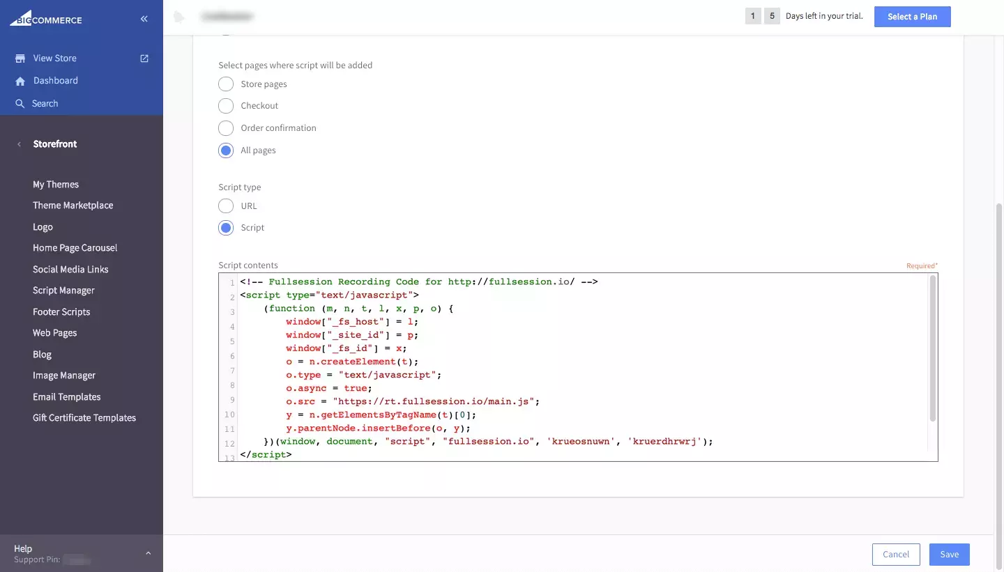
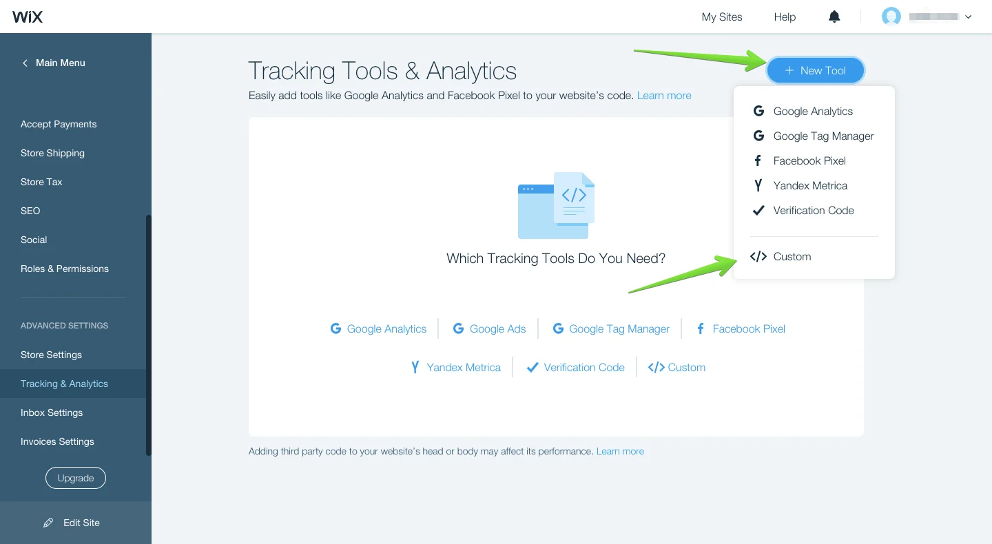
- Contentsquare
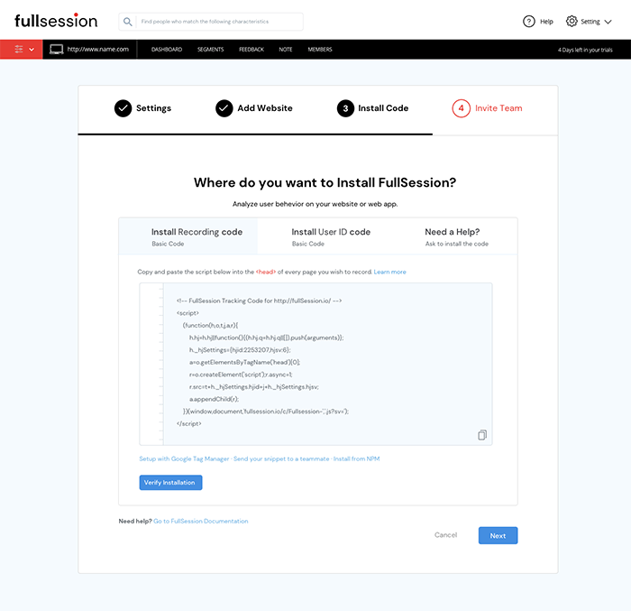
- FullSession
These tools help product teams, marketers, and UX researchers analyze how users interact with digital experiences.
A Practical Workflow for Behavioral Analysis
Experienced teams follow a simple investigation workflow.
Step 1: Identify the problem
Example: conversion rate drops from 8 percent to 5 percent.
Step 2: Analyze heatmaps
Heatmaps show heavy click activity on a product image instead of the CTA.
Step 3: Segment behavior
Mobile users show significantly lower engagement with the CTA.
Step 4: Review session recordings
Session replay shows users tapping the image expecting a demo.
Step 5: Implement improvement
Turning the image into a clickable demo video increases conversion rates to above 9 percent.
This workflow allows teams to move from observation to actionable insight quickly.
Privacy and Data Considerations
Behavior tracking should always respect user privacy.
Best practices include:
- masking sensitive form fields
- respecting consent requirements
- anonymizing user session recordings
- limiting data retention
Responsible data practices ensure behavioral insights remain ethical and compliant.
FAQ
What is the difference between heatmaps and session replay?
Heatmaps visualize aggregated interaction data across many users, such as clicks and scrolling behavior. Session replay records individual user sessions so teams can observe how visitors interact with pages and diagnose usability issues.
Are heatmaps better than session replay?
Neither tool is better. Heatmaps help identify engagement patterns across users, while session replay explains the behavior behind those patterns. Most product teams use both tools together.
When should you use session replay?
Session replay is best for diagnosing usability issues such as funnel drop-offs, rage clicks, form errors, and other user experience problems that require detailed observation.
Expert Perspective: When to Use Heatmaps vs Session Replay
Most experienced product teams use heatmaps and session replay together as part of a behavioral analysis workflow.
Heatmaps are typically used first to detect patterns across large groups of users. Once a pattern appears such as low CTA engagement or unexpected click behavior, session replay helps investigate the underlying cause.
This combination allows teams to move from pattern discovery to root cause diagnosis, which leads to more effective UX improvements and stronger conversion performance.
Key Takeaways
- Heatmaps reveal engagement patterns across large groups of users.
- Session replay explains the reasons behind individual user behavior.
- Combining both tools helps teams move from pattern detection to UX diagnosis.
- Segmenting behavior by device and traffic source significantly improves insights.
Conclusion
Understanding user behavior requires more than traditional analytics metrics.
Heatmaps provide a visual overview of engagement patterns across pages. Session replay reveals the detailed journey behind individual user interactions.
Together, these tools help teams uncover usability issues, improve digital experiences, and increase conversion performance.
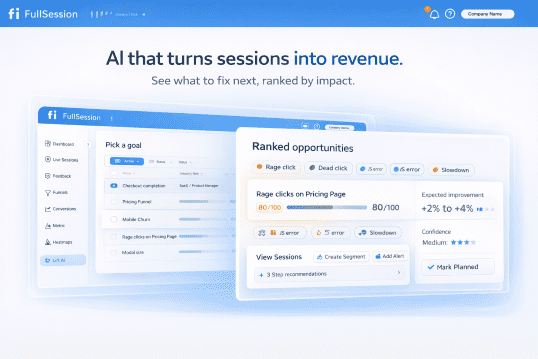
Platforms like FullSession combine heatmaps and session replay so teams can identify patterns, diagnose problems, and continuously improve their product experience based on real user behavior.

Roman Mohren is CEO of FullSession, a privacy-first UX analytics platform offering session replay, interactive heatmaps, conversion funnels, error insights, and in-app feedback. He directly leads Product, Sales, and Customer Success, owning the full customer journey from first touch to long-term outcomes. With 25+ years in B2B SaaS, spanning venture- and PE-backed startups, public software companies, and his own ventures, Roman has built and scaled revenue teams, designed go-to-market systems, and led organizations through every growth stage from first dollar to eight-figure ARR. He writes from hands-on operator experience about UX diagnosis, conversion optimization, user onboarding, and turning behavioral data into measurable business impact.