Category: Product analytics

  • How to Prioritize Product Roadmap Using Revenue Data

    How to Prioritize Product Roadmap Using Revenue Data

    Your backlog has 80 items in it. Sales wants three of them shipped yesterday. Engineering wants you to address technical debt before it causes an outage.

    Knowing how to prioritize product roadmap decisions means ranking features, fixes, and initiatives against a fixed amount of engineering capacity. You need a repeatable method instead of relying on whoever argued loudest in the meeting. The problem is that most product prioritization frameworks ask you to score “Confidence,” and most teams just guess at that number.

    This guide shows you what closes that gap. Real session, funnel, and revenue data turns a guess into evidence, so you can prioritize product features with something more solid than instinct.

    FullSession, our privacy-first user behavior analytics platform, is built around exactly that problem. We’ll cover how it helps you see what’s actually slowing your roadmap down.

    Key Takeaway

    • Most prioritization frameworks ask for a “Confidence” score that’s usually just a guess. RICE, in particular, breaks down the moment that number isn’t backed by real data.
    • Behavioral data (heatmaps, funnels, and session replay) turns that guess into evidence. Together they show what users actually do, not what they say they want, and reveal whether a feature is ignored or just badly placed.
    • You can put a real revenue number on a friction point. Multiply sessions by friction rate by the conversion gap by conversion value, and you get a figure leadership will actually act on.
    • Scoring is only half the job. Stakeholder alignment is the other half. Agree on criteria up front and attach a rationale to every roadmap item, so overrides become visible trade-offs instead of quiet reversals.
    • Technical debt competes for the same engineering hours as new features. Protect a fixed share of every release, around 20%, so it doesn’t quietly disappear from the roadmap.

    FullSession closes that gap with session replay, heatmaps, funnels, and Lift AI all connected in one place, so every score is backed by real data instead of opinion. That gives stakeholders a shared, evidence-based view of the roadmap that holds up when priorities get challenged later.

    Why Feature Prioritization Matters in PLG
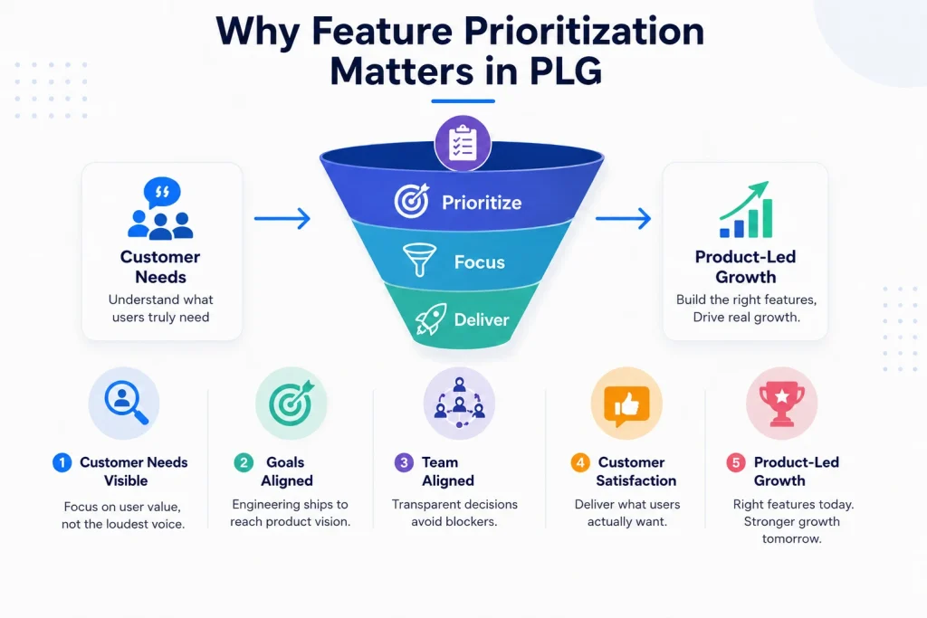
    Infographic explaining why feature prioritization matters in product-led growth, showing customer needs, goals, team alignment, satisfaction, and growth.

    Feature prioritization is the discipline of ranking what to build next against the engineering capacity you actually have, not the capacity you wish you had. Get it wrong and you lose focus fast.

    In a product-led growth (PLG) company, your product is your sales funnel. A poorly prioritized roadmap slows signups, activation, and expansion revenue all at once. That’s exactly why you need a clear way to prioritize your product roadmap before that happens.

    A prioritization framework fixes this by giving everyone, including your product managers, a shared language for “why this and not that.” Here’s what it actually protects:

    • Customer needs stay visible instead of getting buried under whoever’s loudest that week
    • Strategic goals stay connected to what engineering actually ships, and product teams stop drifting from their product vision
    • Team alignment improves because everyone can see the same decision-making process, which keeps cross-functional team’s workflows from stalling on second-guessed decisions
    • Customer satisfaction rises because effort goes toward what users actually feel

    A framework built to improve customer satisfaction beats one built to please the stakeholders. It’s a communication tool as much as a ranking method.

    When you can point to a number instead of a feeling, fewer decisions get argued again in the next meeting.

    Collecting Inputs: Feature Requests, Feedback, and Opportunities

    Every roadmap starts with raw input. The quality of that input determines the quality of everything you build on top of it.

    Treat customer feedback as informative, not prescriptive. Customers are experts in their own problems, not your solution.

    Common sources worth pulling into one place before you score anything:

    • Direct feature requests submitted through in-app forms or a user story backlog
    • Sales team escalations, weighed against your broader business objectives
    • Support requests, which often reveal specific features that are quietly broken or confusing
    • Internal strategic bets nobody asked for, but the business needs anyway

    Why context matters more than the request itself
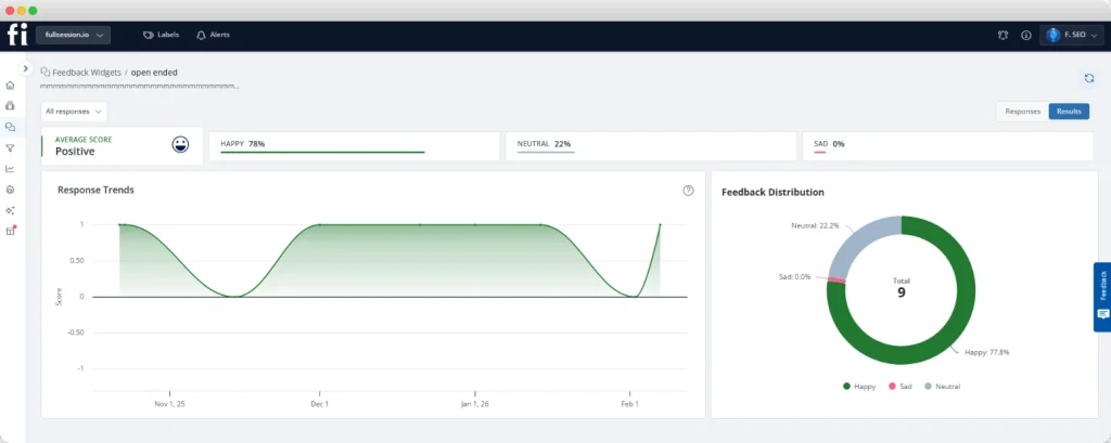
    A feature request on its own only tells you what someone wants. It doesn’t tell you what they were doing, where they got stuck, or how many other users hit the same wall right before they asked.

    FullSession’s in-app feedback feature closes that gap by capturing the request alongside the session it came from. You see the exact moment a user got frustrated enough to say something, not just the comment they left.

    That context turns a vague request into something you can actually score. Instead of guessing how widespread a problem is, you can check.

    Opportunity scoring is exactly where this earns its place. Ask users to rate how important potential features are to them, then how satisfied they are with your current solution.

    A feature rated high on importance and low on satisfaction is your biggest opportunity, full stop. That gap is what separates relevant features from ones that just sound nice.

    Without a consistent intake process, your backlog turns reactive. You end up firefighting whatever happened most recently instead of being able to prioritize initiatives that actually deliver customer value.

    That’s just another way of failing to prioritize spending resources where they matter most, and it’s exactly what a healthy product backlog is supposed to prevent.

    Using UX and Behavioral Data: Session Replays, Heatmaps, and Funnels
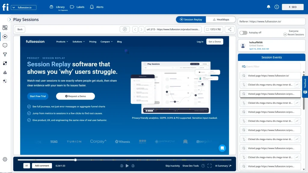
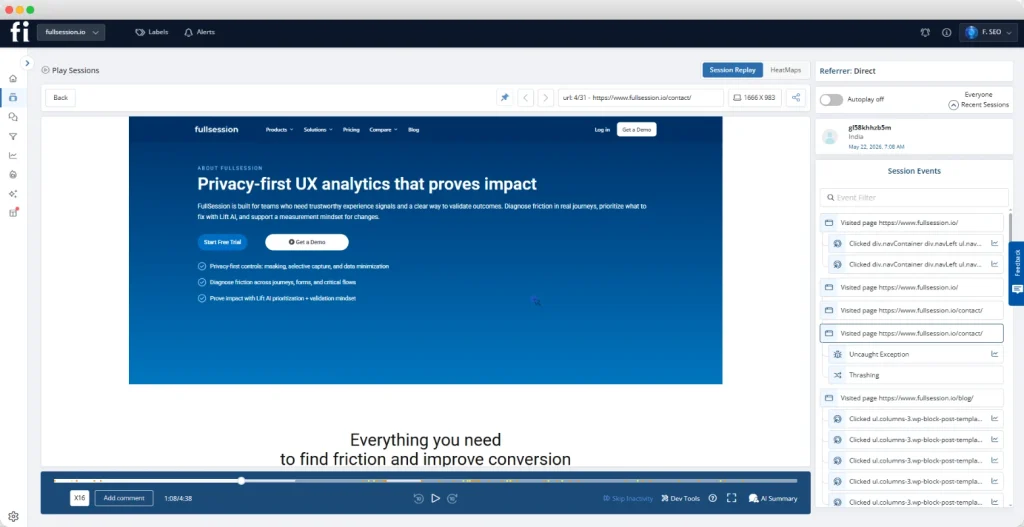
    FullSession session replay dashboard showing website session playback, session events, heatmap tab, referrer field, and replay timeline controls.

    Behavioral data answers a question customer feedback alone cannot. It shows you what users are actually doing, not what they say they’re doing.

    This is customer data in its most honest form. FullSession combines four signals in one place to deliver it:

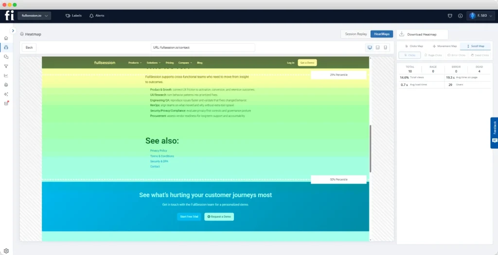
    1. Interactive heatmaps show where attention concentrates on a page. FullSession’s click, scroll, and movement heatmaps reveal a core feature sitting in a dead zone, ignored because of bad placement, not because nobody wants it.
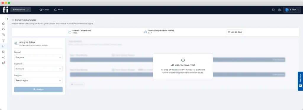
    2. Funnels and conversions show where users abandon a flow. FullSession maps the exact step losing the most user base, step by step.
    3. Session replay confirms the cause. FullSession’s session replay lets you watch the real session and see the rage click or confused scroll behind the drop, instead of session replay alone leaving you guessing.
    4. Errors and alerts catch what the other three signals can miss entirely. A broken checkout button doesn’t show up as “friction,” it shows up as a JavaScript error, and FullSession flags it before it quietly tanks a conversion rate you’re about to build a roadmap item around.

    Most analytics tools make you stitch these three signals together yourself, across three different dashboards. FullSession keeps them connected.

    The practical workflow takes minutes instead of days: spot the pattern in a heatmap, confirm the gap in funnel data, validate the cause in session replay, all without switching tools.

    This same combination doubles as a feature-adoption check before you build anything new. If a heatmap shows a core feature sitting unclicked, and the funnel shows users dropping off right before they’d reach it, your next roadmap priority is fixing that existing workflow.

    Don’t build something else on top of a broken one.

    Turning friction into a revenue number

    You can turn that confirmed problem into a number leadership will act on:

    Formula ComponentWhat It Measures
    SessionsUsers who reach the step
    Friction rateShare showing the friction pattern
    Conversion gapDifference vs. non-friction sessions
    Conversion valueRevenue per converted action

    Multiply all four together and you get an estimated revenue figure tied to one specific step. That’s exactly how you’d quantify revenue loss from friction heatmaps in a pure conversion context.

    It’s also what should feed the Confidence variable in a framework like the RICE scoring model, instead of a guess.

    Querying your data without switching tools
    FullSession blog image showing a team reviewing charts with the title How to Prioritize Product Roadmap Using Revenue Data.

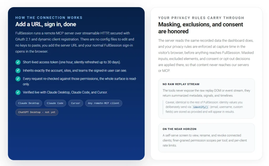
    You don’t have to open a dashboard to get an answer out of this data. FullSession’s MCP Server connects your behavioral data directly to your AI assistant, so you can ask a question and get a straight answer instead of digging through heatmaps and funnels yourself.

    That matters most when you’re mid-conversation with a stakeholder and need the number now, not after you’ve opened three separate tools.

    Not Ready for a Demo? See Your Own Data First.

    Start a free trial and watch how FullSession shows ranked opportunities from your own sessions and funnels.

    Organizing and Scoring Features with a Prioritization Framework

    MoA prioritization framework gives your team a repeatable process for comparing wildly different ideas on the same scale. Without one, you’re comparing a backend performance fix to a new onboarding flow using nothing but instinct.

    RICE Scoring Model

    RICE was developed at Intercom. It scores each idea on four variables:

    • Reach: how many customers this touches in a given period
    • Impact: how much it moves the needle for each one
    • Confidence: how sure you are about the first two numbers
    • Effort score: how many person-months it will take to build

    Multiply Reach by Impact by Confidence, then divide by that last number. You get the highest business value item at the top of your list.

    RICE works best for teams with at least some usage data to ground Reach and Impact in real numbers. Its core weakness is the confidence score: most teams set it from gut feel, which quietly poisons the whole score.

    Kano Model

    The Kano Model sorts features by how they affect customer satisfaction, not by how loudly customers ask for them:

    • Essential features: the baseline. Skip them and customers stay dissatisfied no matter what else you build.
    • Performance features: create a direct, linear bump in satisfaction the better you build them.
    • Delight features: the unexpected ones that delight customers and build real loyalty, things nobody demanded but everyone loves once they see them.

    Kano works best with direct customer input, usually a short survey. It says nothing about effort or cost, so pair it with something else before scheduling the work.

    MoSCoW and the dynamic systems development method

    MoSCoW sorts every initiative into one of four buckets: Must have, Should have, Could have, and Won’t have. It traces back to the dynamic systems development method, an agile delivery framework tied to a fixed release date.

    It’s best for fast, defensible communication with stakeholders about what’s shipping next. Its limitation shows up the moment two items both land in “Must have”: MoSCoW won’t tell you which goes first.

    Value vs. Effort

    Value vs. Effort plots every initiative on two axes: value against the effort required to build it. Quick wins sit in the high-value, low-effort quadrant, and that’s where you start, since an item with high-value and low effort beats waiting on a bigger bet.

    FrameworkBest ForLimitation
    RICETeams with usage dataConfidence is often a guess
    KanoCustomer satisfaction and delightIgnores effort and cost
    MoSCoWFast, fixed-release communicationNo order within “Must have”
    Value vs. EffortQuick visual triageCan sideline high-effort wins

    Pick whichever framework fits your team. None of them replace real evidence.

    Closing the confidence gap with Lift AI
    The right prioritization framework is only as good as the confidence score you feed it, and that’s exactly the gap FullSession is built to close.

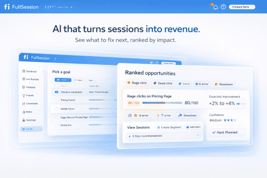
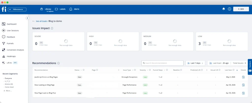
    FullSession’s Lift AI starts with a goal you set, like checkout completion or signup conversion, then scans your sessions, funnels, and frustration signals for friction tied to that goal. Instead of you guessing which fix matters most, Lift AI hands you a ranked list of opportunities, each with a confidence score and the actual sessions that back it up.

    That’s the part most tools skip. You’re not assigning the confidence score by feel anymore, you’re reading one Lift AI already calculated from real behavior.

    Lift AI doesn’t stop at the recommendation either. Once you ship a fix, you measure the result against a before-and-after window or a holdout experiment, so you know whether the prediction actually held up before you move on to the next item on your roadmap.

    You can also skip the dashboard hunt with FullSession’s MCP Server. It connects directly to your AI assistant and answers plain questions like “what’s the top error causing mobile drop-off this week” using real session data.

    See Your Own Confidence Gap, Not a Demo Script

    Stop guessing which fix matters most. Get a ranked list built from your own sessions and funnels.

    Aligning Stakeholders, Teams, and Product Roadmaps

    Stakeholder alignment is what happens after scoring ends and the real arguing starts, especially across cross-functional teams who each see the roadmap differently. Treat your framework’s output as a strong starting position, not a verdict nobody can question, because priorities will shift no matter what.

    A few habits keep teams on the same page instead of relitigating decisions every quarter:

    • Agree on scoring criteria with key stakeholders before you score a single feature
    • Attach a one-line rationale to every roadmap item so an override becomes a named trade-off, not a quiet reversal
    • Use FullSession’s Feedback widgets to link a stakeholder’s “but a customer asked for this” directly to that customer’s actual session and behavioral history
    • Trace every feature back to stated strategic objectives, so disconnected requests are easy to spot

    When everyone can see the same rationale, setting priorities stops being personal. It becomes a process the whole product development organization trusts.

    Planning Releases and Executing on Priorities

    Releases turn a scored list into a shipped roadmap, grouped by theme, dependency, or stage in your product’s lifecycle. A ranked backlog isn’t a release plan yet. It’s an input to one.

    Technical debt competes for the exact same engineering hours as new features. A few rules keep that competition from quietly losing the roadmap:

    1. Protect a fixed share of every release, around 20%, for debt and essential performance work so it never silently disappears
    2. Separate severity from noise using error tracking. FullSession’s errors and alerts engine ties JavaScript errors and broken flows directly to session replays, so a conversion blocker doesn’t get treated the same as a glitch
    3. Ship the smallest version first. Prove the assumption before expanding further, the same minimum viable product thinking that applies before launch still applies after it
    4. Watch the launch closely. Filter session replay to just the users touching your new feature and you’ll spot usability flaws within days, before more technical debt has a chance to pile up unnoticed

    This same approach is exactly how a first-week activation playbook gets built for brand new SaaS users.

    Tools, Templates, and Data Sources to Support Decisions

    Most product managers run the entire process through a combination of a scoring template and the data sources covered above. That might be a shared spreadsheet or dedicated software.

    The tool matters less than whether the team actually trusts it. A short checklist worth keeping visible:

    • A shared scoring template everyone can see and edit, not one person’s private document
    • Behavioral data feeding confidence scores instead of gut feel
    • A documented rationale attached to every roadmap item before it ships
    • Market research and competitive context alongside internal data, since matching a category standard for competitive differentiation sometimes matters as much as a RICE score
    • Development efforts logged against a measurable key result, so agile teams can tell whether the work actually moved customer delight, not just shipped on time
    • A regular cadence for revisiting priorities as new key performance indicators come in

    A winning product roadmap isn’t built by chasing every request or by building products faster than you can validate them. It’s a repeatable process designed to eliminate wasteful practices, keep customers happy, and earn the whole team’s trust, sprint after sprint, instead of reinventing the argument every cycle.

    Conclusion on How to Prioritize Product Roadmap

    Prioritizing a product roadmap works best as one connected process. Gather real inputs and ground your scoring in behavioral and revenue data instead of gut feel.

    Apply a framework everyone agrees on in advance. Align teams before priorities change without warning.

    The confidence score in any framework you choose is only as honest as the data sitting behind it. FullSession closes that gap end to end: session replay, heatmaps, funnels, and errors and alerts surface the real friction, Lift AI ranks it by predicted revenue impact, and the MCP Server lets you query all of it without opening a single dashboard.

    See Your Roadmap Decisions Backed by Real Data

    Stop scoring confidence by guesswork. Get a ranked, evidence-backed view of what to fix next.

    FAQs on How to Prioritize Product Roadmap

    How do you prioritize features on a roadmap?

    Collect inputs from customer feedback, behavioral data, and internal strategy, then score each item against a consistent framework like RICE or Kano. Ground your scores in real usage and funnel data instead of opinion. Align stakeholders around the ranked result before locking it into a release plan for informed decisions.

    What is roadmap prioritization?

    Roadmap prioritization is the process of ranking features, fixes, and initiatives against your available engineering capacity and business goals. It determines what gets built now, what waits, and what gets dropped entirely. Done well, target key results stay tied to what’s actually getting shipped.

    How to decide product roadmap?

    Decide your roadmap by combining customer value, business impact, and technical feasibility into one scoring framework. Validate the inputs with real usage or revenue data wherever possible. The goal isn’t a perfect score, just that the ranking is defensible and visible to everyone involved.

    What is the rule of 3 prioritization?

    The rule of 3 isn’t a formal product management framework like RICE or MoSCoW. It’s a general productivity habit: limit your active priorities to three at a time, in any given week or planning cycle, to force genuine focus instead of spreading effort across everything at once.

  • Web Analytics for Product-Led Growth Companies: Boost Signups in 2026

    Web Analytics for Product-Led Growth Companies: Boost Signups in 2026

    Your product is your sales team in a self-serve model. But that only works if you can see exactly what it’s doing. Web analytics for product-led growth companies tracks the behavioral signals that determine whether a free user converts, stays, or disappears without filing a single complaint.

    Unlike traditional SaaS companies that rely on sales-assisted funnels, product-led growth companies need a different measurement stack.

    This article covers the key PLG metrics, a complete seven-part analytics framework, and the tools that connect quantitative funnel data to qualitative user behavior so your growth strategy is built on evidence.

    Key Takeaway

    • Web analytics for product-led growth companies is not about tracking traffic. It is about tracking in-product behavior signals that predict whether a free user will convert, stay, or churn silently without ever contacting support.
    • The seven PLG analytics categories (acquisition, activation, retention, UX reliability, funnel analysis, experimentation, and PQL scoring) must work as a connected system, not in isolation. Tracking one metric without the others produces noise, not decisions.
    • Time-to-value is the single highest-leverage metric in a PLG model. Users who don’t reach their Aha moment within minutes rarely convert, making onboarding optimization the fastest path to improving free trial conversion rate.
    • Product qualified leads change the economics of conversion entirely. Instead of chasing every free user with outreach, your sales team focuses only on accounts that have already demonstrated intent through in-product behavior. It means fewer wasted sales calls, shorter deal cycles, and a pipeline that’s filtered by evidence rather than gut feeling.
    • Silent bugs and UX friction are invisible revenue killers in self-serve models. Because users leave without filing tickets, only real-time error tracking paired with session replay can catch and fix conversion-blocking issues before they suppress an entire cohort.

    FullSession brings all seven PLG analytics categories into a single workspace, connecting the funnel drop-off numbers you can see to the actual user behavior behind them.

    Session replay, heatmaps, feedback widgets, funnel tracking, error alerts, mobile replay, and Lift AI work together rather than as disconnected point solutions.

    That means your product and growth teams spend less time switching tools and more time shipping fixes that move conversion.

    What Is Web Analytics for Product-LED Growth?

    Web analytics for product-led growth measures in-product user behavior, not just traffic, to drive customer acquisition, activation, retention, and expansion without a traditional sales-led growth strategy.

    In a sales-led growth model, a sales rep qualifies potential customers, runs sales calls, and closes deals. In a product-led growth model, the product does that work. New users sign up, explore the product on a free plan or free trial, and convert to paying customers based on the value they experience, with minimal human intervention.

    That shift in business model creates a measurement problem. Standard analytics tools track pageviews, sessions, and bounce rate. They don’t tell you whether a new user understood your core feature, reached their first value moment, or hit an error that quietly broke the upgrade flow.

    Most businesses running a PLG strategy discover this gap too late, after churn has already happened.

    The self-serve signal problem

    Without a sales rep in the loop, every user action is either a conversion signal or a churn signal. Existing users who don’t reach their “Aha moment” abandon the app forever. Most PLG companies never find out why, because self-serve users don’t open support tickets. They simply leave.

    The goal of web analytics for product led growth companies is to make every one of those signals visible, interpretable, and actionable before the user is gone.

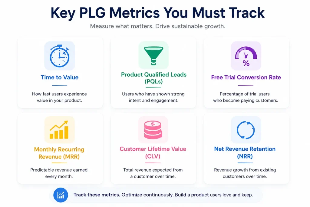
    Key PLG Metrics You Must Track

    Infographic showing key PLG metrics including time to value, product qualified leads, free trial conversion rate, monthly recurring revenue, customer lifetime value, and net revenue retention.

    Onboarding completion and activation are not the same thing. These are leading indicators of revenue, not vanity metrics. Tracking metrics in isolation produces noise. Tracking them as a connected system within your product led growth strategy produces decisions.

    Acquisition and activation metrics

    Time to value (also called Time-to-First-Value) measures how quickly a new user reaches their first meaningful outcome. In a freemium model or free trial, users who don’t hit that moment within minutes are unlikely to convert. Faster time to value is the most direct lever a PLG team controls.

    Product qualified leads (PQLs) are free users who’ve demonstrated enough in-product behavior to signal purchase intent. Examples include:

    • Hitting a usage threshold
    • Inviting a teammate
    • Returning repeatedly to a premium feature

    Free trial conversion rate measures the percentage of free users who become paying customers. The overall benchmark is 9% across all PLG model types, according to ProductLed’s 2025 PLG Benchmark covering 600+ SaaS companies. If you’re sitting well below that, the gap is almost always in onboarding, not the product itself.

    Retention and expansion metrics

    Monthly recurring revenue (MRR) and expansion revenue are the compound growth engine of the PLG model. The pirate metrics framework (Acquisition, Activation, Retention, Referral, Revenue) maps directly to the PLG customer lifecycle. In a healthy PLG motion, expansion MRR from existing customers eventually exceeds new MRR from customer acquisition alone.

    Customer lifetime value relative to customer acquisition cost (LTV:CAC) determines whether the product led growth model is economically sustainable. In a sales-led model, acquiring each customer requires significant investment in sales rep time, outbound outreach, and demo cycles before a deal closes.

    PLG short-circuits that process by letting the product qualify, educate, and convert users on its own, which means the cost of acquiring each paying customer shrinks as the self-serve motion matures. That’s one of the clearest paths to lower customer acquisition costs at scale.

    Net Revenue Retention (NRR) above 120% signals that existing customers are expanding faster than churning (SaaSMag). That’s the defining characteristic of sustainable revenue growth in successful PLG strategies.

    The Complete PLG Analytics Framework

    Knowing what to measure is only half the job. Understanding how each analytics category connects to revenue is what separates PLG companies that achieve growth from those that stall. This framework covers the full customer lifecycle from acquisition to expansion.

    1. Acquisition

    Acquisition analytics tracks self-serve traffic sources, signup volumes, and attribution models to answer one question: which channels bring in users who actually convert?

    Unlike a sales-led growth strategy where the marketing team hands leads to sales teams, PLG acquisition lives entirely in product signals. Key things to track:

    • Signup source by channel
    • Organic growth rates
    • Word of mouth referrals as measurable events, not as soft brand sentiment

    2. Activation and conversion

    Activation is where most product-led growth companies win or lose. This category covers time to value, Aha moment identification, and onboarding completion rates.

    Active users who complete onboarding within their first session convert at dramatically higher rates. The user journey from signup to first value is the single highest-leverage area for product management to optimize.

    Faster time to value directly lowers customer acquisition cost by reducing the trial length needed before conversion.

    3. Retention and expansion

    Retention analytics tracks cohort behavior over time: which users return, which features drive long-term product usage, and how expansion revenue and average revenue per account build from the existing customer base.

    Customer success teams use product led growth metrics like feature adoption rate and cohort retention curves to identify accounts at risk before churn occurs.

    When users discover and regularly use multiple features, churn probability drops and expansion revenue potential increases. Satisfied customers who embed the product into their workflow become the primary driver of word of mouth referrals and viral growth in a product-led strategy.

    4. Product UX and reliability

    In a self-service model, friction points and bugs are silent revenue killers. A broken onboarding step, a UI element users can’t find, or a JavaScript error on the upgrade page will cause a free user to leave without ever filing a complaint.

    This category covers:

    For software companies running PLG, a single recurring bug on a conversion-critical page can suppress free trial conversion rate across an entire cohort, often without appearing in any dashboard.

    5. Funnel and behavioral analysis

    Funnel analytics measures drop-off at every step of the PLG conversion path, from website visit through signup, onboarding, paywall click, and payment. Behavioral analysis adds the user journey context that explains why each drop-off happened.

    The most actionable PLG funnel work happens when quantitative drop-off data is paired directly with session replays of the users who exited at that step. Drop-off percentages identify the problem. User behavior recordings diagnose it.

    6. Experimentation and growth strategy

    Product-led growth examples from companies like Slack, Figma, and Notion share one characteristic: continuous experimentation. A functioning PLG strategy involves constant testing across:

    • Onboarding flow variations
    • Feature release sequences
    • Pricing tests
    • Free plan scope adjustments

    The discipline is validating experiments against behavioral outcomes, not just conversion rate lifts. A test that improves paid conversion rates in week one but reduces user satisfaction by week four is a negative result, even if the headline number looks positive.

    7. PQLs, scoring, and routing

    Product qualified leads represent the bridge between product analytics and revenue. PQL scoring assigns a conversion likelihood to free users based on in-product behavior signals:

    • Feature usage frequency
    • Session depth
    • Team invitations sent
    • Paywall interactions

    When a free user crosses the PQL threshold, they can be routed to sales teams for targeted outreach, or triggered into an automated upgrade prompt.

    Most PLG companies running a hybrid go to market strategy use PQL scoring to determine when to involve a sales rep and when to let the product close the deal. This model dramatically reduces the volume of sales calls required to retain users and convert potential customers.

    Tracking all seven of these analytics categories in practice requires tooling that connects behavioral data, session-level evidence, and automated prioritization in one place. Most PLG teams struggle not because they lack data, but because that data lives across separate tools that don’t talk to each other.

    FullSession is built specifically to close that gap, giving product teams and growth teams a single workspace where funnel numbers, user behavior recordings, and AI-assisted prioritization all point to the same answer: what to fix next, and why it matters for revenue.

    Using FullSession for PLG Analytics and UX Insights

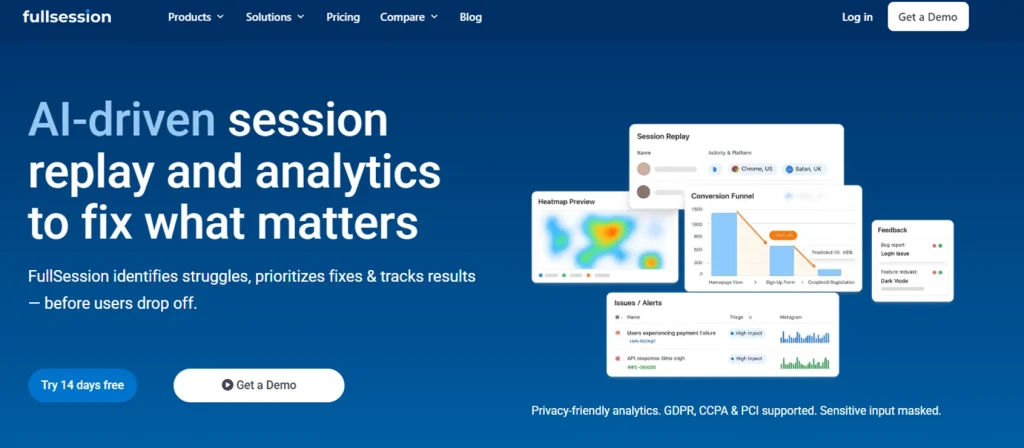
    AI Driven Session Replay Product Analytics FullSession

    FullSession is a behavior analytics platform built for product led companies that need to connect funnel data, qualitative user behavior, and automated prioritization in one place. Here’s how each feature maps to a specific PLG growth function.

    1. Session replay: validating time to value

    Session replay in a PLG context isn’t about watching random users browse. It’s about watching the onboarding sessions of free users who signed up but never completed their first key action.

    FullSession’s session replay captures pixel-perfect playbacks of individual user journeys. Growth teams filter by cohort (for example: “signed up in the last 7 days, never completed first action”) and watch exactly where those users hesitated, misread a UI prompt, or gave up.

    Instead of guessing why activation stalled, product teams see visual proof and fix the onboarding friction immediately.

    2. Interactive heatmaps: auditing feature discovery

    FullSession heatmap dashboard showing user scroll behavior and engagement tracking on a website

    PLG companies rely on users discovering premium features naturally to trigger upgrades. If a high-value feature sits in a visual dead zone on the dashboard, most trial users will never find it.

    FullSession’s interactive heatmaps visualize clicks, scroll depth, and engagement overlays across sessions.

    Segmenting heatmaps by trial-user cohort versus paying-user cohort reveals the feature discovery gap: where free users stop versus where paying users engage most.

    UX designers use that data to restructure layouts and drive feature adoption.

    3. Feedback widgets and surveys: capturing qualitative feedback

    PLG minimizes human touchpoints, so growth teams rarely get to ask users directly why they’re leaving. FullSession’s in-app feedback captures user sentiment at the exact moment of friction.

    Every piece of qualitative feedback is linked directly to that user’s session replay. When someone submits “This doesn’t work,” the product team watches the exact playback of what happened.

    No back-and-forth. No guesswork. Just the visual proof behind the complaint.

    4. Funnel tracking: finding the trial-to-paid leak

    Screenshot of FullSession funnel tracking dashboard showing conversion analysis, completed funnel users, and drop-off insights.

    PLG teams live and die by conversion funnels. Funnel analysis in FullSession highlights which step in the free-to-paid journey has the steepest drop-off: Signup, Onboarding, First Key Action, Paywall, or Payment.

    Teams can click directly into a leaking funnel step and instantly watch session replays of the users who dropped off at that exact point. Quantitative data identifies the leak. Session replay diagnoses it.

    5. Error tracking: protecting revenue from silent bugs

    error tracking alerts

    If a JavaScript error breaks the “Upgrade Plan” button, a self-serve user won’t file a ticket. They’ll leave.

    FullSession’s errors and alerts track frontend and backend issues in real time, alerting engineering before a bug causes mass trial churn. It pairs the code stack trace with the session replay of the affected user, so QA teams can reproduce and patch conversion-blocking bugs in minutes.

    6. Mobile session replay: closing the cross-device gap

    Many B2B and B2C SaaS users sign up on desktop but manage tasks on mobile. A broken mobile experience causes drop-off during multi-device usage cycles that most product-led companies never detect in standard funnel data.

    FullSession’s mobile session replay captures taps, pinches, swipes, and responsive layout breakage, closing the visibility gap between what works in a desktop demo and what users actually experience on the go.

    7. Lift AI: eliminating analysis paralysis

    PLG platforms generate thousands of user sessions daily. No team can watch them all. Analysis paralysis is one of the most common failure modes in PLG analytics programs.

    Lift AI scans those sessions based on a stated growth goal (for example: “Visitor-to-Signup” or “Paywall Completion”) and outputs a ranked list of friction opportunities sorted by estimated revenue impact.

    Product managers know exactly what to fix next to yield the highest upgrade conversion, without manually triaging replays.

    See Where Your Trial Users Are Dropping Off

    FullSession shows you exactly where trial users abandon your product, so you can fix friction points and boost conversions without any setup calls.

    Attribution, Experimentation & Growth Loops

    • Multi-touch attribution shows which channels drive real outcomes, not just signups. Track how users move from first touch to activation, PQL, and paid conversion.
    • Avoid last-click bias. A blog post, ad, and referral may all contribute to one conversion. Measure the full path.
    • A/B test onboarding first. Small changes in onboarding steps, UI prompts, or feature order can significantly improve time to value and conversion rates.
    • Measure long-term impact. A test is only successful if it improves retention and expansion, not just short-term upgrades.
    • Track growth loops. Monitor invite flows, referrals, and collaboration features that bring in new users. Focus on loop completion rate and speed.

    Governance, Privacy & Cross-Functional Alignment

    • PLG analytics must comply with GDPR, CCPA, and PCI DSS where relevant. This includes proper consent handling and secure data storage.
    • Use data masking to protect sensitive information. Automatically hide PII, passwords, and payment details in session replays.
    • Keep one source of truth. Product, marketing, growth, and engineering teams should work from the same data and definitions.
    • Align teams around shared metrics like activation, retention, and PQLs to avoid conflicting priorities.

    FullSession includes built-in privacy and security features such as data masking, consent controls, secure data handling, and compliance-ready infrastructure to help you stay compliant while analyzing user behavior.

    Turn Product Insights Into Growth

    Analyze user behavior, find friction, and align your teams with privacy-first session replay and product analytics built for PLG companies.

    PLG Analytics Roadmap to Reduce CAC and Increase LTV

    Turning product analytics into lower customer acquisition costs and higher customer lifetime value requires a sequenced approach, not a wishlist of tracking metrics. Follow these four steps in order.

    • Automate prioritization and iterate weekly. Use AI-assisted scoring to rank friction opportunities by estimated revenue impact. Ship the highest-ranked fix, measure before/after, and repeat. Rapid growth in a product-led strategy is a weekly iteration loop, not a quarterly planning event.
    • Instrument your PLG funnel. Define every funnel step, set conversion events, and baseline your current time to value and drop-off rate per step. Without a baseline, improvement is invisible.
    • Connect quantitative drop-off to qualitative behavior. For each leaking funnel step, watch session replays from users who exited there. Identify the specific friction pattern (confusion, error, dead end) before designing any fix.
    • Score and route PQLs. Define your PQL threshold based on in-product behavior signals and route high-scoring free users into upgrade prompts or sales team outreach automatically.

    Conclusion About Web Analytics for Product LED Growth Companies

    Your analytics stack needs to answer questions standard web analytics tools weren’t built for. Where do free users stall before reaching value? Which onboarding step is leaking the most revenue? Which bug is quietly suppressing upgrades this week?

    The PLG analytics framework spanning acquisition, activation, retention, UX reliability, funnel analysis, experimentation, and PQL scoring gives product teams and growth teams a complete view of the customer lifecycle. Acting on it consistently is what turns a product led strategy into sustainable, compounding revenue.

    FullSession brings these signals together in one place, so teams can move from guessing to seeing the exact friction points behind drop-offs, low activation, and missed upgrades. That makes it easier to fix the right issue faster and keep growth decisions grounded in real user behavior.

    See Where Trial Users Drop Off and Fix It Faster

    FullSession shows you exactly where trial users abandon your product, so you can fix friction points and boost conversions.

    FAQs About Web Analytics for Product LED Growth Companies

    What is the difference between product analytics and growth analytics?

    Product analytics measures in-product user behavior: how active users interact with features, where they activate, and where they churn. Growth analytics broadens the lens to include customer acquisition channels, referral loops, and the full customer journey from first touch to expansion revenue. In PLG companies, both disciplines overlap because the product is the primary driver of acquisition and growth.

    What is the PLG methodology?

    The product-led growth (PLG) methodology is a go-to-market strategy where the product itself drives customer acquisition, activation, retention, and expansion without a sales team handling early-stage conversion. Users discover the product, experience its value through a free trial or freemium model, and convert to paying customers based on that value alone. Sales teams get involved only for high-value accounts.

    What are examples of web analytics?

    Web analytics examples for product-led growth companies include:

    • Funnel conversion tracking (measuring drop-off from signup to first key action)
    • Session replay (recording user journeys to identify UX friction)
    • Heatmaps (visualizing clicks and scroll depth)
    • Error tracking (detecting bugs that block conversions)
    • In-app surveys that capture user feedback at friction points

    FullSession provides all these features in one, user-friendly platform.

    What is product-led SEO?

    Product-led SEO is a growth strategy where a product’s core functionality generates indexable, user-created pages at scale, turning the product into an organic growth engine. Figma’s shareable design files and Notion’s public page templates are widely cited product led growth examples. It differs from traditional sales or content-led approaches by making user generated content the acquisition mechanism.

    How do PLG companies measure success?

    PLG companies measure success through activation rate, time to value, free trial conversion rate, expansion revenue from existing customers upgrading, and net revenue retention above 120%. That NRR threshold signals organic growth from the existing customer base, which is the foundation of a self service business model that lowers customer acquisition cost over time.

  • Introducing Lift AI: Stop Guessing What to Fix Next

    Introducing Lift AI: Stop Guessing What to Fix Next

    Every product team has the same dirty secret: they collect more behavioral data than they can act on.

    Session replays pile up unwatched. Heatmaps confirm what everyone already suspected. Funnels show where users drop off, but not why, and definitely not what to do about it. The real bottleneck was never data collection. It’s prioritization.

    That’s why we built Lift AI.

    Most analytics tools are excellent at telling you what happened. A smaller number can tell you why. Almost none can tell you what to do next, ranked by business impact, with evidence attached.

    This is the gap where teams lose weeks. The PM pulls data one way. The designer interprets it another. Engineering asks for clearer requirements. Growth wants revenue attribution. Alignment meetings multiply. Meanwhile, users keep dropping off at the same checkout step.

    We’ve heard this pattern from dozens of teams. It’s not a data problem. It’s a decision problem.

    Lift AI sits on top of FullSession’s behavioral data layer (session replays, heatmaps, funnels, error tracking) and transforms raw signals into a prioritized action plan.

    Here’s the workflow:

    1. Set a goal

    Choose the business outcome you’re optimizing for: Checkout completion, Revenue per visitor, Visitor-to-Signup, or any custom funnel goal. This anchors every recommendation to revenue.

    2. Lift AI determines the attribution window

    The system automatically selects the optimal lookback and forward analysis window based on your funnel metrics. No manual configuration required.

    3. Get ranked opportunities

    Lift AI analyzes friction, failures, and slowdowns across real sessions. It surfaces a ranked list of opportunities, each with an expected improvement estimate, confidence score, the specific funnel step it impacts, affected pages, and links to example sessions as proof.

    That’s it. No dashboards to configure. No segments to build first. No analyst required to interpret the output.

    A lot of analytics tools have started bolting on AI features that generate text summaries of your data. These read well but rarely change behavior. They describe what you’re already looking at in slightly different words.

    Lift AI is different in three ways:

    1. Goal-anchored, not dashboard-anchored

    Every recommendation ties back to the specific business outcome you selected. Lift AI doesn’t summarize your heatmap. It tells you which friction point, if resolved, would have the largest estimated effect on your chosen goal.

    2. Evidence-backed, not vibes-based

    Each opportunity includes the funnel step it affects, the pages involved, and direct links to session replays where the problem manifests. Your team can verify the recommendation before committing engineering time.

    3. Confidence-scored, not binary

    Not all opportunities are created equal. Lift AI provides a predicated lift impact and when you implemented a recommendation and the post window is complete, it also provides the actual lift. Just be careful not to do lots of changes within the testing timeframe, or the actual lift calculation will be flawed.

    Lift AI is designed for teams responsible for revenue-critical user journeys:

    • Ecommerce and DTC teams focused on checkout completion and basket value.
    • PLG SaaS teams optimizing signup-to-paid conversion and onboarding activation.
    • Growth and Product teams who need a shared, goal-based opportunity list instead of scattered insights across tools.
    • UX, Engineering, and Analytics teams who want to see exactly where technical and experience issues hurt revenue, with sessions attached.

    We’re transparent about what Lift AI is and isn’t. It provides estimates, not guarantees. The recommended workflow is straightforward:

    1. Review the recommendation and its linked evidence (sessions, impacted steps, affected pages).
    2. Ship the fix (UX, copy, flow, or technical) and let Lift AI know you completed the recommended action.
    3. Measure impact using a pre/post comparison.

    Your measurement is always the source of truth.

    Lift AI is available now as a beta feature for all FullSession users. Start a free trial to see it in action, or book a demo if you want a guided walkthrough of how it applies to your specific funnels.

    We built this because we believe the next generation of analytics isn’t about more data. It’s about better decisions. Lift AI is our first step toward that.

  • Product engagement metrics: how to choose, define, and validate the metrics that matter

    Product engagement metrics: how to choose, define, and validate the metrics that matter

    Quick takeaway

    If you want product engagement metrics that actually predict retention, pick a core action, define “active” precisely, then track a small set across frequency, depth, and return behavior. Validate each metric against cohorts and retention outcomes, not vanity DAU.

    What are product engagement metrics (and what they are not)

    Product engagement metrics measure what users do in the product that indicates progress toward value, habit formation, and future retention. They are not the same as customer engagement metrics like NPS, or traffic metrics like page views. If you cannot tie the metric to a user action and a retention outcome, it is not a product engagement metric.

    Start with retention, then pick a “core action”

    If retention is the KPI, you need one anchor behavior that represents value in your product. A core action is the smallest repeatable action that reflects real value, not navigation noise. Once you have it, engagement becomes a structured view of frequency, depth, and return behavior. Map that action into a funnel to keep the definition consistent with funnels and conversions.

    A decision tree to choose your 3–5 engagement metrics

    Most teams do not need 20 KPIs. They need 3–5 metrics that map to a retention story and can be segmented. Use this workflow:

    1. Choose your unit of retention (user, seat, account, workspace).
    2. Pick the lifecycle window (Week 1, Week 4, Month 3).
    3. Pick one metric each for core action rate, time-to-value, return rate, and depth.
    4. Add one guardrail metric (drop-off on the core flow, error rate, or “meaningful session” rate).
    5. Segment before you compare (new vs returning, plan tier, channel, persona).

    To operationalize this monthly, attach the decision tree to a single workflow like PLG activation so your definitions, cohorts, and outcomes stay aligned.

    The metric definition worksheet (so numbers do not drift)

    Engagement programs fail when metric definitions drift. For every metric, document: what counts as active, what counts as engaged, the time window, the unit of analysis, identity rules, edge cases, and an owner for changes. If your team is still choosing how to capture these user actions, compare event tracking tools before finalizing naming rules, event properties, and funnel definitions. If you are measuring in a funnel, keep “entrants” definitions explicit in funnels and conversions so conversion does not inflate via duplicates.

    A practical KPI set for SaaS retention teams

    Metric What it measures Common pitfall
    Core action rate % active users doing the value action Core action is too easy, becomes noise
    Time-to-value Time to first core action Measuring “time in product” instead of value
    Return rate % who return and repeat in-window No segmentation, averages hide churn
    Depth Core actions per user, or meaningful steps completed Counting clicks, not progress

    Validate engagement metrics against outcomes

    A metric is only “good” if it predicts something you care about. Cohort it, check that it separates retained vs churned users, and verify that it moves before retention improves. Watch for false positives like notification-only opens without meaningful progress.

    Common measurement pitfalls (and how to prevent them)

    Use cohorts to manage seasonality, filter bots and internal traffic, and define “meaningful sessions” to avoid counting empty engagement. Document identity rules so multi-device and seat mapping do not break your denominators.

    Common follow-up questions

    How many product engagement metrics should we track?

    Start with 3–5 that map to frequency, depth, and return behavior. Add one guardrail metric for a critical failure mode so you can diagnose changes quickly.

    Is DAU/MAU a good engagement metric?

    It is a coarse directional signal. Use it for context, then rely on core action rate and return rate for decisions and experiments.

    How do we define an “active user”?

    Define active as a set of meaningful events, not a login. Document exclusions and keep the definition stable across releases so the metric stays comparable.

    What is the best engagement metric for retention?

    Usually core action rate within a lifecycle window plus return rate. The right choice depends on your product’s value action and your retention unit (user vs account).

    How do we handle B2B seat mapping?

    Pick a unit of analysis, define identity rules, and keep mapping logic centralized so dashboards agree on denominators. Audit changes when roles or seats shift.

    Next step

    Download a metric definition worksheet and cohort template to standardize how your team measures engagement, then operationalize it inside your PLG activation workflow and your funnels and conversions baseline.

  • User onboarding best practices: how teams decide what actually matters

    User onboarding best practices: how teams decide what actually matters

    Quick Takeaway (Answer Summary)
    User onboarding best practices only work when they’re prioritized and validated in context. Start by identifying your activation moment, find the highest-friction step that blocks it, choose the smallest onboarding change that should reduce that friction, and validate impact with activation quality and time-to-value not just completion rates.

    What is user onboarding?

    User onboarding is the set of product experiences that help a new user reach their first meaningful outcome, the point where your product’s value becomes obvious enough to keep going.

    When people search “user onboarding best practices,” they’re usually asking a more specific question:

    “What should we change first to improve activation, and how do we know it worked?”

    This post is a practical answer to that question without pretending every “best practice” matters equally for every product.

    Why onboarding matters (beyond “first impressions”)

    Onboarding is where your product makes (or breaks) its first value promise.

    For SaaS teams, the downstream effects are familiar:

    • Activation is flat even though signups increase.
    • Users complete onboarding steps but don’t stick.
    • Support load spikes with “I’m stuck” tickets that aren’t captured in analytics.
    • Sales-assisted deals stall because early users can’t reproduce success.

    If you can’t connect onboarding to a measurable activation outcome, you end up shipping tours, checklists, and emails that look busy but don’t change behavior.

    Why most “best practices” articles feel true and still don’t help

    Most lists share three problems:

    1. No prioritization logic
      A welcome email and role-based routing are not equally important in every product but lists treat them that way.
    2. No sequencing
      Teams implement everything at once, then can’t attribute impact.
    3. No validation loop
      “Onboarding completion rate” becomes the proxy for success even when users complete steps and still don’t activate.

    So, let’s keep the best-practices format (because it’s useful), but anchor it to decisions: what to do first, why, and how to measure it.

    The practical decision framework: Prioritize → Design → Validate

    Use this 3-phase loop any time you’re deciding which onboarding best practices to implement.

    Step 1: Prioritize the activation constraint

    Question: What is the single biggest reason a new user fails to reach activation?
    You don’t need a perfect model, you need a defensible starting point.

    Start with three inputs:

    • Your activation moment (the first “meaningful outcome”)
    • Your activation path (the 3–7 actions most users take before activation)
    • Your highest-friction step (where the most qualified users stall)

    Common high-friction patterns:

    • Users don’t know what to do next (directional ambiguity)
    • Users can’t complete setup (missing prerequisites, technical blockers)
    • Users can’t find the feature that matters (discovery failure)
    • Users don’t trust the outcome (confidence gap)

    Step 2: Design the smallest onboarding change that should remove that constraint

    Best onboarding isn’t “more onboarding.” It’s the minimum guidance that helps the user take the next value step.

    Pick one primary mechanism per iteration:

    • An in-product cue (UI copy, empty state, tooltip, checklist)
    • A workflow nudge (templates, sample data, default configuration)
    • A lifecycle nudge (email, in-app message)
    • A human assist (sales/CS handoff, concierge setup)

    Step 3: Validate impact with activation quality and time-to-value

    Avoid declaring victory on “onboarding completion.”

    Validate with:

    • Activation rate (did more users reach the meaningful outcome?)
    • Time-to-value (did they reach it faster?)
    • Activation quality (did activated users keep using the product?)
    • Downstream retention / expansion signals (did cohorts improve?)

    If your best practice doesn’t move these, it may still be “nice UX”but it’s not an activation lever.

    User onboarding best practices (sequenced, with when they matter)

    Below are the “classic” best practices but framed as decisions.

    1) Define activation in one sentence (and align the team)

    When it matters most: early-stage products, multi-person teams, or any time you’re debating onboarding changes.
    What to do: Write a one-sentence definition:

    “A user is activated when they ______ within ______.”

    Then list the 3–7 actions that typically lead there.

    Common failure mode: Teams optimize “setup completion” instead of meaningful outcomes.

    2) Reduce setup friction before you add guidance

    When it matters most: products with integrations, configuration, or data import.
    What to do: Remove or defer prerequisites. Provide defaults, templates, or sample data.

    Common failure mode: A polished tour that walks users into a hard blocker.

    3) Make the next step obvious at every moment

    When it matters most: self-serve onboarding and PLG motions.
    What to do: Use clear calls-to-action, empty states that explain value, and contextual prompts.

    Common failure mode: “Explore the dashboard” onboarding that creates decision paralysis.

    4) Teach by doing (not by telling)

    When it matters most: products with a clear “first win” action (create, invite, publish, launch, analyze).
    What to do: Convert your onboarding into a guided action path:

    • Do the action
    • Show immediate result
    • Explain what changed (briefly)
    • Point to the next value step

    Common failure mode: Long modal explanations that users skip.

    5) Use progressive disclosure for complex products

    When it matters most: multi-role, multi-module, or enterprise workflows.
    What to do: Reveal complexity only when it becomes relevant. Start with one core job-to-be-done.

    Common failure mode: Asking users to configure everything upfront “just in case.”

    6) Segment onboarding by intent (not by persona slides)

    When it matters most: products serving multiple use cases (e.g., reporting vs automation vs collaboration).
    What to do: Segment by the user’s desired outcome:

    • “I want to do X”
    • “I’m evaluating for team use”
    • “I’m integrating this with Y”
      Then route users to the shortest path to that outcome.

    Common failure mode: Over-personalization that creates branches you can’t maintain.

    7) Add trust and confirmation moments (especially around “risky” actions)

    When it matters most: financial, data-impacting, irreversible, or “did that work?” actions.
    What to do: Provide clear success states, previews, and undo paths where possible.

    Common failure mode: Users stop because they’re not confident they did it right.

    8) Close the loop with a validation cadence

    When it matters most: always because onboarding is never “done.”
    What to do: Run a simple cadence:

    • Weekly: review drop-offs and top confusion points
    • Biweekly: ship 1–2 small onboarding improvements
    • Monthly: cohort review on activation + time-to-value

    Common failure mode: Quarterly “big onboarding redesigns” that are hard to attribute.

    Prioritization table: map signals → best practice → validation metric

    Use this table when you’re resource-constrained and need to pick what matters first.

    What you observe (signal)Likely root causeBest practice to try firstValidation metric
    Users start onboarding but don’t finish setupPrerequisites too heavyReduce setup friction + defaults/templatesSetup completion and activation rate
    Users finish onboarding steps but don’t activateOnboarding not tied to valueTeach-by-doing toward first winActivation rate + time-to-value
    Many users wander (lots of page views, few key actions)Next step unclearMake next step obvious (CTAs, empty states)Drop-off at key step + time-to-value
    Users hit support with “I’m stuck”Hidden blockers or confusing UXProgressive disclosure + targeted guidanceFewer “stuck” tickets + activation quality

    Scenario 1: Self-serve trial SaaS (speed matters more than completeness)

    Context: You run a self-serve trial. Most users will never talk to a human. Your goal is to get qualified users to a first win fast.

    What “best practices” usually fail here:
    Teams add more education (tours, videos, long checklists) when they really need a shorter path to value.

    A practical sequence:

    1. Define “activated” as one clear outcome (not “completed onboarding”).
    2. Remove setup steps that aren’t required for the first win.
    3. Guide users through a single “do the thing → see result” flow.
    4. Validate with time-to-value and activation quality (not just completions).

    Tradeoff to acknowledge:
    Reducing friction can increase low-quality activations. That’s why “activation quality” measures whether activated users keep using the product.

    Scenario 2: Complex or sales-assisted SaaS (confidence matters more than speed)

    Context: Activation depends on configuration, team alignment, permissions, or integration. A fast “first win” may be impossible without setup.

    What “best practices” usually miss:
    This onboarding needs proof and confidence, not just direction.

    A practical sequence:

    1. Segment by intent: “quick evaluation” vs “implementation path.”
    2. Provide defaults for evaluation, and a clear checklist for implementation.
    3. Use progressive disclosure: show only what’s necessary for this stage.
    4. Validate with activation rate, time-to-value, and fewer “can’t figure this out” escalations.

    Tradeoff to acknowledge:
    Too much gating can slow evaluation; too little guidance creates misconfiguration and churn later. Your segmentation is how you handle that tradeoff.

    What to look for in tooling (if you’re validating onboarding changes)

    You can run this framework with basic analytics, but it’s much easier when you can answer two questions quickly:

    1. Where do users drop off on the activation path? (funnels + segmentation)
    2. Why do they drop off? (session replay, interaction patterns, and direct feedback)

    A user behavior analytics platform like FullSession can support this loop by combining funnels, session replay, heatmaps, and in-app feedback so you can see both the metric drop and the real user behavior behind it.

    FAQs

    What are the most important user onboarding best practices?

    The most important practices are the ones that remove the biggest constraint on activation for your product right now. Start by defining activation, then identify the highest-friction step on the path to it. Pick the smallest onboarding change that should reduce that friction, and validate with activation rate and time-to-value.

    How do you measure onboarding success?

    Avoid relying only on onboarding completion. Measure success with activation rate, time-to-value, and activation quality (whether users who “activate” keep using the product). If you have the data, review cohorts to confirm changes improved downstream retention.

    What’s the difference between activation and onboarding completion?

    Onboarding completion means users finished the steps you designed. Activation means users achieved a meaningful outcome and experienced value. A user can complete onboarding and still not activate if steps aren’t tied to the first win.

    How do you prioritize onboarding improvements with limited resources?

    Use a constraint-first approach: pick one drop-off point that blocks activation, ship one change aimed at that point, and measure impact. The goal is not to improve everything; it’s to improve the step that’s currently limiting activation.

    Should onboarding be personalized for different personas?

    Personalization helps when it routes users to different value paths based on intent (what they’re trying to accomplish). It hurts when it creates branching complexity you can’t maintain. Prefer simple intent-based segmentation over heavy persona logic.

    What are common onboarding mistakes in SaaS?

    Common mistakes include optimizing for completion instead of activation, adding more guidance without removing friction, shipping “explore the dashboard” flows with no next-step clarity, and failing to validate impact with time-to-value and retention.

    Next steps

    If you want to apply this prioritization-and-validation approach to real onboarding journeys, explore how teams identify and validate onboarding improvements that drive real activation.

  • Product analytics is only useful if it changes what you build next

    Product analytics is only useful if it changes what you build next

    Most SaaS teams collect plenty of metrics. The harder problem is making sure those metrics actually drive decisions, not debates.

    What is product analytics? (Definition)
    Product analytics is the practice of measuring how people use your product so you can make better product decisions, validate outcomes, and prioritize work.

    If your KPI is activation, product analytics should answer one question repeatedly: which behaviors predict a user reaching the first meaningful outcome, and what is blocking that path?

    Treat product analytics like a decision-making system, not a reporting layer

    A dashboard is output. A decision system is input to your roadmap, onboarding, and experiments.

    A typical failure mode is metric theater: teams review numbers weekly, then ship based on gut feel because the data did not map to a choice.

    The minimum components of a decision system

    You need three things, even before you debate tools.

    1. A shared activation definition (what counts, and for whom).
    2. A small set of decision points (what choices you will use data to make).
    3. A validation loop (how you will confirm the change improved activation).

    If you cannot name the decision a chart supports, the chart is overhead. This is also why teams should evaluate event tracking tools based on the decisions they need to make, not just the number of events or dashboards a platform can produce.

    Start with activation decisions, then work backward to the data you need

    For activation work, the most valuable analytics questions are about sequence and friction, not averages.

    Below is a practical way to map decision types to the signals you should collect and the output you should produce.

    Decision you need to makeSignal to look forOutput you shipOwner
    Which onboarding step to simplify firstDrop-off by step and time-to-first-valuePrioritized onboarding backlog itemPM
    Which “aha” action to promoteBehavior paths of activated vs not-yet-activated usersUpdated onboarding checklist and promptsPM + Design
    Whether a change helped activationCohort comparison with a clear start dateKeep, iterate, or revert decisionPM + Eng
    Where qualitative review is requiredRage clicks, dead clicks, repeated errors around key stepsTargeted session review listPM + Support

    What to avoid when activation is the KPI

    Teams often over-rotate on broad engagement metrics because they are easy to track. The trade-off is that you lose causal clarity about first value.

    Common example: DAU rises after a UI change, but activation does not move because new users still fail in the setup step.

    A practical workflow for turning product analytics into decisions

    This workflow is designed for a PM running activation work without turning every question into a tracking project.

    1. Write the activation decision you are trying to make.
      Example: “Should we remove step X from onboarding for Segment A?”
    2. Define the “first value” event and the prerequisite behaviors.
      Keep it behavioral. Avoid internal milestones like “visited dashboard” unless that is truly valuable.
    3. Instrument only what you need to answer the decision.
      Start with events for key steps and one identifier that lets you segment (plan, role, integration type).
    4. Diagnose the path, then zoom into friction.
      Use funnels for sequence, then use session replay or heatmaps when you need to see what users did, not just where they dropped.
    5. Pick the smallest change that can disconfirm your hypothesis.
      This keeps scope under control and makes outcome validation easier.
    6. Validate, then standardize the learning.
      Decide what “good” looks like before you ship.
    7. After the readout, update the team’s decision rules so you do not re-litigate later.

    Outcome validation is where most teams quietly fail

    Teams ship onboarding changes, see movement in one metric, and declare success. Then activation drifts back because the change did not generalize.

    A safer pattern is to validate in layers:

    • Primary: activation rate or time-to-first-value for the target segment.
    • Guardrails: error rate, support contact rate, and downstream retention signals.

    If you cannot run a clean experiment, use a clear before/after window and document what else changed that week. It is not perfect, but it is honest.

    When FullSession fits an activation-focused product analytics system

    If you are trying to improve activation, you usually need both quantitative signals (where users drop) and behavioral context (why they drop).

    FullSession is a privacy-first behavior analytics platform that helps teams connect funnels and conversions with session replay, heatmaps, and error signals so product decisions are easier to defend.

    If you want to pressure-test your onboarding path and turn drop-off into a concrete backlog, start with Funnels and Conversions.
    If your activation motion is PLG and onboarding is your bottleneck, review PLG Activation.

    FAQs

    What is the difference between product analytics and marketing analytics?

    Product analytics focuses on in-product behavior and usage outcomes. Marketing analytics focuses on acquisition channels, campaigns, and attribution.

    Which product analytics metrics matter most for activation?

    Activation rate, time-to-first-value, drop-off by onboarding step, and the conversion rate from setup started to first value achieved.

    Do I need a data warehouse to do product analytics well?

    Not always. For many activation problems, you can start with focused event tracking plus behavior context, then expand as questions mature.

    How do I know if an insight is actionable?

    If it suggests a specific change you could ship and a measurement plan to validate the outcome, it is actionable. If it only describes what happened, it is descriptive.

    How often should a PM review product analytics?

    Weekly for activation work is common, but only if the review ends in a decision. Otherwise reduce cadence and tighten the question.

    What are common instrumentation mistakes?

    Tracking too many events, inconsistent naming, mixing user and account identifiers, and changing definitions mid-quarter without documenting the impact.