
Your dashboard says conversion is 3 percent, the average session runs 90 seconds, and NPS sits at 32. Clean numbers, easy to report, easy to track week over week. The trouble is that two products with identical numbers on that dashboard can be having completely different experiences, and the average will never tell you which one is yours.
That is the exact warning behind Anscombe’s quartet, a small set of datasets that has been quietly embarrassing summary statistics since 1973. It is worth understanding, not as a stats-class curiosity, but because almost every metric you report about your users is a summary statistic with the same blind spot.
QUICK TAKEAWAY
Anscombe’s quartet is four datasets with the same mean, variance, correlation, and regression line that look nothing alike when plotted. The lesson for analytics: your average conversion rate, session time, and NPS can hide two very different groups of users. Compute the number to know something changed, then visualize and segment to learn what actually happened.
What Anscombe’s quartet is
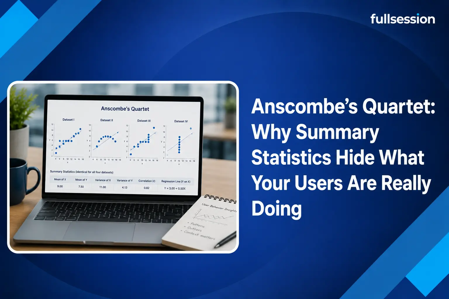
In 1973 the statistician Francis Anscombe built four small datasets, each with eleven points, to make a point that a table of numbers could not. Across all four, the summary statistics are almost identical: the mean of x is 9, the mean of y is 7.50, the variance of x is 11 and of y is 4.12, the correlation between x and y is 0.816, and the line of best fit is the same equation, y = 3 + 0.5x. Read the summary and you would swear the four datasets are basically the same.
Then you plot them, and they fall apart. The first is a loose linear cloud, the honest case the statistics describe. The second is a clean curve that is not linear at all, so a straight-line model is simply the wrong tool. The third is a tight straight line dragged off course by one extreme outlier. The fourth has x fixed at a single value except for one point that props up the entire correlation. Same numbers, four different stories, and only the picture tells you which is which.

The modern version: a dinosaur hiding in the numbers
If a quartet from 1973 feels easy to dismiss, researchers at Autodesk updated the joke for the data-science era. In 2017, Justin Matejka and George Fitzmaurice generated a set of thirteen datasets, the Datasaurus Dozen, that share the same mean, standard deviation, and correlation to two decimal places. One of them, when plotted, is a picture of a dinosaur. The others are stars, circles, and lines. Every one reports the same tidy statistics, and every one is a different beast. The point is the same as Anscombe’s, made impossible to ignore: matching summaries are no guarantee of matching realities.
Why this matters for your product and marketing metrics
Here is the part the textbook version leaves out. Nearly every number on a product or marketing dashboard is a summary statistic, which means every one carries the Anscombe risk. The danger is not theoretical; it changes what you decide to fix.
Take an average time on page of 90 seconds. That can describe a page where most visitors read for a minute and a half, or a page where half bounce in five seconds and half stay for three minutes, with almost nobody near the average. Those are opposite problems, and the mean hides which one you have. A 3 percent conversion rate can be a steady 3 percent across the board, or it can be one segment converting at 8 percent while another sits near zero, which means your real job is to figure out why one group fails. An average NPS of 32 can come from lukewarm neutrality or from a fierce split of promoters and detractors that needs two different responses. In each case the summary is a bimodal distribution wearing a single-number disguise, exactly like dataset four of the quartet leaning on one point.

How to see the distribution behind the average
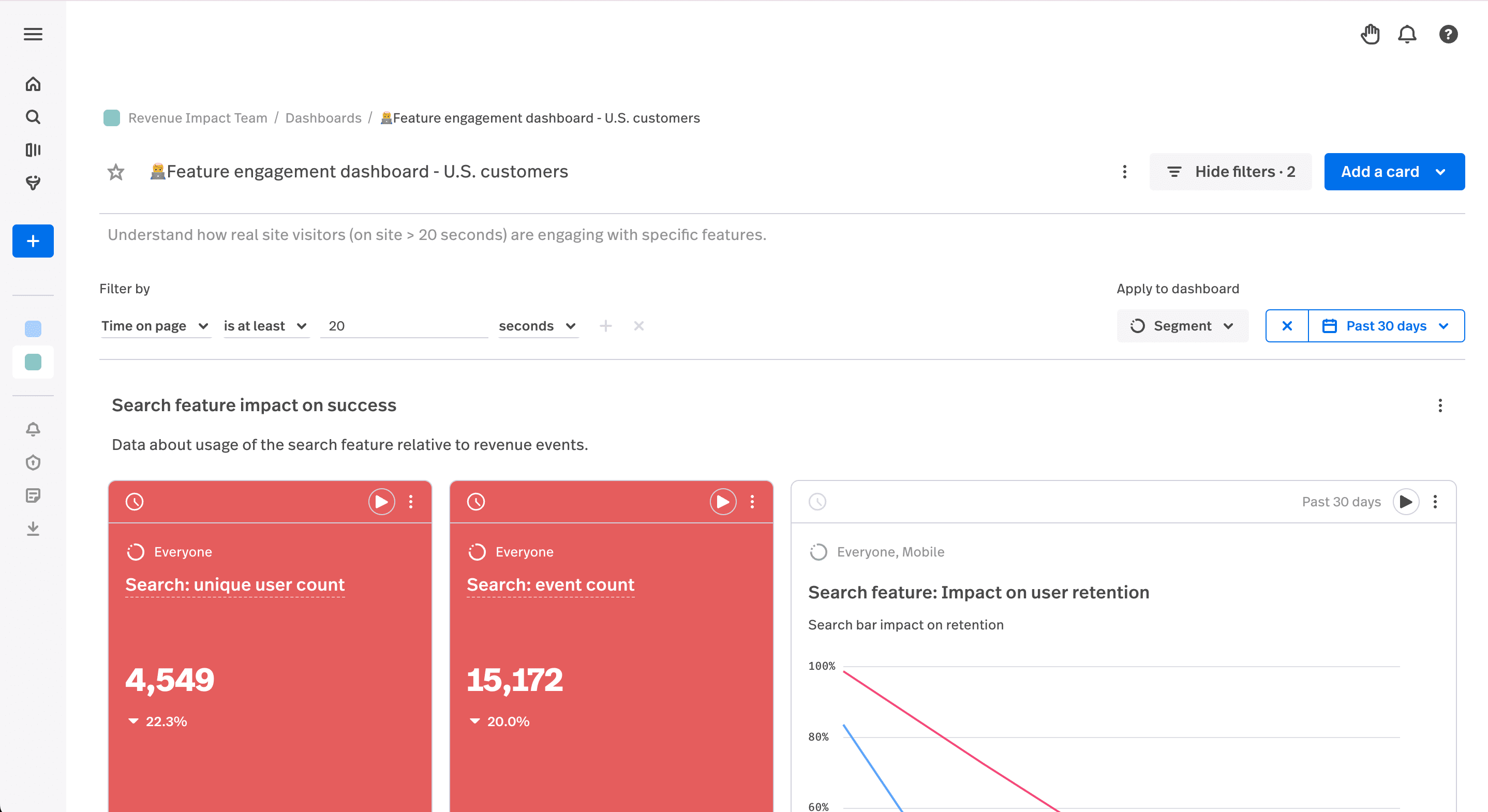
Anscombe’s fix was simple: plot the data. For user behavior, plotting means two things, splitting the number apart and watching the raw behavior it came from. Both turn a flat average into a shape you can act on.
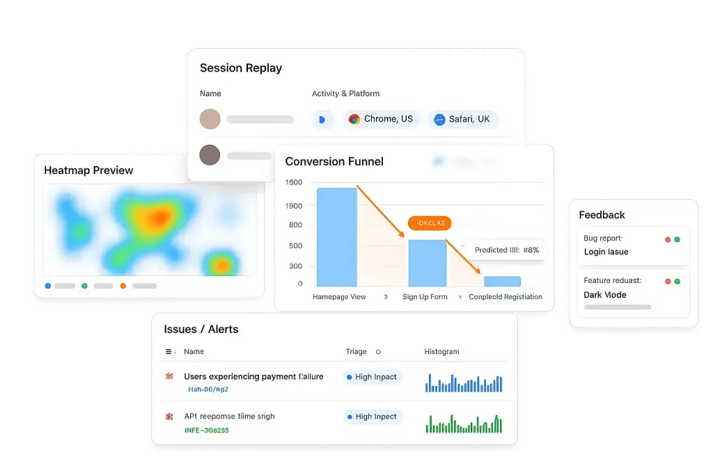
Start by segmenting. Break any metric down by source, device, plan, or stage and the bimodal cases reveal themselves; a conversion funnel segmented that way shows exactly where one group drops while another sails through. Then look at the raw behavior, which is the analytics equivalent of graphing every point. Session replay is each individual data point made visible, one real user moving through the flow, so you can see the five-second bounce and the three-minute struggle that the 90-second average blended together. A heatmap shows the distribution of attention across a page rather than a single scroll-depth number. And in-page feedback adds the why, turning a quiet detractor score into a sentence you can act on. Our piece on qualitative versus quantitative data covers how these two views reinforce each other.
To skip the manual hunt for which segment or page is dragging a number, Lift AI ranks where friction concentrates, pointing you at the part of the distribution that is actually costing you. That is the whole Anscombe lesson operationalized: the summary tells you a number moved, and the behavior tells you which group moved it and why.
SEE THE SHAPE, NOT JUST THE AVERAGE
Plot the behavior behind every metric
FullSession pairs session replay, heatmaps, and funnels so a flat average opens up into the real distribution of what your users do.
When summary statistics are still the right tool
None of this makes averages useless. A single number is efficient, and it is exactly what you want for tracking a trend over time or getting an alert when something shifts. The error is treating the summary as the answer instead of the prompt. Compute the average to notice that conversion dropped this week, then segment and watch replays to learn that the drop lives entirely in mobile checkout. Used that way, summary statistics and behavioral detail are partners: the number is a fast, cheap alarm, and the distribution behind it is the diagnosis. Our guides to product metrics and SaaS metrics show how to keep both views in play.
Turn flat metrics into decisions you can trust
Visualize, analyze, and act on real user behavior with FullSession. Get past the average and see the distinct groups of users behind every number. No credit card needed to start.
Anscombe’s quartet and summary statistics: FAQ
What is Anscombe’s quartet?
Anscombe’s quartet is a set of four datasets built by statistician Francis Anscombe in 1973. All four share nearly identical summary statistics: the same mean of x and y, the same variance, the same correlation of 0.816, and the same regression line. Yet when you plot them, they look completely different: one is roughly linear, one is a curve, and two are dominated by a single outlier. It is the classic proof that summary numbers alone can hide the real shape of your data.
Why can summary statistics be misleading?
Because a single number collapses a whole distribution into one point, and very different distributions can produce the same number. An average conversion rate can hide two segments, one converting well and one not at all. An average session time can be a mix of instant bounces and long readers, with almost nobody near the average. The statistic is not wrong, it is just incomplete, and it can point you at the wrong fix if you never look at the shape behind it.
How does this apply to product and marketing analytics?
Most product and marketing dashboards are summary statistics: average time on page, overall conversion rate, mean NPS. Each one can mask a bimodal or segmented reality the same way Anscombe’s quartet does. The fix is to look at the distribution behind the number: segment by source, device, or plan, and watch the behavior itself with session replay, heatmaps, and funnels so you see the shape, not just the average.
Are summary statistics still useful?
Yes. They are efficient for tracking trends and monitoring a metric over time once you understand the distribution underneath it. The mistake is using them as the only view. Compute the summary to spot that something moved, then visualize and segment to learn what actually happened. Summary statistics are a good alarm and a poor diagnosis.

Roman Mohren is CEO of FullSession, a privacy-first UX analytics platform offering session replay, interactive heatmaps, conversion funnels, error insights, and in-app feedback. He directly leads Product, Sales, and Customer Success, owning the full customer journey from first touch to long-term outcomes. With 25+ years in B2B SaaS, spanning venture- and PE-backed startups, public software companies, and his own ventures, Roman has built and scaled revenue teams, designed go-to-market systems, and led organizations through every growth stage from first dollar to eight-figure ARR. He writes from hands-on operator experience about UX diagnosis, conversion optimization, user onboarding, and turning behavioral data into measurable business impact.