

You shipped the feature three weeks ago. The release notes went out, a few hundred people clicked it, and the usage chart shows a line that points up and to the right. So it worked. Probably. Except renewal conversations keep circling back to the same gap the feature was supposed to close, and nobody on the team can say whether the people who needed it ever actually found it.
That uncertainty is the whole problem with feature adoption. A raw usage count tells you something happened. It does not tell you whether the right users reached the feature, whether they got value, or whether they came back. This guide covers how to measure adoption properly, the formulas and current benchmarks behind each metric, and the part most guides skip: how to see the behavior that explains why a feature is or is not landing.
QUICK TAKEAWAY
Feature adoption is a funnel, not a number. Users move from exposed, to activated, to used, to used again, and each stage fails for a different reason. Measure the adoption rate against eligible users, not everyone, then watch the recordings behind each drop. The metric tells you a feature is stuck. The behavior tells you where.
What feature adoption actually measures
Feature adoption is the path from a user noticing a feature exists to using it often enough that it becomes part of how they work. Most teams collapse that path into one figure and lose the detail that matters. A feature can have a thousand first clicks and almost no second clicks, which means people tried it and walked away. Another feature can show modest numbers that are entirely repeat users, which means it found its audience and stuck. Same usage chart, opposite stories.
So the useful frame is a funnel with four stages: exposed (the user sees the feature), activated (they take the first real action), used (they complete the workflow it was built for), and used again (they come back). This model is common in product analytics, and on its own it is just a diagram. The value comes from measuring each stage and, more importantly, being able to look at the behavior behind the stage where users fall out.
Get the denominator right before anything else
The single most common way teams fool themselves on adoption is the math. Feature adoption rate looks simple:
Feature adoption rate = (eligible users who completed the adoption event / eligible users) × 100
The trap is the word eligible. Suppose you ship a feature to your Pro tier and 1,800 people use it in the first month. Divide that by your 30,000 monthly active users and you get a discouraging six percent. But only 4,200 of those users are on Pro and can even see the feature. Measured against the people who actually had access, adoption is 1,800 of 4,200, or roughly 43 percent. Those are two completely different decisions: one says kill the feature, the other says it is doing well and the job now is to widen access.
Eligible means the users whose plan, role, permissions, or device give them a real path to the feature. Get that denominator right and most adoption debates resolve themselves. The practical wrinkle is that eligibility is messy to track by hand, which is where segmenting by plan, role, or device inside your analytics earns its keep.
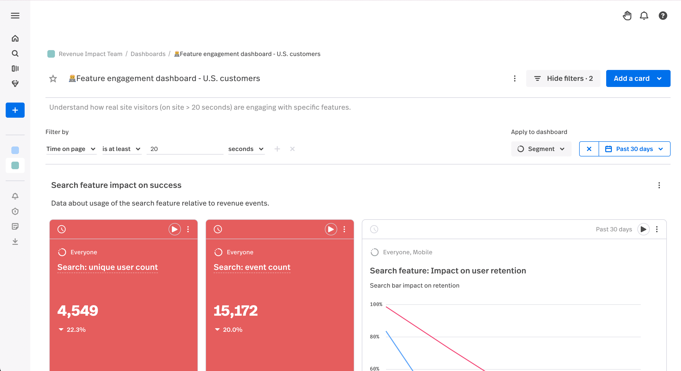
The adoption metrics that matter, with formulas and benchmarks
Adoption rate is the headline, but it hides the diagnosis. A short stack of supporting metrics tells you not just whether a feature is adopted, but where it is failing. Treat the benchmarks below as a starting line, since they shift by category and by how central the feature is to the product.
Breadth and depth
Breadth is how many eligible users tried the feature at all. Depth is how hard the ones who tried it lean on it. The two answer different questions. Low breadth means a discovery problem, since people never reached the feature. Healthy breadth with shallow depth means the feature is easy to find but not worth returning to. You want both numbers in view, because a single adoption rate can look fine while hiding a feature that everyone opens once and nobody uses twice.
Time to adopt
Time to adopt measures how long it takes an eligible user to reach first use. Speed matters more than it looks. High-performing products see a median time to first use of two to five days for strategic features, while products that bury features behind menu discovery often stretch to two or three weeks. The same research finds that every extra day of delay shaves roughly three to five percent off the chance the user ever adopts at all. A feature that is hard to find is a feature slowly dying.
Activation rate
Activation is the share of exposed users who take the first meaningful action, not just glance at the feature. Well-designed features tend to land activation rates of 40 to 60 percent, and anything under 30 percent usually signals onboarding friction or a value proposition that is not clear at the moment of the click. Activation is the stage where a confusing first-run experience does the most damage.
Duration: habit versus curiosity
Duration tracks how long a user keeps using a feature after that first action. It is what separates a habit from a passing look. Someone who opens a feature every day for a week and then never again was curious. Someone who returns weekly for three months has adopted it. Without duration, a launch spike reads as success right up until the cohort quietly disappears.
Friction signals: rage clicks, dead clicks, and errors
Numbers tell you a feature is stuck. Friction signals start to tell you why, before the adoption rate even moves. A cluster of rage clicks on a feature’s control means people are trying and failing. Dead clicks on something that looks interactive but is not means the affordance is misleading. An error spike means the feature broke quietly while users watched. None of these appear in an adoption chart, yet each is often the reason the chart is flat.
| Metric | Question it answers | Formula | Rough benchmark |
|---|---|---|---|
| Feature adoption rate | Are eligible users adopting it? | Adopters / eligible users × 100 | ~24.5% average for core features; 28%+ is healthy |
| Breadth | How many eligible users tried it? | Users who tried / eligible users | Compare to the feature’s reach goal |
| Time to adopt | How fast do they reach first use? | Median days from exposure to first use | 2-5 days for strategic features (high performers) |
| Activation rate | Did exposed users take a real first action? | Activated / exposed users × 100 | 40-60% for well-designed features; under 30% signals friction |
| Duration | Habit or curiosity? | Time still active after first use | Repeat use over weeks, not a one-week spike |
SEE IT IN YOUR PRODUCT
Watch the behavior behind every adoption number
FullSession pairs session replay, heatmaps, and conversion funnels so a low adoption rate links straight to the recording that explains it.
The adoption funnel, and how to actually see each stage
The four-stage funnel is only useful if you can look at the stage where users leave. Each stage has a behavioral artifact that proves what went wrong, and this is where measurement turns into a fix.
For exposed, the question is whether users ever saw the feature. A heatmap answers it directly: if attention and scroll depth never reach the part of the screen where the feature lives, you have a discovery problem, not an adoption problem, and no amount of feature polish will help. For activated, open session replays of users who saw the feature but did not take the first action, and you will usually watch the hesitation happen in a handful of recordings. For used and used again, a funnel report quantifies the drop between first use and repeat use, and segmenting it by plan or device shows which group is driving the loss.
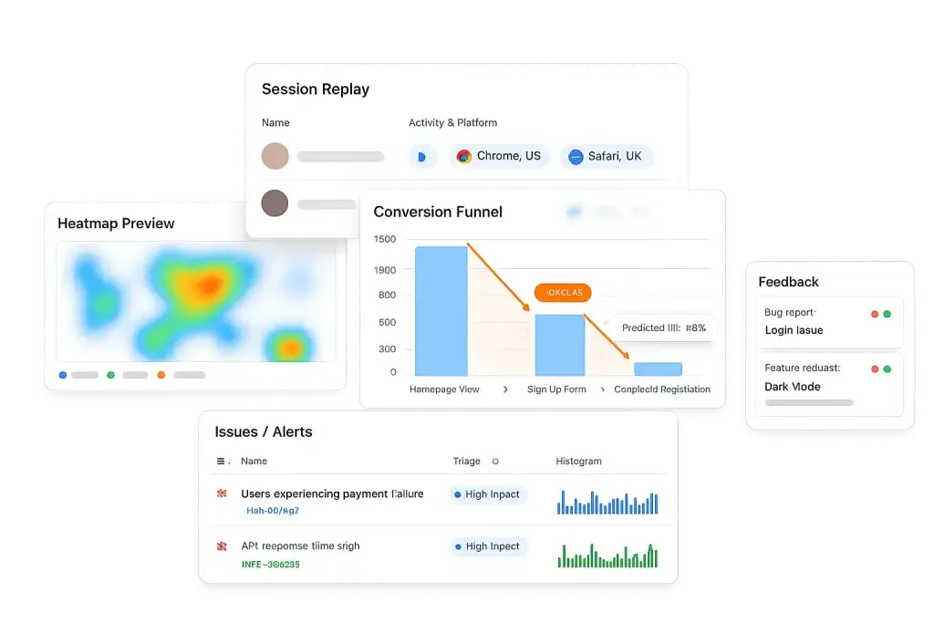
Run that loop and adoption stops being a guessing game. Heatmap to confirm exposure, replay to see the activation friction, funnel to measure the repeat-use drop, ship the change, and watch the metric respond. For a related walkthrough of tracing these drops, see our piece on onboarding funnel analysis.
Why most feature-adoption dashboards mislead
Here is the uncomfortable backdrop to every adoption chart. When Pendo analyzed usage across 615 products, it found that about 80 percent of features are rarely or never used, and that the median product has only 6.4 percent of its features driving most of the clicks. Your new feature is, by default, far more likely to land in the ignored majority than in the small set that carries the product.
That reality breaks the most common dashboard read. Total product usage climbs, everyone relaxes, and the new feature sits untouched inside the aggregate, invisible because the headline number went up for unrelated reasons. The second trap is the launch spike that activation campaigns create, where a burst of first clicks looks like adoption until the cohort never returns and duration quietly flatlines. The fix for both is the same: measure each feature against its eligible users, watch breadth and depth separately, and read the funnel by cohort rather than trusting one rolled-up line. Our guide to product metrics goes deeper on segmenting these views.
How to lift adoption once you can see the cause
Diagnosis points to the fix. If the heatmap shows users never reach the feature, the work is discovery: surface it in the flow where the need arises, not in a settings menu nobody opens. If replays show people reach it and stall, the work is the first-run experience: make the first action obvious and show value before asking for effort. If breadth is healthy but depth is shallow, the feature is findable but not yet worth a second visit, which is a value question, not a UI one.
None of this requires a redesign or a data team. It requires seeing which stage of the funnel is leaking and matching the fix to the cause. For teams driving activation, our notes on app engagement metrics and the PLG activation workflow pair well with this. Setting up adoption tracking in FullSession takes a few minutes, and you can watch the behavior behind your first feature the same day.
Turn feature usage into adoption you can prove
Visualize, analyze, and act on real user behavior with FullSession. No credit card needed to start.

Feature adoption: FAQ
What is feature adoption?
Feature adoption is the share of users who find a feature, use it, and keep using it because it delivers value. It is best measured as a funnel, not a single number: users move from exposed, to activated, to used, to used again. The headline metric is the feature adoption rate, but it only means something when measured against the users who can actually reach the feature.
How do you calculate feature adoption rate?
Feature adoption rate is the eligible users who completed the adoption event divided by total eligible users, times 100. The key is the denominator. Use eligible users, meaning the people whose plan, role, permissions, or device give them access, not your entire active base. Dividing by all active users hides real adoption behind users who were never able to see the feature.
What is a good feature adoption rate?
Userpilot’s 2025 benchmark puts the average core-feature adoption rate near 24.5 percent, with anything above 28 percent reading as healthy. It varies by category: HR tools trend higher near 31 percent, while fintech and insurance sit closer to 22 to 23 percent. Compare against your own segment rather than a single universal number.
Why do most features go unused?
Pendo’s analysis of 615 products found that about 80 percent of features are rarely or never used, and that the median product sees only 6.4 percent of its features drive most of the click volume. Features usually fail at one of two points: users never discover them, or they find them and the feature does not earn the next click. Those need different fixes, so you have to see which one you have.
How can I see why a feature is not being adopted?
An adoption number tells you a feature is underused, not why. Heatmaps show whether users even saw the feature, session replay shows where they hesitate or abandon after clicking it, and funnel reports quantify the drop between exposure, first use, and repeat use. FullSession connects these so a low adoption rate leads straight to the behavior behind it.

Roman Mohren is CEO of FullSession, a privacy-first UX analytics platform offering session replay, interactive heatmaps, conversion funnels, error insights, and in-app feedback. He directly leads Product, Sales, and Customer Success, owning the full customer journey from first touch to long-term outcomes. With 25+ years in B2B SaaS, spanning venture- and PE-backed startups, public software companies, and his own ventures, Roman has built and scaled revenue teams, designed go-to-market systems, and led organizations through every growth stage from first dollar to eight-figure ARR. He writes from hands-on operator experience about UX diagnosis, conversion optimization, user onboarding, and turning behavioral data into measurable business impact.