Understanding user behavior is key to evaluating how customers interact with your website, web app, or landing page. You can gain valuable insights by analyzing activities like cart abandonment, button clicks, page navigation, and scrolling.
Scroll maps help uncover visitor interactions, especially on crucial landing pages designed to drive sign-ups and guide customers through the sales funnel. They track how users move through your pages, revealing opportunities for pixel-perfect user experiences.
In this article, we’ll explore scroll maps, their importance, and how to use them to create perfect user journeys. Want to skip ahead and see scroll maps in action with FullSession?
Scroll Your Way to Success With FullSession
Discover how our interactive scroll maps help you visualize user engagement, identify drop-off points, and optimize your content placement for maximum impact.
What is a Scroll Map?
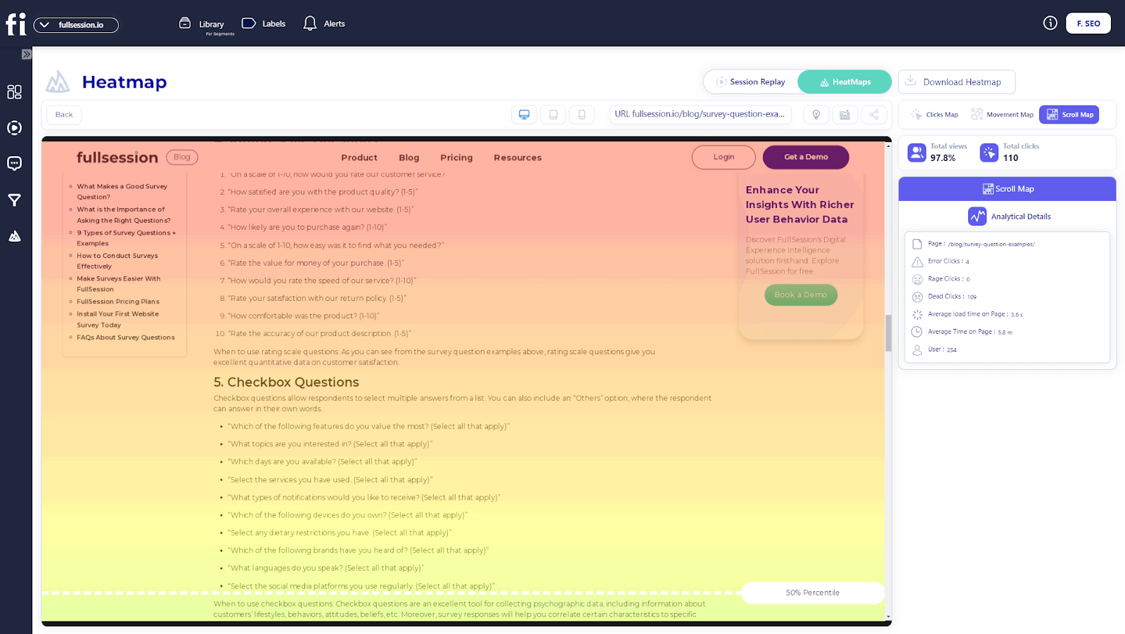
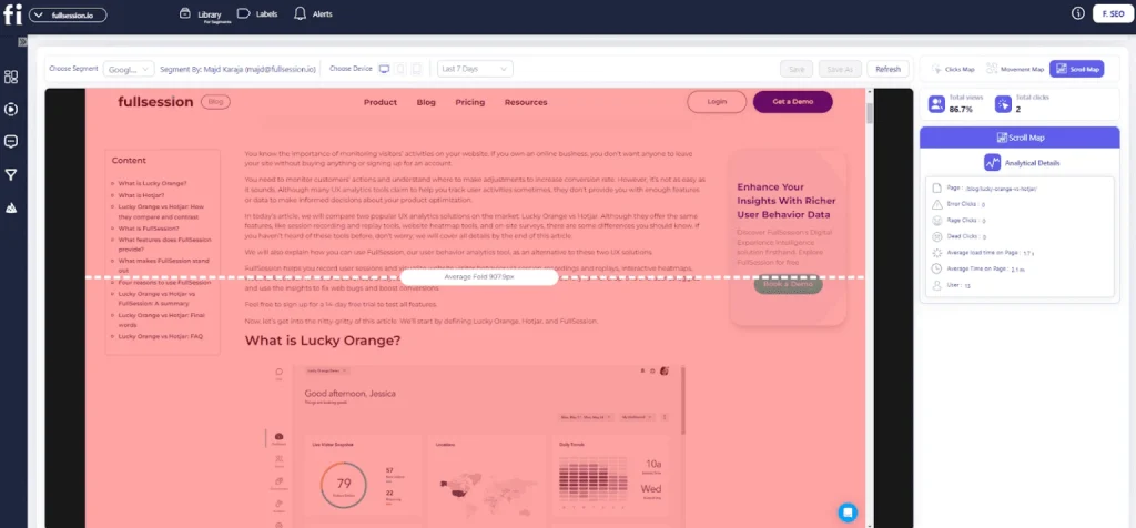
A scroll map is a tool that analyzes user behavior to help you better understand their actions and figure out what encourages them or prevents them from converting. You can capture scroll maps across different device types (tablet, computer, mobile) and use scroll data presented in visual reports to understand how far down the page your customers scroll.
When reviewing your scroll map data, you will see different colors on each page. Red represents the most viewed sections, while cold colors represent the least viewed page sections.
Scroll maps also provide numerical data to show the percentage of individuals who went all the way to the bottom of the page. You can also calculate average fold data showing the parts of pages that receive the most attention from users before they scroll.
Analyzing customers’ scrolling behavior can give you many insights into which pages need improvement to increase visitor engagement and achieve maximum conversions.
While many use the terms scroll maps and heatmaps interchangeably, it’s important to note that they are not the same – here’s why.
Scroll Maps vs. Heatmaps
Scroll maps are only one type of website heatmaps where warmer colors represent the most popular sections on a website, web app, or landing page, while colder colors represent the least engaging ones. For a broader breakdown of heatmap types and how teams use them, see Website Heatmap Tools.
“Heatmaps” act as an umbrella term for all user behavior tools that gather user data based on their activities on your website and visually present it to help you understand how users interact with your web pages.
It helps your product team deduce which page elements work and which don’t. Let’s explore different types of heatmaps.
| Scroll maps | Maps that offer a visual representation of website visitors’ scroll behavior. You can see how many users scroll to or before the bottom and how many abandon the page. |
| Click maps | Maps that show where users click on your page. You can see which elements and buttons are the most effective and which sections require improvement. |
| Mouse movement maps | These maps track general mouse movement. You can spot different patterns like which parts of pages users hesitate to click. Move maps can also help you optimize complex pages with dynamic elements. |
| Eye-tracking heatmaps | These maps use sensor-based technology to track the user’s eye movement when they’re on your page. It monitors blinking, pupil dilation, and overall eye activity. |
| Error click heatmaps | These maps help you visualize which elements trigger errors once the user clicks on them. |
| Dead-click heatmaps | Dead-click maps show which unclickable elements visitors often mistake for clickable, such as a piece of text or image that resembles a button. |
| AI-generated heatmaps | AI-generated heatmaps use artificial intelligence to suggest which elements the users will likely pay the most attention to. They use previously-aggregated data to make these assumptions. |
Make Every Scroll Count With FullSession
Learn how to visualize, analyze and identify areas for improvement to create a website that users love to explore.
What Is a Heatmap Used For?
Heatmaps help you learn more about your site visitors’ behavior. Marketers and business owners most commonly use them to determine which website elements require some attention.
They categorize information by color. Warm colors depict parts of pages that customers find the most interesting. In contrast, colder colors represent parts that users interact with the least. These categories are also known as heat zones.
You can create heatmaps for every category, product, and landing page. These help you understand what users click on, how far visitors scroll down, and which parts of pages they completely ignore. For online stores, ecommerce scroll heatmaps can show whether shoppers see key product details, trust signals, shipping information, reviews, and checkout prompts before they leave the page.
How Are Heatmaps Generated?
Third-party software makes it easy to generate heatmaps. When choosing the perfect heatmap tool to gather this type of data, opt for services offering different kinds of user experience analytics tools.
FullSession is comprehensive web analytics software that helps you aggregate and analyze different data sets to make effective UX improvements, such as learning where to place important elements.
It is one of the most effective ways to spot false bottoms, bring in more visitors, and have fewer people bounce before they become converting customers. Aside from interactive heatmaps, FullSession’s key features include:
- Session recording and replay
- User engagement analysis
- Advanced user and event segmentation and filtering options
- Customer feedback features
- Conversion funnel tracking
- Error analysis
Start a free trial or book a demo and experience these powerful features firsthand.
Create Data-Driven Scroll Maps with FullSession
FullSession offers the most advanced user behavior analytics tools, including three types of heatmaps. Making a click, mouse movement, or scroll map with FullSession is very easy – our software does it automatically in seconds.
Our heatmap data lets you track dynamic elements, unlike other companies that only offer static element tracking.
Instead of waiting for your heatmap to process data every time you want to view it, FullSession lets you track it in real time, reducing the wait time to zero.

The interactive heatmap feature will help you perfect even the most complex pages to minimize user frustrations and reduce the bounce rate.
With advanced user and event filtering options that make the data analysis process more convenient, FullSession lets you take full control over all content on your website. It helps you gain valuable insights into optimizing the overall user experience.
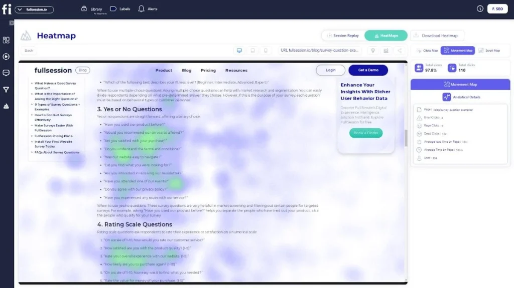
Here’s how you can use FullSession’s heatmap feature:
- Visualize heatmap data on different devices
- See the URL the user visited
- Track the number of total views and total clicks
- Watch error clicks
- Visualize rage clicks
- Monitor dead clicks
- See the average load time on the page
- See the average time on the page
- Track the number of users that visited the page
While most digital customer experience platforms slow down your website significantly when recording sessions, FullSession doesn’t affect its performance whatsoever – your customers will enjoy a glitch-free website. At the same time, you can gather data on their behavior and interests.
Take Control of Your Website Performance
Learn how our interactive scroll maps reveal how users interact with your content, enabling you to create engaging, high-converting pages.
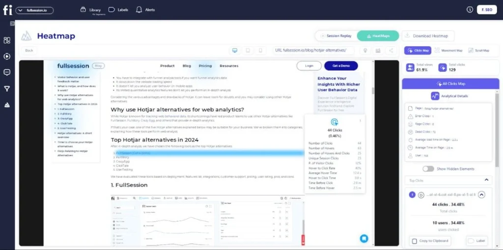
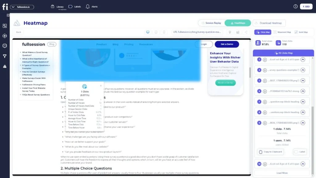
FullSession click map example
FullSession mouse movement map example
5 Ways Scroll Maps Can Help You Understand Your Customers Better
Let’s have a quick rundown of the five ways how scroll maps can help you analyze and optimize different app pages, category pages, and all other elements on your website.
Learn why visitors leave your website
Scroll maps help determine where your visitors start losing attention during their on-page experience.
When you notice the appearance of cold colors on your scroll map, you’ll know that section is where users lose interest. You can analyze and test different elements from these cold sections to see why they left the page.
Pinpoint false bottoms
“False bottom” refers to parts of a web page that give the impression of being the bottom of the page, even though there is more content beneath.
Because these areas look like the bottom of the page, users often leave before they have a chance to view the content located further down. Pinpointing these issues helps you use the whole page better and learn where to place important elements.
Analyze your page above the fold
Your customers are the most exposed to parts of the page above the fold. A scroll map will calculate the average fold on your pages for desktop and mobile users. It shows you where to place calls to action and other important elements to capture users’ attention.
See how easy it is for customers to find what they want
Sometimes, you may notice raging scroll activity from your customers that results from struggling to find what they want. Understanding how long it takes for users to scroll to important sections will help you prioritize and arrange elements more effectively.
Analyze cross-device experience
Users don’t have the same behavior patterns when browsing their phones as when browsing on desktops.. Scroll maps can identify weak spots across different devices to show you how to optimize each of the layouts to create the best cross-device experience.
Pros & Cons of Using Scroll Maps
Scroll maps are a very effective method of analyzing user behavior. We’ve already discussed the benefits of including scroll maps in your strategy to detect various data patterns. However, they lack versatility and come with certain drawbacks.
Here’s a quick rundown of all the pros and cons associated with using scroll map data.
Pros:
- Scroll maps are handy for optimizing pages above the fold
- Watching how visitors scroll can show you how easy it is for them to find the desired page elements
- You can analyze how users scroll and think of ways to make them scroll even further down the web page
- It’s great for helping you design a high-quality, converting page
- It allows you to understand how to prioritize content and elements on each page
- They are very visual, easy to understand, and a great resource for gathering valuable quantitative and qualitative data
Cons:
- Scroll maps are not very useful for web pages that have dynamic elements
- The data isn’t always 100% accurate
Collect Your Own Scroll Map Data With FullSession
Scroll maps are only one method for learning more about your customers’ behavior. This information is of great value if you want to provide your users with a great experience when they visit your website pages.
Scroll maps can help you determine which pages must be fixed and optimized. They also help you spot patterns, like finding out which pages perform well, allowing you to apply that same principle to other pages to improve the retention and conversion rate.
FullSession’s advanced user experience analytics can take your website from regular to above industry standard in weeks.
Book a demo to boost your website’s performance and increase conversions.
FullSession Pricing Plans
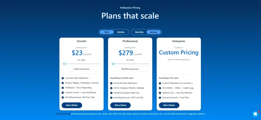
The FullSession platform offers a 14-day free trial. It provides three paid plans—Starter, Business, and Enterprise. You can save up to 20% with a yearly subscription!
FAQs About Scroll Maps
What are scroll maps?
Scroll maps visually display how far users scroll down your pages, highlighting which sections grab attention and which get missed. They’re perfect for optimizing content placement and improving user engagement, especially if you have a responsive website design where elements can collapse or drop under each other.
What is the difference between a heatmap and a scroll map?
A heatmap shows where users click, tap, or hover, revealing interaction hotspots. A scroll map, on the other hand, tracks how far down the page users scroll, showing the most and least-viewed parts of the page.
What is an example of a heatmap?
An example of a heatmap is a color-coded overlay on your webpage showing where users click the most. Red areas indicate high activity, while blue areas show less interaction.
What does a heatmap show?
A heatmap displays user interaction patterns, highlighting clicks, taps, and hovers. It visually represents which parts of your webpage are the most and least engaging, guiding you to optimize your layout.
Mohamed oversees operations and finance at FullSession and has contributed to the company’s UX analytics knowledge base.