Checkout drop-offs are rarely caused by one “bad UI choice.” They are usually a mix of hesitation (trust, transparency, delivery uncertainty) and failure states (validation loops, slow shipping quotes, 3DS interruptions, declines). This guide gives ecommerce CROs and checkout PMs a repeatable way to find what matters, fix it, and prove impact on RPV, not just clicks.
If you want to operationalize the workflow with a tool, this maps cleanly to Lift AI and the Checkout Recovery solution.
Quick Takeaway / Answer Summary (verbatim, 40–55 words)
Checkout UX issues are moments of doubt, confusion, or failure between “Checkout” and “Order confirmed” that cause drop-off. The fastest way to reduce abandonment is to segment where users exit, classify the root cause, prioritize fixes by impact and effort, then validate with funnel, error, and device-level guardrails.
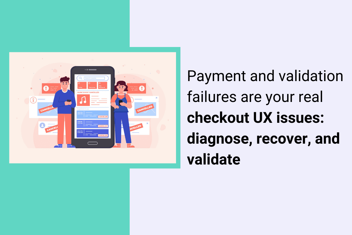
What are checkout UX issues?
Definition (What is “checkout UX issues”?)
Checkout UX issues are design, content, performance, and failure-state problems that increase the effort or uncertainty required to complete a purchase. They show up as drop-offs, repeated attempts, error loops, slow steps, and “I’m not sure what happens next” moments across account, address, shipping, payment, and review.
Why does this matter for RPV?
Because “small” checkout friction compounds. A confusing shipping promise, a coupon edge case, or a mobile keyboard mismatch can remove a meaningful share of otherwise qualified buyers from the revenue path.Industry research consistently lists extra costs, trust concerns, forced account creation, and checkout complexity among top abandonment drivers. If you want a tighter breakdown of how to analyze your own drop-offs, start with cart abandonment analysis.
Where checkout UX issues cluster: the 5 breakpoints
Most teams argue about “one-page vs multi-step” checkout. In practice, issues cluster around the decisions and failures inside each step.
1) Account selection (sign-in vs guest)
Common issues:
- Guest checkout exists, but is visually buried
- Password creation happens too early, or has strict rules that trigger retries
- “Already have an account?” flows that bounce users out of checkout
Baymard’s research repeatedly shows that guest checkout needs to be prominent to avoid unnecessary abandonment.
2) Address and contact
Common issues:
- Too many fields, poor autofill, and unclear input formats
- Inline validation that fires too early, or only on submit
- Phone and postal code rules that do not match the user’s locale
3) Shipping and delivery choices
Common issues:
- Shipping fees, taxes, or delivery times appear late
- Delivery promise language is vague (“3–7 business days”) with no confidence cues
- Slow shipping quote APIs that cause spinners and rage clicks
4) Payment and authentication
Common issues:
- Missing preferred payment methods (wallets, BNPL, local methods)
- Card entry friction on mobile (keyboard type, spacing, focus)
- 3DS/SCA interruptions with weak recovery messaging
- Declines that read like user error, with no guidance on what to do next
5) Review, promo, and confirmation
Common issues:
- Promo codes that fail silently or reset totals
- Inventory or price changes that appear after effort is invested
- Confirmation page lacks next-step clarity (receipt, tracking, returns)
Which checkout UX issues should you fix first?
Question hook: What should I fix first if I have a long checklist of checkout problems?
Fix the issues that combine high revenue impact with high frequency and clear evidence, while staying realistic about effort. Start by sanity-checking your baseline against checkout conversion benchmarks. A prioritization model keeps you from spending weeks polishing low-yield UI.
Use ICEE for checkout: Impact × Frequency × Confidence ÷ Effort
- Impact: If this breaks, how much RPV is at risk? (Payment step failures usually rank high.)
- Frequency: How often does it happen? (Segment by device, browser, geo, payment method.)
- Confidence: Do we have proof? (Replays, errors, field-level signals, support tags.)
- Effort: Engineering and risk cost. (Some fixes are copy or validation rules. Others touch payments.)
Practical rule: prioritize “high impact + high frequency” failure states before “nice-to-have” UX polish.
A diagnostic table you can use today
| Symptom you see | Likely root cause category | Proof to collect |
| Drop spikes at “Pay now” | Declines, 3DS interruptions, payment method mismatch | Decline reason buckets, 3DS event outcomes, replay of failed attempts |
| High exit on shipping step | Fees shown late, slow quote, unclear delivery promise | Quote latency, rage clicks, users changing address repeatedly |
| Form completion stalls | Validation loops, autofill conflicts, unclear formats | Field error logs, replays showing re-typing, mobile keyboard mismatches |
| Promo usage correlates with exits | Coupon edge cases, total changes, eligibility confusion | Promo error states, cart total deltas, support tickets tagged “promo” |
Mid-workflow tooling note: this is the point where teams often pair funnel segmentation with session evidence. If you want a single place to go from “drop-off spike” to “what users did,” Lift AI and the checkout recovery workflow are designed for that.
The practical workflow: diagnose → confirm → fix → validate
Question hook: How do you diagnose checkout UX issues without guessing?
Use a repeatable workflow: start with segmented drop-off, classify root cause, confirm with evidence, ship a targeted fix, then validate with guardrails.
Step 1) Find the drop and segment it (do not average it)
Start with the simplest question: Where exactly do people exit? Then segment before you brainstorm fixes.
Segmentation that usually changes the answer:
- Mobile vs desktop
- New vs returning
- Payment method (wallet vs card)
- Geo and locale
- Browser and device model
- Promo users vs no promo
Deliverable: a shortlist of “top 2–3 drop points” by segment.
Step 2) Classify the root cause category (so you stop debating opinions)
Pick one dominant category per drop point:
- Expectation and transparency: fees, delivery, returns, trust cues
- Form friction: fields, input rules, validation, autofill
- Performance: slow shipping quotes, slow payment tokenization, timeouts
- Payment failure states: declines, 3DS/SCA, retries
- Content and comprehension: unclear labels, weak microcopy, uncertain next step
Step 3) Confirm with evidence (proof, not vibes)
Question hook: What counts as “proof” for a checkout UX problem?
Proof is a repeatable pattern you can point to: a consistent behavior in replays, a consistent error bucket, or a consistent field-level failure in a segment. If you want a practical way to turn click and scroll behavior into a test backlog, see ecommerce heatmaps and prioritized CRO tests.
Examples of strong proof: this is where session replay helps because you can see the exact retry loops, hesitation, and dead-ends behind the drop-off, not just the metric.
- Replays showing users repeatedly toggling shipping methods, then leaving
- Field-level logs showing postal code validation rejects a specific region format
- High latency on shipping quote calls correlating with exits
- 3DS challenge loops causing repeated “Pay” attempts
Step 4) Fix with recovery-first patterns
Instead of “make it simpler,” ship fixes that reduce uncertainty and help users recover.
High-yield fix patterns by breakpoint:
- Account: make guest checkout obvious; delay account creation until after purchase where possible
- Forms: add inline validation that is helpful, not punitive; do not wait until submit for everything
- Shipping: show total cost earlier; make delivery promise concrete and consistent
- Payment: design for retries; make declines actionable; keep the user oriented during authentication
- Review: handle promo edge cases with clear microcopy and stable totals
Step 5) Validate outcomes with guardrails (so you do not “win” the wrong metric)
Validate on the KPI you actually care about, with checks that prevent accidental damage.
A simple validation plan:
- Primary: checkout completion and RPV in the affected segment(s)
- Guardrails: payment authorization rate, error rate, page performance (especially mobile), refund and support contact rate
- Time window: compare pre/post with the same traffic mix (campaigns change everything)
Tooling note: if you are trying to move fast without losing control, you want a workflow that ties funnel movement to what users actually experienced. That is the point of the checkout recovery approach, and it pairs naturally with Lift AI when you need help prioritizing what to test and proving impact.
Failure-state UX: the part most “best practice” lists skip
Question hook: Why do “clean” checkouts still have high abandonment?
Because the checkout UI can be fine, but the failure states are not. Declines, timeouts, and authentication interruptions create confusing loops that users interpret as “this site is broken” or “I’m about to get charged twice.”
Patterns to implement for payment and auth failures
- Declines: say what happened in plain language, and offer a next action (try another method, check billing address, contact bank). Avoid blame-heavy copy.
- Retries: preserve entered data where safe; confirm whether the user was charged; prevent double-submit confusion.
- 3DS/SCA interruptions: keep a stable frame, show progress, and explain why the step exists. If the challenge fails, explain what to do next.
- Timeouts: provide a clear “try again” path and record enough detail for debugging.
This is also one of the most measurable areas: you can bucket declines and auth outcomes and watch whether UX changes reduce repeated attempts and exits.
Accessibility and localization: small changes that quietly move RPV
Accessibility is not just compliance. It is checkout completion insurance.
Minimum accessibility checks for checkout forms:
- Errors must be identified in text, not only by color or position.
- Error messages should be associated with the field so assistive tech users can recover.
- Keyboard navigation and focus states must work across the full checkout, especially modals (address search, payment widgets).
Localization checks beyond “add multi-currency”:
- Address formats vary. Avoid forcing “State” or ZIP patterns where they do not apply.
- Phone validation should accept local formats or clearly explain the required format.
- Tax and VAT expectations differ by region. Make totals transparent early.
Scenario A (CRO): Shipping step drop-off after a promo launch
A CRO manager sees a sharp drop on the shipping step, mostly on mobile, starting the same day a promotion banner went live. Funnel segmentation shows the drop is concentrated among users who add a promo code, then switch shipping methods. Session evidence shows long loading states after shipping selection and repeated taps on the “Continue” button. The team buckets shipping quote latency and finds a spike tied to the promo flow calling the quote service more often than expected. The fix is not “simplify checkout.” It is to reduce redundant quote calls, display a stable delivery promise while loading, and keep the call-to-action disabled with clear progress feedback. Validation focuses on mobile checkout completion and RPV, with latency and error rate as guardrails.
Scenario B (Checkout PM): Payment drop-off driven by declines and retries
A checkout PM sees drop-off at “Pay now” increase, but only for card payments in one region. Wallet payments look healthy. Decline codes show a rise in “do not honor,” and replays show users attempting the same card multiple times, then abandoning. The UI currently says “Payment failed” with no guidance, and the form clears on retry. The team ships a recovery-first change: preserve safe inputs, add plain-language guidance (“Try another payment method or contact your bank”), and surface wallet options earlier for that region. They also add a “Was I charged?” reassurance message to reduce panic exits. Validation looks at card-to-wallet switching, repeated attempts per session, checkout completion, and RPV in that region, with authorization rate as the key guardrail.
When to use FullSession for checkout UX issues (RPV-focused)
If you already know “where” conversion drops but struggle to prove “why,” you need a workflow that connects funnel movement to real user behavior and failure evidence.
FullSession is a behavior analytics platform that can help when:
- You need to tie segmented funnel drop-offs to what users actually did in the moments before exiting.
- You want to prioritize fixes based on observed friction and failure patterns, not stakeholder opinions.
- You need to validate that changes improved checkout completion and RPV without breaking performance or payment reliability.
If you want to see where customers struggle in your checkout and validate which fixes reduce drop-off before you roll them out broadly, start with the checkout recovery workflow and use Lift AI to prioritize and prove impact.
FAQs
What are the most common checkout UX issues?
They cluster around hidden costs, trust uncertainty, forced account creation, form friction, and payment failures. The “most common” list matters less than which ones appear in your highest-value segments.
How do I know if a checkout problem is UX or a technical failure?
Segment the drop point, then look for evidence. UX friction shows hesitation patterns and repeated attempts. Technical failures show error buckets, timeouts, or sharp drops tied to specific devices, browsers, or payment methods.
Should I focus on one-page checkout or multi-step checkout?
Focus on effort and clarity per step, not the number of steps. Many “one-page” checkouts still fail because validation, shipping quotes, or payment widgets create hidden complexity.
What is the fastest way to reduce checkout abandonment?
Start with the highest-impact breakpoint (often payment or shipping), segment it, confirm the dominant root cause, then ship a recovery-first fix and validate with RPV and guardrails.
How should I handle inline validation at checkout?
Use helpful inline validation that avoids premature errors and makes recovery easy. Validation that only appears on submit, or fires too early, often increases retries and abandonment.
What should I measure to prove a checkout UX fix worked?
Measure checkout completion and RPV in the affected segments, plus guardrails like payment authorization rate, error rate, and mobile performance. Track whether the specific failure state you targeted (declines, validation loops, timeouts) decreased.

Roman Mohren is CEO of FullSession, a privacy-first UX analytics platform offering session replay, interactive heatmaps, conversion funnels, error insights, and in-app feedback. He directly leads Product, Sales, and Customer Success, owning the full customer journey from first touch to long-term outcomes. With 25+ years in B2B SaaS, spanning venture- and PE-backed startups, public software companies, and his own ventures, Roman has built and scaled revenue teams, designed go-to-market systems, and led organizations through every growth stage from first dollar to eight-figure ARR. He writes from hands-on operator experience about UX diagnosis, conversion optimization, user onboarding, and turning behavioral data into measurable business impact.