Author: Roman Mohren (CEO)
-
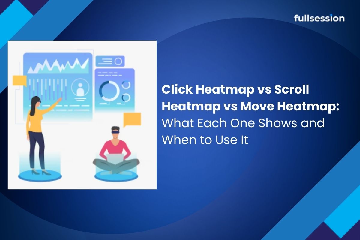
Click Heatmap vs Scroll Heatmap vs Move Heatmap: What Each One Shows and When to Use It
If you are trying to improve Activation in a SaaS PLG funnel, heatmaps can feel like three versions of the same answer: users clicked here, users scrolled this far, users moved their cursor there. The real value is knowing which map to open first for the problem you have, and how to validate the signal…
-

Why Your Dropdown Click Isn’t Working: A Practical Debugging Guide
If you’re searching “dropdown click not working,” you’re not looking for theory. You’ve got a menu that won’t open, won’t select, or opens then immediately closes. This guide gives you a failure-mode workflow that reduces MTTR by isolating whether the issue is event handling, state toggling, visibility/layering, or framework lifecycle. Quick takeaway A dropdown click…
-

How to Analyze an Onboarding Funnel: Find Drop-Offs, Prioritize Friction, and Improve Activation
If your trial or self-serve motion is healthy, onboarding is not “a checklist,” it’s the shortest path to first value. Onboarding funnel analysis helps you see where new users stall, why they stall, and which leak to fix first so activation moves, not just step completion. Quick Takeaway (Answer Summary)Onboarding funnel analysis maps new users’…
-

Rage Clicks vs Dead Clicks: What’s the Difference and Which UX Problems Matter Most?
Dead clicks are unresponsive clicks with no visible feedback. Rage clicks are rapid repeat clicks that usually signal frustration. In PLG SaaS, the signal that matters most is the one clustering on activation-critical steps. Use session replay to confirm whether it’s a broken interaction, slow feedback, or a tracking artifact, then prioritize fixes by journey…
-
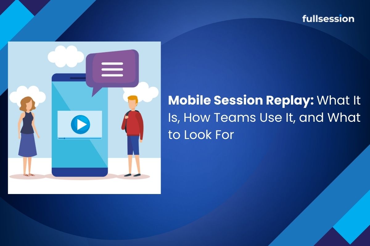
Mobile Session Replay: What It Is, How Teams Use It, and What to Look For
Mobile session replay is most useful when it stops being “watching videos” and becomes a repeatable operating system: decide when replay is the right tool, prioritize which sessions matter, turn findings into fixes or experiments, and then validate whether Week-1 activation actually moved.
-

Crazy Egg vs Microsoft Clarity: how to choose for activation, not just price (as of March 2026)
If you are a Growth PM owning activation and onboarding, the “crazy egg vs microsoft clarity” decision is rarely about heatmaps versus recordings. It is about whether your team needs fast exploratory diagnosis, repeatable segmentation workflows, and reliable validation after you ship changes. Crazy Egg and Microsoft Clarity overlap on core behavior visuals (heatmaps +…
-
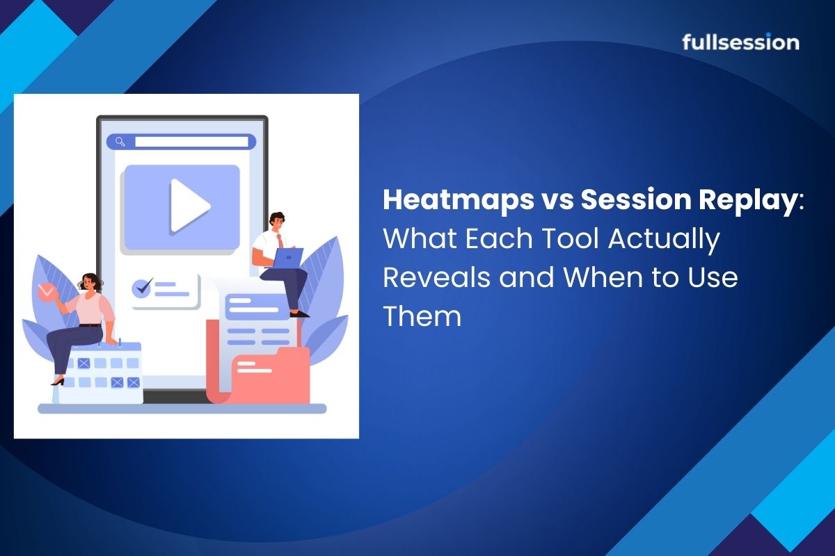
Heatmaps vs Session Replay: What Each Tool Actually Reveals and When to Use Them
You can see your traffic numbers.You can see your conversion rate. But those numbers rarely explain one important question. What are users actually doing on your website? Traditional analytics tools show outcomes such as bounce rate, page views, and conversions. They rarely explain the behavior behind those metrics. This is where behavior analytics tools like…
-

How to Use Heatmaps to Improve Activation Rate in SaaS Onboarding
Heatmaps can improve activation rate when you use them to diagnose friction in onboarding, not just to spot clicks. The winning workflow is to isolate new users, review heatmaps alongside session replay and funnels, rank issues by likely activation impact, then validate changes against the activation milestone with a user behavior analytics platform like FullSession.…
-
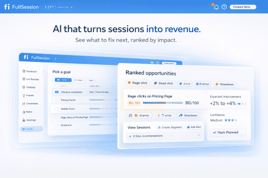
Introducing Lift AI: Stop Guessing What to Fix Next
Every product team has the same dirty secret: they collect more behavioral data than they can act on. Session replays pile up unwatched. Heatmaps confirm what everyone already suspected. Funnels show where users drop off, but not why, and definitely not what to do about it. The real bottleneck was never data collection. It’s prioritization.…
-
How to set up heatmaps for single-page applications (SPAs): route changes, view identity, and validation
Quick Takeaway To set up heatmaps for a single-page app (SPA), you need a consistent view identity (routes and key UI states), a reliable navigation signal (router events or History API changes), and a validation loop to confirm views are bucketed correctly. Without that, multiple screens merge, and heatmaps mislead debugging and MTTR work. If…